E-Bus Xpress Passenger App

Phiona Nyangoma


UI / UX Design
E-Bus Xpress Passenger App
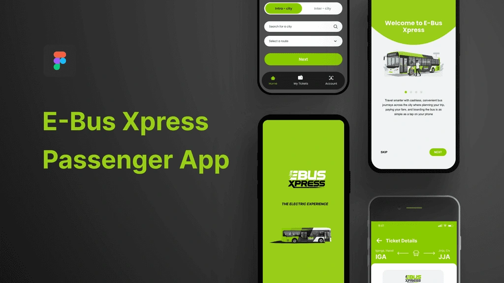
E-Bus Xpress is Uganda's first electric mass transit service, operating between Jinja and expanding to Kampala. As the service grew, so did the gap between what passengers needed and what the existing system, built around physical cards, manual agent activation, and WhatsApp group chats, could actually deliver. I led UX research and product design for the IRMS E-Bus Passenger App, a mobile-first solution designed to make the service accessible, intuitive, and trustworthy for a diverse range of commuters
Role: Lead in User Research, Analysis & MVP Definition
Year :
2026
Project Duration :
2 months
Tools :
Figma, Google Forms and Sheets, Notion
Problem :
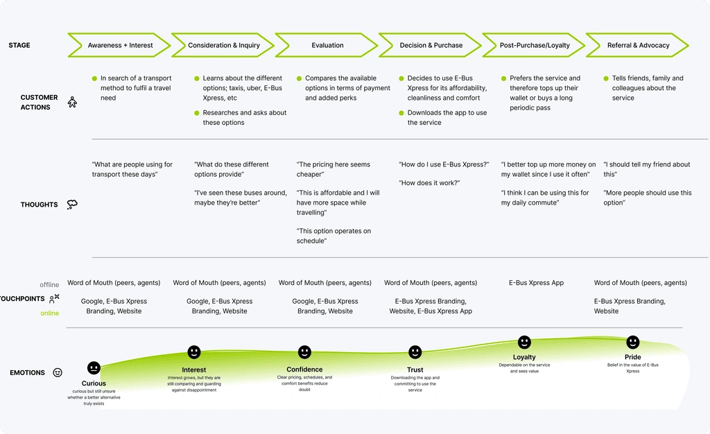
Passengers were frustrated, confused, and dependent on workarounds. Through passenger interviews and feedback form analysis, recurring pain points emerged across four critical areas:
Payments & top-ups: Loading money onto a card required a separate agent activation step, passengers would top up and then have to wait for someone, a bus steward, to activate the balance before it was usable. This felt broken and arbitrary. The top-up cap of UGX 30,000 per transaction added further friction.
Balance & transaction visibility: Passengers had no way to check their card balance independently. Any deduction happened silently, no SMS, no notification, no record, leaving users anxious about running out of funds mid-journey.
Real-time information: Bus tracking didn't exist. Passengers relied on WhatsApp groups or asking fellow commuters, and if no one in the group was online, they had no idea where the bus was or when it was coming. Schedule changes were communicated late or not at all.
Access & inclusion: The card-only system excluded tourists who couldn't register quickly, and made family travel unnecessarily complicated, each family member needed their own card even the children.
Solution :
Research Approach
I conducted qualitative user interviews and synthesised responses from passenger feedback forms, grouping insights into themes. From this, I developed five distinct user personas representing the full spectrum of E-Bus commuters:
Eric, The Smartphone-Savvy Commuter: Tech-first, operations manager, frustrated by partial digitalisation. Wants QR boarding, instant payments, real-time tracking, and SMS notifications for every transaction.
Julian, The Short-Term Visitor: 10-day business traveller, needs immediate access without local ID or SIM card registration. Wants to pay with an international bank card and get a time-limited pass.
Margaret, The Feature Phone User: 52-year-old teacher who has commuted for 8 years. No smartphone, no WhatsApp. Relies on staff and fellow passengers for information. Anxious about her balance, confused by the activation process.
Samuel, The Phone-Free Commuter: Market vendor, no phone at all. Tops up with help from a friend. Feels excluded by a system designed only for smartphone users. Needs agent-based access and biometric verification.
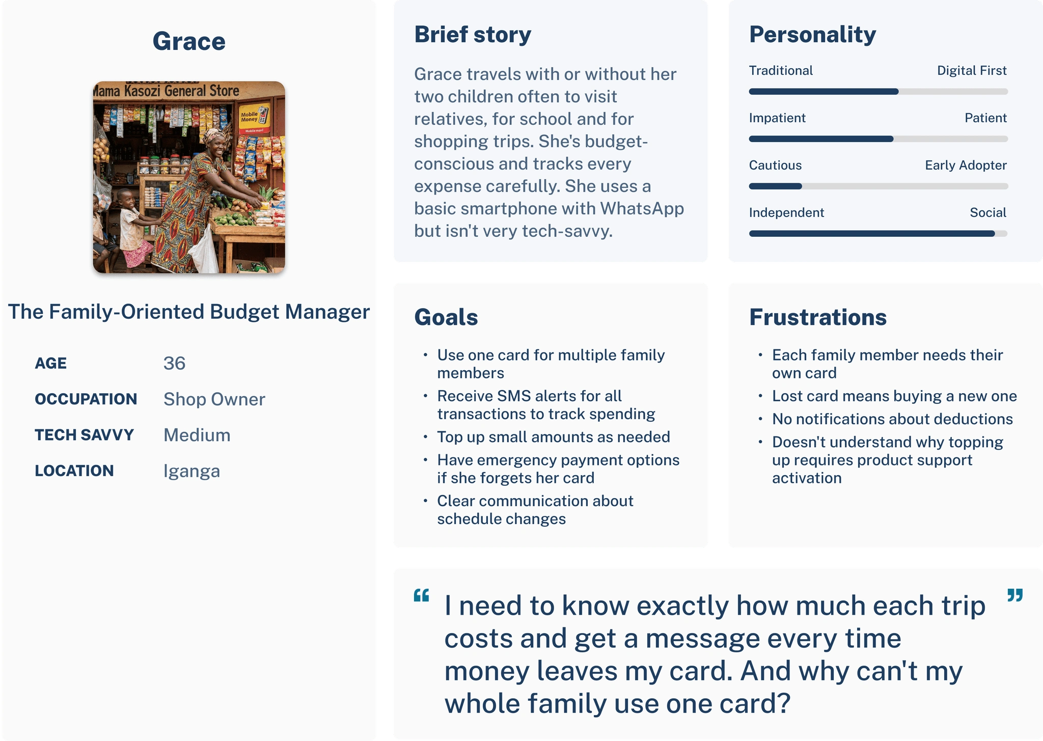
Grace, The Caregiver: Manages travel for herself and her children. Tracks every shilling carefully. Wants one account for the whole family, SMS alerts for every deduction, and emergency payment options when she forgets her card.
Design Approach:
The research made one thing clear: there was no single user and therefore no single solution. The app needed to serve all five personas without making any of them feel like an afterthought. The solution was structured around three core design principles:
Instant, automated payments with no agent dependency. Top-ups via Mobile Money or bank card should credit the wallet immediately, no activation step, no agent visit. The system also needed to support any top-up amount, removing the UGX 30,000 cap.
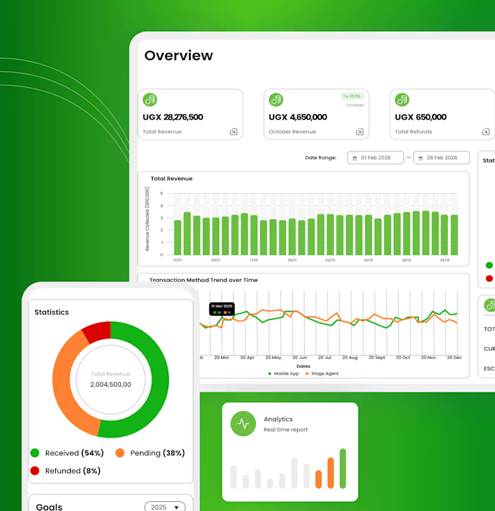
Full transparency at every touchpoint. Every transaction triggers an SMS/email and an in-app notification. Balance is always visible on the home screen. A transaction history gives passengers a complete, auditable record of their spending.
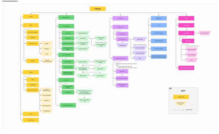
Triple-layer access that includes everyone. To serve Eric's QR preference, Margaret's feature phone limitations, and Samuel's complete lack of a phone, we designed a three-method boarding system: dynamic QR code scanning, biometric fingerprint verification, and a unique fallback code that stewards can manually enter, ensuring no passenger is ever left behind due to technology failure.
Additional Features from Research:
Real-time bus tracking and proactive notifications: passengers know exactly where their bus is and receive alerts for schedule changes before they affect their journey.
Defined stages and route schedules: in-app and in-bus screens show fixed stop information and timetables, removing dependency on WhatsApp groups and staff.
USSD access: for Margaret and users without smartphones, the core functions (balance check, trip notification) are accessible via USSD on a feature phone.
Challenge :
Designing for the phone-free user:
Samuel's persona presented the hardest design problem. Every solution we considered, QR codes, app-based boarding, USSD flows, assumed some level of phone access. The physical card had partially solved this by providing phone-free users with a physical token. However, it still relied on agent activation and raised concerns about balance visibility and lost cards.
The real breakthrough came when we reframed the question: instead of asking "how do we get Samuel to use the app?" we asked, "what does Samuel already have that we can build on?" The answer was his identity. Since the physical card was already linked to his SIM, which was linked to his National ID and biometric details, we had a foundation to work from. In case we failed to get access to his biometrics by National ID, we decided we would have the option to register users ourselves. This led directly to the introduction of biometric fingerprint boarding, allowing phone-free users to board using a fingerprint scan at the stage, with no card, no phone, and no agent dependency. It was the most technically ambitious part of the solution, but also the most necessary for true inclusivity.
The caregiver and family travel problem
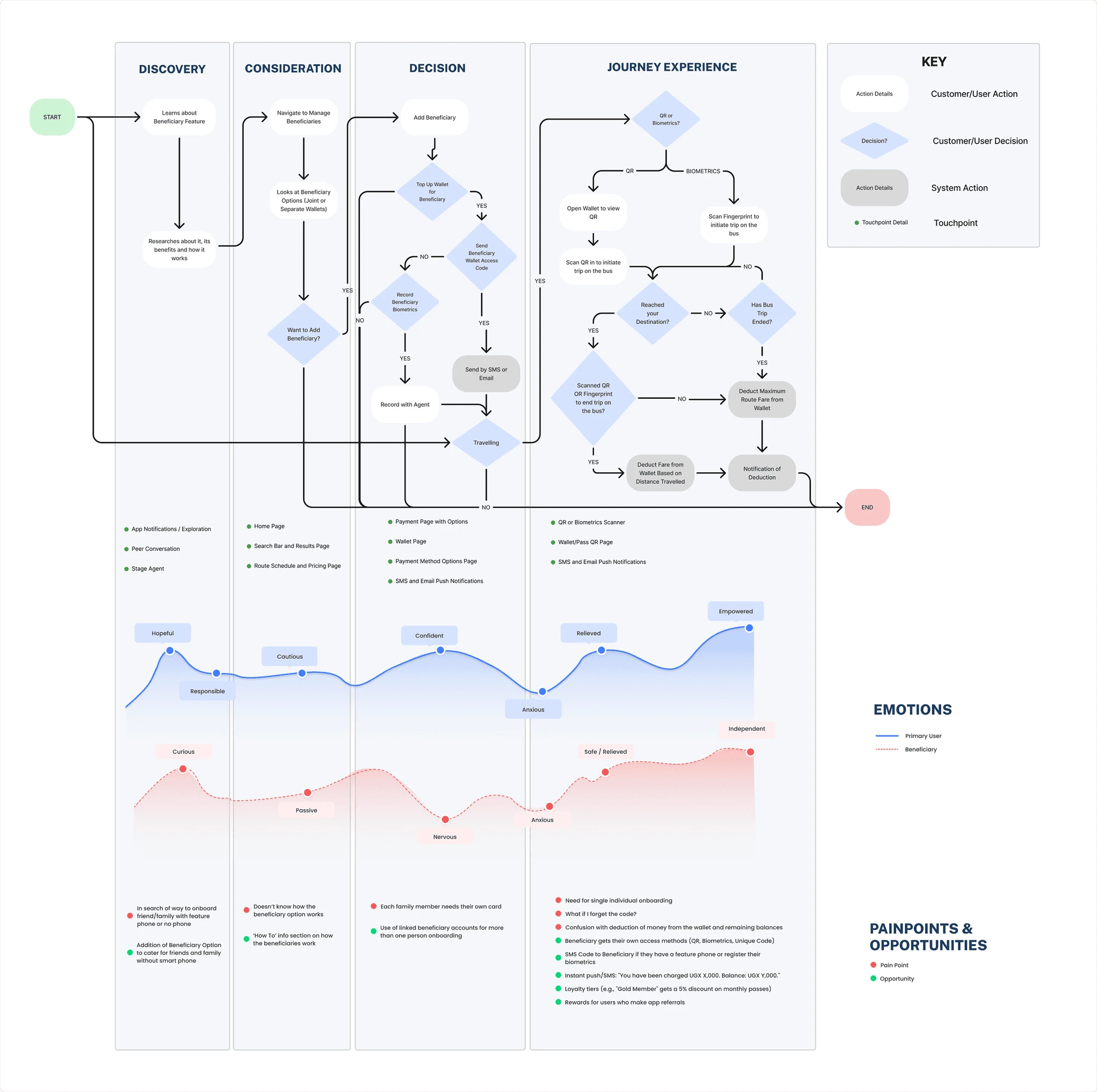
Grace's use case generated the most discussion during the design process. On the surface, it seemed straightforward: a parent managing travel for her children. In practice, it raised a cascade of questions: Should children have their own wallets or share Grace's? What happens when Grace isn't travelling with them? How does a child board independently without a smartphone? What if the card is lost? Does the whole family lose access?
These weren't just UX questions; they touched on account security, payment logic, and operational workflows that required close collaboration with the product and engineering teams. Several approaches were proposed and walked back before we landed on the Beneficiary Accounts model: a flexible structure that allows Grace to top up individual child wallets, share a joint wallet, purchase passes on their behalf, or board together with a single QR scan that charges all passengers simultaneously. Children without phones board using a unique code provided by Grace, manually entered by the steward. It took significant iteration to get right, but solving it properly meant the service became genuinely usable for one of the most common travel patterns on the route: families
Impact :
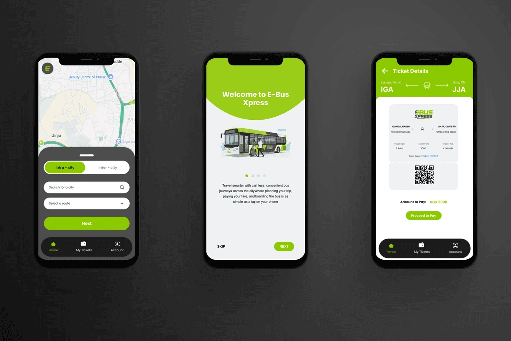
The redesigned experience addressed every major friction point surfaced in research:
Eliminated the agent activation dependency: top-ups are instant and self-service
Gave passengers full visibility of their balance and transaction history for the first time
Replaced WhatsApp-based tracking with real-time bus location and proactive schedule alerts
Extended service access to feature phone and phone-free users through USSD and biometric boarding
Enabled family and group travel through shared wallets and beneficiary accounts
Reduced dependency on staff for information, boarding, and payments across all user types
Like this project
Posted Aug 24, 2026
Led research and MVP definition to redesign the E-Bus Xpress passenger app, solving payment, visibility, tracking, and inclusion issues for diverse commuters.
Likes
0
Views
1