Hallway

Phiona Nyangoma


UI / UX Design
Hallway
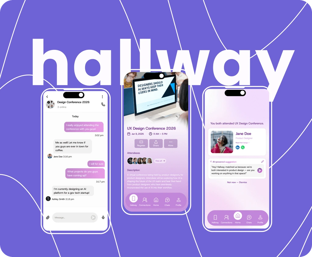
A digital networking companion that works alongside any existing conference platform. Hallway replicates the 'hallway effect' digitally - helping remote attendees form meaningful, authentic connections during and after virtual events.
Role: Lead in User Research, Analysis & MVP Definition
Year :
2026
Project Duration :
8 weeks
Tools :
Figma, Canva, Google Forms, FigJam
Problem :
Virtual conferences are increasingly common, but the spontaneous, serendipitous connections that make in-person events so valuable - the hallway conversations, the shared lunches, the overheard insights - simply don't happen online. A 2023 ScienceDirect study identified this as the single biggest disadvantage of virtual conferences, ahead of technology issues, content quality, or cost.
Solution :
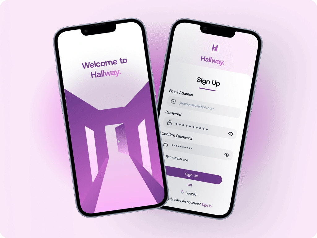
Hallway is a lightweight Progressive Web App (PWA) that acts as a networking companion alongside any existing conference platform.
Using interest-based matchmaking, session-linked topic rooms, context-driven connection nudges, and structured post-event follow-up tools, Hallway replicates the 'hallway effect' digitally - helping remote attendees form meaningful, authentic connections during and after virtual events.
Primary Research :
To validate the problem Hallway is solving, we ran a survey of 19 participants spanning a range of ages, genders, and employment backgrounds to gain an all-round perspective. The results were telling!
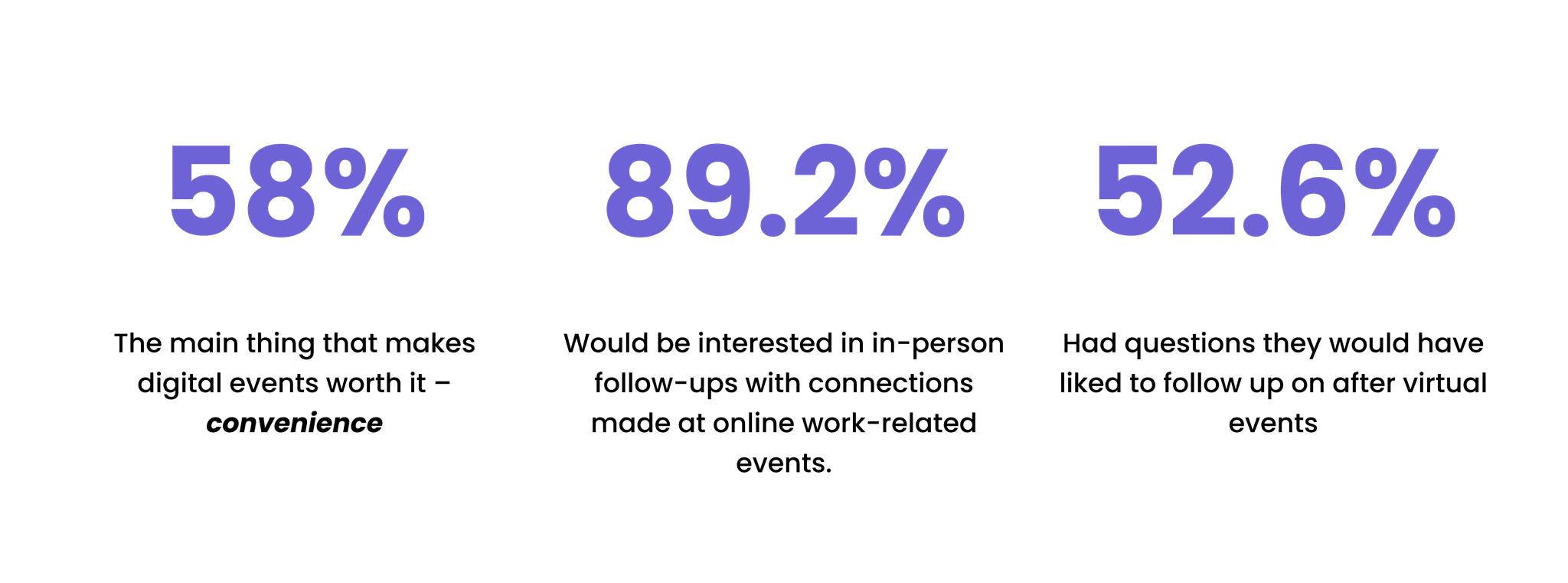
People aren't abandoning virtual events; the desire to connect is clearly there. The infrastructure just isn't. People want the human element back. A digital hallway is missing, and that is exactly what we set out to build.
COMPETITOR ANALYSIS:
Looking at 3 competitors in the virtual event networking arena (Whova, Brella, and RingCentral), we noticed that none truly captured the experiential elements that lend in-person events their unique value.
Feature
Whova
Brella
RingCentral
Hallway ✓
Intent-based goal matching
Spontaneous / casual encounters
Post-event relationship tools
Session-linked suggestions
Low onboarding friction
Transparent match reasoning
Hallway's Opportunity: Post-event follow-up is white space: not one of the three competitors sends a follow-up prompt, suggests a check-in, or helps attendees act on connections at the moment inertia kicks in. Brella connections expire at event close. RingCentral content persists but people don't. Whova offers 3-month passive community access but no proactive nudge.
User Personas:
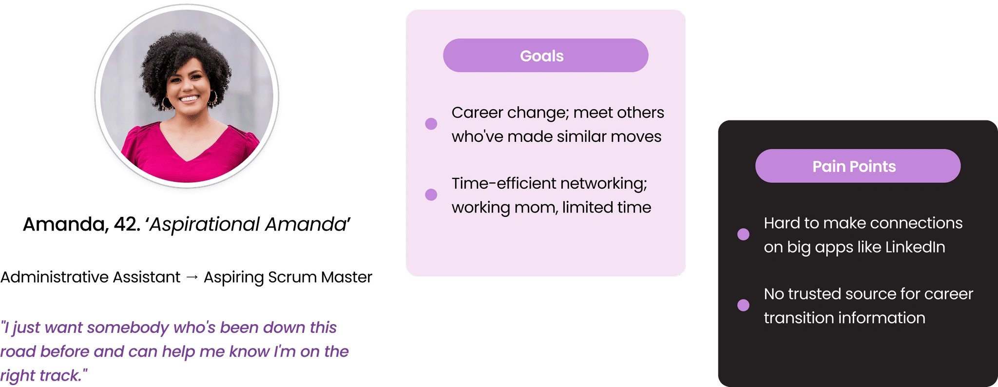
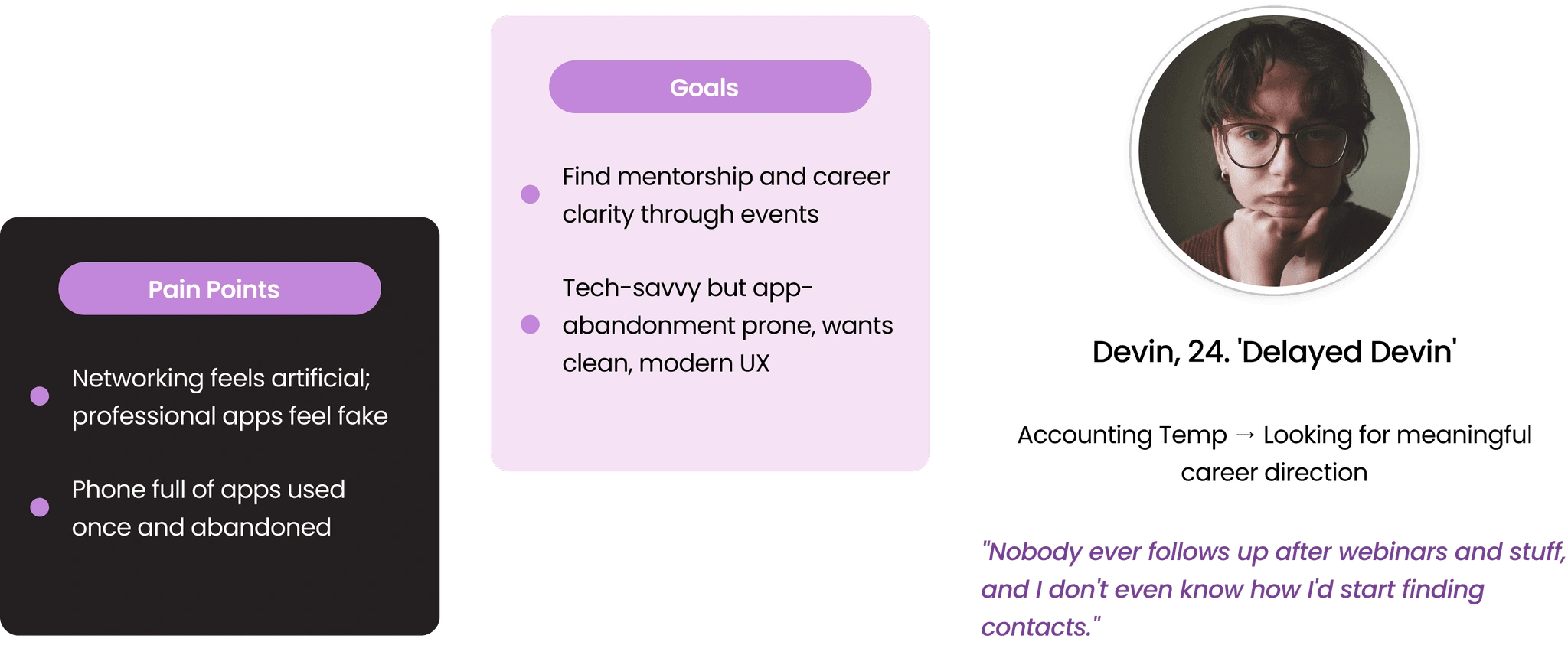
We defined two user personas; Amanda, 42-year-old administrative assistant who is up-skilling for a career change, often attends online events to meet others who have succeeded at this career change and find it hard to make connections on big networking apps like LinkedIn. Then, Devin, a 24-year-old accounting temp officer who hates networking because it feels very artificial, but wants to learn more about the job market and what options there are for qualifications or mentorships to find a clear career direction, is therefore attending various online training sessions.
IDEATION:
With the problem validated by both desk research and primary survey data, we moved into ideation. Our design principle throughout was constraint: every feature had to serve the core hypothesis of context-first connection. If it added friction without unlocking meaningful connection, it was cut.
After evaluating native iOS/Android apps against a PWA, we chose the PWA approach for three clear reasons:
Convenience is non-negotiable. Attendees access Hallway via a URL in their event email, same as every other conference link. No installation step, no app store decision, no new behavior required.
Attendees already have multiple apps. A PWA doesn't add to that list. It lives in a browser tab alongside their ongoing event. Devin's persona made this real: their phone is full of apps loaded once, used twice, then never opened again.
A single PWA codebase works across iOS, Android, Windows, and macOS simultaneously, saving development effort that can go into features users actually want.
INFORMATION ARCHITECTURE & user flows
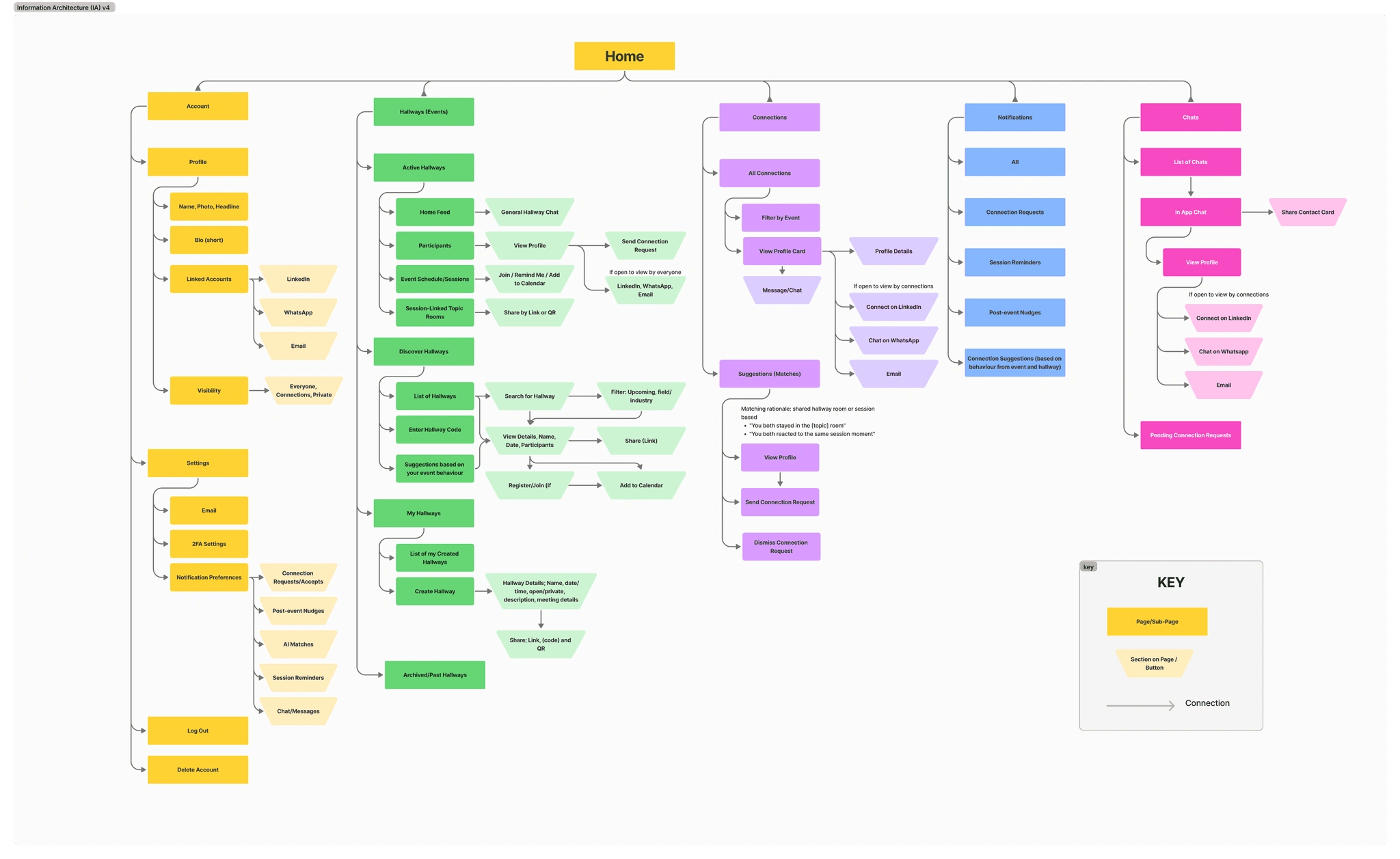
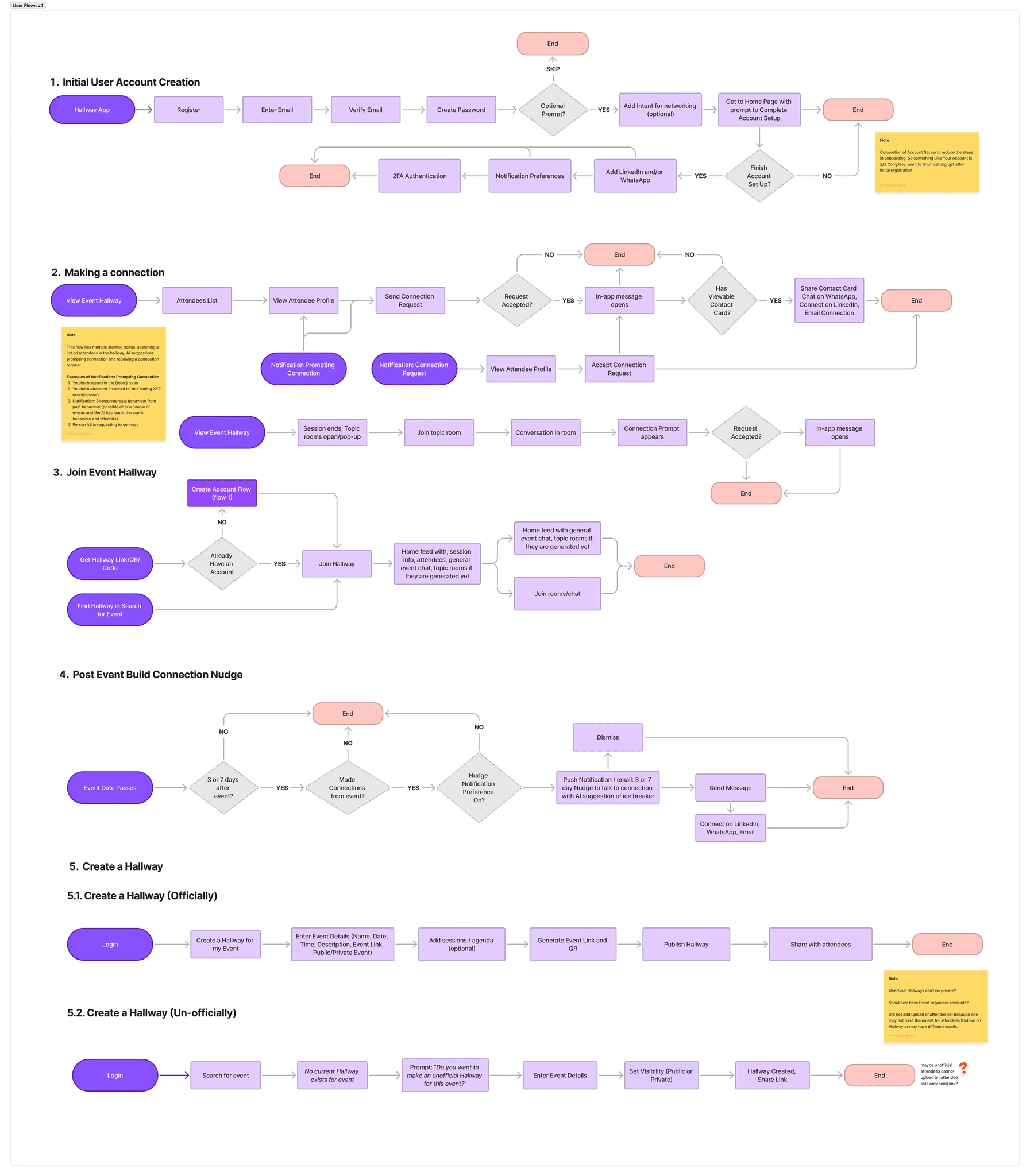
We mapped five user flows that collectively cover every meaningful interaction in the product. This FigJam board maps all five flows from entry point to end state, including error and skip paths. Key design decision at each branch: how do we keep the user's intent alive and avoid dead ends?
low FIDELITY SCREENS
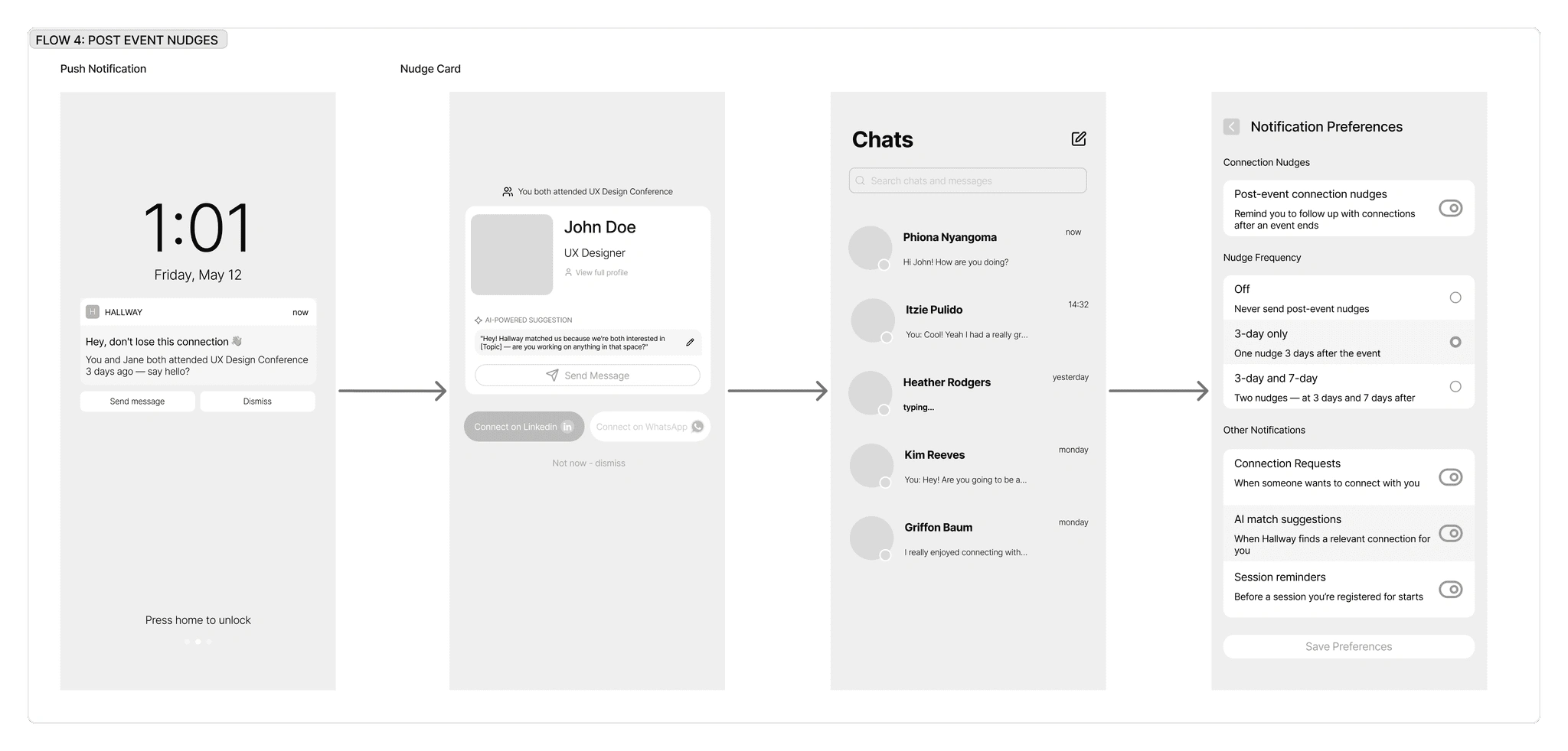
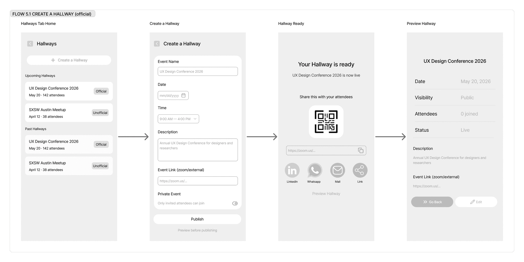
To validate the structure and flow of the experience, we sketched low-fidelity wireframes covering the core user journeys. This allowed us to test ideas early and align on a clear design direction before investing in visual design.
High fidelity screens
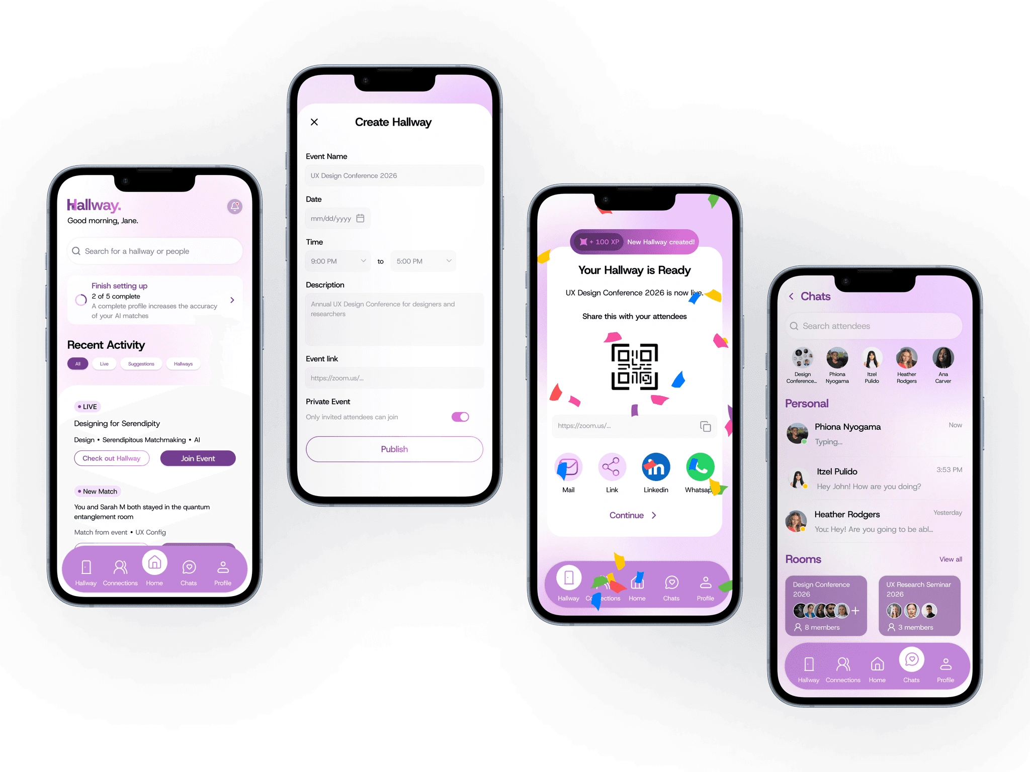
Building on insights from the wireframing phase, we translated the approved concepts into high-fidelity screens. This stage focused on visual hierarchy, branding, accessibility, and interaction details to create a polished and intuitive experience.
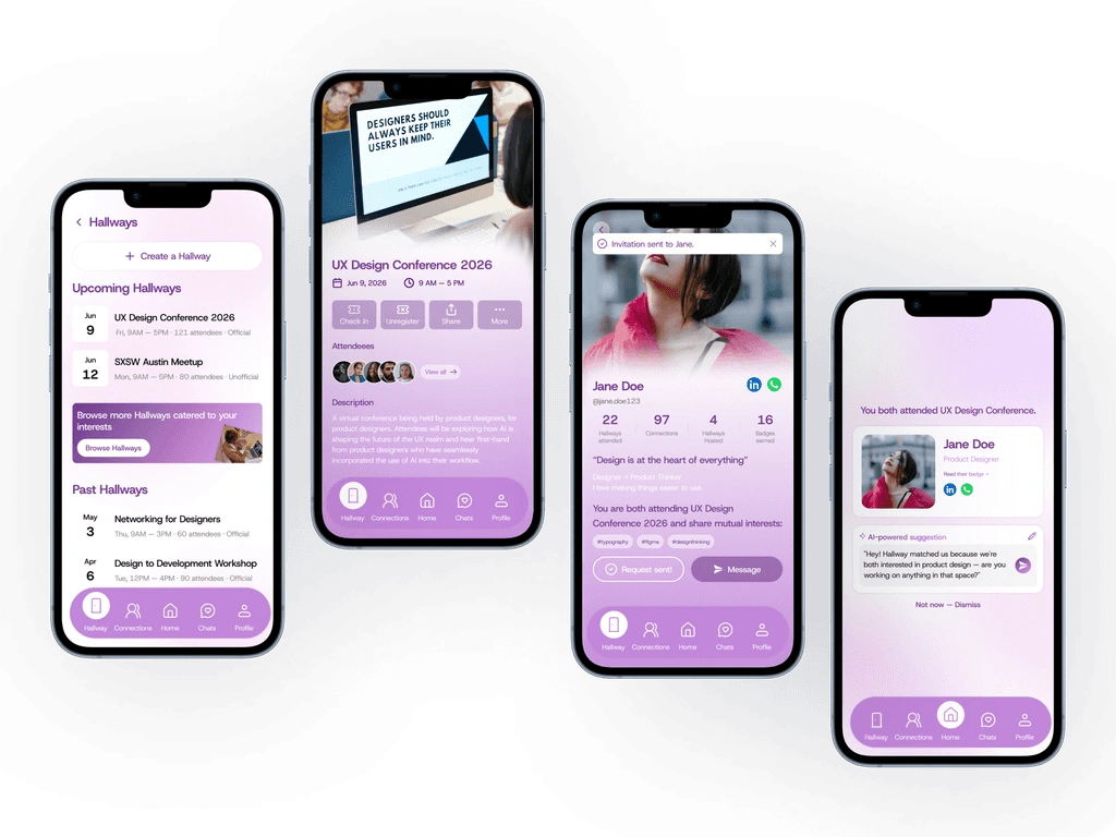
Key Design Decisions :
Progressive Disclosure: Minimum info at registration; profile enrichment over time. Competitor audit showed Whova and RingCentral both suffer from demanding too much at sign-up.
Status Transparency: All connection states (Sent, Pending, Accepted, In Conversation) shown with clear visual feedback. 72% of survey respondents cited initiation awkwardness as a top barrier.
Flat Navigation: All primary actions reachable within 2–3 taps via bottom navigation bar. Whova's buried menus cause users to miss core functionality.
Event-Scoped Messaging: Conversations are tied to specific event context, reducing spam and keeping interactions relevant, a direct response to user survey feedback about unsolicited cold messages.
Hallway Effect by Design: When a session ends, a topic room automatically surfaces seeded with session themes. Attendees self-select in because they want to discuss what they just heard, not because an algorithm predicted they would.
NEXT STEPS & LEARNINGS
What Next?
The project was done as a capstone project for a postgraduate program. However if given more time these are the next most valuable improvements, in priority order:
Usability testing on the onboarding flow: specifically, the interest-first entry point. Does inverting account creation reduce drop-off in practice? We'd run a 5-person moderated test and measure completion rates vs. a traditional sign-up gate.
Goal-based networking suggestions (deferred from MVP): matching users by declared goals (mentorship, collaboration, job market research) was cut for scope. This would be the first post-MVP feature iteration.
Local in-person meetup bridge: 89.5% of survey respondents expressed interest. Dependent on user density reaching a threshold where geographic clustering becomes meaningful.
Official organiser onboarding flow: the MVP assumes organisers find Hallway independently. A proper organiser acquisition flow (including event import, attendee list upload, and brand customisation) would unlock the official Hallway tier at scale.
Key Learnings
Personas make abstract problems concrete. Amanda and Devin were referenced throughout every design decision, from the PWA choice to nudge copy. Every time a feature felt too complex, we asked: would Devin use this once and abandon it?
Platform choice is a UX decision. Choosing a PWA over native apps wasn't just technical; it was a direct response to the primary finding that convenience is non-negotiable. Every architectural decision that protects convenience is a UX decision
Like this project
Posted Aug 24, 2026
Hallway — a lightweight PWA networking companion that uses interest-based matchmaking, session-linked rooms, and follow-up tools to replicate in-person 'hallway' connections.
Likes
0
Views
1