EBX Connect - Content Management System

Phiona Nyangoma

UI / UX Design
EBX Connect - Content Management System
Designing a centralized analytics and management platform for Uganda's first electric mass transit service, turning fragmented operational data into clear, actionable intelligence for fleet managers and finance teams.
Role: Lead in User Research, Analysis & MVP Definition
Year :
2026
Project Duration :
5 months
Tools :
Figma, FigJam, Google Forms and Sheets
Problem :
E-Bus Xpress operates electric buses across different routes in Uganda, generating thousands of ticketing and payment transactions daily. Despite a growing fleet and passenger base, operational decision-making was still largely reactive and relied on delayed spreadsheet reports rather than real-time data. The core pain points surfaced through stakeholder interviews and workflow shadowing.
No central visibility: Revenue, trips, and passenger data lived in disconnected systems, requiring manual aggregation before any analysis
Slow reporting cycles: Finance managers spent 3–4 hours per week pulling together reports, mostly from Excel exports
Poor decision support: Stakeholders couldn't identify route underperformance, occupancy trends, or revenue leakage
We knew the numbers were in there somewhere, we just couldn't see them without spending half our morning on Excel
As a result, operational teams struggle to optimise routes, improve service reliability, and make data-driven decisions in real time.
Key Design Decisions :
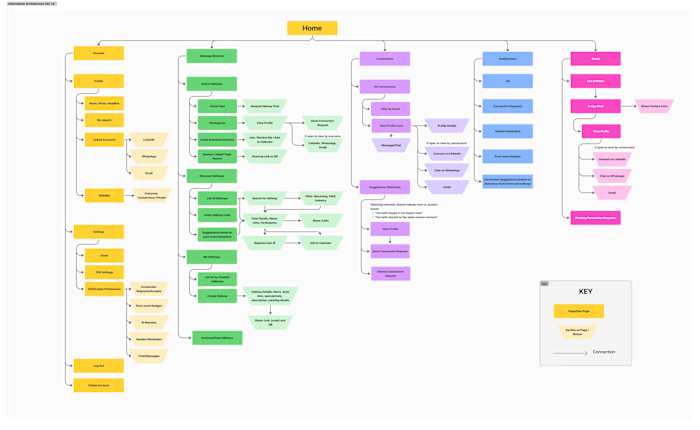
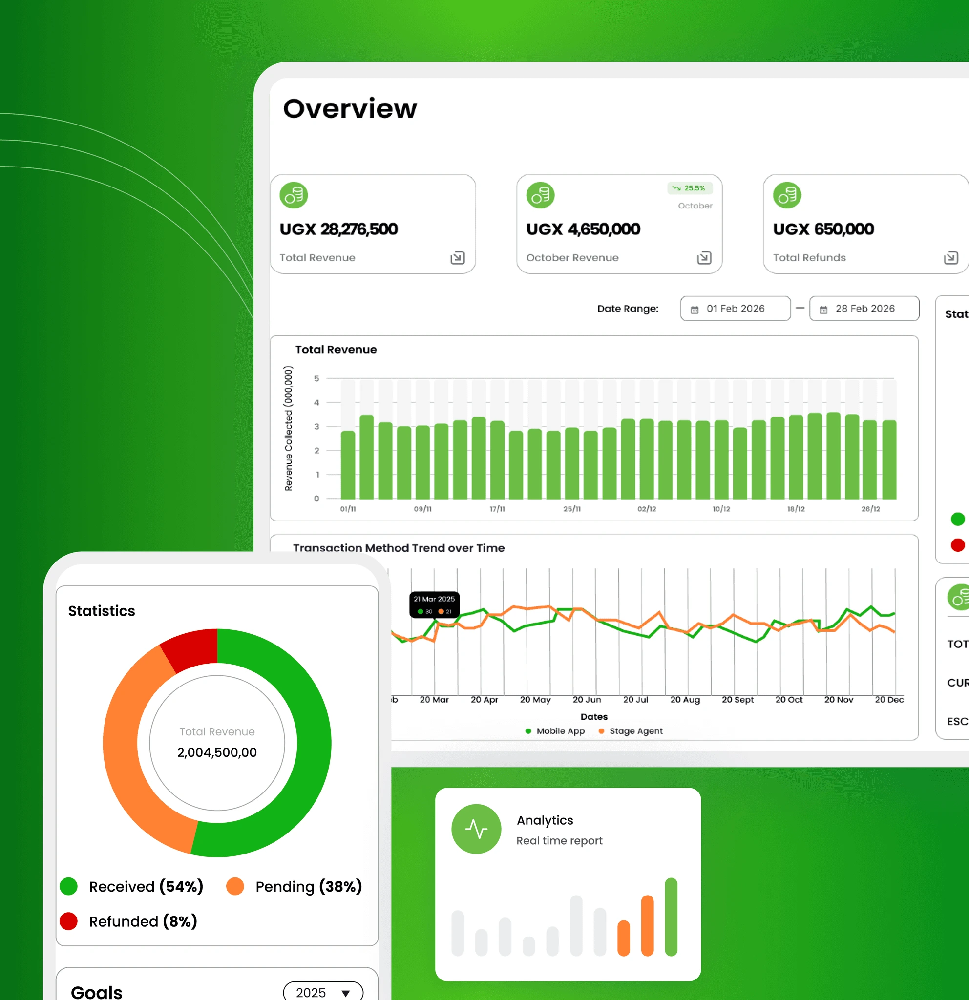
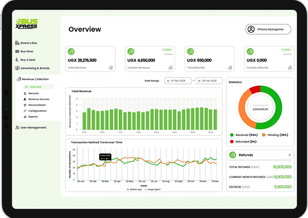
The solution was built using a user-centred, dashboard-driven approach, focusing on clarity, hierarchy, and decision-making efficiency. I used a multi-layered Information architecture (IA) by structuring the analytics experience into three progressive layers.
High-level KPIs for quick performance monitoring
Visual insights (charts) for trend analysis
Detailed trip-level data for operational deep dives
This ensured there was less cognitive overload and allowed users to move from overview → insight → detail seamlessly.
I also designed a flexible filtering system (date, region, route, bus, etc.) to enable the users to drill down into specific operational contexts, compare performance across different segments and generate targeted reports.
I then added an integrated export functionality (CSV, Excel, PDF) to support offline reporting, financial reconciliation and stakeholder communication
Challenges :
Too much information at once overwhelms users, so we wanted to reduce the detail shown at any one time. Settling on key KPIs required a bit of back-and-forth within the team, but the main performance indicators were identified. Looking back, a customisable dashboard where users can add or remove desired KPI tiles could help all users see what they want to see.
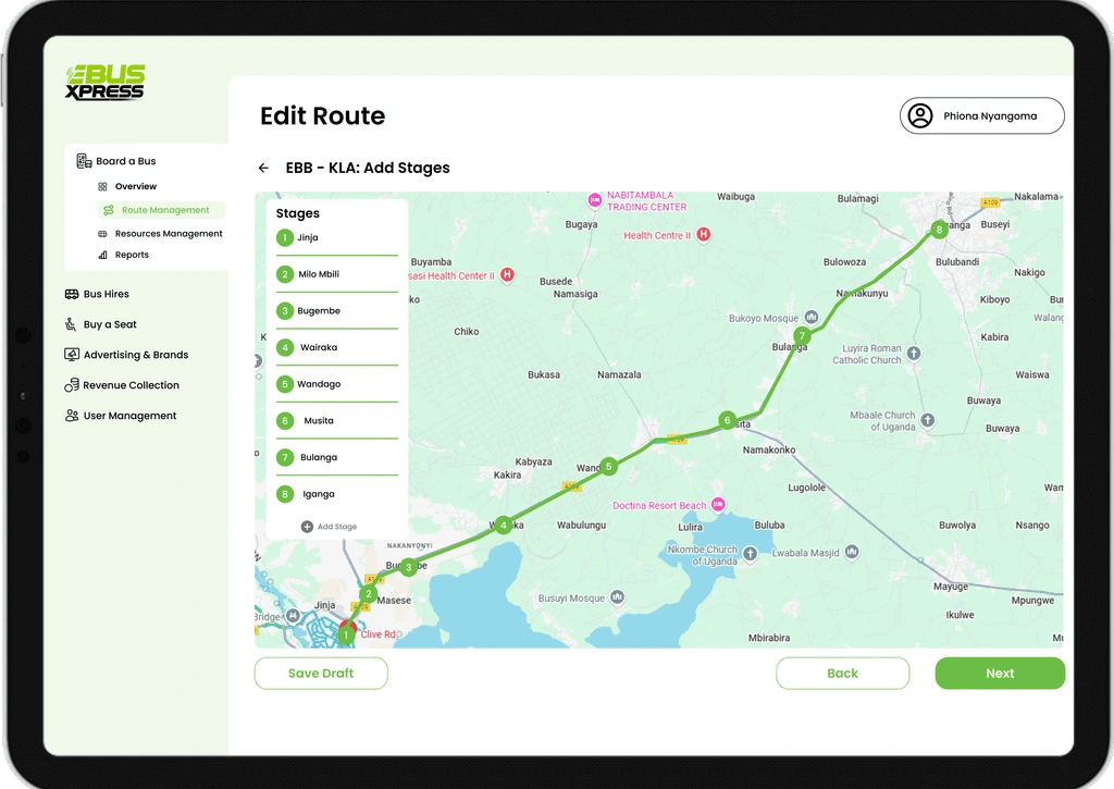
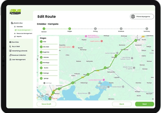
Users in operations management also found the route creation section difficult to navigate. I added a stepper component to help users see which section of the process they were in and to move easily back and forth between sections as they create routes.
Conclusion :
Through iterative design and usability testing, I transformed a data-heavy reporting experience into an intuitive analytics dashboard, reducing reporting time and significantly improving users’ ability to make data-driven decisions and ease their day-to-day operations
Like this project
Posted Aug 24, 2026
EBX Connect — a user-centred, dashboard-driven analytics platform that surfaces KPIs, visual insights, and trip-level data to improve operations and reporting efficiency.
Likes
0
Views
1