Gatilho Festival Branding (2025)
Maria Fernanda de Sá
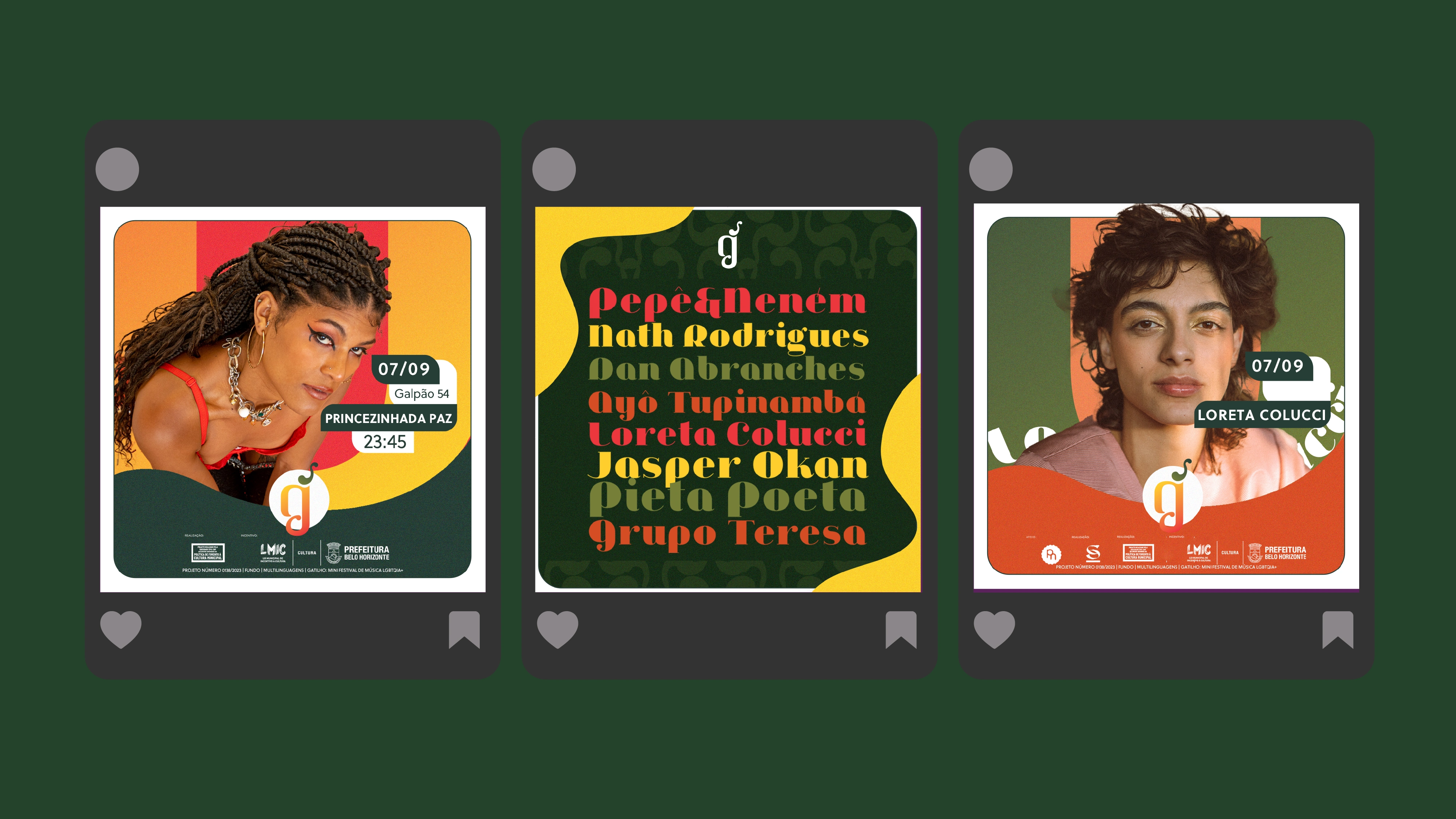
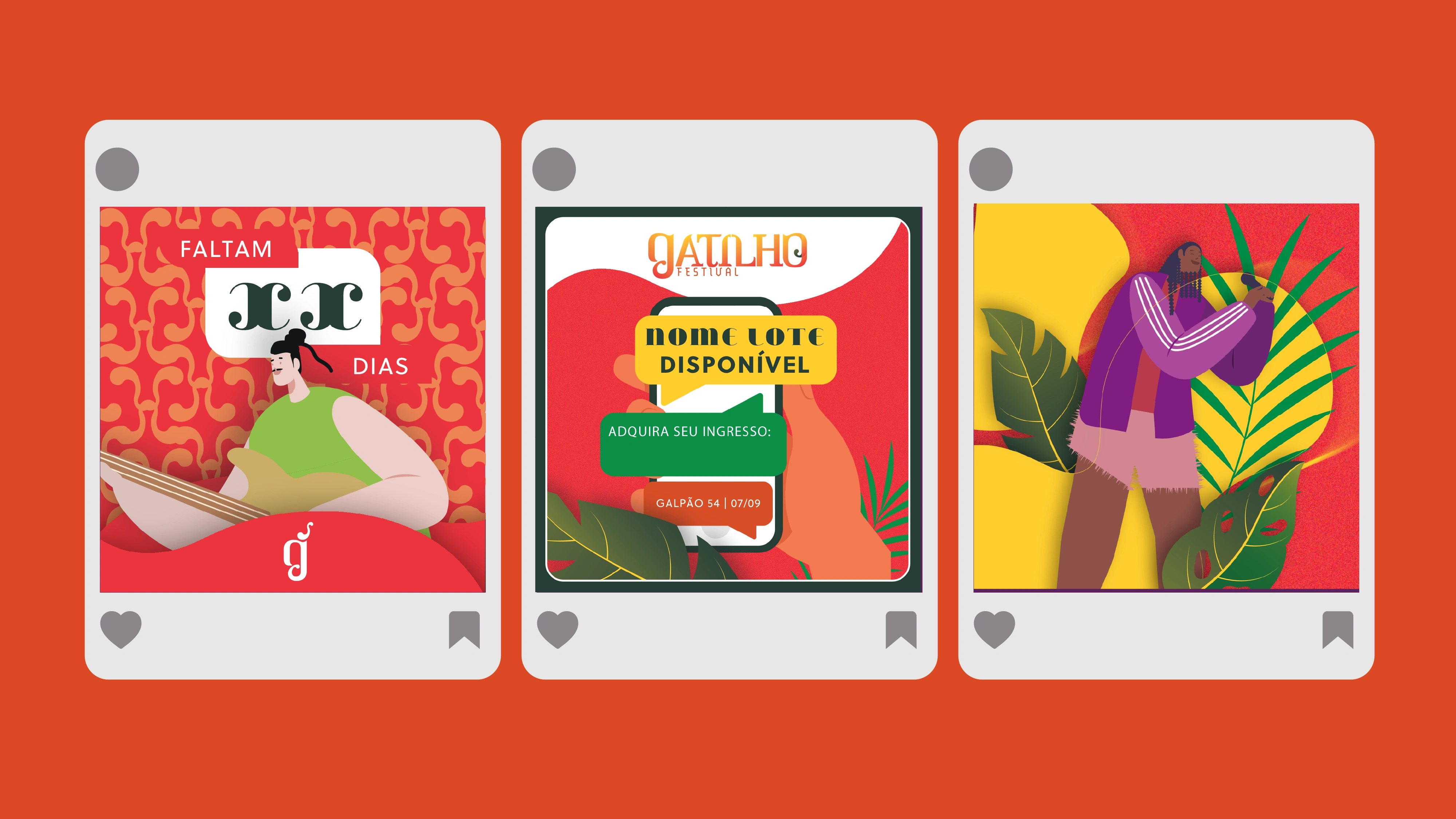
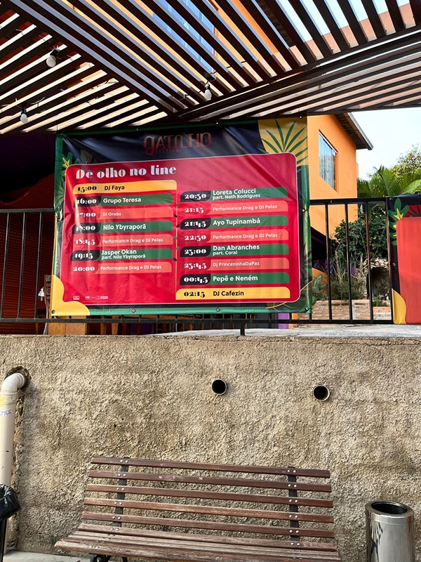
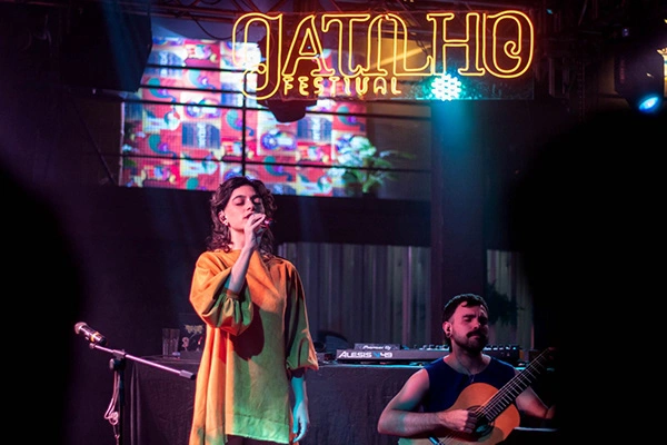
The Gatilho Cultural Festival emerged with a bold mission: to shed light on LGBTQIAP+ voices and issues during Setembro Amarelo (Suicide Prevention Month), a time when this community faces disproportionate vulnerability. More than an event, it sought to provoke dialogue, challenge taboos, and celebrate life through art and culture.
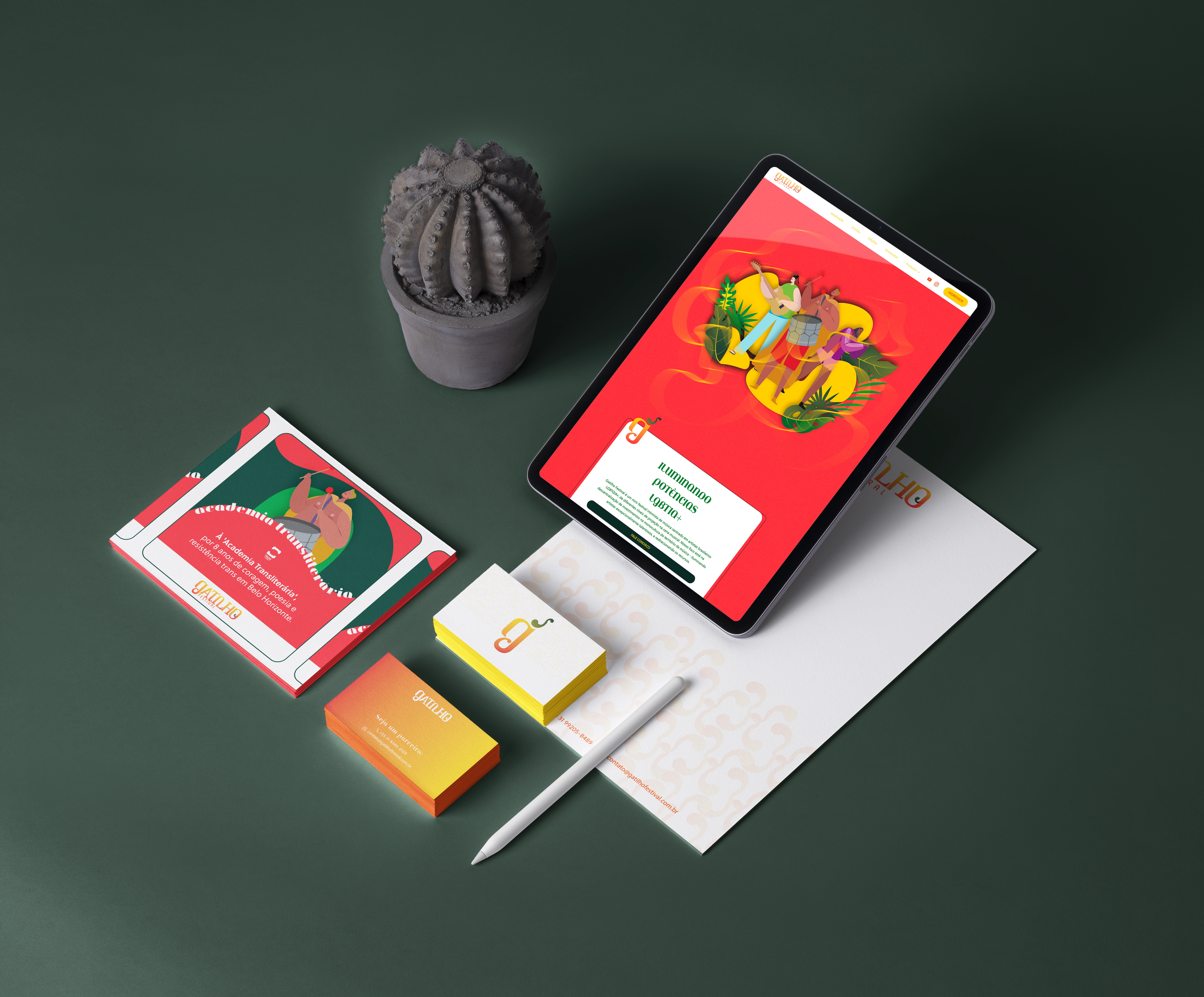
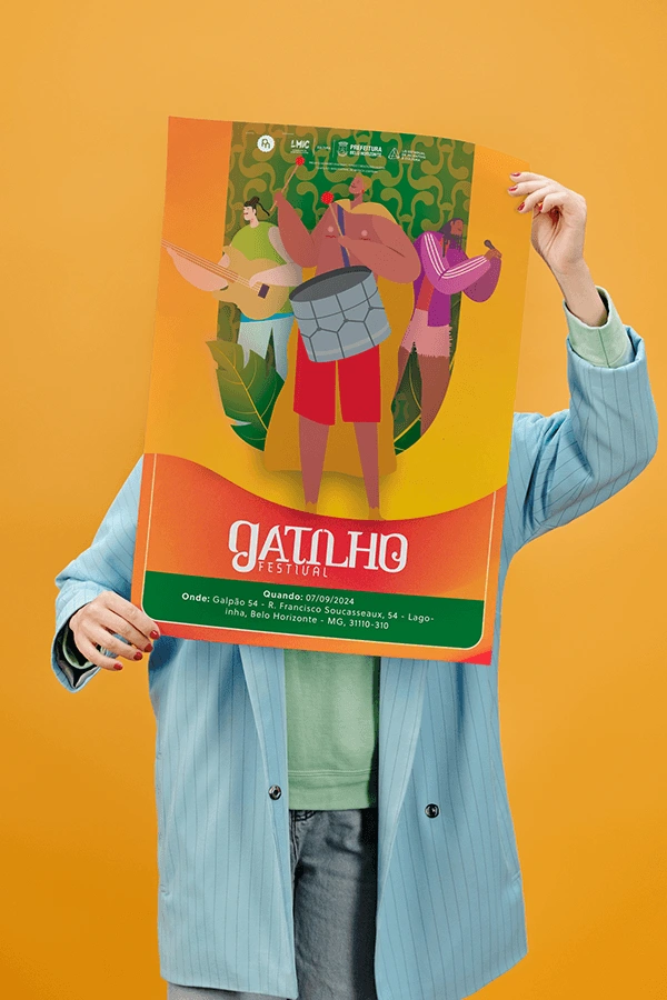
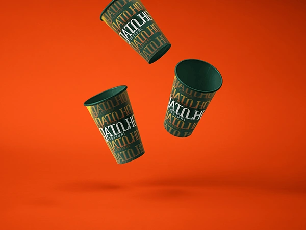
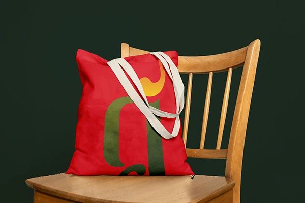
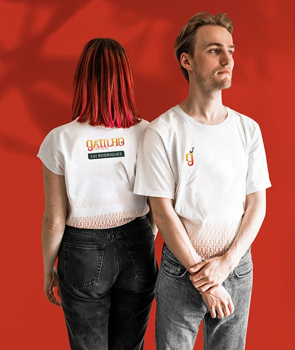
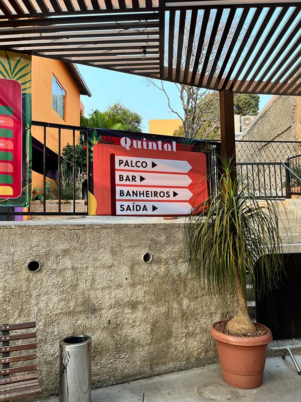
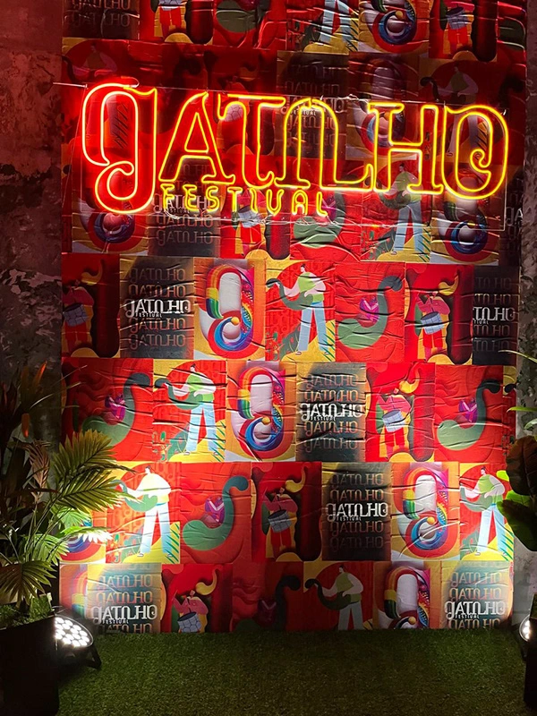
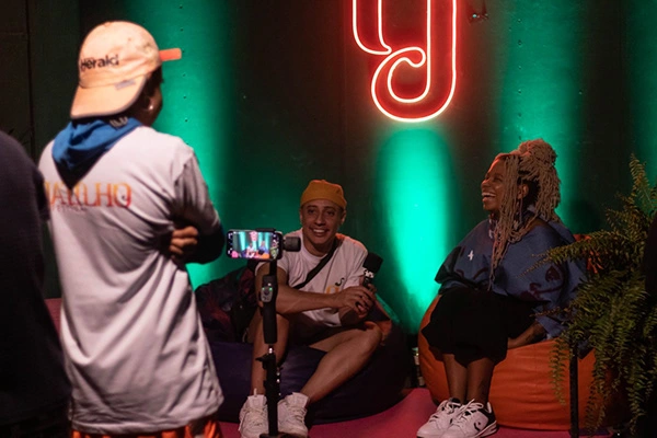
The visual identity was conceived to translate this transgressive spirit into a sensorial experience. The logo draws inspiration from Tropicália and MPB — movements that merge avant-garde experimentation with Brazilian tradition — to create a language that feels both disruptive and elegant. Playful typography, simple yet emblematic forms, and subtle illustrations suggest triggers and reactions, tying directly to the festival’s name in a refined, symbolic way.
The colour palette amplifies this concept: warm tones communicate urgency and embrace, while touches of green evoke nature, balance, and a sensorial connection. The result is an identity that is delicate yet powerful, light yet profound — one that makes space for reflection while celebrating the visibility of Brazilian LGBTQIAP+ artists.

Like this project
Posted Feb 3, 2026
The Gatilho Cultural Festival emerged with a bold mission: to shed light on LGBTQIAP+ voices and issues during Setembro Amarelo (Suicide Prevention Month),