Widly Event Website Design

Eniola Olugbuyi

Widly
A playful event website designed to make people feel the atmosphere before the event begins.
The Brief
Widly is a concept for an event brand built around picnics, outdoor games, and shared experiences.
The idea started with a simple question: What if the website felt as fun as the event itself?
Instead of relying on large blocks of information, I focused on colour, movement, and spacing to create something that feels light, welcoming, and easy to explore.
The interface stays clean, while pastel colours and playful interactions give the site its personality.
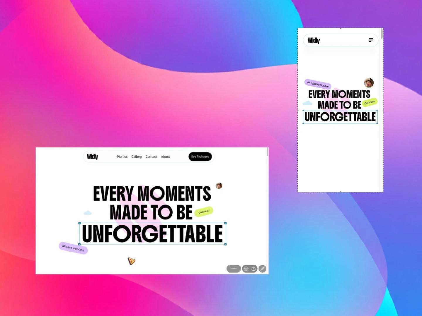
Built entirely in Readymag, the project is fully responsive across desktop, tablet, and mobile screens.
The Challenges
Designing around a feeling.
People decide how they feel about an event long before they arrive. The challenge was creating a website that immediately feels relaxed, social, and inviting.
Keeping the interface playful without becoming busy.
A colourful interface can quickly become overwhelming. The challenge was finding the balance between playful visuals and clean layouts, allowing the colours to add energy without competing for attention.
Making interaction feel natural.
Animations are easy to overuse. Every transition was added with a purpose, whether it was guiding attention, creating rhythm, or making the experience feel more engaging.
Building for every screen.
Readymag offers a great deal of creative freedom, but every breakpoint needs careful refinement. Desktop, tablet, and mobile layouts were adjusted individually to preserve the same flow and visual balance across devices.
My Approach
Starting with colour.
The soft colour palette wasn't added at the end it shaped the entire design from the beginning. Once the colours were established, typography and layout became restrained so the interface never felt overwhelming.
Letting the layout breathe.
Instead of filling every section, I relied on generous spacing and simple compositions to keep the experience calm and easy to navigate.
Exploring Readymag creatively.
One of the goals of this project was to push Readymag beyond conventional layouts. By combining layered compositions, interactions, and responsive layouts, I explored how expressive the platform can be without relying on custom development.
What Was Built
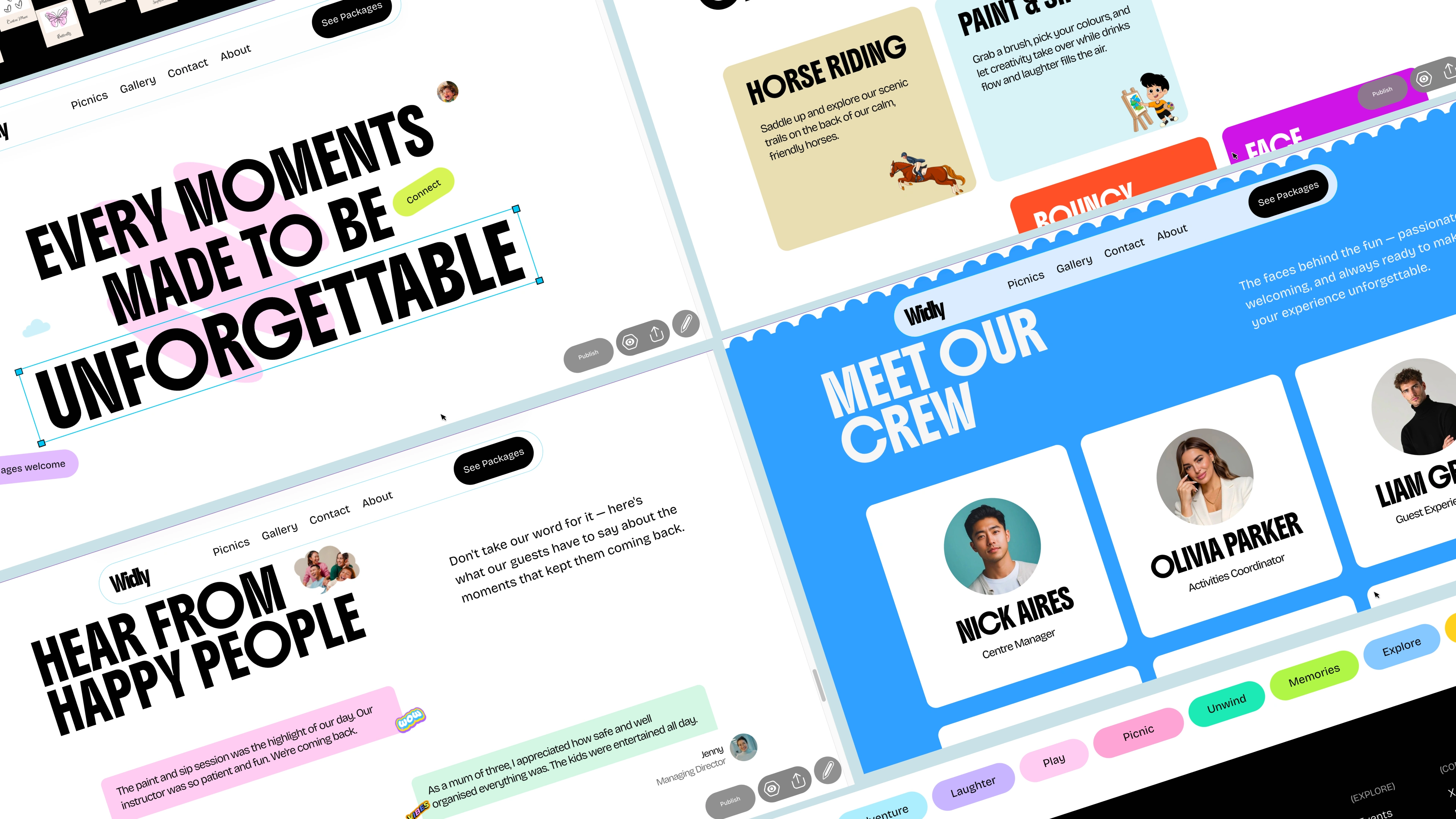
Widly includes:
Responsive layouts for desktop, tablet, and mobile
A pastel-inspired visual system
Interactive transitions throughout the site
Flexible sections for events and activities
Clean layouts with generous spacing
Takeaways
Widly reminded me that personality doesn't have to come from complexity. A simple layout, paired with intentional colour and interaction, can completely change how a website feels.
It also reinforced something I've come to appreciate about Readymag: when you approach it with a strong design idea instead of treating it like a template builder, it becomes a surprisingly flexible tool for creating expressive, interactive websites.
Have a project in mind?
If Cyph Studio™ reflects the kind of website you're looking for, let's talk about your goals and create something that's tailored to your brand.
Like this project
Posted Jul 27, 2026
Designed a playful, responsive event website for Widly using Readymag.
Likes
1
Views
6