AMC Global Media | Corporate Rebrand

Muskaan Sethi


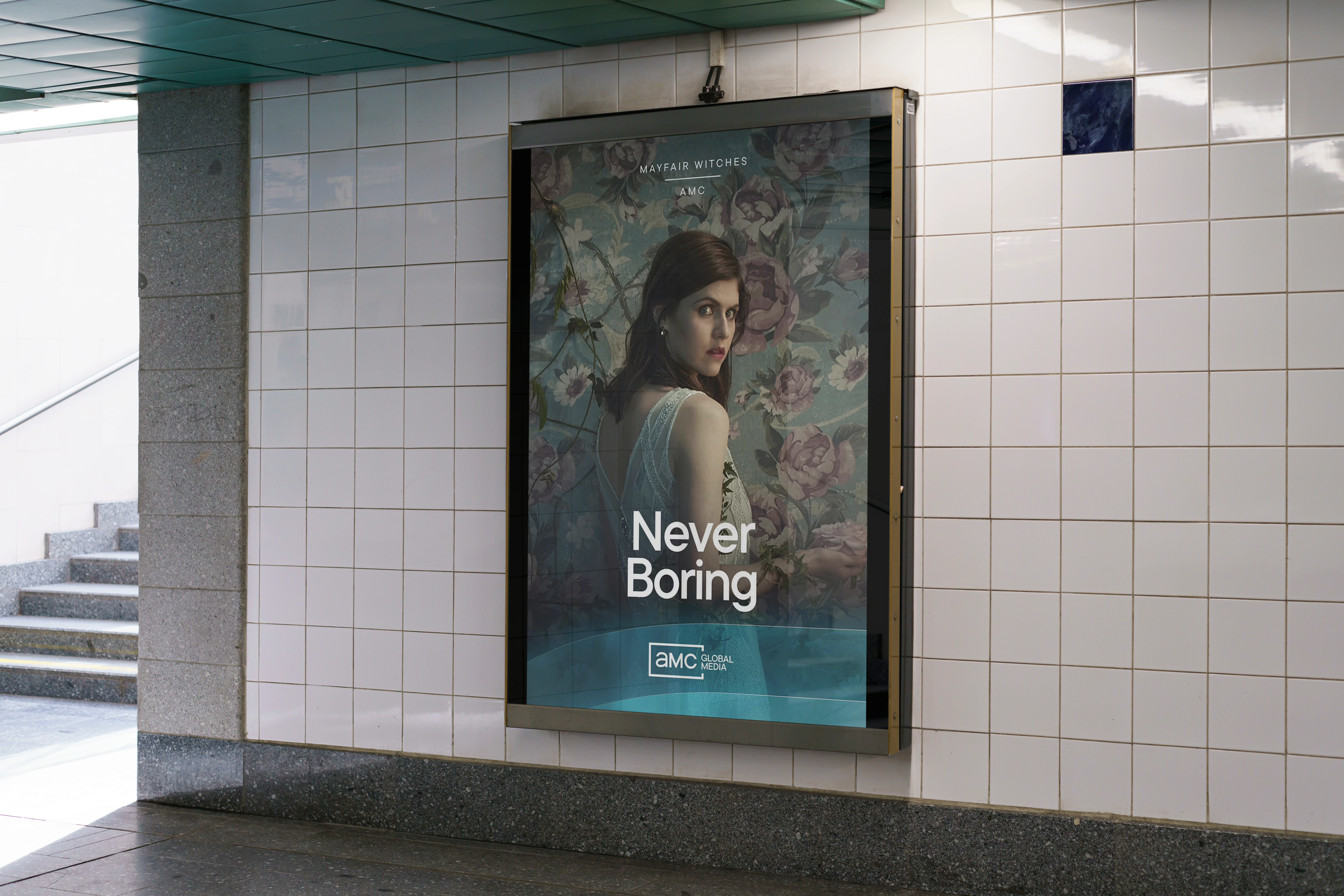
AMC Global Media | Corporate Rebrand
AMC Global Media’s rebrand called for a visual identity that could represent its expanding portfolio of networks, streaming platforms, and studios while keeping content at the center.
Building on the established visual direction, I developed design explorations incorporating the AMC logo mark into imagery and layouts, using scale, transparency, and color to create dynamic compositions and adapt the identity into a flexible system across different applications.
More details on my site!
Color Strategy
The team proposed expanding AMC's signature teal into a range of gradients to introduce greater variety, while allowing the palette to shift and evolve in response to the content. We also introduced secondary accent colors that complement the core brand palette. I explored a range of accent colors pulled directly from the content, creating a more adaptive color system that adds to the brand expression while complementing the imagery.

Concept 01
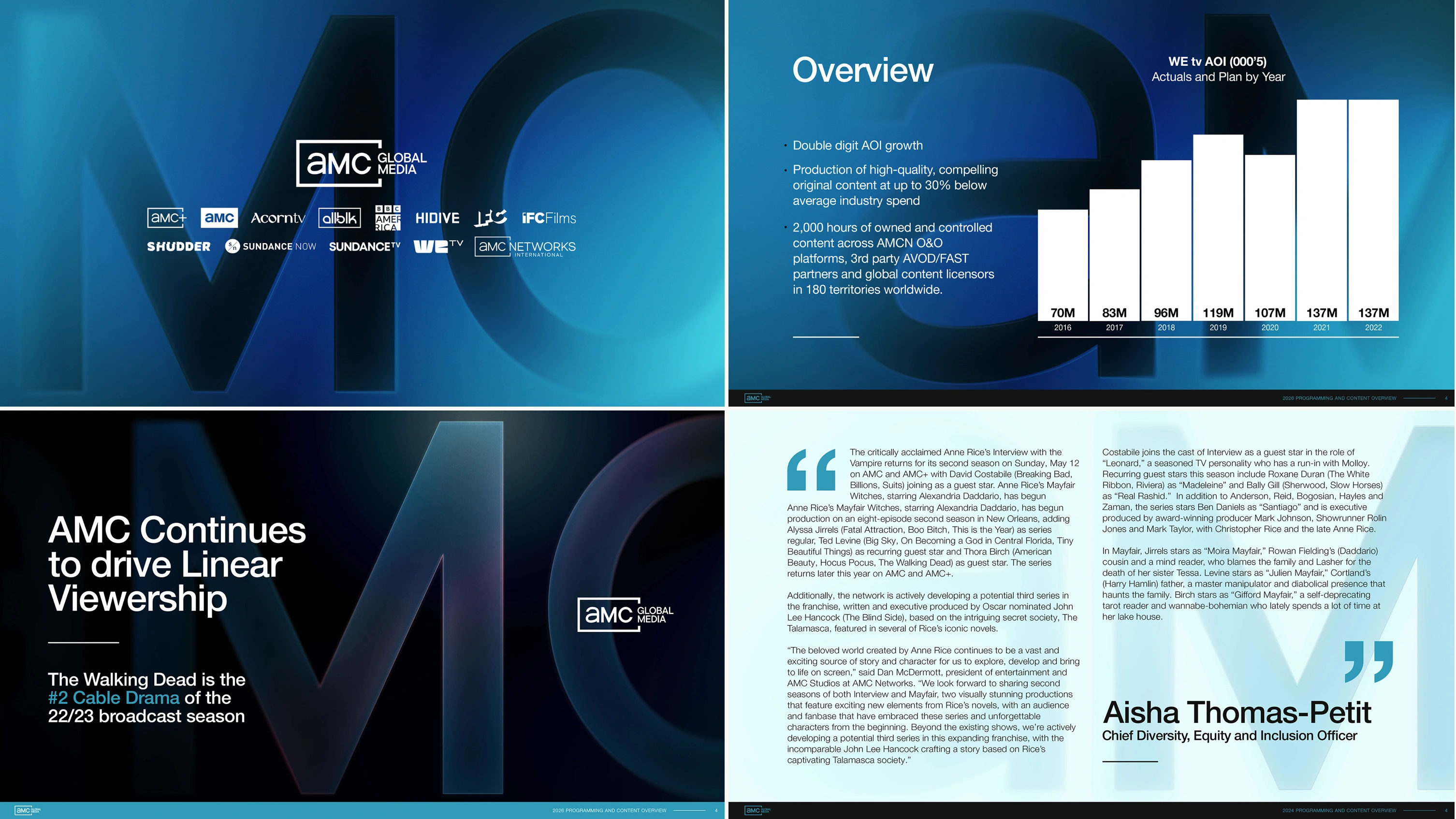
This direction lets the content take center stage, with the AMC letterforms rendered as subtle, glass-like elements layered over the imagery. Echoed across the composition, the letterforms act as framing elements, creating balance and depth while subtly connecting back to the brand.

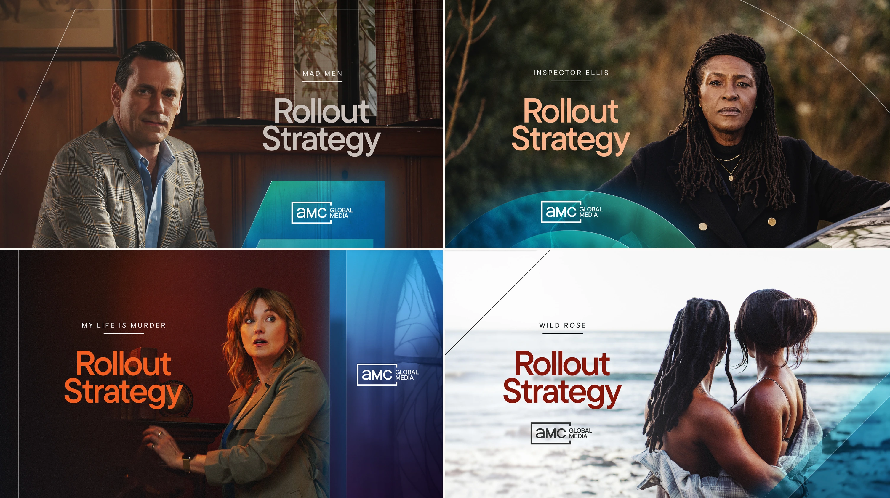
Content-Focused Deck Slides
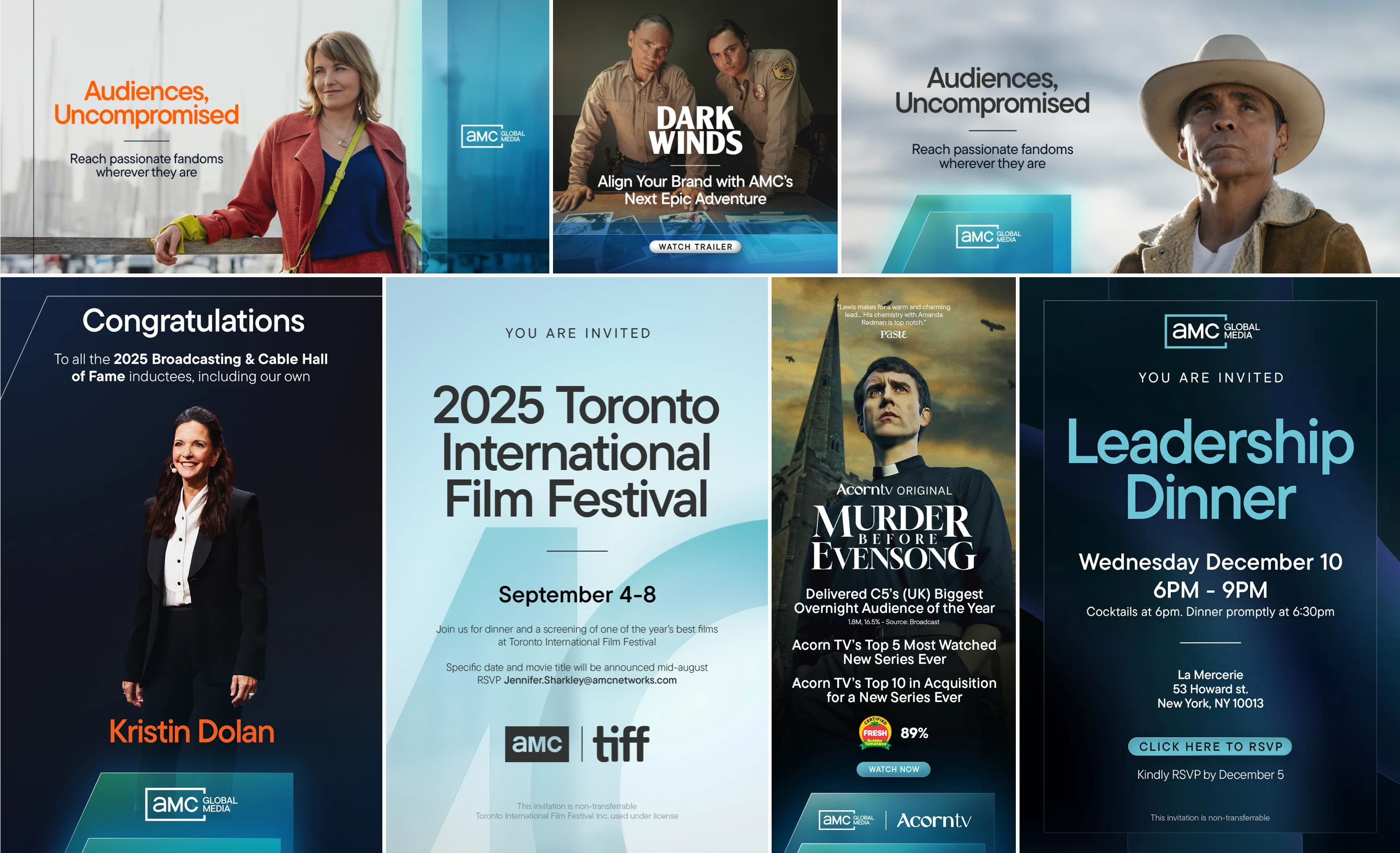
Invites, Elevators & E-Blasts
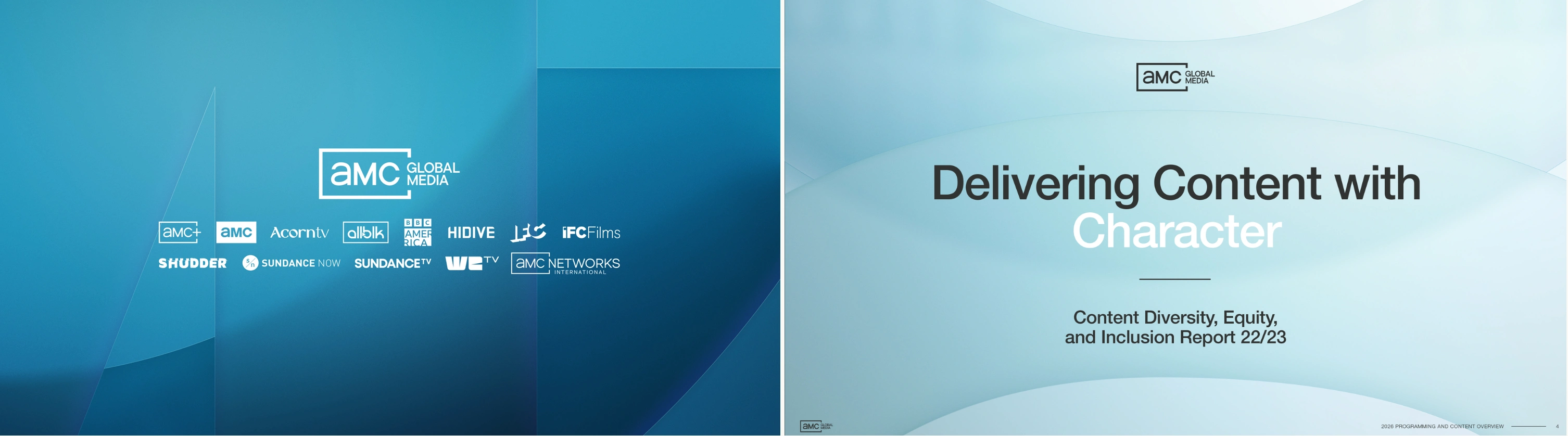
Graphic Deck Slides
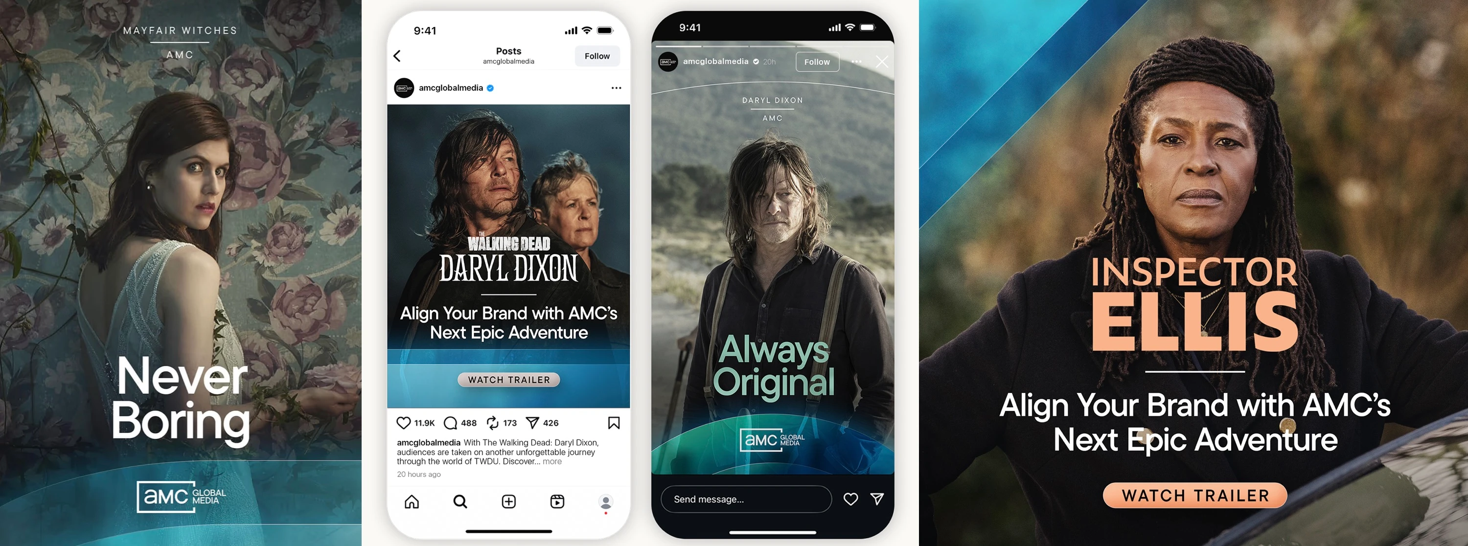
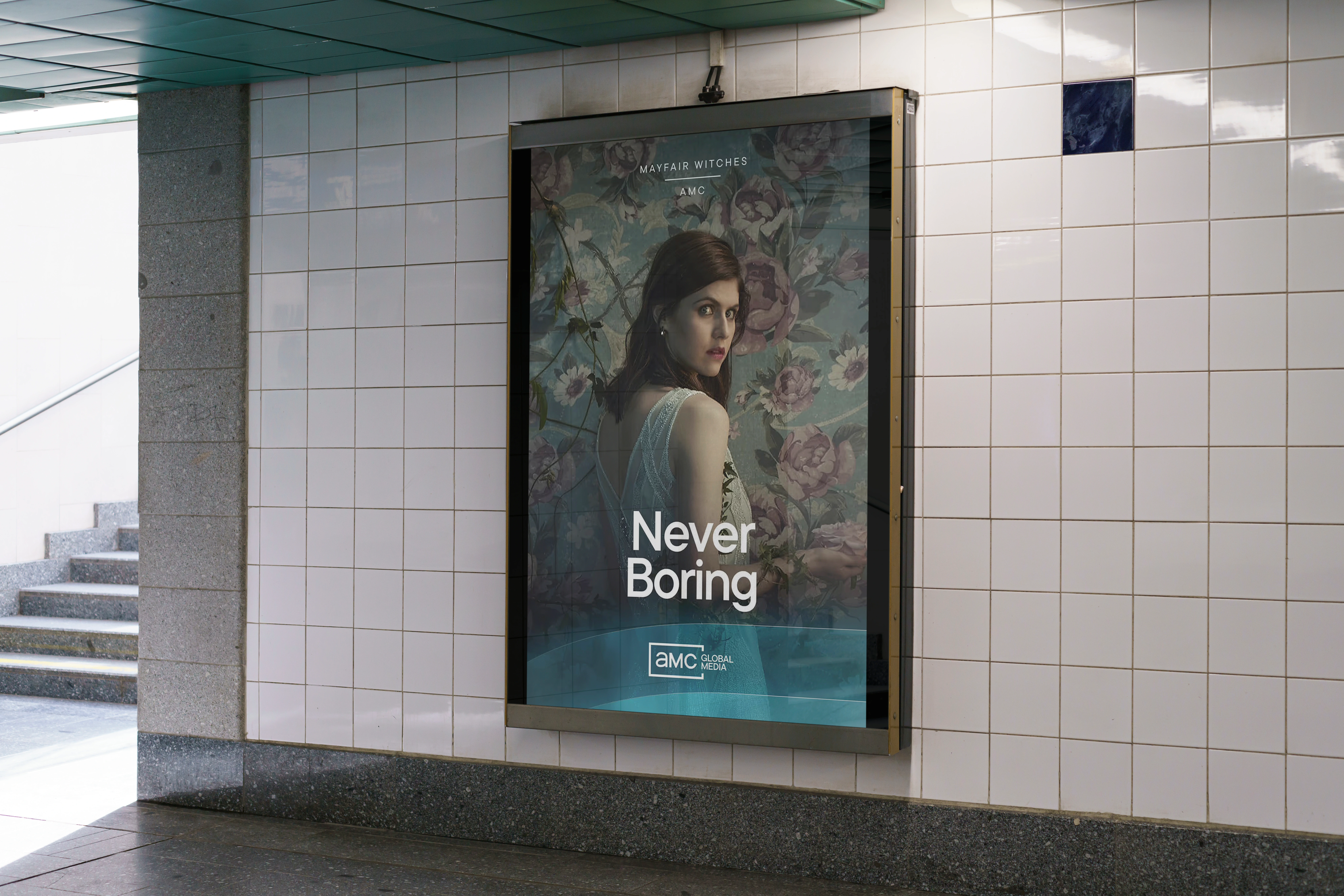

Concept 02
This direction takes a more minimal and cinematic approach, allowing the imagery and content to lead. The AMC mark becomes a flexible graphic element, interacting with the imagery and typography to create distinctive compositions.
We explored subtle gradients and abstracted forms from the logo to reinforce the brand without competing with the content. Typography is pushed to the periphery of the composition, creating space for the imagery. The logo frame evolves into an expressive multi-colored brand element, framing type, guiding hierarchy, and generating a clean and adaptable visual system.

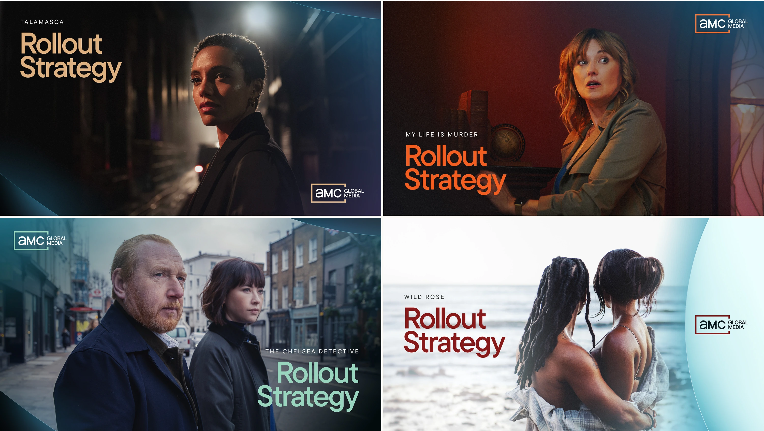
Content-Focused Deck Slides
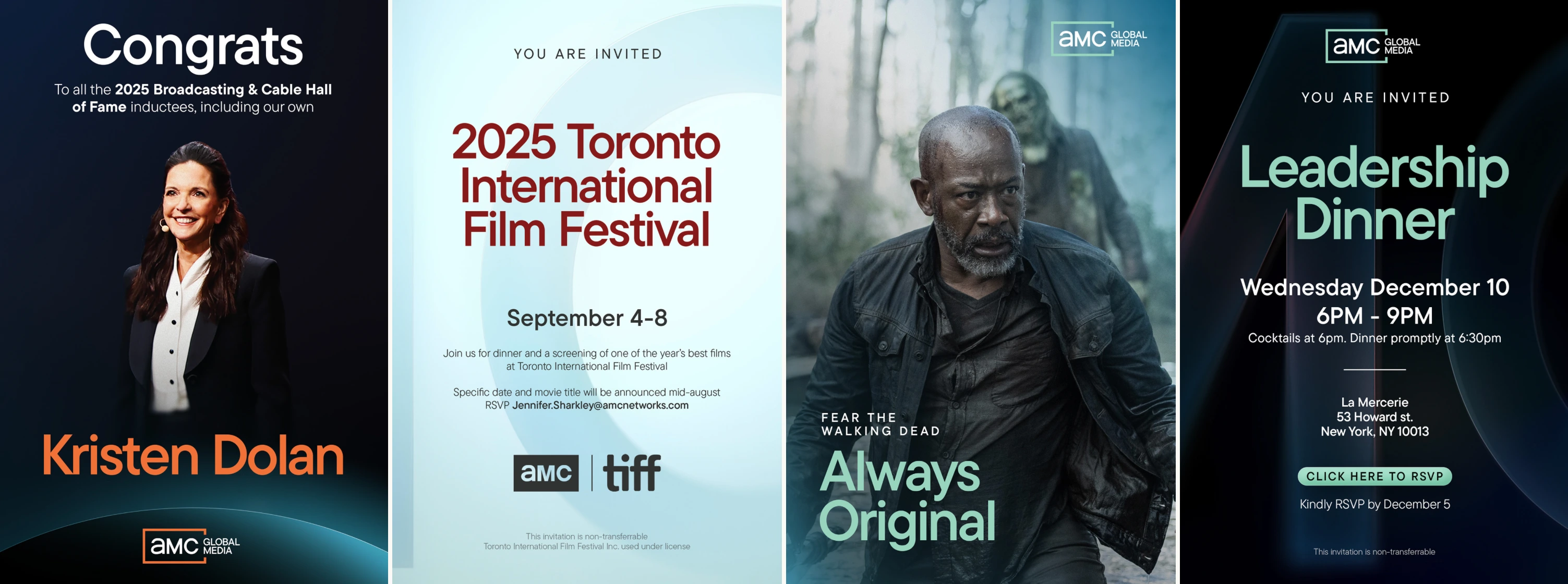
Invites & Elevators
Graphic Deck Slides

E-Blasts
Like this project
Posted Sep 16, 2026
AMC Global Media’s corporate rebrand concepts, transforming the AMC mark into a flexible graphic system of letterforms, color, and imagery.
Likes
0
Views
0
Clients
AMC Global Media