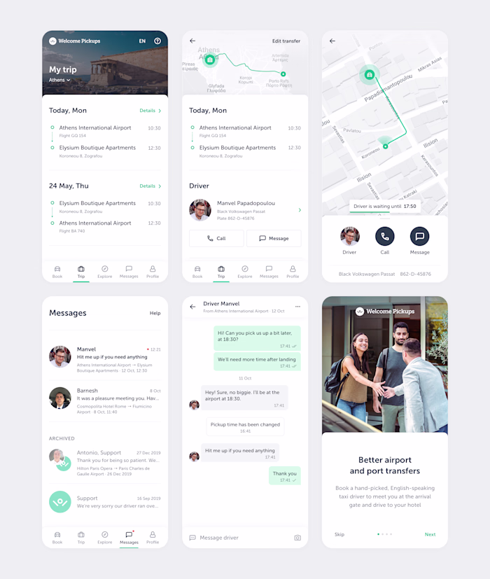
Welcome Pickups. Ride booking.
Sergey Shan
Welcome Pickups is a taxi service for travelers that handles 1500 rides a day across 50 destinations. To increase revenue, I was making continuous data-driven improvements to its booking site, which was the main source of customers. After around 20 experiments and a complete redesign, the conversion rate and revenue increased by a double-digit percentage, while support costs dropped by a similar amount. A key factor in these results was close collaboration with product managers, developers, and support agents to identify problems, develop ideas, run experiments, and ultimately deliver the final product.
Context
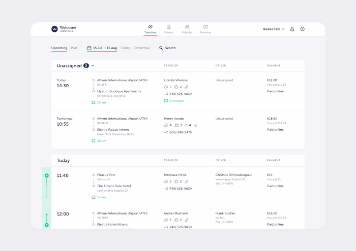
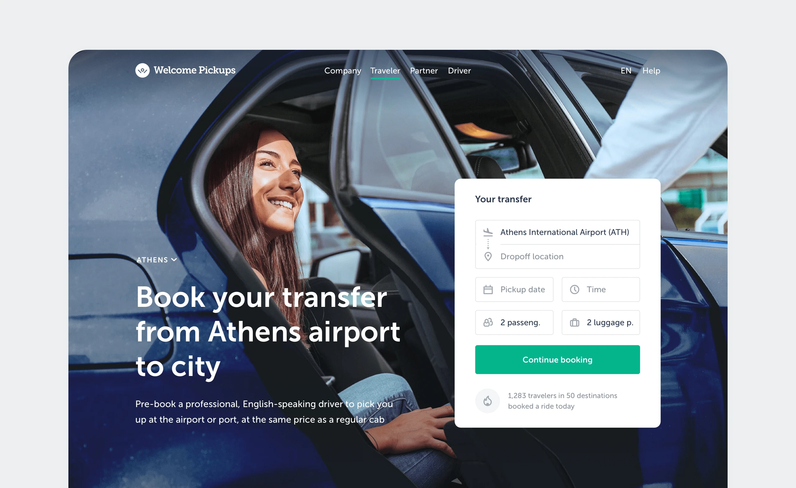
The main source of revenue for Welcome Pickups was ride bookings made through its website, typically for rides from the local airport to a hotel somewhere in the city. One of the main business goals was increasing that revenue. The primary way the product team could achieve this was by increasing the conversion rate from landing on the site to a paid booking.
There were serious restrictions: the site was a critical part of the business, the code was very complex, and the team had limited resources. This meant we had to be very careful, prioritize changes well, and introduce them incrementally.
Research
To identify problems that could prevent users from completing their booking, I began analyzing the data we already had: form statistics, click maps, and session recordings. This revealed several issues: high drop-off rates on certain fields, attempts to submit incomplete data, clicks on unclickable elements, and the lack of attention toward blocks that were considered important.
Next, I conducted a short series of tests with people similar to our typical bookers. They uncovered usability issues on mobile devices, a lack of adaptation for non-EU users (currency, time), problems with selecting pickup times and editing information from previous steps, along with a bunch of other issues and observations.
Initially, this provided enough information to start cooking up fixes. As this was a long-term initiative, I later used additional research methods to uncover more issues and cross-check the existing ones. These included competitor research, surveys, a fake support chat, analyzing customer reviews and support tickets, and interviewing our support agents.
Solutions
All identified problems and potential solutions were compiled into a table, which I shared with the product team to gather feedback and generate more ideas. Together with the main stakeholders, we brainstormed and prioritized the items based on potential impact, confidence, and complexity. This table became the key resource guiding our roadmap for this initiative.
There were 3 main lines of work: improving basic usability, reducing friction, and informing the booker.
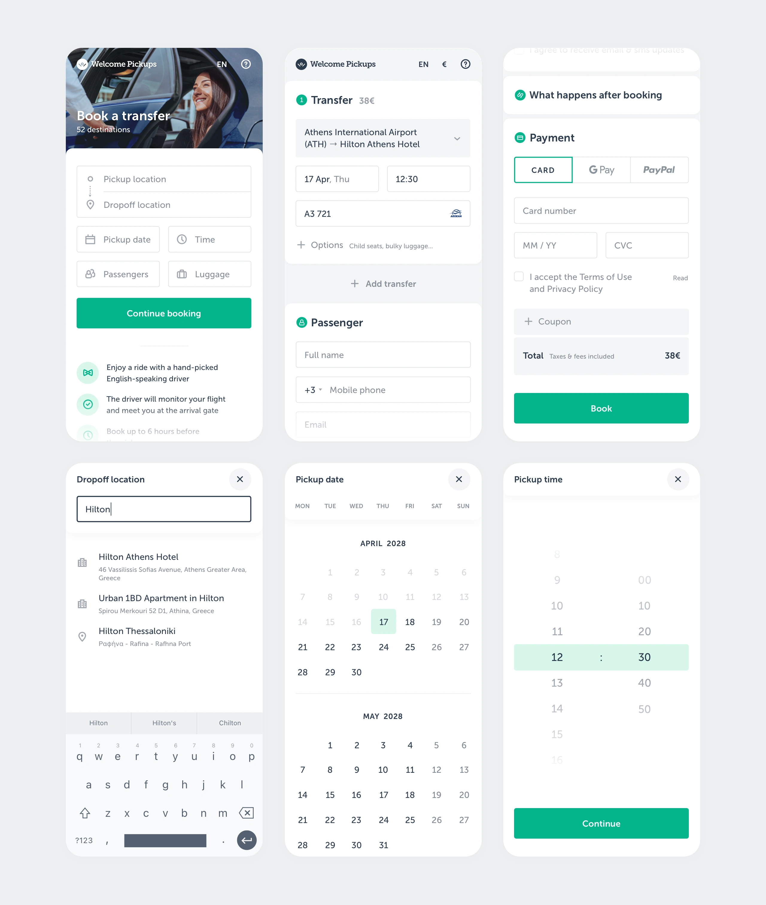
I started with basic usability, as it was the simplest and highest-confidence area. I ensured the interactive elements were large enough to tap, the correct mobile keyboards were triggered for each field, the dropdown elements were displayed within the viewport, the Back button was handled predictably, etc.
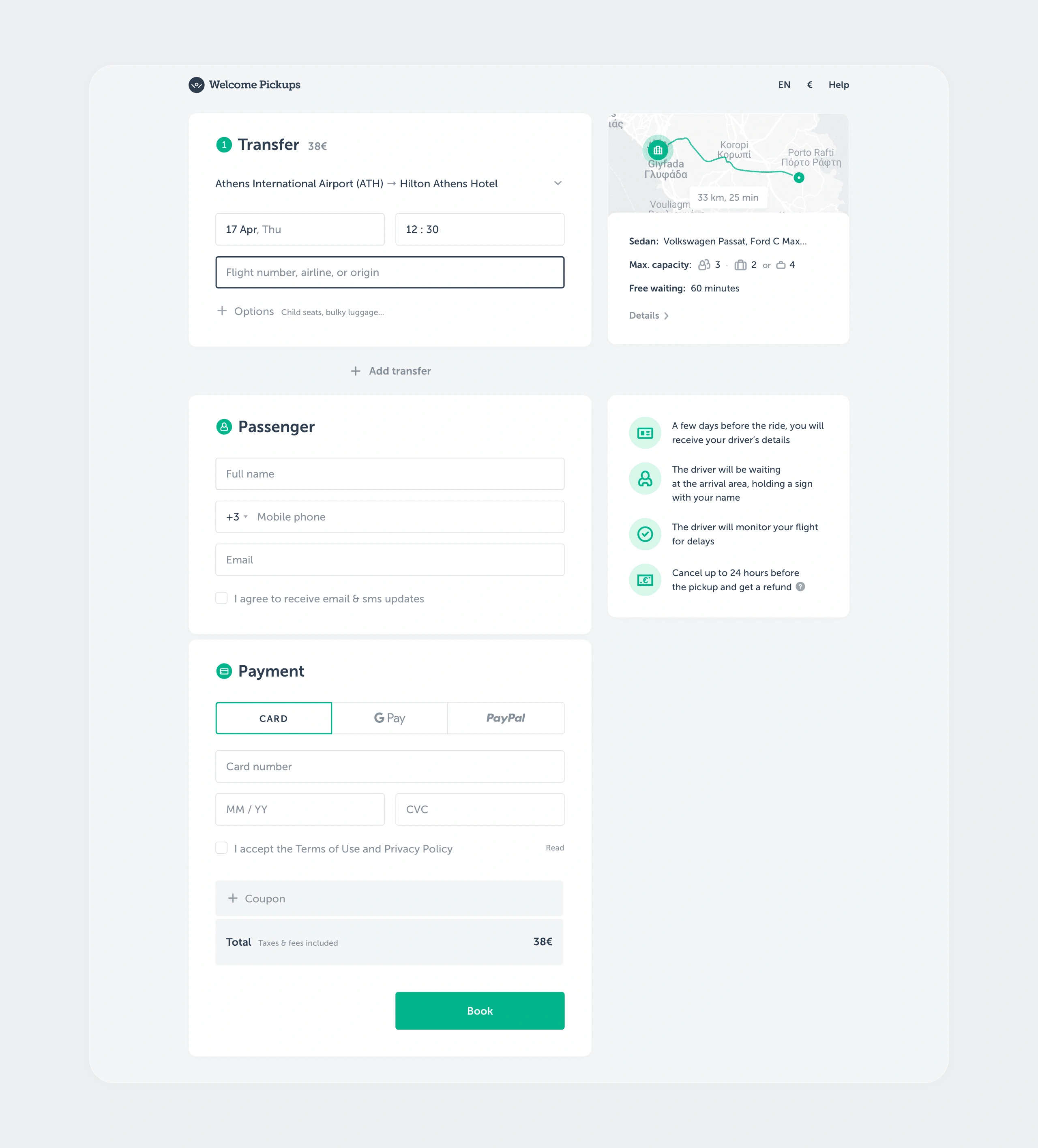
Reducing friction involved two approaches. First, I set smart defaults for fields where I had high confidence about what the booker would choose. From analyzing the stats I knew that most bookings were for two adults with two large pieces of luggage, from the local airport, and so forth. The second approach was adding tools to help bookers with the fields where they were struggling. I added a flight finder, a pickup time assistant, a better calendar, mobile payment methods, and a number of smaller tools.
The final line of work was informing the booker. I showed more important selling points, provided richer information about the ride, car, and driver, and explained what to expect after booking and upon arrival.
I quickly validated most of the changes with users via high-fidelity prototypes before handing them off to developers. Once implemented, we launched them through A/B tests and used the results to determine the next steps.
Results
A good percentage of the experiments were successful, leading to a double-digit increase in the overall conversion rate and revenue, while support costs dropped by a similar percentage. Besides the tactical improvements, I also refreshed and simplified the UI as a whole.
See the old version.
Like this project
Posted Dec 10, 2024
Redesigned a booking site, driving double-digit revenue growth, higher conversions, and cutting support costs.
Likes
0
Views
9
Clients
Welcome Pickups