Gifford Academy Branding
Logo-Branding
Gifford Academy is an Australian childcare and education company that offers government-approved courses in childcare. The project included creating a visual identity that would represent the educational brand and appeal to both local and international students.
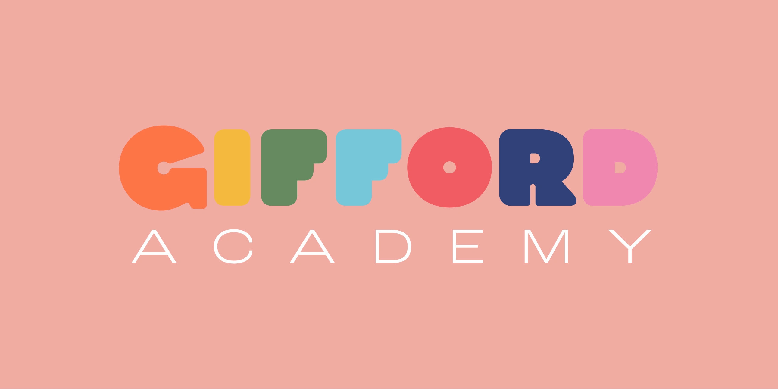
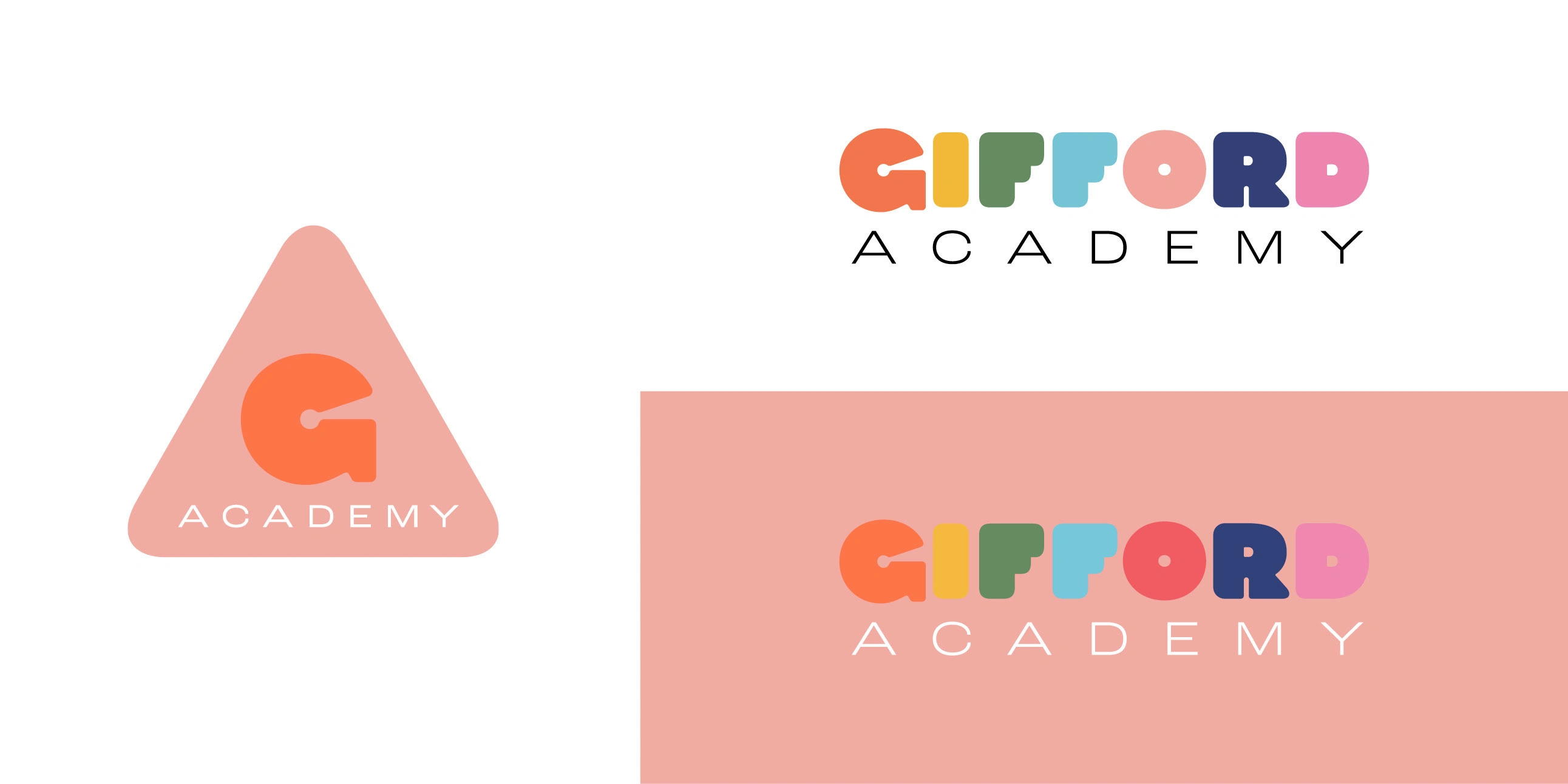
The logo design was meant to show the bright and playful nature of childhood while showing how high-quality the academy is. A lettering style that looked like children's games was used for the word "Gifford," and the word "Academy" was used as a high-end stamp to add formality and credibility.
Logo-Branding
Typography-Branding

Branding
The color scheme focused on orange, which conveys childhood and happiness, making the logo both fun and memorable. The Academy icon was designed as a triangle or an 'A' for Academy, with the 'G' of the brand contained within, creating a cohesive and recognizable symbol.
The Gifford Academy brand image is cheerful, jovial and dynamic through its chromatic range, imagery and playful graphic elements that give dynamism and versatility.
Adobe Creative Suite, specifically InDesign, Photoshop, and Illustrator, was used to ensure high-quality and professional results. The final logo effectively represents Gifford Academy's mission and resonates with its target audience, making it a standout in the education sector.
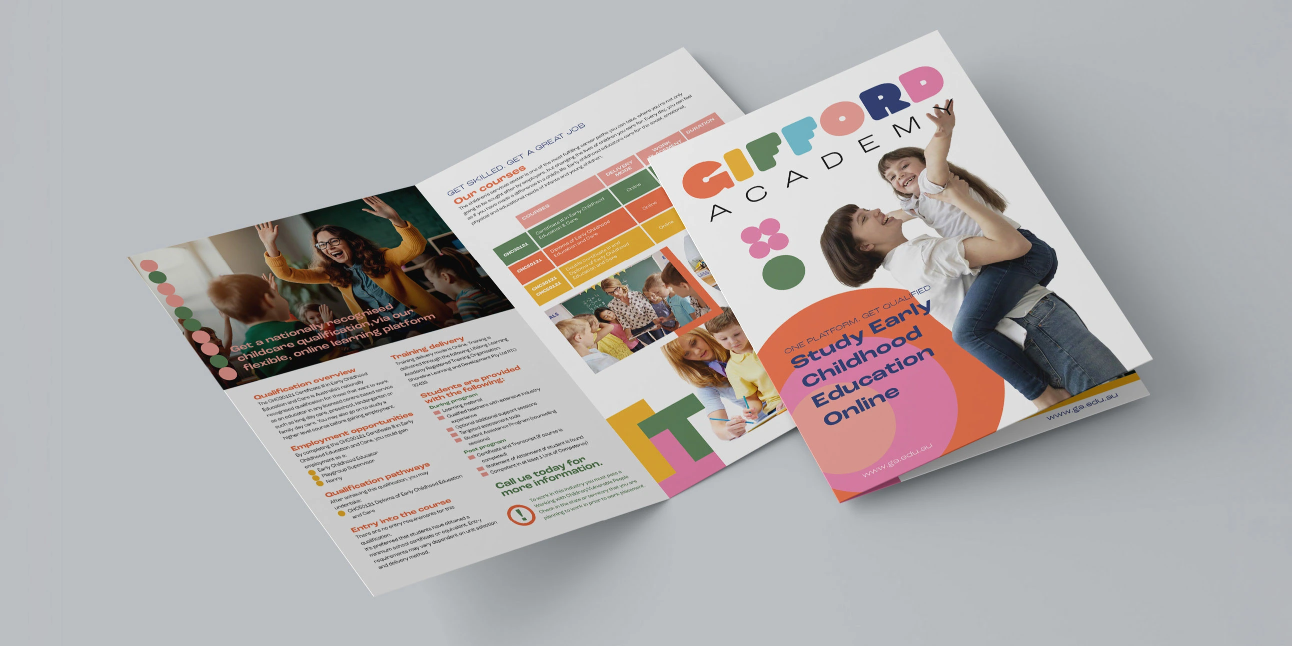
Brochure
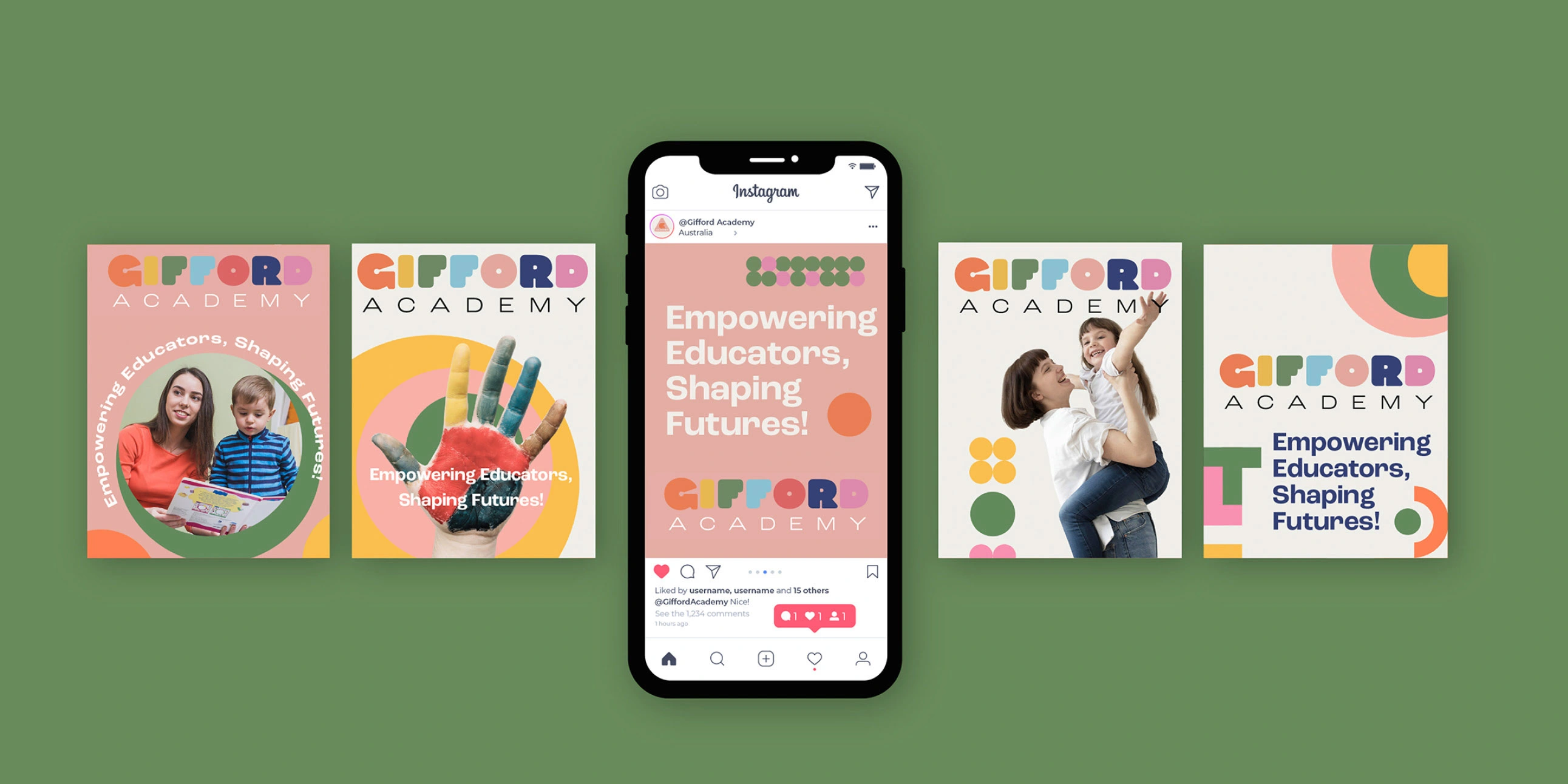
Social Media
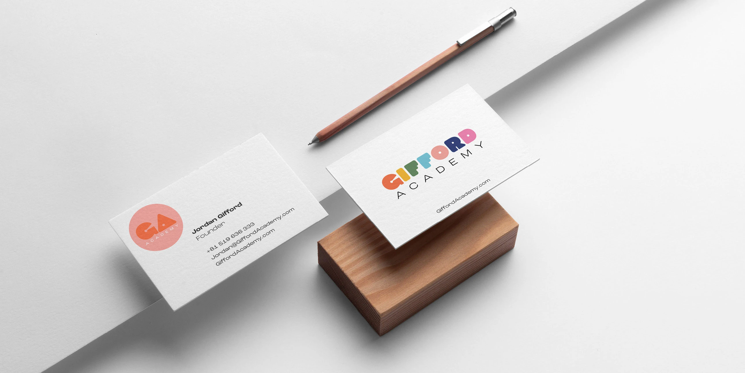
Stationery

Signage
Like this project
Posted Nov 4, 2024
Gifford Academy, an Australian childcare and education company, contacted me to create their visual identity. Gifford Academy provides government-approved cours


