CoSHA Visual Identity: The Safety Trainer's Power Tool
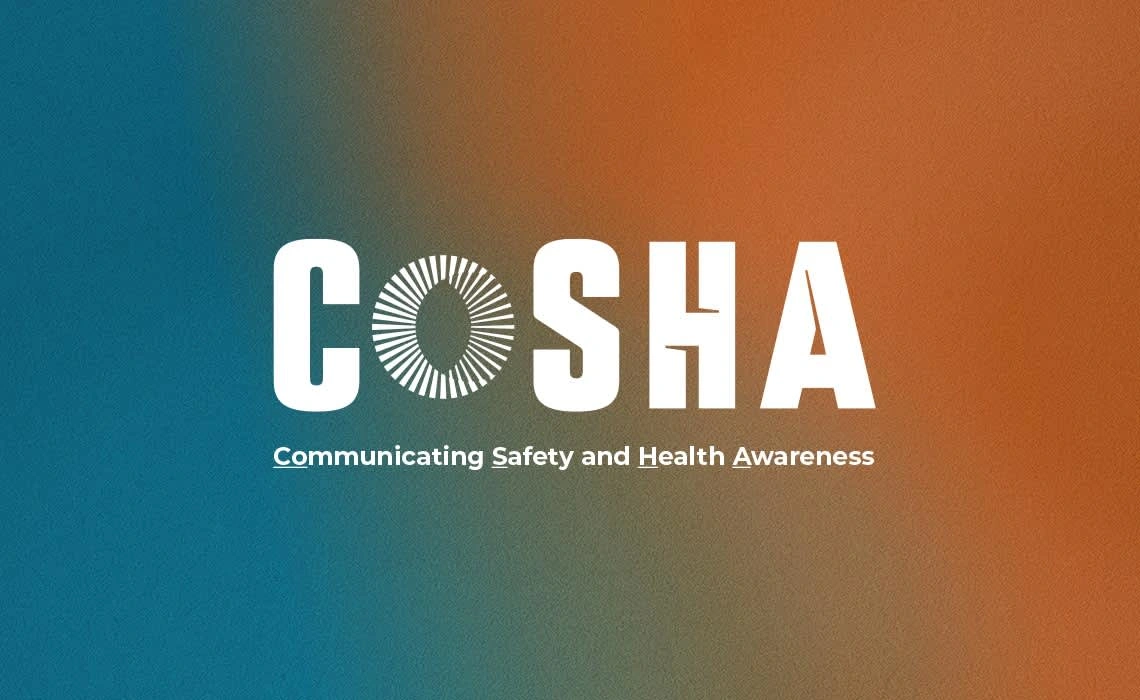
CoSHA Visual Identity
CoSHA is an innovative language and communication training system designed to enhance safety and health awareness in the workplace. It emphasizes fostering a cooperative safety culture among employees and supervisors to ensure a safe working environment.
The goal was to create a compelling visual identity that encapsulates CoSHA’s core values of effective training, precision, and quick reporting.
Through a strategic blend of bold typography and harmonious design elements, I developed a visual language that reflects CoSHA’s commitment to safety and swift communication. The identity is both approachable and professional, aligning with the brand's ethos of fostering unity and safety.
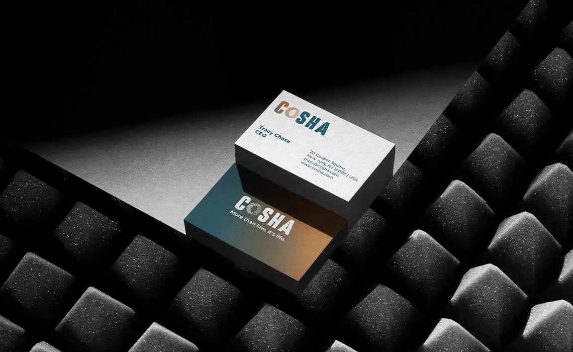


Logo Design: A distinctive mark that symbolizes clarity and communication.
Color Palette: Utilized colors that are synonymous with safety and trust.
Typography: Selected fonts that enhance readability and convey professionalism.
Visual Elements: Designed icons and graphics that underscore CoSHA’s training and reporting capabilities.
The CoSHA visual identity successfully communicates the essence of a safety-centric training tool, aligning with its mission to create safer workplaces through clear and cohesive communication.

Like this project
Posted Nov 15, 2023
I created a compelling visual identity that encapsulates CoSHA’s core values of effective training, precision, and quick reporting.

