Rodeo Drive - Empty State Illustrations

Petar Avramoski


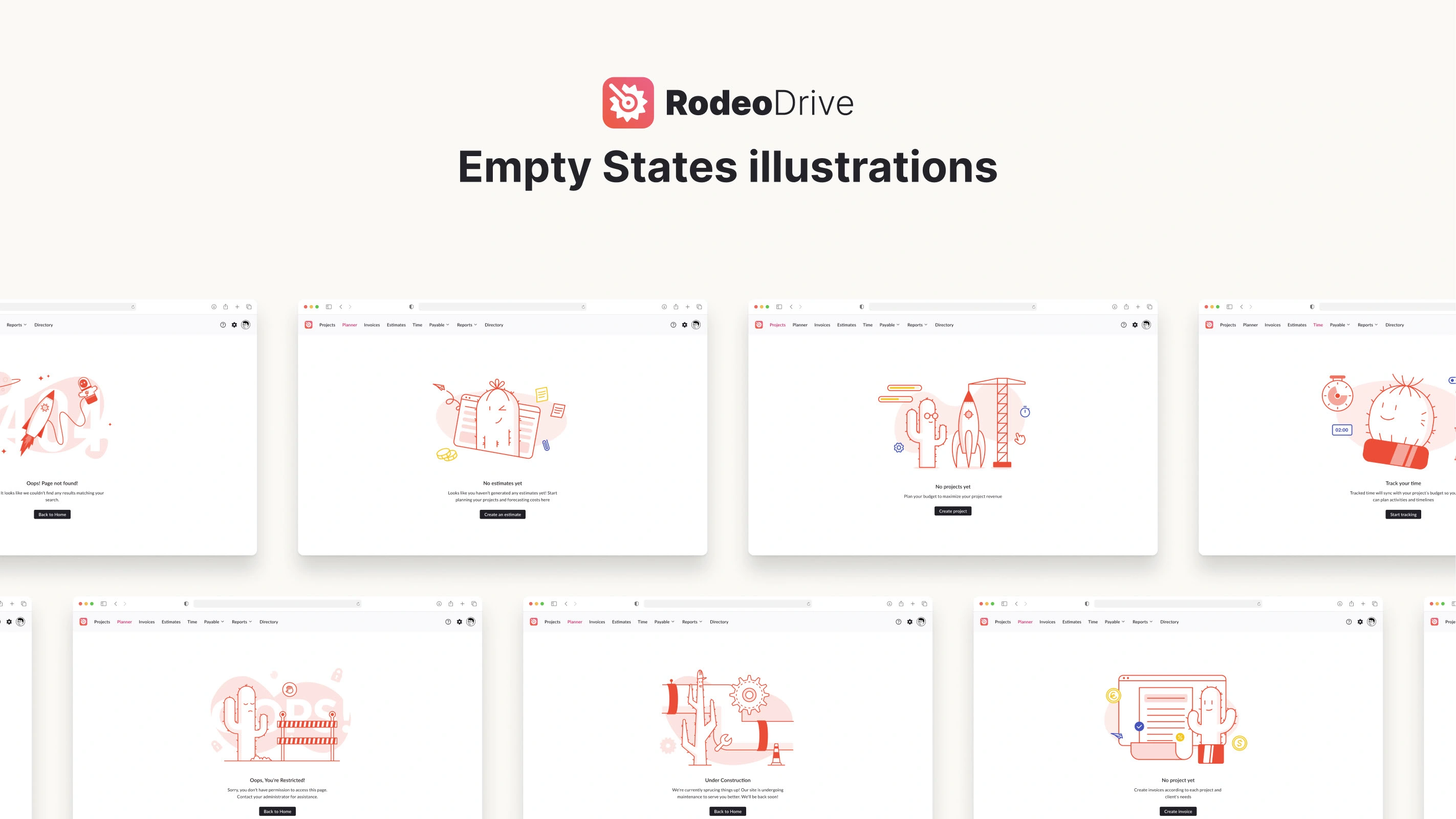
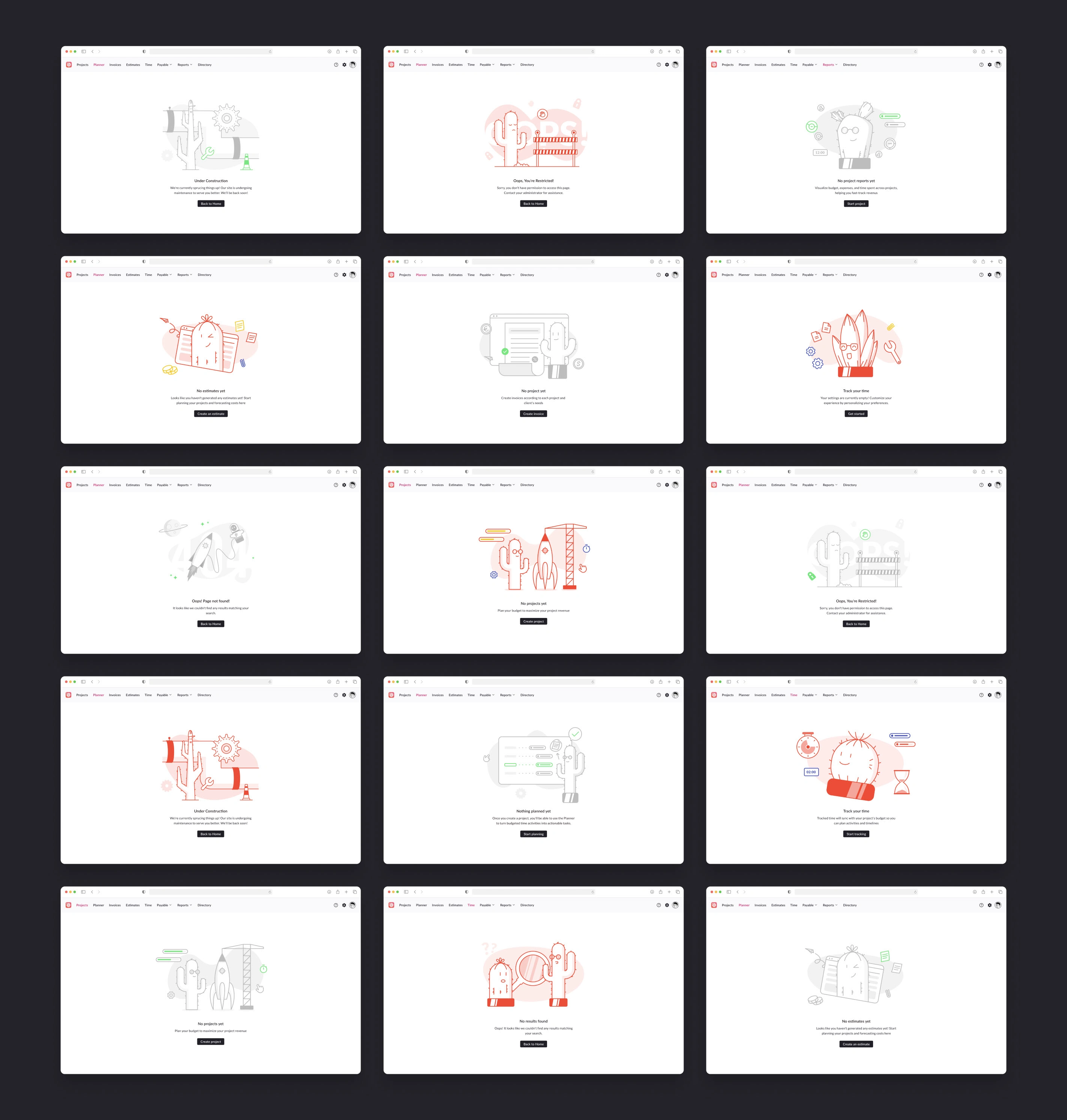
Rodeo Drive, a project management and financial platform, wanted to enhance its user experience by addressing moments when active users face empty states within the application — for example, when no data is available due to deletion or the user hasn’t yet populated a feature. We created a comprehensive suite of neutral and colored illustrations for these empty states, making them engaging, reassuring, and consistent with Rodeo Drive’s brand identity.
The Challenge
In user interfaces, empty states can feel cold and discouraging. Rodeo Drive’s team recognized that these states are critical moments in the user journey: when data is missing or when features haven’t yet been utilized, users are vulnerable to confusion or disengagement. Our challenge was to transform these potentially frustrating moments into calm and inviting opportunities for exploration.
The Approach
We divided the illustration work into two strategic use cases:
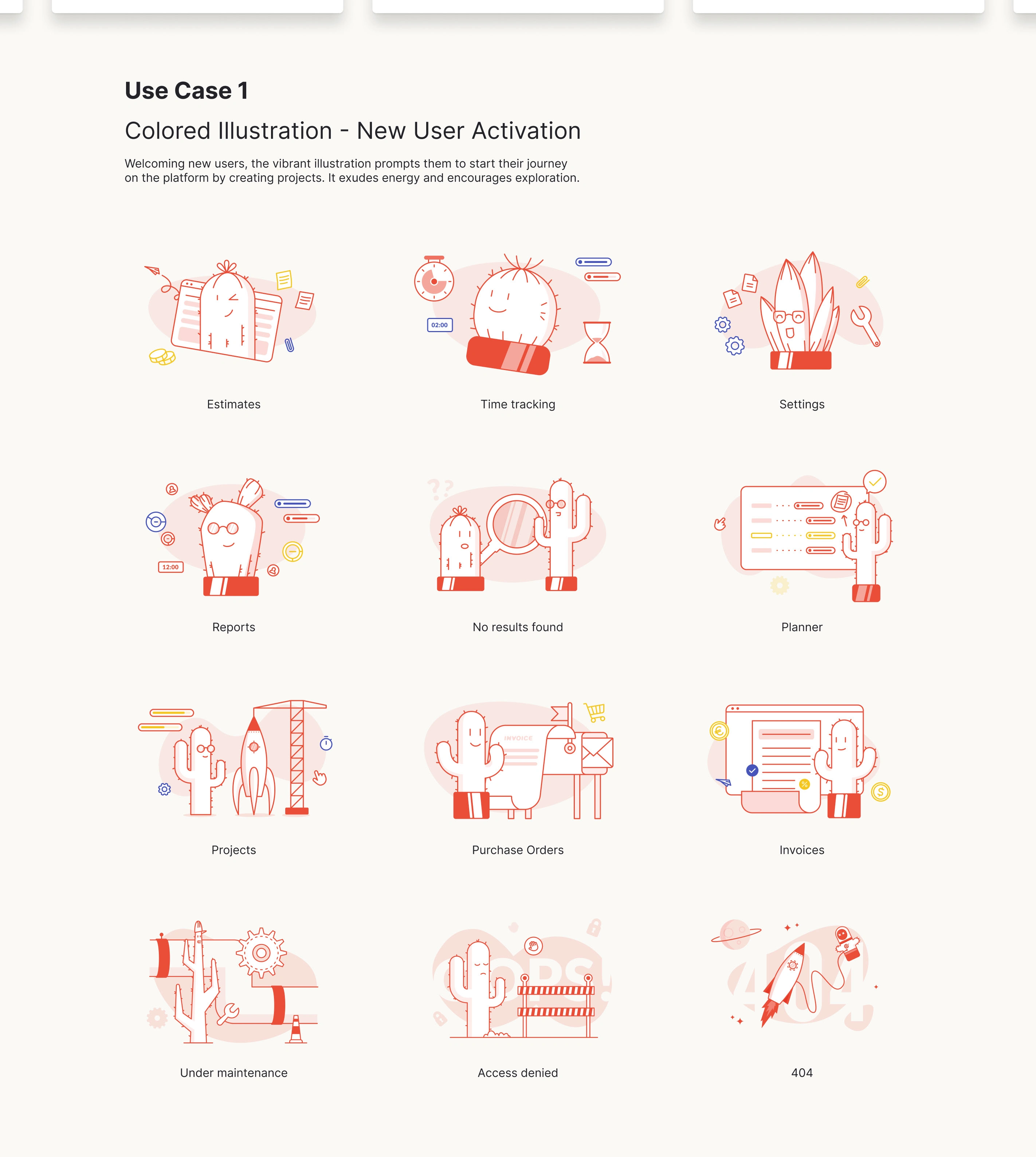
Use Case 1 – Colored Illustrations for New User Activation:
These vibrant illustrations greet new users, highlight the platform’s functionality, and guide them to start their first projects confidently. The red and orange color palette conveys warmth and energy, encouraging exploration.
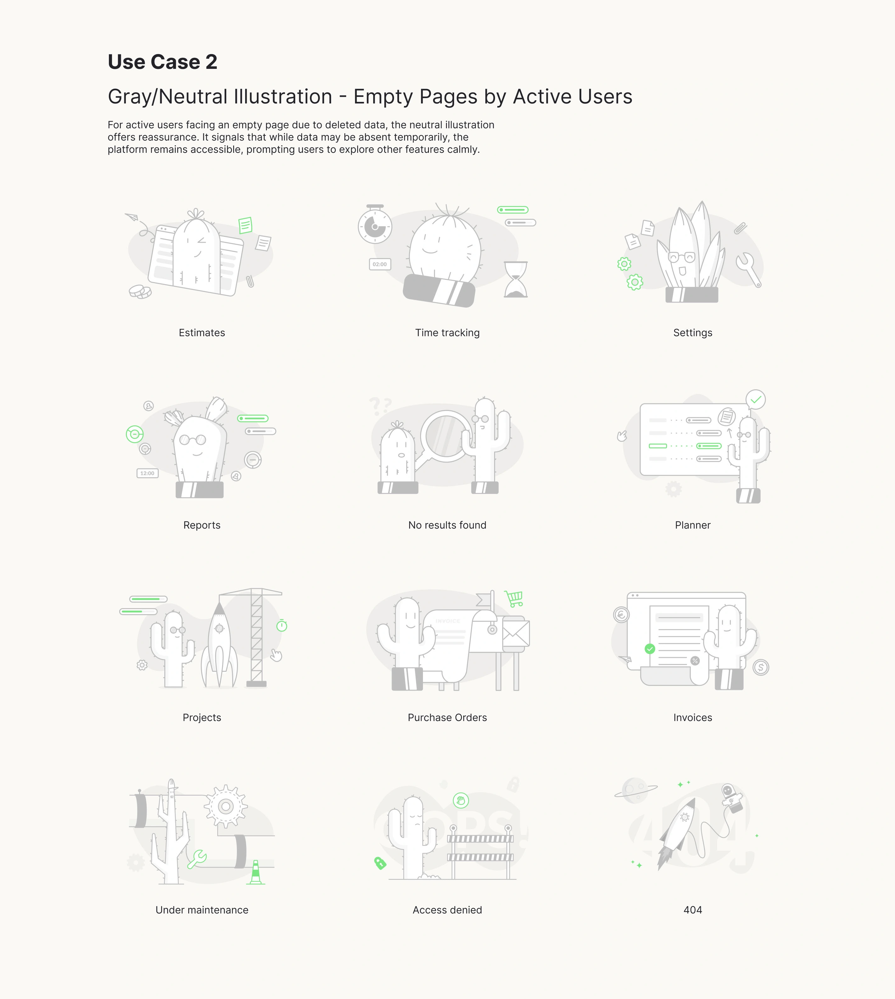
Use Case 2 – Gray/Neutral Illustrations for Active Users:
For active users encountering empty pages (due to deletion, maintenance, or restricted access), neutral illustrations offer a friendly visual cue, signaling that while data may be missing, the platform is still operational and reliable.
Each illustration set was designed to:
✅ Maintain brand consistency with Rodeo Drive’s playful visual style.
✅ Reduce user anxiety by softening the “empty” experience.
✅ Encourage engagement by prompting further exploration.
The Process
Research & Ideation:
We identified 12 key empty states across the app (e.g., Projects, Reports, Purchase Orders, No Results, and 404 errors). We gathered insights from user behavior analytics to ensure the illustrations would address real user needs.
Sketching & Style Development:
We experimented with character-driven designs (notably the cactus and other charming elements), aiming for an accessible yet distinctive visual language.
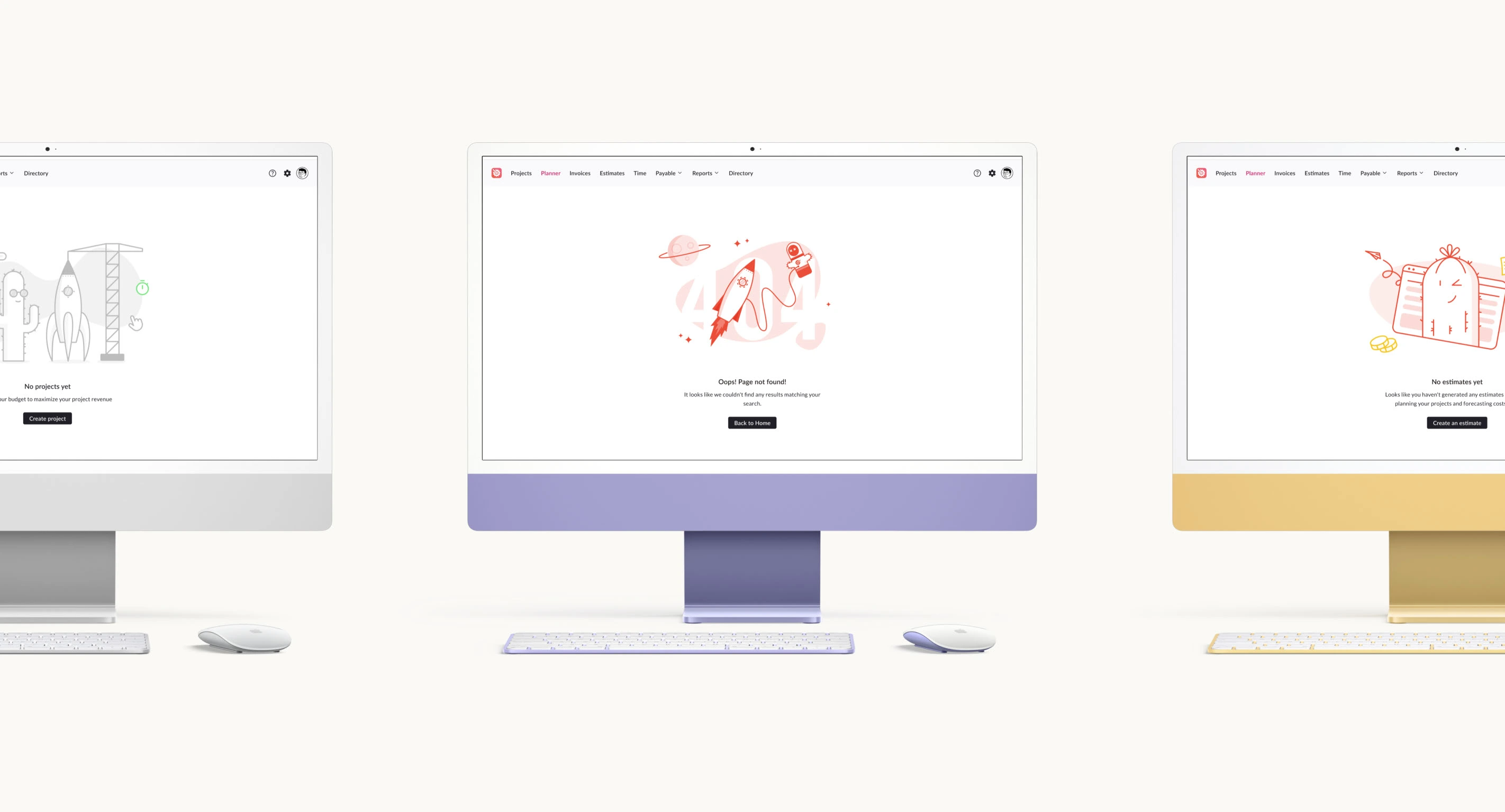
Integration & Testing:
We tested the illustrations within the app’s UI on different device breakpoints (desktop, tablet, mobile) to ensure seamless integration and legibility.
The Outcome
The final suite includes 12 illustration sets in two styles (neutral and colored), tailored for specific user journeys. They create a cohesive visual language that balances brand personality with user reassurance. By replacing empty states with these delightful illustrations, Rodeo Drive significantly improved the user experience, turning potential friction points into engaging and memorable interactions.
Impact
✨ Improved onboarding experience for new users, encouraging project creation and platform exploration.
✨ Reduced user anxiety in empty states, fostering trust and confidence in the platform’s reliability.
✨ Consistent visual identity that reinforces Rodeo Drive’s playful, accessible brand tone.
Like this project
Posted Sep 23, 2024
A delightful set of empty state illustrations for Rodeo Drive, designed to calm active users and energize new users through charming, brand-aligned visuals.
Likes
0
Views
6
Clients
Rodeo Software


LOGOFOLIO (Curated logo collection)

Winter Square
Bektesh House - Brand Identity & Interior Design

Email Marketing Designs