Hace La Fuerza Branding, Brand Strategy, & Illustrations
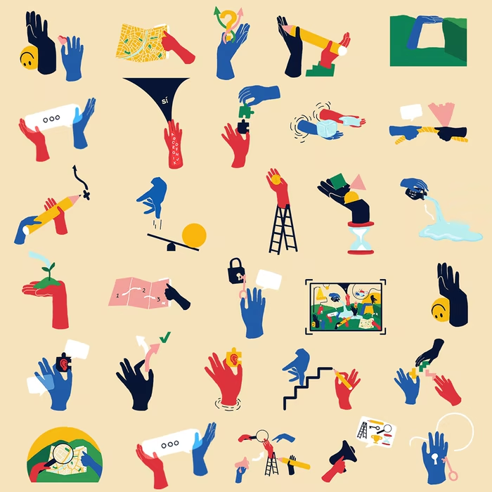
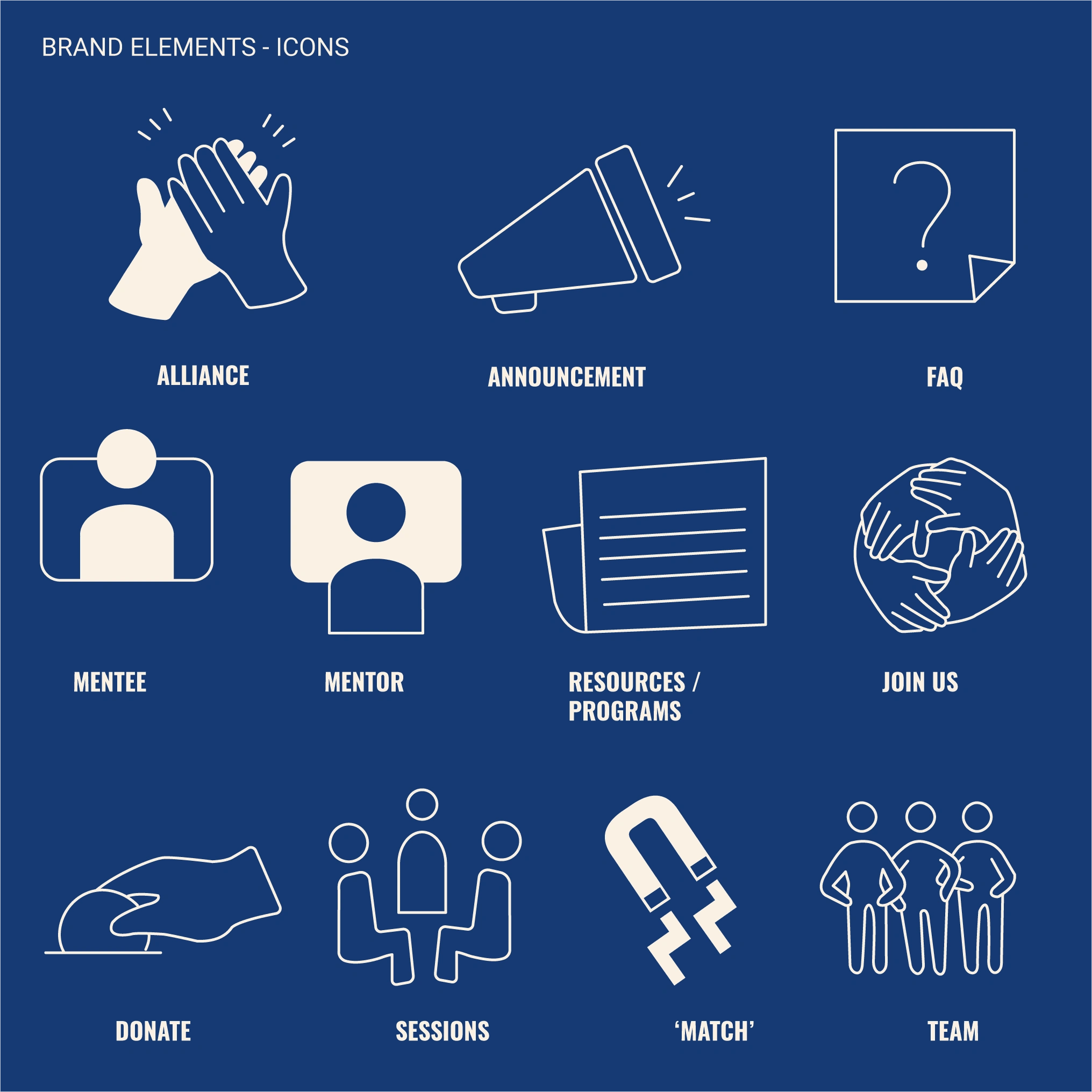
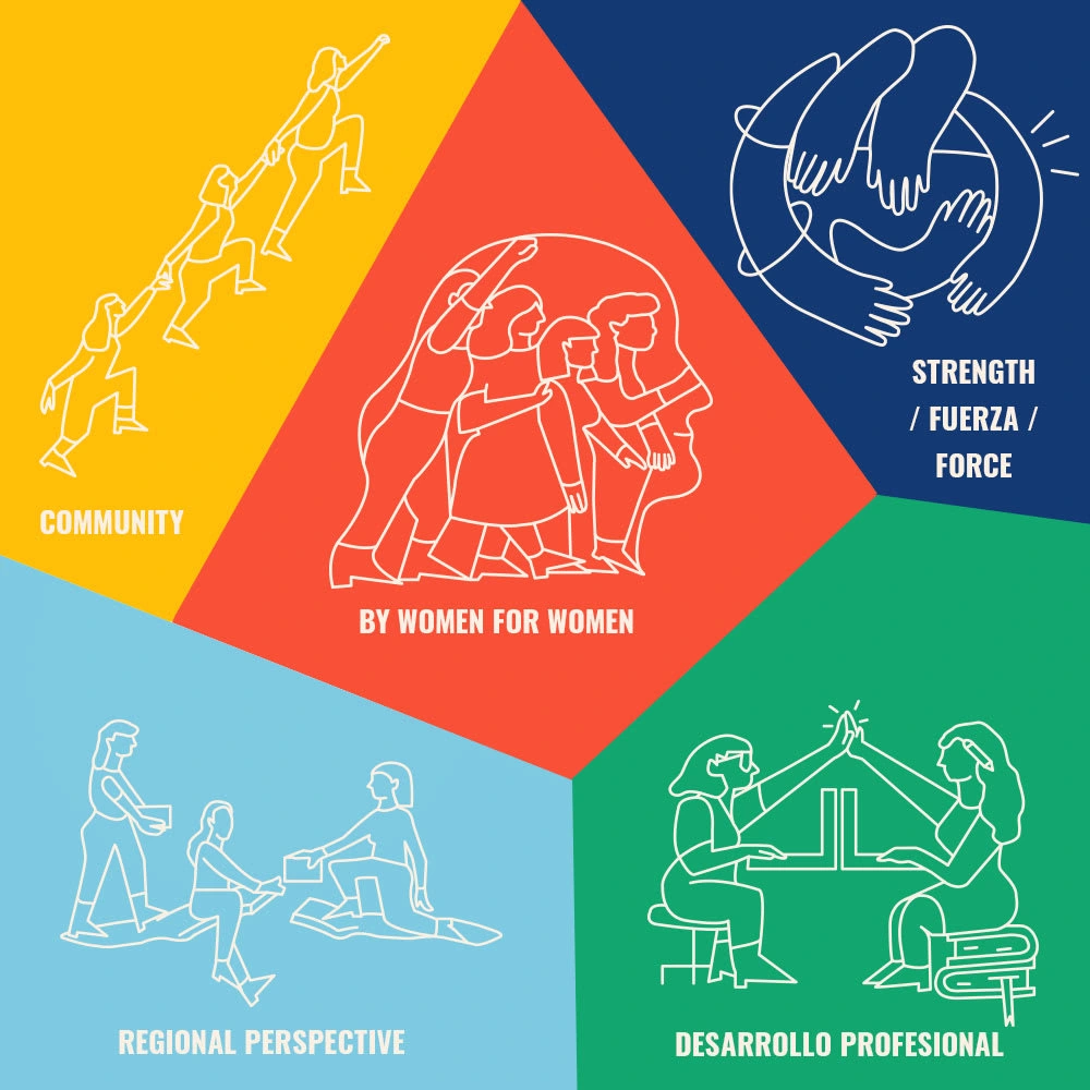
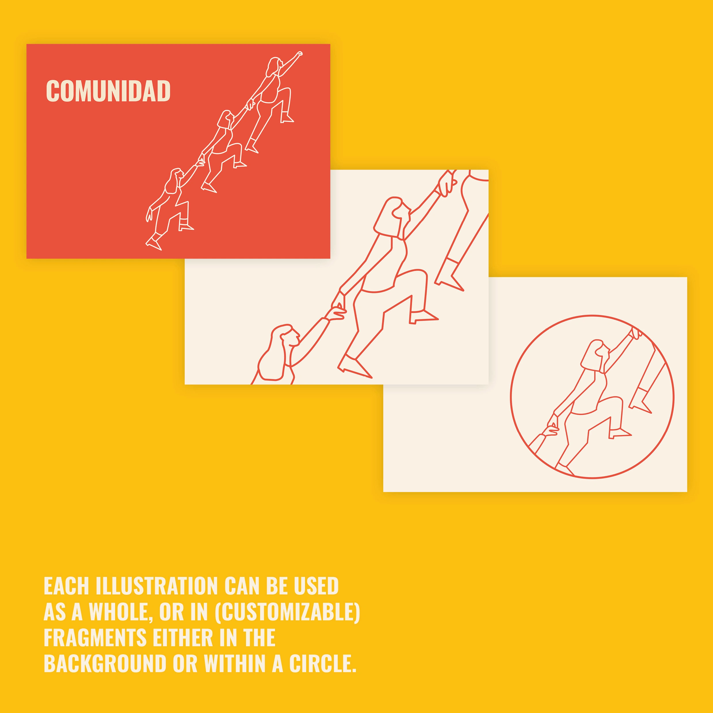
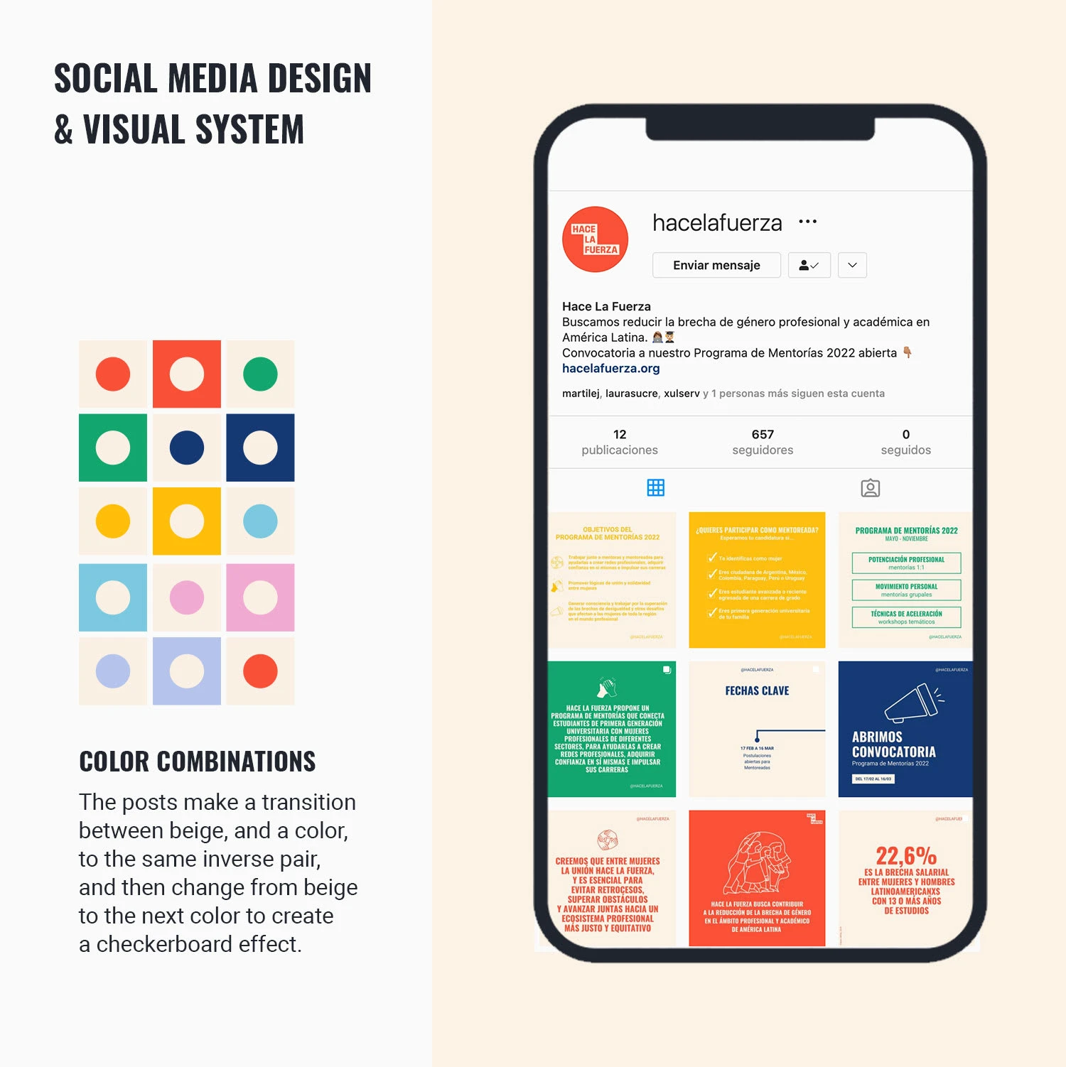
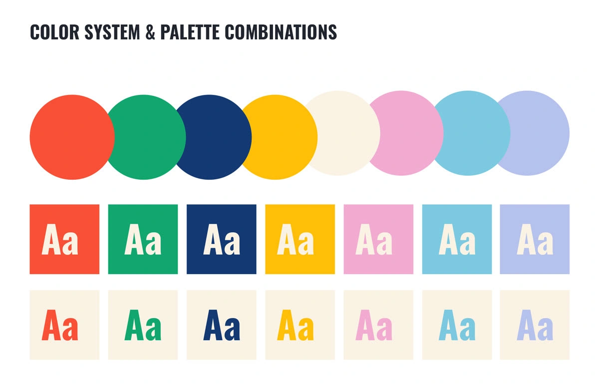
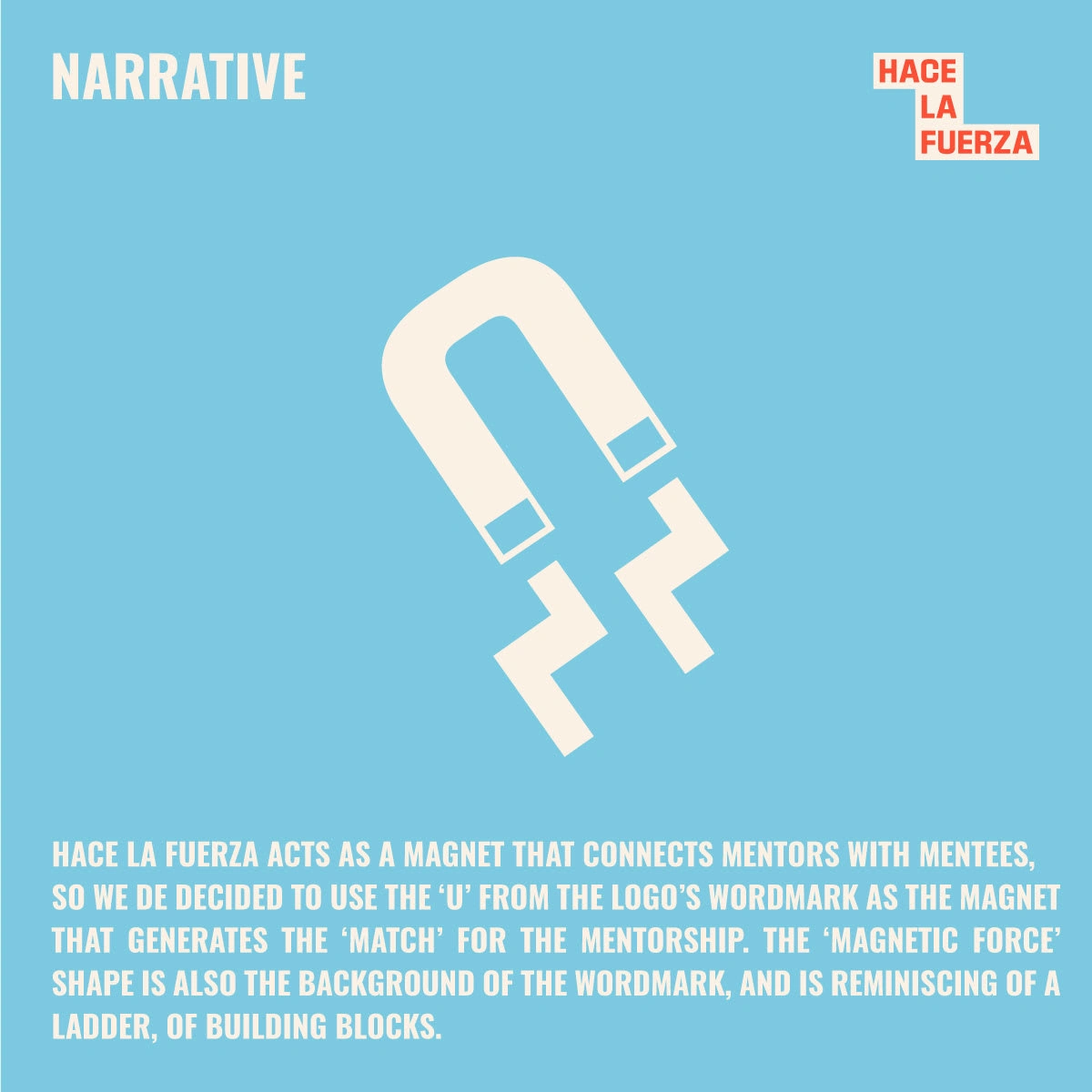
The development of Hace La Fuerza's brand identity is a strategic communication project to build the brand by highlighting its values through storytelling and creative design. We created a set of flexible guidelines that express the brand's personality, philosophy and mission, in order to highlight the difference of the social impact company through tone, art direction, complementary graphics, colors, typography and logos. This branding project elaborated and enhanced its story with creative, communication and design tools to convey in a coherent and empathetic way what the organization is all about: Hace La Fuerza is a community of women that seeks to contribute to the reduction of the gender gap in the professional and academic fields in Latin America. We developed the Hace La Fuerza symbol based on the concept: Uniting & meshing different forces & users, because unity is strength, & together we are stronger. The organization acts as a magnet that connects mentors with mentees, so we decided to use the U in the logo as the magnet that generates the "couple" for mentoring. The shape of the "magnetic force" is also the background of the wordmark, and is reminiscent of a ladder, building blocks. (All elements of the brand tell a story (with a clever, direct and relatable tone ^_^). *There are 5 pillars in the project (Community, By women for women, Practical development, By women for women, By women for women, By women for women, By women for women, By women for women, By women for women.
Like this project
Posted Oct 31, 2023
Hace La Fuerza's brand identity is a strategic communication project to build the brand by highlighting its values through storytelling and creative design.
