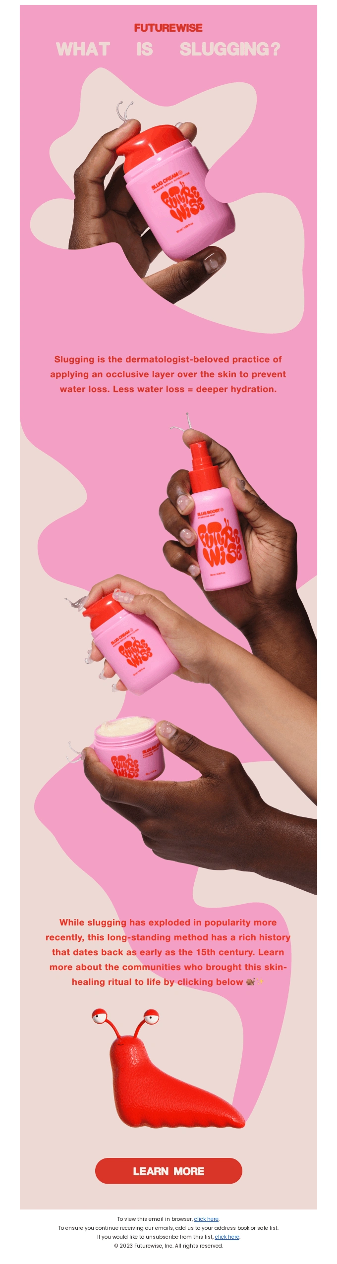
Educational Email Newsletter on Slugging for Futurewise
Sam Hackson
📌 Case Study: Educational Email Newsletter Design for Futurewise
Project Overview
Client: Futurewise Industry: Skincare / Dermatology-Inspired Beauty Project Type: Educational Email Newsletter Campaign Focus: “What Is Slugging?” Goal: Educate subscribers on skincare practices while subtly positioning the brand as a trusted authority.
Futurewise is a modern skincare brand that prioritizes education, inclusivity, and science-backed routines. This email newsletter was designed to explain the concept of slugging in a visually engaging, accessible, and brand-aligned way—without pushing aggressive sales.
🎯 Objectives
Educate subscribers about the skincare practice of slugging
Build trust and authority through dermatologist-aligned messaging
Highlight product usage naturally within an educational narrative
Drive curiosity-based clicks to learn more
🧠 Design & Content Strategy
1. Education-First Approach
Instead of starting with a product pitch, the email opens with a clear educational hook:
“What is Slugging?”
The copy explains the skincare concept in simple, non-intimidating language, making it beginner-friendly while still credible.
This positions Futurewise as a guide, not just a seller.
2. Soft Product Integration
The product is:
Shown in real hands
Used in context (opened, pumped, applied)
Never aggressively “sold”
This creates authenticity and helps subscribers visualize how the product fits into their routine, rather than feeling like an ad.
3. Inclusive Visual Storytelling
The design prominently features:
Multiple skin tones
Real hands instead of abstract mockups
Minimal retouching
This reinforces inclusivity and relatability—key values in modern skincare branding.
🎨 Visual & UI Decisions
Soft pink palette to convey skin-safety and comfort
Organic blob shapes to keep the layout playful and non-clinical
Bold red accents for hierarchy and CTA contrast
Clean typography for easy reading on mobile
The playful slug illustration at the bottom adds personality and memorability, making the email feel friendly rather than clinical.
📱 Mobile-First Layout
The long, scroll-based structure is optimized for:
Mobile readers
Bite-sized content consumption
Visual breaks to reduce fatigue
Each section flows naturally into the next without overwhelming the user.
🚀 Call to Action (CTA)
The CTA “LEARN MORE” is:
Low-pressure
Education-focused
Placed after value has already been delivered
This increases click intent by appealing to curiosity, not urgency.
📈 Expected Impact
This newsletter is designed to:
Increase time spent reading emails
Build long-term brand trust
Improve click-through rates on educational content
Strengthen customer-brand relationships
🛠 Tools & Skills Demonstrated
Email marketing design
Visual storytelling
Educational copy hierarchy
Brand consistency
Inclusive design thinking
✅ Final Outcome
The final design successfully balances education, branding, and subtle conversion. By leading with knowledge and inclusivity, the newsletter strengthens Futurewise’s position as a thoughtful, science-informed skincare brand while naturally guiding users toward deeper engagement.
Like this project
Posted Jan 12, 2026
Designed an educational email newsletter on skincare for Futurewise, focusing on slugging.