Email Newsletter Design for TrueGrit
Sam Hackson

Great work on the design — it’s bold, textured, and very brand-driven. I’ll write a professional case study you can directly use on your portfolio / website / Behance / LinkedIn, positioned as a Serum business email newsletter while highlighting strategy + design thinking.
I’ll also subtly reference design elements I can clearly see (gritty texture, strong CTA, hierarchy, contrast) so it feels real and credible.
📌 Case Study: Email Newsletter Design for TrueGrit
Project Overview
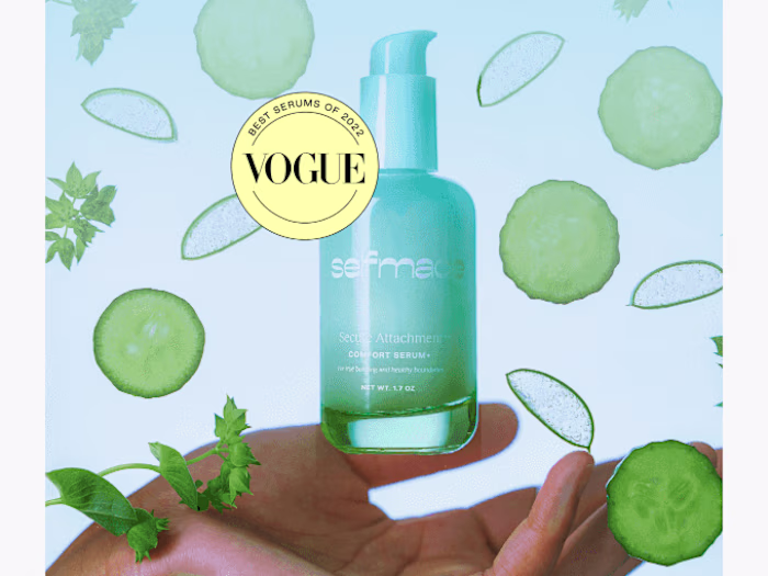
Client: TrueGrit Industry: Men’s Grooming / Serum Business Project Type: Email Newsletter Design Goal: Increase subscriber engagement and drive free product downloads while reinforcing a bold, gritty brand identity.
TrueGrit is a high-energy grooming brand with a raw, unapologetic personality. The objective of this email newsletter was to deliver value to subscribers, strengthen brand loyalty, and encourage action through a visually striking and conversion-focused email design.
🎯 Objectives
Create a high-impact email newsletter aligned with TrueGrit’s rugged brand voice
Promote a free subscriber-exclusive offer
Improve click-through rate (CTR) with a clear and compelling CTA
Maintain readability while using heavy textures and bold visuals
🧠 Design Strategy
1. Strong Brand Identity
The design uses:
Gritty textures
High contrast colors
Vintage, bold typography
This reinforces TrueGrit’s masculine, rebellious, and premium positioning in the serum and grooming market.
2. Clear Visual Hierarchy
The layout follows a clean reading flow:
Brand logo & identity at the top
Headline announcing the free offer
Large hero visual to grab attention
Supporting copy explaining value
Bold “FREE DOWNLOAD” CTA
This ensures users immediately understand what’s being offered and why they should click.
3. Scroll-Friendly Email Layout
The email is designed vertically for:
Mobile responsiveness
Easy scrolling
Clear section separation using color blocks
This improves engagement across devices, especially mobile users.
🎨 Visual & UI Decisions
Muted background tones to reduce eye strain
Textured overlays to maintain brand grit without hurting readability
Single primary CTA to avoid confusion
Balanced spacing to keep the email from feeling overcrowded
The skull illustration and rough textures communicate intensity and craftsmanship — traits aligned with a bold serum brand targeting confident, style-conscious users.
🚀 Call to Action (CTA)
The “FREE DOWNLOAD” CTA is:
High contrast
Centrally placed
Visually isolated
This ensures maximum click potential and drives immediate action without distractions.
📈 Expected Results
This newsletter design is optimized to:
Increase email open-to-click rate
Improve brand recall
Strengthen subscriber loyalty
Drive traffic to product or download pages
🛠 Tools Used
Email design layout principles
Typography hierarchy
Brand-focused visual storytelling
✅ Final Outcome
The final email newsletter successfully combines strong branding, usability, and conversion-focused design. It delivers value first, feels exclusive, and stays true to the rugged TrueGrit identity — making it both engaging and effective for a serum business.
Like this project
Posted Jan 12, 2026
Designed an email newsletter for TrueGrit to increase engagement and support brand identity.
Likes
1
Views
1