Brand Identity Development for la.
Sam Hackson

Brand Identity Case Study: la.
Project Overview
la. is a modern social media software designed to simplify online interaction, content sharing, and digital presence management. The goal of this project was to create a distinctive, minimal, and scalable brand identity that feels intuitive, friendly, and tech-forward while standing out in a crowded social media landscape.
The Challenge
The social media software space is highly competitive and visually noisy. The main challenge was to:
Create a simple yet memorable identity
Communicate trust, innovation, and ease of use
Ensure the brand works seamlessly across apps, websites, dashboards, and marketing assets
Keep the identity flexible for future feature expansion
Brand Strategy
The core brand values defined for la.:
Simplicity – easy to use, easy to recognize
Connection – bringing people together digitally
Modernity – clean, minimal, software-first aesthetic
Approachability – friendly, not corporate or intimidating
The brand needed to feel lightweight and human, not overly technical.
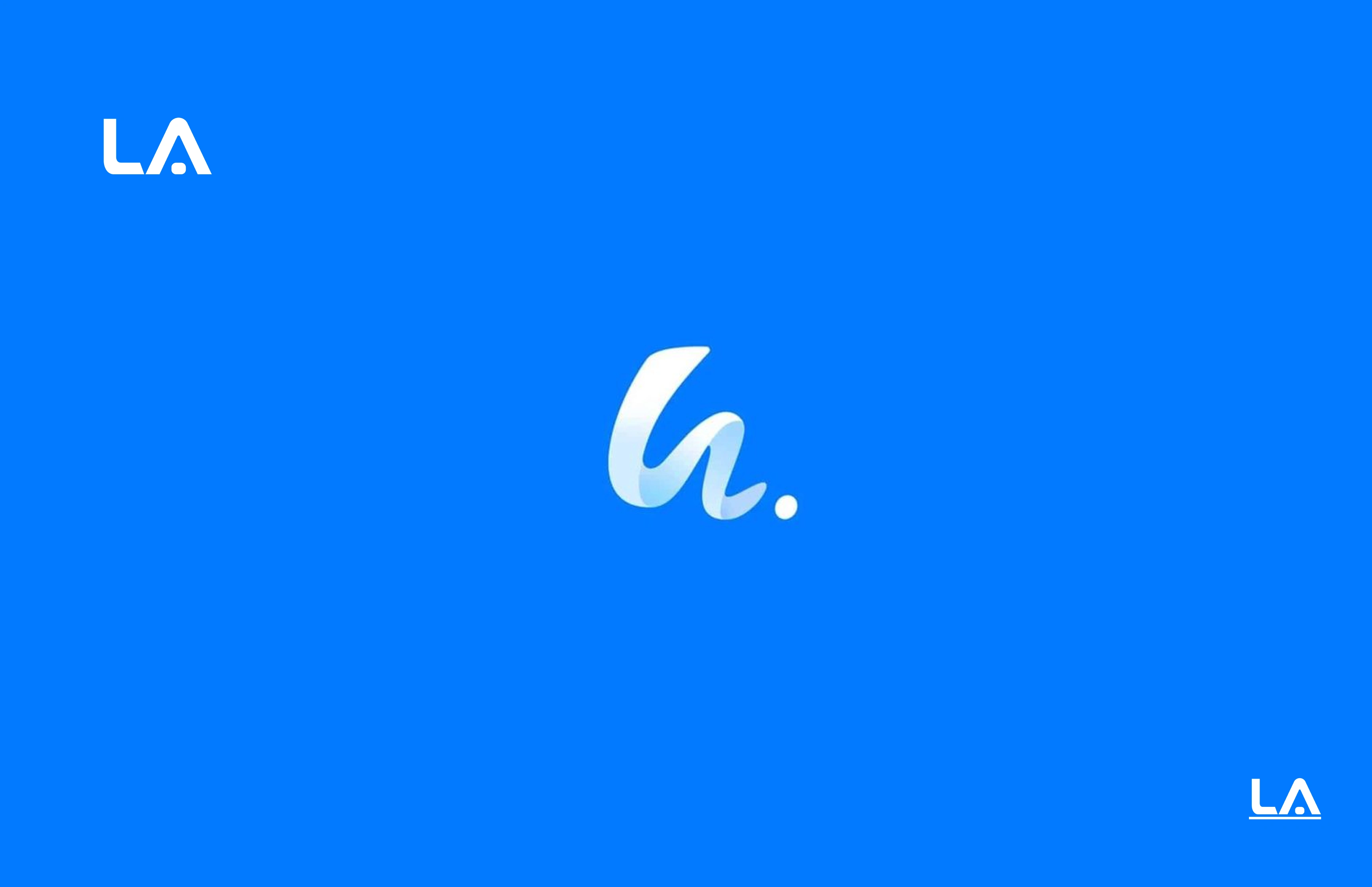
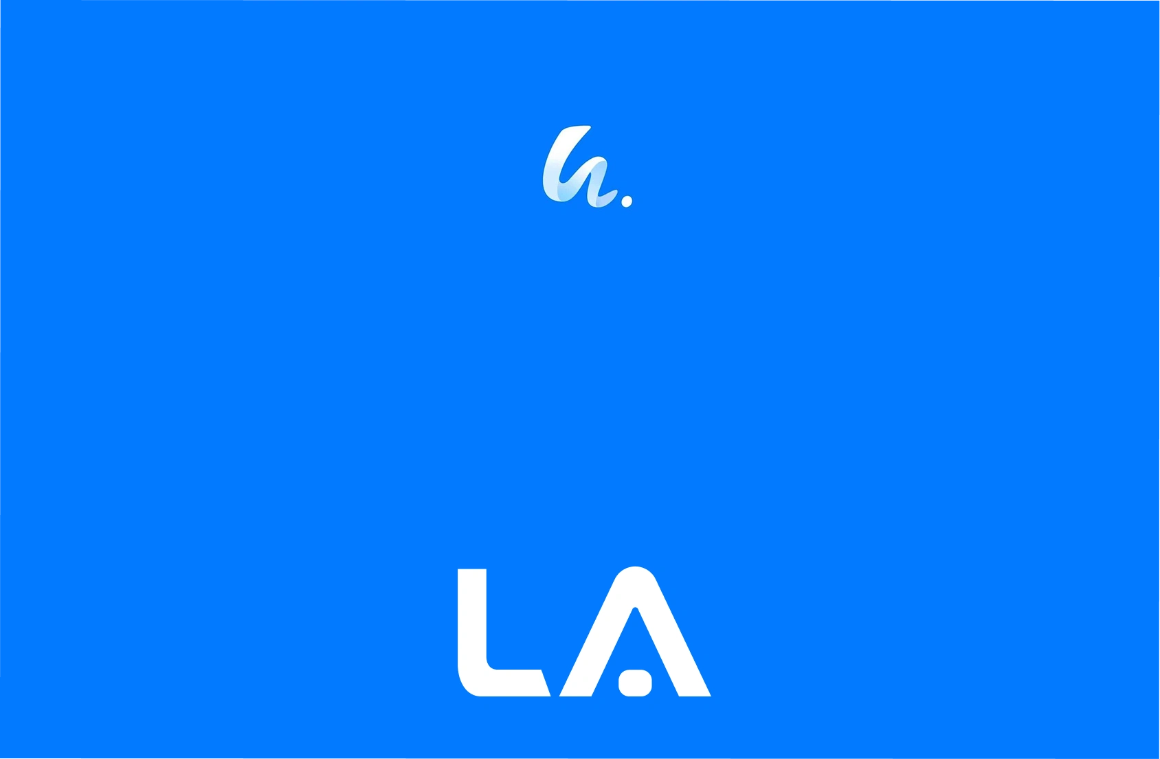
Logo Concept & Design
The logo for la. is built around a handwritten-style lowercase letterform, paired with a subtle dot.
Concept highlights:
The lowercase form represents casual communication and accessibility, aligning with social media behavior.
The fluid, soft curves suggest movement, interaction, and conversation.
The dot acts as a full stop, symbolizing clarity, completion, and confidence.
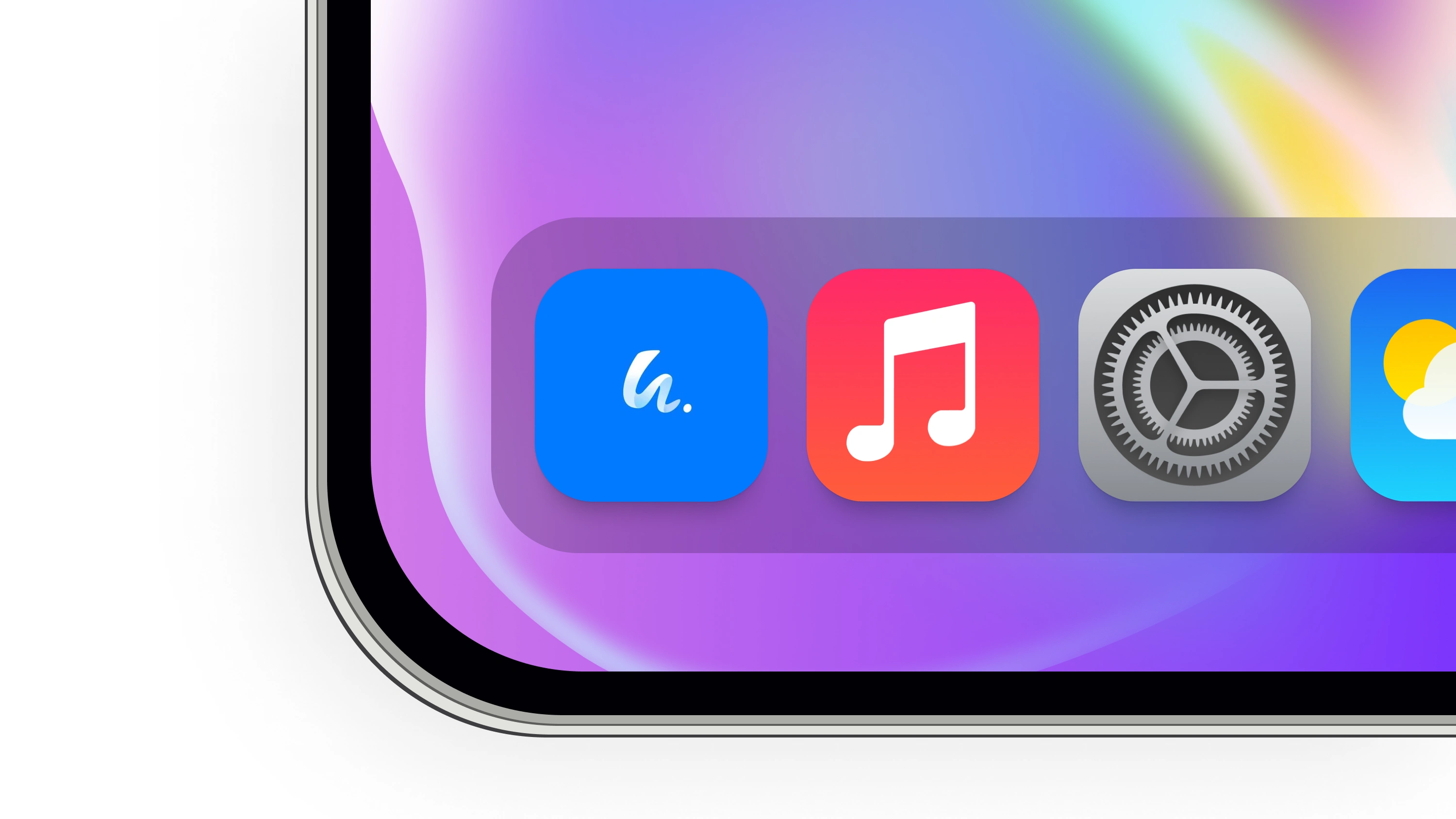
The minimal mark ensures high recognizability at small sizes, ideal for app icons and social avatars.
The logo is intentionally simple to remain timeless and versatile across digital platforms.
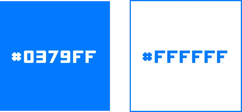
Color Palette
The primary blue tone was selected to represent:
Trust & reliability (essential for software products)
Calmness and clarity
Digital-native energy
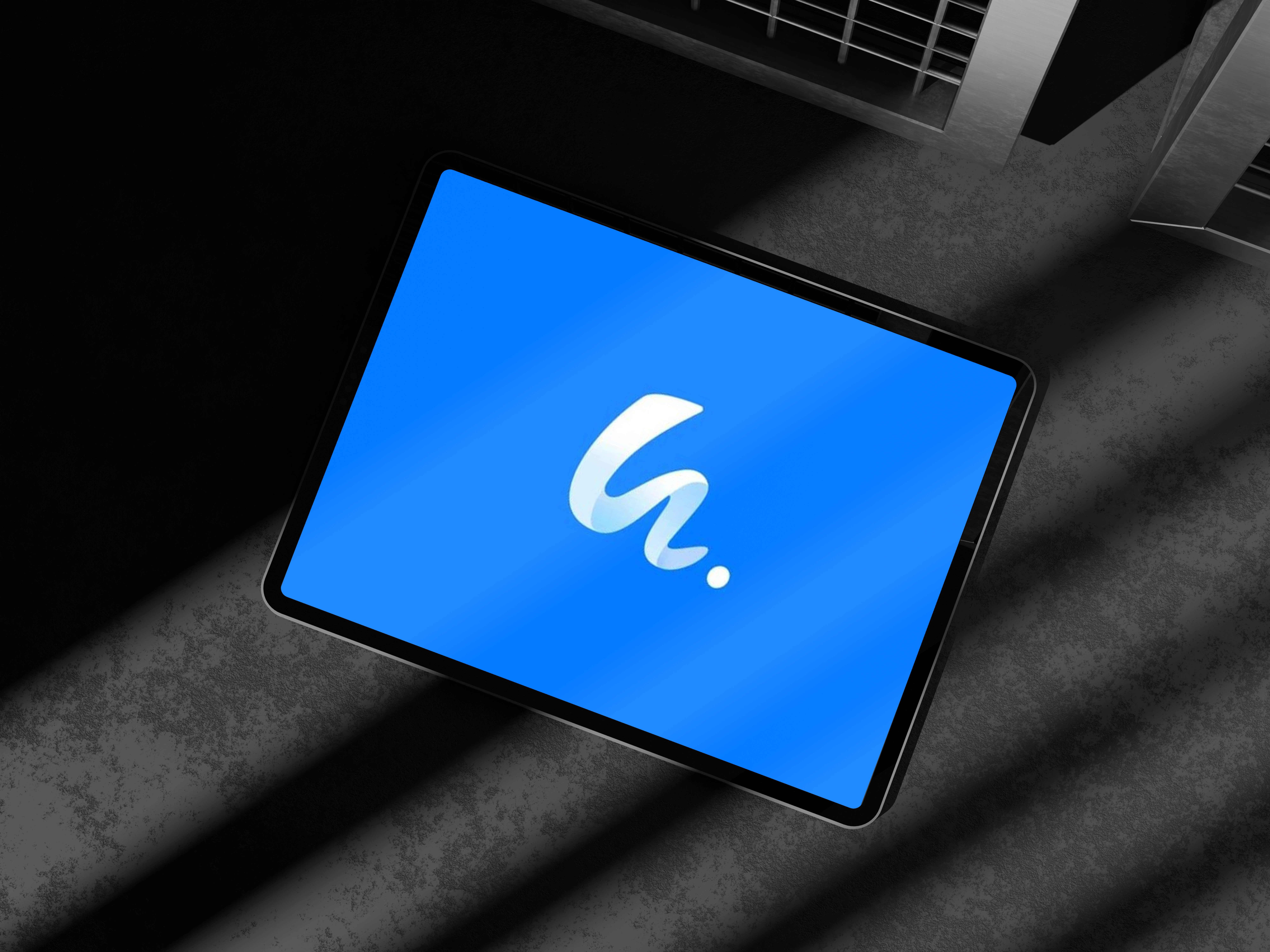
The high contrast between the logo and background ensures excellent visibility across light and dark environments.
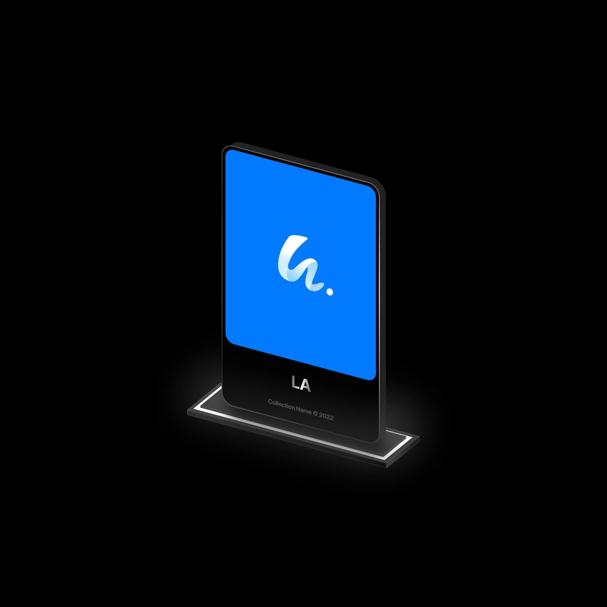
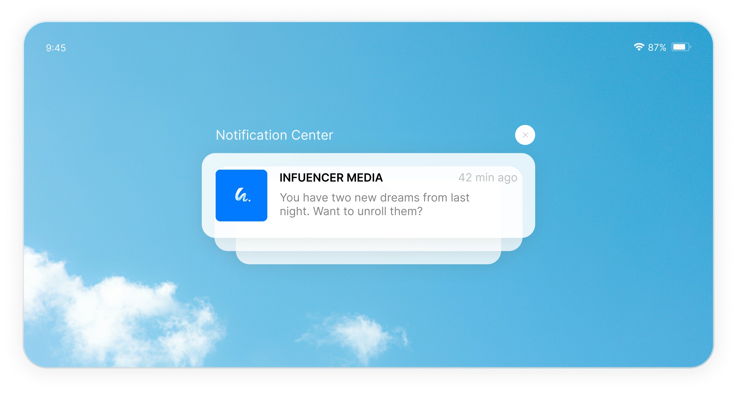
MOCKUPS:
Typography Direction
Typography choices follow the same principles as the logo:
Clean
Rounded
Modern
Highly readable on screens
This reinforces consistency across UI elements, dashboards, and marketing materials.
Brand Applications
The identity system was designed to scale across:
App icons & splash screens
Website UI
Social media branding
SaaS dashboards
Marketing visuals & onboarding screens
The logo remains effective in both icon-only and full brand lockup formats.
Outcome
The final brand identity for la. delivers:
A strong, recognizable visual presence
A minimal and modern aesthetic aligned with social media culture
A flexible system ready for product growth and feature expansion
The identity positions la. as a friendly, modern, and reliable social media software brand.
Designer’s Role
Brand strategy & concept development
Logo design
Visual identity direction
Color & typography selection
Like this project
Posted Jan 12, 2026
Developed la.'s brand identity with a modern, flexible logo and minimal aesthetic.
Likes
1
Views
1