Zehra Studio: Whimsical Brand Identity for Storytelling Atelier
The Vision
Zehra Studio was created as more than just a design agency—it was envisioned as a creative atelier where stories come to life, crafted with intention and a touch of magic. Our primary focus is content creation and production for artisanal brands, and I knew the brand identity had to reflect that. I wanted Zehra Studio to feel like stepping into a world of wonder and curiosity, a space where each detail is deliberate, where every piece of content is crafted to leave a lasting impact.
Strategic Foundation
To bring Zehra Studio’s vision to life, I focused on capturing the studio’s essence through a few guiding themes:
Artisanal Storytelling: I wanted the brand to evoke the same craftsmanship and intentionality that define artisanal brands, reflecting Zehra Studio’s commitment to creating content that’s both beautiful and meaningful.
Whimsy & Wonder: Inspired by the emotions of curiosity, happiness, and calm, I sought to design a brand that felt like a quiet journey through an enchanted library, inviting viewers to pause and explore.
Magic & Mystery: With a hint of the mystical, the brand needed to feel like it held secrets—a sense of wonder woven into each visual element, capturing attention and sparking curiosity.
Visual Language
Guided by these themes, I crafted a brand identity that balances whimsy with a sense of grounded calm, combining enchanting visuals with intentional design.
Logo Design
The logo was crafted with keywords like “book,” “jewels,” and “magic” in mind. I envisioned a stamp mark that would feel both timeless and enchanting, like an artifact from a hidden world. The resulting mark houses a bowl (which could also be seen as an open book) holding a floating gem-like symbol and a droplet—symbols that convey a magical, alchemical process. This logo became a visual representation of the studio’s approach: a blend of storytelling, artistry, and a touch of magic.
Color Palette
I curated a muted yet elegant palette that embodies the calm, somber nature of the studio. The primary colors—soft shades that evoke curiosity and elegance—anchor the brand, creating a sense of stability and intrigue. Secondary and accent colors bring in happiness and wonder, balancing the grounded tones with a sense of discovery.
Deep Blues and Greens: Representing curiosity and a deep sense of elegance, these tones are reminiscent of rare, antique books and the depth of a forest.
Soft Ochres and Muted Reds: These accents bring warmth and a spark of joy, reflecting the delight and wonder that the studio aims to bring to every project.
Typography
The typeface selection was a key element in conveying Zehra Studio’s unique voice. I chose a serif heading with playful curves, adding an elegant yet fun character to the brand’s identity, echoing the feeling of flipping through an old storybook with delightful surprises on every page. The sans serif body font was selected for its clarity and stability, grounding the brand’s messaging in coherence and making communication feel intentional and accessible.
Brand Implementation
The visual identity was applied thoughtfully across all touchpoints, creating a cohesive experience that feels both inviting and enchanting.
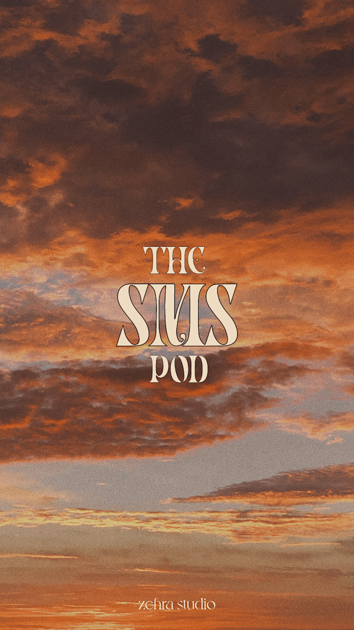
Social Media & Content Production: Each piece of content—whether a carousel, a reel, or a single graphic—was designed to feel like a page from the Zehra Studio story. The visuals are simple yet intriguing, encouraging audiences to pause, look closer, and engage with the content.
Website & Digital Presence: Online, Zehra Studio feels like an atelier filled with treasures. The muted color palette and intentional typography create an immersive experience that echoes the studio’s commitment to quality and beauty.
Printed Collateral: From business cards to client presentations, every piece of collateral reflects the studio’s ethos, combining whimsical elements with a timeless aesthetic to make a lasting impression.
Content Strategy & Creation Process
My approach to content at Zehra Studio is rooted in intention and clarity. Before crafting each post, I ensure the messaging aligns with the studio’s brand promise and reflects the overall identity. Every detail, from copy to visuals, is crafted to tell a story. After establishing a design system—social media templates, color palette, typography—I create a content calendar, researching trends and refining topics to resonate with our target audience.
Each post is then crafted with care, whether it’s a caption, a graphic, a video, or a photograph, ensuring that every piece feels like a chapter in Zehra Studio’s story. By reviewing engagement data, I iterate and refine our content, keeping what resonates and evolving what doesn’t. This intentional process allows Zehra Studio’s content to remain relevant, engaging, and impactful.
The Result
The brand identity for Zehra Studio captures a unique blend of whimsy and calm, reflecting the fun and curious spirit of the atelier while showcasing the solid intention behind our work. The outcome is a visual language that resonates with artisanal brands and creatives who value storytelling that goes beyond aesthetics, creating an impact that’s both beautiful and meaningful.
Through thoughtful design and strategic choices, Zehra Studio has become a space where brands can discover their unique story, connect with their audience, and leave a lasting impression. It’s a brand that looks good on the surface—and does good for the brands it represents.

Like this project
Posted Mar 22, 2022
A charming, balanced brand identity for Zehra Studio, blending whimsy and elegance to craft impactful, story-driven content for artisanal brands.
Likes
0
Views
295


