The SMS Pod: Branding & UX/UI for a Podcast Series
The Vision
The SMS Pod, short for The Sisters of the Moon & Sun, was born from the story of two founders who shared more than just a design studio—they shared a cosmic connection. One saw herself in the sun, radiant and bold, while the other felt drawn to the moon, reflective and serene. Together, they balanced light and shadow, day and night, work and play. This podcast would be their space to share the journey of building a creative studio, navigating the highs and lows of entrepreneurship, and crafting a life that harmonizes their differences.
Strategic Foundation
With a story as rich as theirs, my approach to branding The SMS Pod centered around three guiding principles:
Duality & Harmony: The brand needed to reflect the unique contrast and balance between the two founders—their partnership a dance of sun and moon energies, united by a shared vision.
Storytelling Depth: Each visual choice was designed to mirror the authenticity and openness with which they share their journey, inviting listeners into an honest conversation about creativity, growth, and finding balance.
User-Friendly Experience: Since this was a podcast for creatives and entrepreneurs, the UX/UI had to be seamless, allowing listeners to immerse themselves in the episodes without distraction.
Visual Language
Inspired by the founders’ connection to the celestial, I crafted a brand aesthetic rooted in the natural beauty of dawn and dusk. This design represents both the beginning of a journey and the quiet reflections at its end.
Typography & Wordmark
The wordmark, The SMS Pod, was given a graceful yet bold serif style to echo both founders’ personalities—distinctive, yet complementary.
The typography blends elegance with a hint of nostalgia, creating a feeling of timelessness. It’s as though each letter carries the weight of stories told under the sun and whispered by moonlight.
Color Palette
The color palette was inspired by the colors of the sky at different times of day, reflecting the journey of balancing work and play:
Deep Indigo and Midnight Blue: Representing the moon, calm and introspective, creating a foundation of depth and reflection.
Golden Ochre and Sunset Orange: Reflecting the sun’s warmth and energy, adding a vibrant balance to the palette.
Ivory and Soft Peach: These soft tones bring in harmony, allowing the bolder colors to breathe and adding a touch of serenity to the visuals.
Brand Implementation
The SMS Pod branding was crafted to be as evocative as it is cohesive, with visual elements that tell the story of a creative partnership grounded in alignment.
Digital Cover Art & Episode Graphics: Each episode cover mirrors the founders’ journey, with scenes of sunsets, moonlit skies, and warm candlelit settings. These visuals evoke the essence of their conversations—illuminating, warm, and inviting.
Social Media Presence: Across platforms, the graphics and captions capture the dynamic balance of the sun and moon, work and play, giving followers a visual story that reflects the podcast’s ethos.
UX/UI Design: For the podcast’s interface, I created an experience as seamless as a day moving into night:
Interactive Playlists: A well-organized, intuitive layout helps listeners discover new episodes, save favorites, and easily follow the journey.
Episode Descriptions & Previews: Clear, engaging descriptions set the tone, offering listeners a preview of the rich conversations waiting inside each episode.
Subtle Interactivity: With features like “Add to Favorites” and “Download,” listeners can personalize their experience, connecting more deeply with each episode.
Content Strategy & Iteration
With each post and episode, I ensured that the content resonated with the story of two founders exploring the balance between work and creativity. Every few weeks, I reviewed listener feedback and engagement data to adapt the content strategy, refining what resonated and letting go of what didn’t. This iterative process allowed The SMS Pod to continuously evolve, keeping it relevant and engaging.
The Impact
The branding and UX/UI design for The SMS Pod transformed it into more than a podcast—it became a narrative experience. This visual and functional identity allowed listeners to:
Connect with the Founders’ Journey: By balancing the boldness of the sun and the calm of the moon, we created an emotional connection, inviting listeners into an honest exploration of creativity and entrepreneurship.
Enjoy a Seamless Listening Experience: The intuitive interface keeps listeners engaged and eager to return, allowing them to dive fully into each episode without friction.
Experience a Visual Story of Balance and Alignment: From colors to typography to graphics, each design choice reflects the founders’ story, making The SMS Pod memorable and distinctive in the podcasting world.
Through intentional design and a commitment to storytelling, The SMS Pod now stands as a digital haven—a space where creatives and entrepreneurs alike can tune in, reflect, and draw inspiration from the sun and moon balance that embodies this creative duo’s partnership.
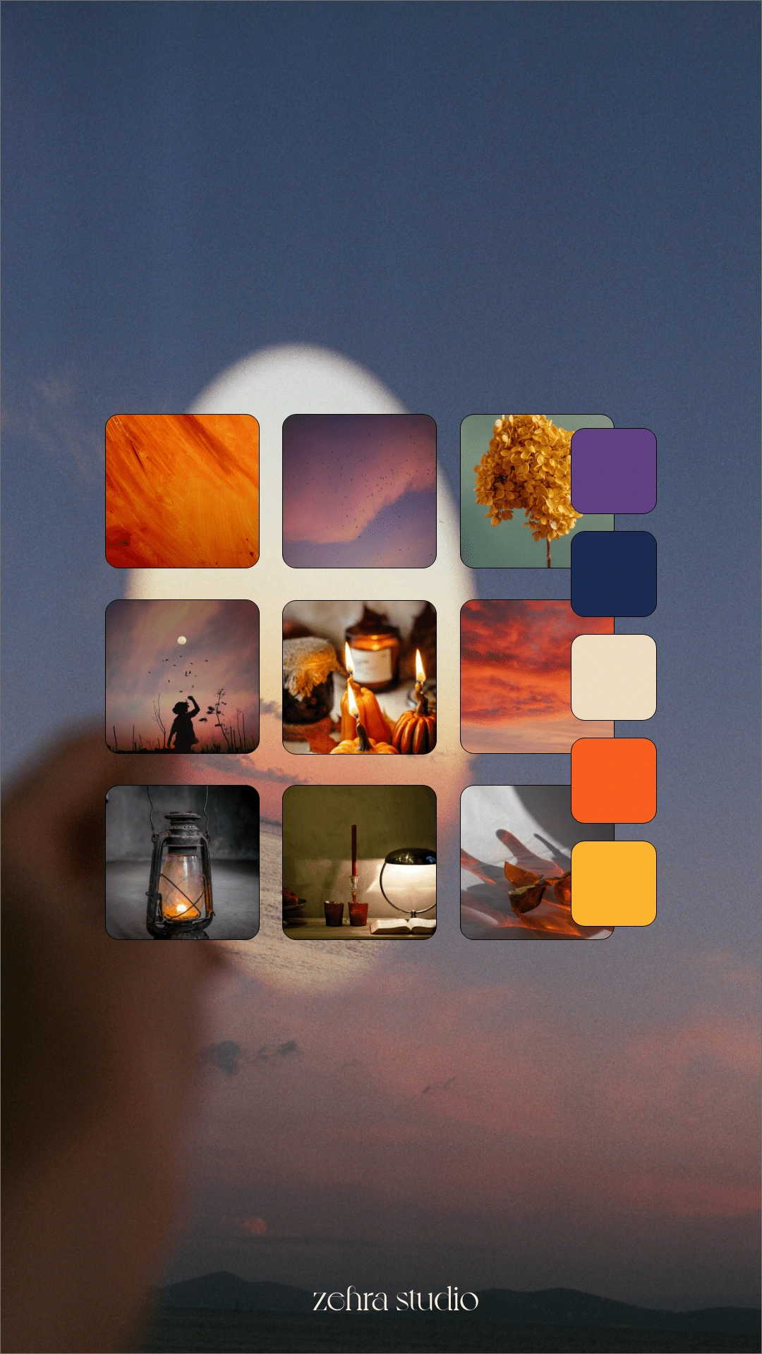
Moodboard
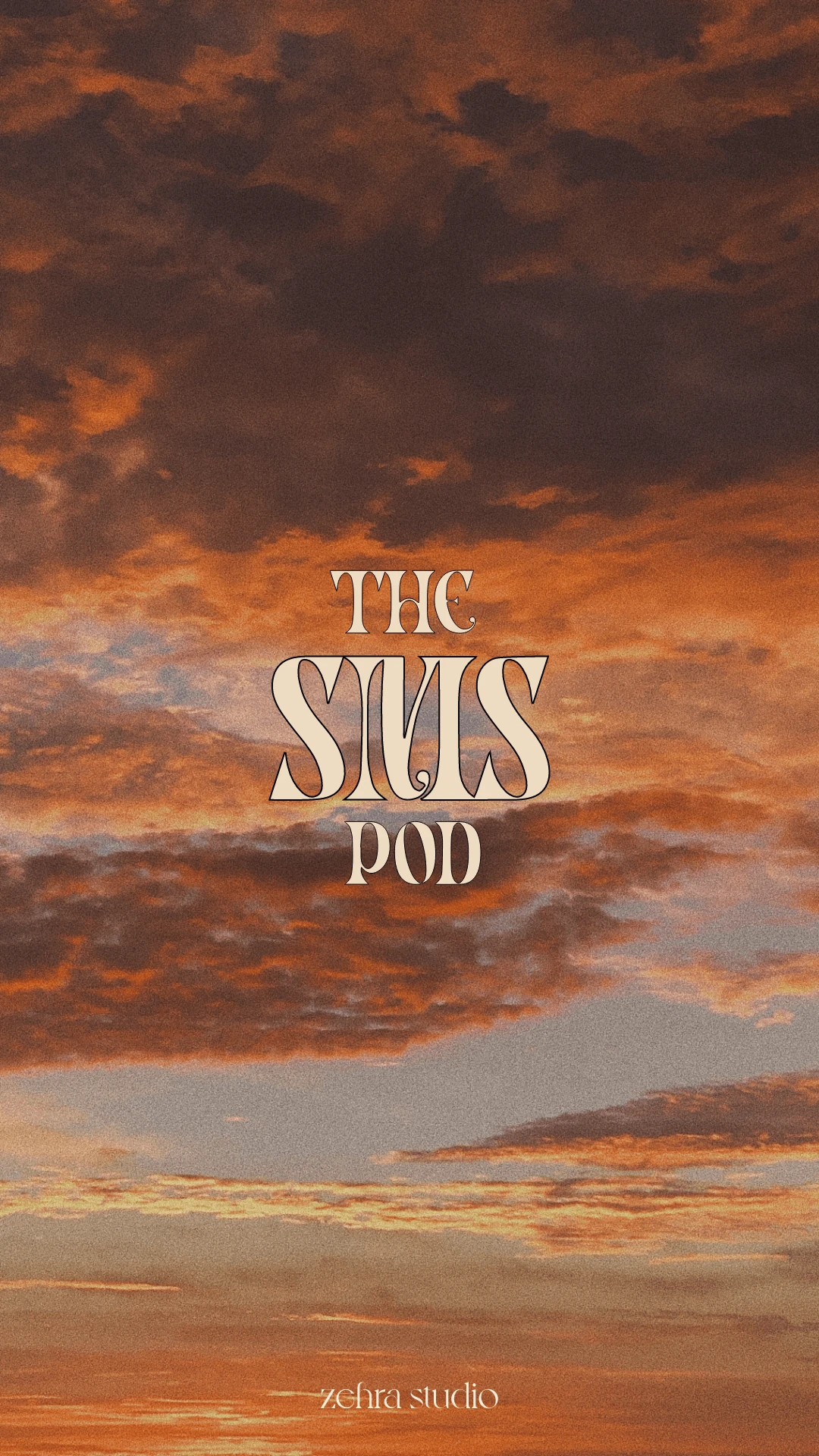
Logo Design
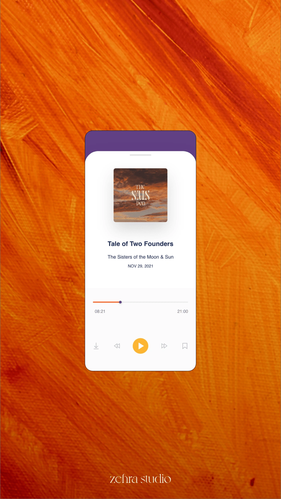
Podcast Episode Interface
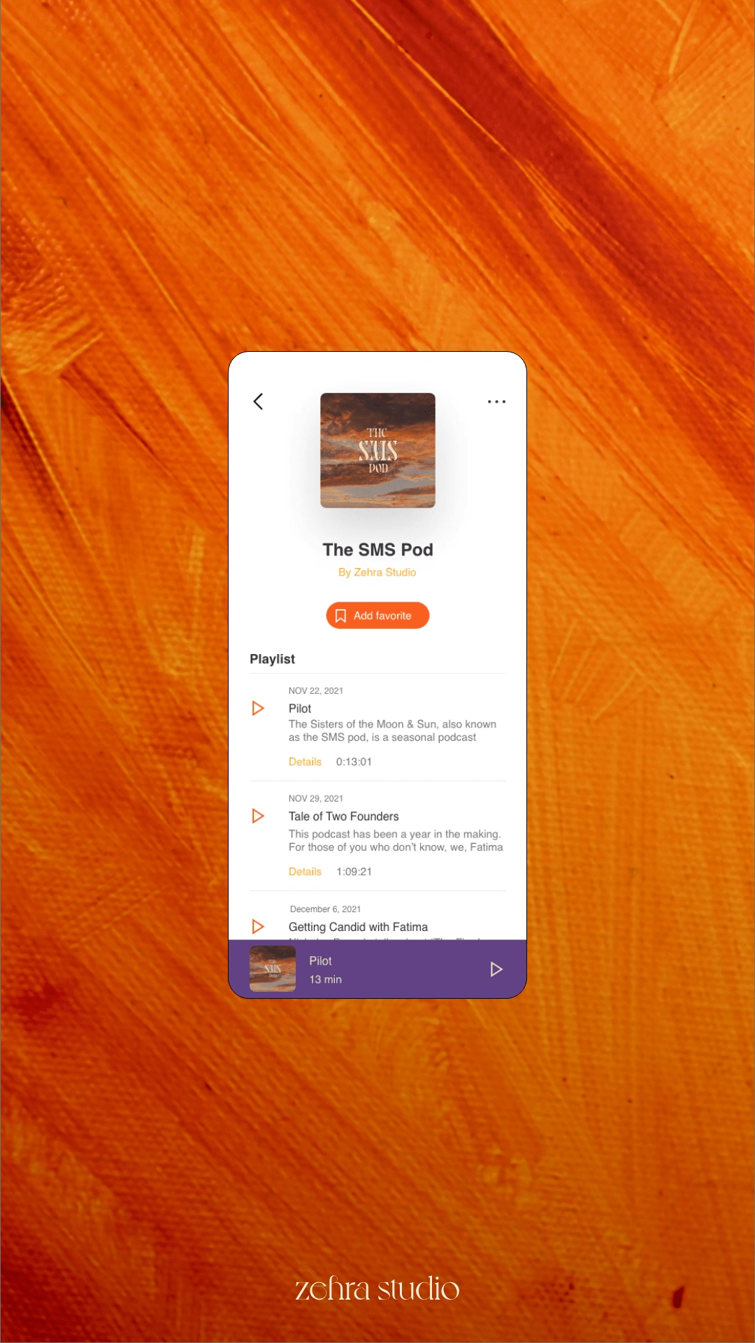
Podcast Playlist Interface
Like this project
Posted Feb 28, 2022
The SMS Pod: A sun-and-moon-inspired podcast brand and UX/UI, capturing the journey of two founders balancing creativity, entrepreneurship, and alignment.
Likes
0
Views
206

