Design system for multi-brand club apps

Igor Voitenko


Design system for multi-brand club apps
Role
UI/UX & Product Designer
Platform
iOS, Android
Domain
SportTech · Design systems
Team
2 designers, project manager, developers, QA
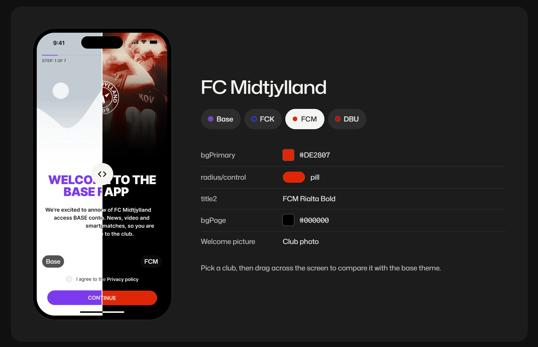
Values are the real club variables from the Figma file
Problem
The white-label product had to add clubs fast, but each club app was still styled by hand on a half-tokenised library.
What I did
With a second designer, moved the system to Figma variables: a semantic layer, a theme per club and a plugin that applies it.
Result
10+ club apps on one base theme. A new club gets a theme — colors, fonts, radii, pictures — not new screens.
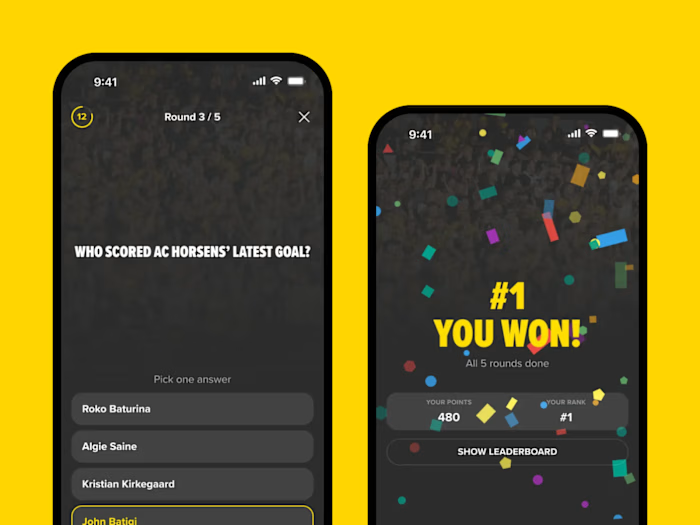
One base theme, 10+ club themes. The same screen becomes FC Copenhagen, FC Midtjylland or ForDanmark when the plugin applies a club’s variables.
Context
I joined the white-label team when the product had been live for about two years. Components were built on Figma styles and only about half of the values were tokens, so every new club still meant styling screens by hand.
Over the next two years the second designer and I co-owned the system. We moved it to Figma variables, added a semantic layer and a theme for each club. He built the plugin that applies a theme to a batch of screens; we tested and improved it together. On top of the system I designed club apps and features, and we both added components, marked old ones as legacy and answered developers’ questions.
Constraints
10+ club brands on one base theme, each with its own colors, fonts, corner radii and pictures
Some clubs may want a dark theme, so a theme needs room for more than one set of colors
New clubs join while other club apps are live, so a component can’t simply be deleted
Developers build from Dev Mode, so names and values in Figma are the handoff
Process
We based the color layer on the Reshaped color system. Names describe a role — bg-primary, fg-neutral, on-bg-primary — and every club fills in the same table. Alpha, beta and gamma are variants a club can use for a dark theme.
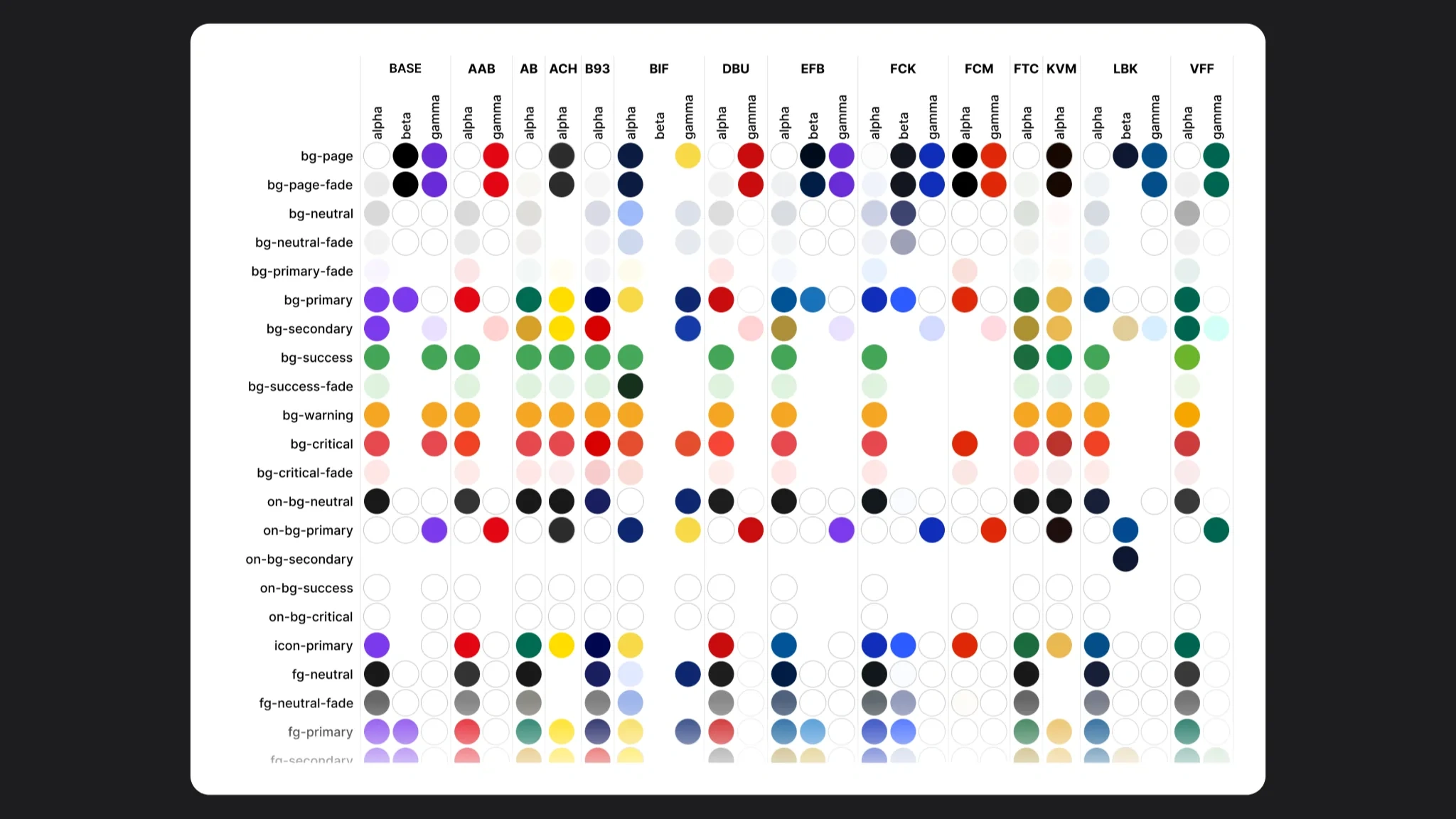
One token name, a value per club
Type follows the same rule. Every club has the same text styles, from display to textLinkSmall, in its own font.
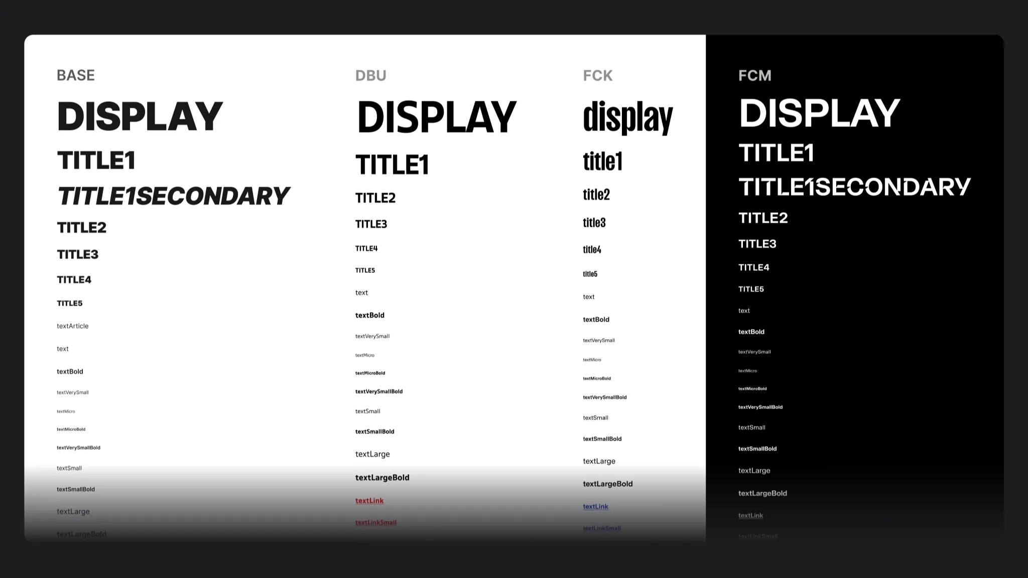
Same style names, four club fonts
Key decisions
Where does a club’s brand live?
Options: a copy of the library for each club, club colors set by hand on each screen, or one base theme that asks for semantic tokens. We chose tokens: a component never knows a club’s color, it asks for bgPrimary or radius/control and the club theme answers. Cost: more time up front on tokens and variables. In return, a new club is a new set of variables, not a recolor of every screen.
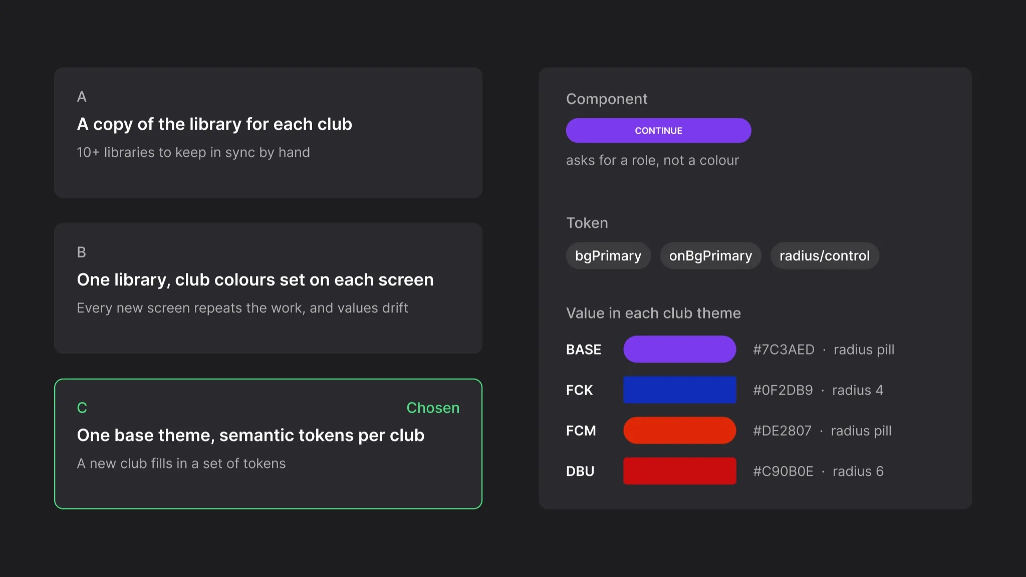
A component asks for a role, the theme answers
What happens to a component we replace?
Options: delete it, or keep it under a _LEGACY name that points to the new one. We kept it: club apps were live, and a deleted component breaks screens nobody is looking at. The name tells the next designer what to use instead. Cost: we didn’t always find time to swap every instance, so some legacy parts stayed in the file.
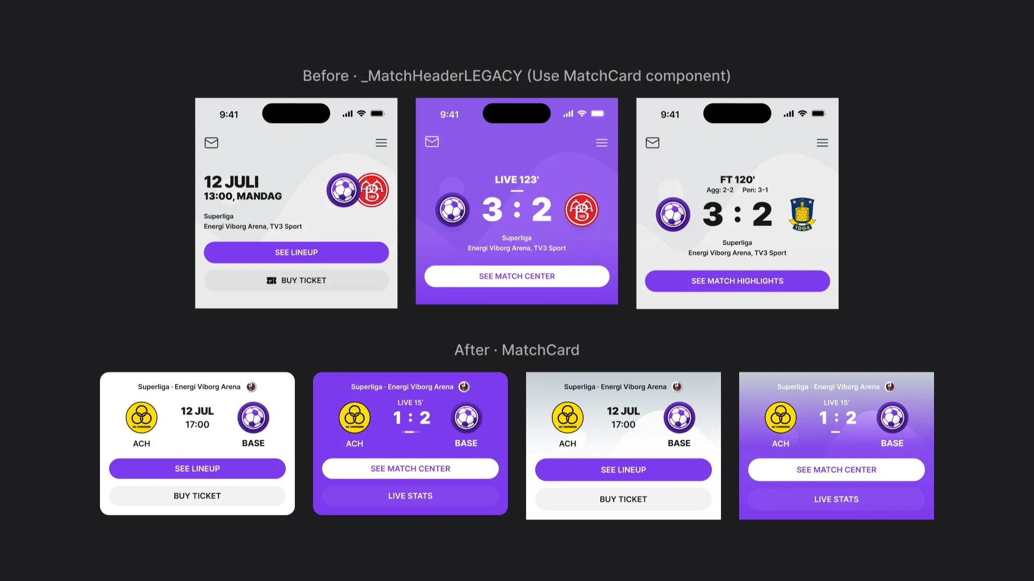
The old header names its replacement
One base theme, a theme per club
Every feature is designed once, in the neutral base theme. A club theme is a group of variables and styles with the same names: colors, corner radii, fonts, shadows and pictures. The plugin swaps the base group for the club’s group across a batch of screens.
Pictures were our own find. Logos, onboarding photos, stories and article images are named per club too, so the plugin changes them along with the colors.
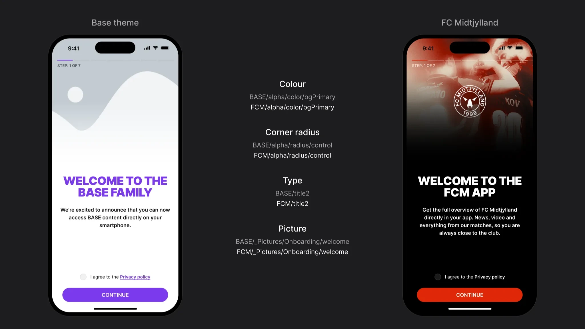
Four names change, the layout stays
Components that hold up in every club
The file holds around 1,000 components and variants. They use tokens only, so each one looks right in any club theme.
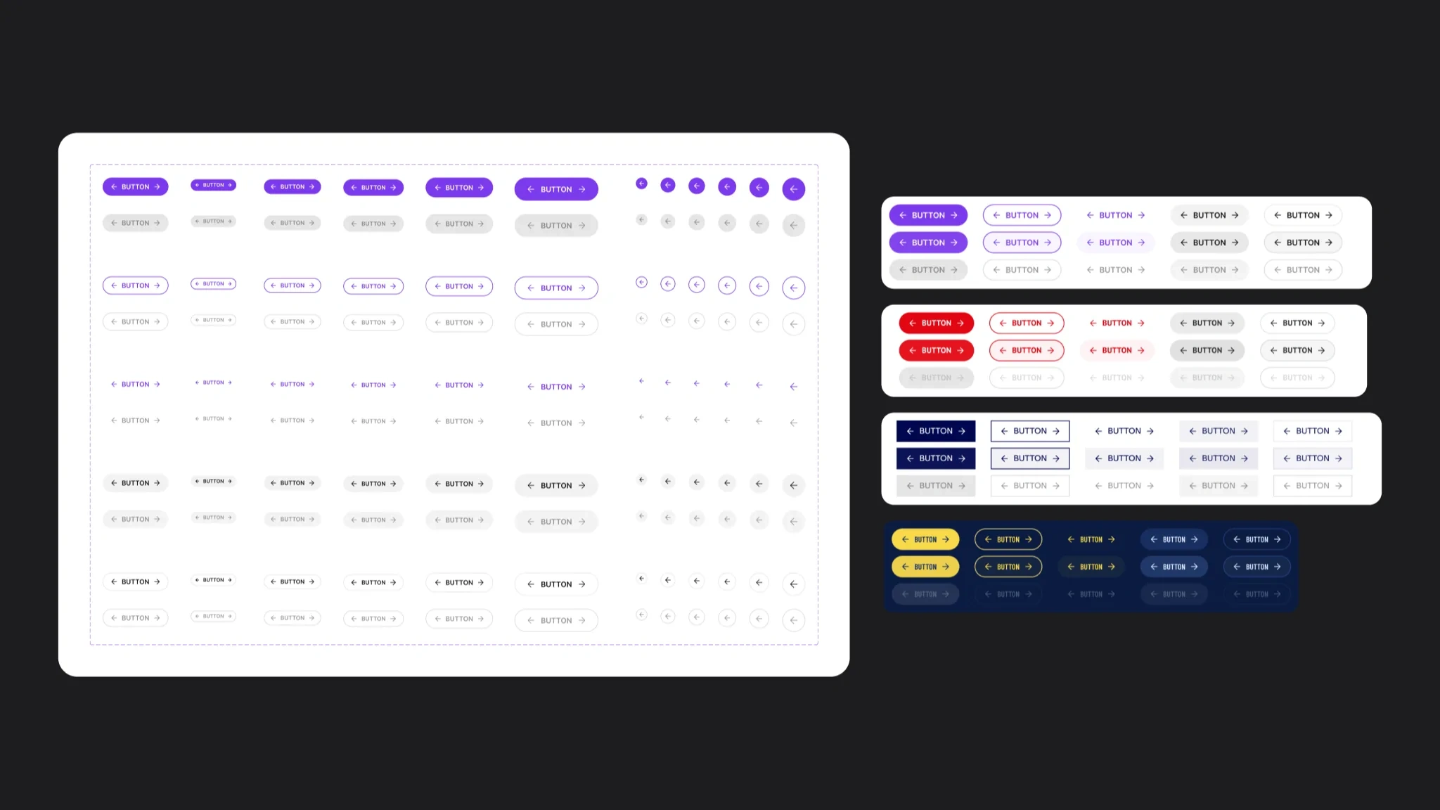
Every button style, then four club themes
Figma had no real slots, so a section is a reusable block with a slot inside. Content changes without detaching anything.
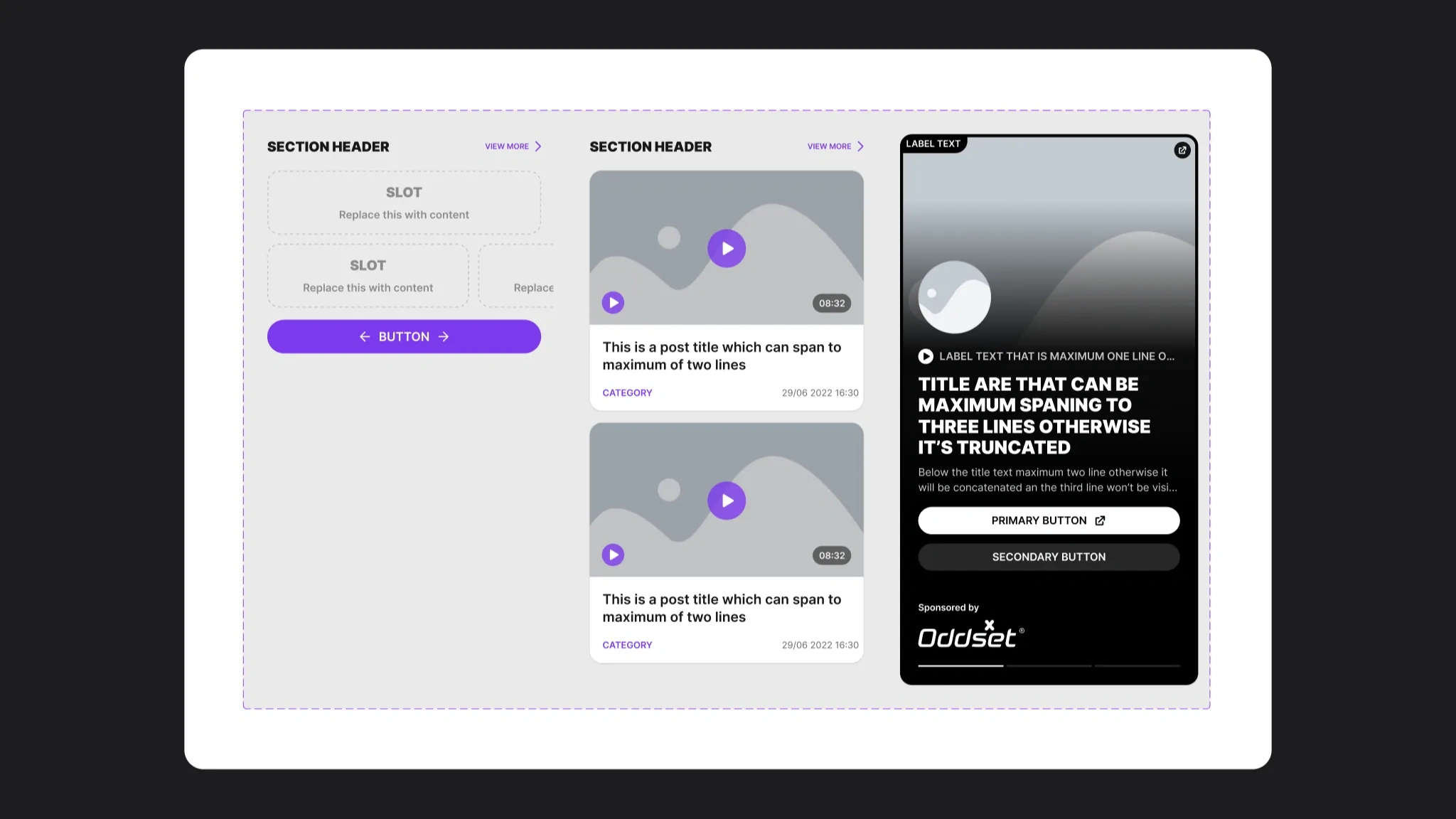
A section with a slot, and what fills it
Screens are assembled from these parts, not drawn.
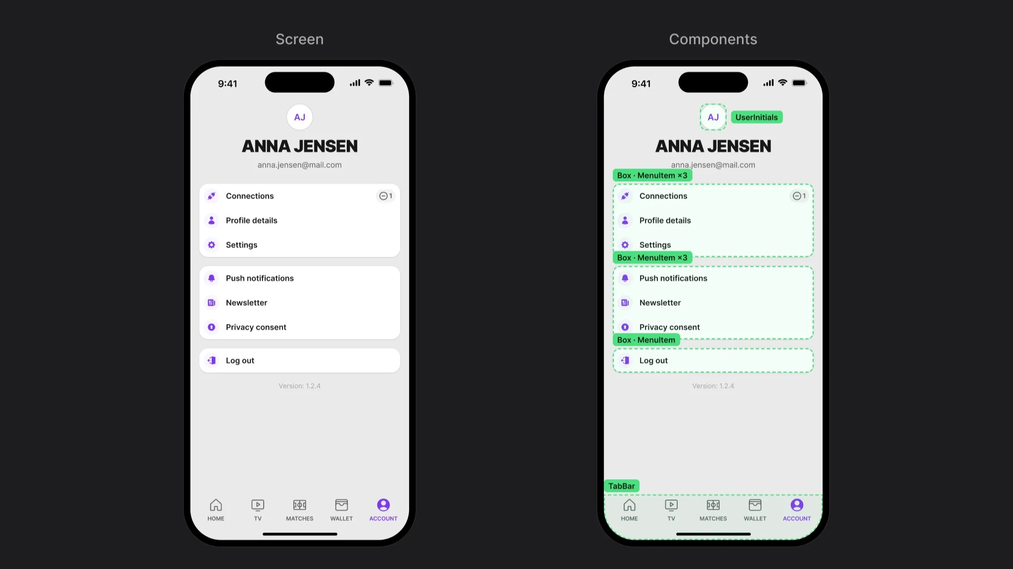
One screen, five components
States and edge cases
Inputs carry every state, so a form never needs a one-off: empty, filled, typing, locked and an error that says what is missing.
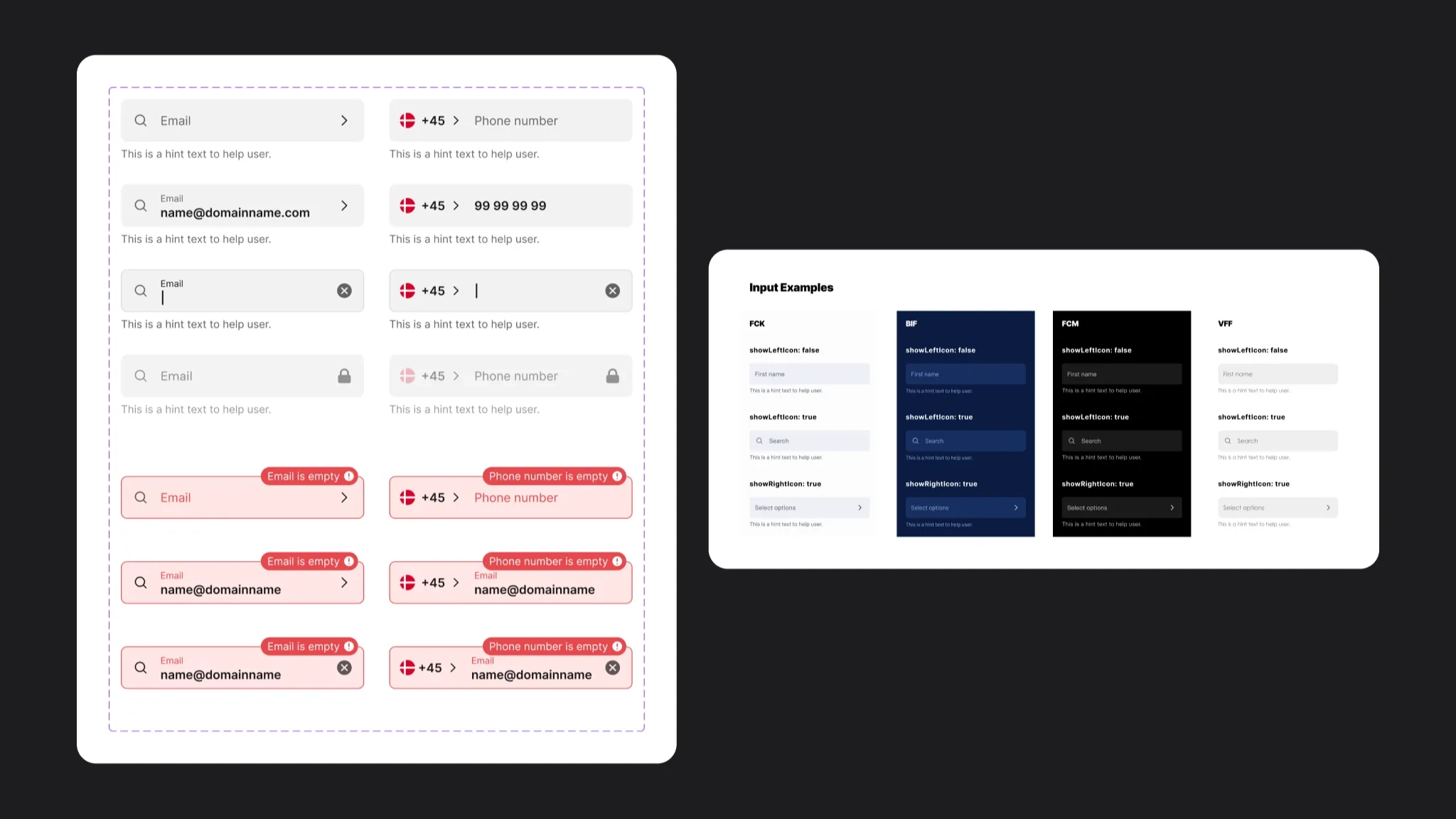
Every input state, then four club themes
Rules live in the file
Most support work was small rules that are easy to forget. We wrote them next to the assets in Figma, where the next designer would see them.
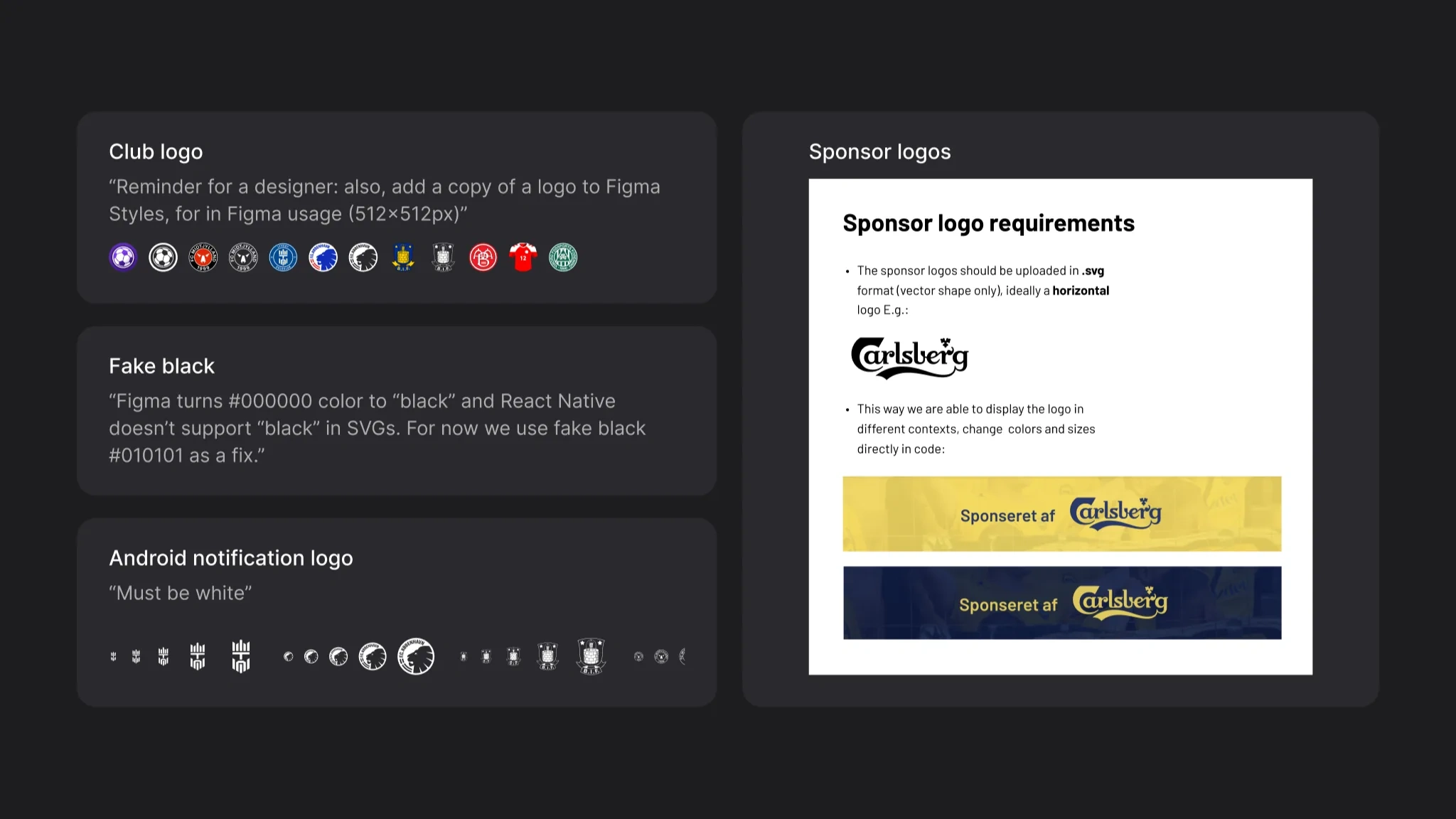
Notes from the file, word for word
Changes reached developers through a changelog, calls and Slack. They built from Dev Mode and asked us when something was unclear.
Result
Platform results. Product numbers, not personal ones.
10+ club apps on one base theme
~1,000 components and variants in the system
+50% more active fans
1.2M app sessions a month
Source: Sports Innovation. My part was the system these apps run on, co-owned with the second designer.
What I learned
Name tokens by role, not by color. A new club then fills in a table instead of redrawing screens.
Pictures are part of the brand too. Once logos, stories and article images were named per club, the plugin could switch a whole screen, not just its colours.
Developers read the system in Dev Mode, so layer and token names are the handoff. A sloppy name is a bug.
Like this project
Posted Oct 21, 2026
A scalable UI system that helped launch and maintain 10+ club applications.
Likes
0
Views
0