Scharf Messer eCommerce Store Redesign
Ammar Yasir
Case Study – Scharf Messer Store Redesign
Project Overview
For this project, I redesigned the eCommerce experience for Scharf Messer, a premium knife brand focused on handcrafted, hand-forged carbon steel Damascus knives. The goal was to transform the existing Shopify store into a more premium, trustworthy, and conversion-focused shopping experience while staying aligned with the client’s vision and using their provided imagery, product content, and brand assets.
The store positioned itself around high-quality craftsmanship and premium kitchen tools, but the original user journey lacked the emotional storytelling and visual confidence needed for high-ticket product purchases. My role was to redesign the store architecture and key customer touchpoints to create a stronger brand perception and smoother purchase path.
The site emphasizes handcrafted Damascus knives and premium kitchen products for the German market.
Design Goals
1. Elevate Brand Perception
Luxury knife products require trust and emotional appeal. The redesign focused on making the brand feel premium, refined, and highly specialized rather than generic.
2. Improve Conversion Flow
Customers purchasing high-value knives need clarity, reassurance, and confidence. I optimized the buying journey from homepage to checkout by improving hierarchy, navigation, and product storytelling.
3. Use Existing Brand Assets Effectively
The client provided all imagery, product content, and brand direction. My task was to strategically structure and present those assets in a way that maximized visual impact and sales performance.
4. Create a Consistent User Experience
The redesign ensured consistency across homepage, collection pages, and product detail pages so the store felt unified and professionally crafted.
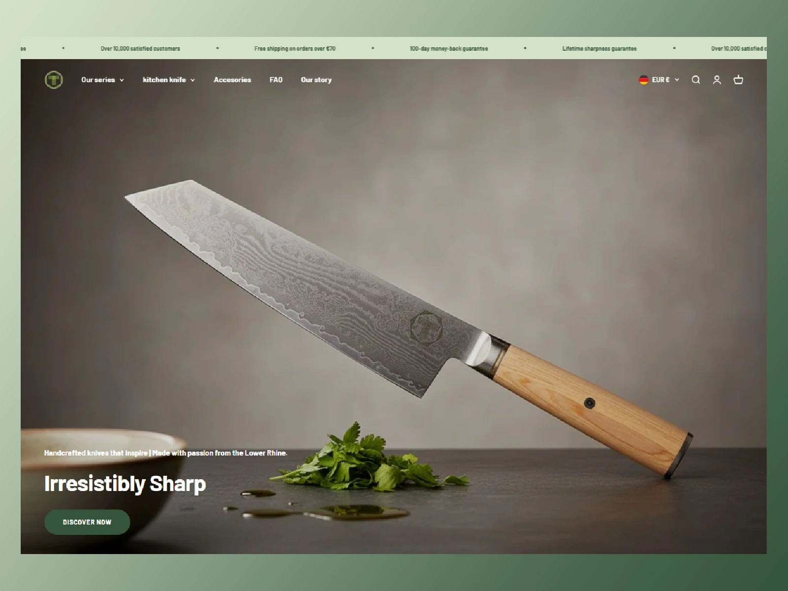
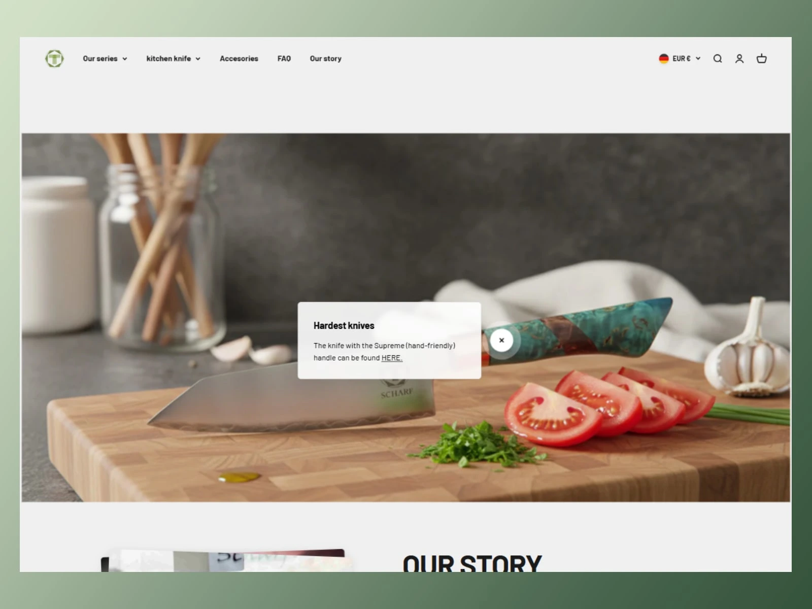
Homepage Redesign
Challenge
The homepage needed stronger storytelling and better visual hierarchy. Premium knife buyers make emotional decisions first and rational decisions second. The original layout lacked that strong first impression.
Solution
I redesigned the homepage to immediately communicate craftsmanship, exclusivity, and product value.
Hero Section
The hero section was redesigned with large, cinematic product imagery provided by the client, paired with strong messaging focused on:
handcrafted craftsmanship
Damascus steel quality
premium kitchen performance
durability and heritage
This instantly positioned the brand as premium rather than simply another knife store.
Trust & Brand Authority Section
To reduce hesitation, I introduced strong trust-building sections:
craftsmanship explanation
material quality breakdown
hand-forged production story
customer confidence indicators
premium product guarantees
This helped justify pricing and increased perceived value.
Featured Collections
Instead of overwhelming users with too many products, I structured featured collections strategically around buying intent:
Chef Knives
Japanese Knives
Damascus Collection
Gift-Ready Premium Sets
This improved browsing clarity and made discovery easier.
Lifestyle + Storytelling Blocks
I used the client’s imagery to create immersive visual storytelling sections that focused less on “selling products” and more on selling ownership, status, and experience.
This is critical in luxury eCommerce.
Homepage Result
The homepage became less of a product catalog and more of a premium brand experience—guiding users emotionally before asking for a purchase decision.
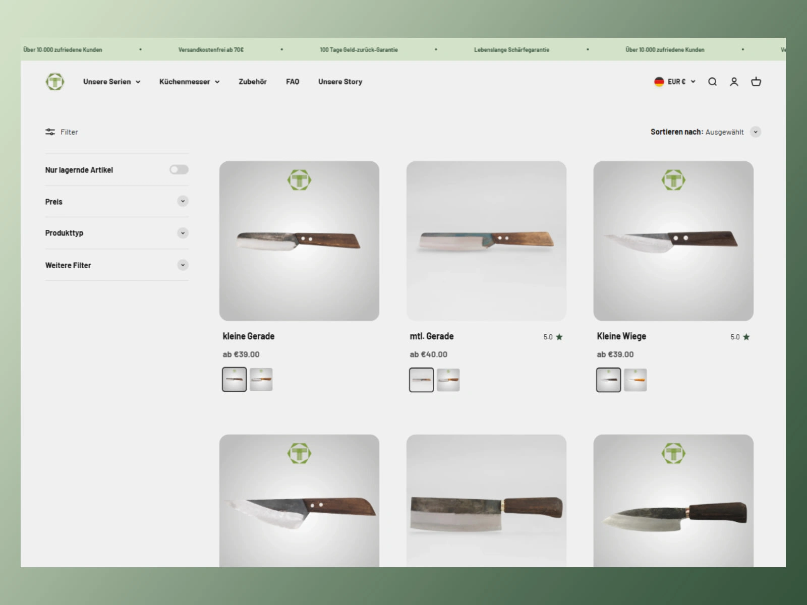
Collection Page Redesign
Challenge
Collection pages often become conversion killers when poorly structured. Too much clutter, weak filtering, and poor product visibility reduce trust quickly.
The goal was to make product discovery feel premium and effortless.
Solution
I redesigned the collection pages with a cleaner and more conversion-focused structure.
Improved Product Grid
Products were presented with:
stronger visual spacing
premium image-first layout
clearer pricing structure
better hover interactions
stronger quick product recognition
This improved scanability while maintaining a luxury feel.
Smart Filtering Experience
For knife buyers, product filtering is essential.
I improved the filtering system around:
knife type
blade material
Damascus pattern
intended usage
price range
gift options
This reduced decision fatigue and improved product discovery.
Better Collection Positioning
Each collection page included short educational content to help customers understand the difference between products.
For example:
Why choose a Damascus Chef Knife?
What makes Japanese steel superior?
This improved both SEO value and conversion trust.
Collection Page Result
The redesigned collection pages created a smoother browsing experience where users could quickly find products without feeling overwhelmed.
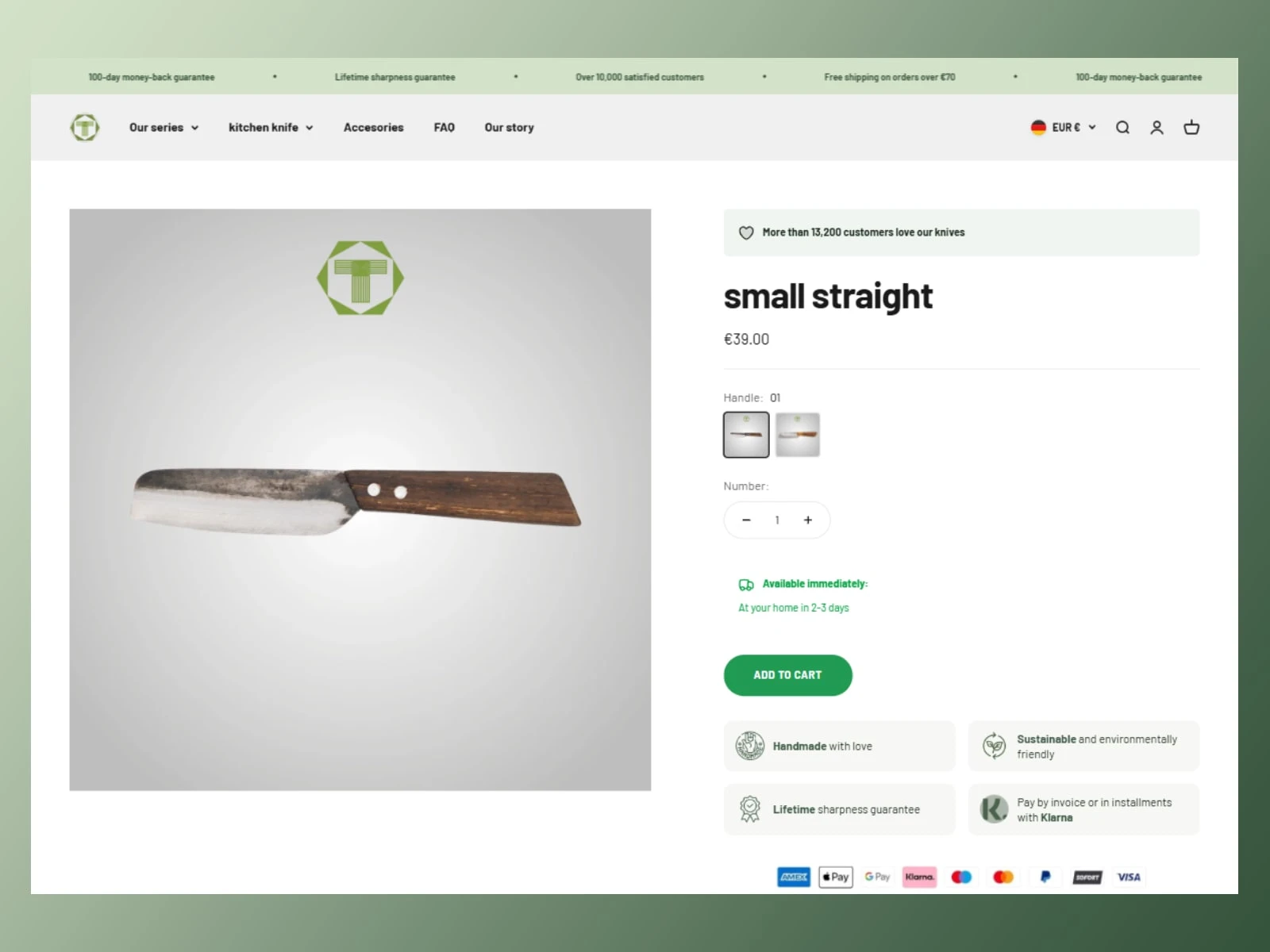
Product Detail Page Redesign
Challenge
The Product Detail Page is the most important conversion point in the entire store.
For premium knives, customers need strong reassurance before purchasing.
The original experience lacked enough emotional value and trust reinforcement.
Solution
I completely restructured the Product Detail Page to support both emotional desire and logical buying decisions.
Premium Product Presentation
The product media gallery was redesigned to create a stronger premium feel:
large visual focus
better image sequencing
detailed craftsmanship close-ups
stronger mobile optimization
The client’s provided imagery played a major role here.
Conversion-Focused Product Information
I improved content hierarchy so customers could instantly understand:
what makes this knife special
why it costs more
how it performs better
who it is ideal for
This reduced bounce and hesitation.
Trust Builders Near CTA
Critical trust elements were placed close to Add to Cart:
secure checkout reassurance
shipping clarity
premium packaging expectations
gifting suitability
durability messaging
This improved decision confidence significantly.
Storytelling Below the Fold
Instead of generic product descriptions, I created stronger storytelling sections:
craftsmanship process
steel quality explanation
maintenance guidance
why Damascus matters
ownership experience
This turned the PDP from a technical page into a premium buying experience.
Product Detail Page Result
The final PDP was designed to justify premium pricing while making the purchase decision feel safer, more desirable, and more emotionally rewarding.
Final Outcome
The redesigned Scharf Messer store became a stronger premium eCommerce experience that aligned with the client’s vision while using their existing content and imagery more effectively.
The redesign improved:
premium brand perception
user trust
product discovery
conversion flow
purchase confidence
mobile shopping experience
visual consistency across the store
Most importantly, the store now feels like a true premium knife brand rather than a standard Shopify catalog.
My Role
I handled the full UX/UI redesign strategy across:
Homepage
Collection Pages
Product Detail Pages
Conversion Optimization
Brand Positioning
User Journey Enhancement
Visual Hierarchy Improvement
The focus was not just aesthetics—but designing a store that sells better.
Key Takeaway
Luxury eCommerce is not about showing more products.
It is about creating confidence.
For Scharf Messer, the redesign transformed the shopping experience from simple browsing into premium brand ownership.
Like this project
Posted Apr 28, 2026
Redesigned Scharf Messer's eCommerce site to enhance luxury brand perception and improve customer conversion.
Likes
0
Views
5
Timeline
Dec 16, 2025 - Dec 31, 2025