Zarii The Artist Creative Digital Portfolio Development
Ammar Yasir
Case Study — Zarii The Artist Website (Webflow Development)
Project Overview
The Zarii The Artist website was built as a creative-first digital portfolio designed to reflect the artist’s personality, visual identity, and multidisciplinary work in a highly immersive way. Rather than creating a traditional portfolio layout, the goal was to build an experience that feels artistic, playful, and memorable—something visitors would explore rather than simply scroll through.
I developed this project in Webflow, starting from a base template structure and transforming it into a fully customized experience through original section design, layout experimentation, and interactive storytelling. While the client provided approvals for each major creative section, I had full creative freedom to conceptualize and execute the visual direction, user experience, and interactive components.
The result was a website that feels less like a standard portfolio and more like an extension of the artist’s creative world.
My Role
Full Website Design & Development in Webflow
I was responsible for:
Customizing and rebuilding the base template into a unique branded experience
Creating entirely new sections from scratch
UX structure and content flow planning
Interactive layout development
Responsive optimization across devices
Scroll behavior and visual hierarchy improvements
Designing immersive project showcase sections
Building engaging About page interactions
Maintaining performance while keeping the site highly visual
This project required balancing creativity with usability—ensuring the site remained visually expressive without sacrificing clarity or user navigation.
The Challenge
The biggest challenge was avoiding the “template feel.”
Since the project started from a base template, the objective was not just customization—it was transformation. The website needed to feel fully original and aligned with the artist’s brand, not like a modified prebuilt layout.
Another major challenge was presenting artistic work in a way that felt interactive and emotionally engaging rather than static. Traditional portfolio grids would not reflect the energy of the brand, so I focused on creating sections that encouraged exploration and play.
The client also wanted every creative direction approved section by section, which meant each design decision had to be strong enough to sell visually while still fitting the overall system.
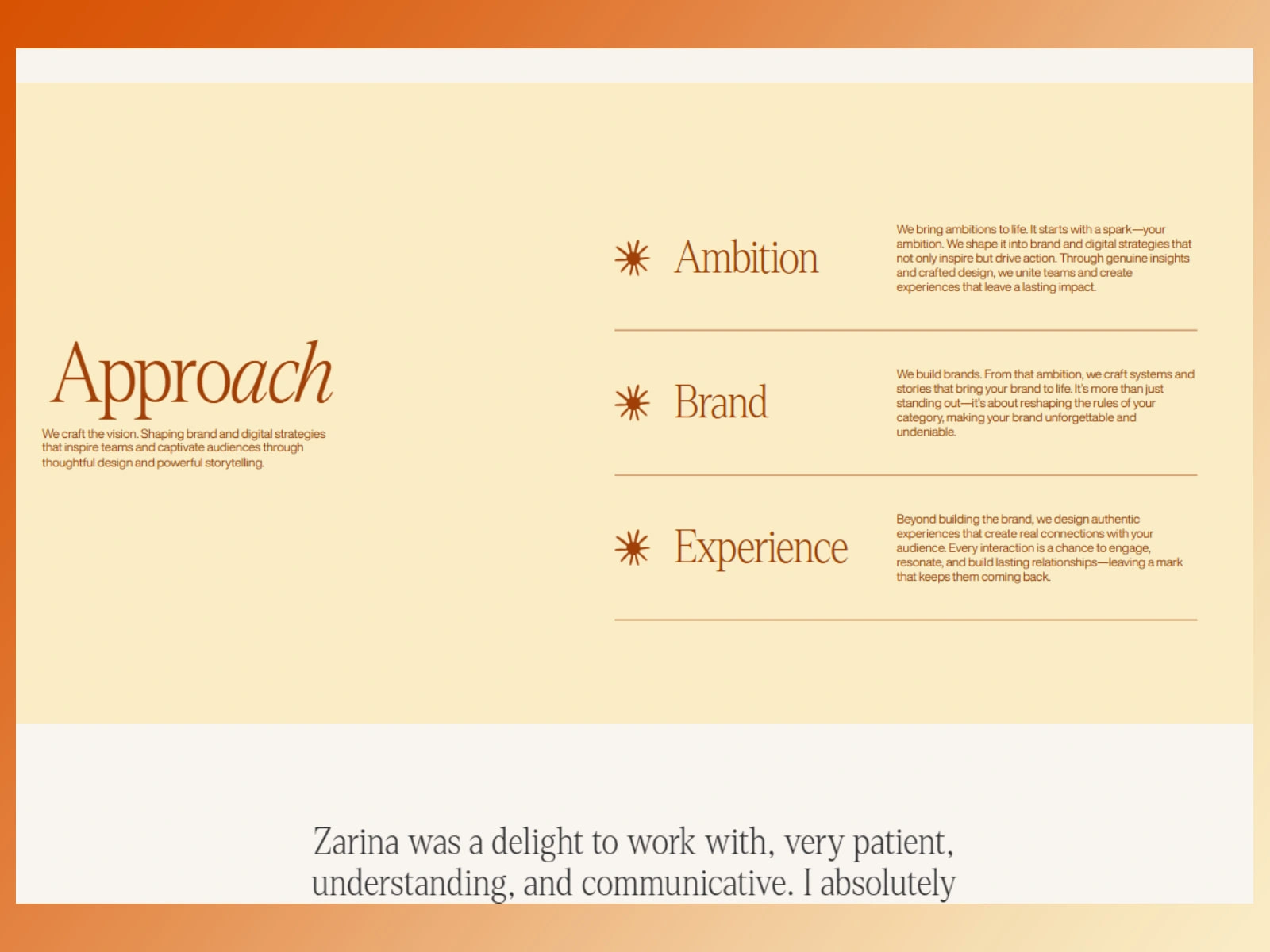
Creative Strategy
The core strategy was built around three principles:
1. Interaction over static presentation
Instead of standard layouts, I introduced motion-driven and behavior-based sections that invited users to interact with the content.
2. Personality-first design
Every section needed to feel human, expressive, and artistically intentional—not corporate or overly structured.
3. Visual storytelling
Projects were not simply displayed; they were presented as experiences with rhythm, spacing, layering, and movement.
This helped create a stronger emotional connection between visitors and the artist’s work.
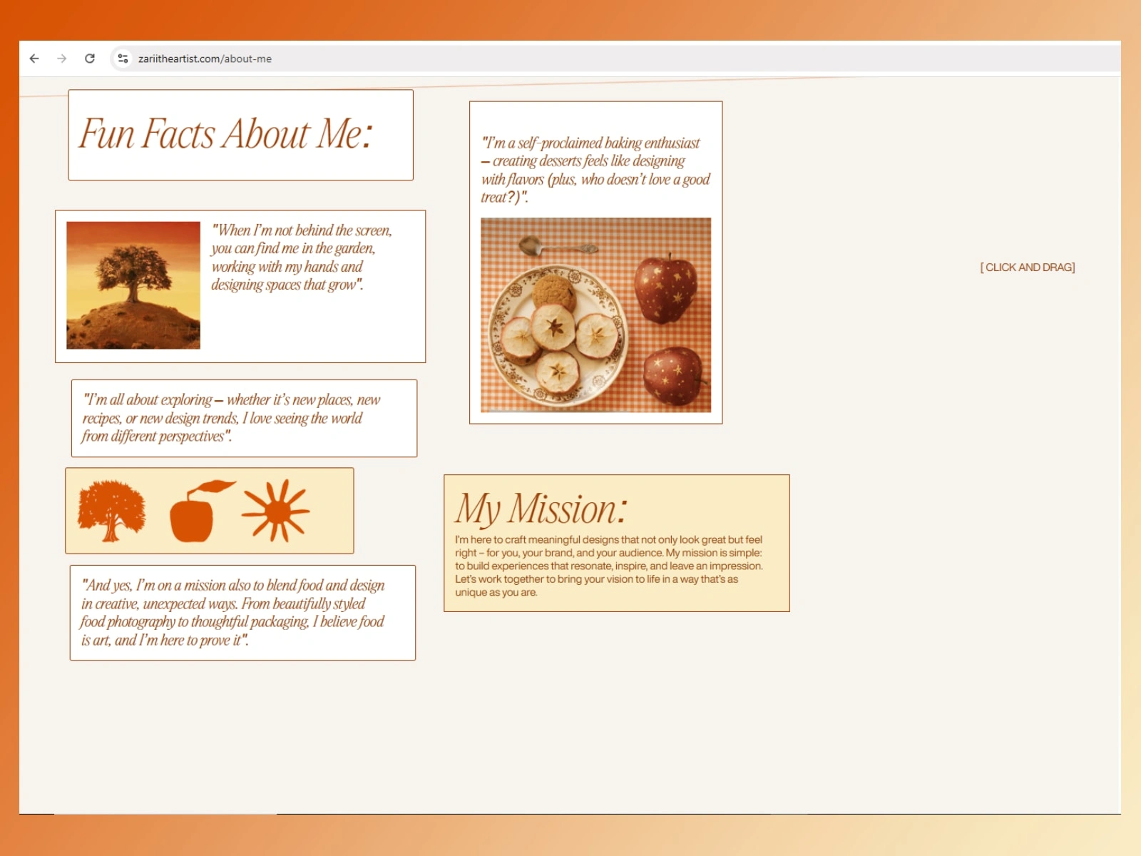
About Page — Draggable Cards Experience
One of the most distinctive features of the site is the draggable cards section on the About page.
Rather than using a conventional biography layout, I designed the About section as an interactive space where visitors could physically engage with content by dragging layered cards around the screen. This transformed passive reading into active exploration.
Why this worked
The draggable cards created:
A playful and memorable first impression
A stronger reflection of the artist’s personality
Higher engagement compared to static text blocks
A tactile experience that made the page feel alive
Each card was positioned intentionally to create a collage-like visual language—almost like pieces of an artist’s sketchboard. Visitors could rearrange the cards naturally, making the experience feel personal and unscripted.
This approach supported the brand identity far better than a standard About page ever could.
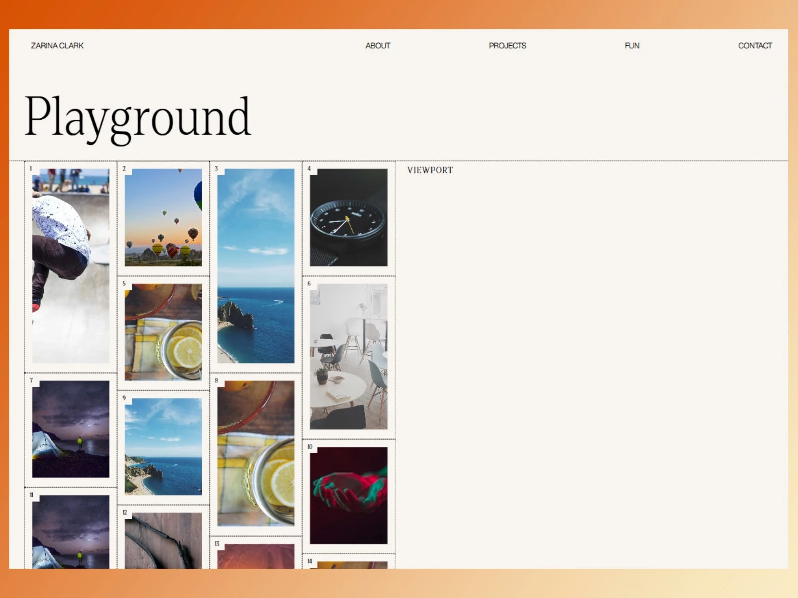
Fun Projects Section — Innovative Interactive Layout
Another standout area was the Fun Projects showcase, where I designed a more experimental and innovative layout to present projects in a way that encouraged discovery.
Instead of a standard project grid, I created a more dynamic composition that allowed the work to feel curated and exploratory. The structure was intentionally less predictable, helping users move through projects with curiosity rather than routine scrolling.
Design goals for this section
Make project browsing feel interactive
Break away from conventional portfolio layouts
Highlight creativity through layout itself
Improve visual retention and project memorability
The spacing, arrangement, and flow were designed to mimic the feeling of browsing creative work in a studio environment rather than clicking through a corporate portfolio.
This gave the section stronger emotional impact and made the showcased work feel more premium and intentional.
Webflow Development Approach
Although the project began from a template foundation, most high-value sections were rebuilt or newly created from scratch.
My Webflow workflow included:
Custom structure rebuilding for flexibility
Section-by-section redesign for originality
Clean class architecture for scalability
Responsive adjustments for mobile and tablet
Performance-conscious interaction handling
Smooth visual transitions without overloading the experience
The goal was not just visual design—but creating a maintainable, scalable Webflow build that felt custom-built throughout.
Results
The final website successfully delivered:
A fully customized creative portfolio experience
Stronger brand personality through interaction design
Higher engagement through draggable and exploratory sections
A memorable About page experience
A standout project showcase through innovative layout design
A premium visual identity beyond the original template structure
Most importantly, the site feels like the artist—not like a template.
That transformation was the real success of the project.
Final Reflection
This project was a strong example of how creative freedom, when paired with strategic UX thinking, can turn a simple template foundation into a highly distinctive digital experience.
The draggable About page cards and the Fun Projects interactive showcase became defining features of the website because they served both aesthetics and purpose—they made the brand more human, more memorable, and more engaging.
Rather than just building a website, the goal was to create a digital experience that visitors would remember.
And that is exactly what this project achieved.
Like this project
Posted Apr 28, 2026
Developed an interactive and personalized artist's website in Webflow.
Likes
0
Views
11
Timeline
Jan 14, 2026 - Feb 27, 2026