Built with Jitter
Sefer - Brand Identity

Margo Syniakova


Core Concept
Some places stay with you long after you leave.
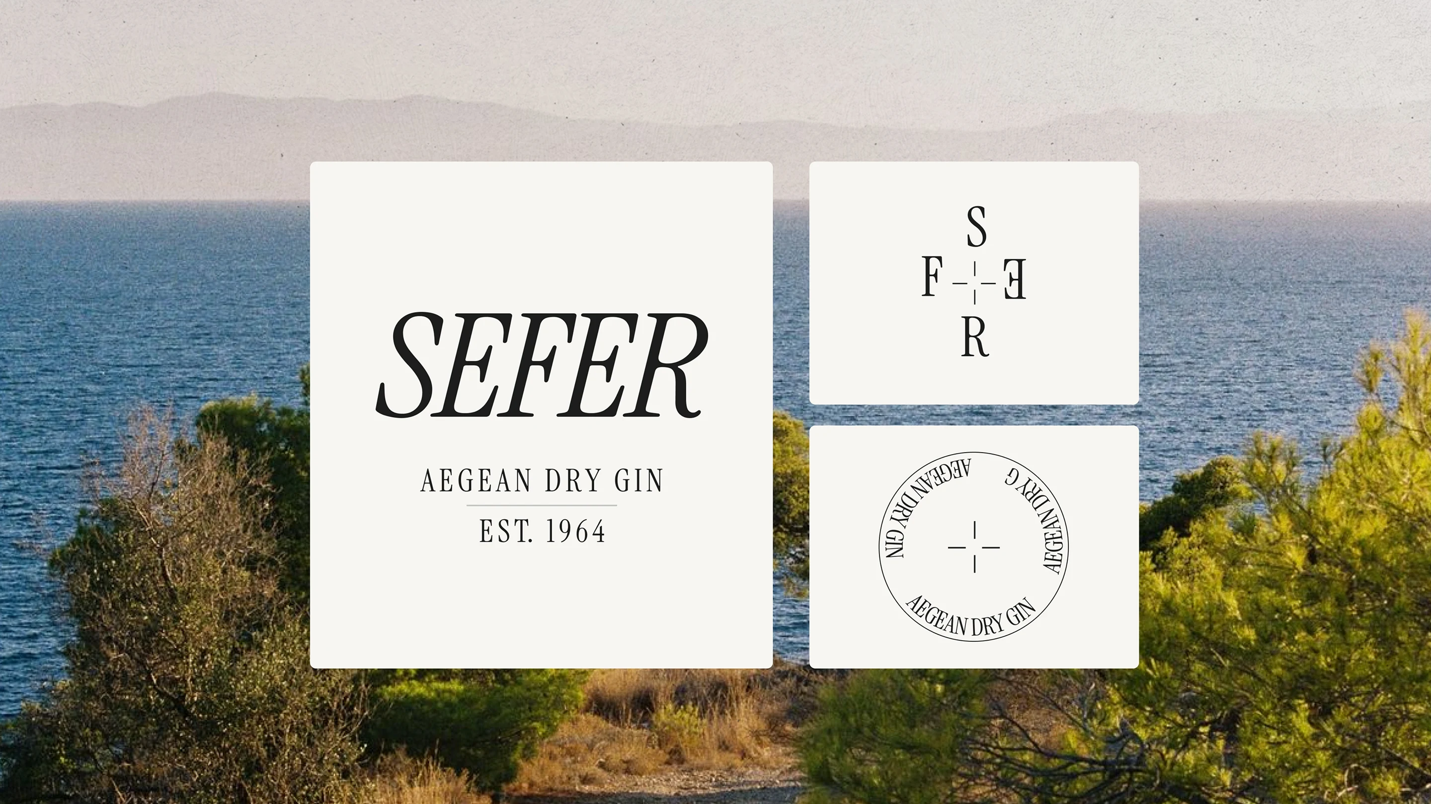
SEFER explores place as memory: the small details that stay vivid long after a journey ends.
A silhouette against the coast, the texture of sun-dried earth, a particular shade of blue. These fragments shaped a visual world where the Aegean is never illustrated literally. It is recalled through form, color, material and atmosphere — allowing the brand to feel deeply local while remaining contemporary.
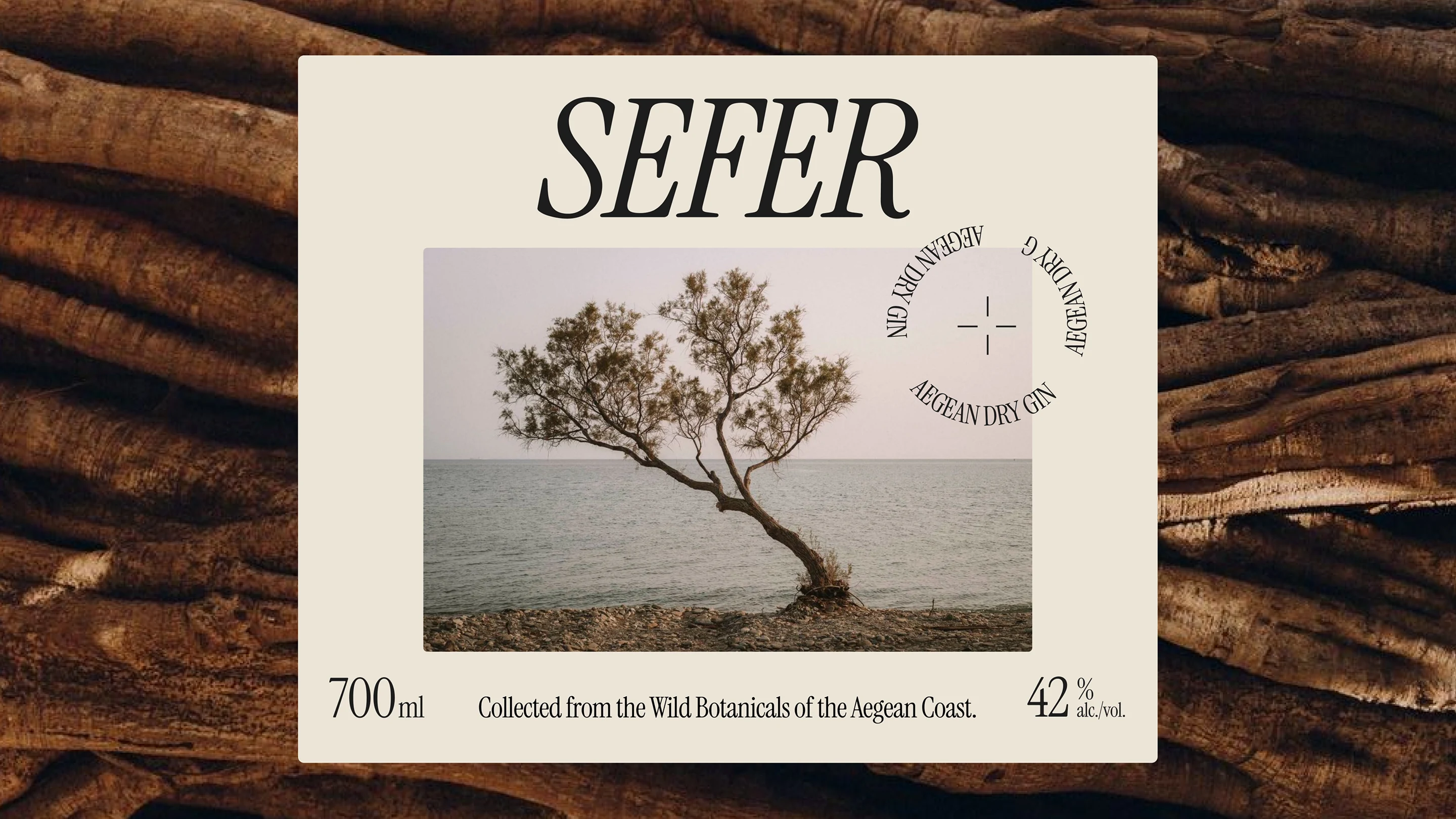
Brand Symbol
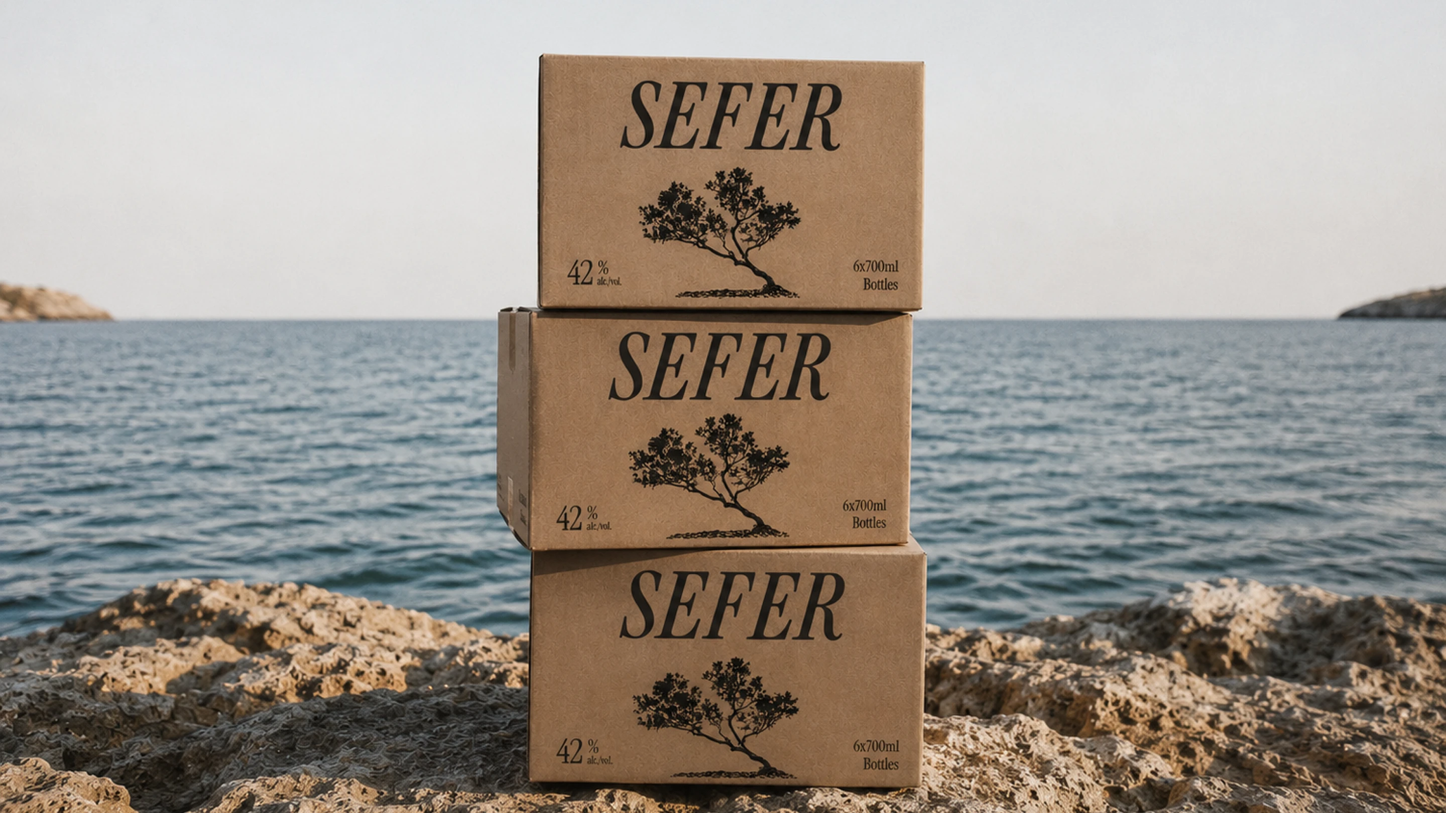
One tree, shaped by years of Aegean wind.
Along the coast, trees grow in the direction of the prevailing wind, their silhouettes becoming an accidental record of the landscape around them. One of these forms became SEFER’s defining mark. Reduced to its essential gesture, the tree feels almost drawn by the wind itself — irregular, directional and unmistakably tied to its surroundings. More than a logo, it acts as a small piece of geography carried across the brand.
Like this project
Posted Sep 6, 2026
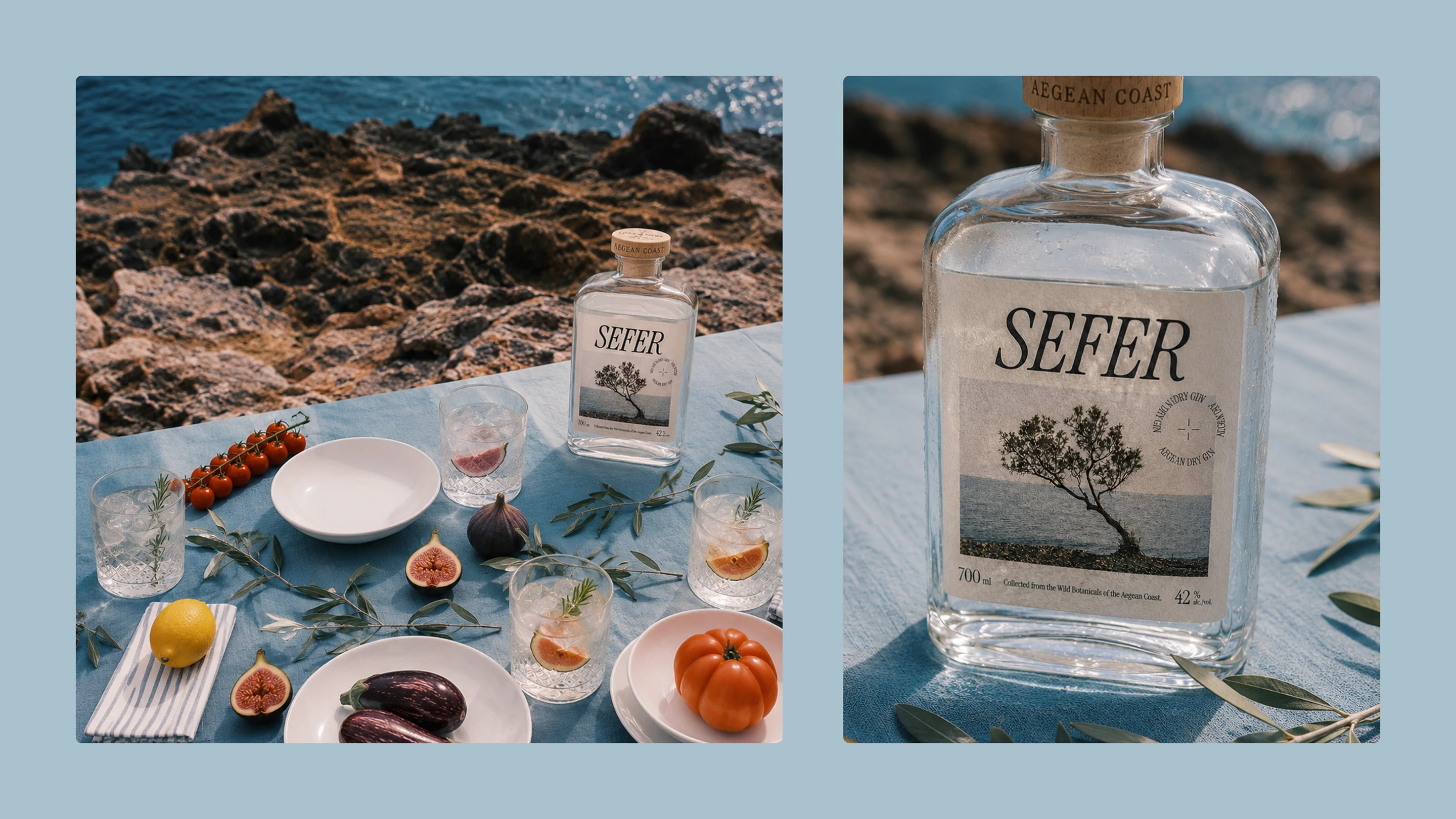
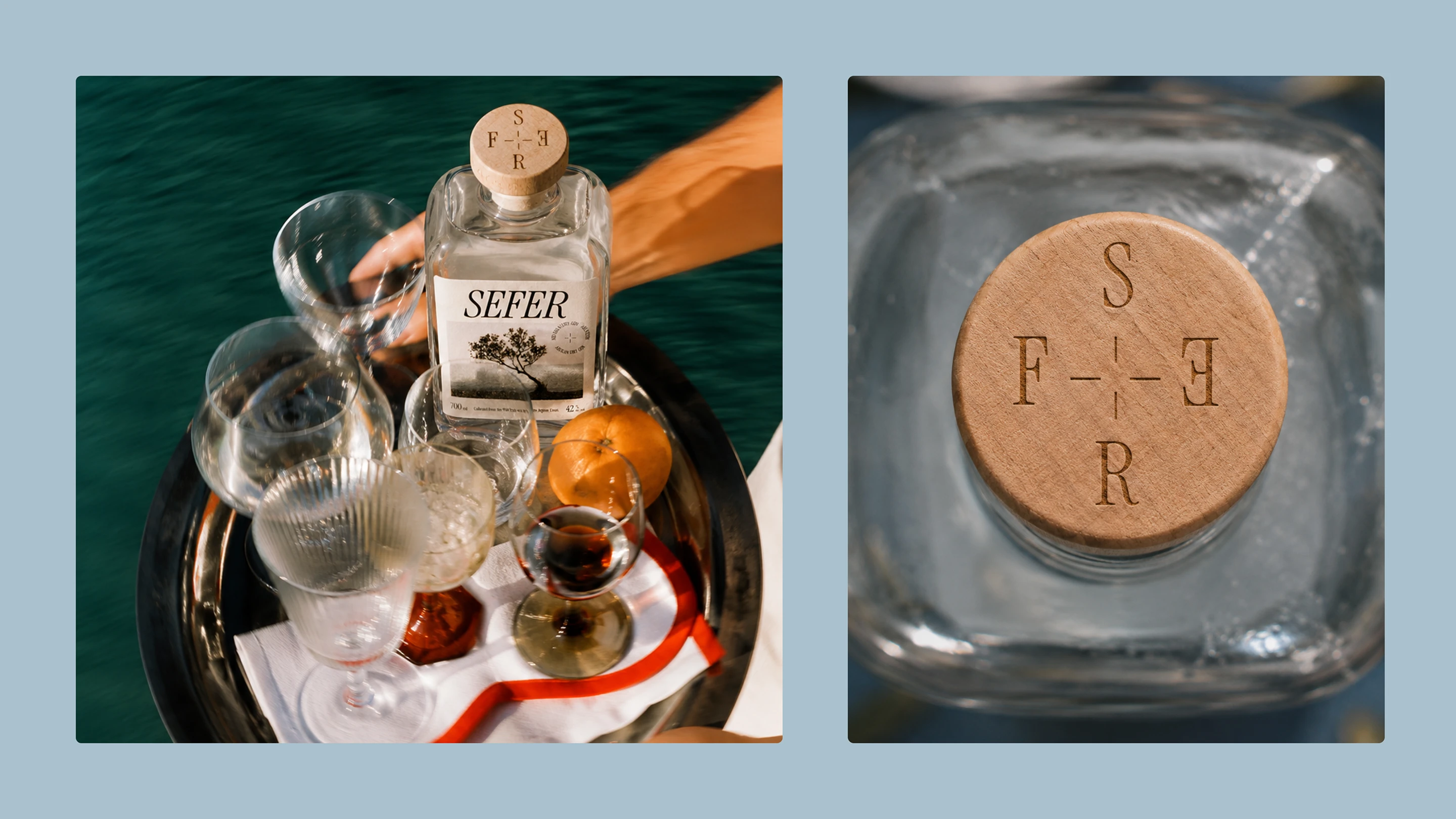
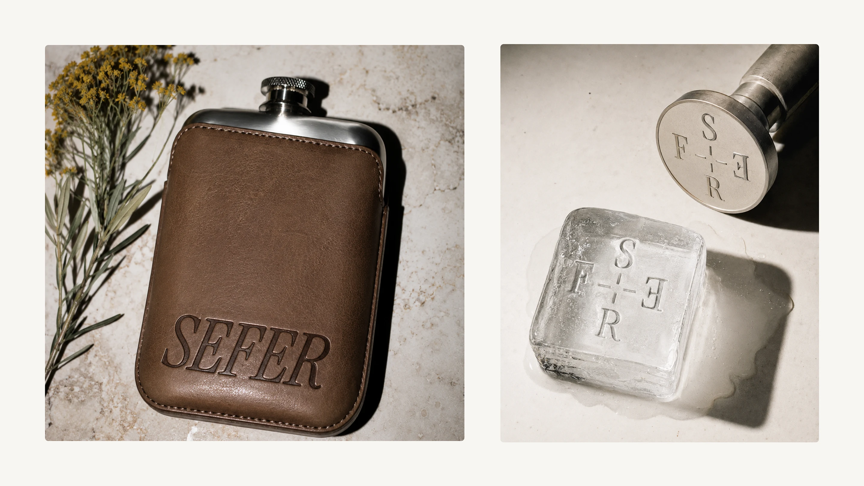
Sefer is an Aegean gin brand shaped by place and memory. A windswept coastal tree became its symbol of a lasting connection to the land.
Likes
2
Views
5
Timeline
Jun 25, 2026 - Sep 2, 2026