KIN — Unbreakable Aviation Identity
Ray Loop
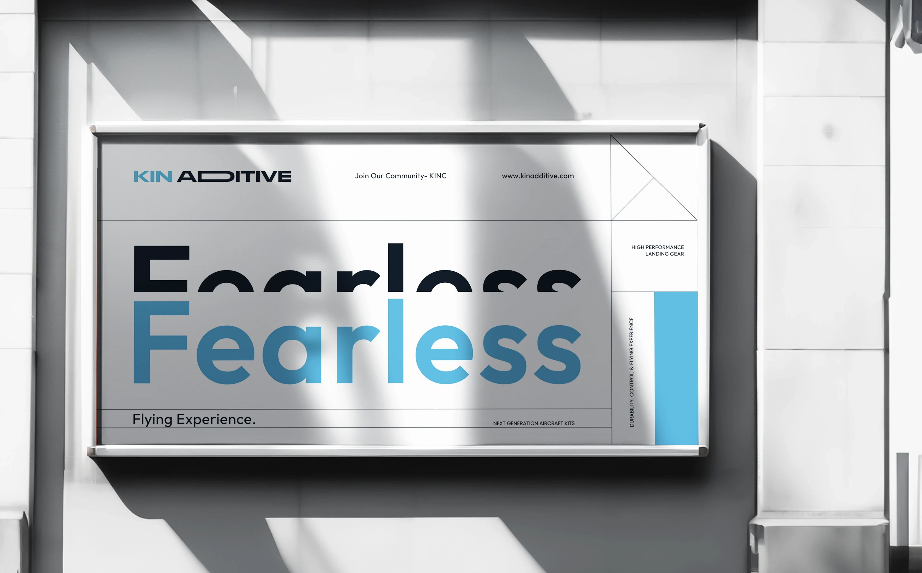
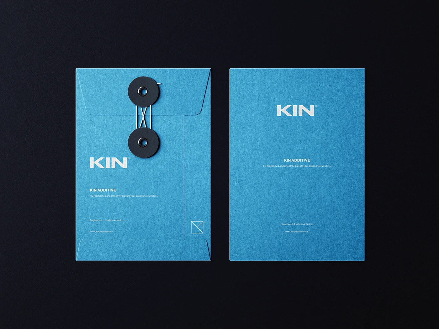
Fly fearlessly. Land smoothly. Elevate your experience with KIN.
KIN ADDITIVE
At KIN Additive, we are innovators and aviation enthusiasts dedicated to pushing the limits of RC flight. Specializing in high-performance landing gear and next-generation aircraft kits, we engineer solutions that enhance durability, control, and overall flying experience.
Our landing gear absorbs impact, reduces wear and tear, and ensures smoother landings—allowing pilots to fly with confidence. Designed for intermediate to professional pilots, our products combine cutting-edge materials, precision engineering, and next-gen technology.
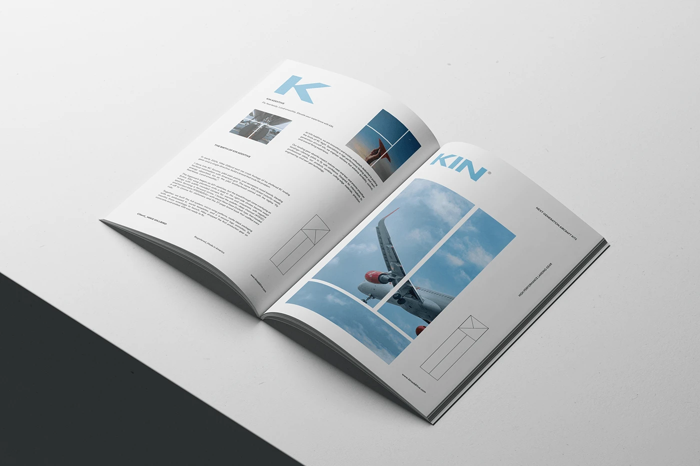
The Birth of KIN Additive
In early 2024, Mike Gillbird sent me crash footage of his shattered RC landing gear and a single directive: build a brand that ends the problem.
We dove into RC forums, pilot pain points, and aerospace mood boards, blending tactical minimalism with American grit. The name KIN clicked instantly—kinetic energy absorbed, kin as the pilot brotherhood—paired with the tagline “Fly fearlessly. Land smoothly.”
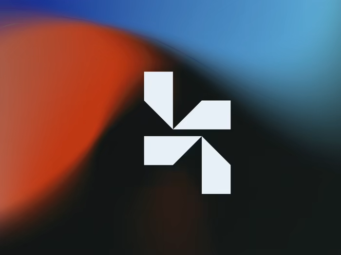
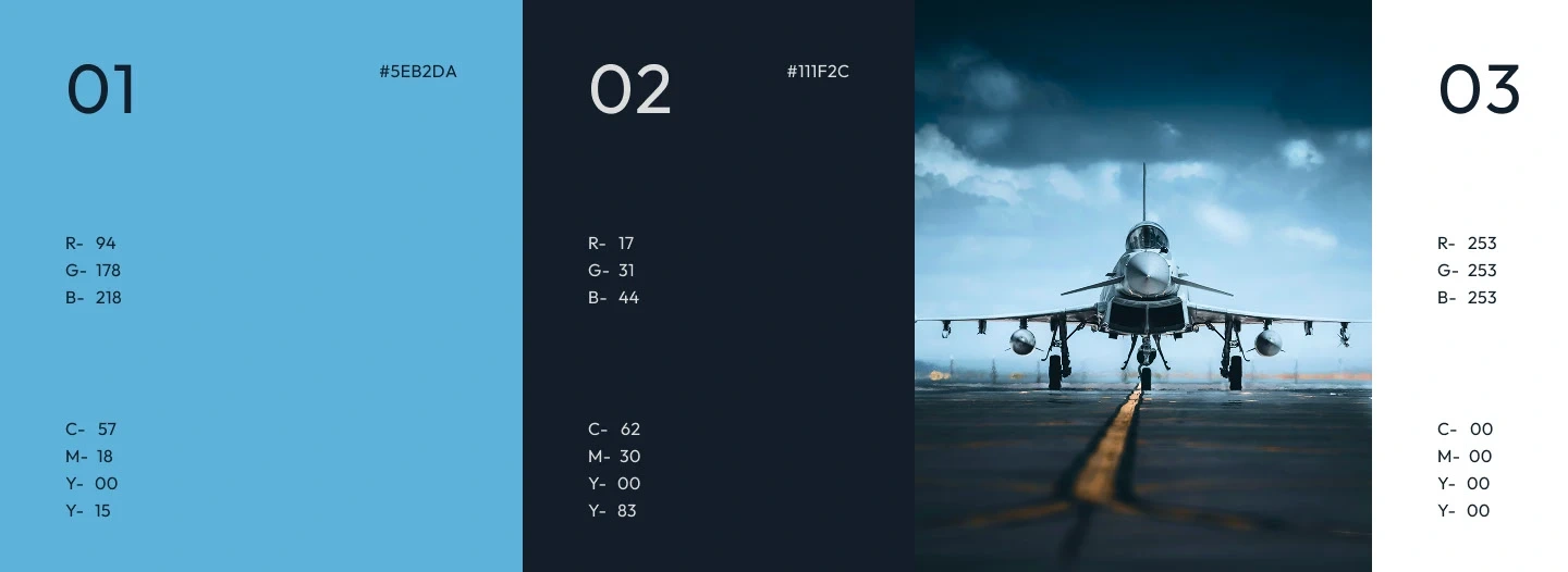
The logomark began as 60+ sketches, but the breakthrough came from overlaying an Extra 330 wing planform onto a bold K: the right-side strokes became swept wings with subtle rounded corners for warmth and uniqueness, with negative space forming a forward arrow. I locked the palette—deep charcoal (#111F2C) and horizon blue (#5EEB2DA)—with sharp Neue Haas Grotesk type, then handed it off to Umme for stationery and the 37-page brand book that codified every rule.
Together, we built the full system: micro-wing patterns, matte-black packaging with an embossed K, social templates, and a 4-second logo animation. Six months from wreckage to launch, Mike dropped the first production gear on concrete and smiled. KIN was ready to fly.
Designer's Challenge
When Mike first approached us, the brief felt deceptively simple: minimal, memorable, and nothing that screams “airplane” on first glance. As a team that had never touched aviation branding, we were stepping onto an unfamiliar runway. Mike didn’t want a silhouette of a plane or a propeller in the logo—he wanted the essence of flight hidden inside something that could just as easily belong to a tech startup or a high-end tool brand.
How do you encode wings, speed, and kinetic energy into a single letter without ever drawing an actual aircraft?
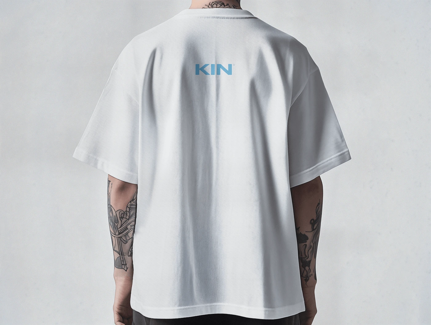
We lived in sketchbooks for weeks, dissecting wing planforms, landing-gear struts, and the negative space inside turbine blades. The breakthrough came when we projected a top-down view of a high-performance aerobatic wing onto a bold capital K. The two diagonal strokes on the right naturally mirrored the sweep and taper of wings, while subtle corner rounding removed any harsh corporate edge and injected just enough approachability. We built three locked variations—the standalone logomark (the wing-K), the compact “KIN” wordmark, and the full “KIN Additive” lockup—so the identity flexes from a tiny favicon to hangar-sized signage yet never loses its fingerprint. Every curve and angle was stress-tested: recognizable at 16 px, unmistakable at 16 feet.
Now what about the color scheme?
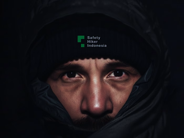
Color was the final battle. Early palettes leaned too “serious aerospace” (cold greys and military greens) or too toy-like. We needed something bright enough to feel playful and confident, yet unique enough to own the shelf. After testing more than ninety blues, we landed on a saturated sky-blue that reads electric against deep charcoal—vibrant like the moment the sun catches a canopy at dawn, optimistic like the split-second before wheels touch. Paired with near-black and clean white, it gives KIN the rare ability to feel premium and approachable at the same time: fearless enough for the pros who hammer their planes, welcoming enough for the weekend warriors who just want to land in one piece. The blue became the brand’s signature—on edge-painted business cards, on box tear-strips, on the lanyard Mike wears at every fly-in—quietly whispering sky while the hidden wings in the K do the rest of the talking.
Like this project
Posted Dec 4, 2025
KIN Additive is a cool American brand. They make super-strong gear and plane kits so RC pilots can go wild in the air and still land safely.
Likes
1
Views
8
Timeline
Jan 1, 2024 - Ongoing