Prototyped E-Commerce Tool for Construction
Project Summary
I designed, prototyped, and tested two user flows in Figma for a client in the professional roofing industry. The client wanted a quote builder for his eCommerce store that sold roofing shingles and accessories to professional, independent roofers at lower prices.
The first flow was a questionnaire about products required that generated a quote. After testing and iterating, the second flow was a more automatic, pre-populated shopping cart.
While the second iteration performed well in tests, the client abandoned the project as not commercially viable before we could perform further tests.
Introduction: Roofing shingle industry disruptor!
My client has been looking for more industries to disrupt with technology ever since he kicked in the commercial door industry (followed promptly by the restroom partition industry).
For this project, he wanted to rapid prototype an eCommerce solution for buying roofing shingles.
The User: Roofers are buying shingles from the seat of a pickup truck
Lots of user research wasn't in the scope for this project, but the client knew the industry and was able to provide some general details about the buyers. Our users were:
Professional, independent roofers
Mobile device users
Buying shingles while they were riding between job sites
Looking for lower prices
Looking for better customer service
Looking for streamlined buying process
Mostly male, between 25 and 45
The Problem: Our user needs a way to buy roofing shingles and accessories easily, quickly, and from a mobile device
My client wanted to test a simple questionnaire flow that would create automated quotes for users. We looked at a few inspiration sites, including Sunday's lawn analysis tool.
Sketches
I started sketching flows in my notebook. As my client and I continued talking through the buying process and adding accessories, the "simple questionnaire" started to become a little longer and more complex, but no choice we were asking users to make was unnecessary.
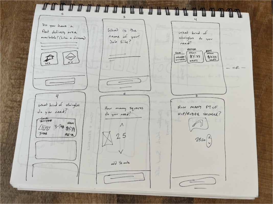
Sketching flows for our roof shingle website
I took the sketches and created wireframes in Figma. We started putting the questionnaire into people's hands using Figma Mirror, and the feedback we got was generally positive. Our test users completed the flow without difficulty, and gave feedback on bits of UI they had trouble with.
Two pieces of feedback stood out in the initial tests:
The flow was a little long.
The users weren't sure how much of an accessory they would need.
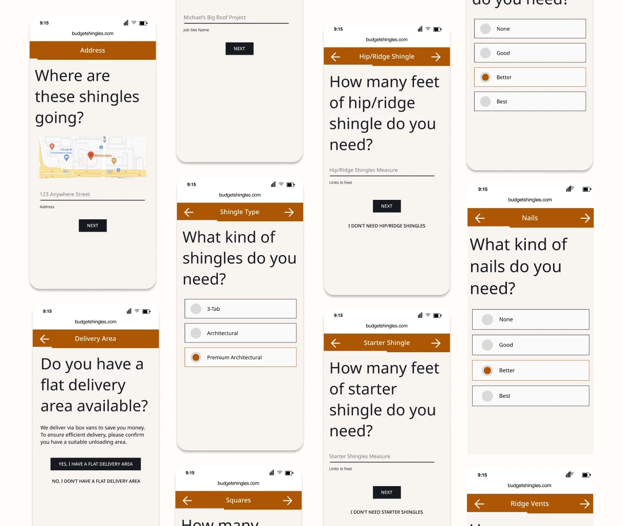
Early wireframes of the roofing shingles website
I made adjustments based on feedback, and we went to high-fidelity prototyping.
Prototyping
I worked on a minimum-viable brand, and we implemented the prototype with color styles, typography, and logos.
The flow asked users a series of questions, and followed best practices:
We had clear, simple navigation.
We gave feedback to users in the form of a progress counter.
We used images of the items, not just their names.
We accepted a variety of inputs (counter could also be tapped to enter a number from the keyboard, for example).
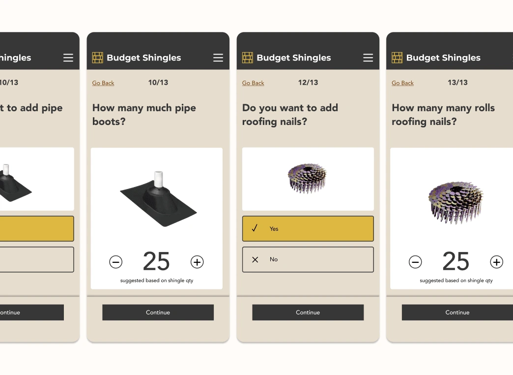
The questionnaire for our roofing shingle/roofing accessory quote builder. Yes, I noticed the typo, too.
The questionnaire still used 13 screens not counting the quote page or the contact information inputs.
And while we wanted to offer all the accessory products for roofing shingles, having them in the questionnaire seemed annoying for someone who was likely going into the website knowing exactly what they needed.
The feedback from my first tests confirmed this. The flow was long, the items didn't include prices until the very end of the flow, and this seemed like it was just a long way to build a shopping cart.
My client wanted something that I didn't think made sense after I looked at it more closely. It was worth testing, though...
..and worth quickly prototyping what I theorized could be a better way!
Sometimes, you have to do hours of bad design to do 1 hour of good design 🫠
Iteration
The building of a shopping cart was the key!
I learned from my client that we could reasonably estimate how much of an accessory item a buyer would need based on the number of roofing shingles they intended to purchase.
So I created a flow that asked the basic qualifying questions:
Contact Information (This ensured that the buyer was in an area to which we delivered)
What kind of shingles do you need?
How many units of shingles do you need?
And that's it. After buyers gave us that information, we had enough data to predict how many units of accessory products they would need and offer them as items to either add to the order or not add to the order.
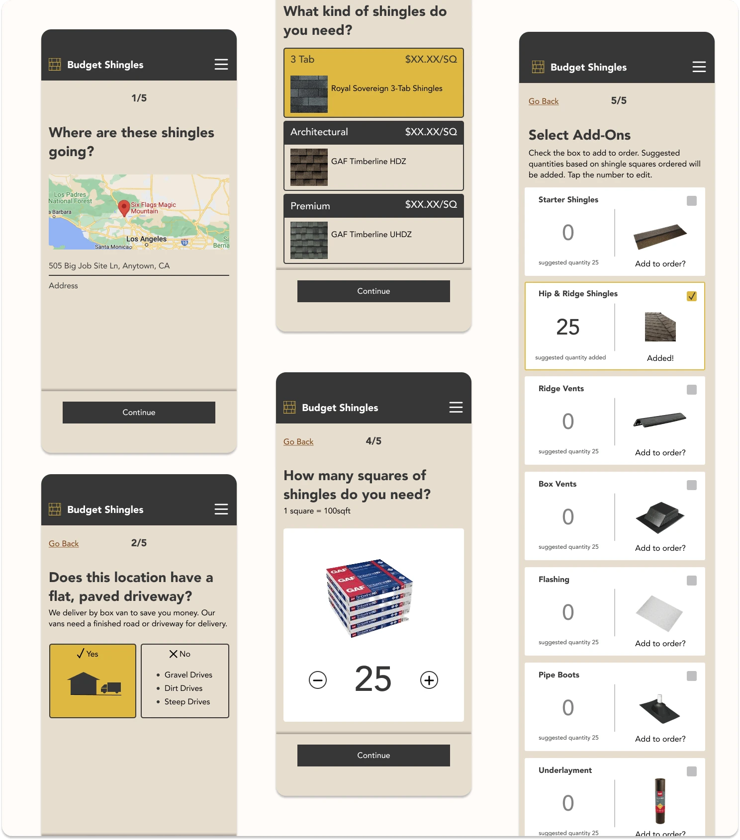
The Pre-Populated Shopping Cart of Add-ons
If the user checked that they wanted an add-on, the suggested quantity that we calculated based on their shingle order was added to the quote. If the user wanted to add a different quantity of the accessory product, they could simple type in a change.
This cut down the screens necessary by over 50%, and the flow was testing more positively with users:
They completed orders faster
They complained less about all the questions
The fact prices weren't calculated until the end of the flow seemed to bother them less
Conclusion: Some industries are hard to disrupt
While the client had high hopes for this project, he realized that the sheer volume of sales required to make money with this business would require fundraising (marketing budget, inventory, etc). So he shelved the project while we were still testing.
Things I'd change if I went back to the project
Just writing this case study, I realized that I would change a few things right off the bat:
I would test a flow where selecting a response automatically took users to the next screen. I'm not sure why I made them select an answer and then select "Continue". It made sense at the time.
I would allow for cases where multiple options can be selected. This was a minimum viable product, but if I went back to it, I would allow for users who wanted to select multiple types of shingles. If a roofer is working in a new development, it's possible that they're working on more than one house at a time and want to order more shingles.
I would make discoverability a higher priority. In the pre-populated shopping cart, I meant for the quantity to be easy to edit. In testing, it wasn't obvious that users could tap to edit the quantity.
I would test showing prices for the items. My client wanted to capture information for re-marketing purposes. He wanted to force users into a quote building flow that asked for a phone number before they got to see the price. I'd be interested to see how users responded when they knew how much items cost.
Lesson Learned
This project was a ton of fun to work on! I think the biggest takeaway I have from it is to ask why when given a brief like "create a questionnaire that builds a quote like the one they have on Sunday Lawn's website".
When I did stop to ask why, I had the idea for the "add-ons" and that dramatically reduced the effort we were putting on users to get a price.
Like this project
Posted Sep 13, 2024
Designed, Prototyped, and Testing two different flows for quote building on an eCommerce site for the professional roofing industry.
Likes
0
Views
12

