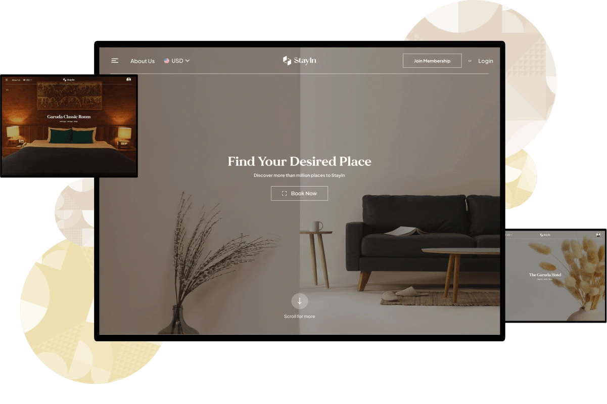
StayIn - an Accommodation Booking Platform
Project Overview
This project is a crucial part of final assignment in the Binar Academy Kampus Merdeka bootcamp. It reflects the skills and knowledge I've gained during the program. Completing this project is a significant step in my educational journey at Binar Academy Kampus Merdeka program.
The Problems
Currently, there are many accommodation booking applications that display information about lodging/hotel facilities, each with diverse and unique features. However, do these applications/websites meet the users' needs?

Research Planning
To create a design that is easy to use and provides a seamless experience, I have to know;
- What are the main reasons users choose an accommodation booking application?
- What is the most important thing for users when choosing a lodging/hotel?
These two questions became the objective of this research. After some brainstorming, I came into conclusion about the research questions and type of research that should be done.

In-depth Interview
Before I start asking a bunch of questions in my deep dive interview, I need to make a plan. I should figure out what exactly I want to know, who I want to talk to, and come up with a list of questions to ask. It's also important to make sure I'm being respectful and getting permission from the people I'm interviewing.
After all set, I tried to recruit users who willingly attend my interview session with this requirements:
1. Indonesian.
2. Has used accommodation booking platforms in the last 1 year.
I’ve managed to interview 3 person based on the criteria above. If you want to see the interview documentation, you can see below.
The interviews I conducted were spontaneous and not confined to fixed interview questions. This was done to understand users more flexibly. As a result, the interviews could proceed in a relaxed manner, allowing me to dig deeper into the information.
What I learned from the interview?
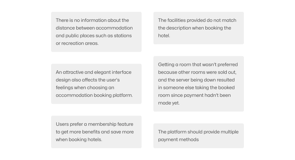
After conducting an interview with users, I did a quick analysis of the behavior and driving force for them to choose booking an accommodation. I use these insight for the next process to optimizing my design to be able to deliver good experience for users.
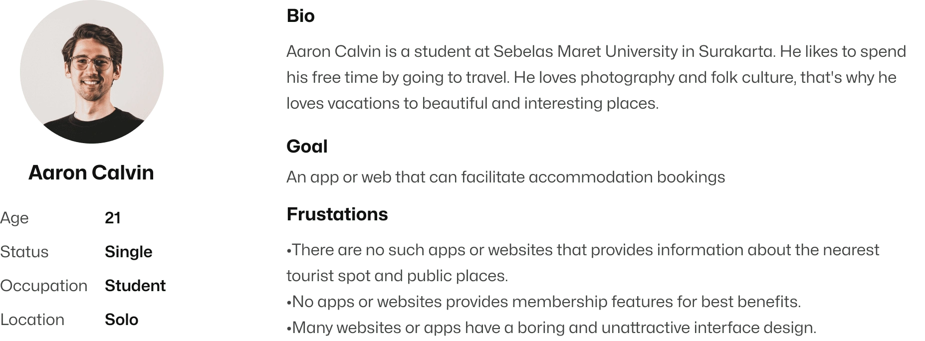
User Persona
To have the same understanding who is our user, I tried to create user persona based on the results from the user interview.
Competitive Analysis
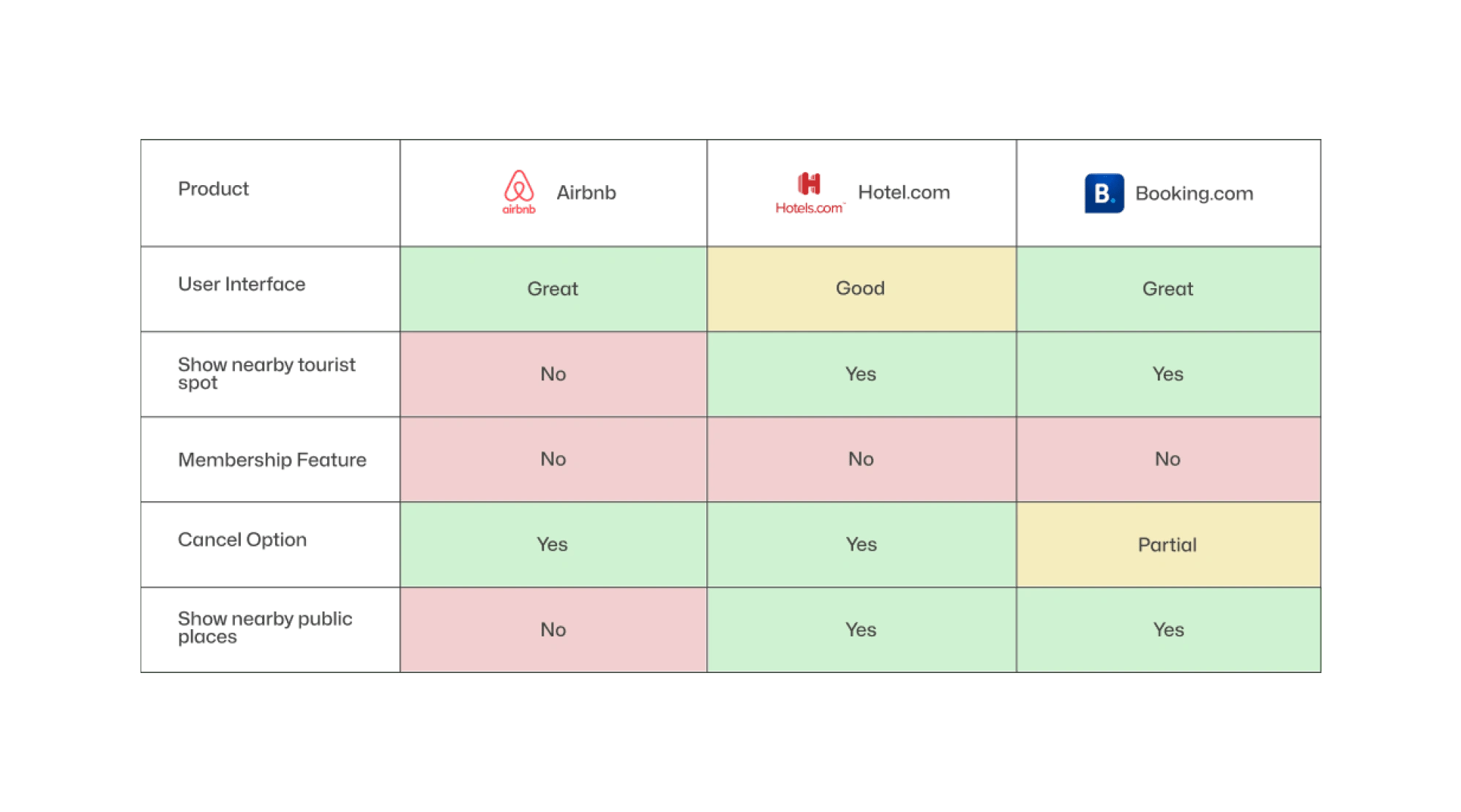
Like I mentioned earlier, there are a bunch of apps and websites made to help us book places to stay. But none of them put everything we need in one place. That's why I did a competitive analysis – to figure out what's good and bad about them, what's important to think about, and what features really matter.
Prioritization Matrix
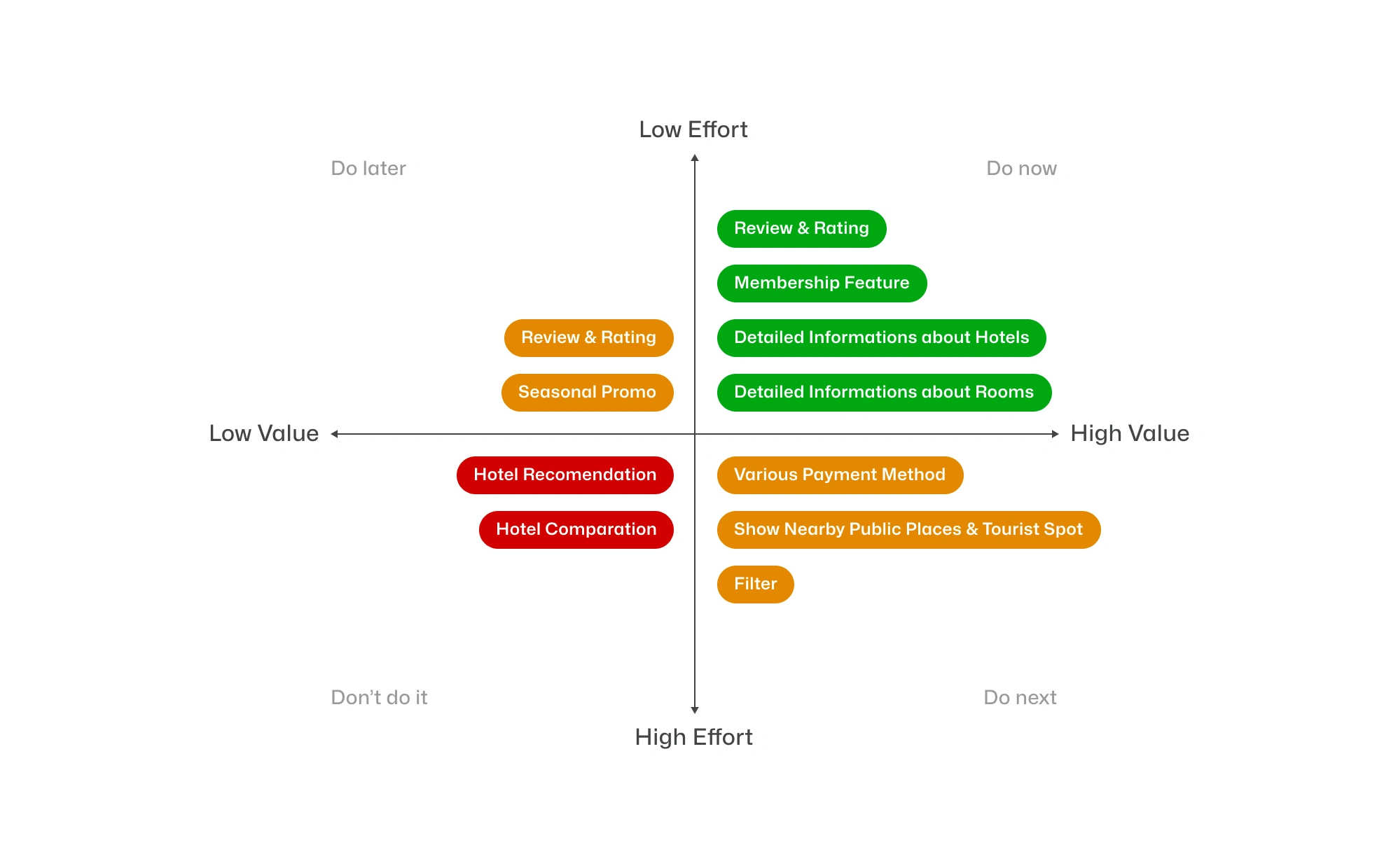
I got a bunch of ideas from the problems after doing an interview, making the user persona. and also doing competitive analysis. But I cannot apply all of these features. I used prioritization matrix to identify what should i do first.
Ideation
User Flow
Once I listed all the solutions I wanted to implement, the next thing to do is create a user flow and implement the solutions I had put together into steps.

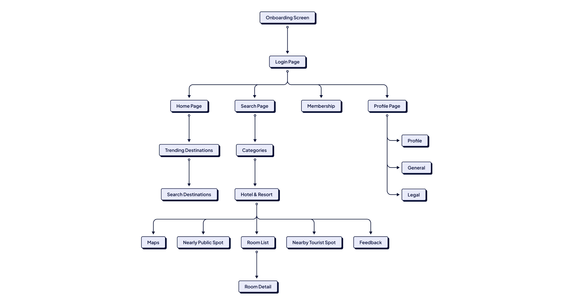
Information Architecture
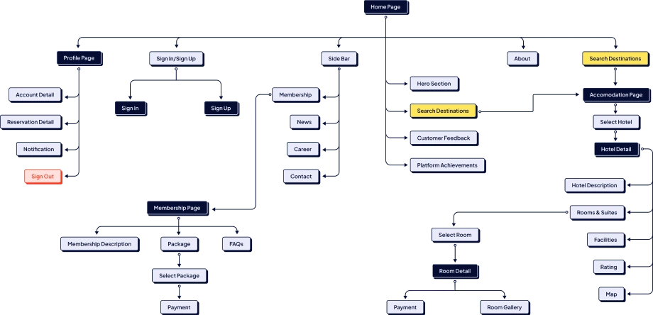
Here I try to explain the Information Architecture of websites and mobile applications. Its function is to clarify the menu structure so as not to confuse users. To make it easier to understand.
Website
Mobile
Wireframe
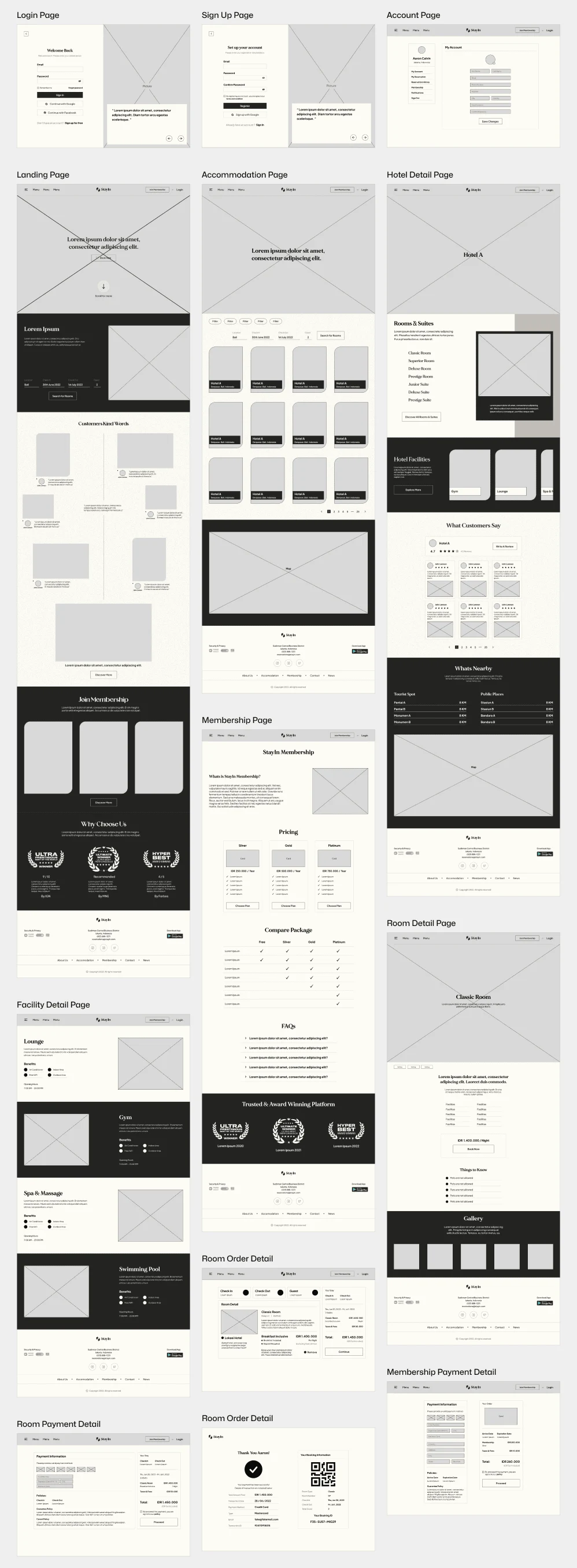
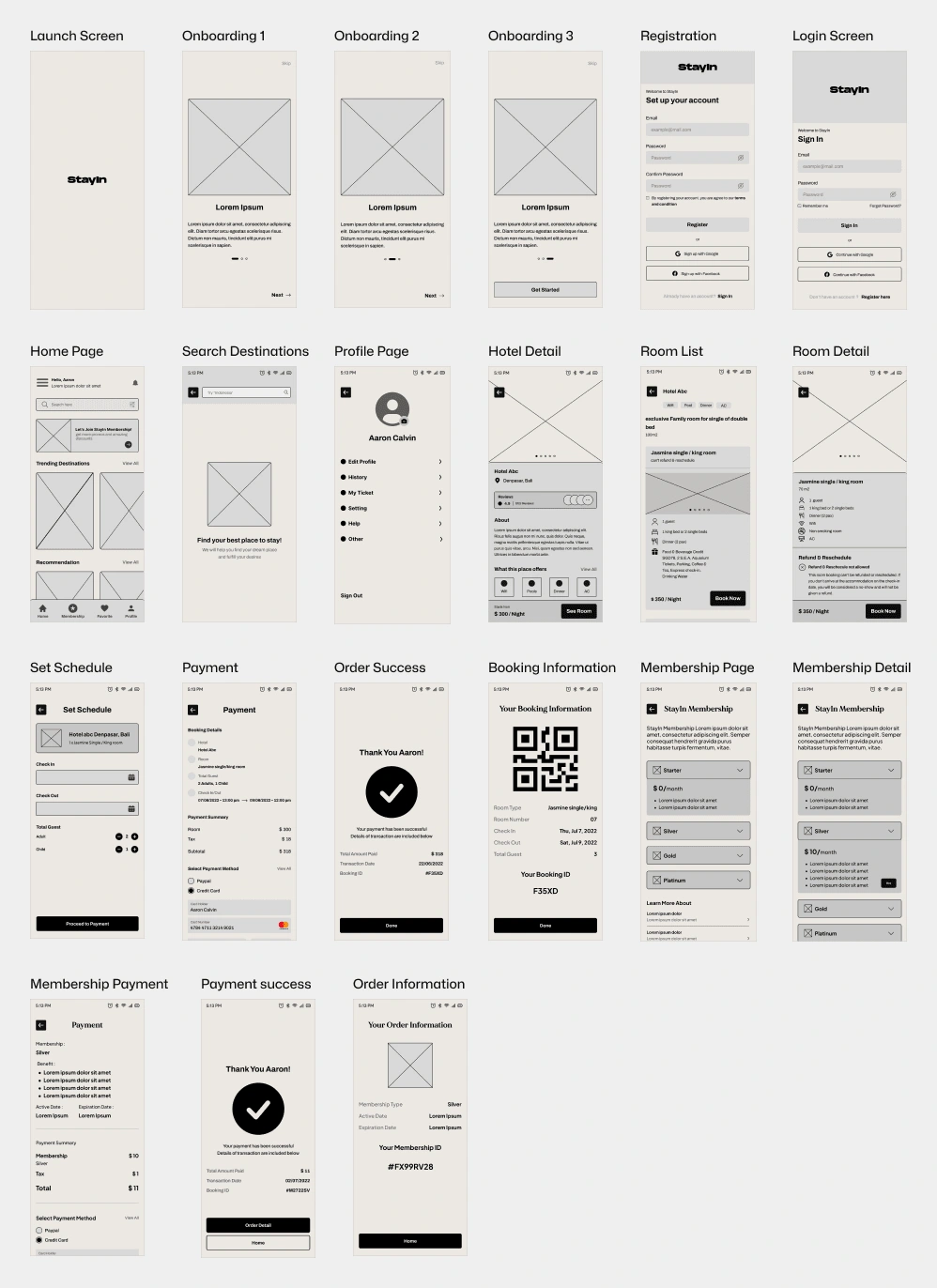
Based on the insights I learned above, I started designing wireframes using figma. I make sure to prioritize the features that best meet user needs across websites and mobile apps.
Website
Mobile
Design Exploration
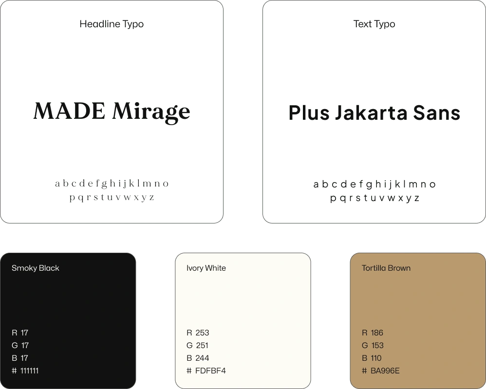
Style Guide
The colors in this design are inspired by fall season. I picked warm tones like those you see in autumn leaves. I wanted to capture the cozy and nostalgic feel of the season, making the design visually appealing and comforting.
Website Design
Based on all the user research and analysis, I create the final UI Design. Below you can find my initial exploration of what this visual style looks like. I refined them based on feedback to make sure the design is user-friendly and visually appealing.
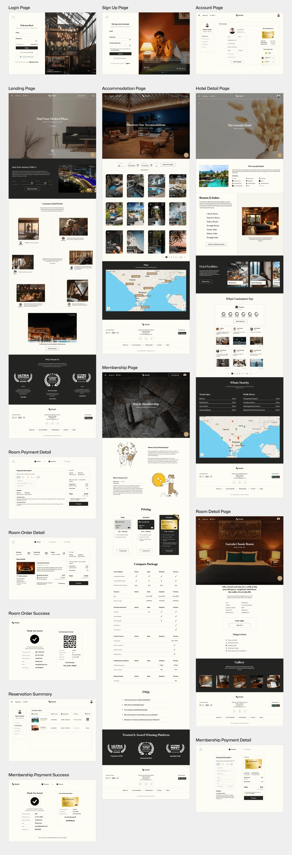
Website Prototype
Mobile Design
I also created a mobile application version, this time the mobile version is not a responsive form of the website design, but looks a little different. This aims to provide potential users with more ways to book accommodation.
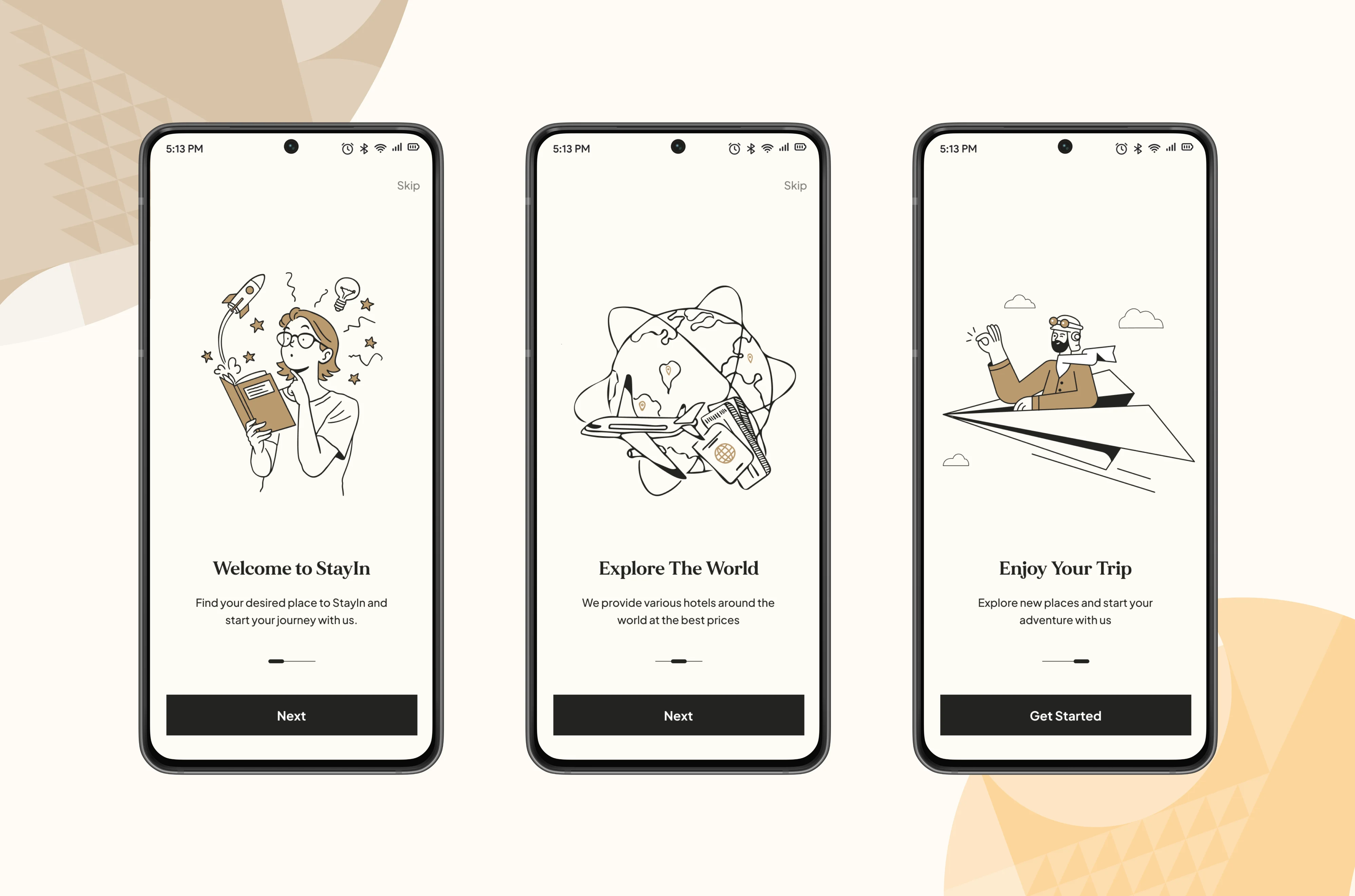
Onboarding Screen
The onboarding screen only available for new users to start their journey by clicking the “Get Started” button, doing account registration and then login. Old users will go directly to the Homepage.
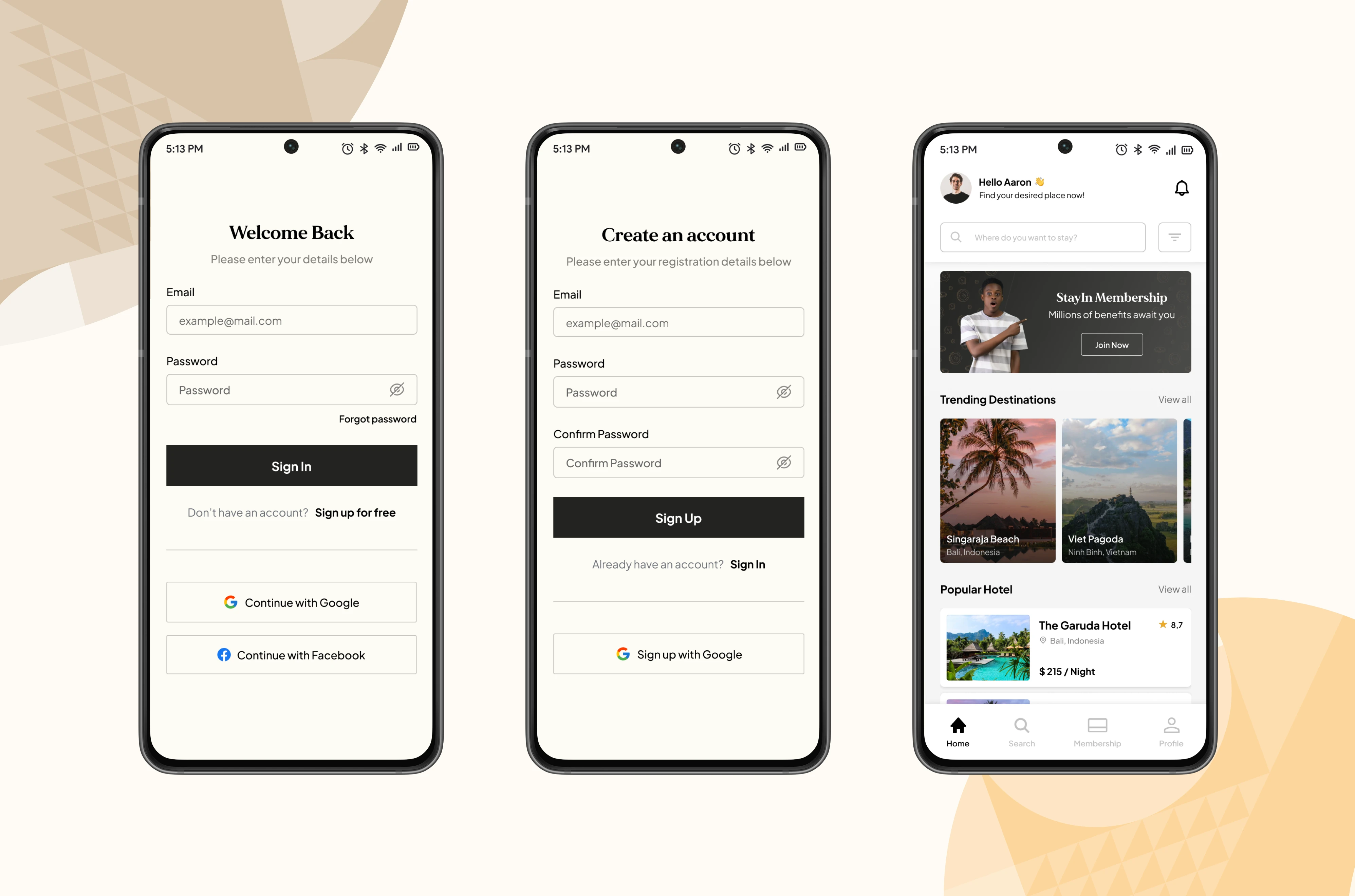
Login & Registration
Registration flow for new users only require one steps to complete. User have to fill the form in Sign Up Page. With this simple step, we can guarantee the instant activation for user so they don’t have to waste a lot of time in the process. Users can also log in with a Google account.
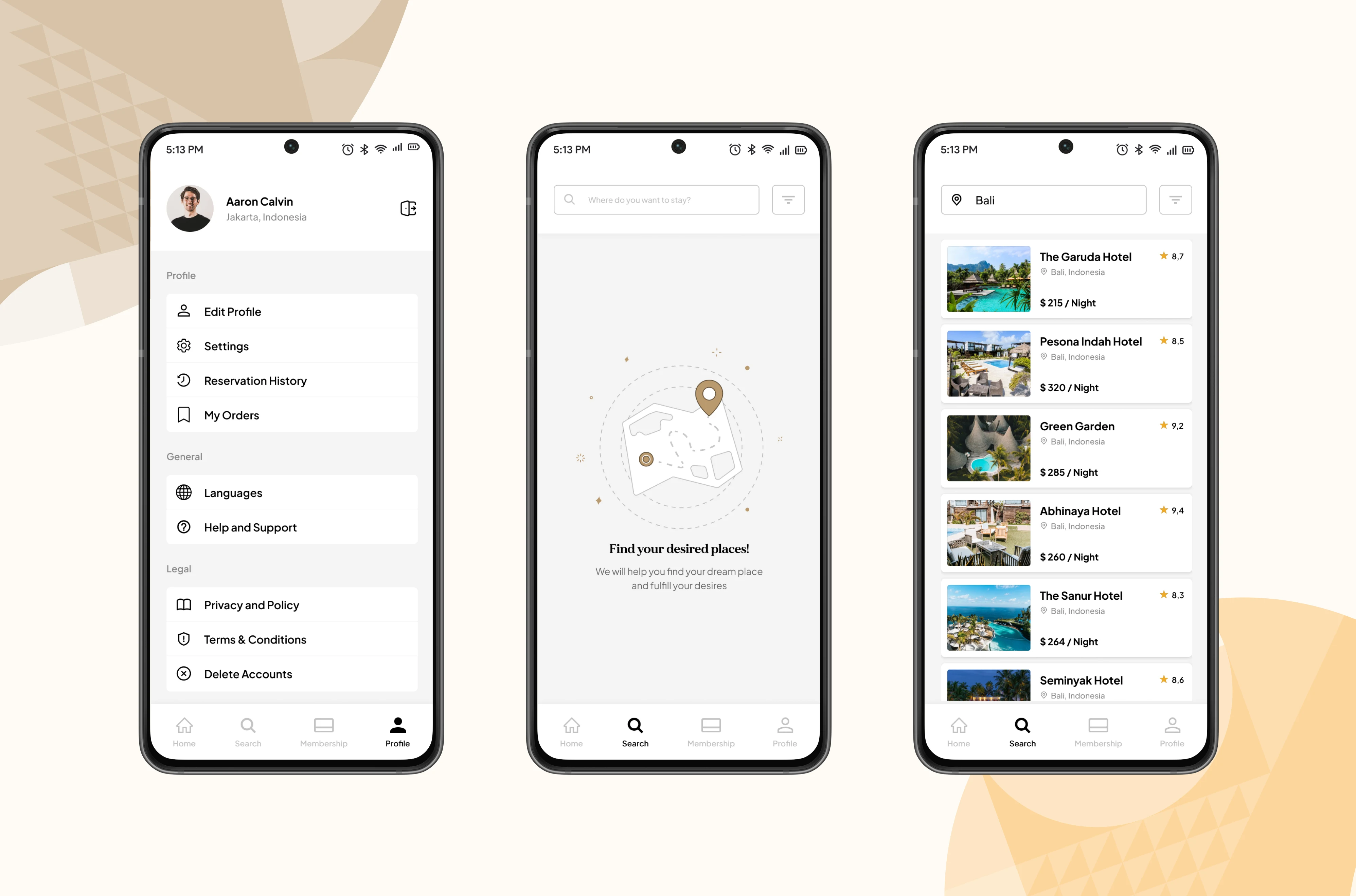
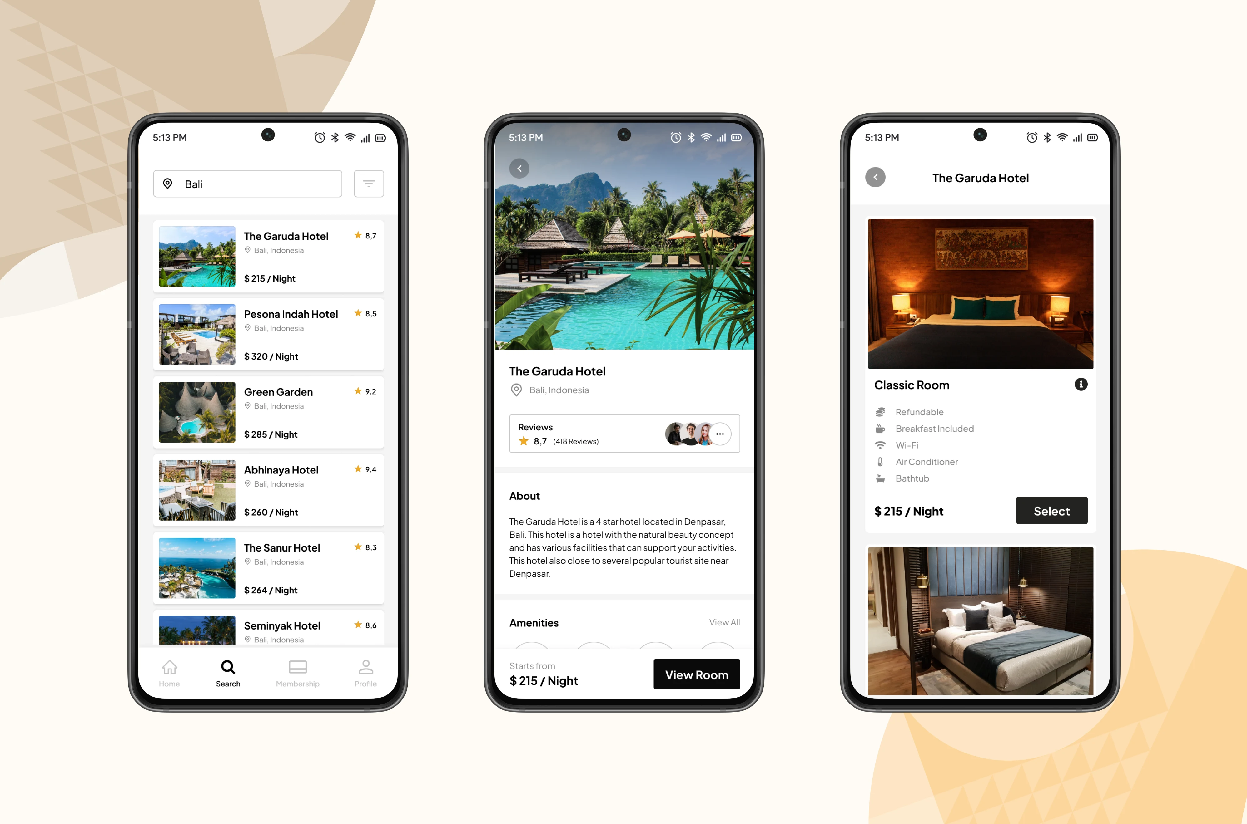
Search Destinations
-The profile page is where users can set their personal information.
-Use search icon on the navigation bar at the bottom of the screen to search for place you want to visit, the app will give you few option of accommodations.
Hotel & Room Detail
By tapping on one of the available accommodations, users will be immediately directed to the details page for that accommodation, which contains an explanation of the facilities, reviews and ratings, as well as the types of rooms available.
Booking Payment
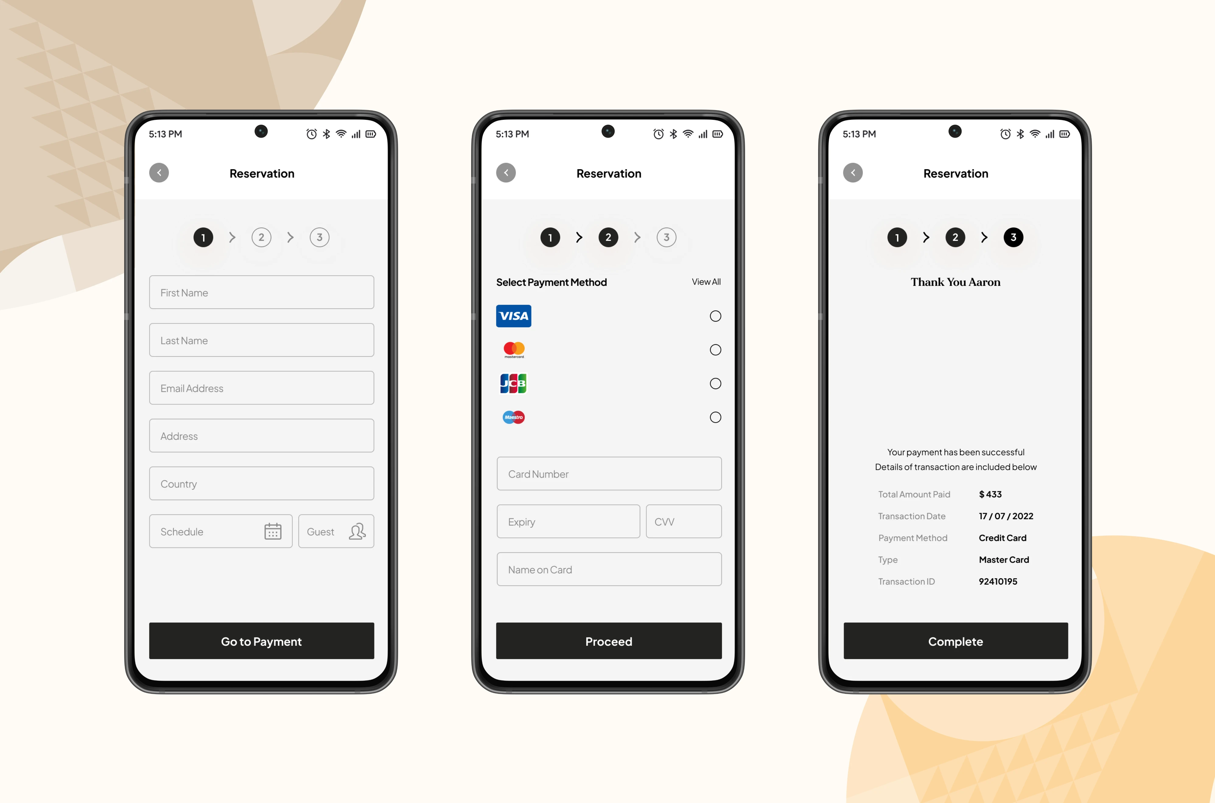
-Before a user makes a payment, the first step they must take is to fill in their personal information
-Next, the user can choose the type of payment method available
-If the transaction is successful, the user will get a booking summary
Membership
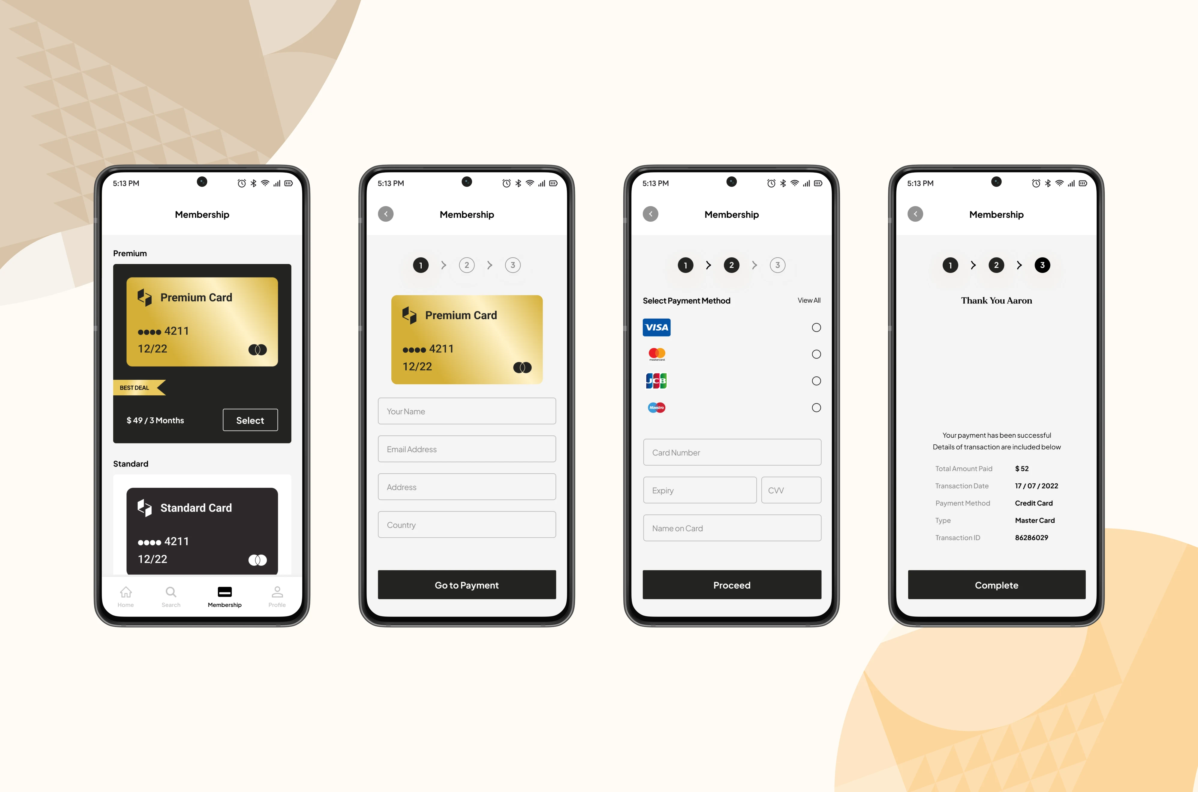
The membership feature on this platform provides 3 types of membership, the first is a basic membership with a silver card, the second is a standard membership with a black card, and the last is a premium membership with a gold card.
Mobile Prototype
Usability Testing
Once the design phase was finished, I decided to perform usability testing with actual users. The objective was to identify any issues in the design and identify potential areas for improvement based on user experiences.
For now, I'm only doing usability testing for the mobile platform, due to time constraints. I will test the website version in the next iteration.
Tasks & Scenario
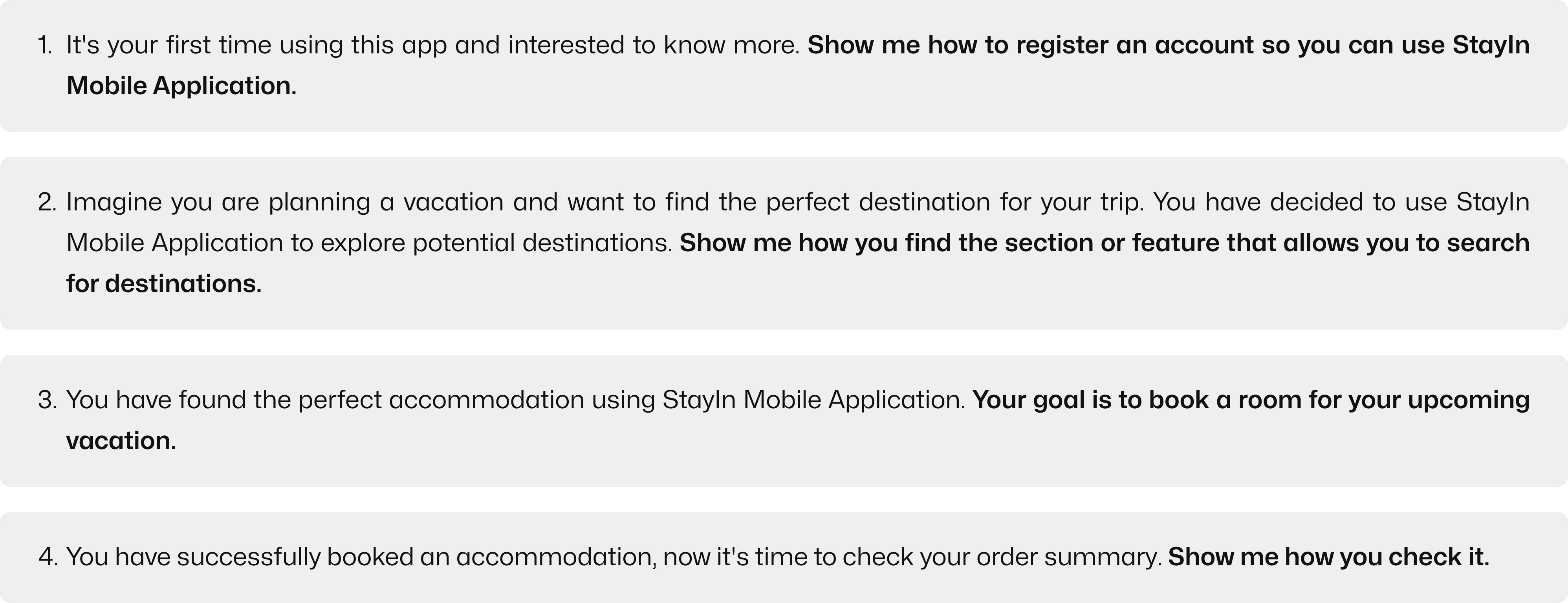
Before initiating remote testing, I developed a hypothetical scenario guiding users to complete specific tasks. I also formulated a set of questions aimed at gauging users' impressions after using the product, identifying any challenges they encountered, determining which tasks were easiest for them.
Tasks Result
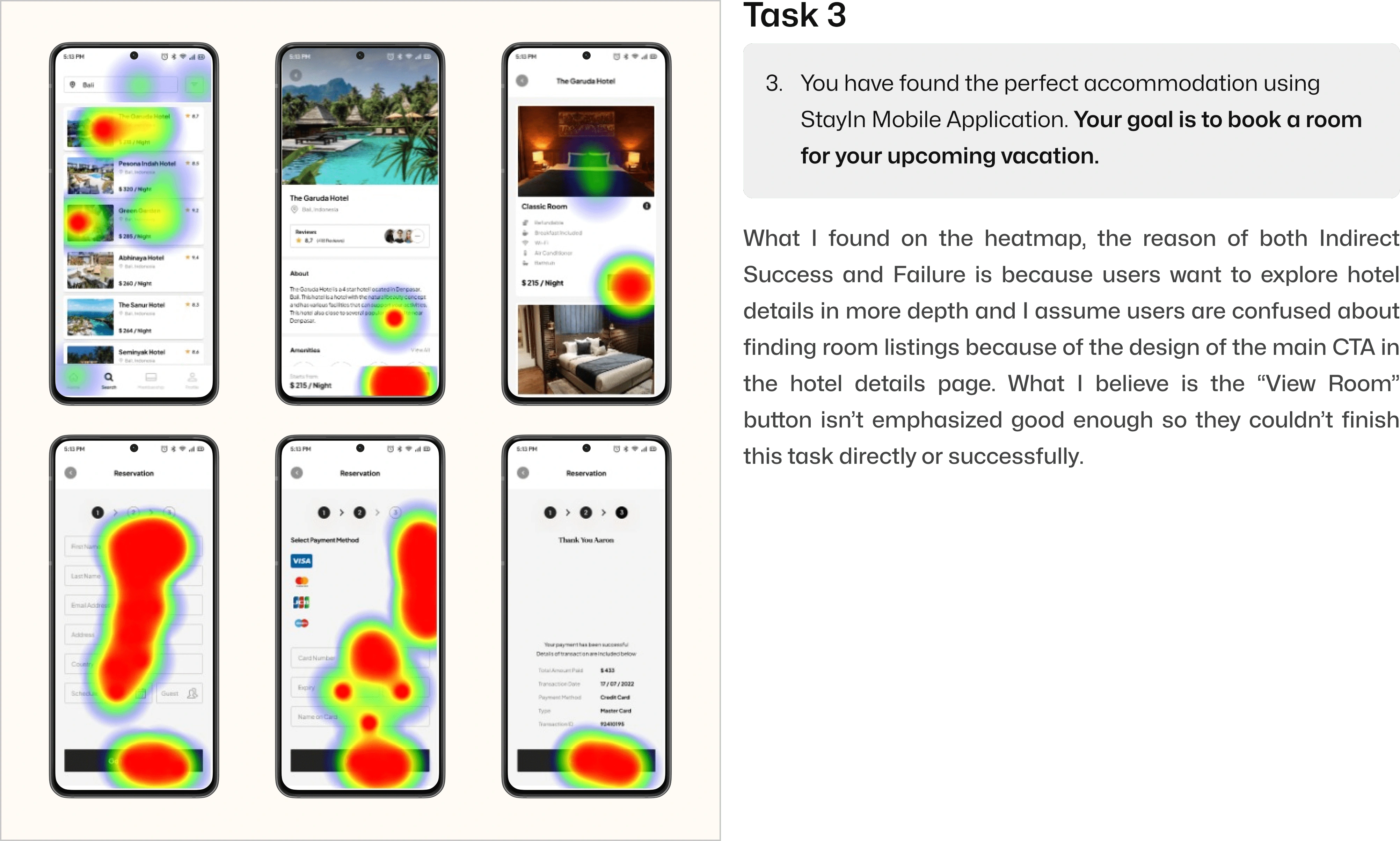
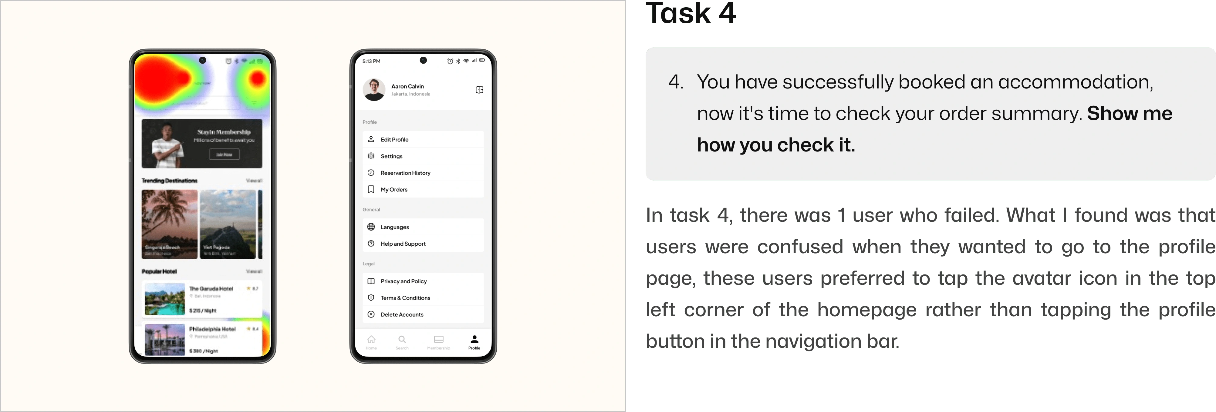
Based on the test outcomes, we can direct our attention to tasks with lower success rates. Analyzing the heatmaps allows us to identify areas of user confusion and provides insights into potential solutions for addressing these issues.

Testing Conclusion
Based on what I did, the result is 2 of 4 scenarios and tasks successfully done by all participants. Meanwhile, there is 2 task that become main concern and could be solved in the next iteration.
Final Statement
In general, creating this app presented both challenges and enjoyment. The most difficult aspect involved managing a tight schedule and my busy agenda, which resulted in some incomplete steps.
What are the next steps?
I think there are ways to make this design project better. Some things in the project are based on what I think, and they need more research. But overall, I'm happy with how it turned out and the way I did it.
If I had extra time for this project, here's what I'd do next:
Solving problems that I found from usability testing.
Doing interview with more participants.
Enhancing the user flow.
Conduct the website usability test.
Doing iteration.
Thank you for taking your time to read my project. ✌
Like this project
Posted Jan 16, 2024
Your Ultimate Haven! Discover All Your Accommodation Needs in One Place!.
Likes
0
Views
69

