Bizhare App Redesign
Overview
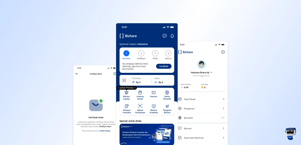
In this case study, I found several issues on the Bizhare platform and I attempted to find solutions related to these problems. Some of the issues I found include problems with the user flow and spacing. In order to address these problems, I will also implement several UX principles, one of which is Hick’s Law.
The Problem
In this particular case study, my analysis has uncovered various challenges within the Bizhare platform, ranging from issues with user flow and spacing to the presence of disparate features that contribute to user confusion.
Main Objective
Improving the existing registration flow to be more user-friendly.
Simplify menu/feature in one place.
Proto-Persona
Before proceeding further, I attempt to define a proto-persona based on my assumptions to ensure that we have a shared understanding of who our users are.

User Scenario
Steve, a 32-year-old entrepreneur, came across the Bizhare platform through his social media channels, sparking his interest in investing in startups and small businesses through the Bizhare app. After signing up, he discovered an intriguing business profile, conducted research, and ultimately decided to invest Rp 50,000,000 in a small and medium-sized enterprise (UMKM). The investment process was seamless through the app, and upon confirmation, Steve received a digital ownership certificate and regular updates on the business's performance. He also actively participated in the Bizhare community, sharing insights with fellow investors. With his successful investment, Steve continues to monitor his portfolio and explore future investment opportunities through this app.
Based on the provided scenario, it can be concluded that:

User Journey Map
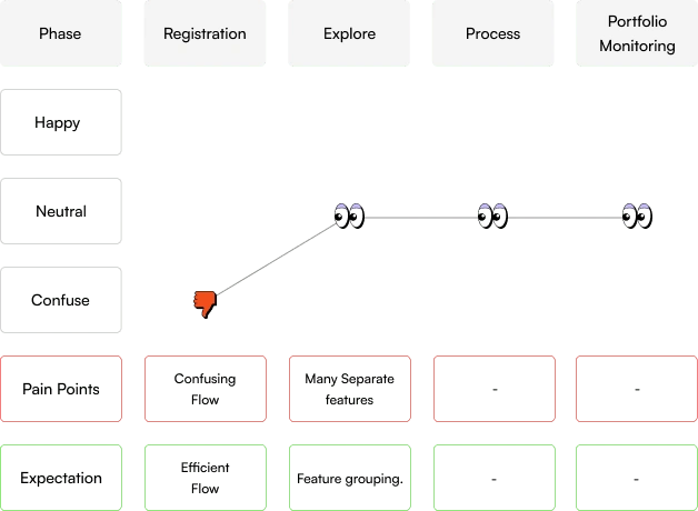
Below, I will attempt to outline a simple user journey map, according to the user scenario and proto-persona described above. However, in this case study, we will focus only on the registration phase and the phase of exploring opportunities.
Review Phase
After conducting a review of the Bizhare platform, I have identified several issues which I will outline below.
User Flow
After the user completes registration via mobile and reaches the verification page, they are prompted to confirm via web. However, after the user confirms via web, they are not automatically logged into the mobile application. Instead, they are only given the option to return to the home page. My assumption is that this flow can be quite confusing.
Before

Solution
Here is the flow solution I've devised, wherein the user does not need to return to the home page after registration.

Design Recommendation
Below are the redesigned results of several features/pages that were identified to have issues.
Design System
Registration
Name Registration
Name Registration Page
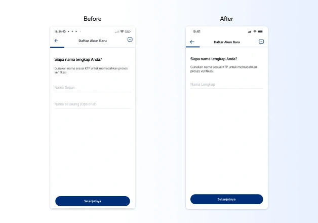
In the name panel, it would be more efficient to use the full name only. In fact, many users still struggle to determine their first name, especially those with three-word names.

Password Registration
Password Registration Page
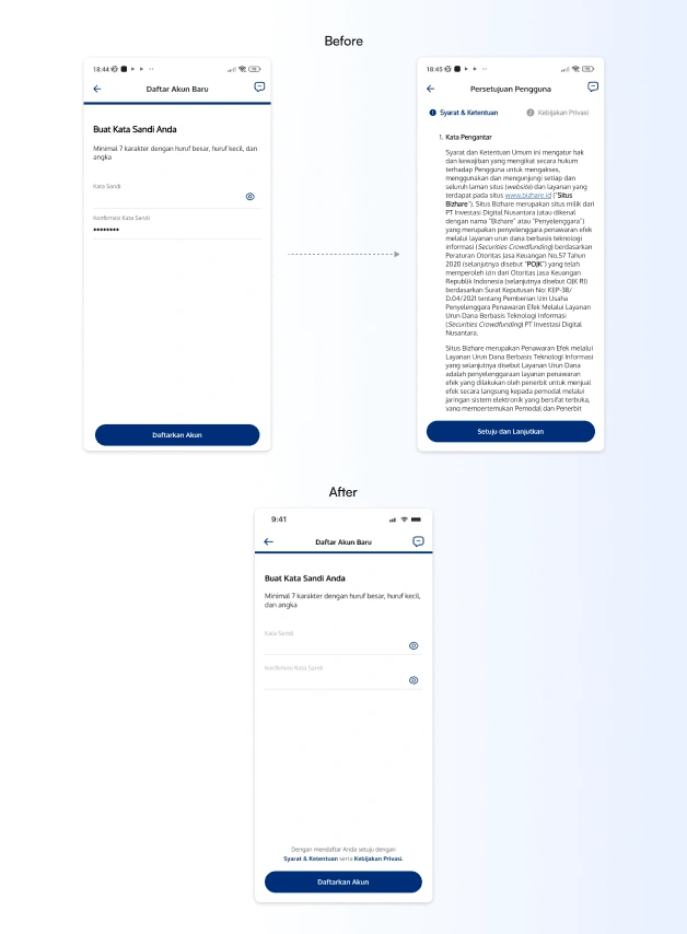
In the password confirmation column, it's advisable to provide an option to show the password confirmation as well. This is to facilitate users when they want to double-check the password confirmation.
Furthermore, the terms & conditions and privacy policy panels should be optional rather than mandatory. My assumption is that the majority of people will skip this step.
Account Verification
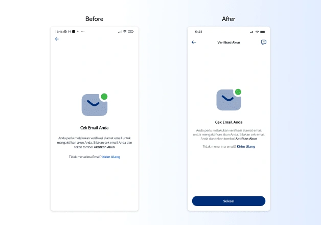
Account Verification Page
On the previous account verification page, as mentioned in the initial journey map, it was quite confusing. Users were asked to verify via web, but after verifying via web, they weren't automatically redirected to the app's homepage; instead, they were only given the option to go back.
To address this, I have added a 'Done' button detail as shown in the image above. The aim is to make the flow more efficient and user-friendly.
Main Application Content
Home Page
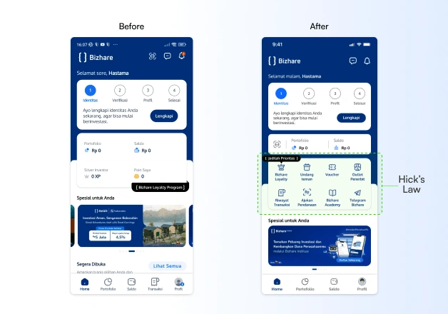
Home Page
Adopting Hick’s Law seems highly suitable here. I have consolidated several menus from the profile page into one unified section on the homepage. This way, users don't need to navigate back and forth between pages to find these menus.
Spacing
I also attempted to adjust the existing spacing to improve visual hierarchy.
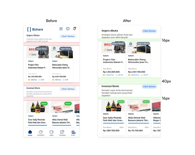
Home Page Spacing
Feature
I also incorporated two features that were previously only accessible via banners, as we can see below:
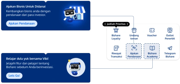
Banner to Menu
For the learning feature, I suggest renaming it to Bizhare Academy, Bizhare University, Bizhare Education, or something similar.
Prototype
Conclusion
Designing this case study has been quite challenging, but at the same time, enjoyable. I am confident that Bizhare will become a more efficient platform that can satisfy its users, drive business growth, and create significant added value in the digital financial ecosystem.
What's next?
I think there's potential for enhancement in this design endeavor. Certain aspects rely on my assumptions, and delving into real data would be essential to enhance its quality.
If I had extra time for this project, here's my next move:
Performing user research to address additional concerns and acquire more profound insights.
Engaging in interviews with actual individuals to gather a range of perspectives.
Conducting usability tests involving real participants.
Iteration.
Appreciate you investing your time in reviewing my project. ✌😁
Like this project
Posted Mar 7, 2024
In this project, I attempted to address several challenges within the Bizhare Indonesia application.


