Amaya – Visual Identity & Packaging Design
Elodie Fontaine
The Project
Amaya is a skincare brand built around light, each product conceived as part of a daily ritual that reconnects skin to radiance, at every hour of the day.
The challenge was to create a brand world that could feel premium and editorial, while staying sensorial, colorful, and deeply evocative of natural light.
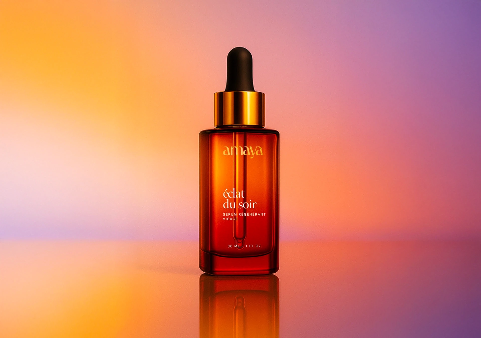
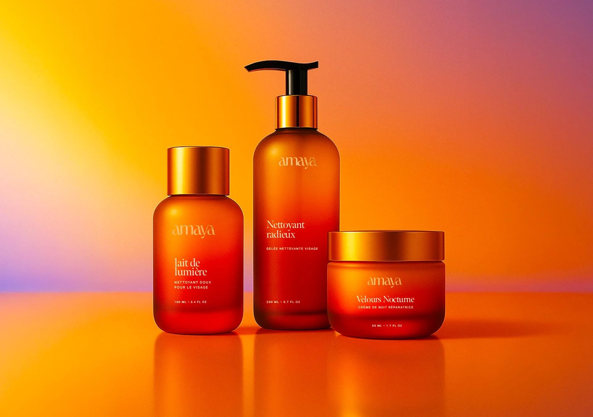
Amaya's serum packaging
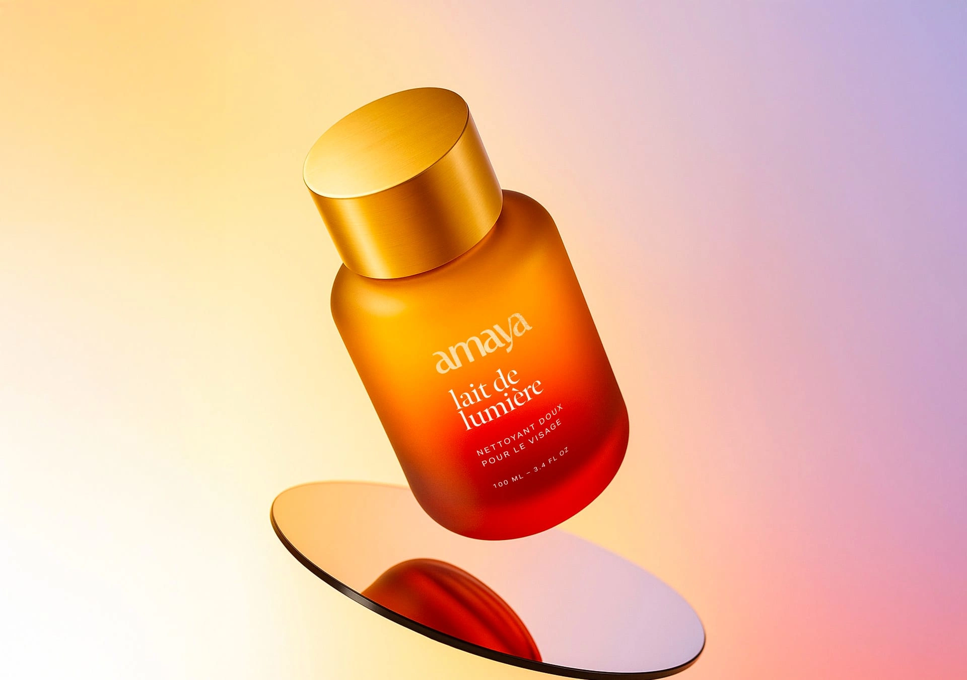
Amaya skincare packaging
The Design
The identity was shaped around softness and glow.
We designed a logotype with refined, fluid curves, balancing elegance with accessibility.
The color palette drew from the gradients of dawn and dusk creating packaging that feels like bottled light.
Typography brought a modern editorial touch, while photography and textures emphasized tactility and emotion.
Each product name was written as a fragment of poetry, extending the brand’s narrative into every touchpoint.


The Outcome
The result is a skincare identity that feels radiant, immersive, and timeless.
Amaya invites its audience to experience beauty not only as care, but as a ritual of light, one that transforms the everyday into something poetic.
Like this project
Posted Jun 23, 2025
Visual identity & packaging for Amaya, a luxury skincare brand inspired by light rituals and sunset tones. A poetic and refined design universe.