Brand Identity for Solene Skincare

Usman Tariq


Overview
The client approached me to build a complete brand identity for a new skincare line. The goal went beyond creating beautiful packaging. They wanted to build a brand that felt trustworthy, elevated and considered from the very first interaction Every touchpoint needed to communicate the same level of care and precision as the formulas themselves. From the visual identity to the packaging system, the direction was built around creating a skincare brand that could feel instantly credible while still having a distinct presence in a crowded market.
The Challenge
The skincare market is saturated with brands relying on the same visual language. Soft palettes, botanical illustrations, delicate typography and clinical minimalism have become familiar cues across the category.
The challenge was not simply to make the brand look different. It was to create distinction without sacrificing trust.
Instead of competing by being louder or more decorative, the direction focused on precision. A sharper visual system, intentional typography and a refined packaging approach were used to create a brand that felt confident, modern and unmistakably its own.
The Concept
Solene was built around the idea of specifying skincare rather than selling it.
Instead of relying on persuasive beauty language, the brand communicates through a structured product language inspired by laboratory specifications, technical documentation and architectural systems. Every product is reduced to what matters most: its function, its defining metric and its formulation details.
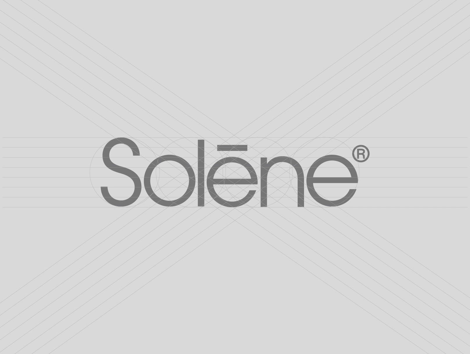
We took an architectural approach to the visual identity, using proportion, structure, spacing and hierarchy to create a sense of precision and order. The result is a skincare brand that feels designed with intention rather than styled for attention.
The Strategy
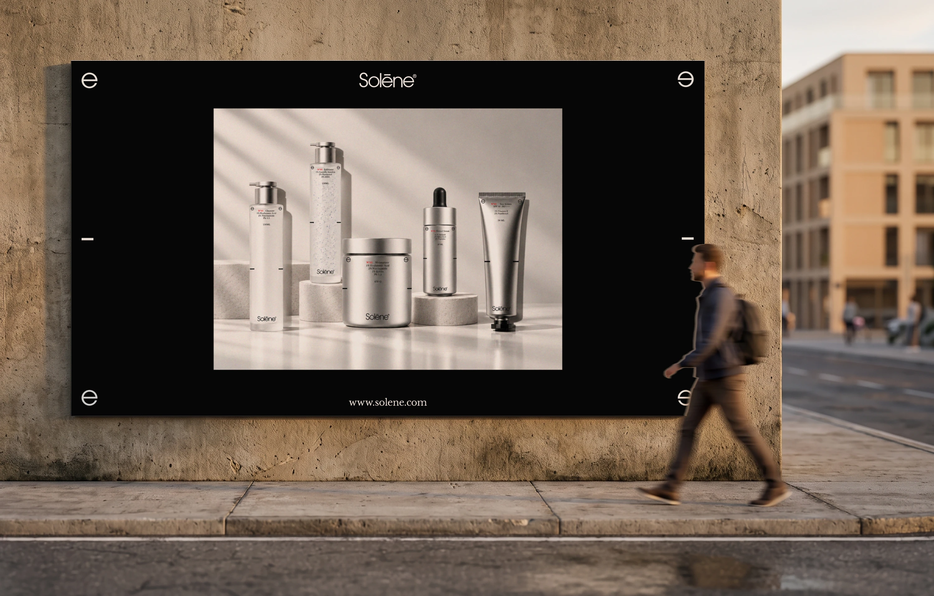
The identity was designed as a scalable visual system, not a collection of individual product designs. The goal was to create a consistent framework that could expand across the entire skincare range while making every product immediately recognizable as part of Solene.
01. Functional Naming
Products use straightforward category names such as Cleanser, Serum, Moisturizer, Sunscreen and Exfoliator.
Removing invented names keeps the communication direct and allows the product information to take priority. The name tells you what the product is while the specification tells you why it matters.
02. The N° System
The N° system acts as the core organizing principle of the range.
Every product follows a consistent structure:
N°[SEQUENCE] [FUNCTION] / [DEFINING METRIC] [VOLUME]Each product is assigned one defining metric such as pH, active percentage, SPF or wear time. Keeping this information in a fixed position creates recognition across the range while allowing each formula to communicate its own point of difference.
The numbering gives the collection an archival and systematic quality, making the products feel like part of one considered series rather than separate SKUs.
03. Architectural Typography
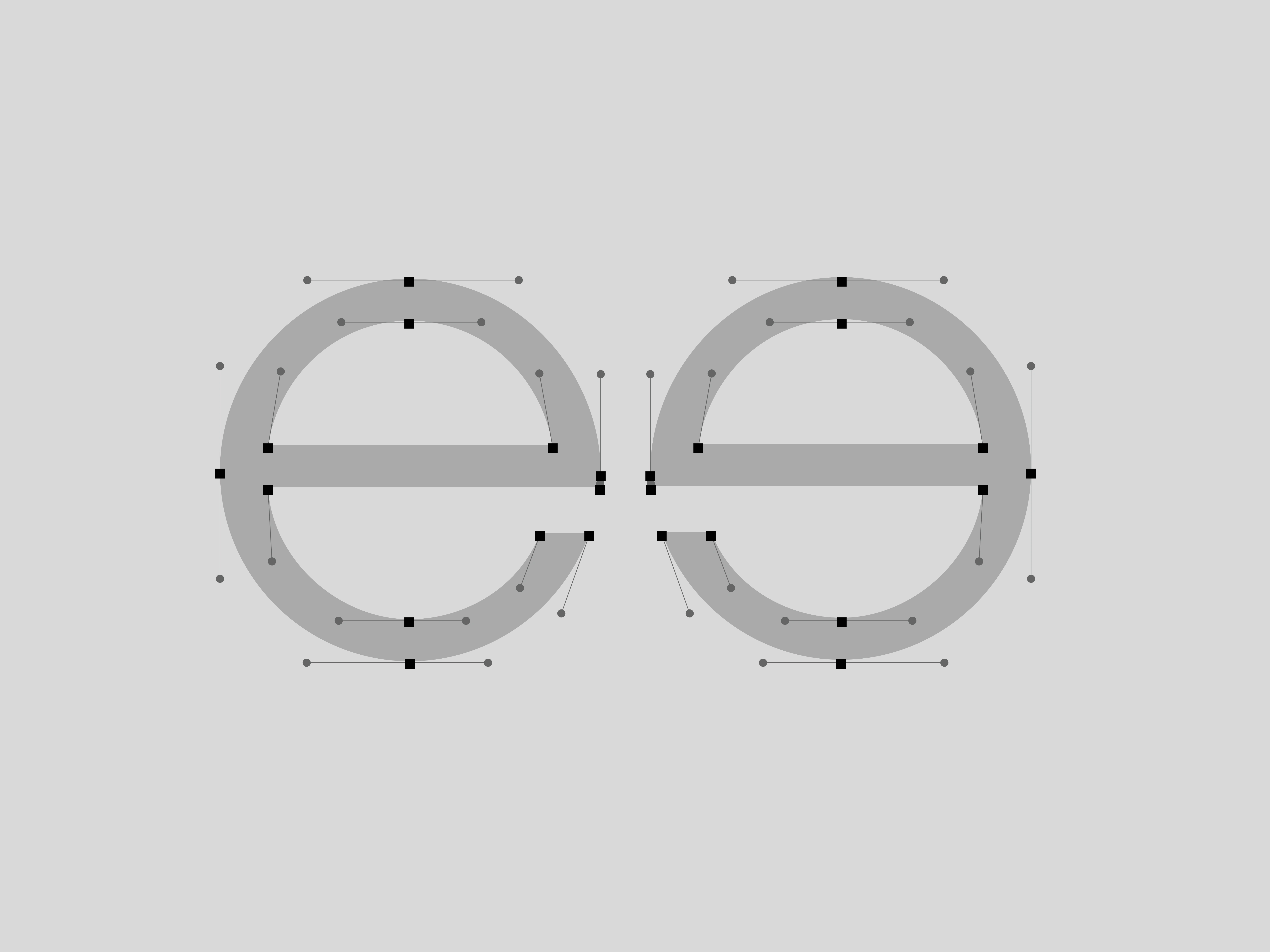
Typography reinforces the brand's architectural character through clear hierarchy, proportion and controlled spacing.
Small caps communicate the product description and supporting information, while regular caps give prominence to the reference code. The structure creates a visual rhythm similar to architectural drawings and technical specifications where every element has a defined role.
Rather than using typography as decoration, we treated it as part of the brand's underlying architecture.
04. Architectural Packaging
The packaging direction follows the same principles of structure, balance and restraint.
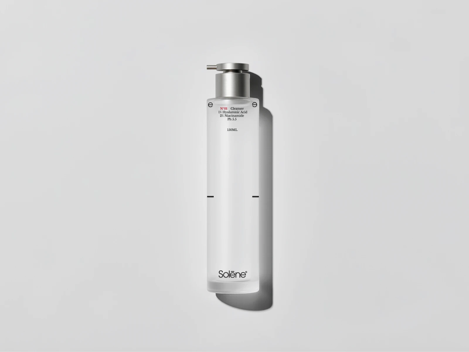
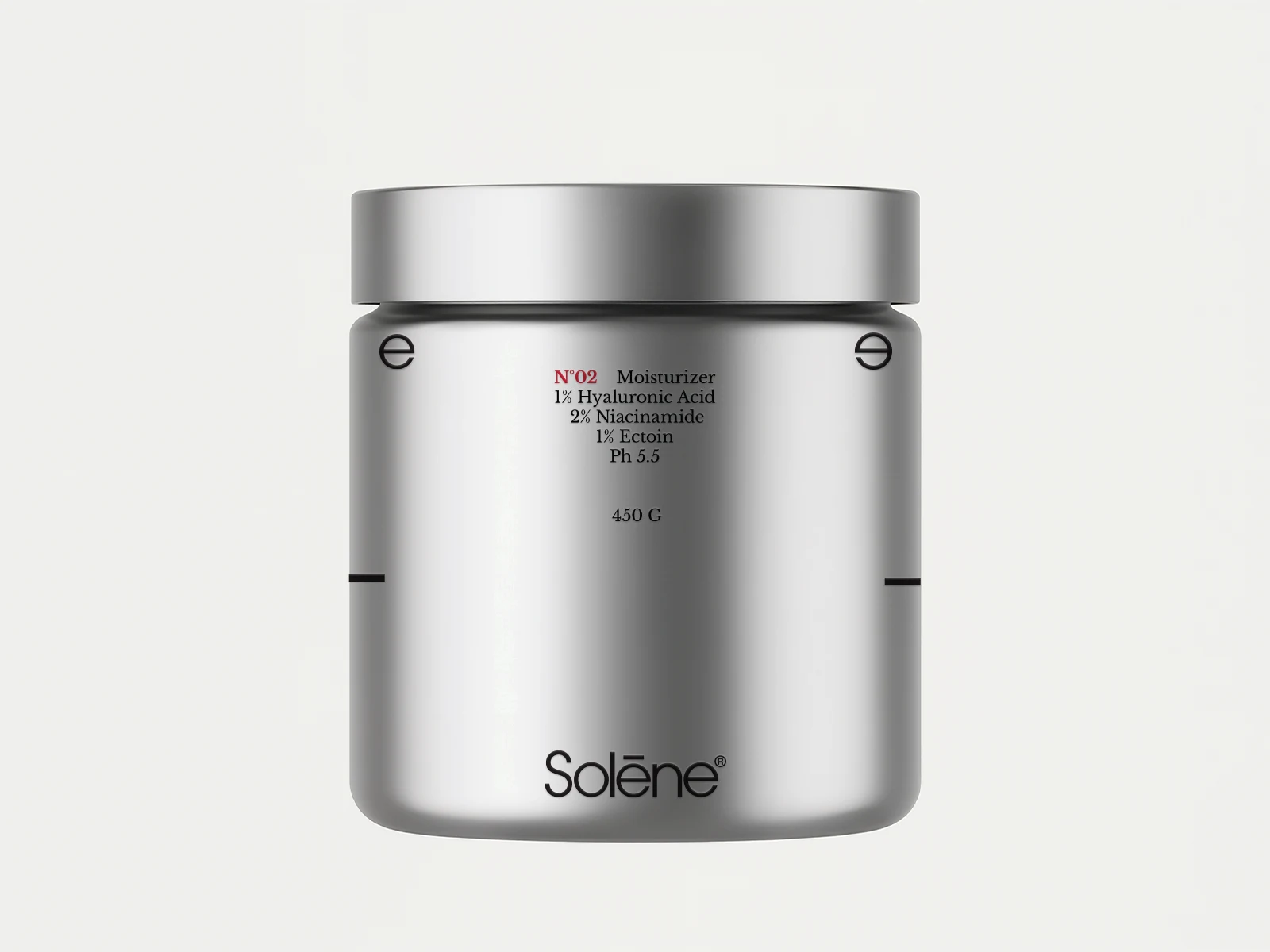
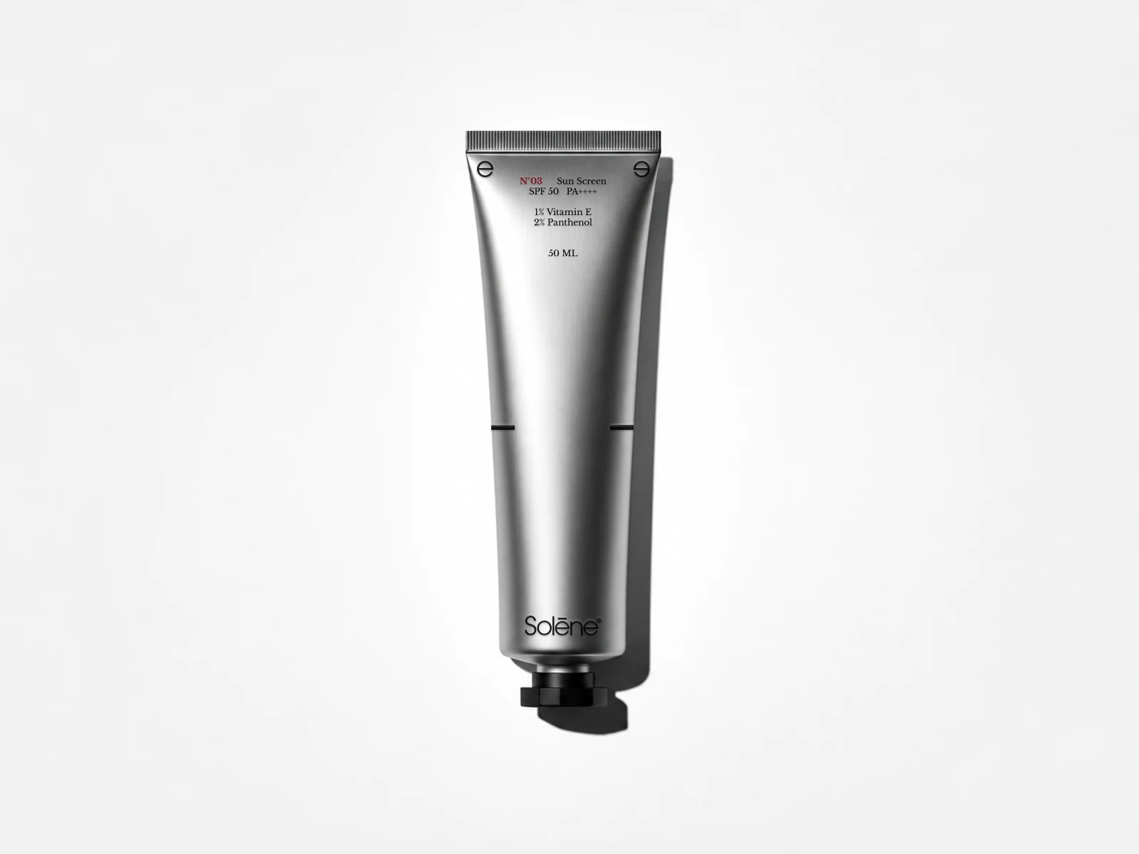
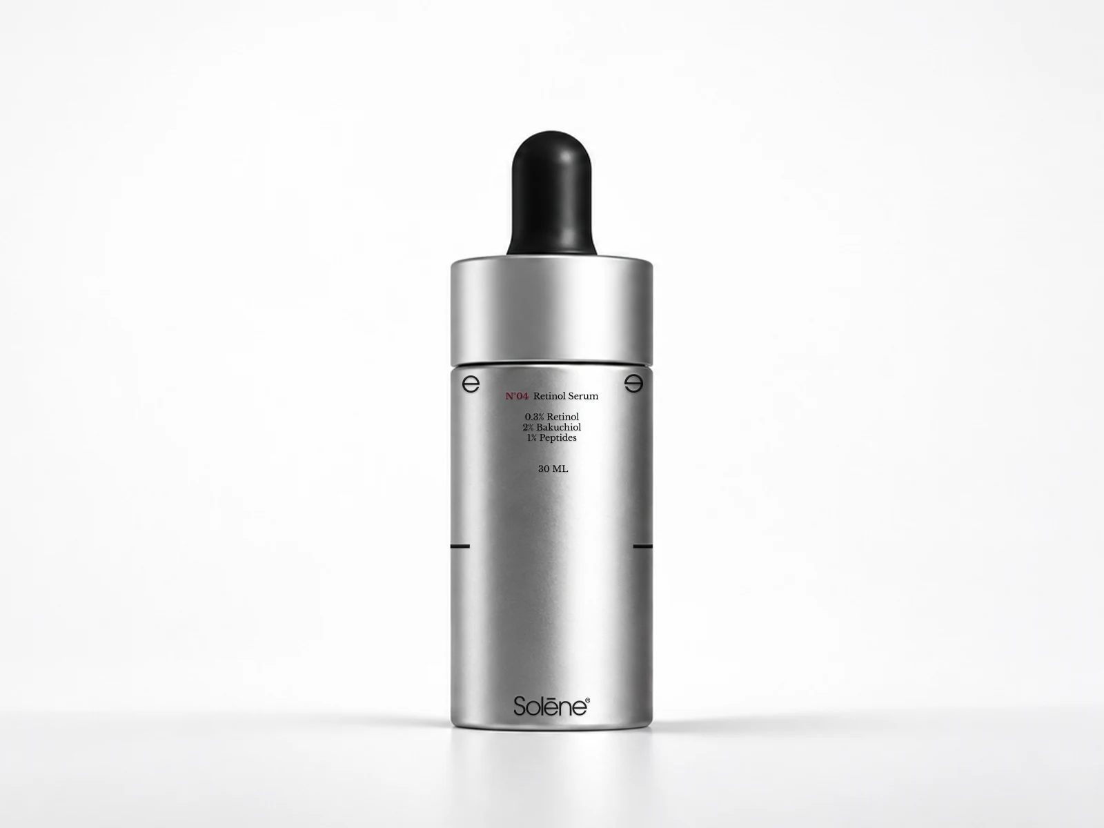
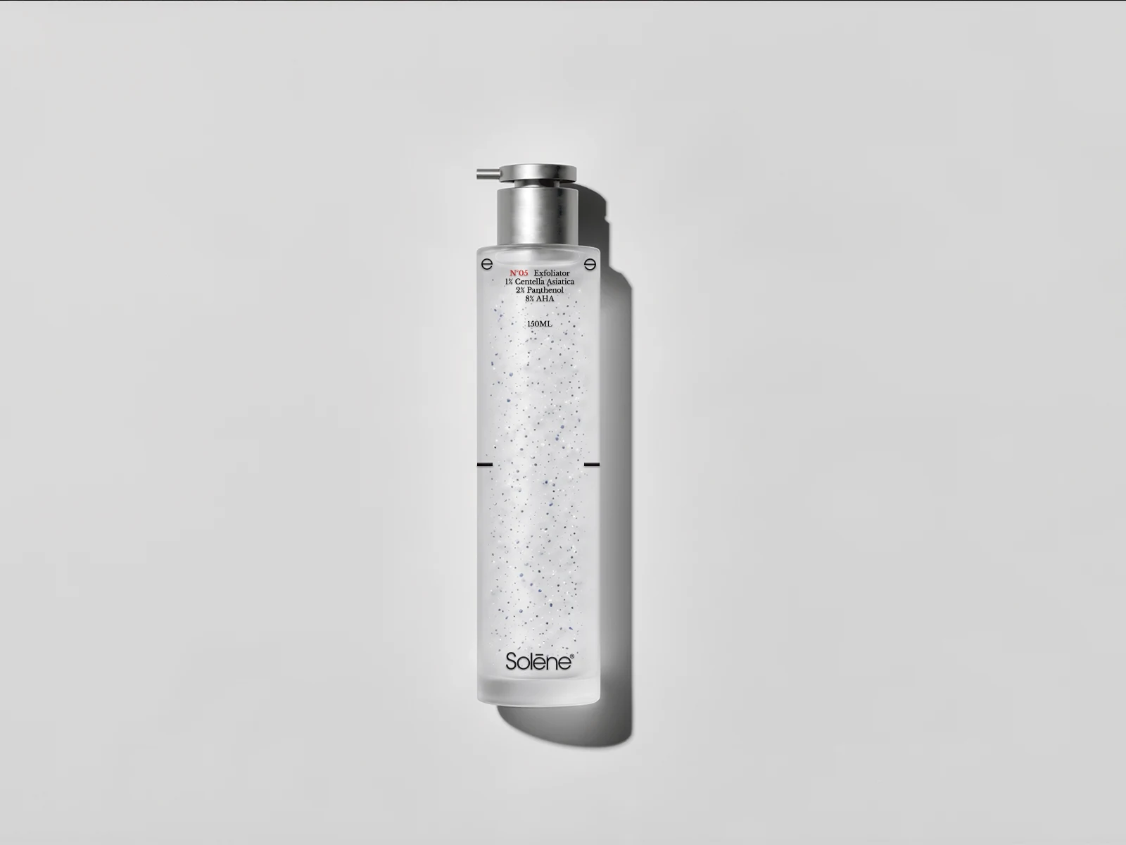
Minimal layouts, generous negative space and carefully positioned information create a strong sense of order across the range. The packaging feels almost like a physical object from an architectural environment rather than a conventional beauty product.
The identity was tested across tubes, droppers, jars and airless pumps to ensure the system remained consistent regardless of the packaging format.
This makes the visual language scalable. As Solene expands its range, new products can enter the system without requiring a completely new visual direction.
Applications — The Line
N°01 — CLEANSER
pH 5.5 / 150ml
1% Hyaluronic Acid — 2% Niacinamide
N°02 — SERUM
10% Active / 30ml
N°03 — MOISTURIZER
24H / 50ml
N°04 — SUNSCREEN
SPF 50 — PA++++ / 50ml
1% Vitamin E — 2% Panthenol
N°05 — EXFOLIATOR
8% AHA / 30ml
2% Panthenol — 1% Centella Asiatica
Outcome
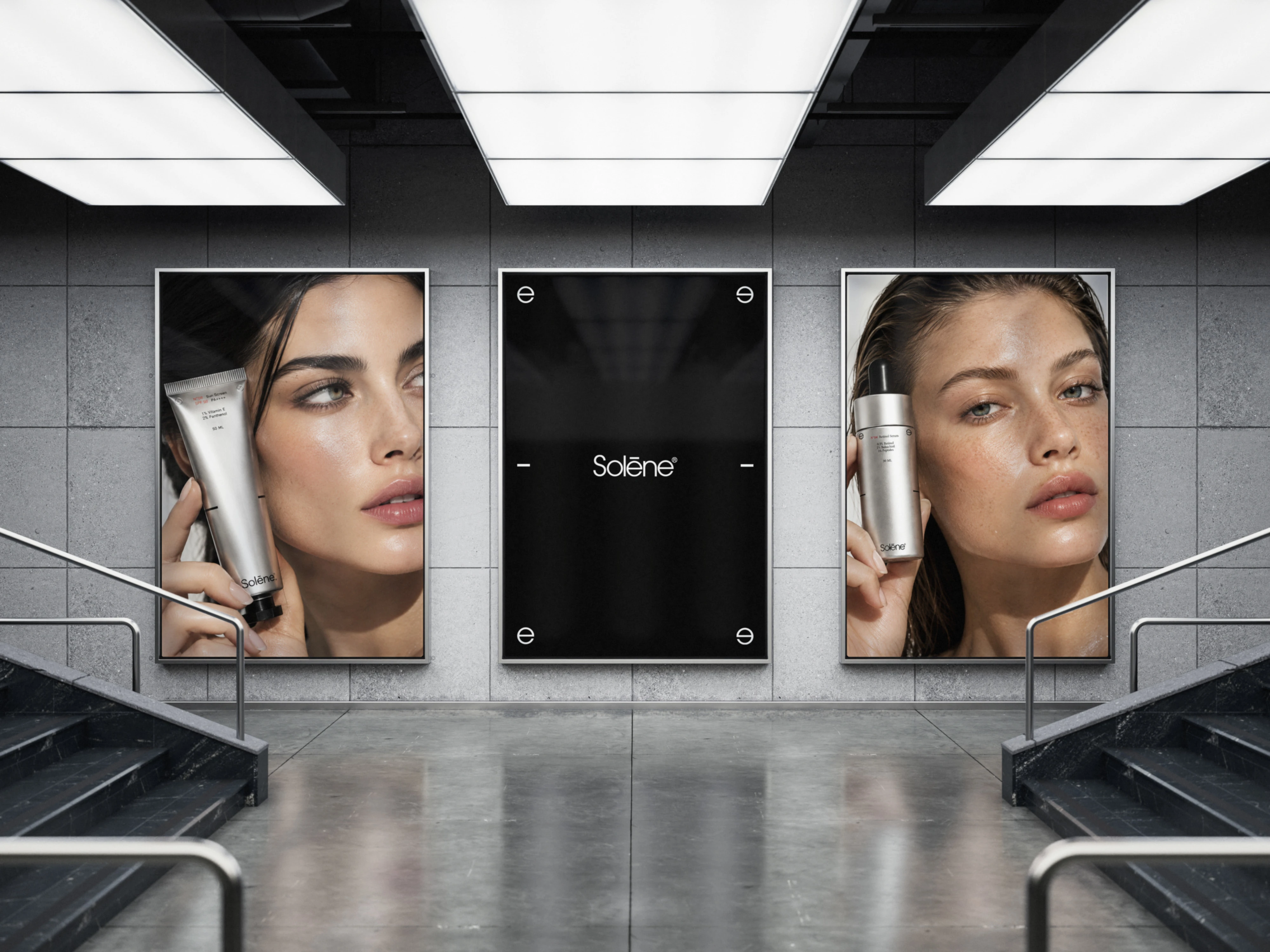
A complete brand identity delivered to Client carried consistently from the logo down to every product label simple, considered, and immediately recognizable as one system.
Like this project
Posted Sep 13, 2026
Architectural,distinctive skincare identity built on one simple idea skincare isn’t complicated. Follow 5 essential steps and you’re good.
Likes
1
Views
9
Clients
Solene