7FISH® Brand Identity & Guidelines

Usman Tariq
Verified


Overview
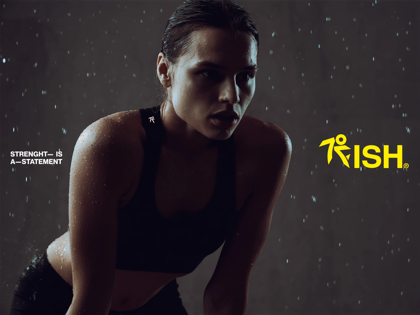
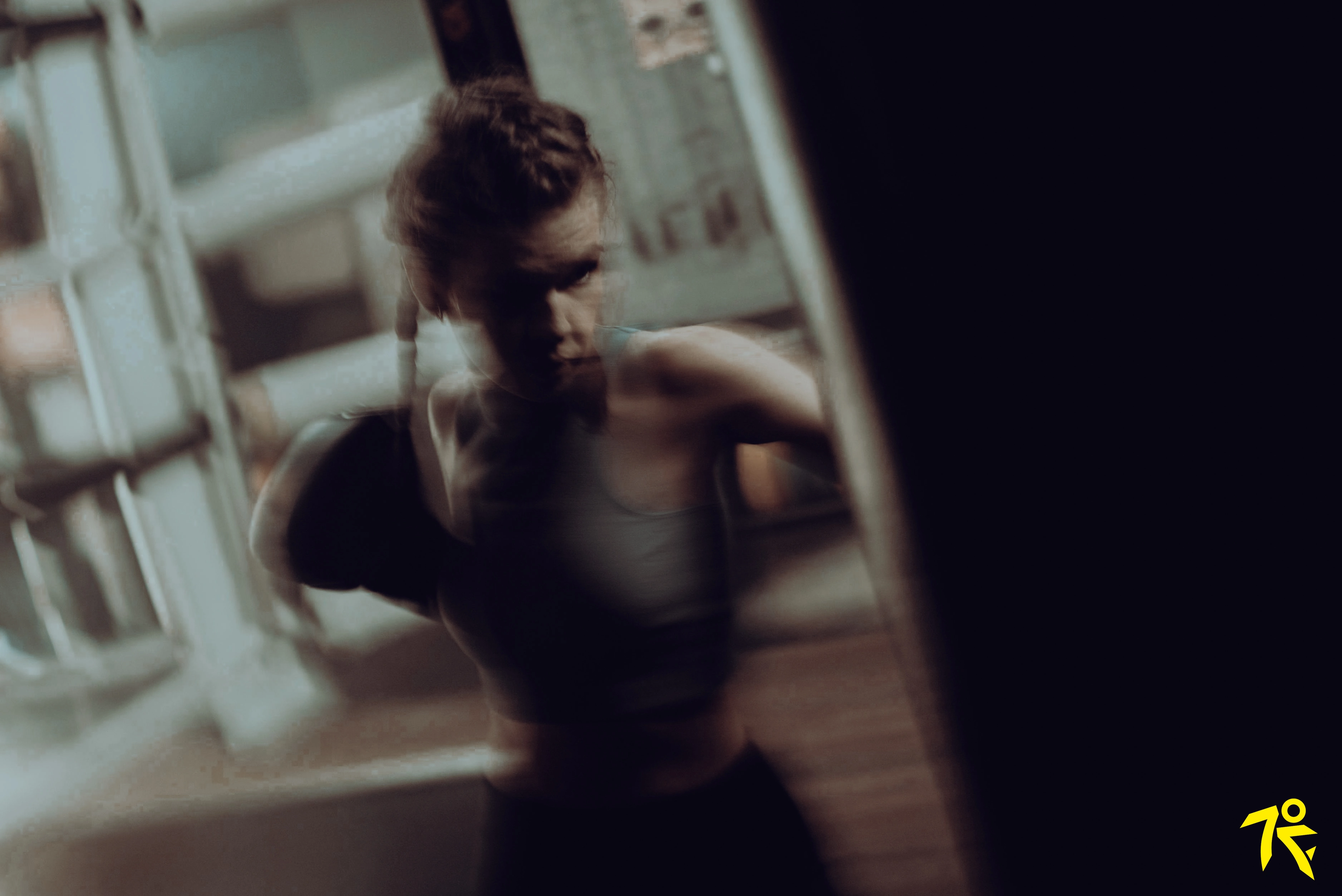
7fish is an urban activewear brand founded by two functional fitness trainers who set out to build more than another workout label. It's a brand for women who lead with strength in training, in work, in everyday life. Drawing on the fearless unapologetic energy of Kill Bill, the ambition was to create an identity that feels bold and elegant in equal measure. activewear built for performance, but styled to move seamlessly from the gym into daily life.
Challenge
The activewear category tends to split into two camps brands built around performance that read as tough and utilitarian, and brands built around fashion that look good but lack functional credibility. 7fish needed a visual identity that refused that trade-off. one confident enough to hold strength and femininity power and polish, at the same time, without diluting either.
Strategy
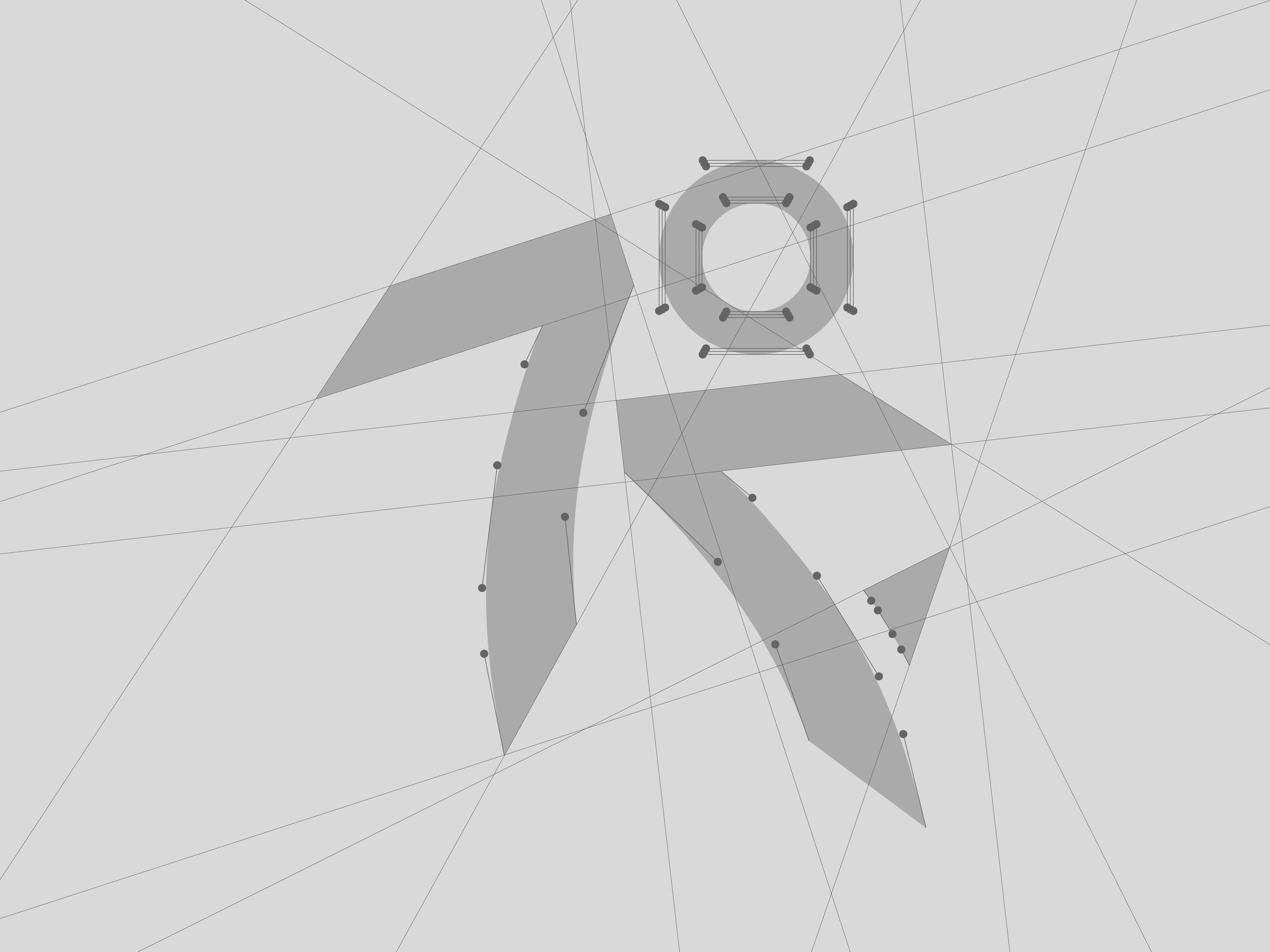
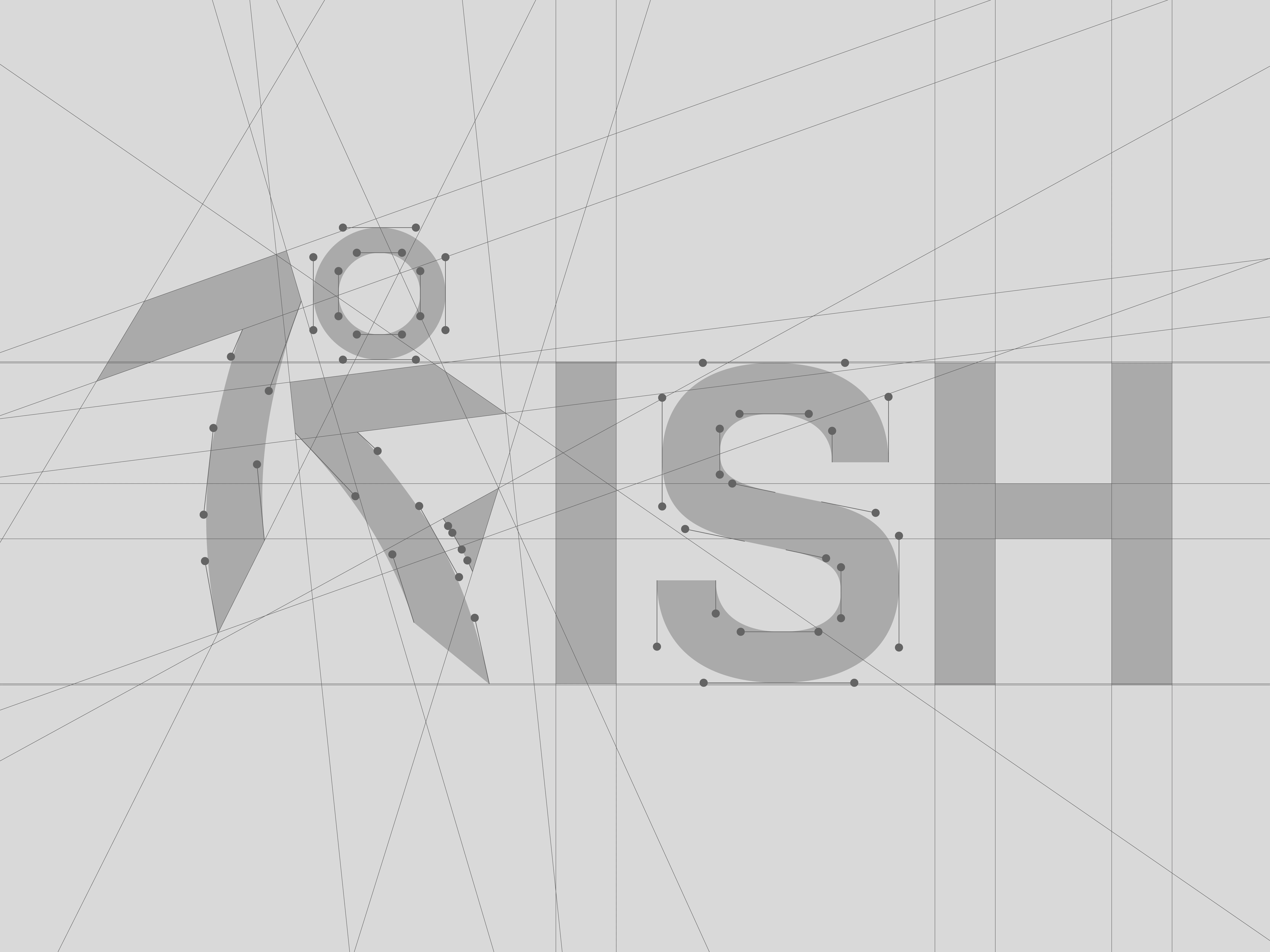
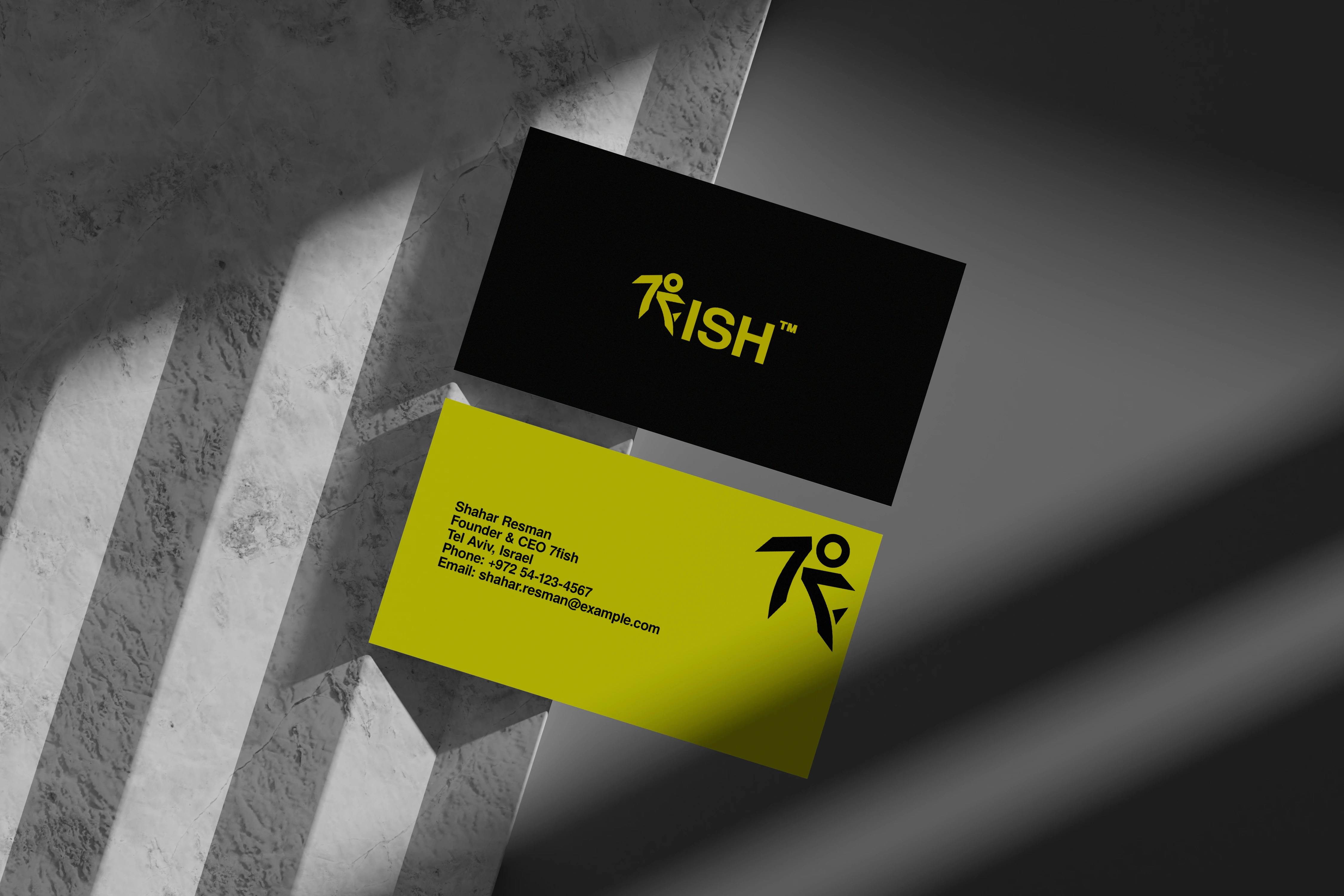
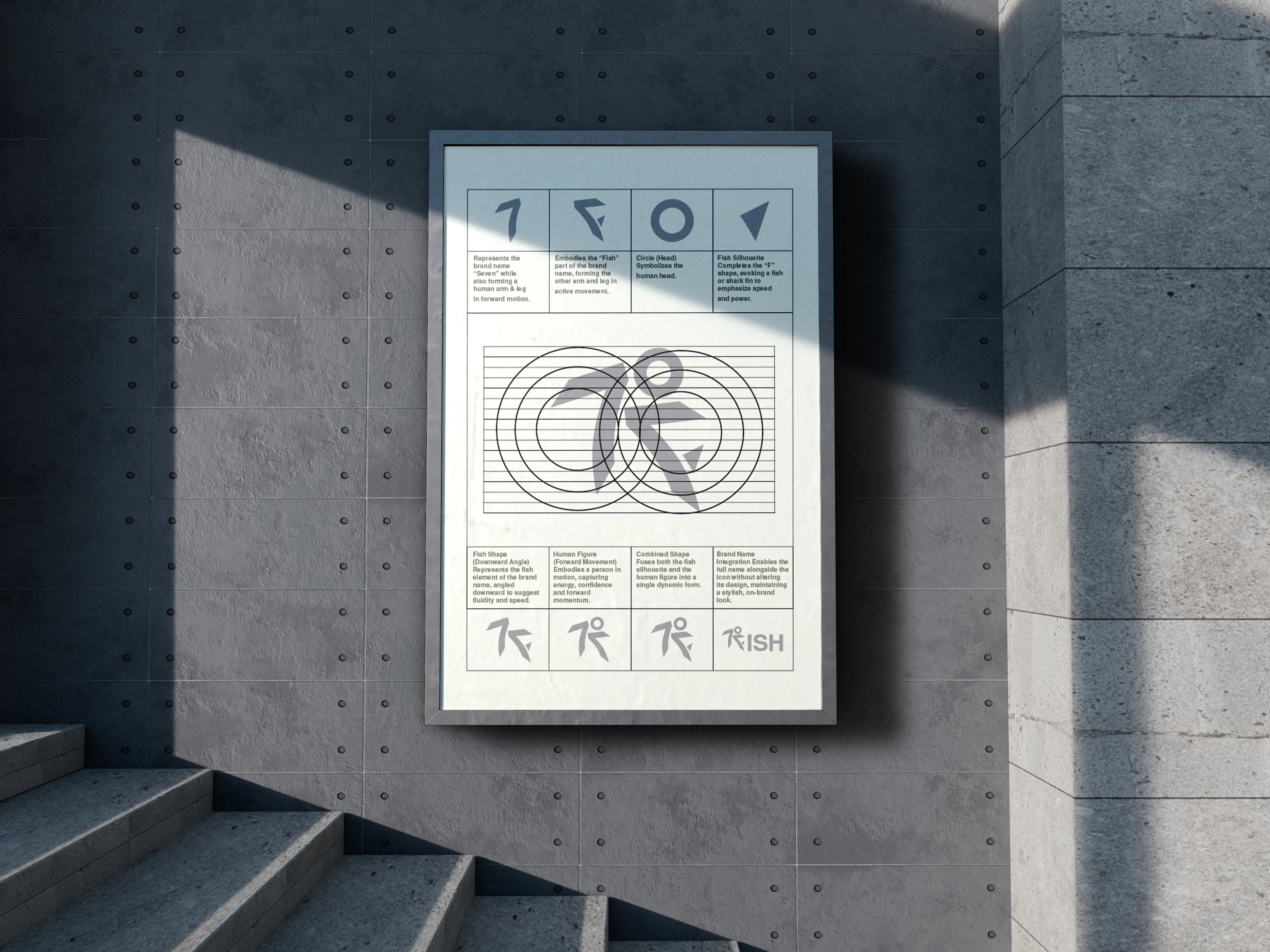
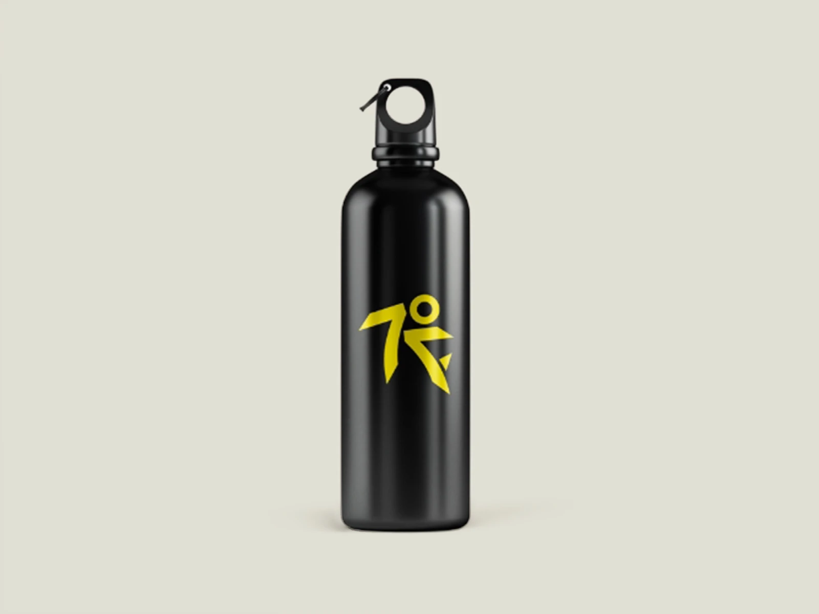
The starting point was the mark itself. Rather than choosing a literal symbol, the brand's name became the design problem to solve: the numeral "7" was reshaped into a figure caught mid-motion, while the same silhouette reads as a fish cutting through water. One symbol carries the brand name, a sense of movement, and the brand's founding metaphor resolving the "pick a side" problem with a single ownable shape rather than two competing visual languages.
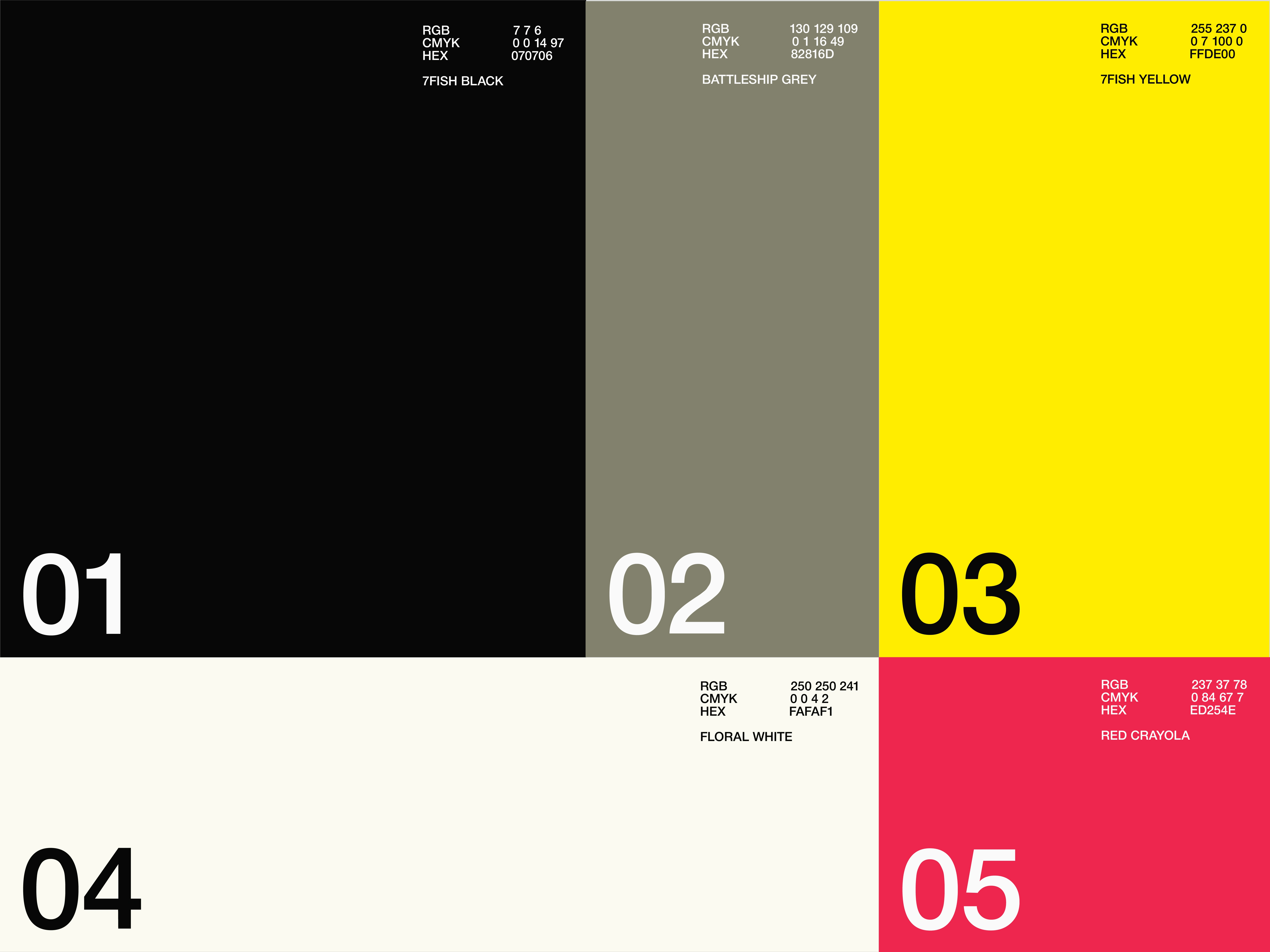
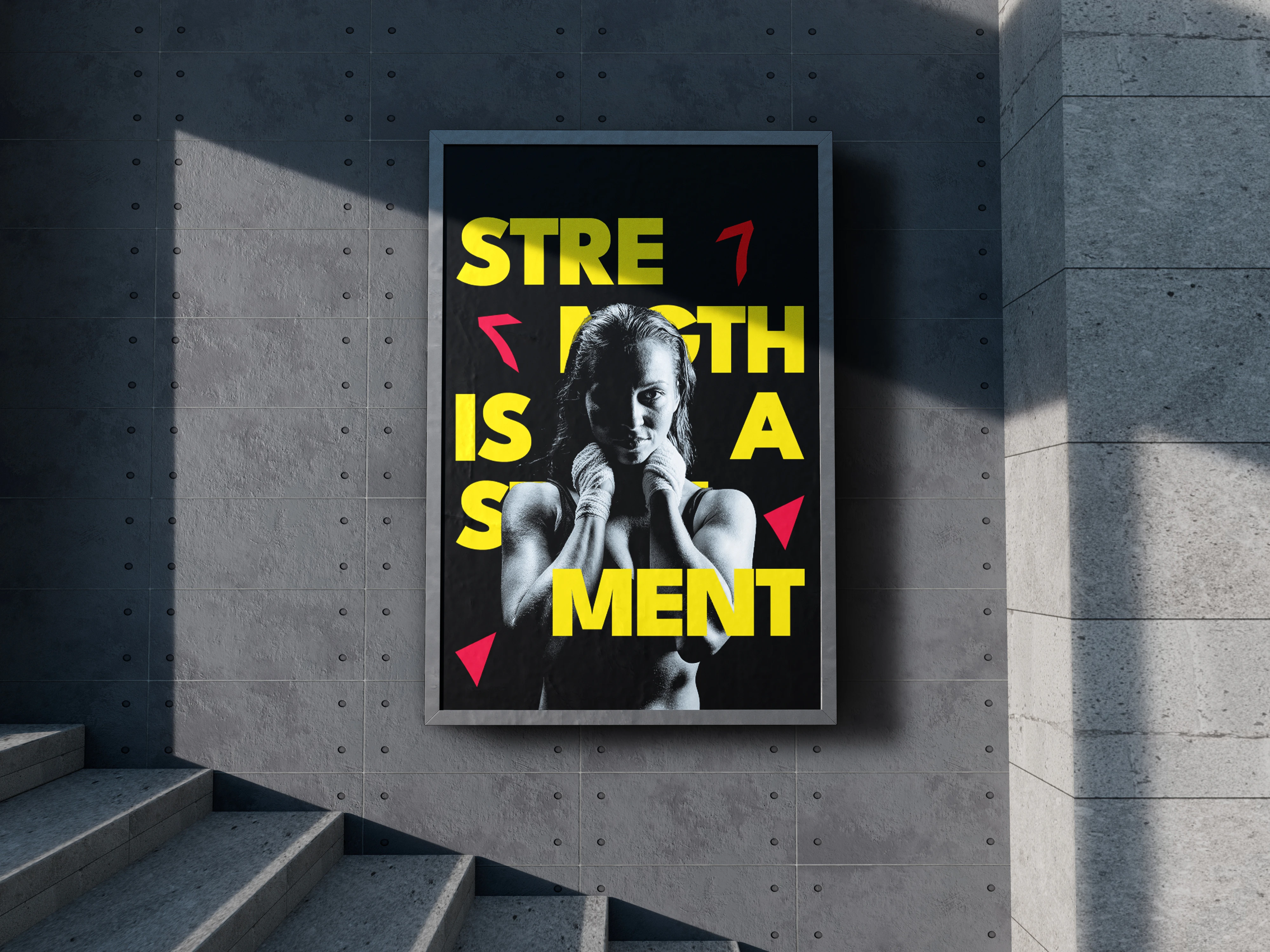
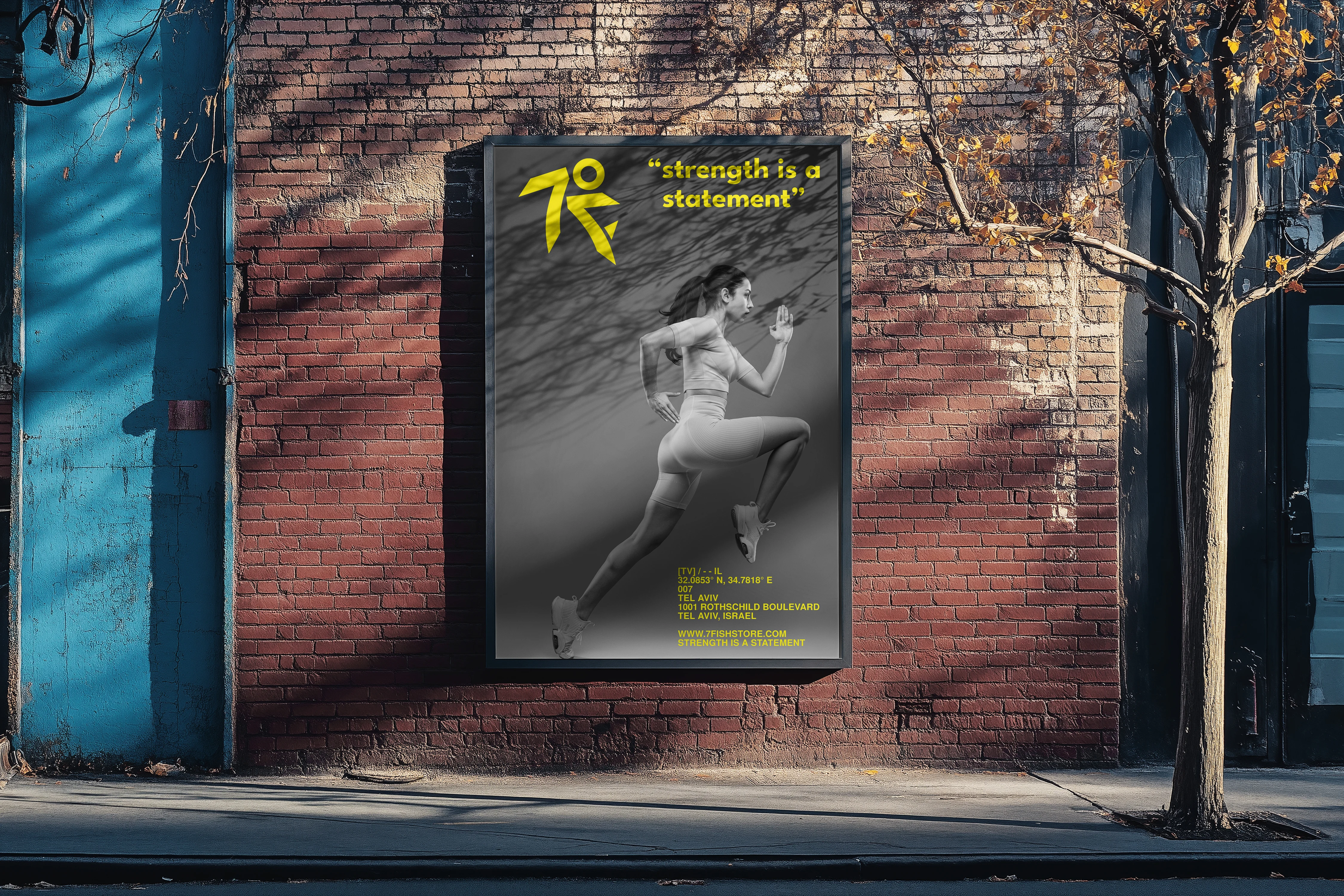
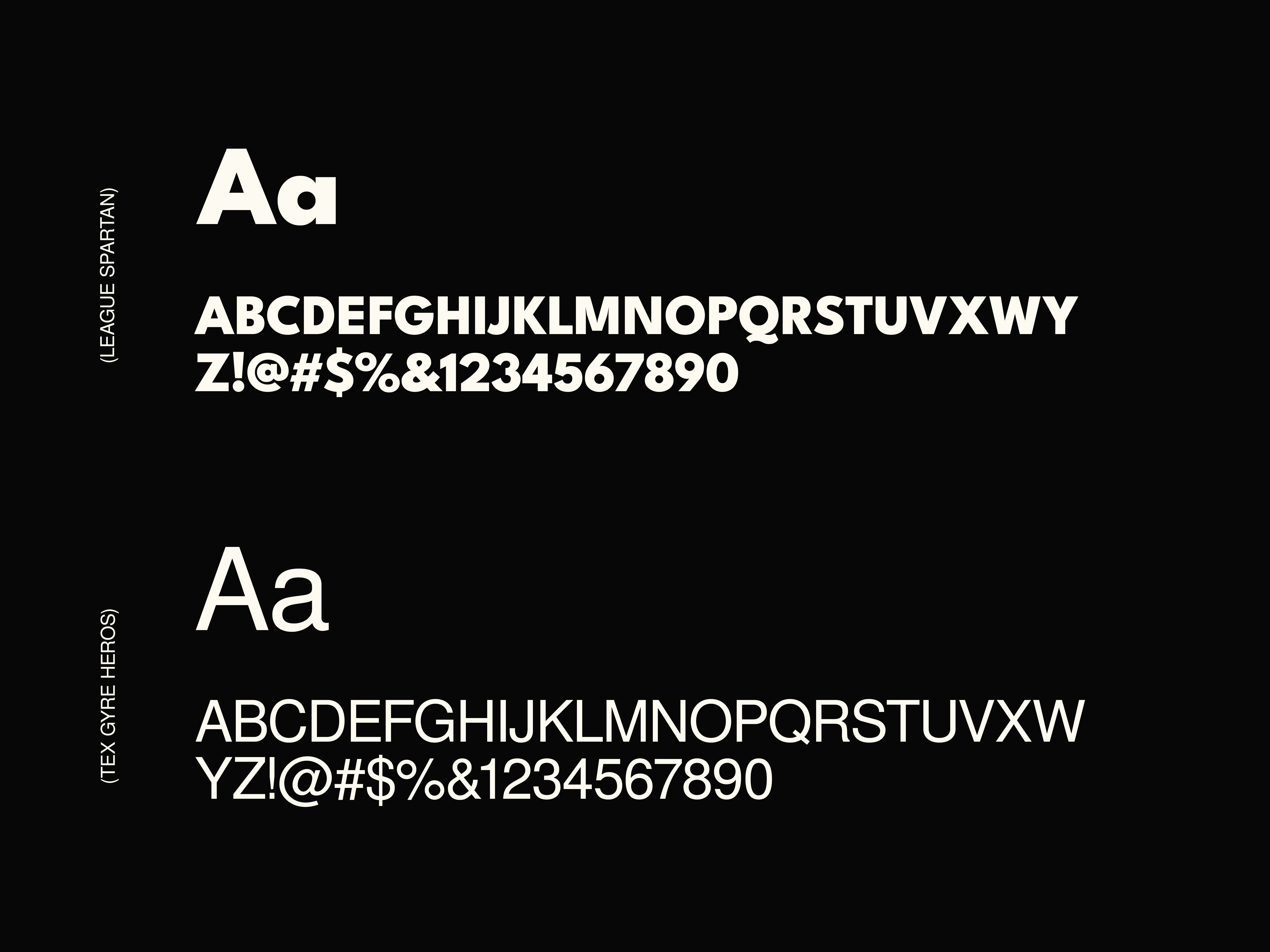
That same logic shaped the brand voice. language built to sound assured and directive rather than aspirational or soft, positioning 7fish less as a product line and more as a statement of intent. A tightly controlled palette a single accent color against a restrained, largely monochrome base was used deliberately, so color reads as a signal of energy rather than decoration. Every downstream decision, from typography to campaign tone, was built to reinforce the same idea: strength that doesn't need to shout to be felt.
Outcome
A single, ownable mark that resolves the brand's core tension reading simultaneously as a numeral, a figure in motion, and a fish instead of splitting the identity across separate symbols.
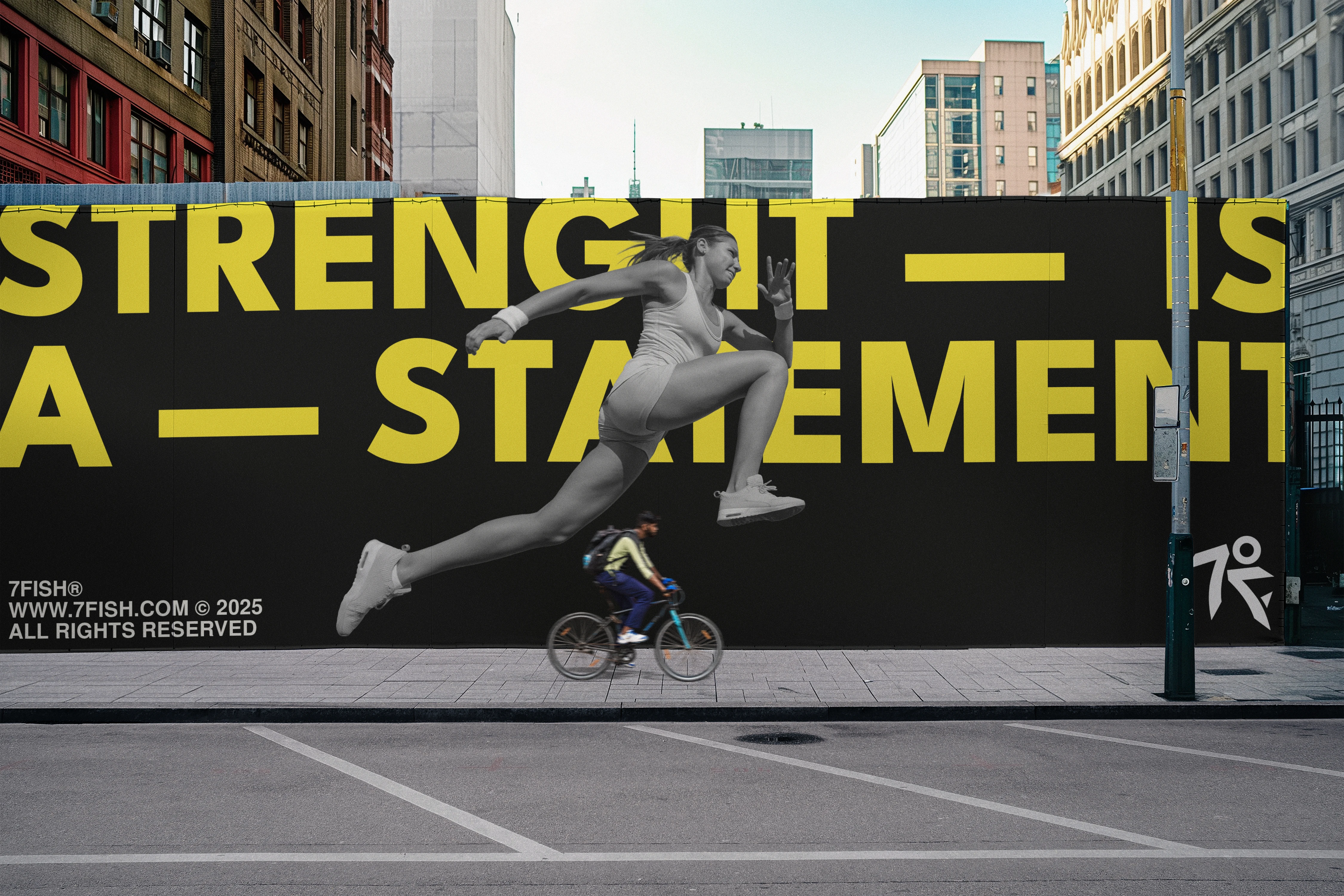
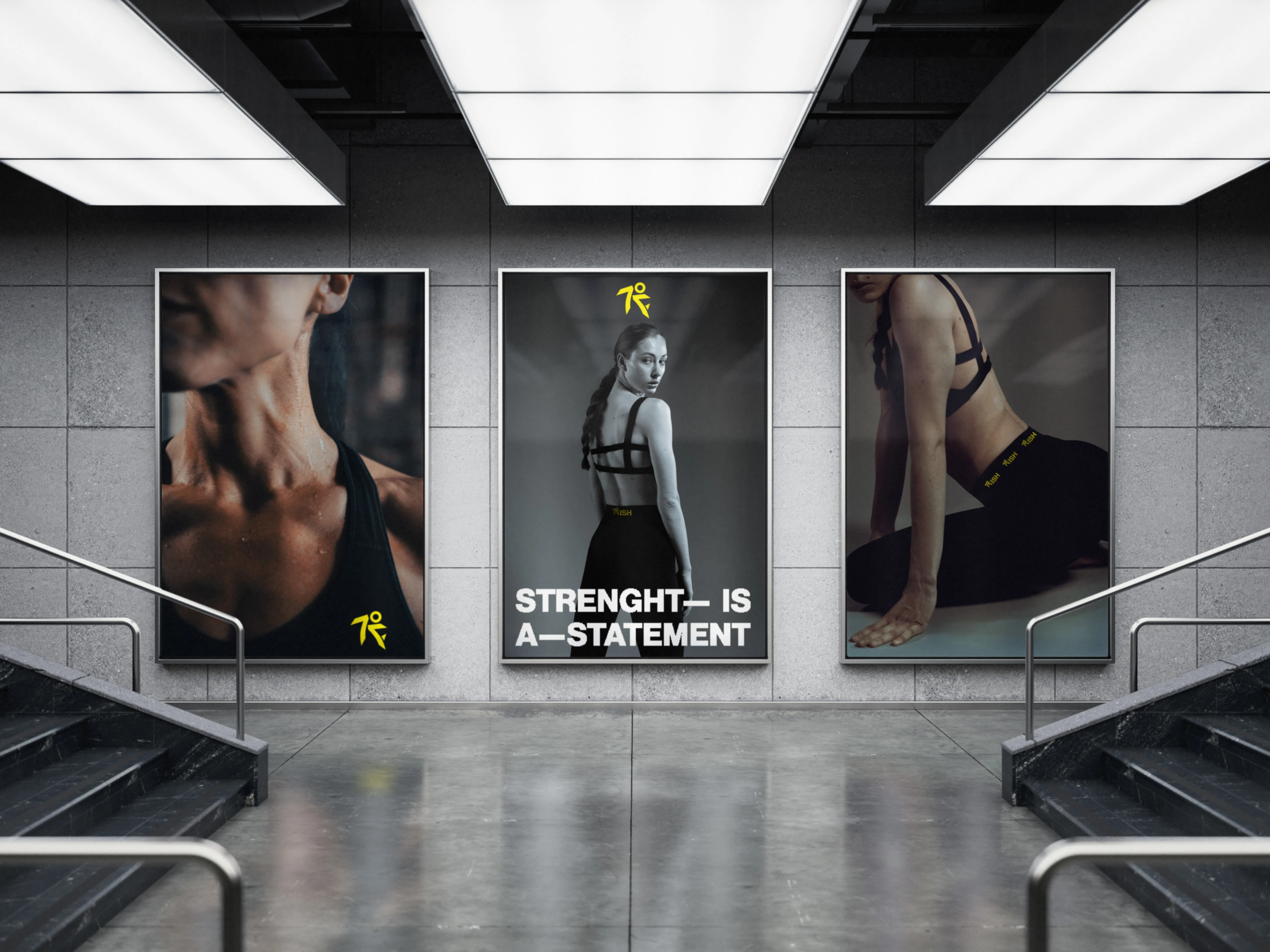
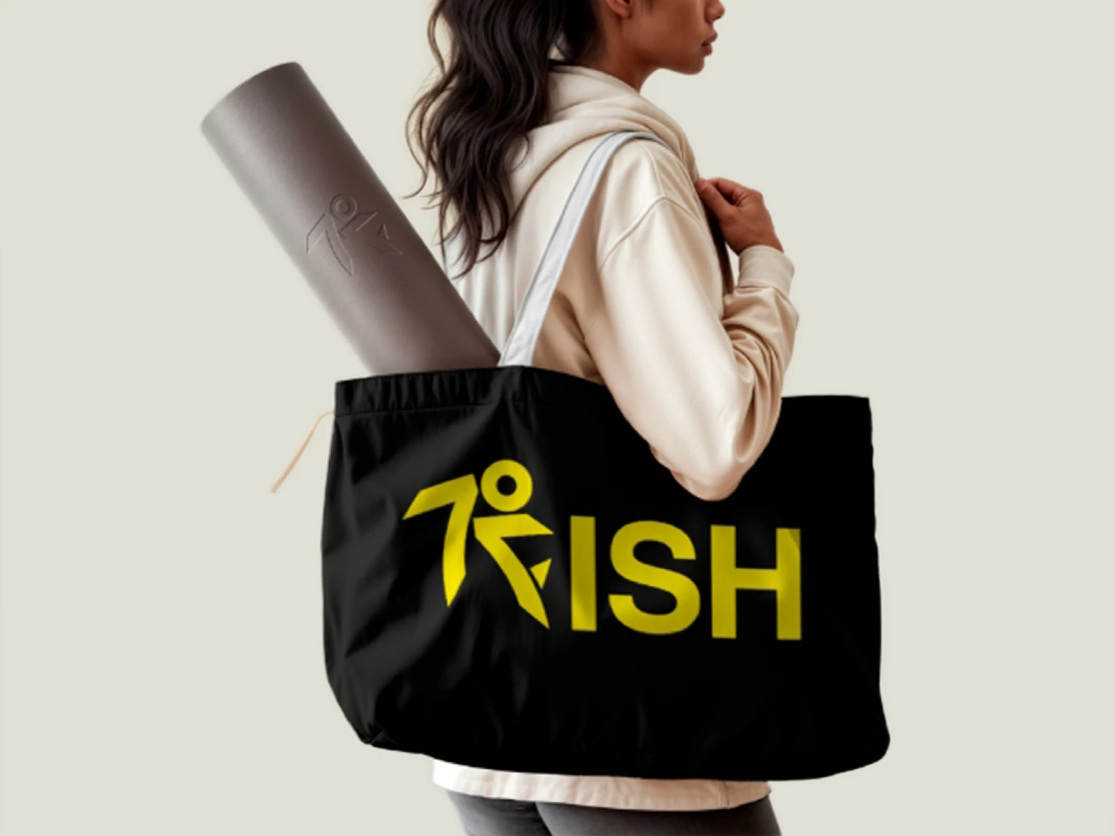
A flexible system built to hold its integrity across scale and context, from a small mark to a full campaign environment.
A distinct brand vocabulary ("Rise. Roar. Repeat.") that gives 7fish language of its own, rather than borrowing the clichés common to fitness marketing.
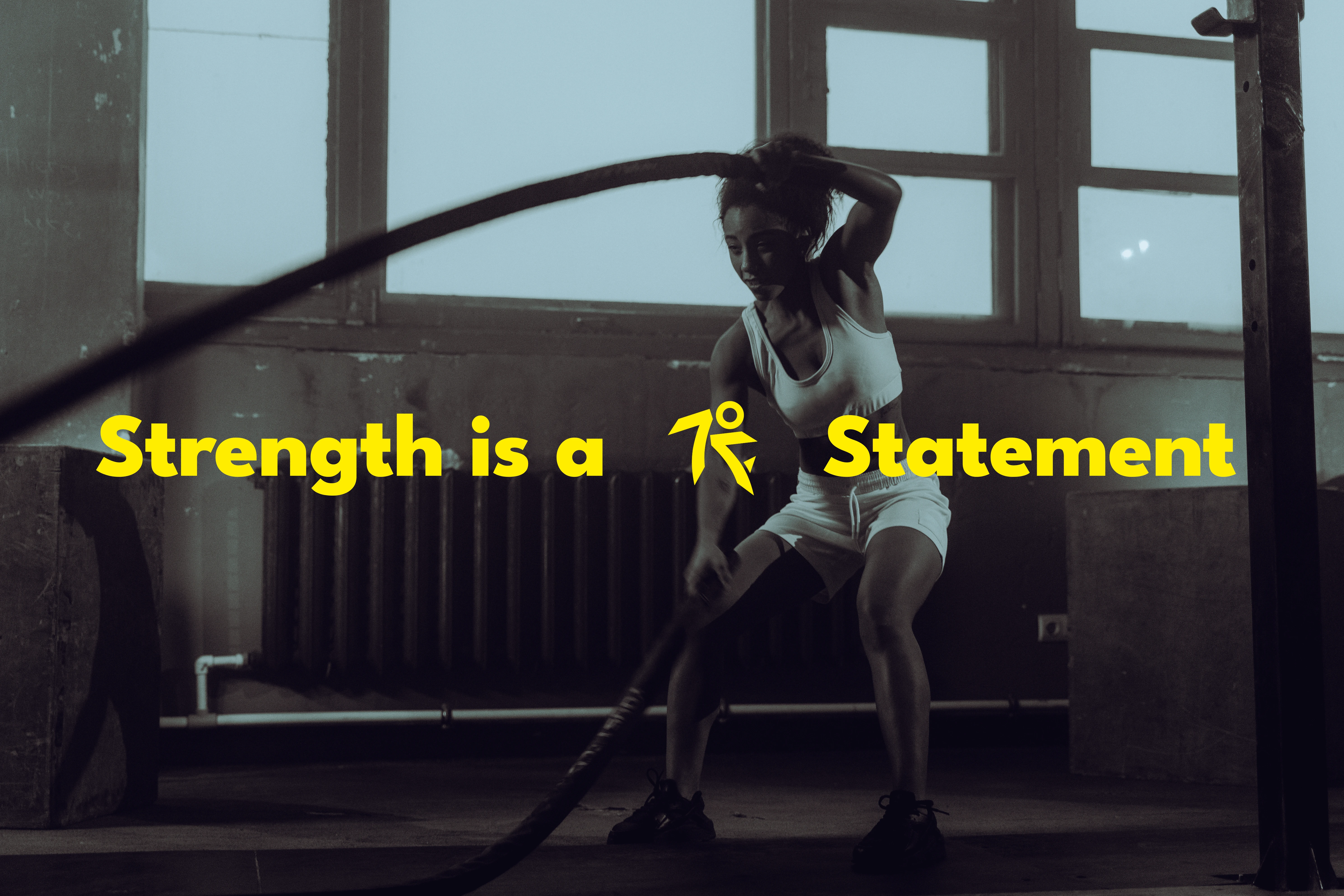
A brand voice designed to double as visual language, where the mark itself can sit inside a sentence and carry meaning, not just sit beside it.
Like this project
What the client had to say
Amazing work on our branding and brand guidelines. Extremely professional, creative and thorough, with a great understanding of fashion, US & European markets. Went above and beyond, even helping with suppliers. Highly recommend!!!!


Naim chowdhury, Hyper Herbs
Sep 4, 2026, Client
Posted Sep 6, 2026
An identity that dissolves the line between strength and elegance one mark engineered to hold both, for women who walk into every room already leading it.
Likes
0
Views
10
Timeline
May 23, 2026 - Sep 4, 2026
Clients
Hyper Herbs