Otie: A Showcase of Unattributed Design
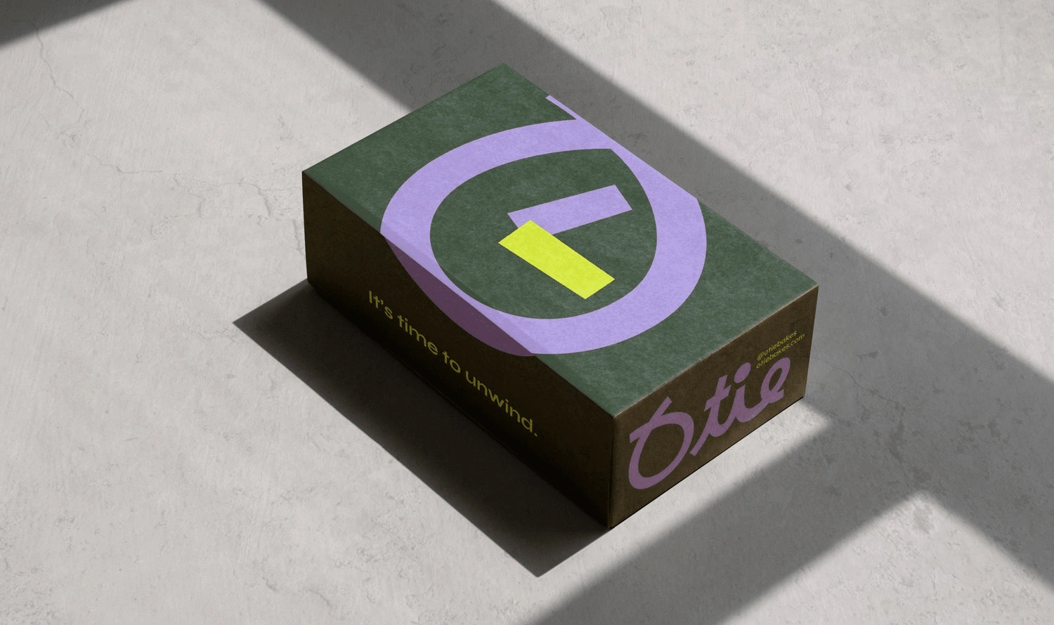
“Time to Unwind” was our guiding mantra from the start. We wanted to capture that moment when someone steps away from the bustle of daily life and indulges in a little self-care—whether that’s sipping a coffee, enjoying a sweet treat, or simply taking a breather. This idea of “unwinding” informed every design decision, from color choices to typography and layout.
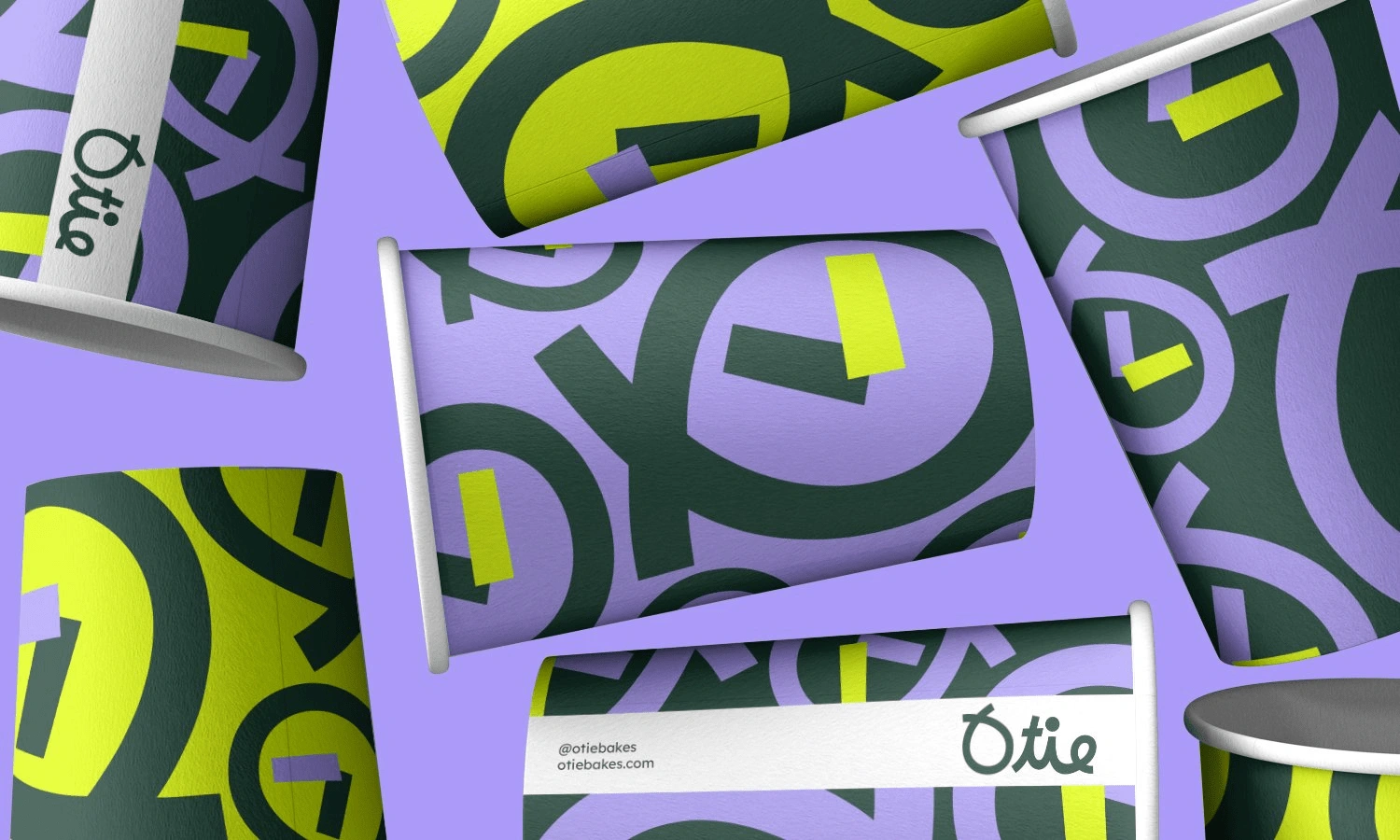
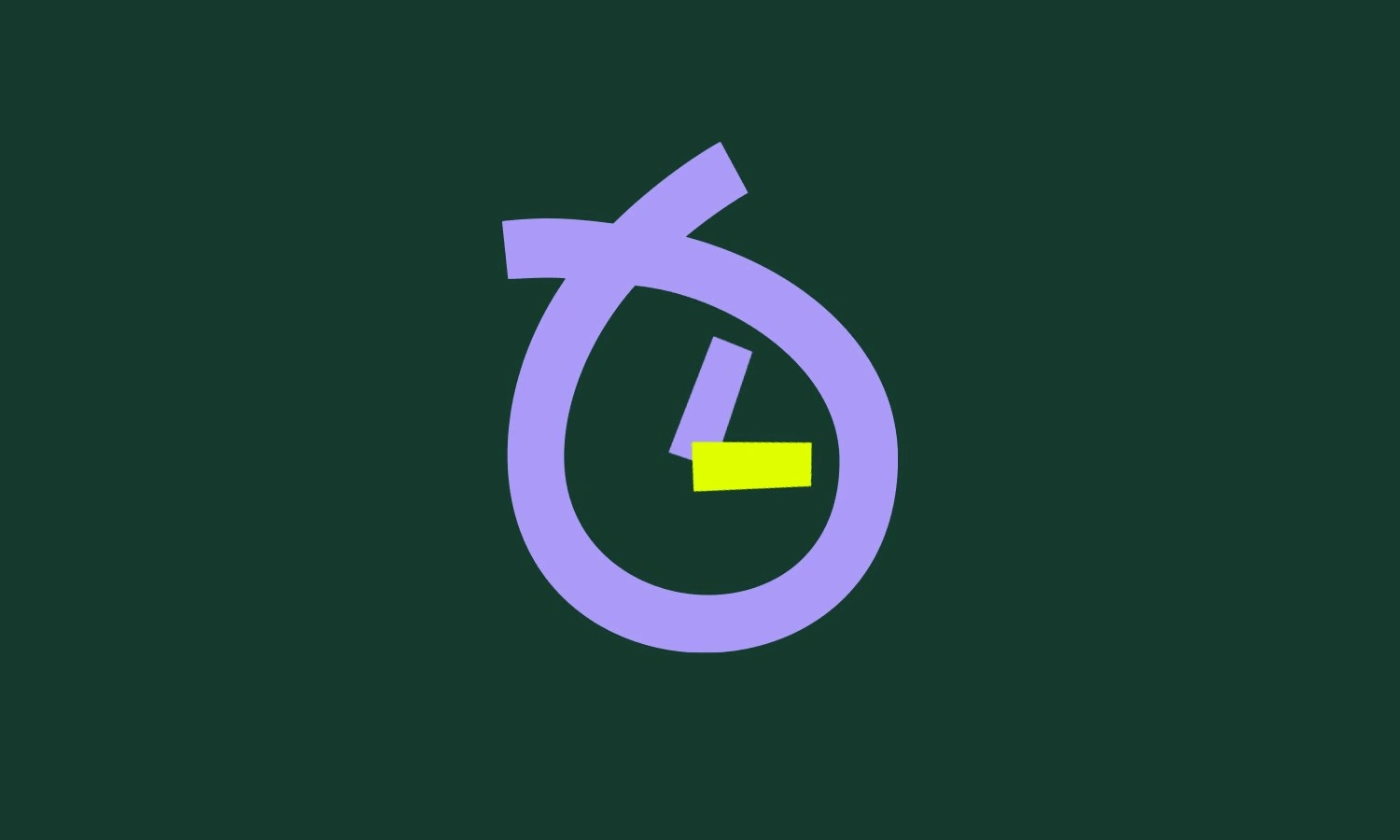
We chose bold, vibrant tones—neon green and lavender—because they’re energetic yet playful.
Neon Green signals freshness, excitement, and a bit of quirkiness.
Soft lavender creates a calm, inviting feel that balances out the bright green. This duality of vibrant vs. calming perfectly reflects the brand’s message: energizing treats and beverages in a space that feels soothing and comforting.
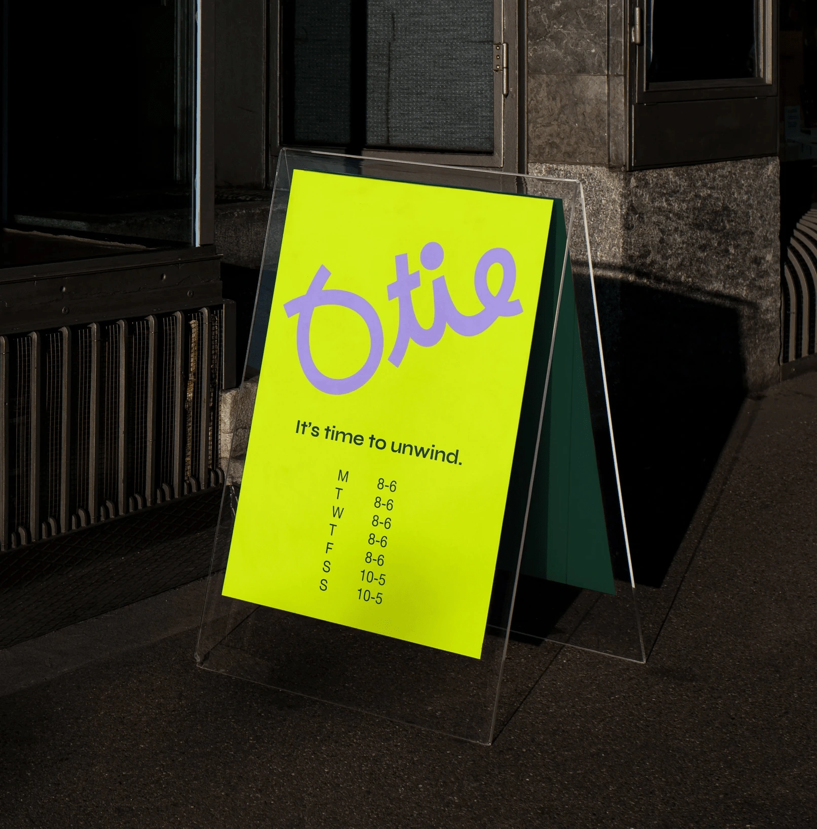
The logotype “Otie” uses a fluid, hand-drawn style to evoke a friendly, approachable vibe. It feels personal, almost as if it were penned in a casual moment of creativity—echoing the brand’s personal touch. The supporting typeface for store hours and brand messaging is clean and modern, ensuring readability and a professional edge against the playful logotype.
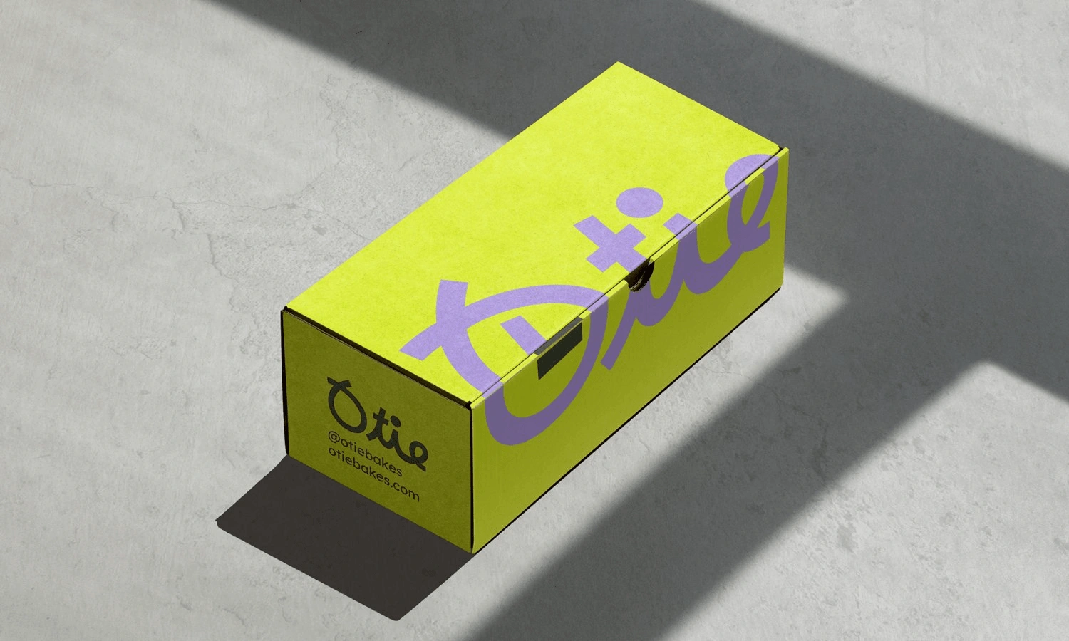
To tie everything together, we created abstract, oversized letterforms derived from the logotype. By repeating and rearranging these shapes, we formed a lively, pattern-like backdrop:
Dynamic shapes echo the circular motion of stirring coffee or kneading dough.
Oversized graphics catch attention from afar, making the packaging and signage instantly recognizable. This patterned approach injects fun and personality while also reinforcing the brand identity on cups, bags, and other touchpoints.
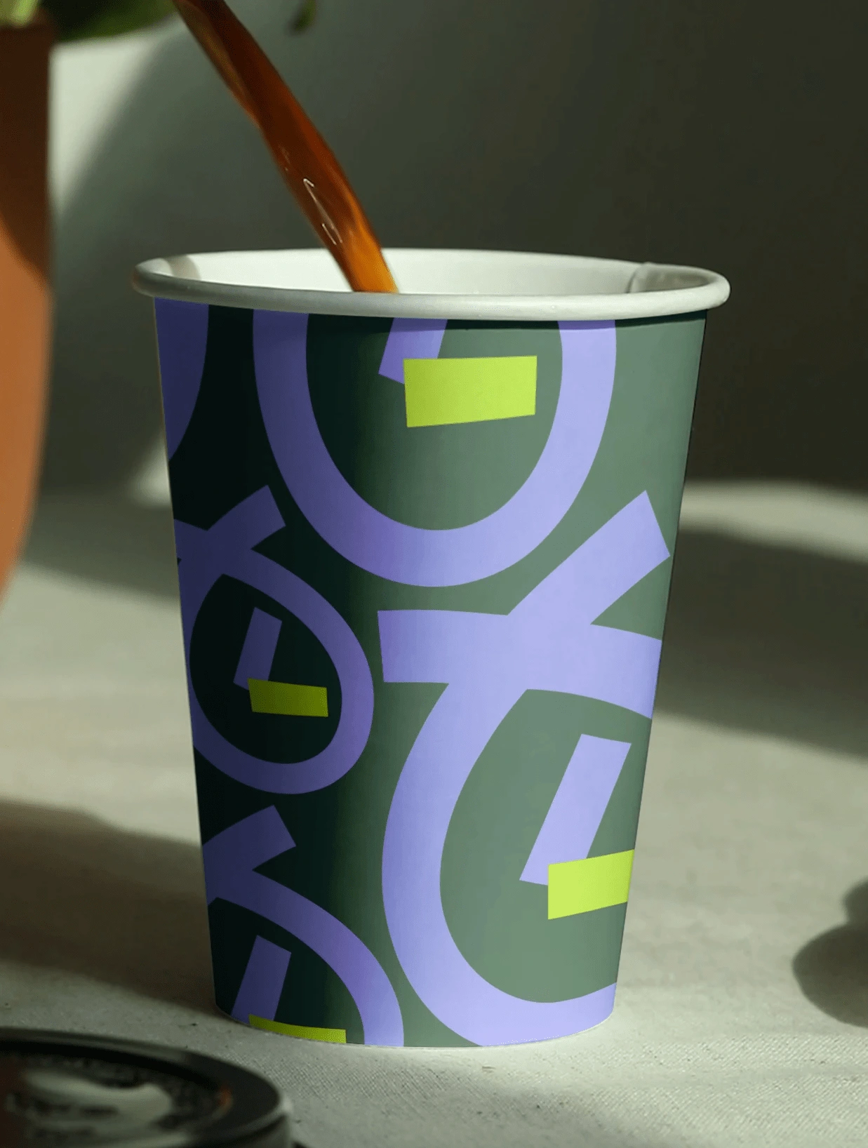
Each application—cups, bags, signage—was designed to amplify brand visibility.
Acrylic Signage: The bright poster stands out, while the translucent stand gives a modern, minimal frame. The schedule is laid out simply, emphasizing ease and approachability.
Takeaway Cups & Bags: The repeating patterns create a sense of continuity; no matter where customers go with these items, they become walking ambassadors of the brand’s playful and welcoming spirit.
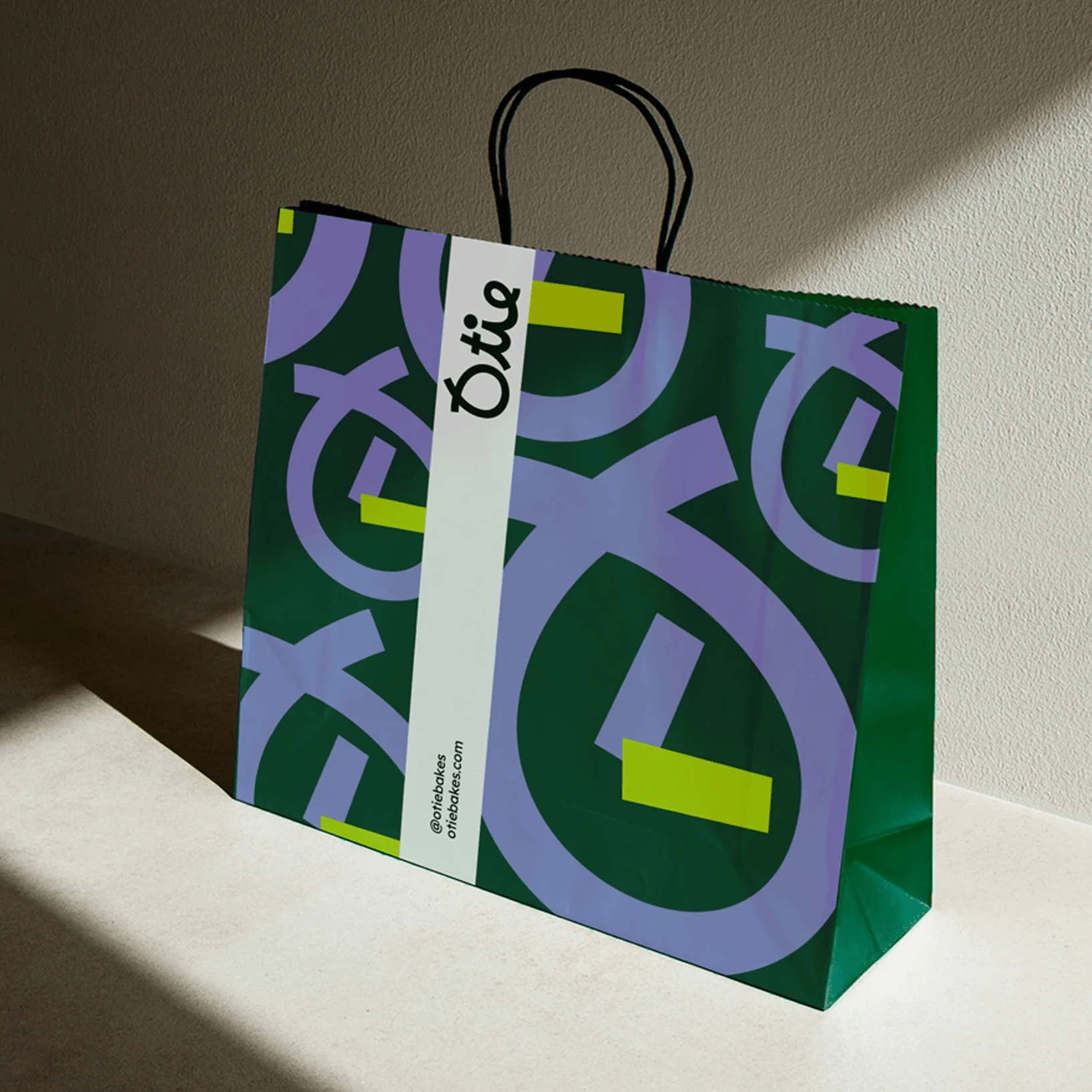
The ultimate goal was to craft an immersive, story-driven brand experience. From the moment someone sees the signage outside to the moment they hold the branded cup or bag, every design element whispers the same promise: “Take a moment, breathe, and enjoy.” This consistency builds trust and memorability—two crucial ingredients for any standout brand.
Like this project
Posted Mar 21, 2025
We present a vivid identity concept developed outside our studio, brought to life here for illustrative exploration and independent of our proprietary work.
Likes
5
Views
312
Timeline
Jan 30, 2025 - Feb 15, 2025


