Talor Made: The Art of Flavorful Design
Design Process
Discovery & Moodboarding:
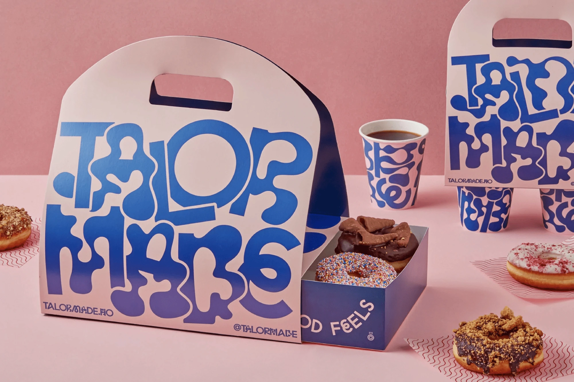
We began by immersing ourselves in the donut shop’s world: tasting donuts, chatting with the baristas, and understanding their brand values.
From there, we created mood boards filled with vibrant color palettes, retro typography references, and organic shapes.
Sketching & Conceptualization:
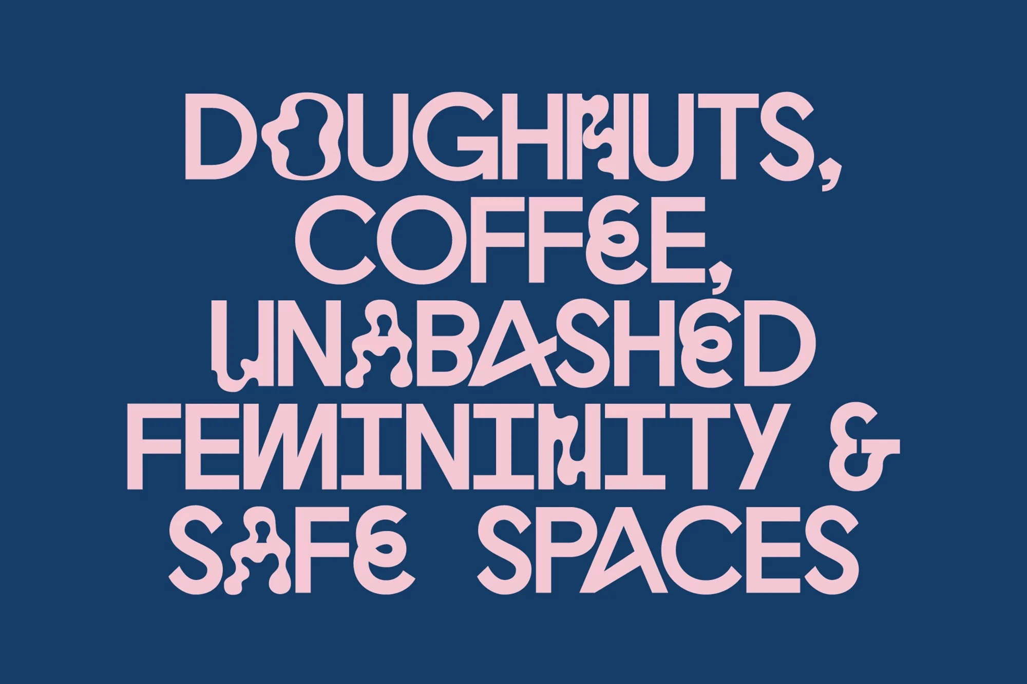
After pinning down the vibe—“playful, vibrant, and a little unexpected”—we started sketching initial logo variations and pattern ideas.
We experimented with different lettering styles to ensure the brand name remained legible yet visually dynamic.
Digital Refinement:
Once the best sketches were chosen, we digitized them. Each letter was hand-drawn and vectorized, so the forms could be cleanly scaled for everything from coffee cups to large donut boxes.
We explored color variations, testing which combinations best highlighted the brand’s spirited identity.
Packaging Prototypes:
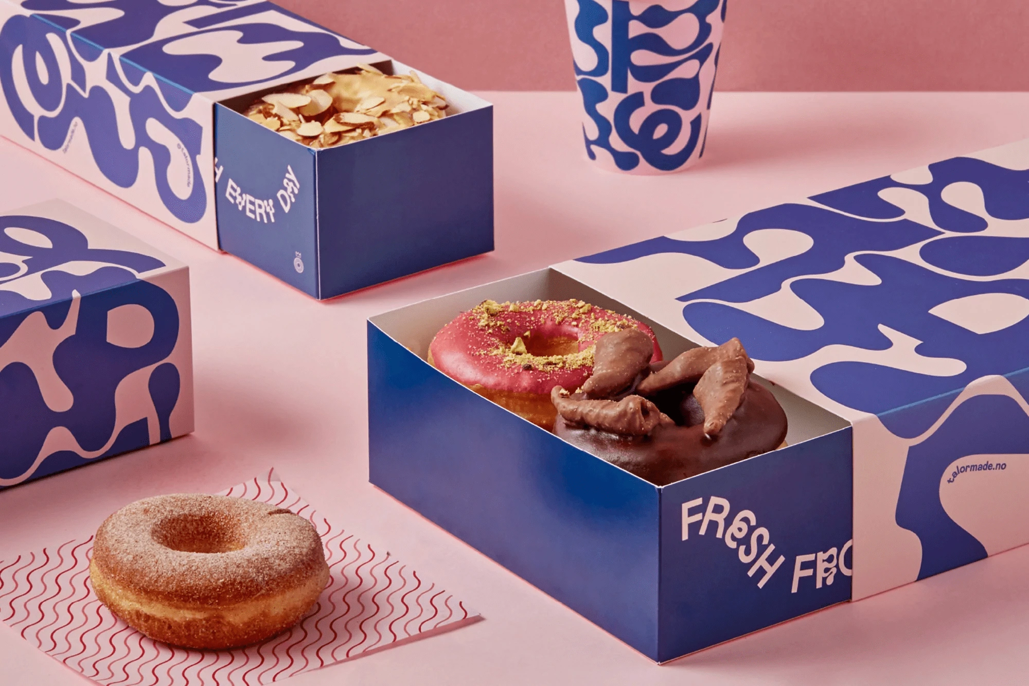
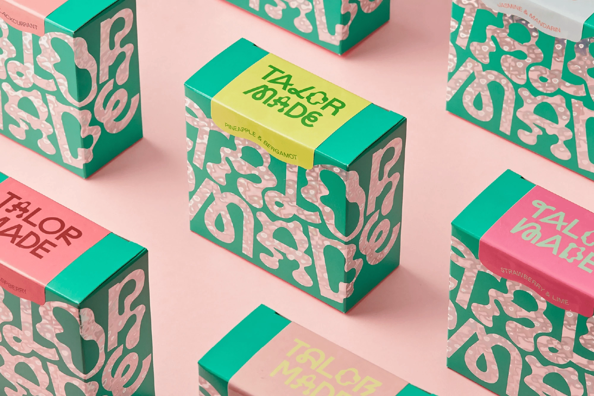
With the final logo and patterns approved, we moved on to structural design. We tested various box shapes and sizes, ensuring they would comfortably hold donuts without damaging toppings.
We also created prototypes for coffee cups and sleeves, balancing brand visibility with practicality (like heat insulation and secure fitting).
Material Selection & Print Production:
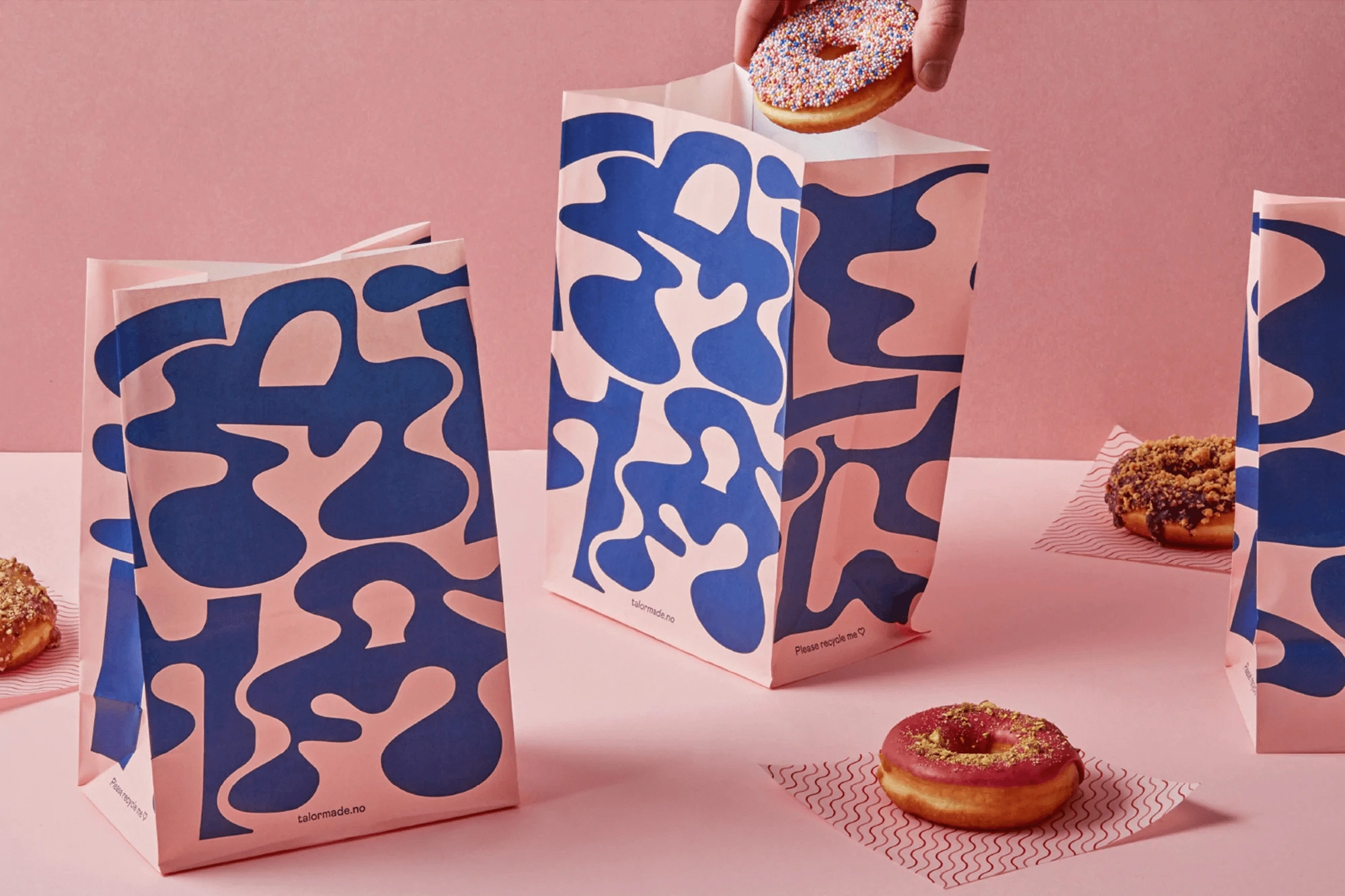
Sustainability was a concern, so we chose recyclable paperboard and soy-based inks where possible.
We worked closely with the printer to achieve crisp, vivid colors and maintain consistency across all items—boxes, cups, and bags.
Final Touches & Launch:
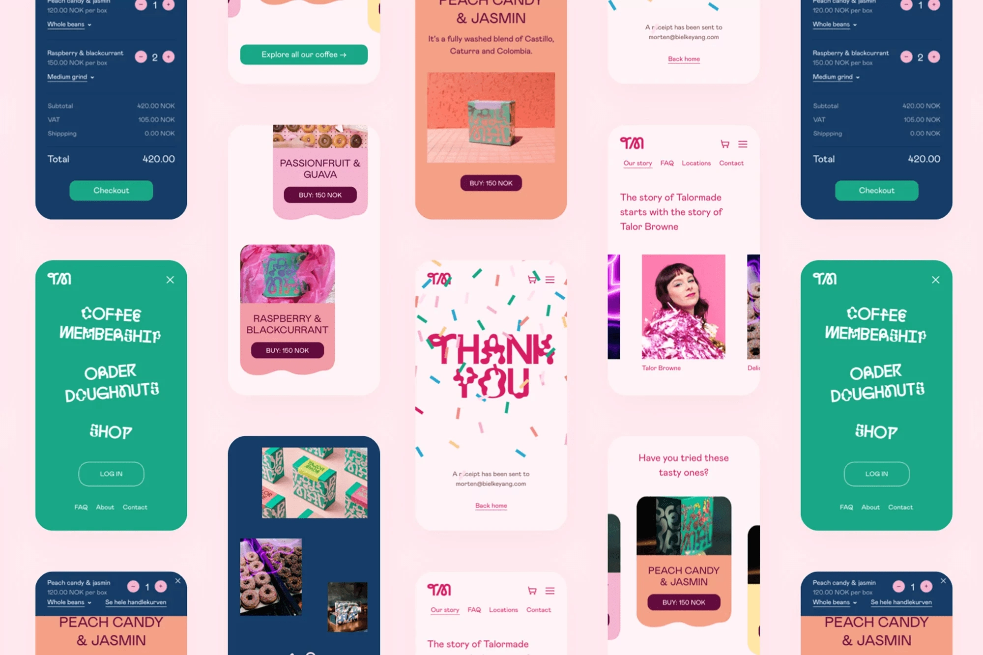
The entire packaging suite was photographed in a bright, pastel environment to reflect the joyful energy of the brand. These images were then used in marketing campaigns and social media promotions.
Like this project
Posted Mar 20, 2025
Immerse in vibrant hues and dynamic swirls that transform every donut box into a sensory journey of flavor, fun, and artful style, evoking pure delight for you.
Likes
6
Views
519
Timeline
Oct 20, 2024 - Dec 10, 2024


