Taskly: Task & Time-Tracking Mobile App, UX/UI Case Study

Saif Ali

Overview
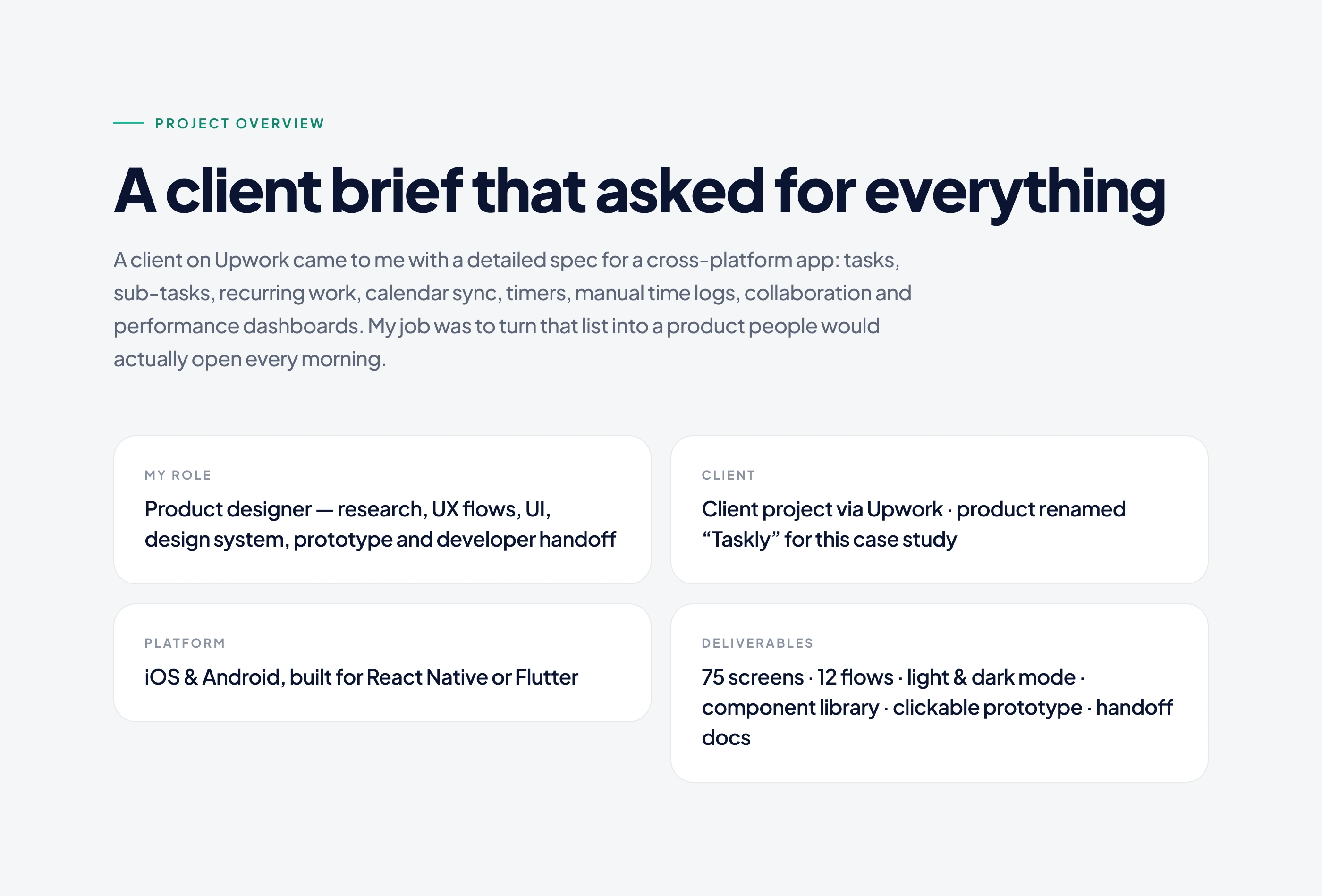
Role: UX/UI designer, end to end
Client: Upwork client (product renamed to Taskly)
Platform: mobile app for iOS and Android
Tools: Figma
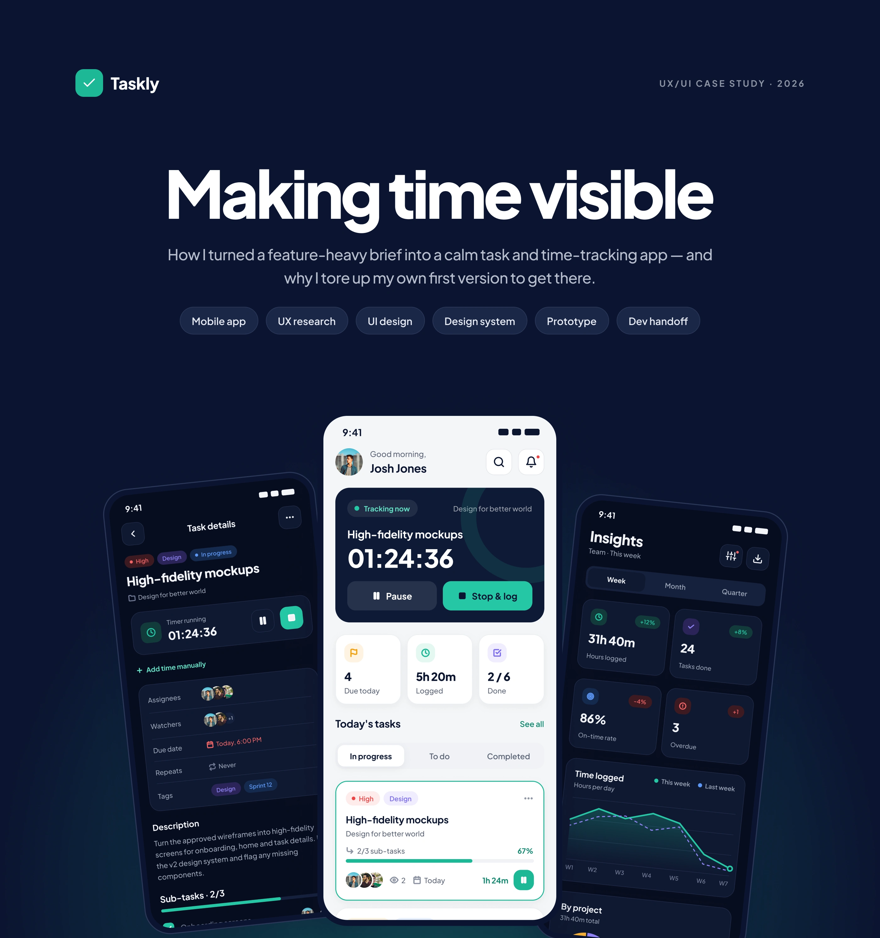
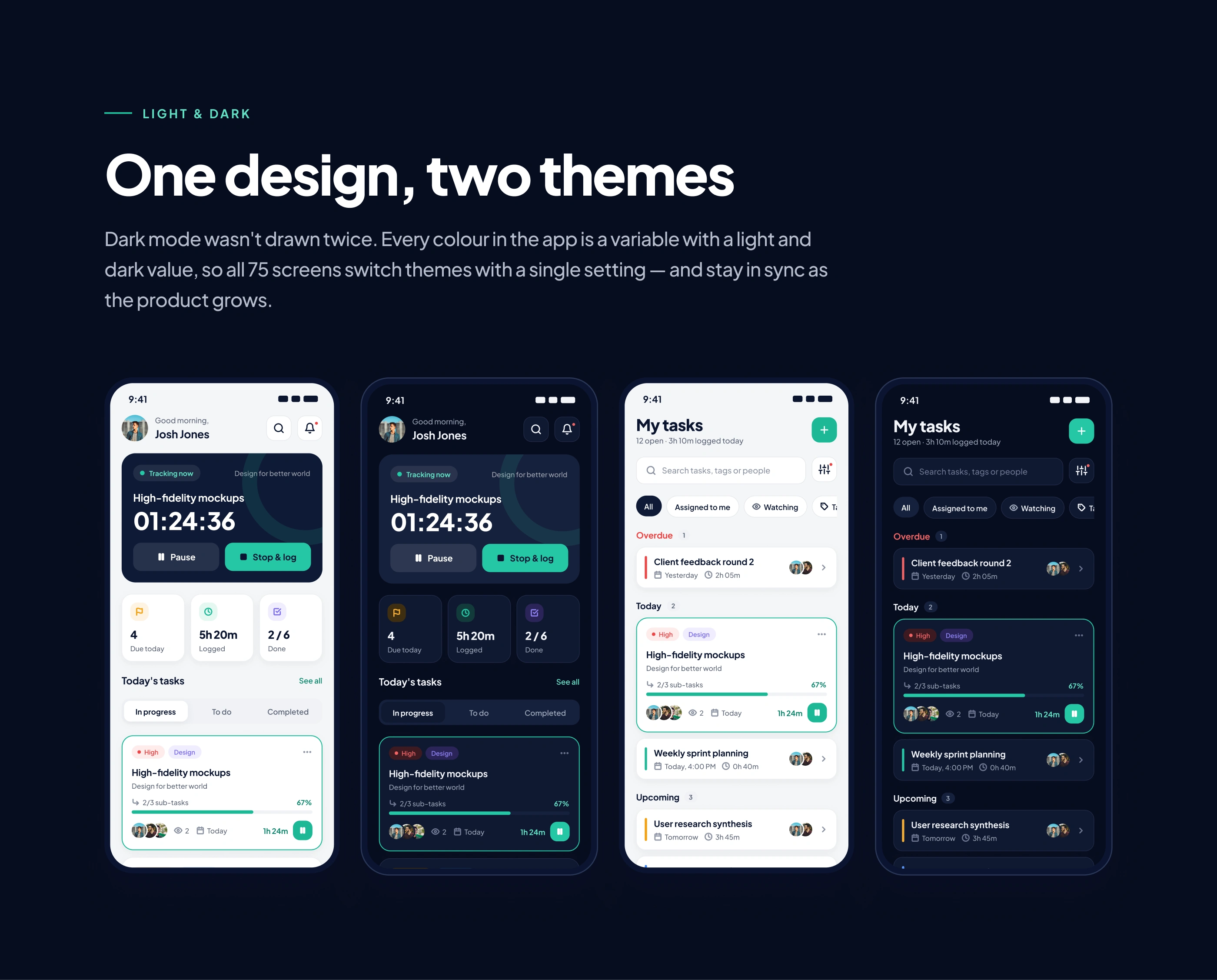
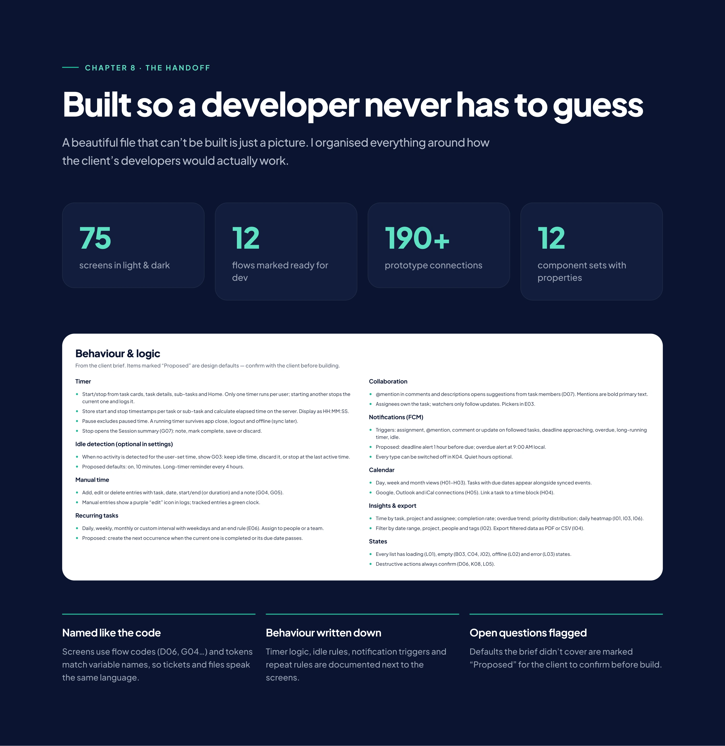
Delivered: 75 screens, 12 user flows, light and dark mode, a component library and a developer handoff
The challenge
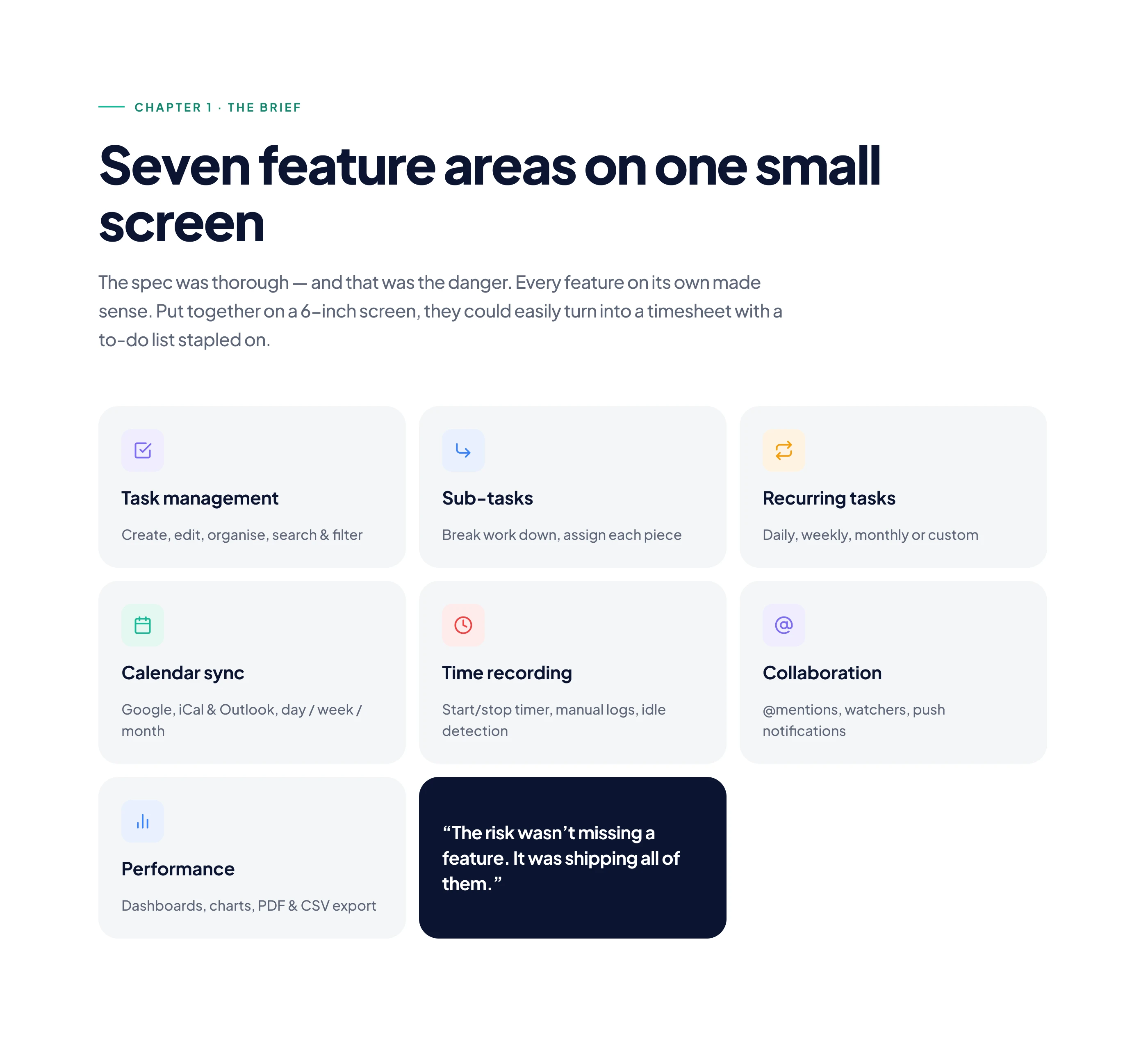
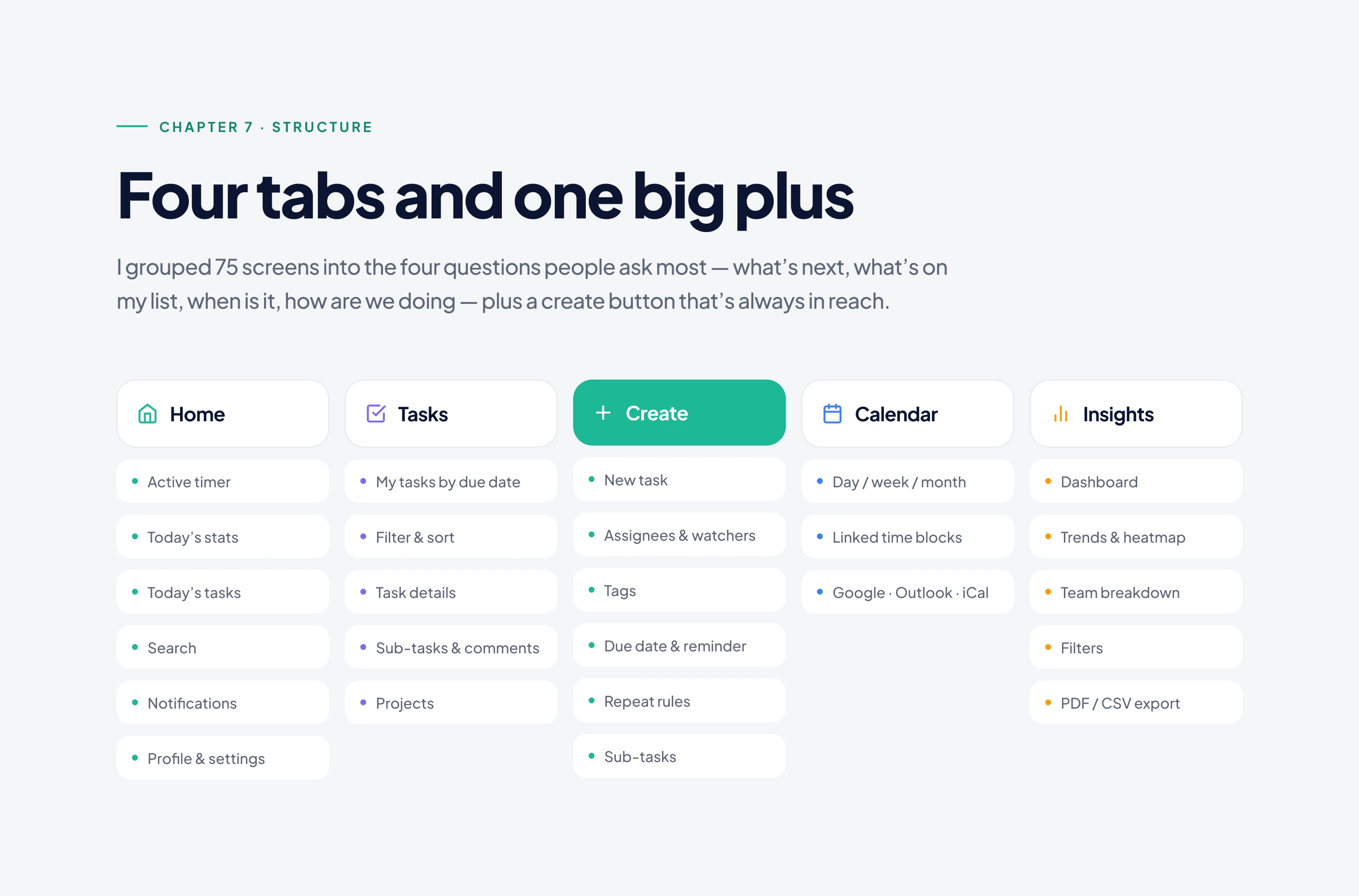
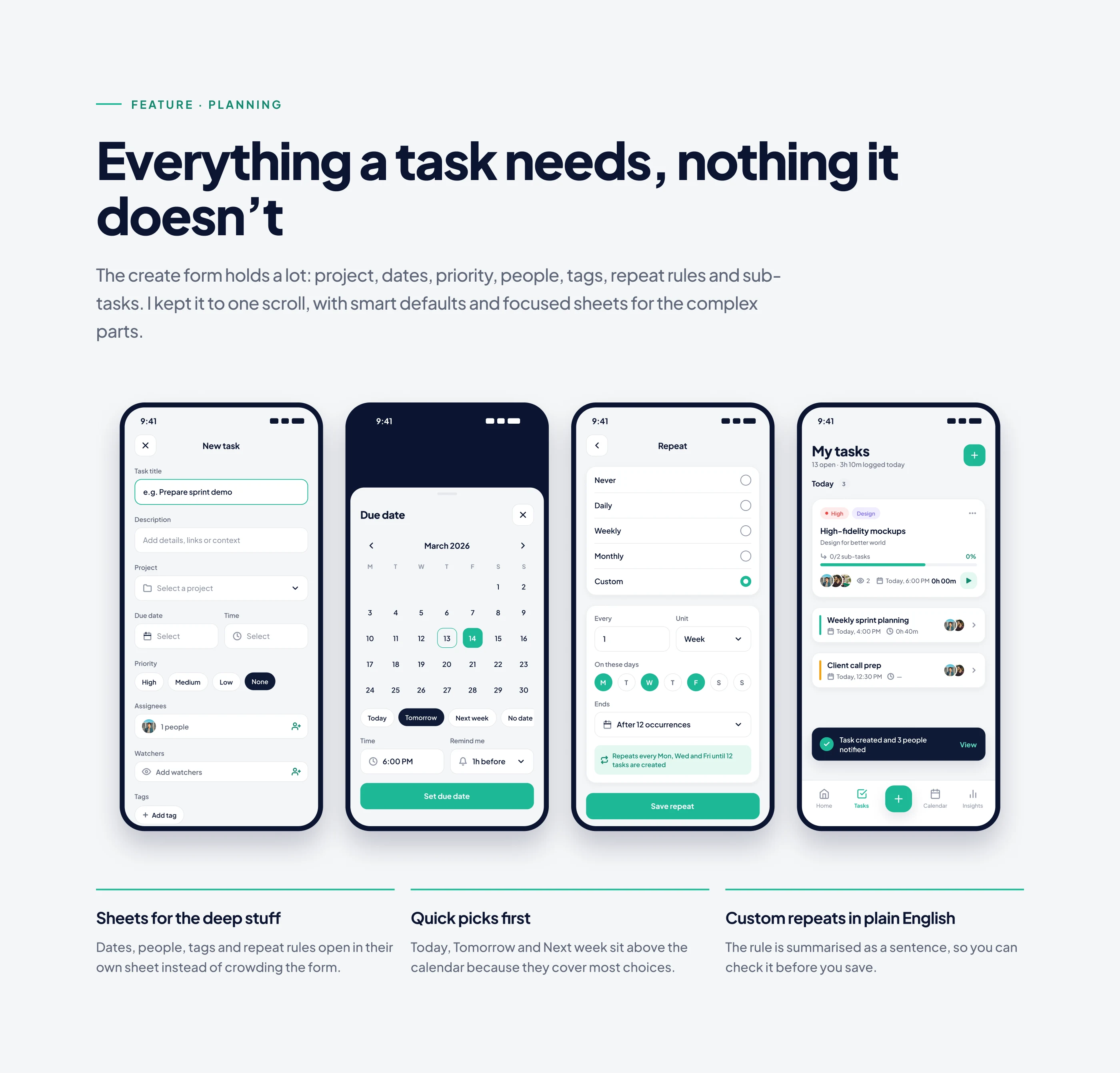
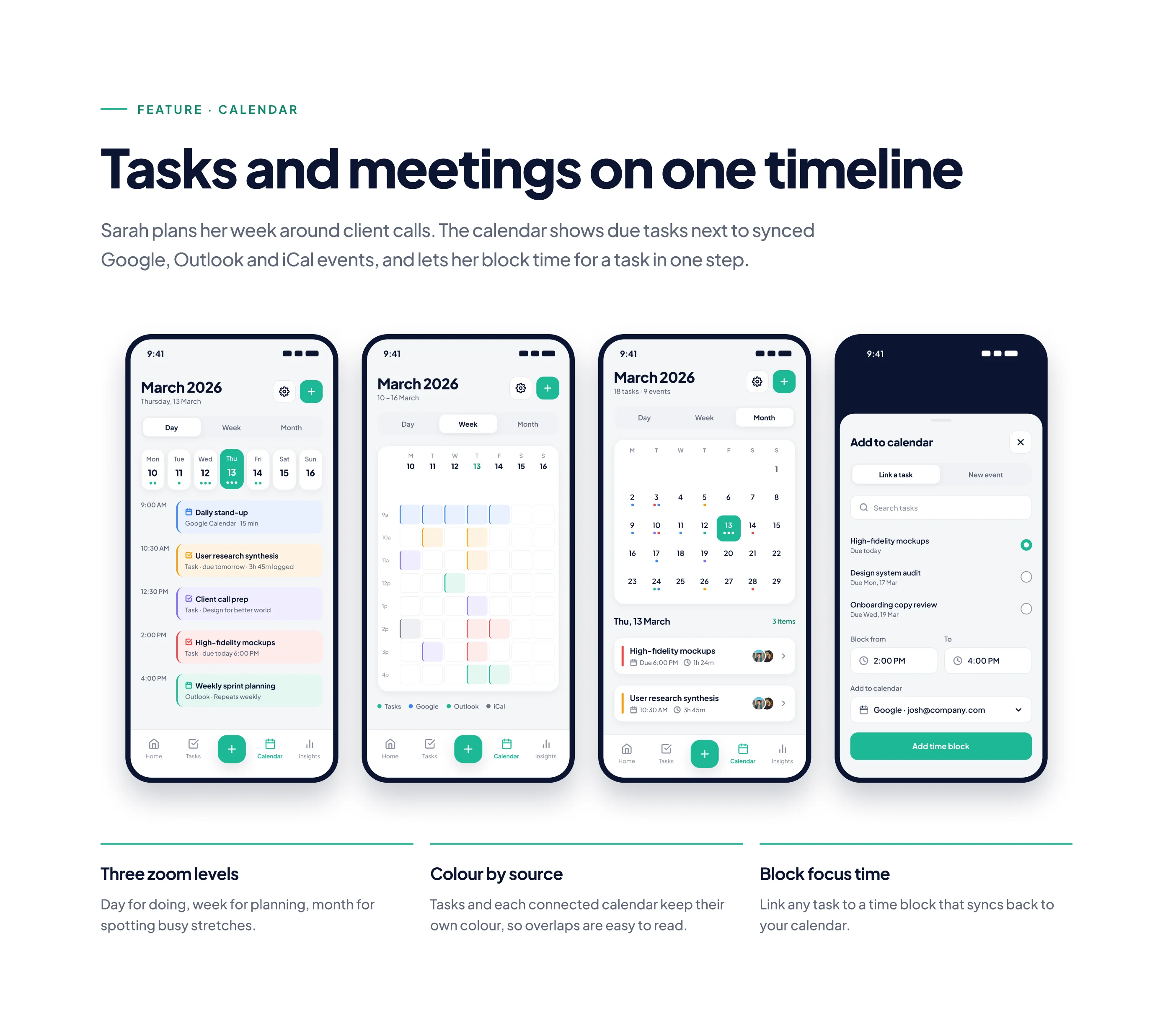
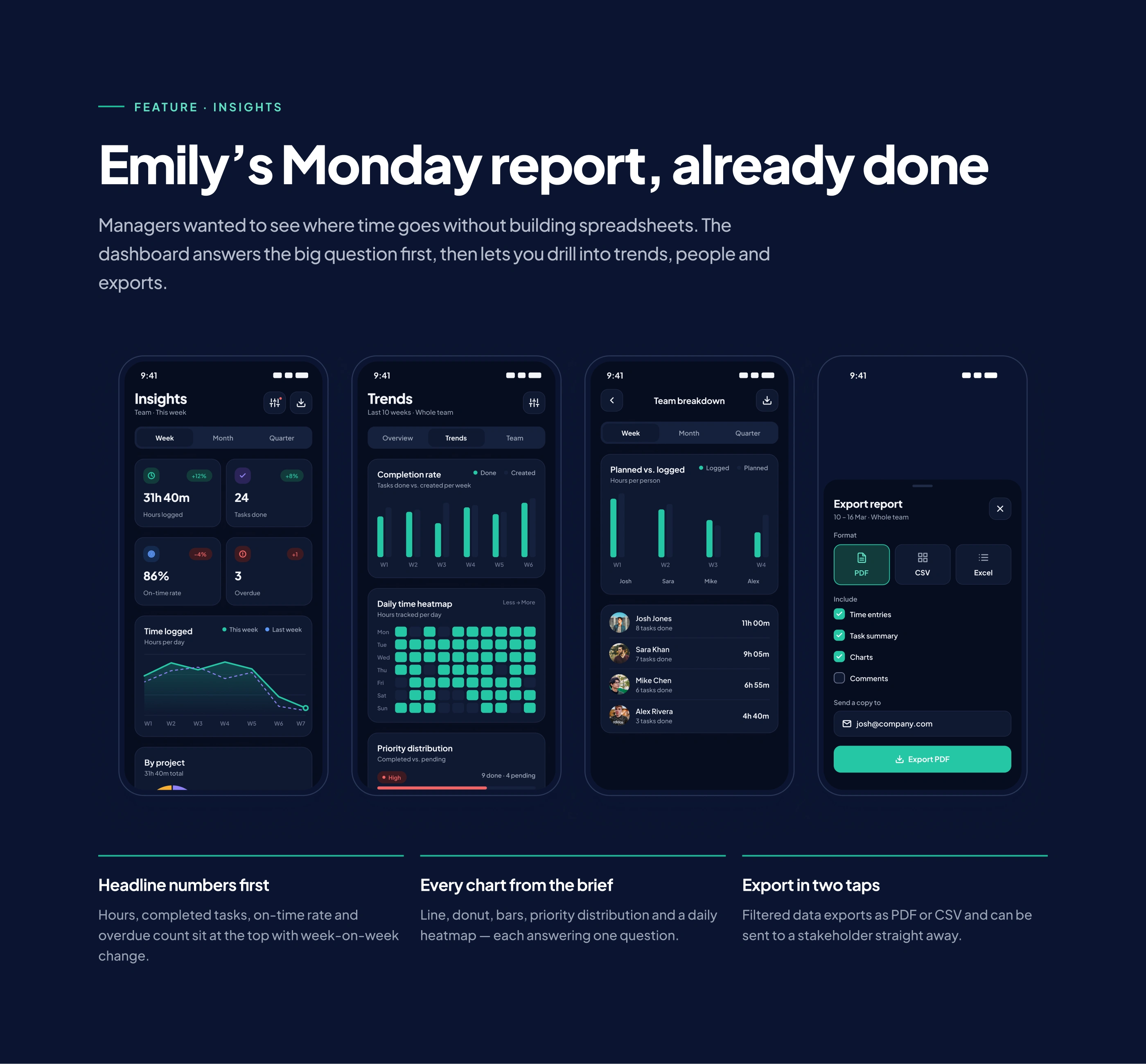
The brief asked for everything at once: tasks, sub-tasks, recurring work, calendar sync, timers and team dashboards. Fitting all of that on a phone screen without overwhelming people was the real problem to solve.
Process
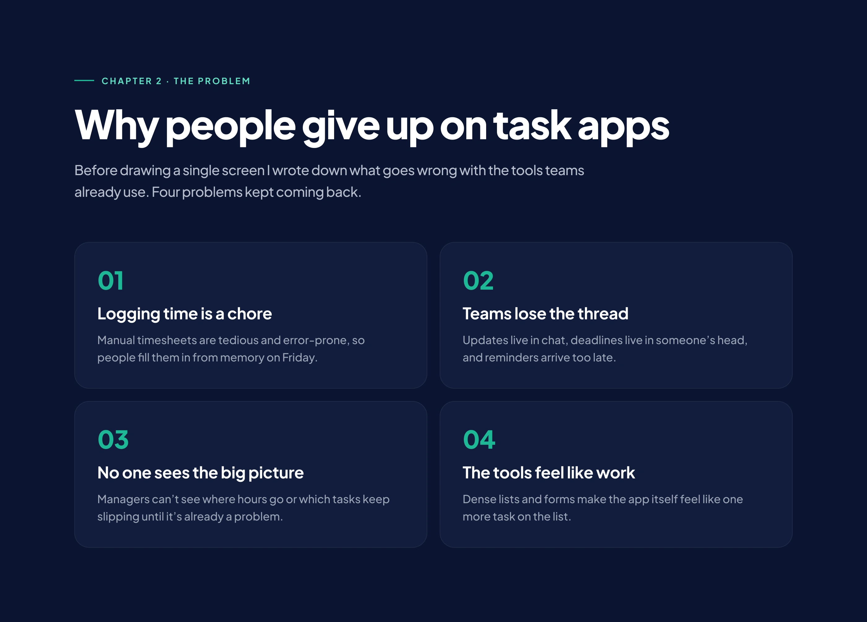
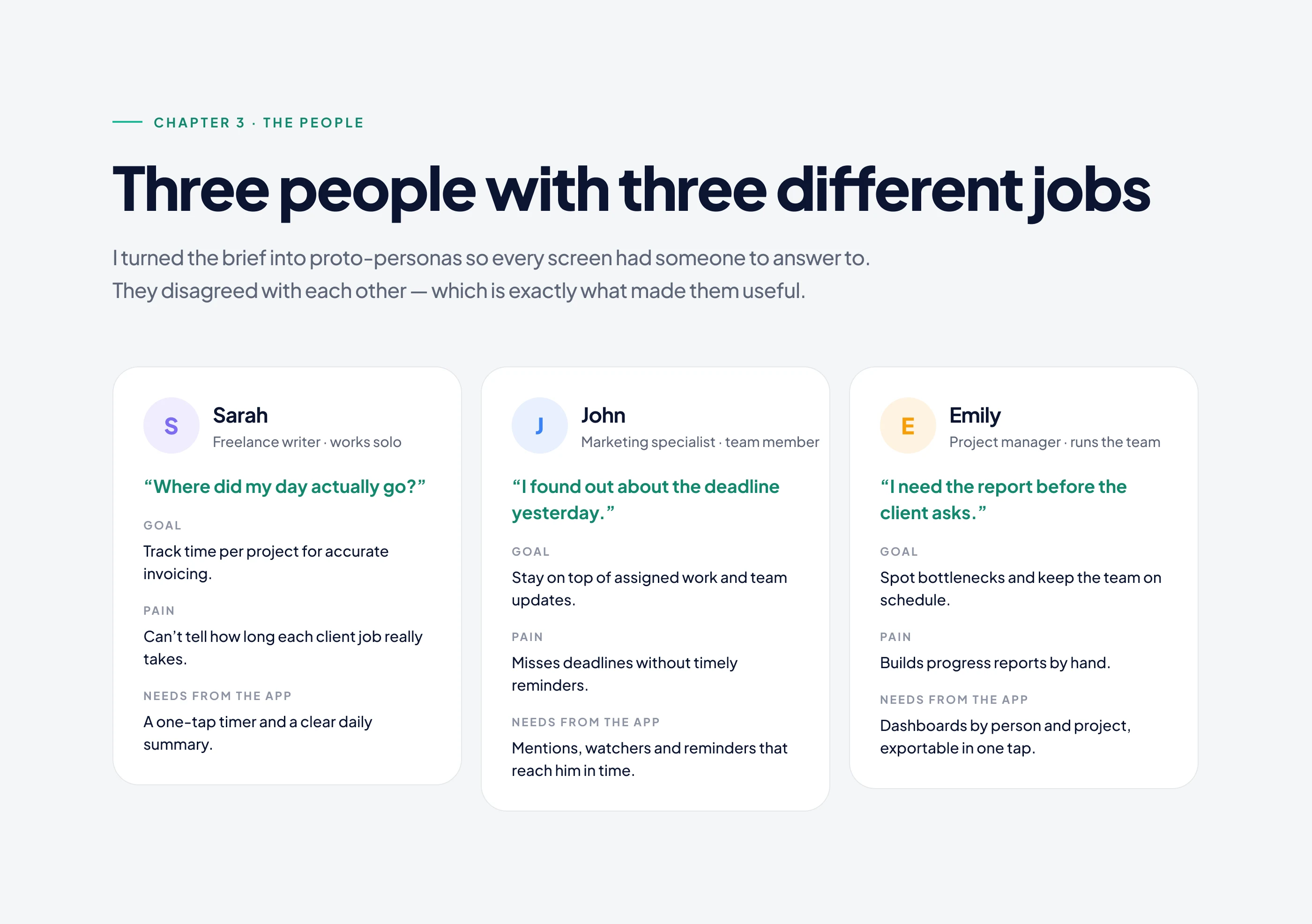
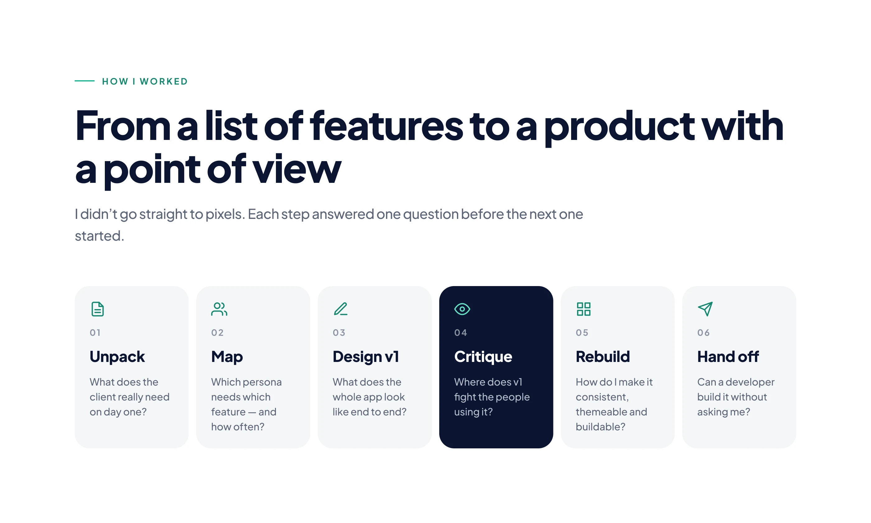
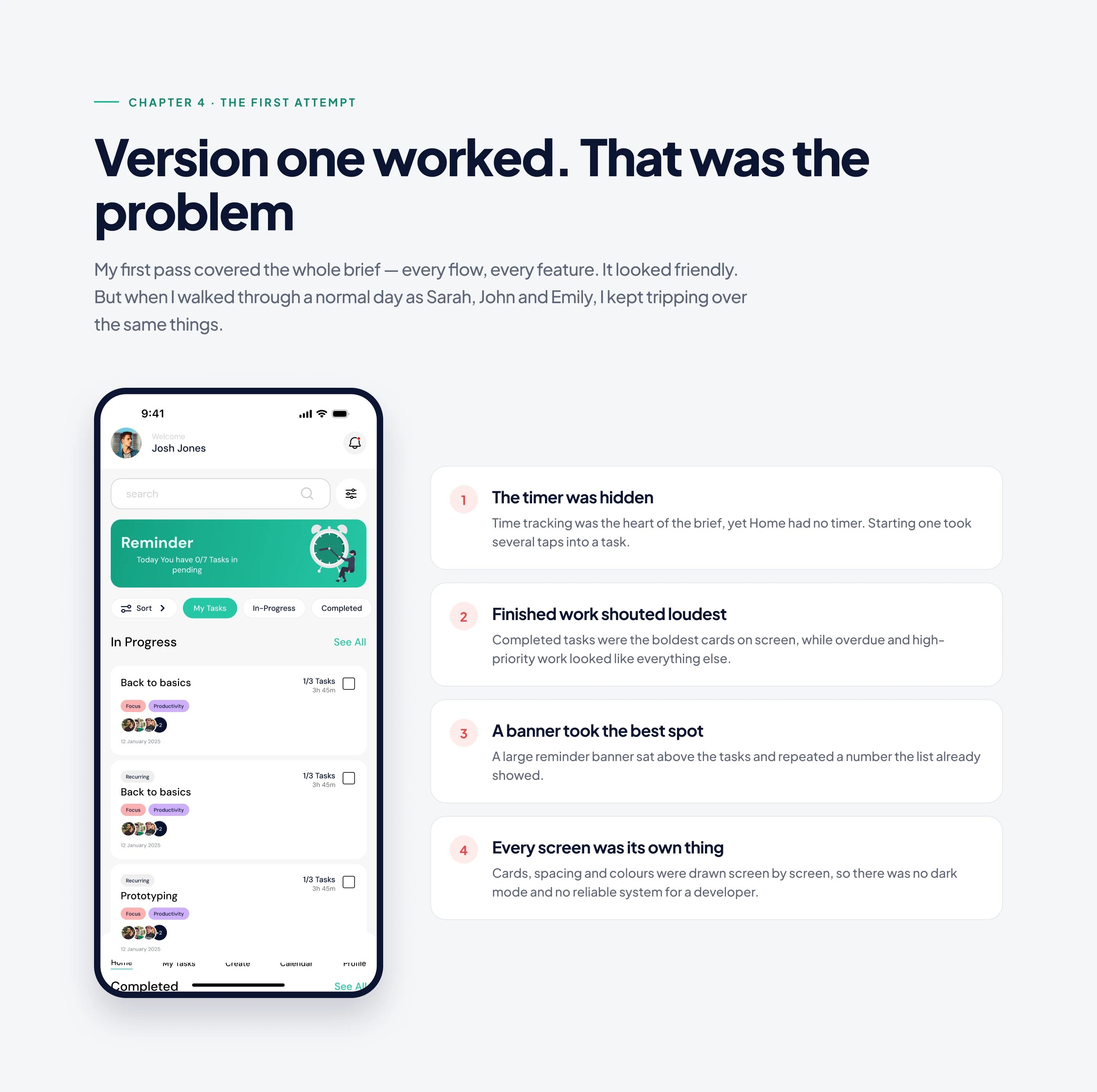
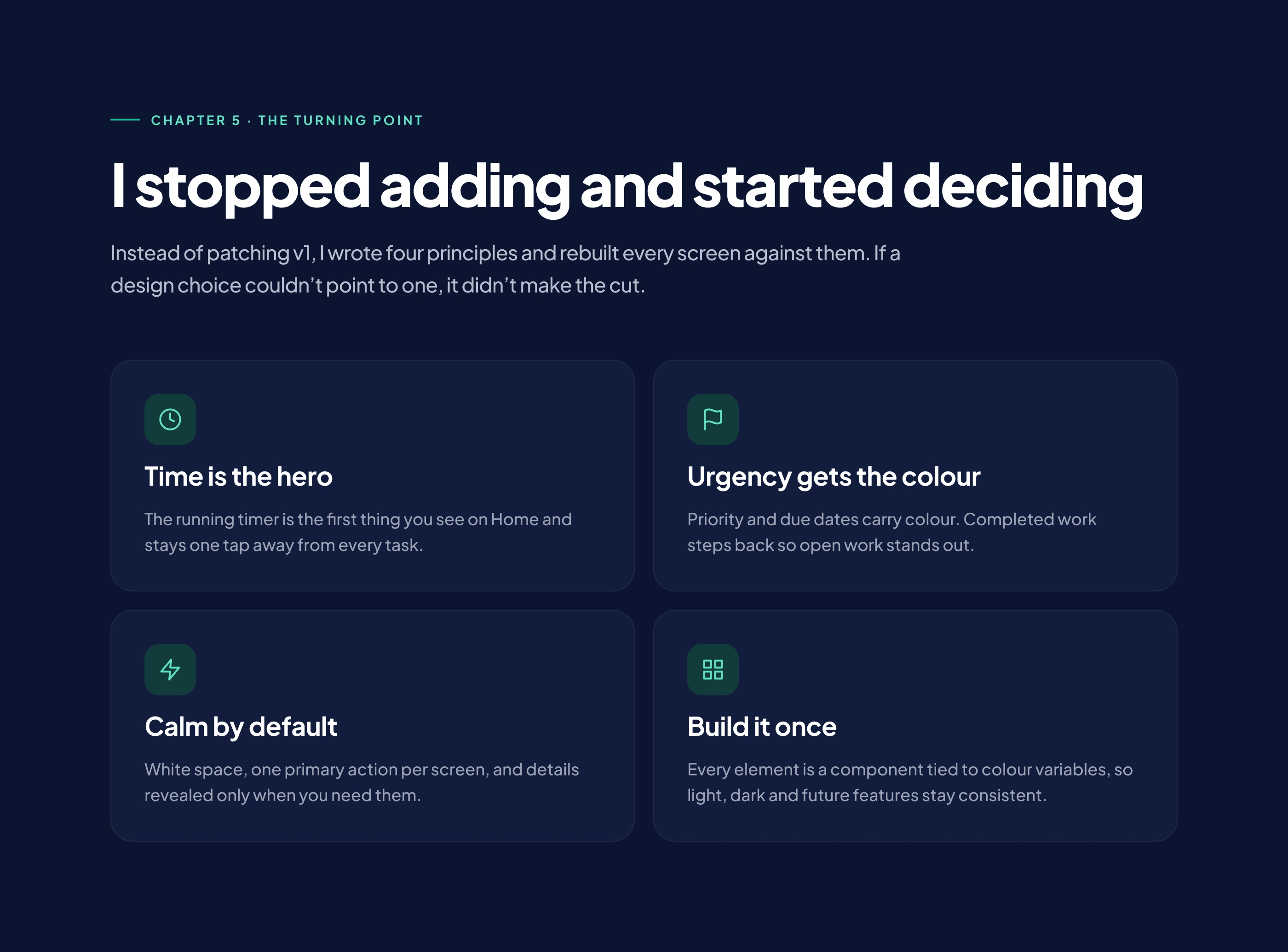
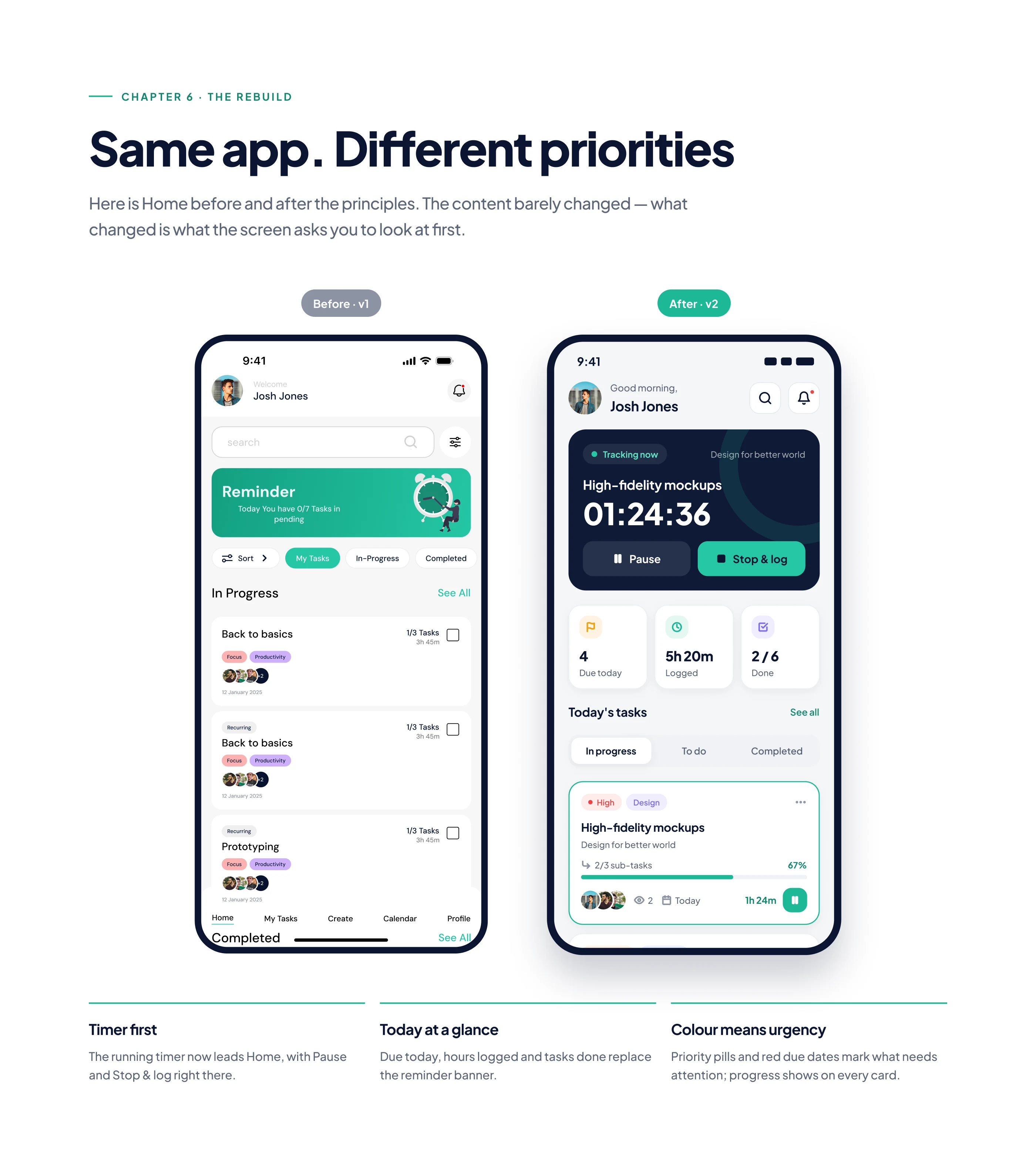
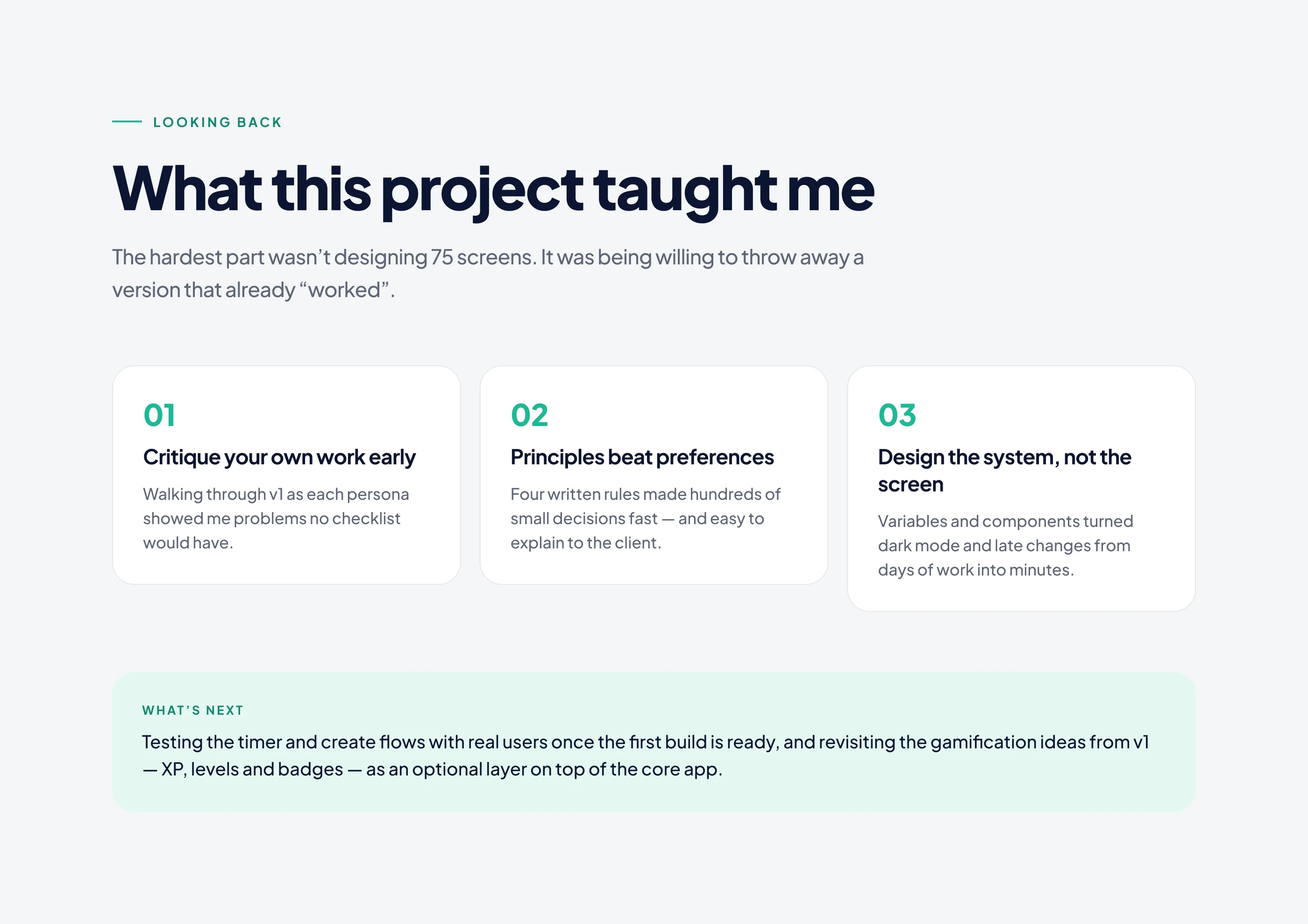
I started with why people give up on task apps, defined three types of users with different jobs, and turned the feature list into a product with a clear point of view. My first version worked, but it still tried to do too much, so I rebuilt it around decisions: what each user needs first, and what can wait.
Final design
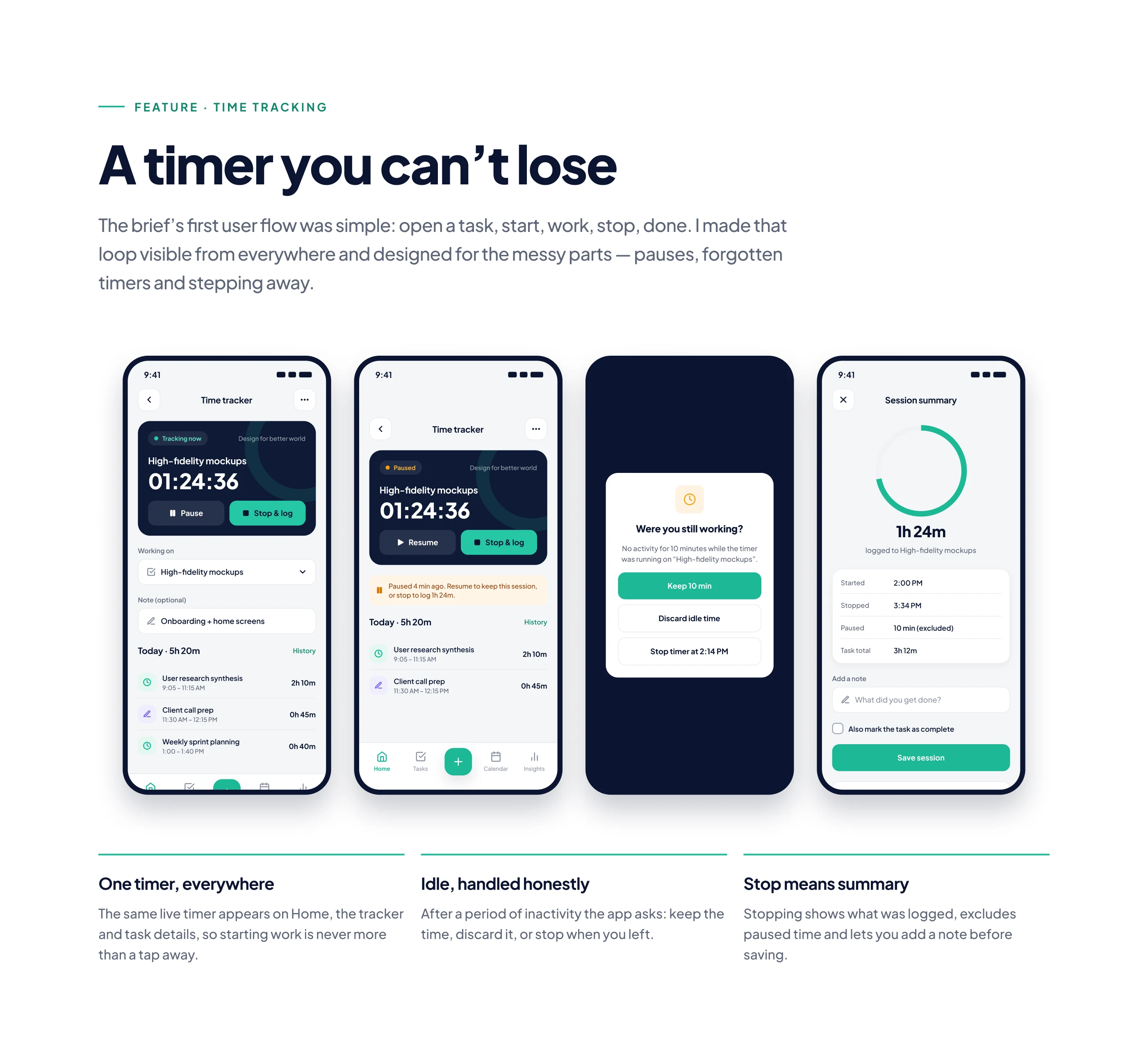
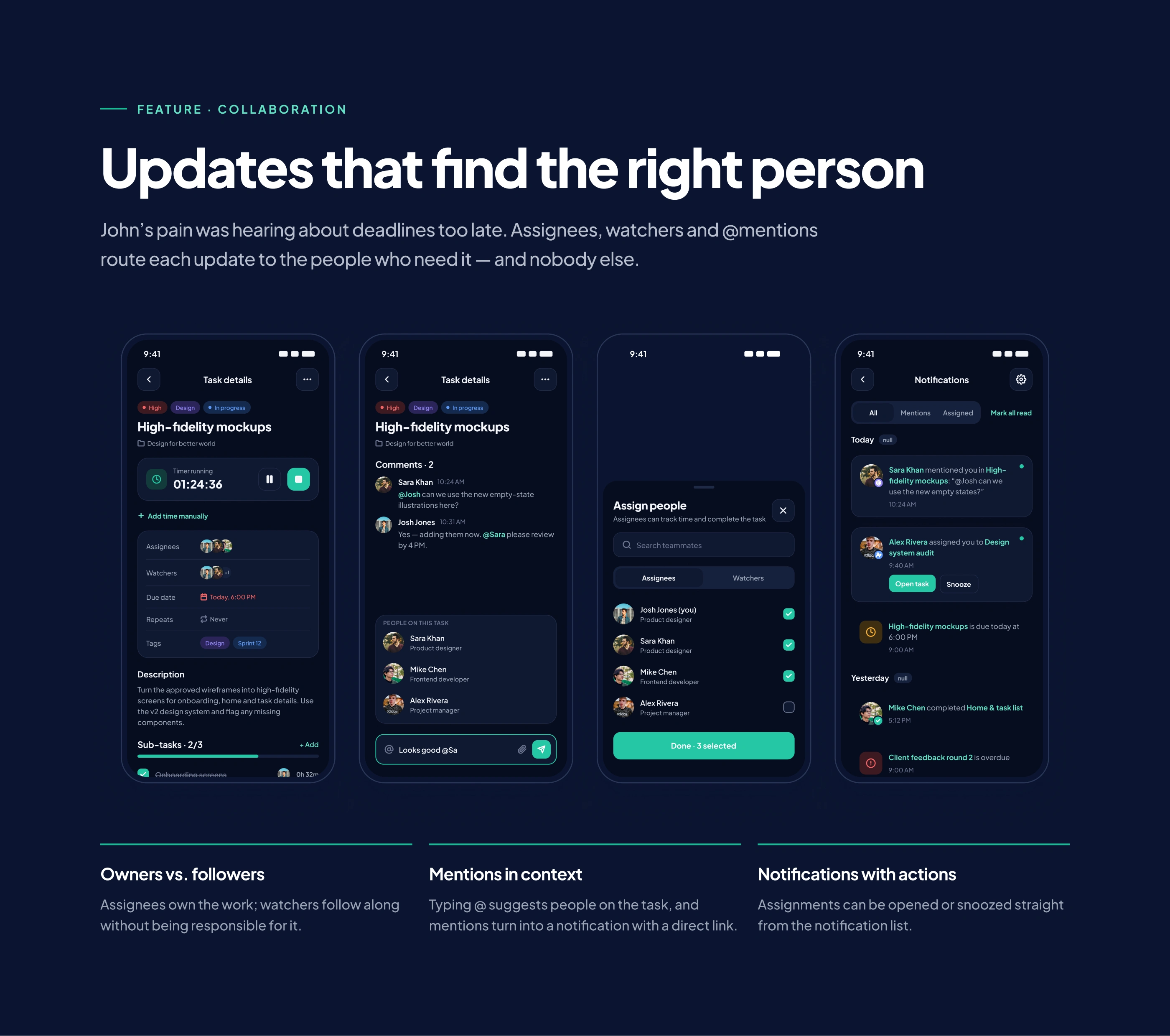
A calm app built around one timer that stays visible everywhere, four main tabs, and screens shaped around each user's priorities, designed in both light and dark mode.
Design system and handoff
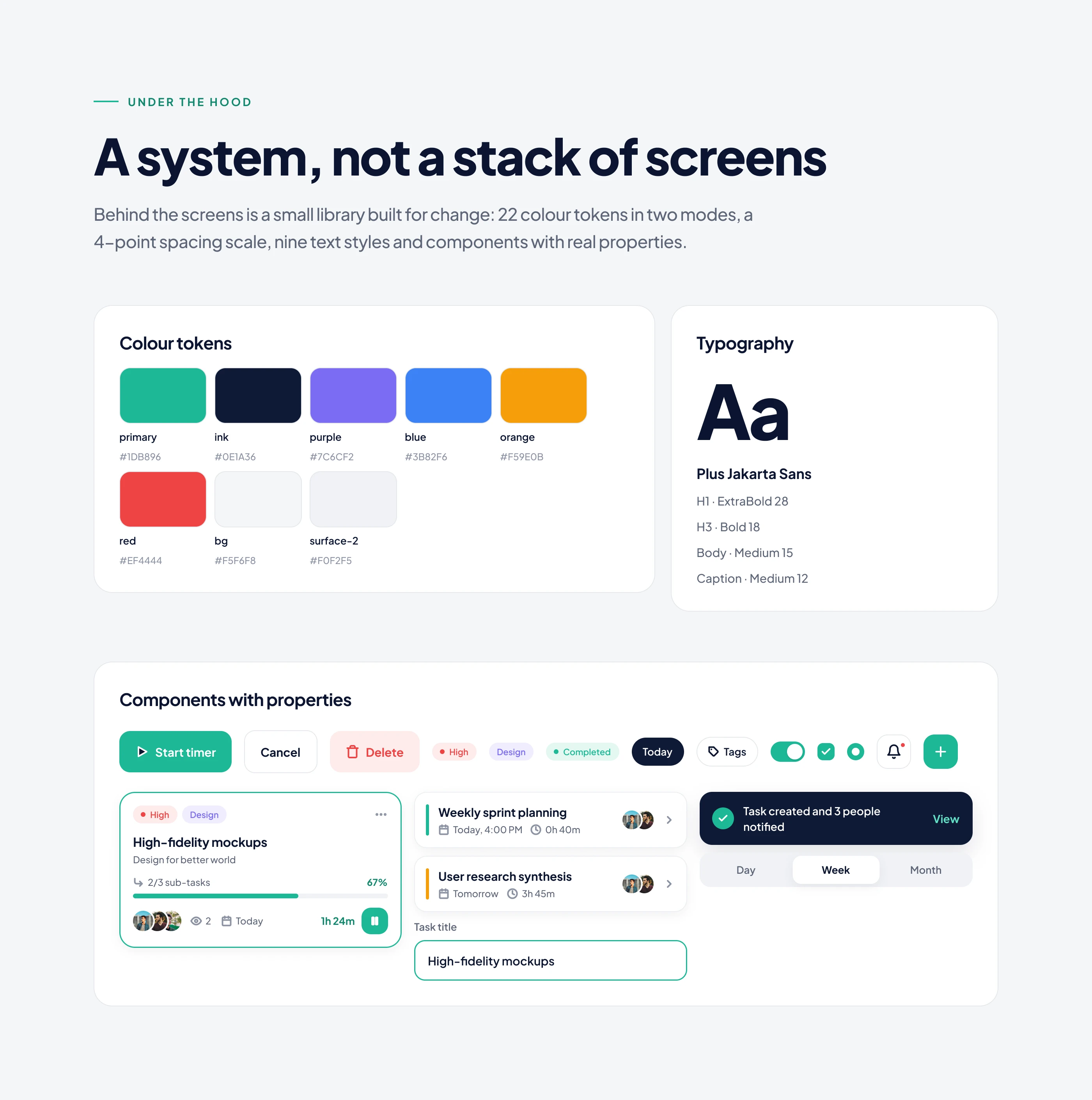
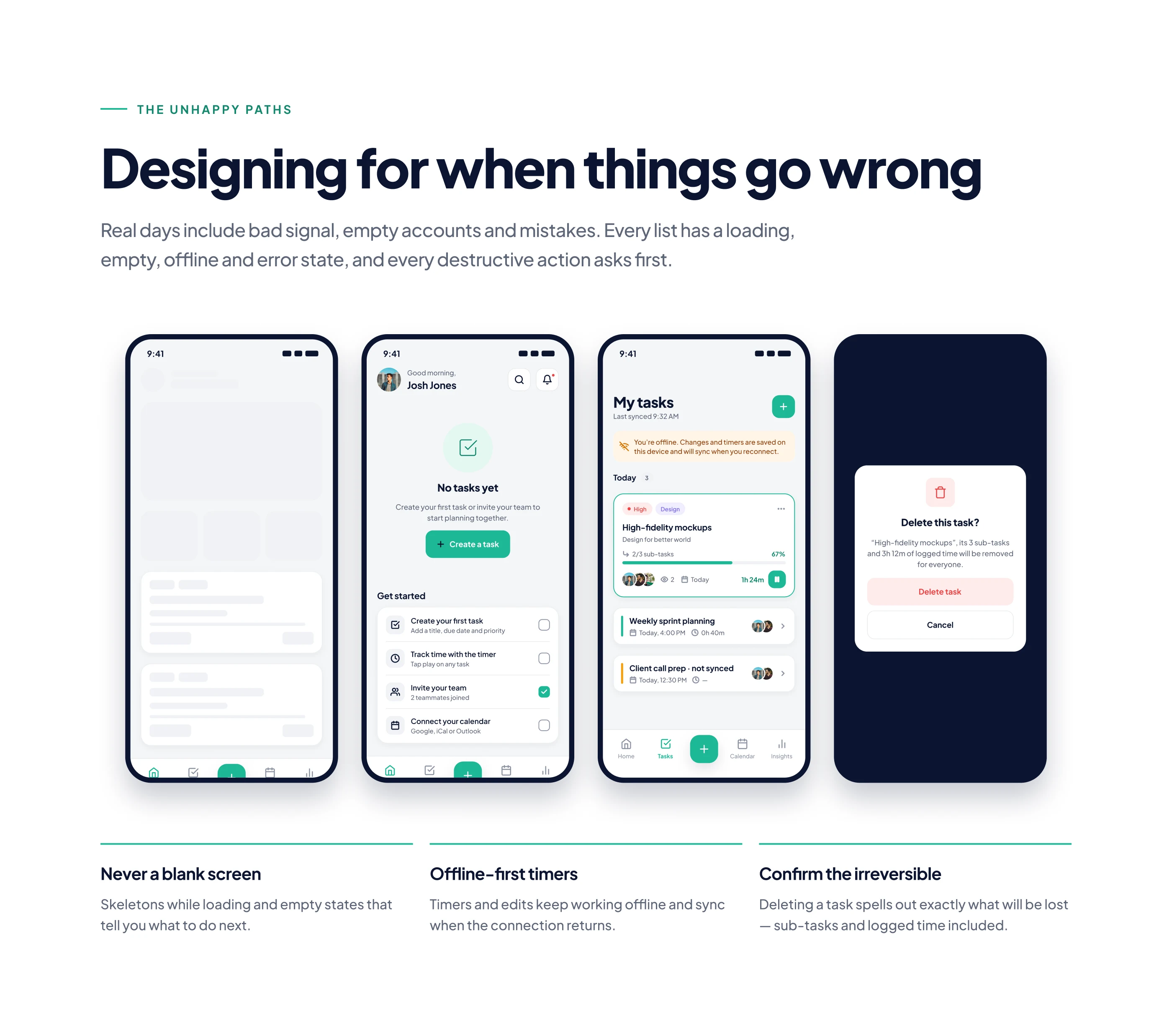
Every screen runs on one component library, including empty, error and edge-case states. The Figma file was prepared for developers with a full handoff, so nothing is left to guesswork.
Planning a mobile app? Message me your idea, who it's for and your deadline, and I'll reply with how I'd approach it.
Like this project
Posted Nov 2, 2026
Taskly: a feature-heavy brief turned into a calm task and time-tracking app. 75 screens, 12 flows, light and dark mode, component library, handoff.
Likes
0
Views
0