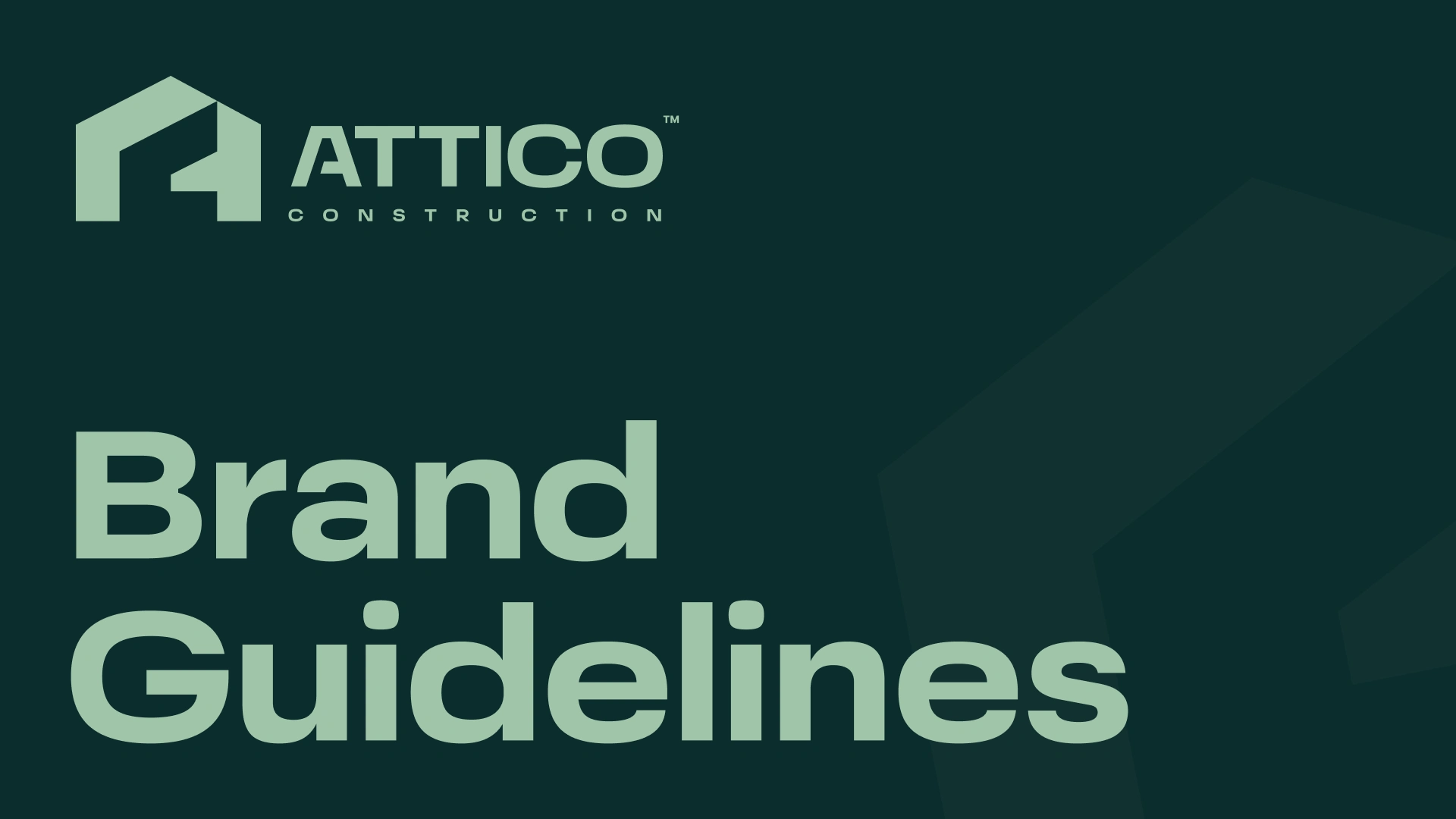
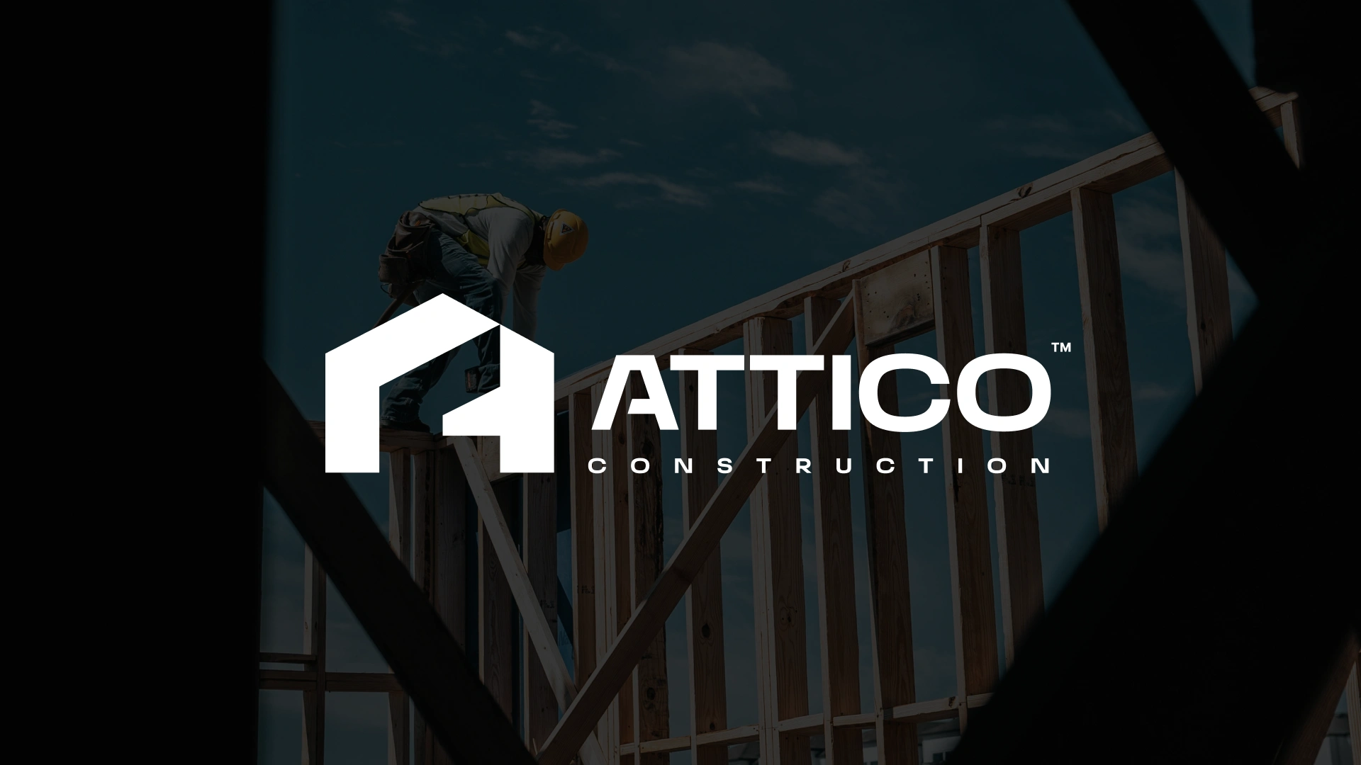
Attico Construction
Dhruvraj Sinh Vala
Brand Brief
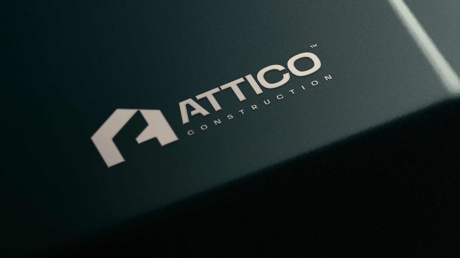
Attico Construction needed an identity that could hold its own in the UK market professional enough to build trust with clients, distinct enough to not look like every other construction company using hard hats and orange. The brief called for something modern and grounded, with a visual presence that could scale from a business card to the side of a shipping container without losing its weight.
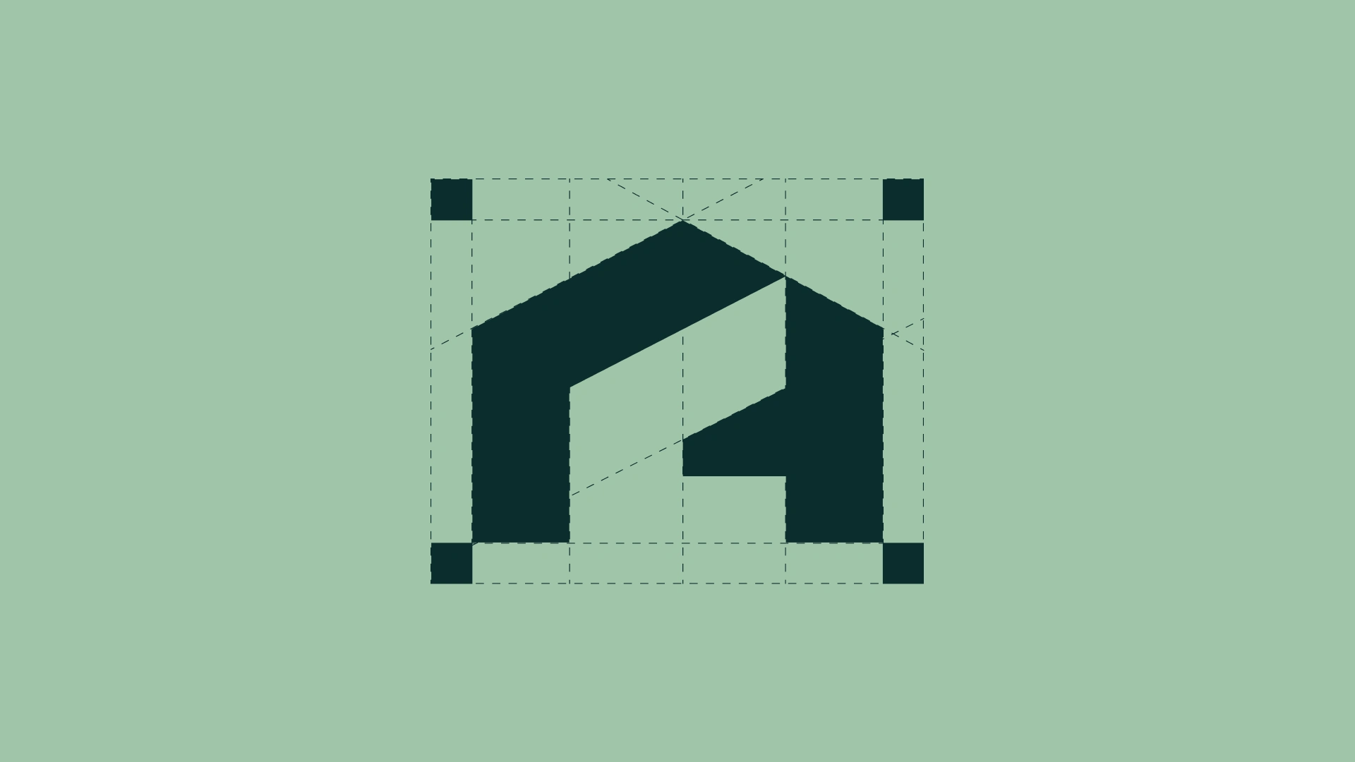
Logo construction
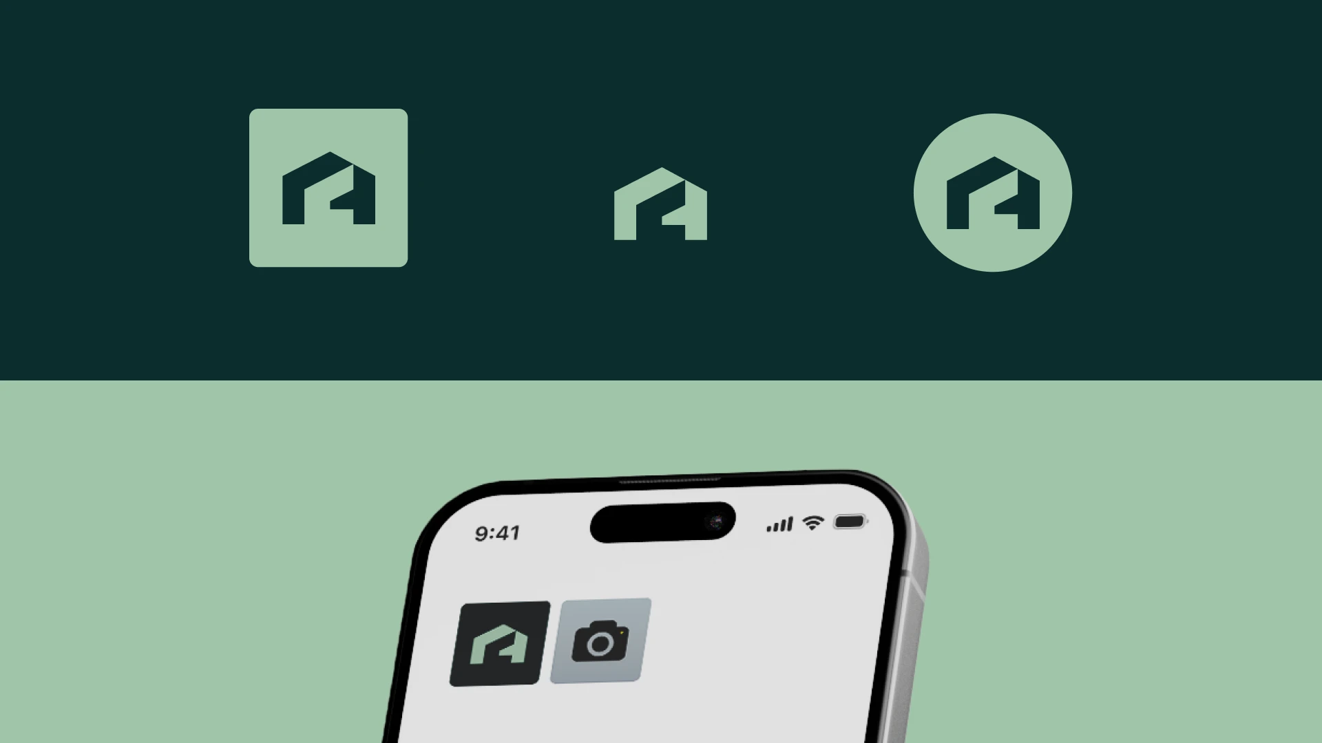
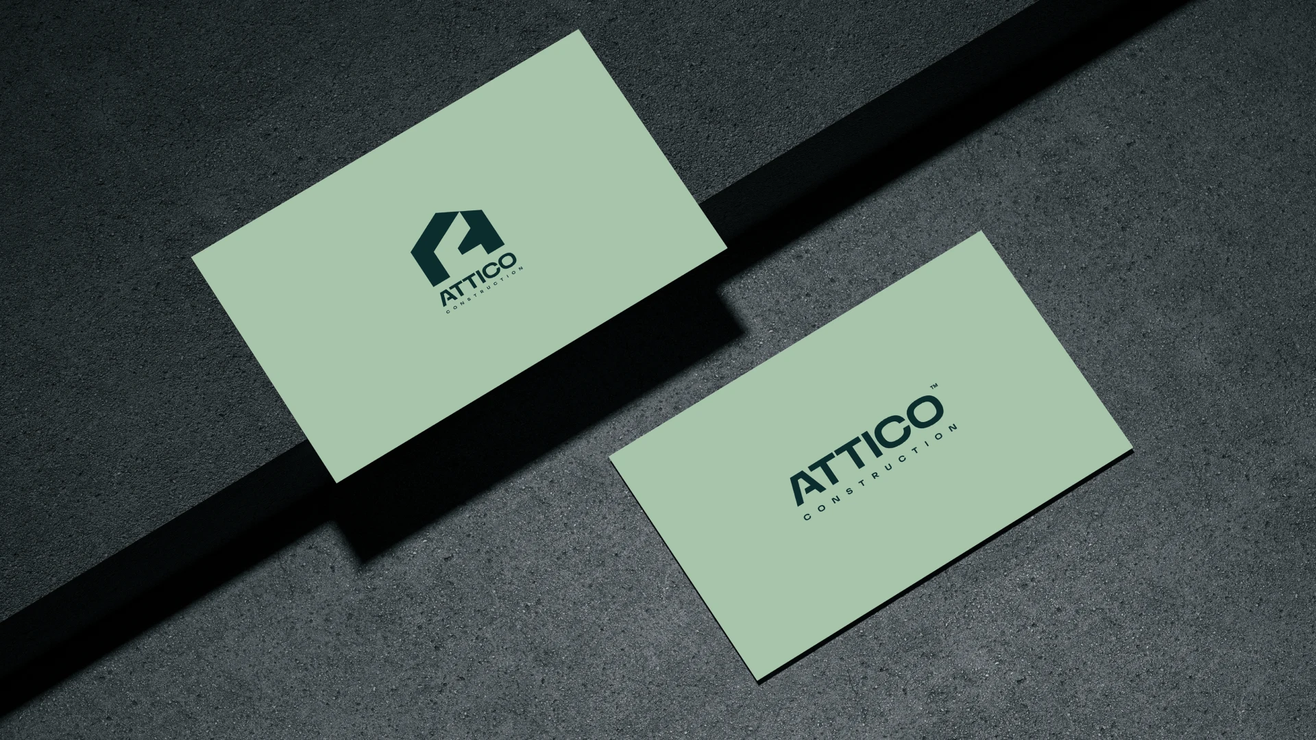
The icon is a house silhouette with the letter A & C embedded inside it, but the A isn't just a letterform, it's structural. The negative space and angular cuts mimic the geometry of a building under construction: beams, frames, load-bearing lines. The result is a mark that communicates both the name and the industry in a single glance, without relying on literal imagery like cranes or hard hats that most competitors default to.
Execution Process
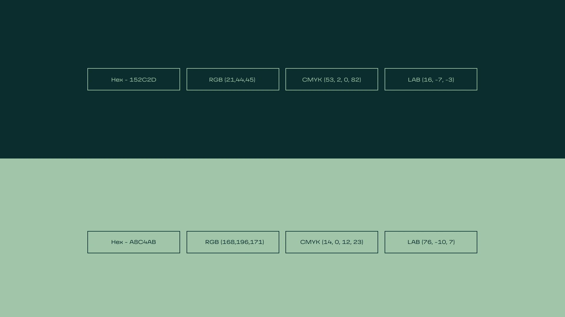
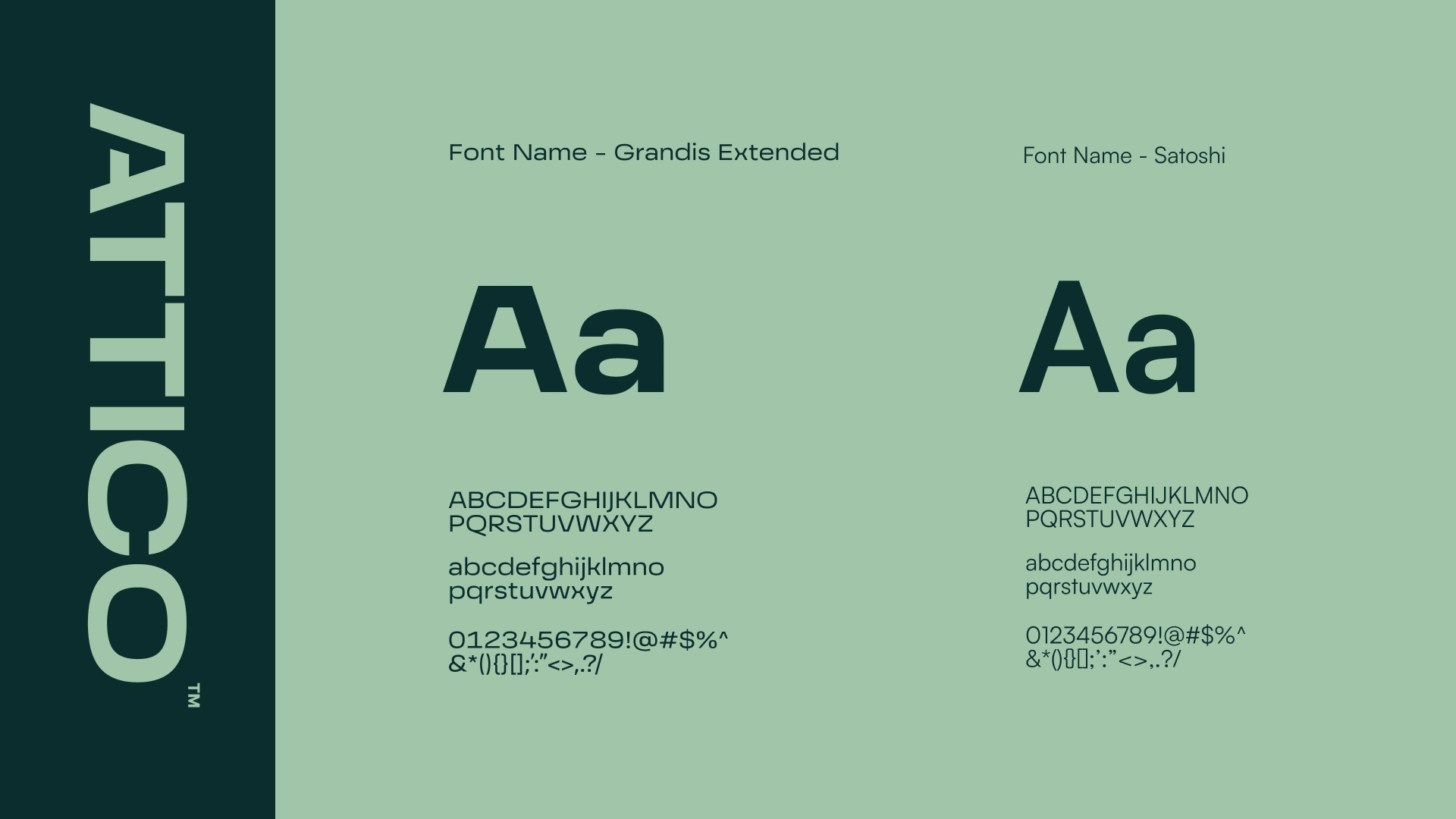
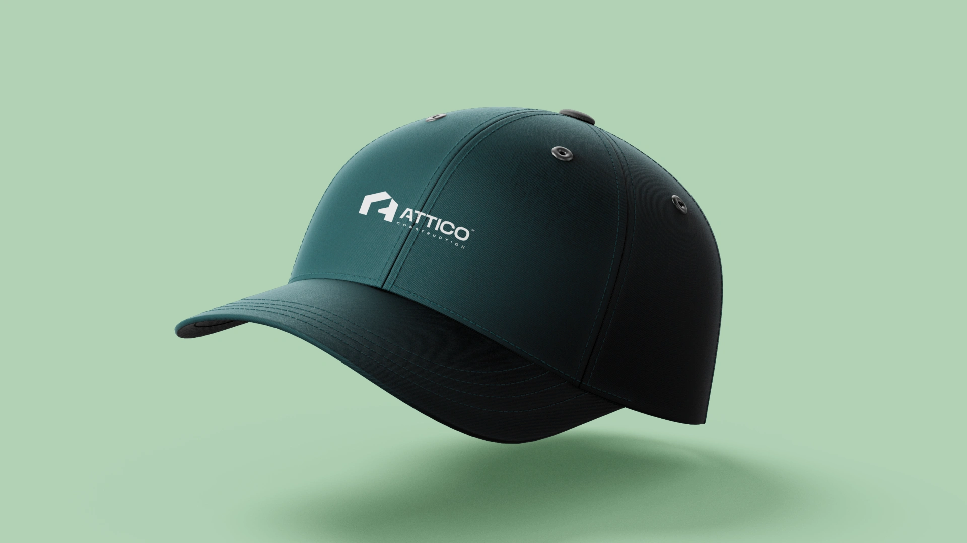
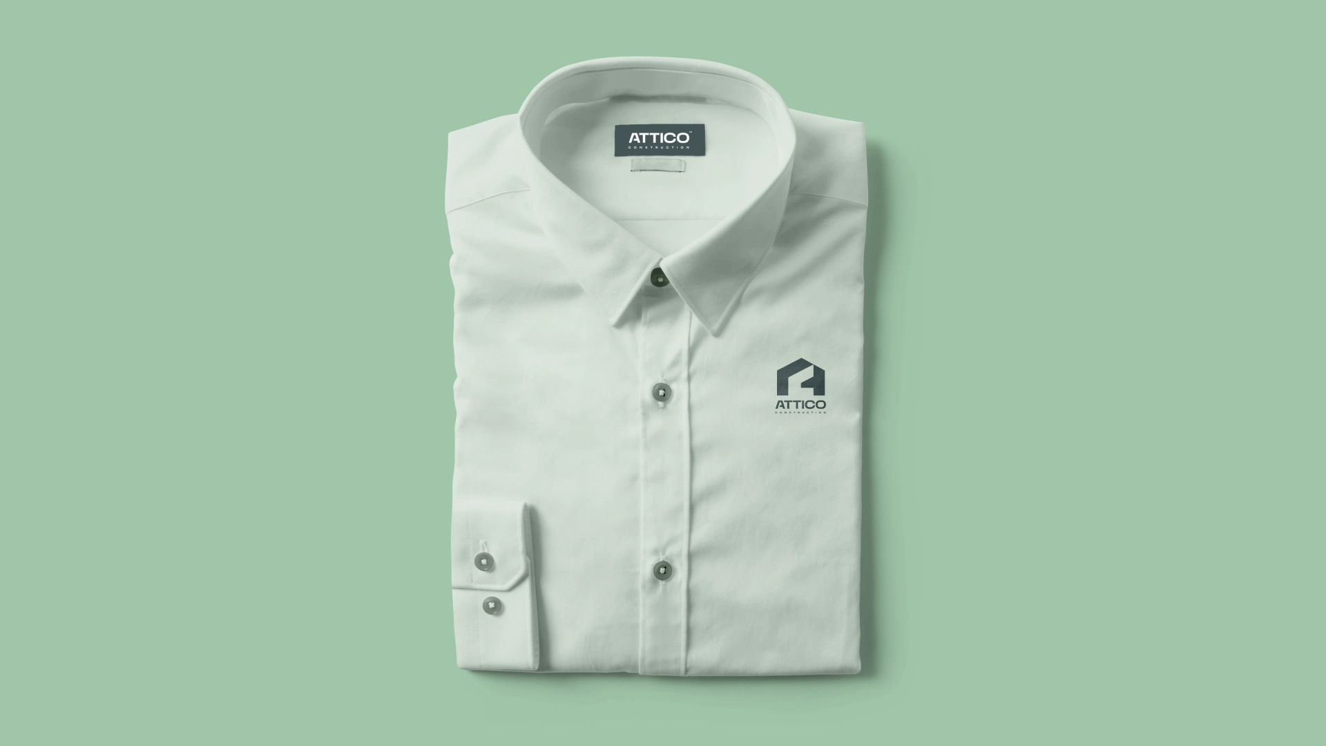
The direction was built around restraint. Deep forest green and sage as the two-tone palette — one authoritative, one approachable — doing the heavy lifting across all touchpoints. Typography was kept architectural: Grandis Extended for display weight, Satoshi for body. Every application, from uniforms to vehicles to stationery, was designed to feel like it belonged to the same system. Nothing decorative that didn't earn its place.
Brand Applications
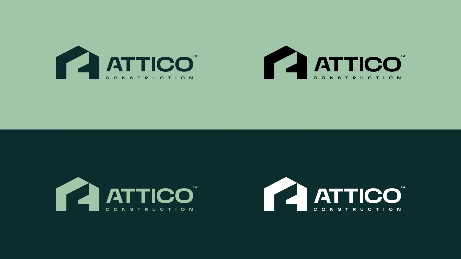
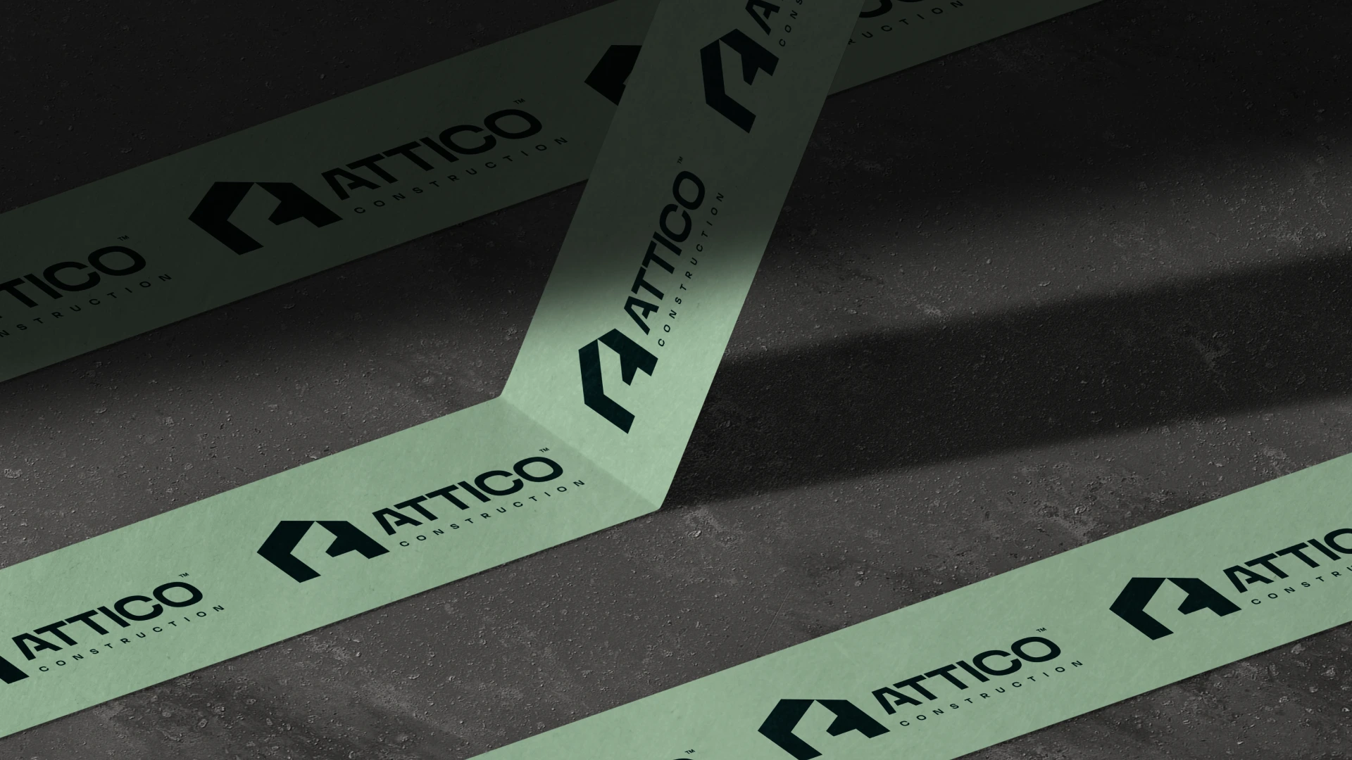
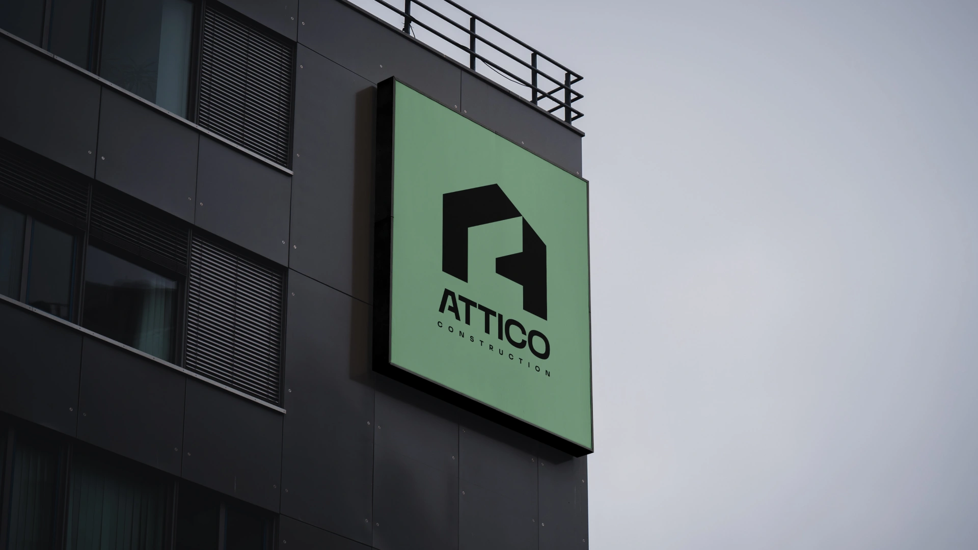
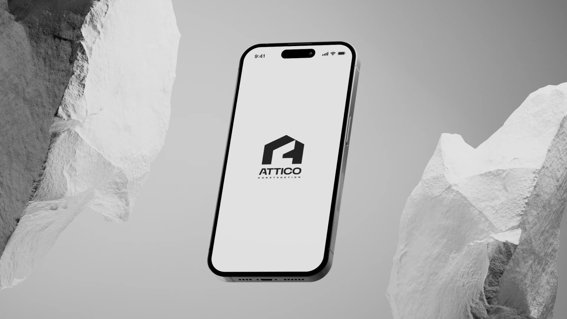
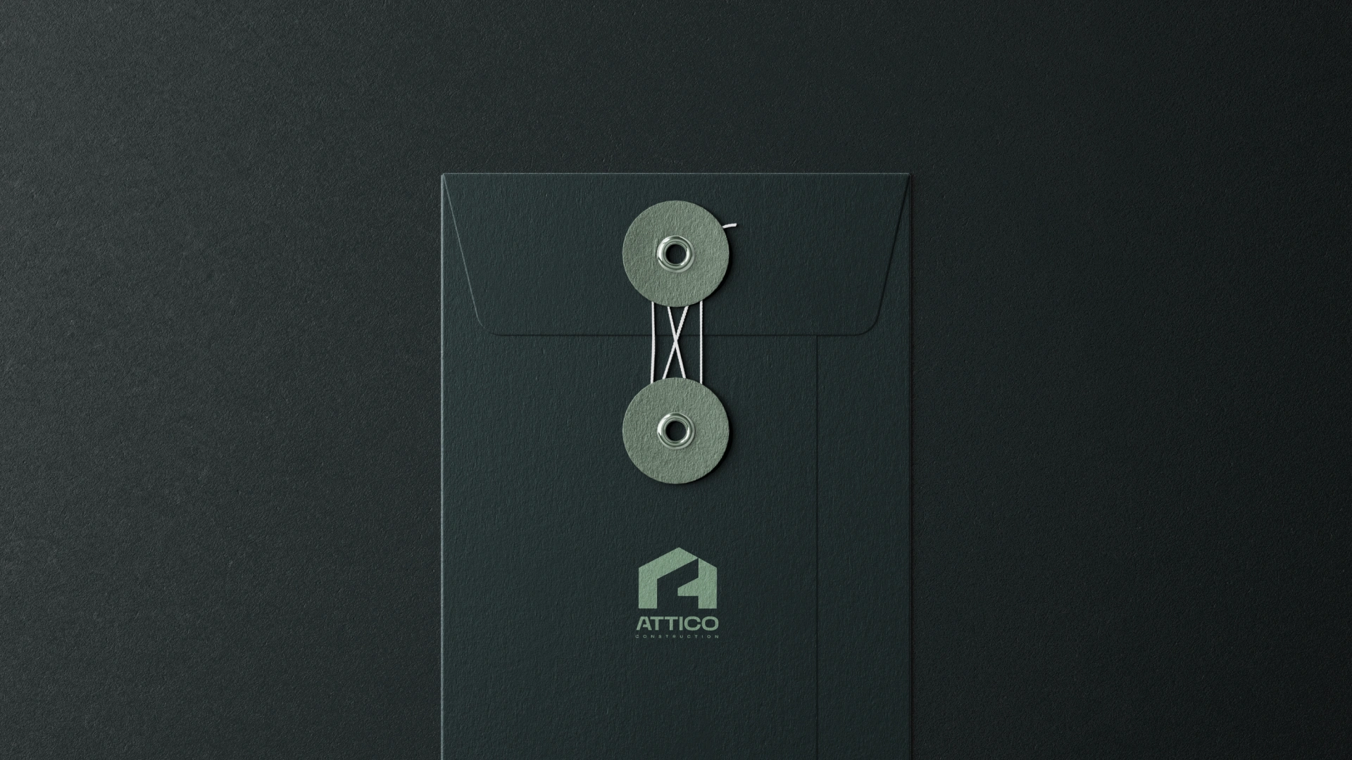
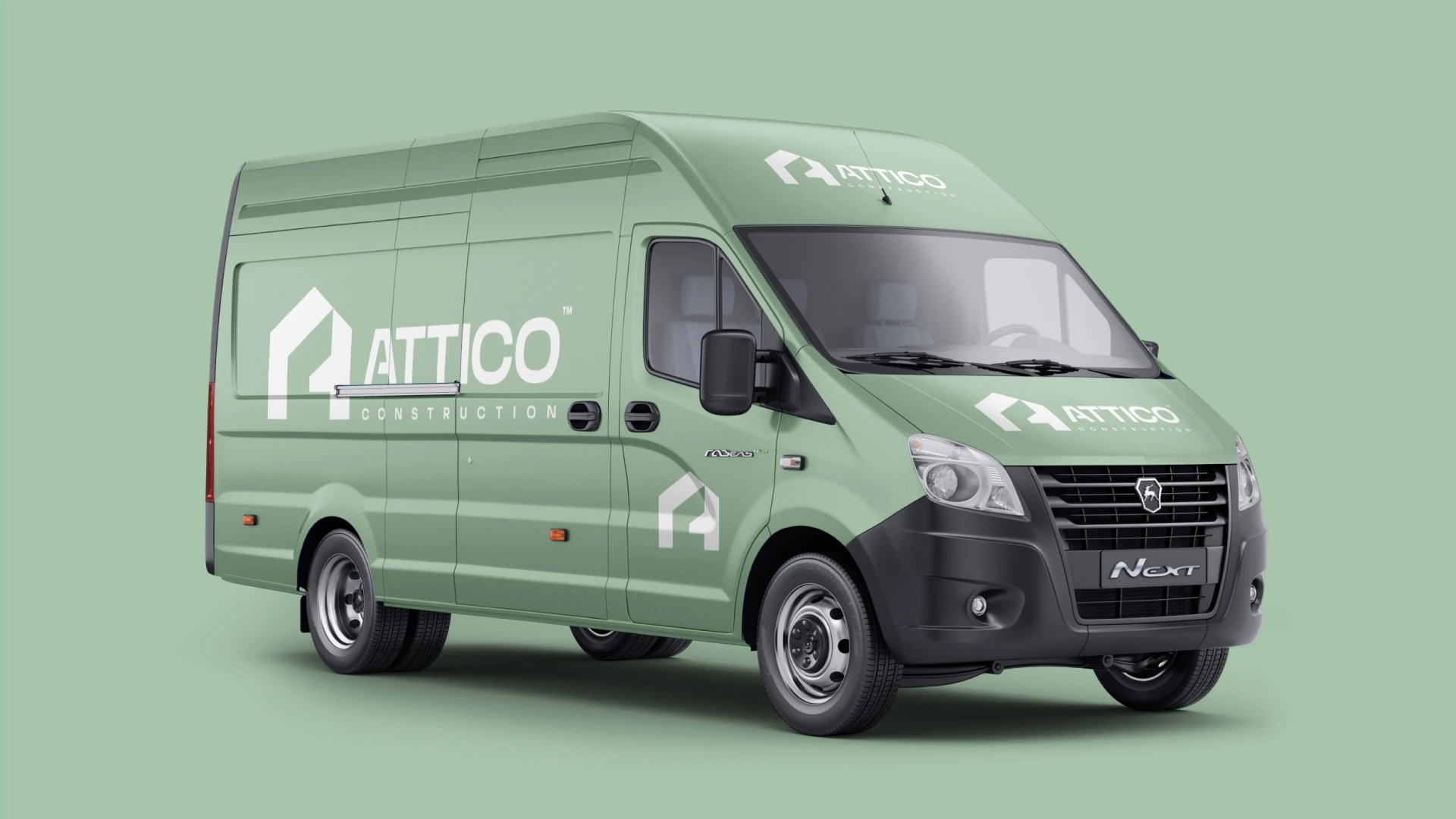
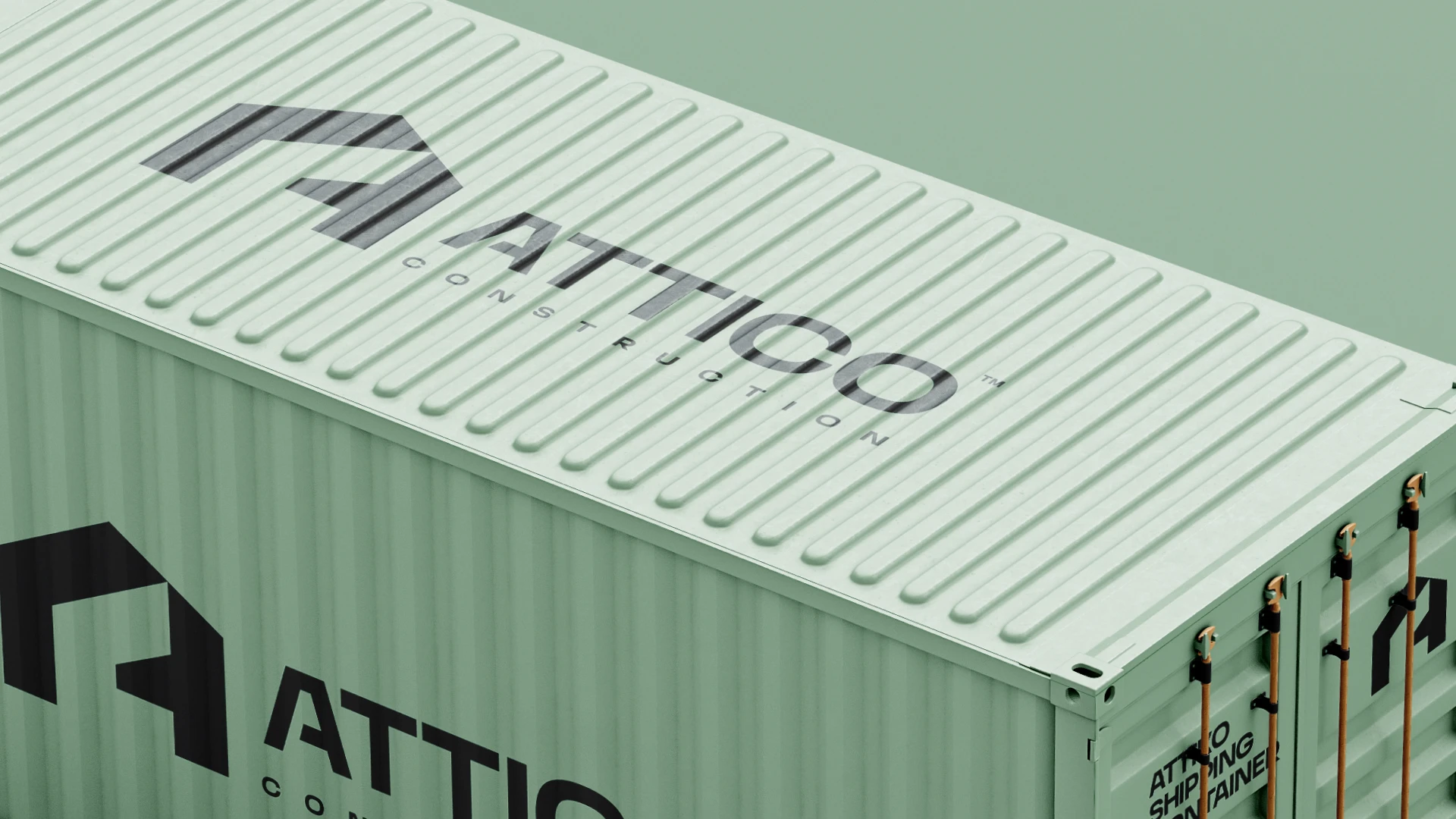
The identity was stress-tested across the full range of physical touchpoints vehicle livery, shipping containers, workwear, business cards, and envelopes. Each application validated the core decision to keep the system bold and minimal. The icon holds at thumbnail scale on a phone screen and at billboard scale on a transit van equally well. That versatility was the goal from the start, and the final system delivers it.
Attico Construction
Outcome
The identity was approved by the client and Attico Construction is now live with the full brand system in place - including their website. The mark works across every surface it was designed for, from digital to physical, without adaptation or compromise. For a construction company entering a competitive UK market, the brand now gives them something most competitors in the space don't have, a visual identity that feels considered rather than generic.
Like this project
Posted Jun 7, 2026
Branding gives them something most competitors in the space don't have - a visual identity that feels considered rather than generic.