The Stoopid Co
Dhruvraj Sinh Vala
Brand Book - Stoopid
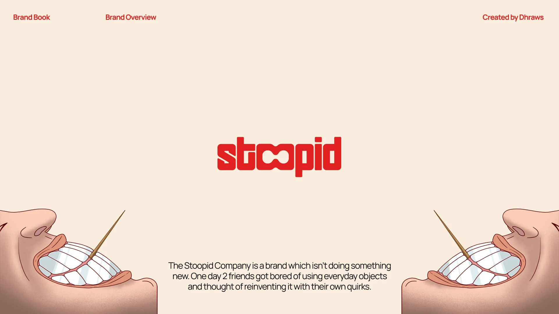
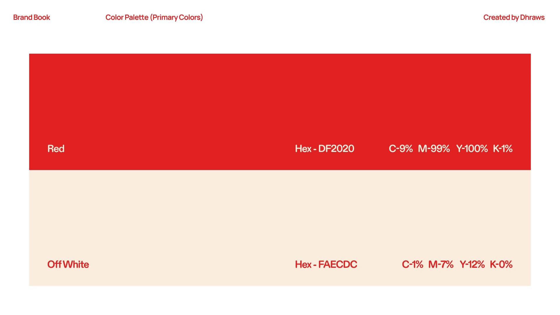
About The Stoopid Company
Stoopid is built on a simple and stupid idea, take the most boring everyday objects and refuse to leave them that way. The brand needed an identity system strong enough to carry that attitude across every product it ever launches, not just the first one. The goal was to build something that felt like a brand universe, opinionated, scalable, and instantly recognizable before anyone even reads the name.
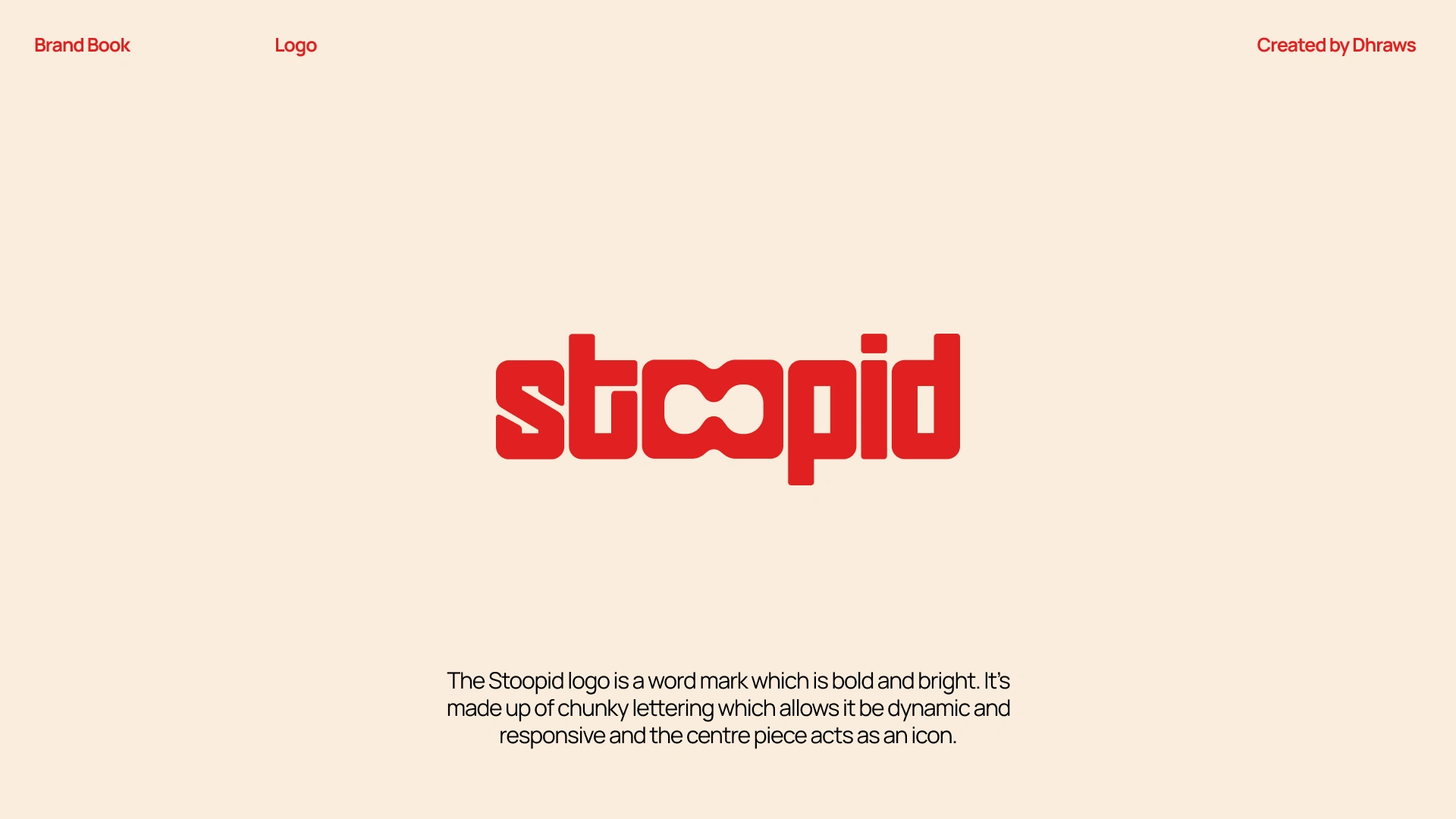
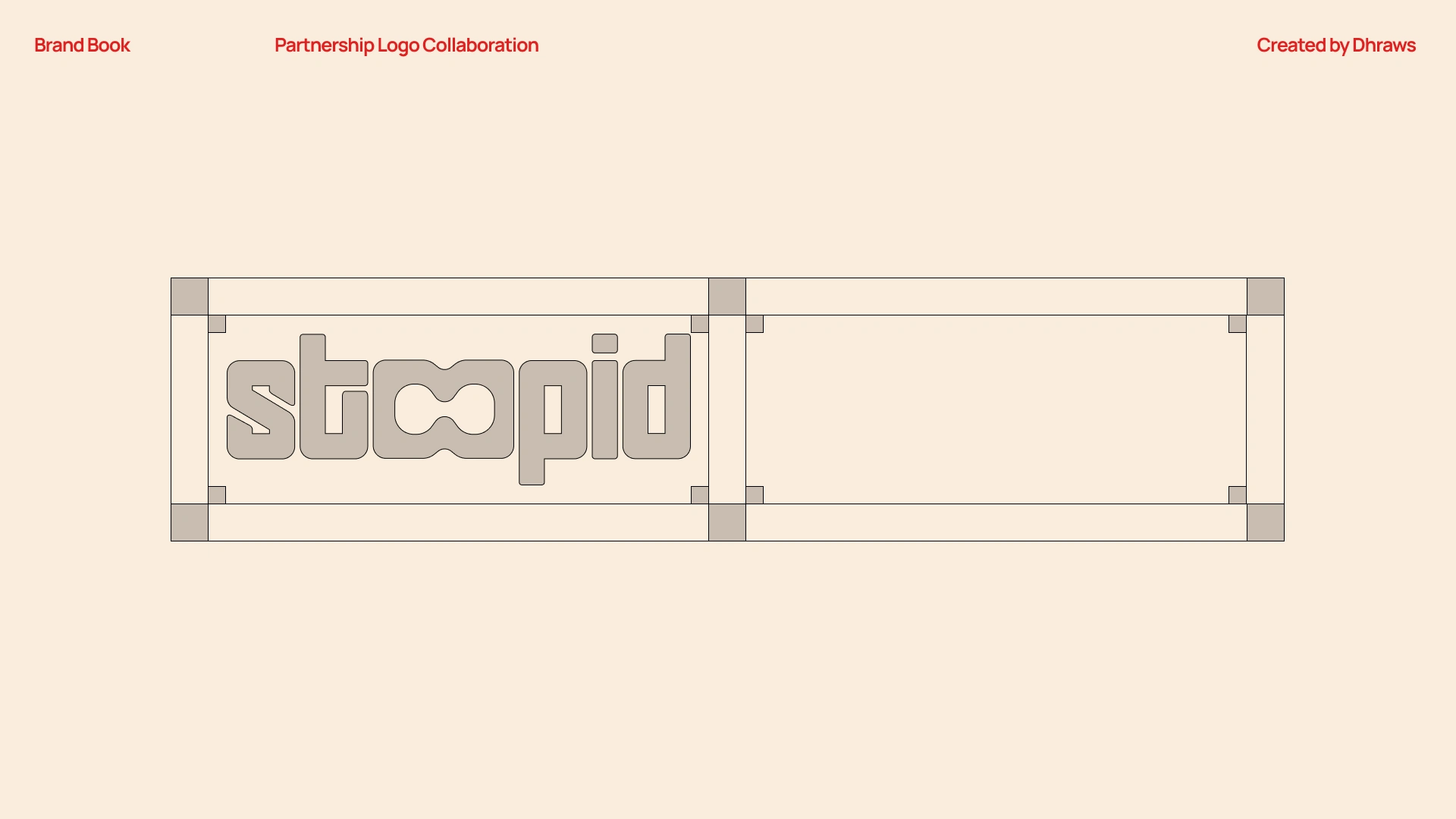
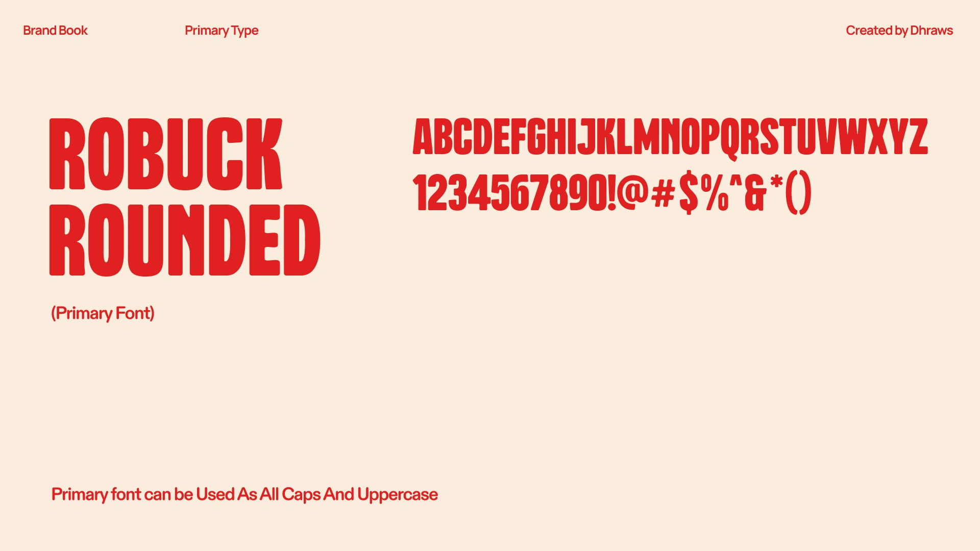
Wordmark Thought Process
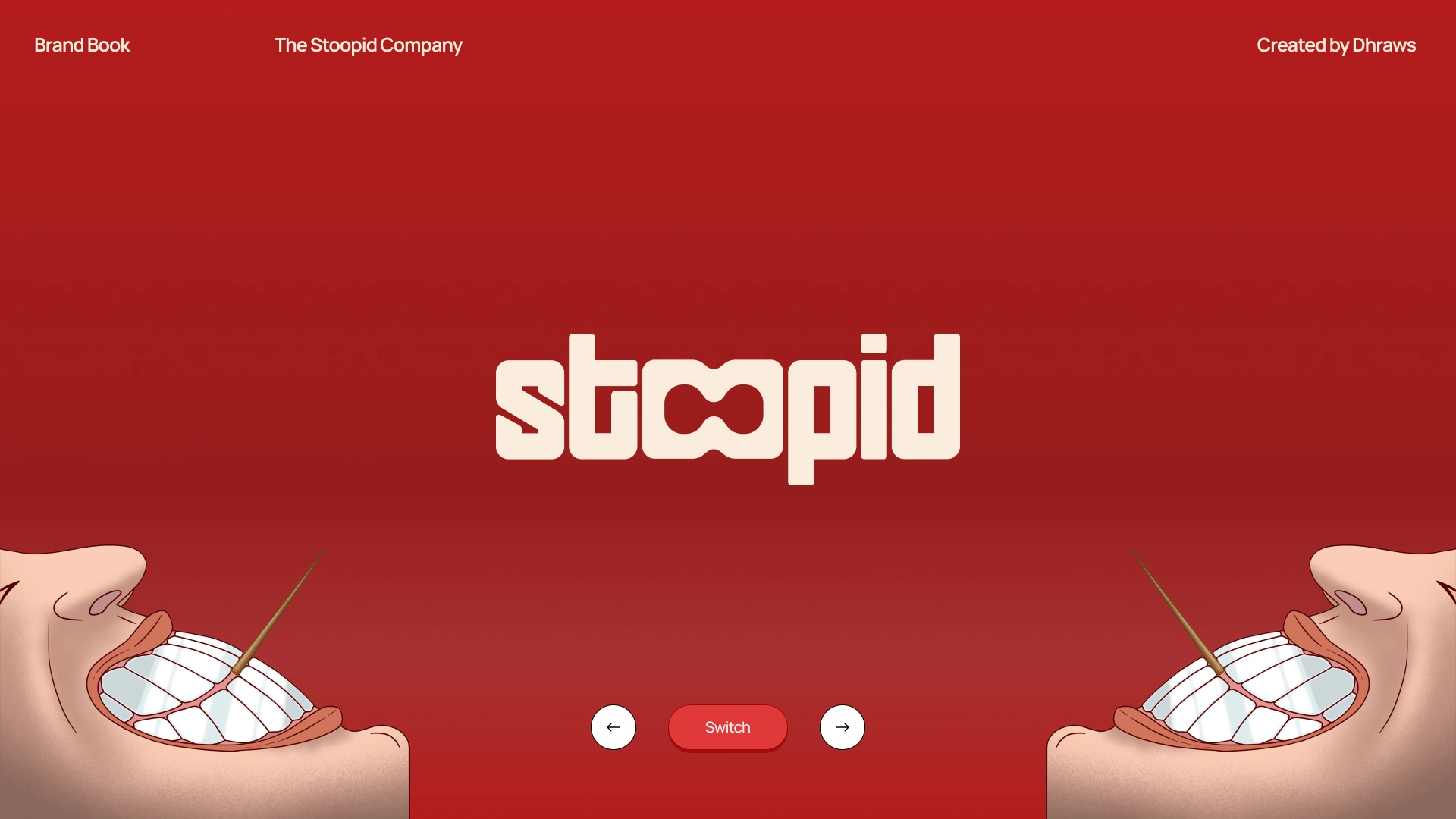
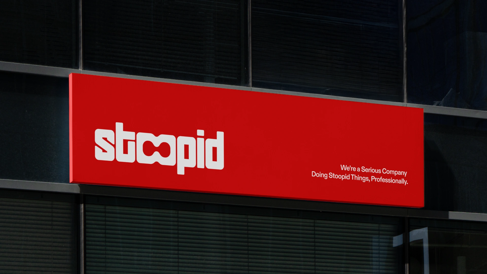
The wordmark is set in chunky, rounded letterforms, bold enough to own shelf space, compact enough to work as an icon. The two O's aren't accidental. They're designed around the concept of Binary Fission, one cell splitting into two, endlessly multiplying. It's a direct metaphor for what Stoopid intends to do: take one ordinary thing, disrupt it, then do it again and again across every boring category it touches.
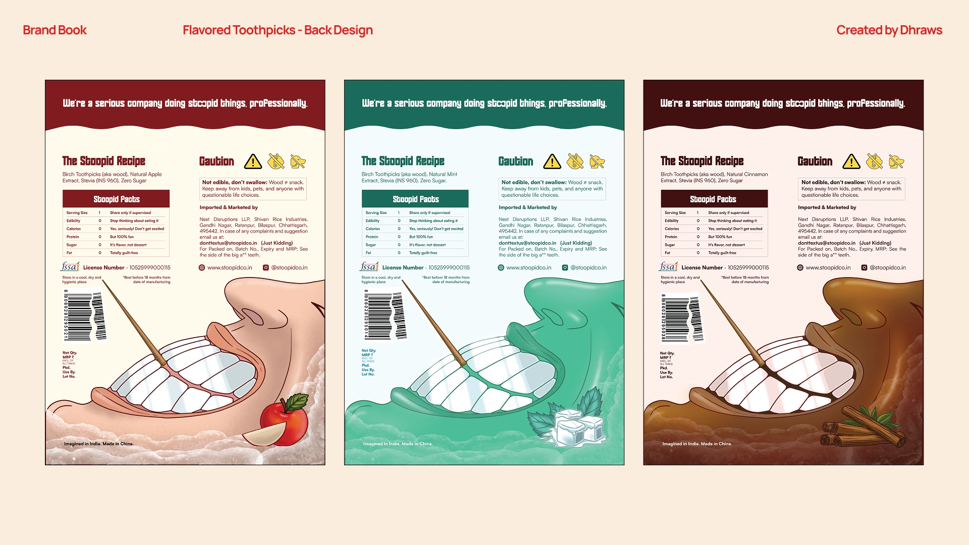
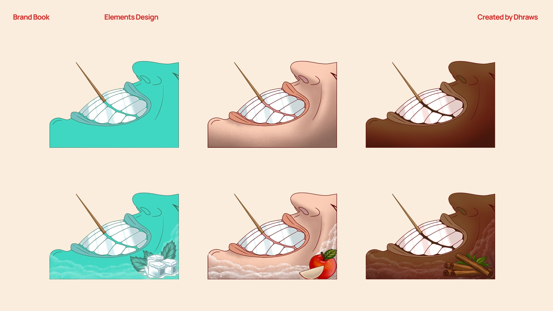
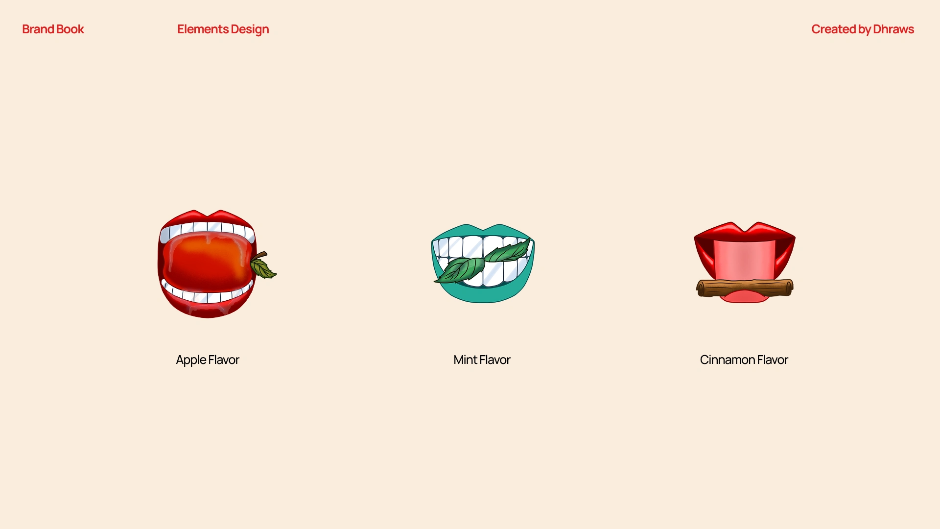
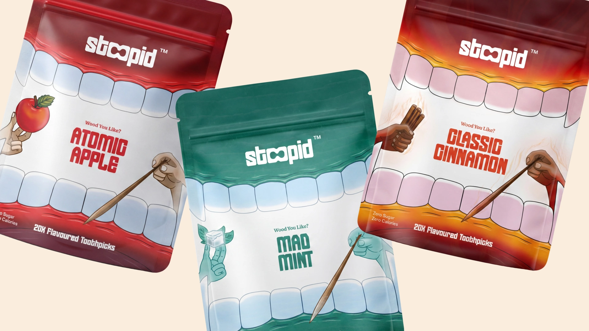
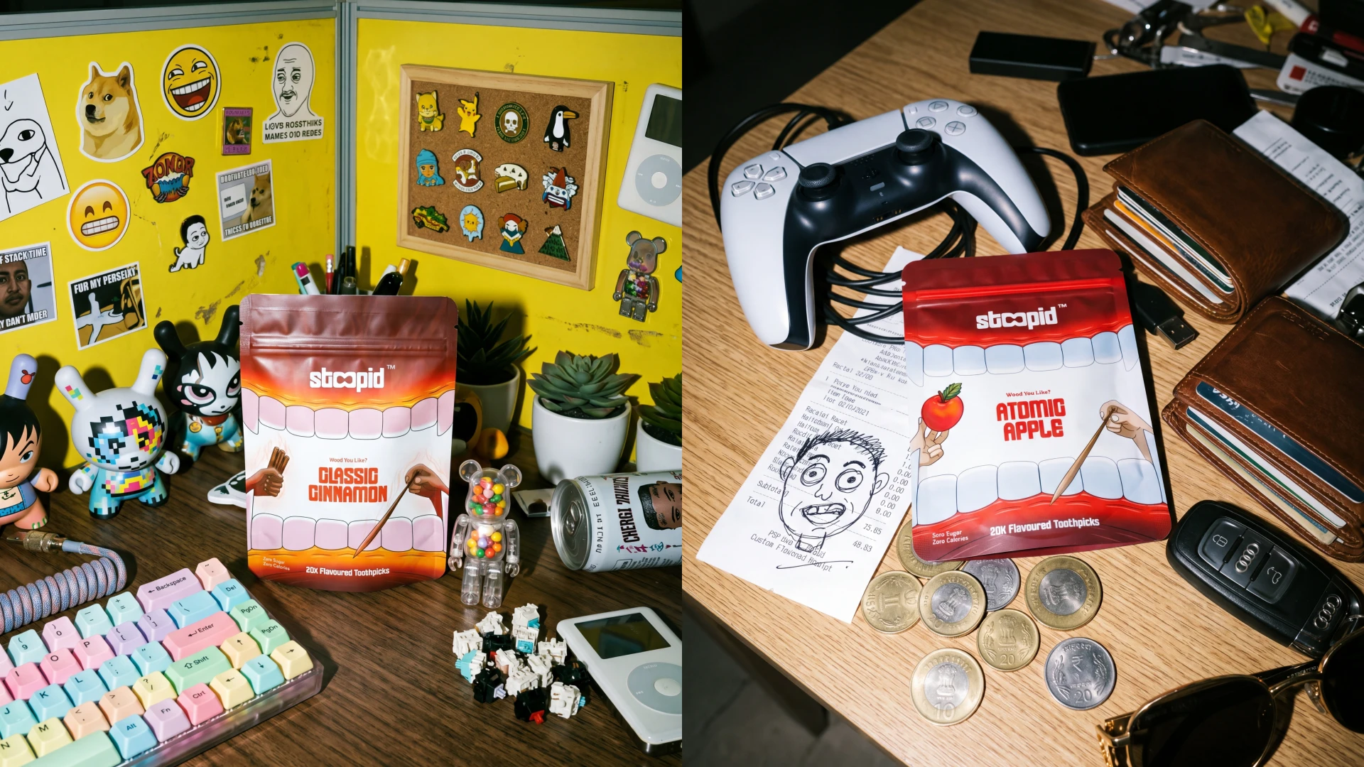
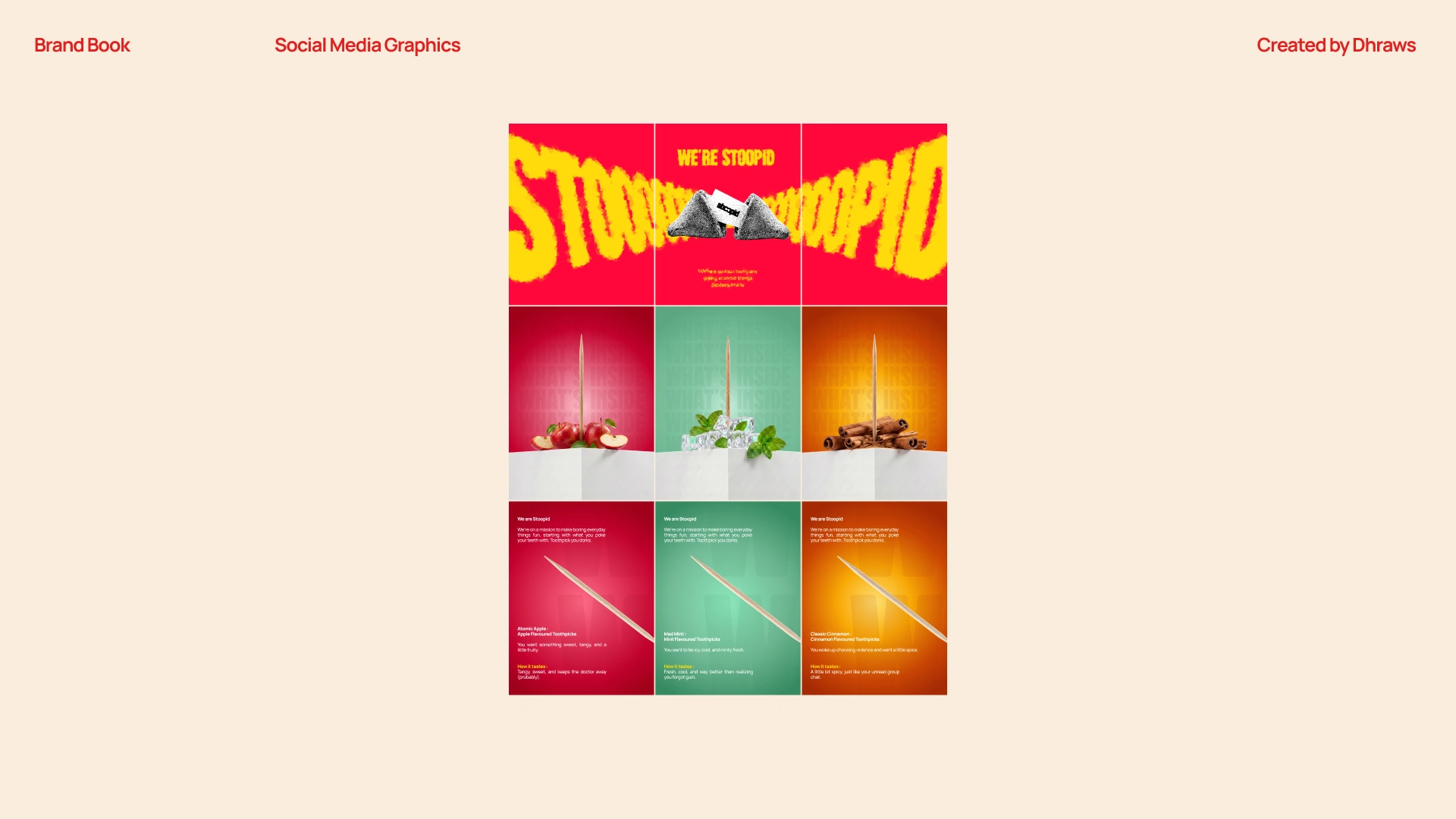
Packaging & Illustration thoughts
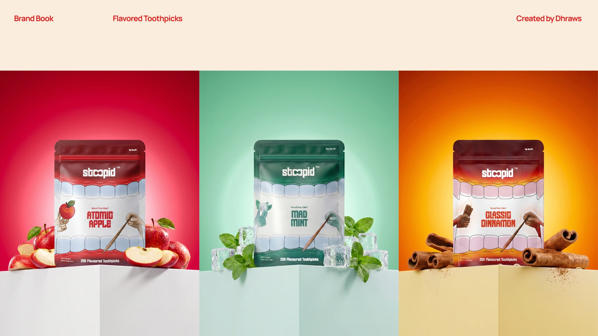
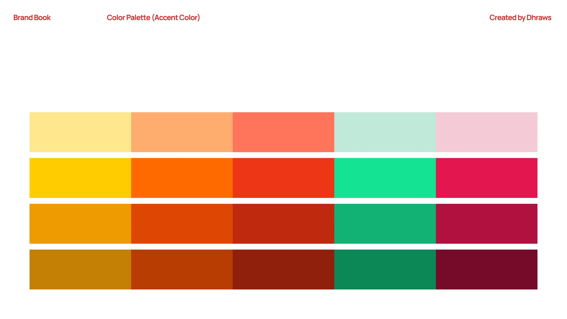
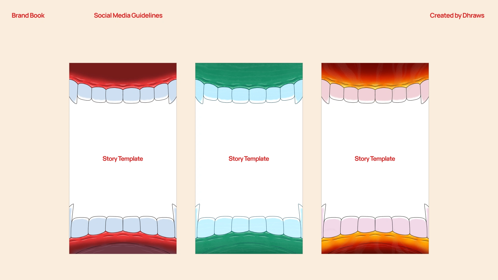
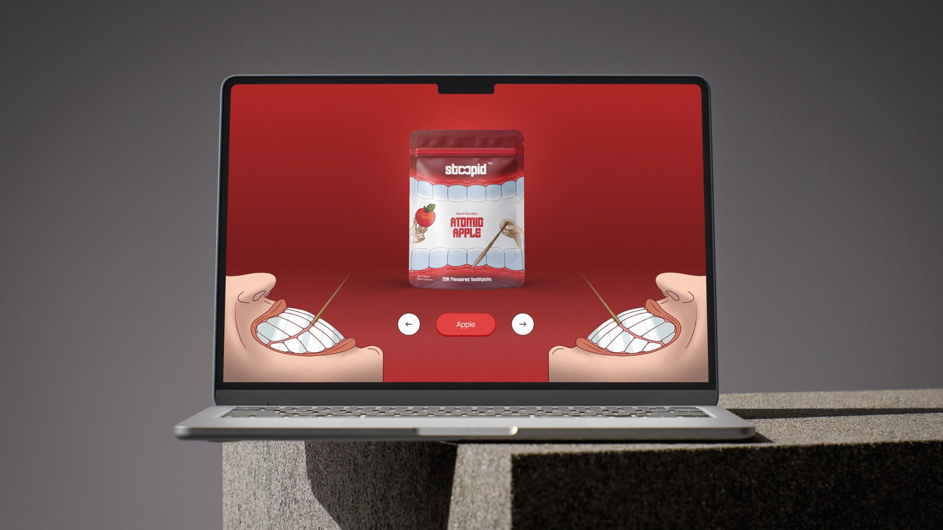
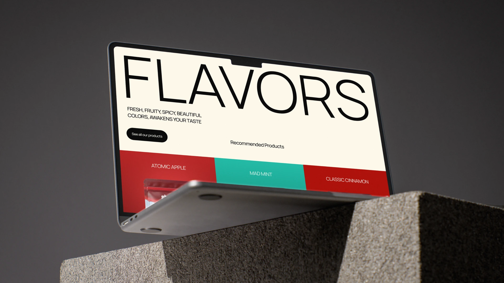
The toothpick was Stoopid's first swing, so the packaging had to prove the brand could be ridiculous and considered at the same time. Each flavor got its own color world - red, teal, orange, while the illustration system and structure stayed consistent across all three. The back-of-pack copy was written with the same irreverence as the front, because on a shelf, every surface is a chance to say something worth reading.

Outcome
The brand identity was signed off without revisions and is now live. Stoopid launched with a complete system in place, identity, packaging, and social all speaking the same language from day one. What started as a brief for a single product ended with a brand built to grow. The client now has a visual and verbal framework that works regardless of what boring thing they decide to disrupt next.
Stoopid Social - https://www.instagram.com/stoopidco.in/
P.S. - Next product is around oral care, guess what it will be?
Like this project
Posted Jun 7, 2026
The client now has a visual and verbal framework that works regardless of what boring thing they decide to disrupt next.