Milkomeda: Cross-Chain Finance UX/UI Design

Robert Licau


Milkomeda
Bringing clarity and consistency to a suite of cross-chain financial tools.
Role
Head of Design, dcSpark Inc., 2021–2023
Scope
Product design, Brand identity, Website
Where
$97.6M
Peak ecosystem TVL
6 tools
Connected through shared design patterns
Product + brand
From transaction flows to visual identity
01 - Brief
Milkomeda provided infrastructure connecting different blockchain networks. Its products supported tasks such as transferring assets, exploring transactions, discovering applications, and participating in staking.
As Head of Design at dcSpark, I led design across the product suite, brand identity, website, and supporting marketing materials.
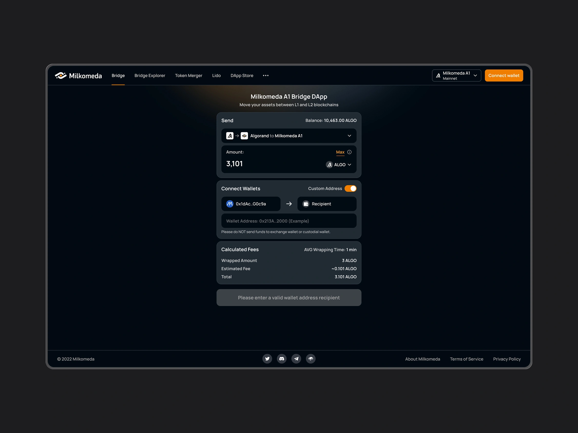
The work covered six tools: Bridge, Bridge Explorer, DApp Store, Liquid Staking, Token Merger, and Validators Coordination. Each addressed a different task within the ecosystem and needed an interface appropriate to its users.
My role was to organize these capabilities into understandable workflows and establish a consistent design language across the platform.
02 - Challenge
Making complex operations understandable.
Transfers between networks, staking, and token consolidation involved unfamiliar concepts and multiple steps. Users needed enough context to understand the available actions and their implications.
Keeping transaction information visible.
These workflows involved financial assets. Network selection, costs, confirmation, and transaction status needed clear presentation so users could review what they were doing and follow its progress.
Connecting products developed in parallel.
Different teams were building tools on separate timelines. The interfaces needed shared patterns while accommodating the requirements of each product.
Building a recognizable identity.
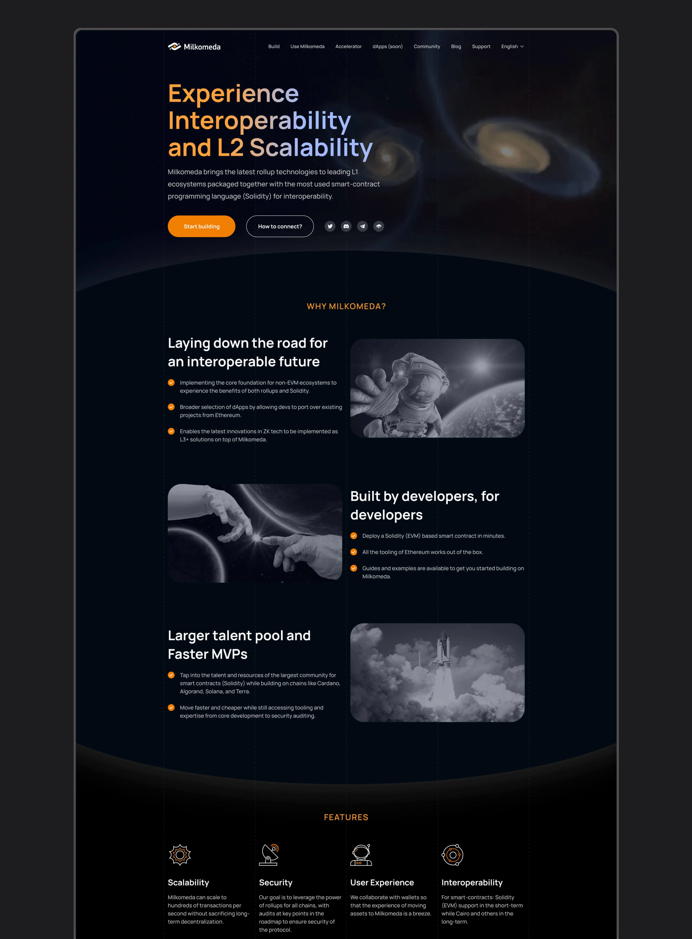
Milkomeda needed a visual direction that could work across functional dashboards, its public website, and event materials. The identity had to remain coherent across these different settings.
03 - Approach
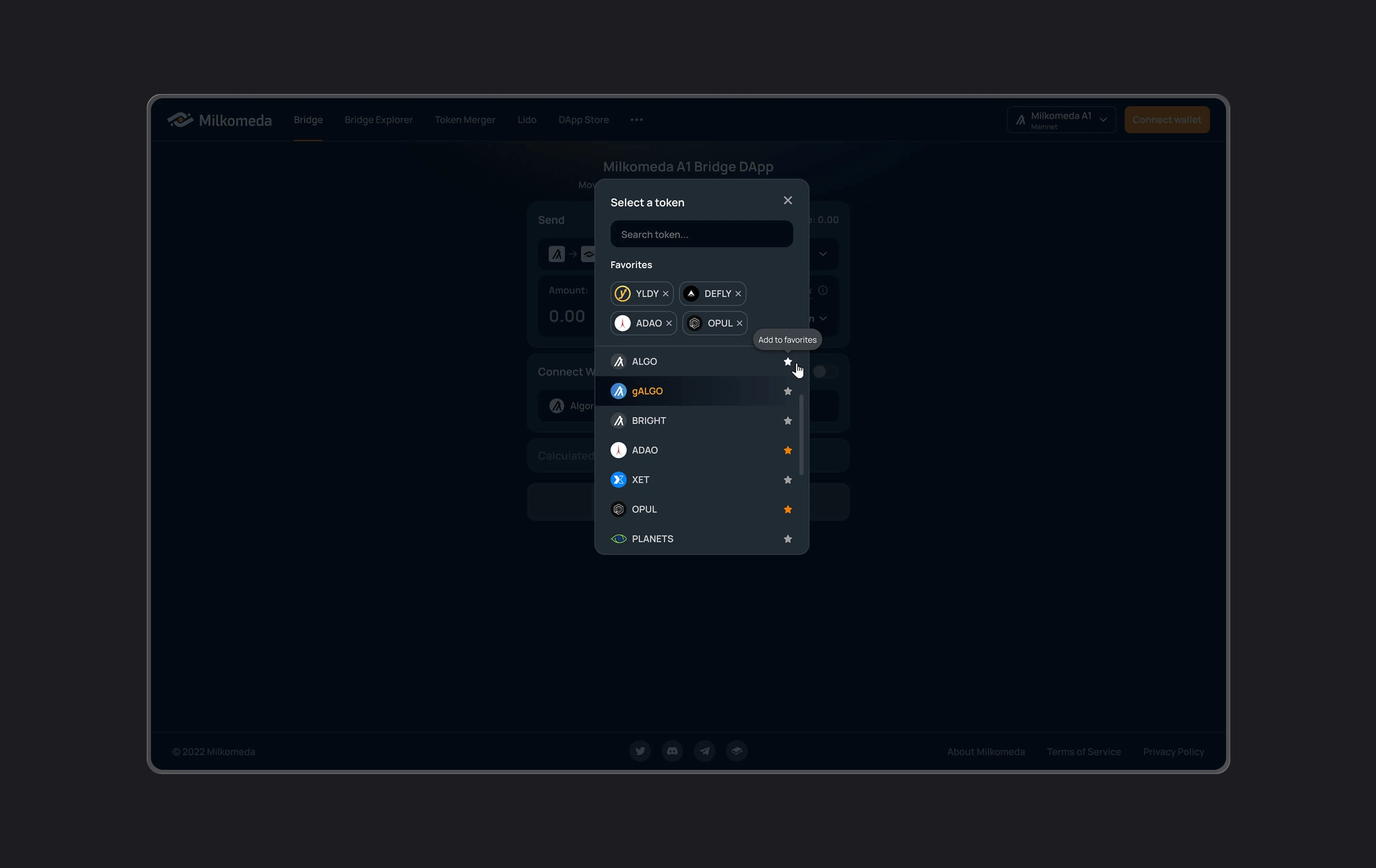
I developed shared interface patterns across the product suite, focusing on navigation, information hierarchy, recurring controls, and status presentation.
For asset-related flows, I prioritized the information needed to make and review a decision: the selected network, the assets involved, available cost information, and the state of the operation.
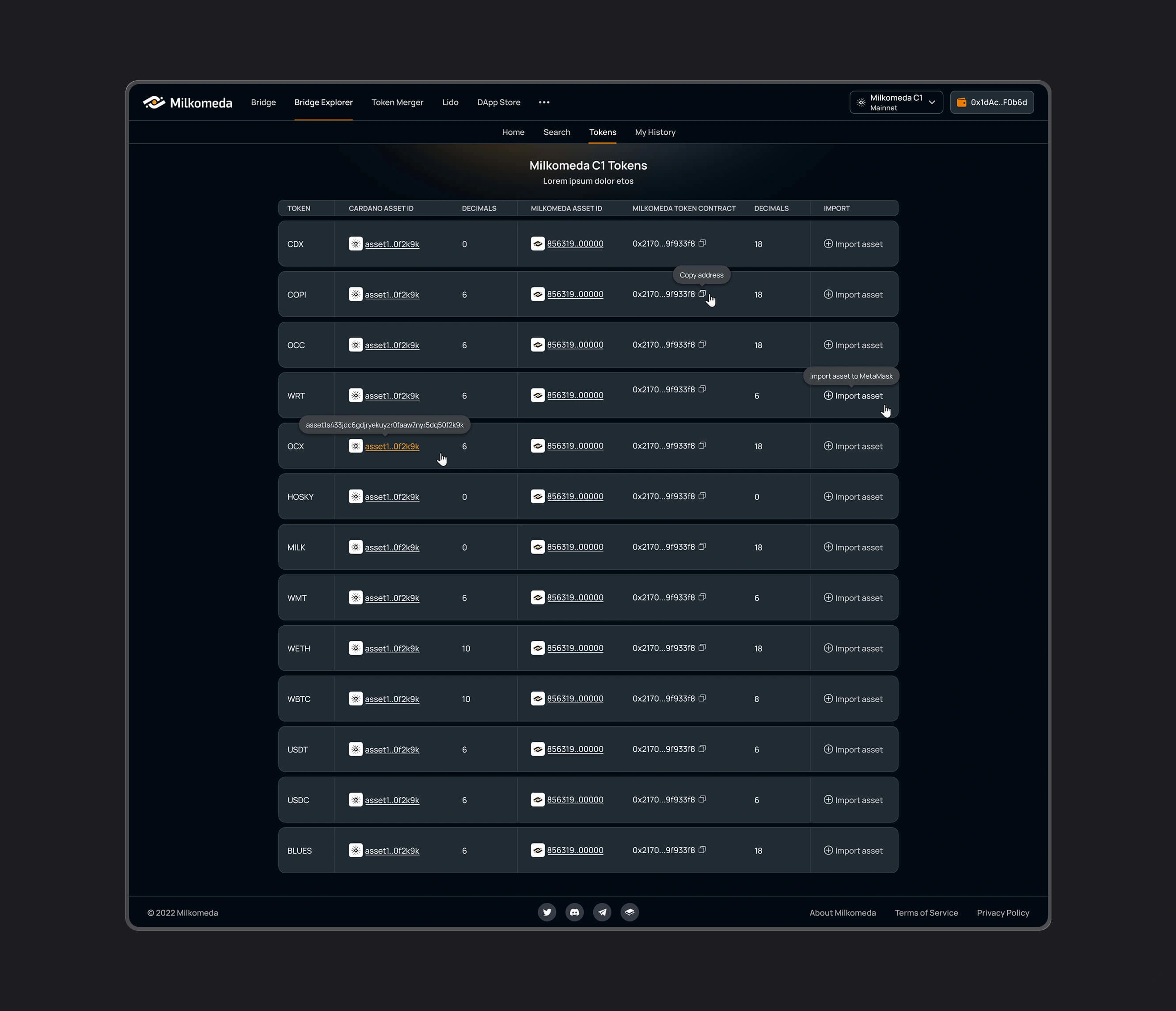
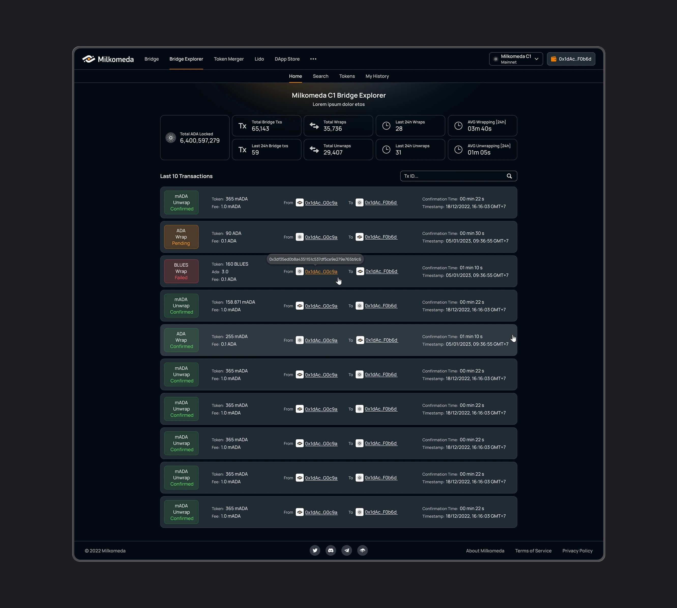
I adapted the level of detail to the task. Application discovery needed a browsable catalog, transaction exploration needed structured records, and validator tools needed more operational information.
Alongside the product work, I developed a visual identity around space and interconnected systems. This direction extended into the website and marketing materials, including galaxy-collision footage sourced from NASA with permission.
04 - Decisions
DECISION 1: Establish shared patterns across the product suite
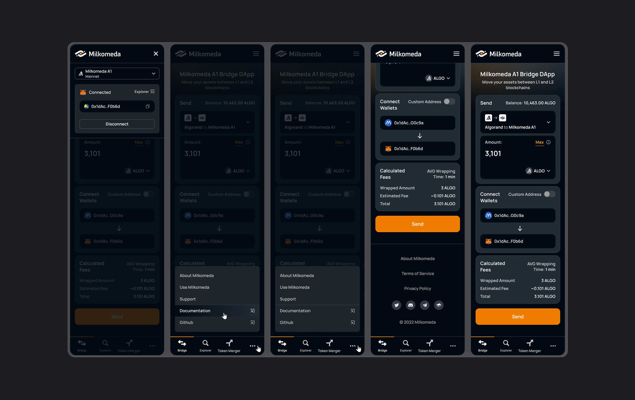
I created a common design language for navigation, controls, layout, and information hierarchy across the six tools.
Each product retained a structure suited to its purpose. Shared patterns gave the teams a consistent reference as they developed different parts of the ecosystem.
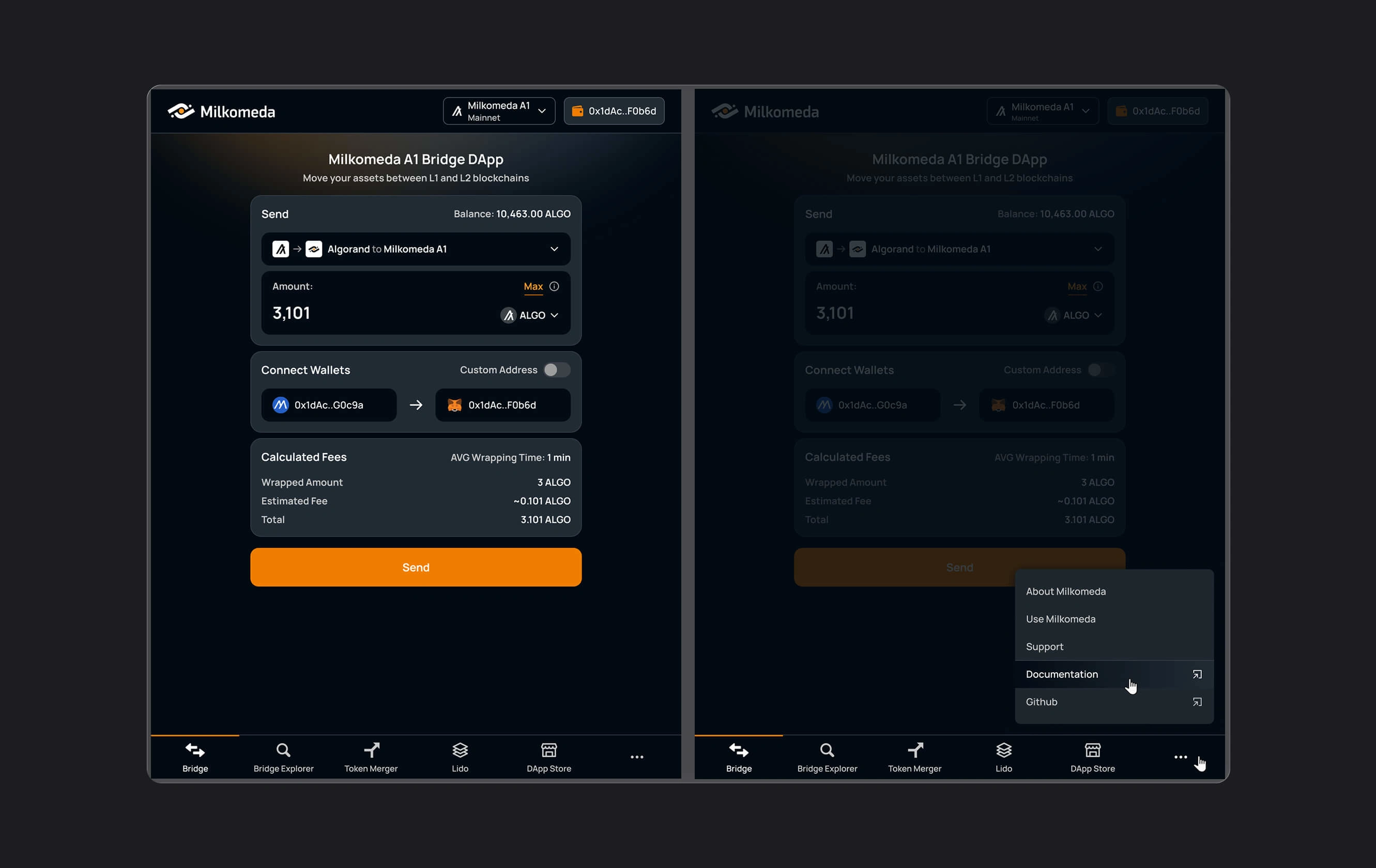
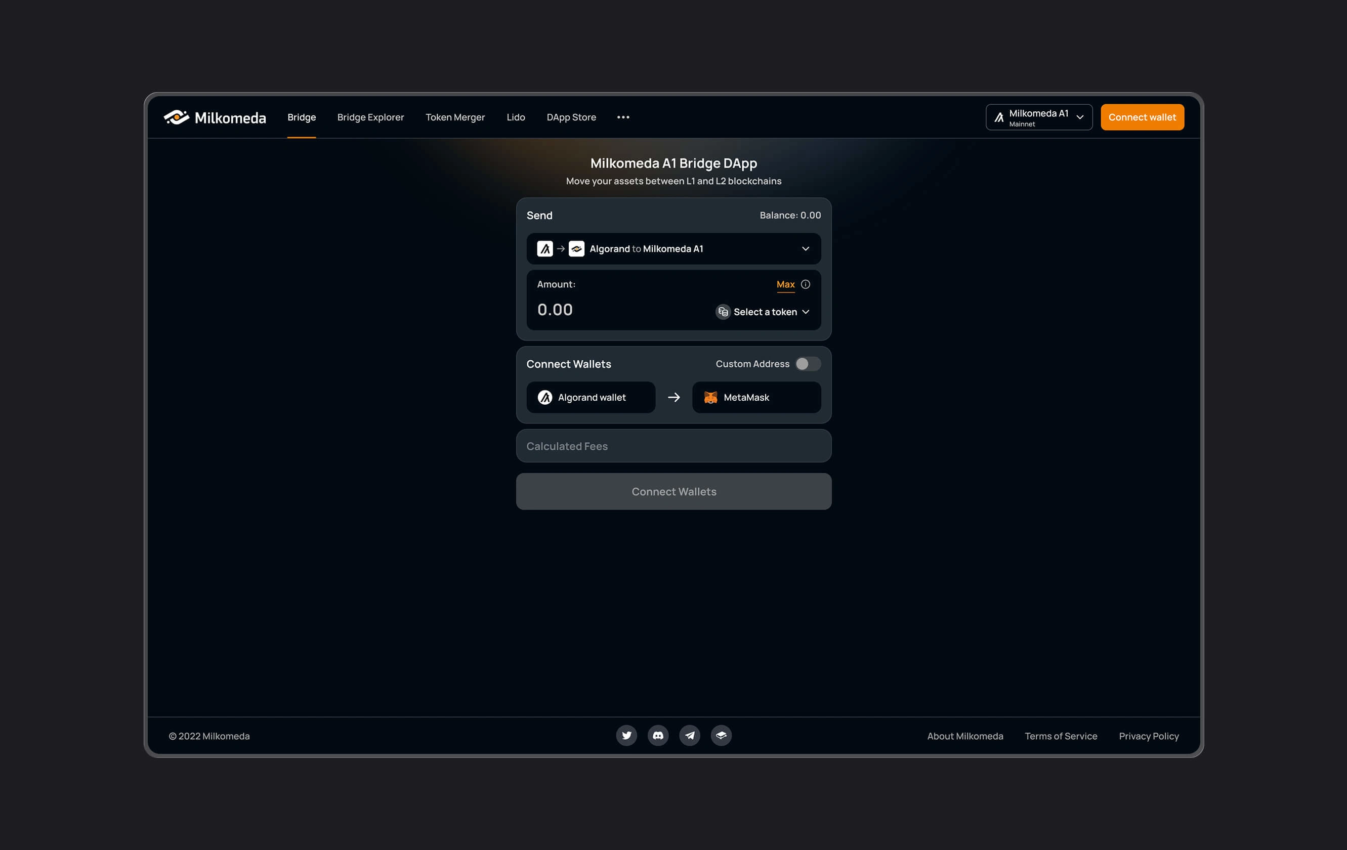
DECISION 2: Make transaction details and status part of the core flow
I structured asset-related interfaces around the information users needed before confirming an action and while following its progress.
Network, asset, cost, and status information received clear places in the hierarchy. The goal was to support informed decisions and make the current state of an operation easier to understand.
DECISION 3: Connect the brand to the idea of interconnected systems
I developed the identity around space, scale, and the relationship between separate systems.
The website and marketing materials provided room for expressive imagery, while the product interfaces used a more restrained treatment to keep controls and information readable. A shared visual direction connected both.
DECISION 4: Source imagery that supported the brand concept
I contacted NASA and secured permission to use galaxy-collision footage in Milkomeda’s brand materials.
The footage provided a visual reference for the idea of separate systems interacting. I incorporated it into the brand storytelling alongside the interface and website design.
05 - The work
A. The product suite
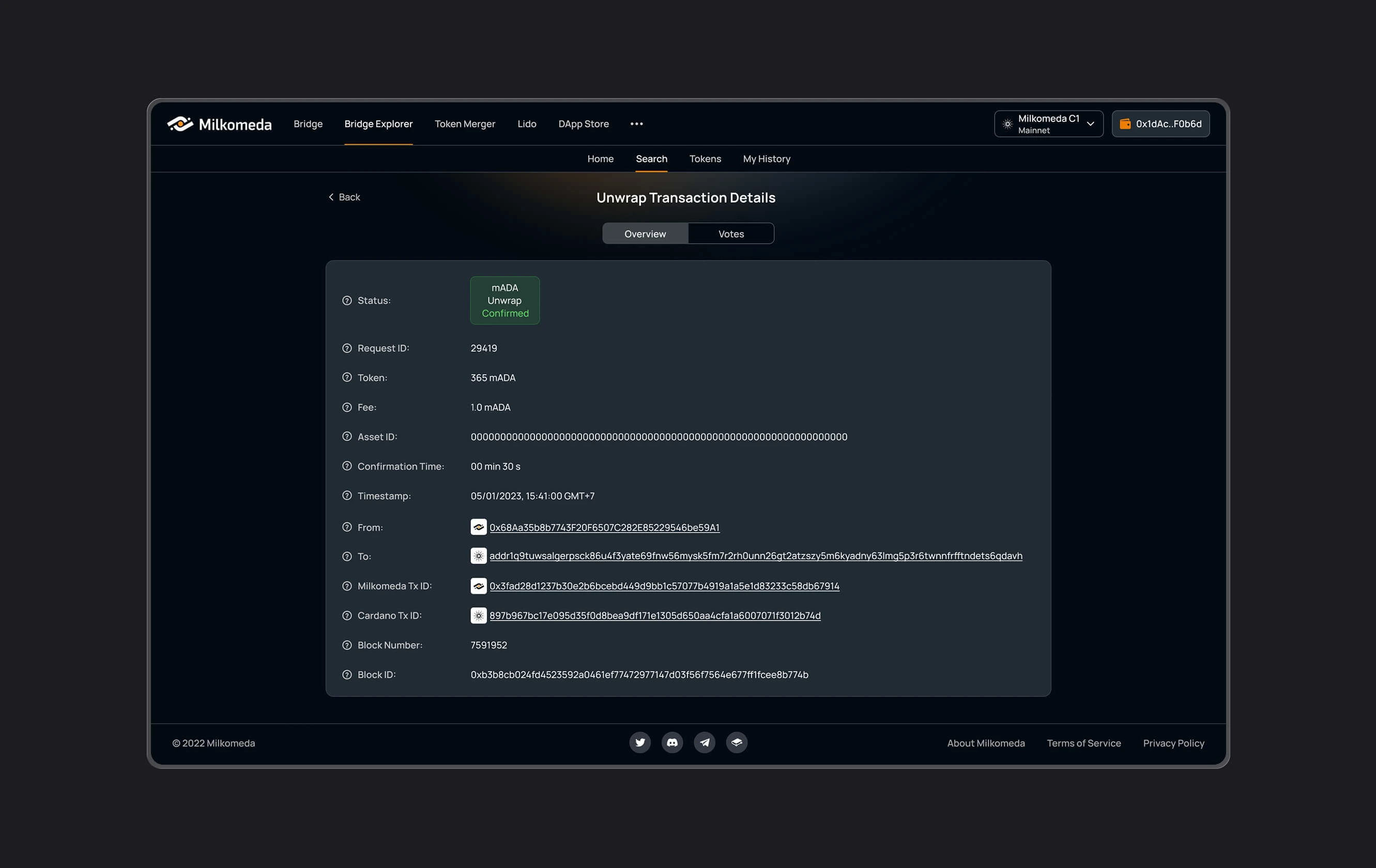
Bridge and Bridge Explorer
Interfaces for initiating transfers between networks and reviewing transaction information, with attention to asset selection, confirmation, and status visibility.
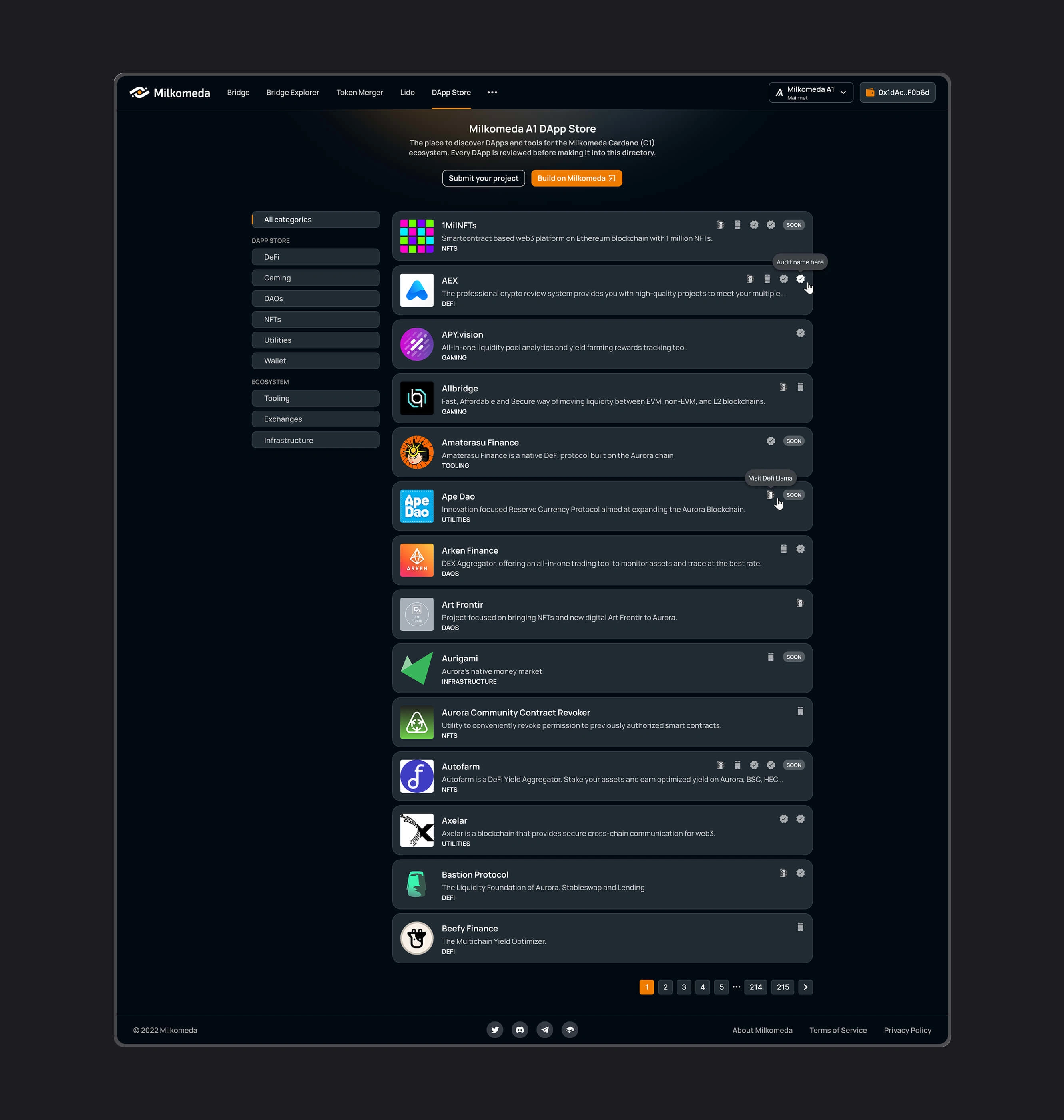
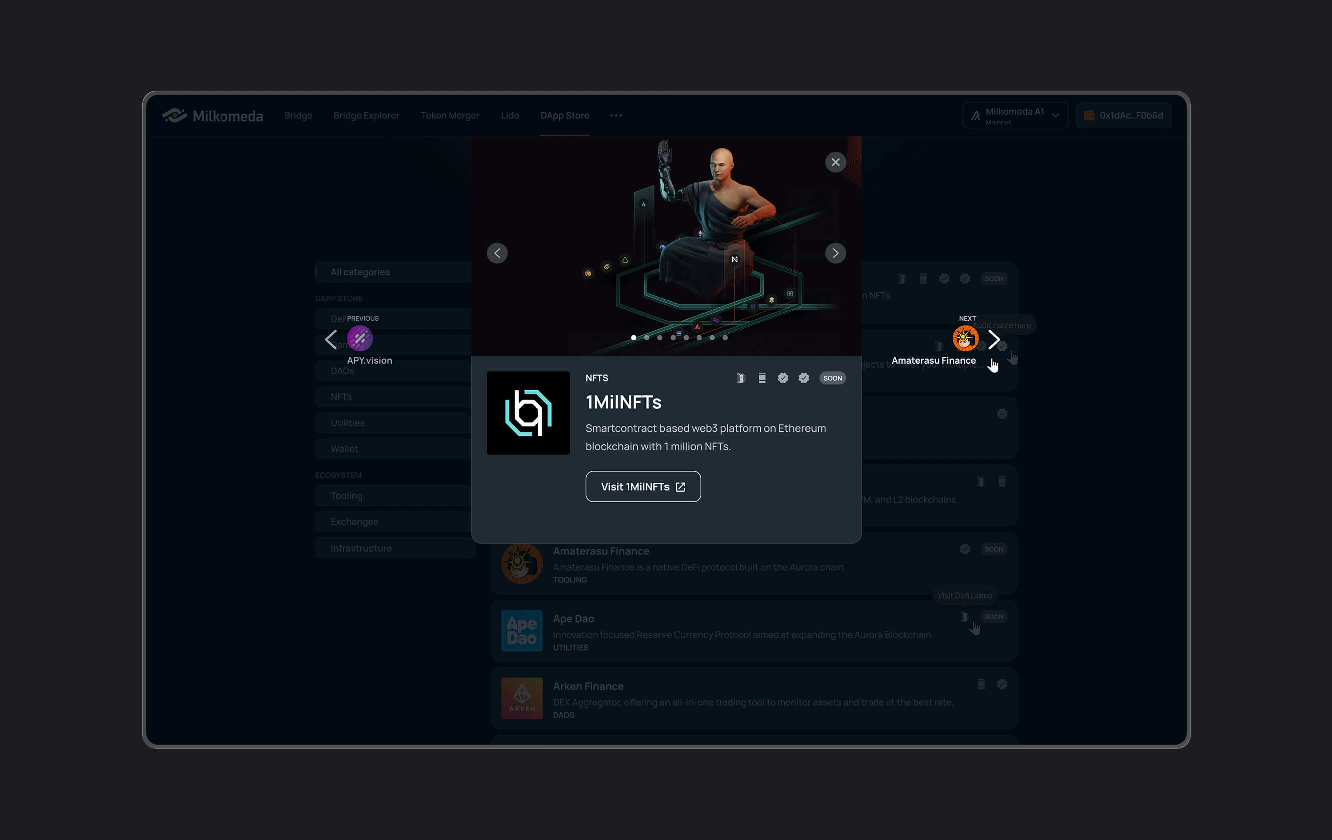
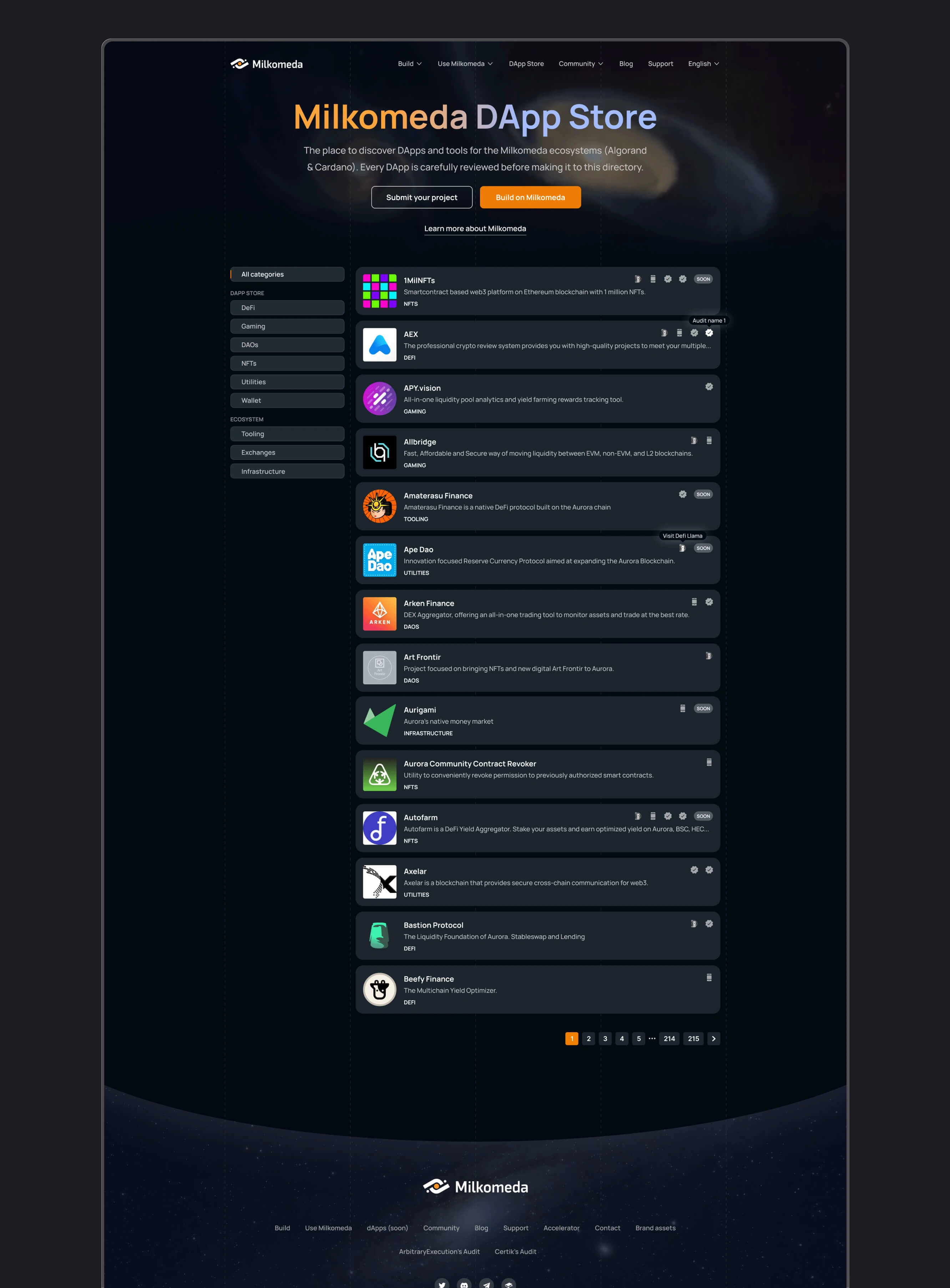
DApp Store
A browsable catalog for discovering and accessing applications within the Milkomeda ecosystem.
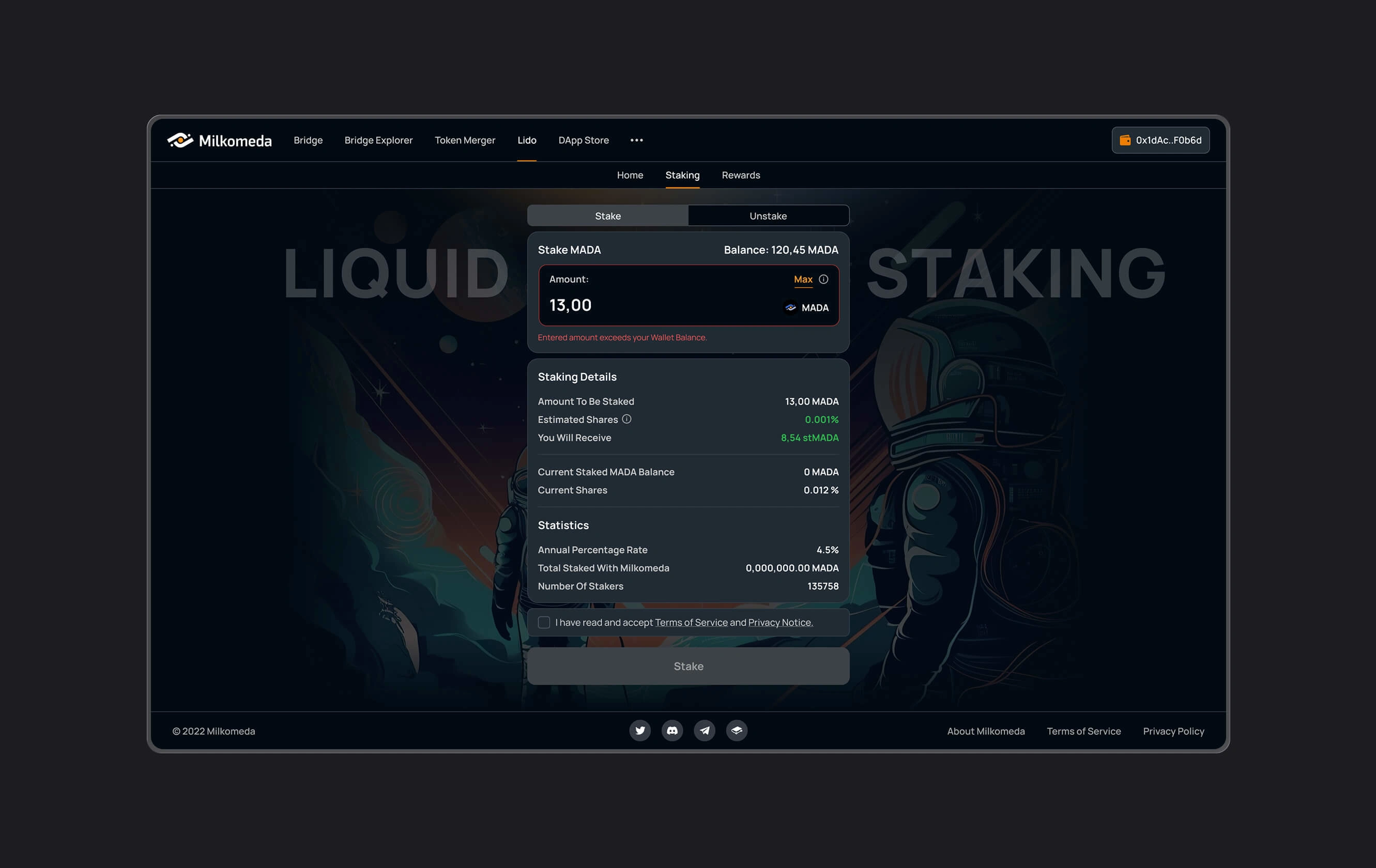
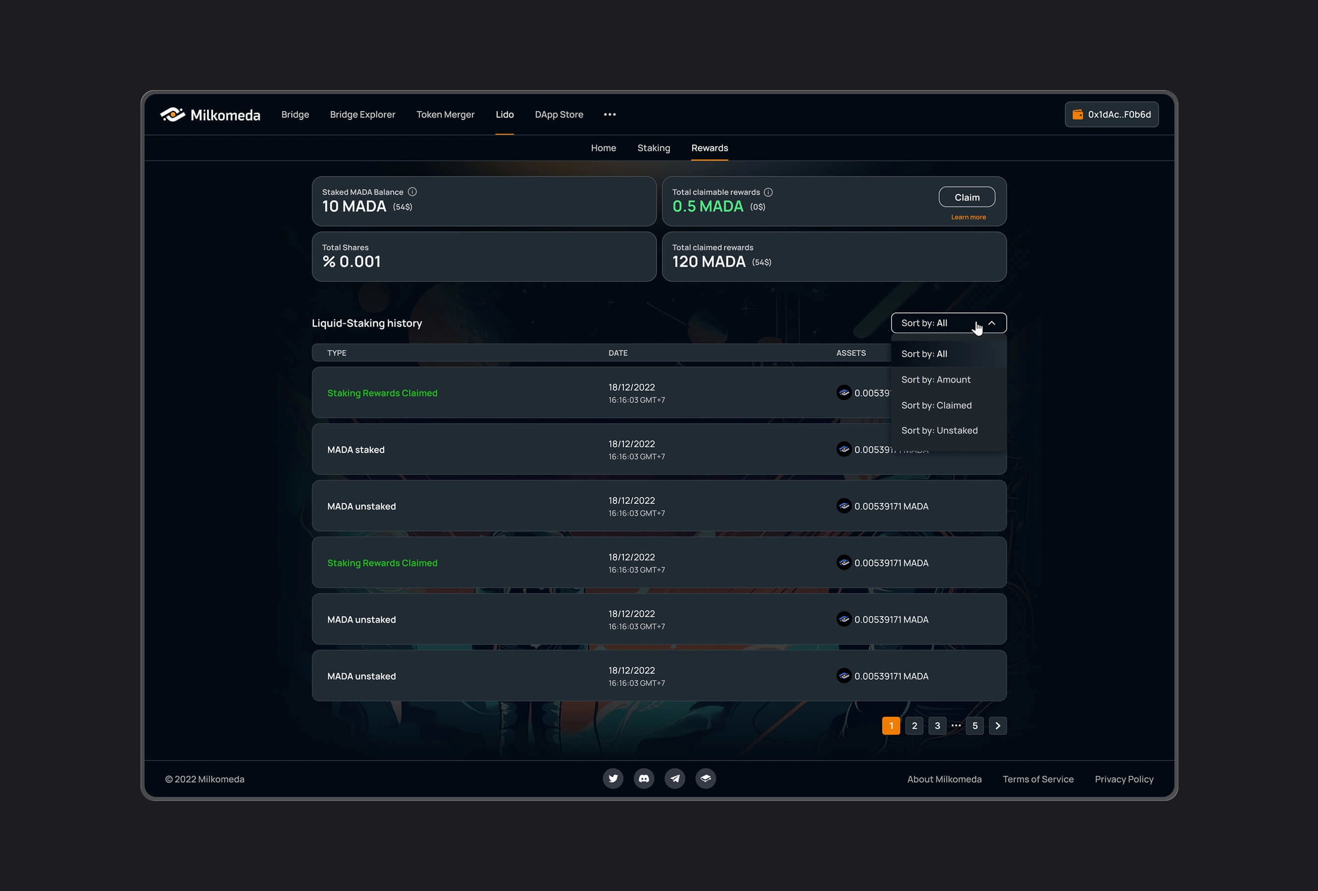
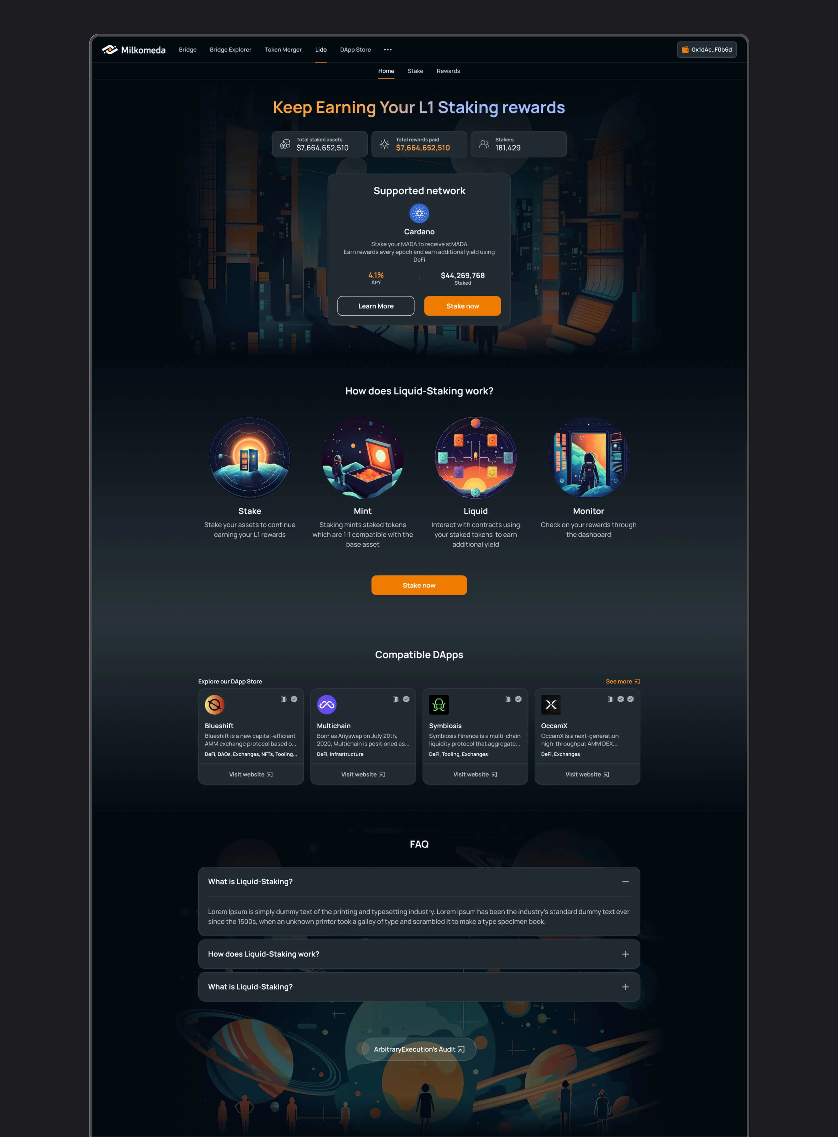
Liquid Staking
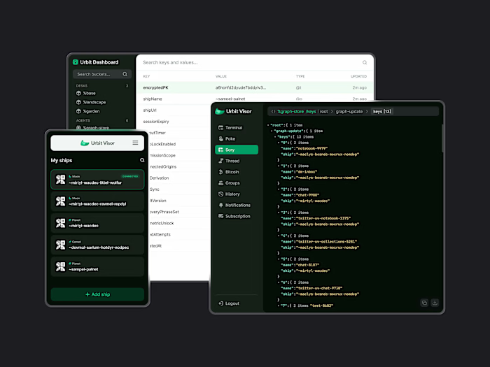
A dashboard for reviewing staking options, taking action, and following the status of staking positions.
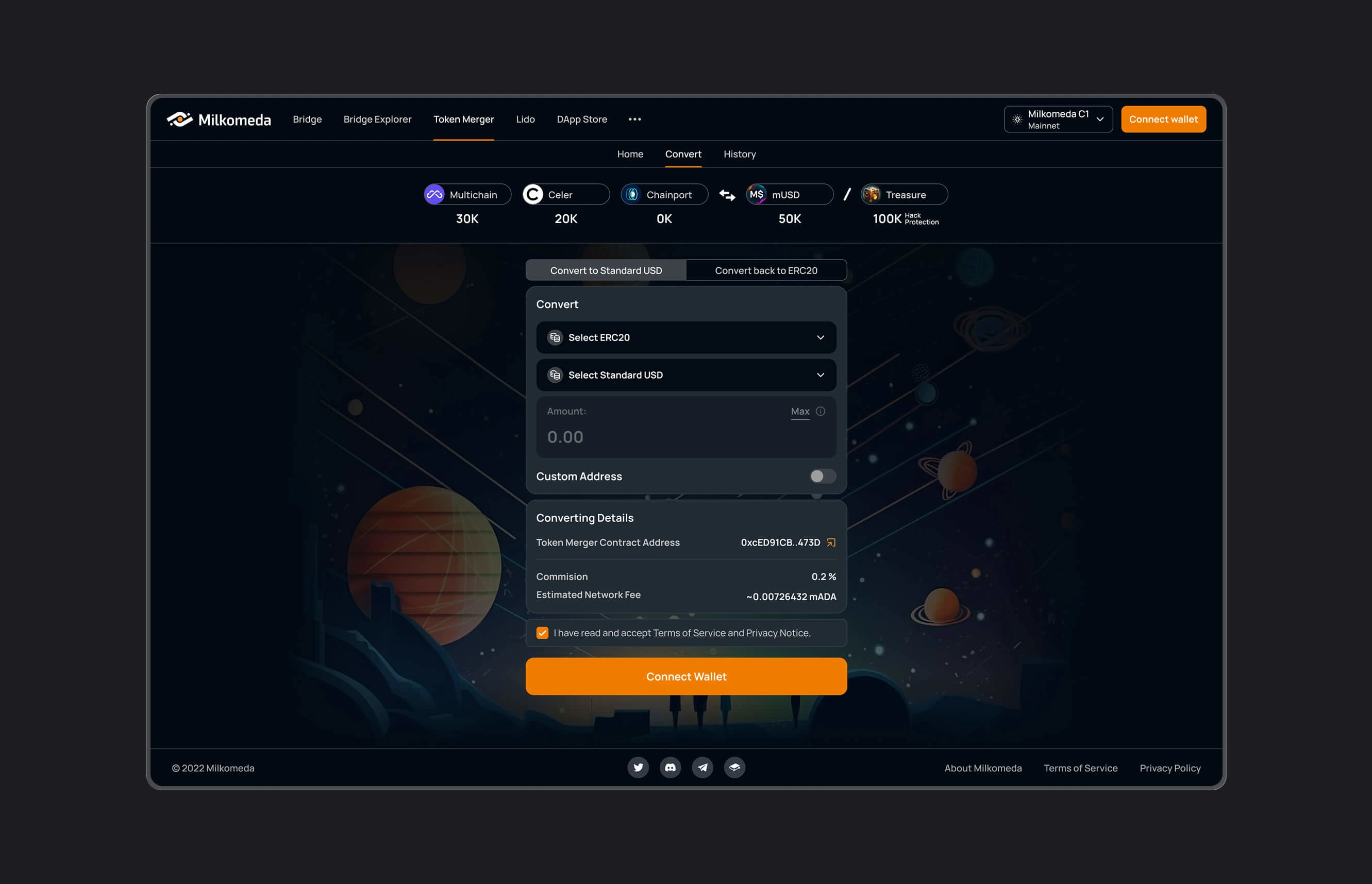
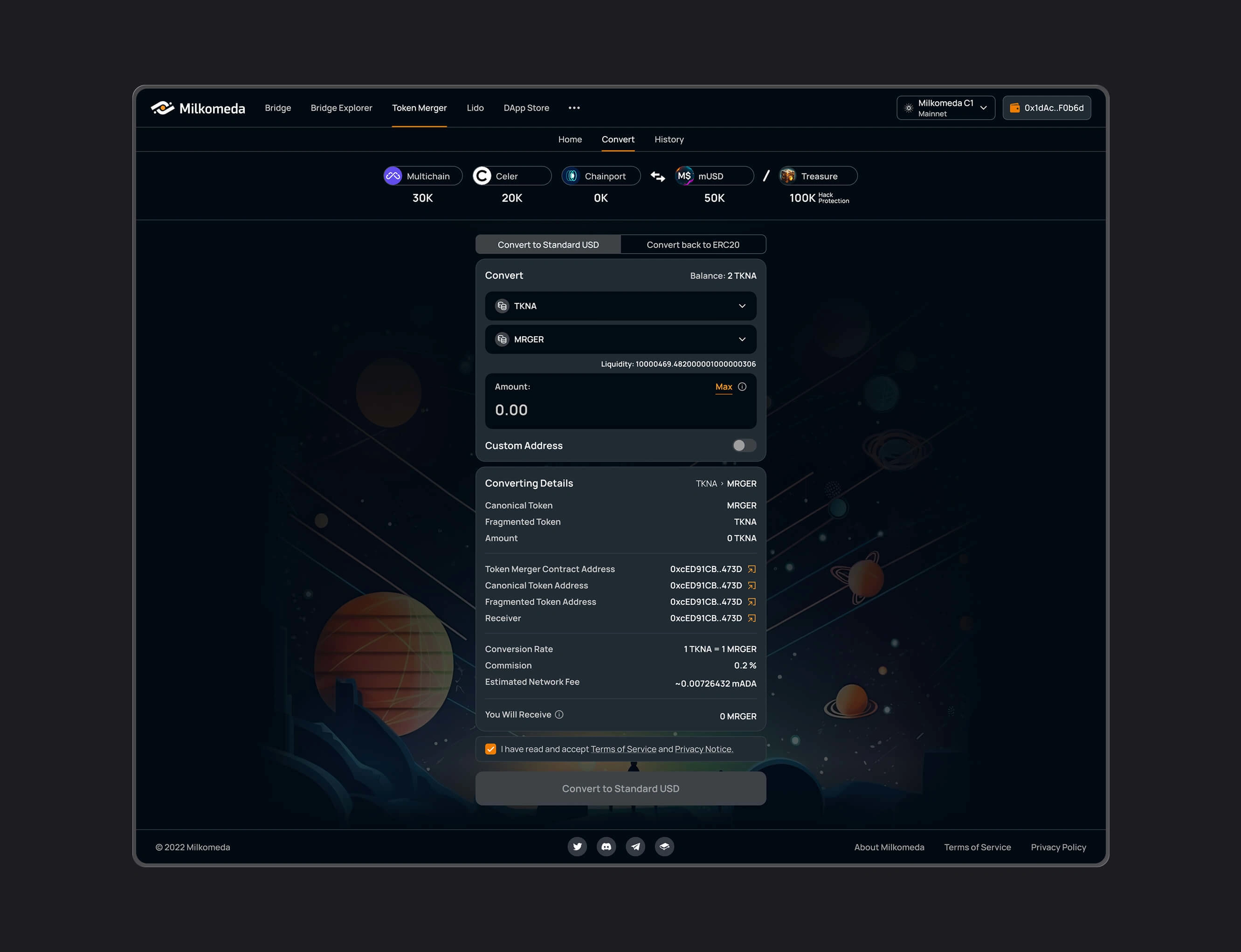
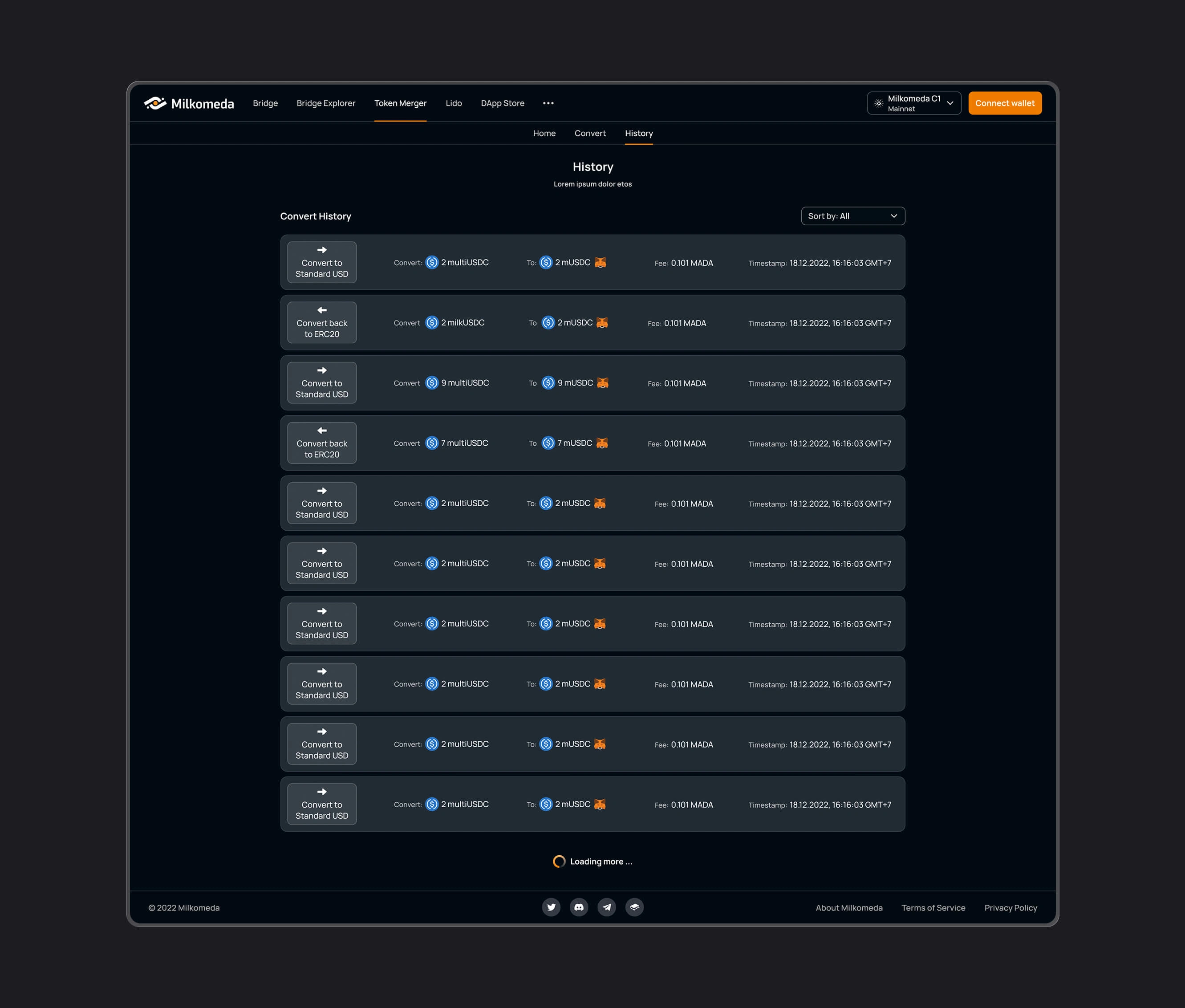
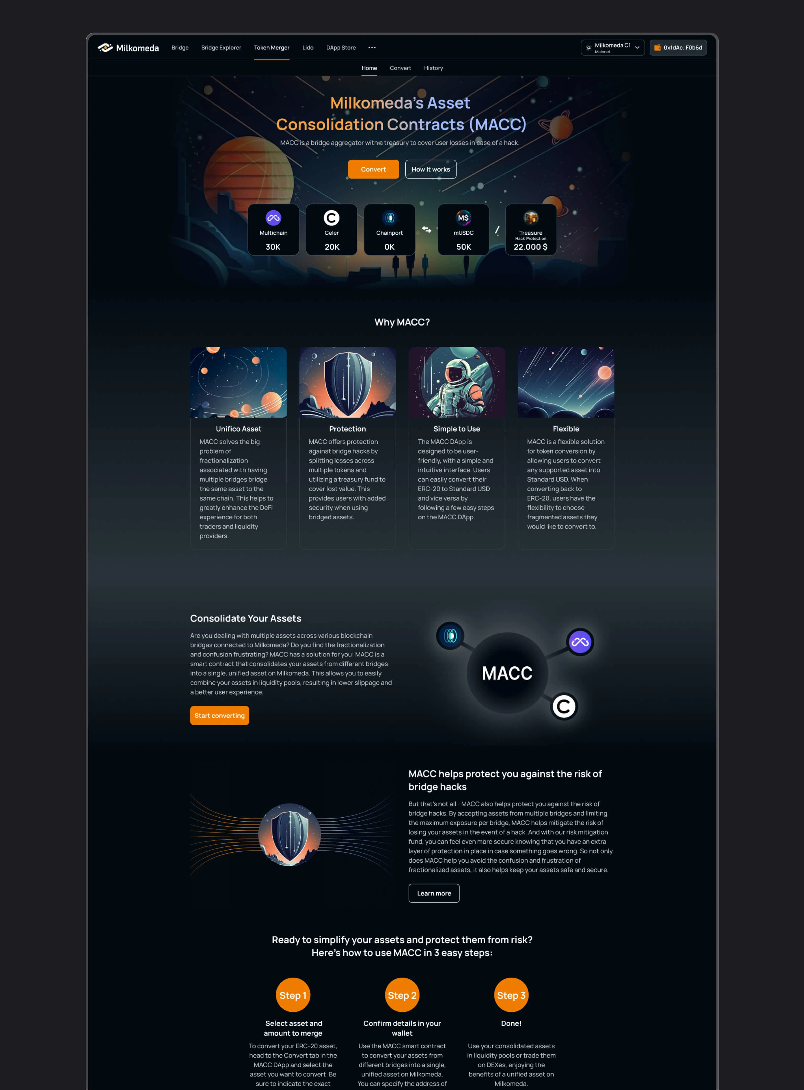
Token Merger
An interface for consolidating supported token representations from different bridges, with a structured flow for selecting assets and reviewing the operation.
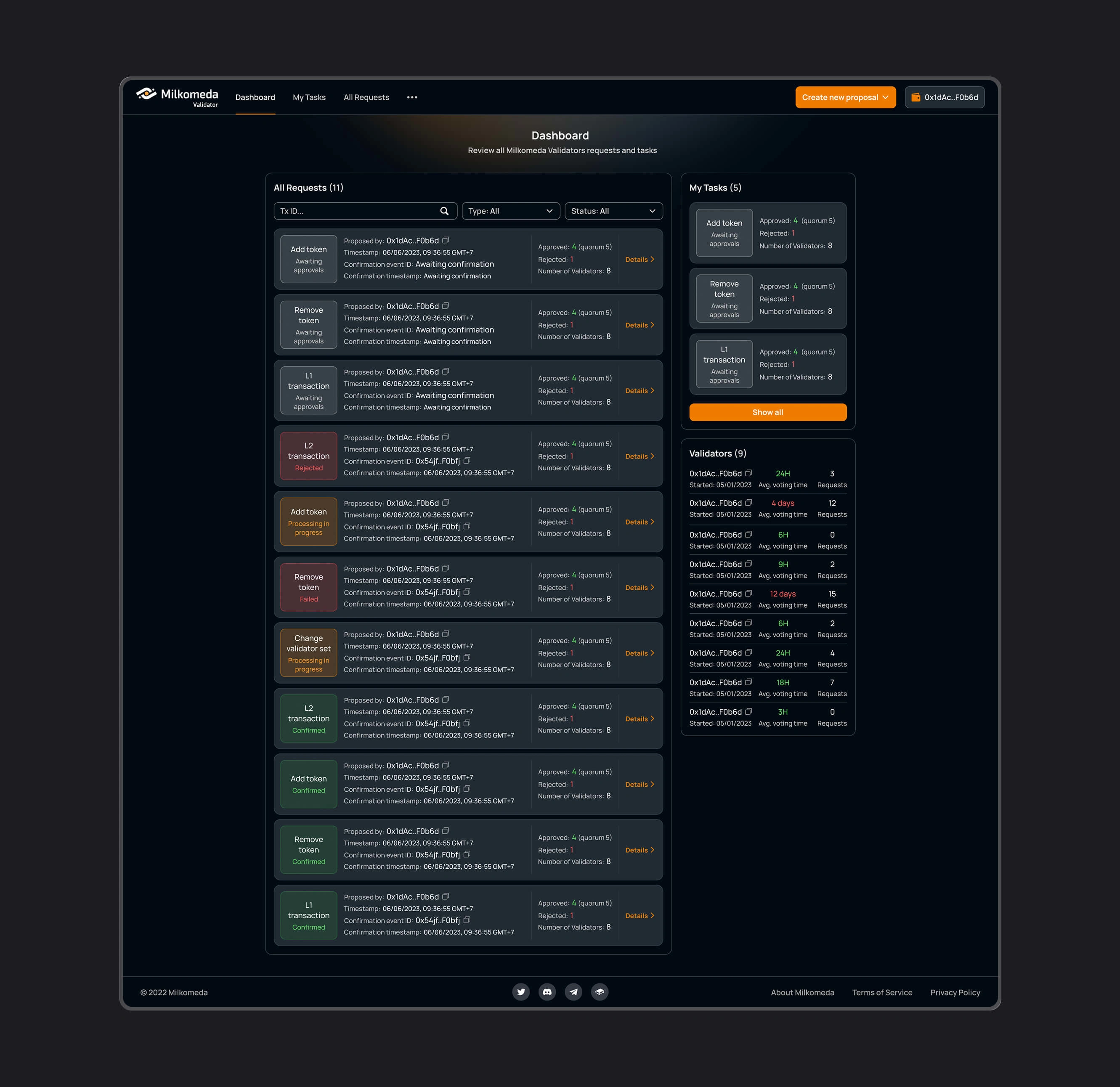
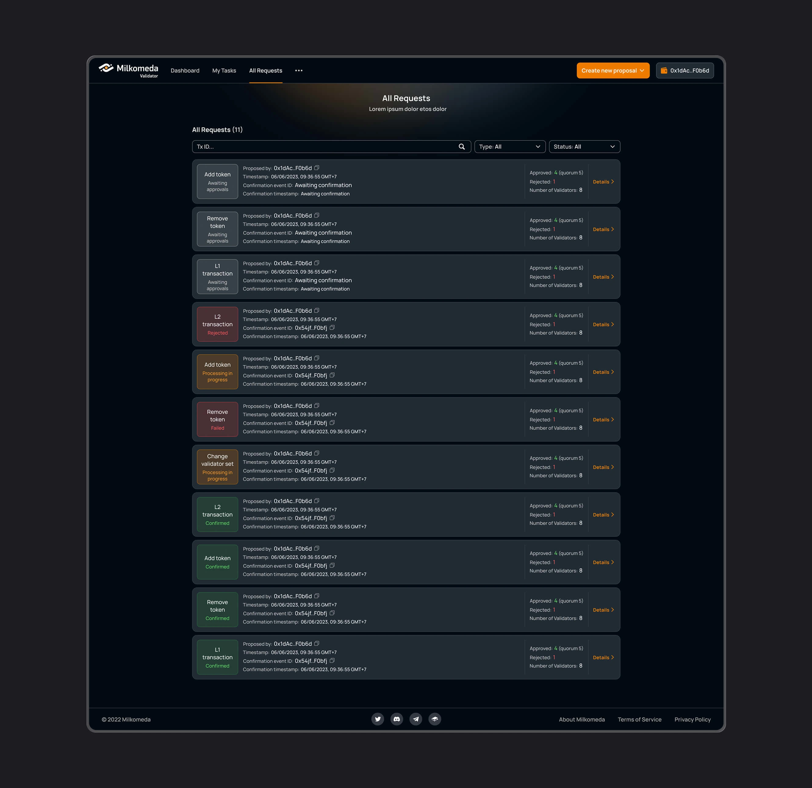
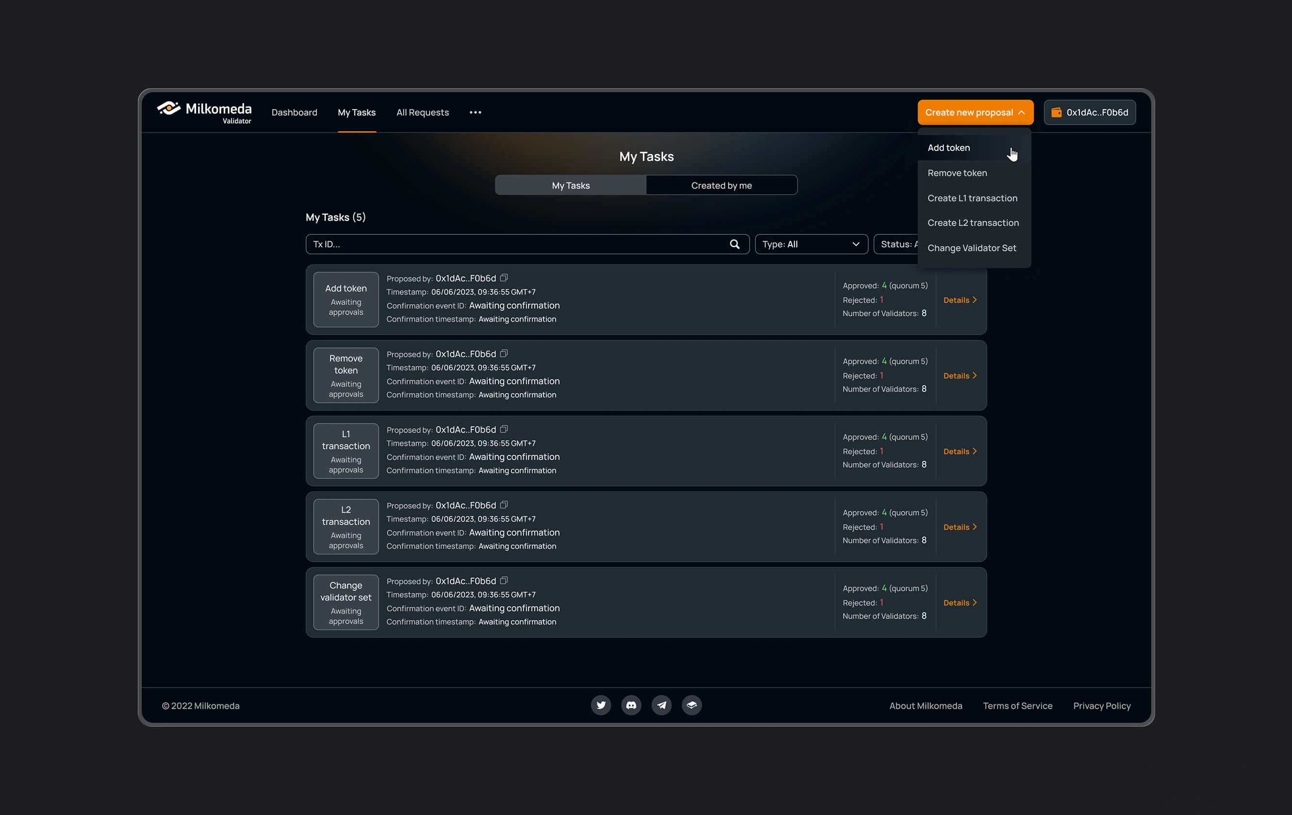
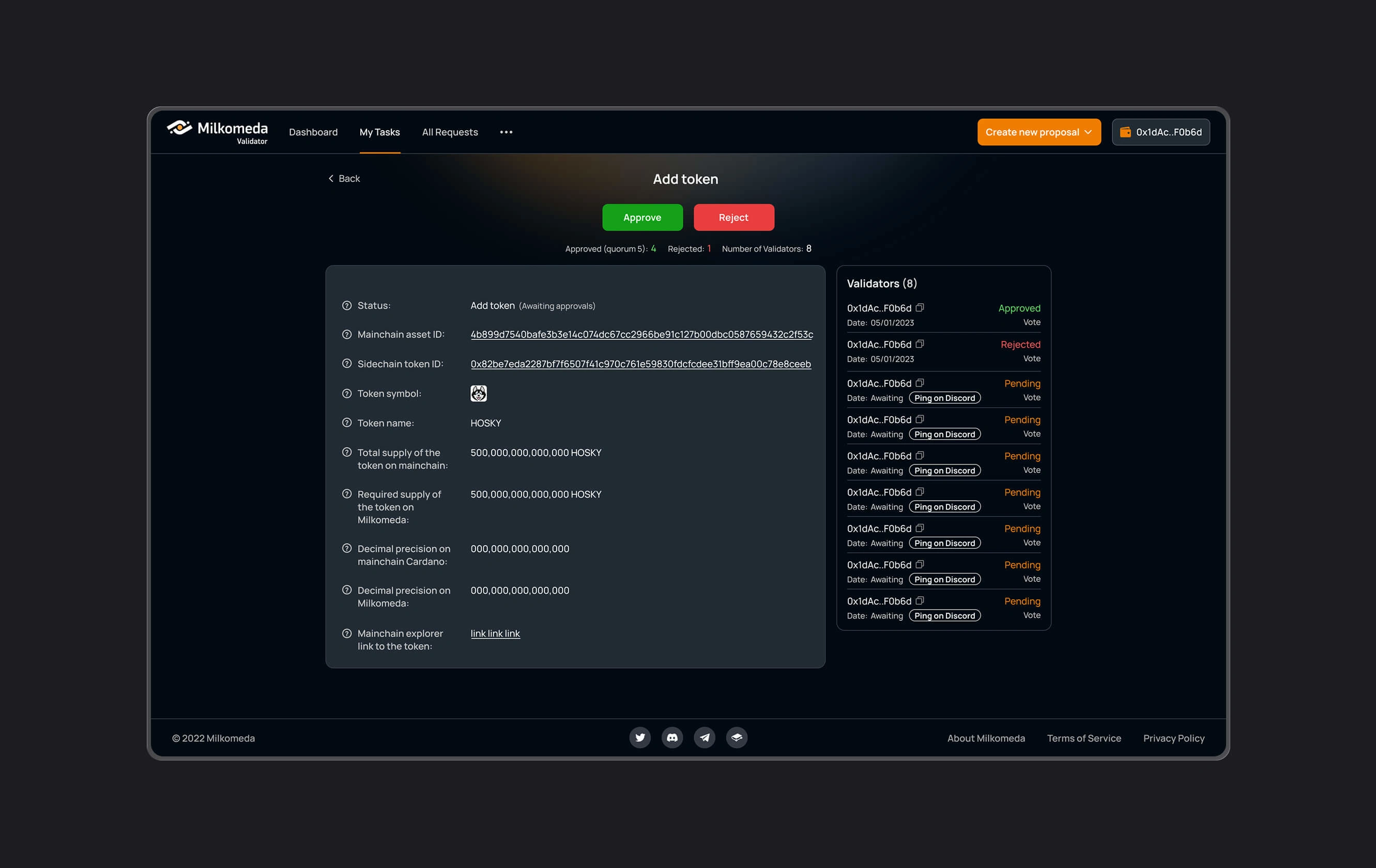
Validators Coordination
Operational interfaces for staking providers and validators, supporting the coordination and management of network participation.
B. Brand and visual identity
A visual direction applied across the product and public-facing materials, including NASA-sourced galaxy-collision footage used with permission.
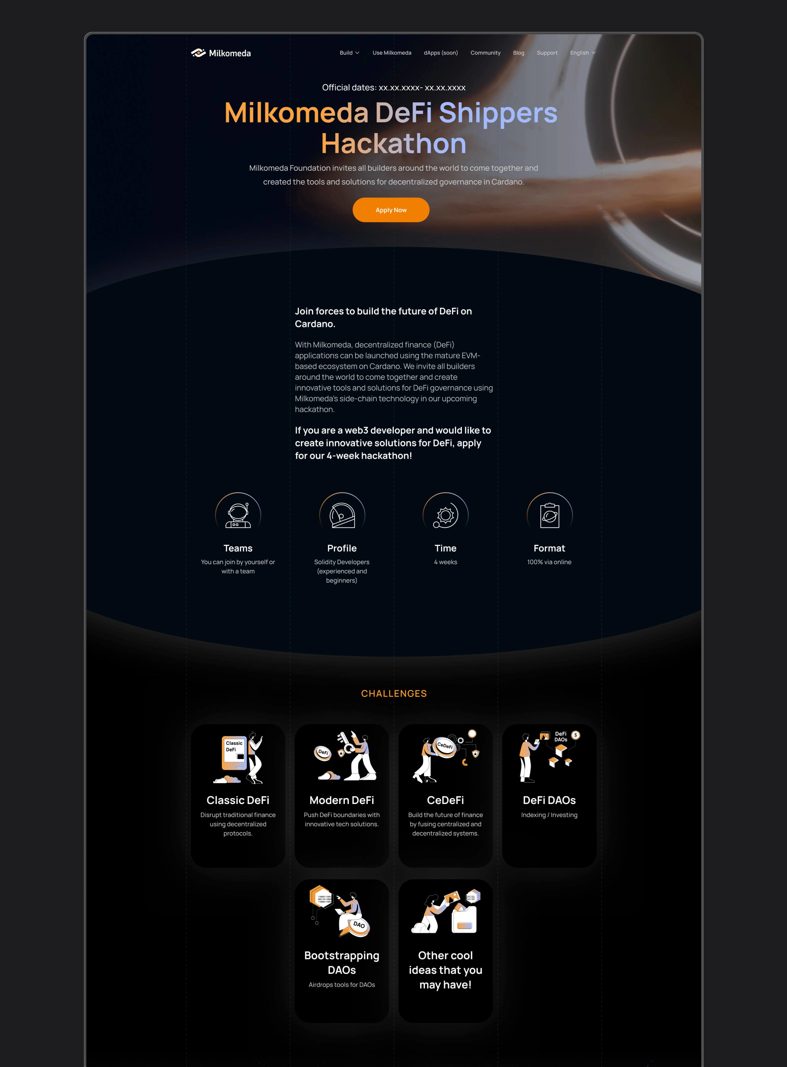
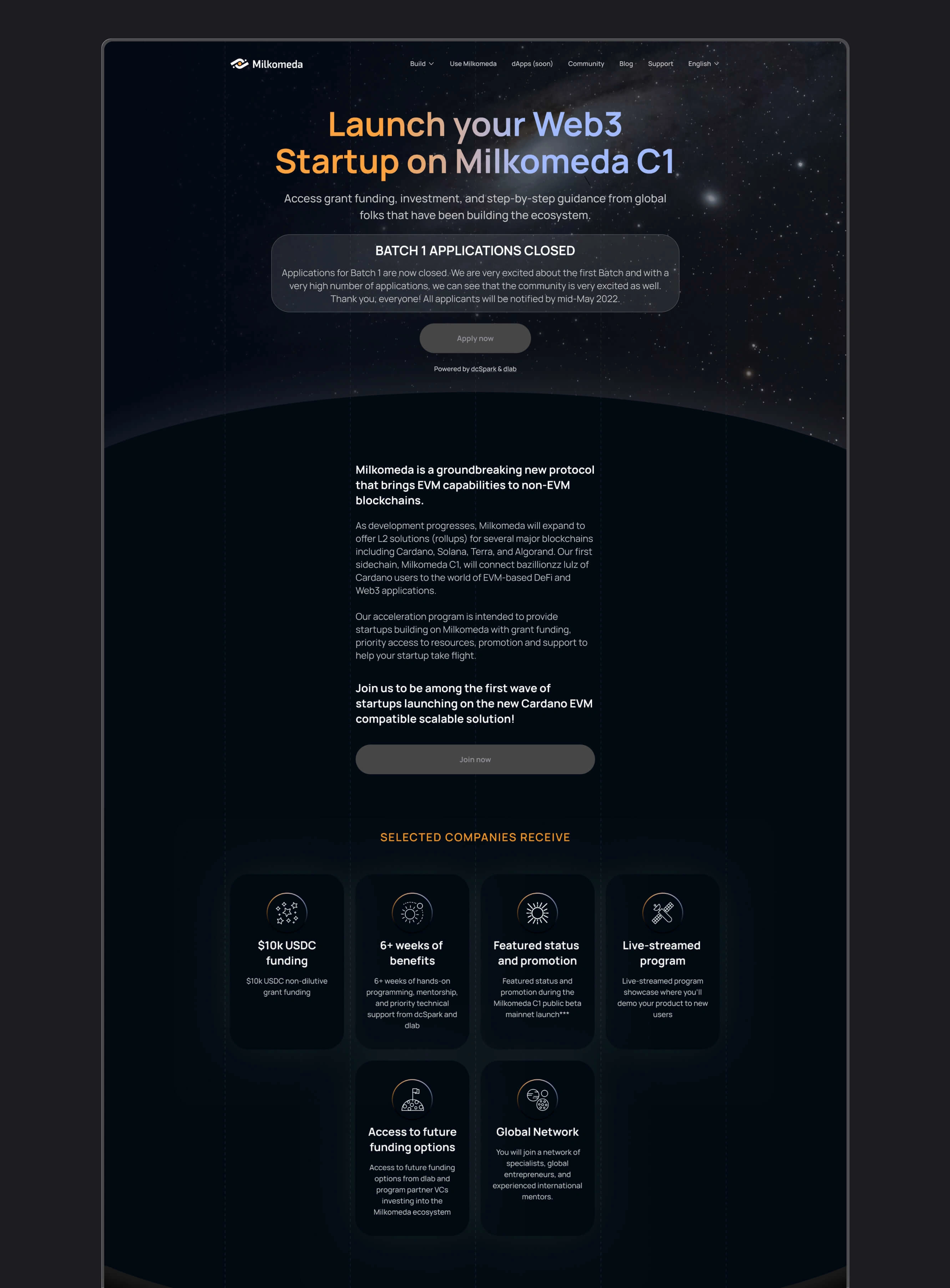
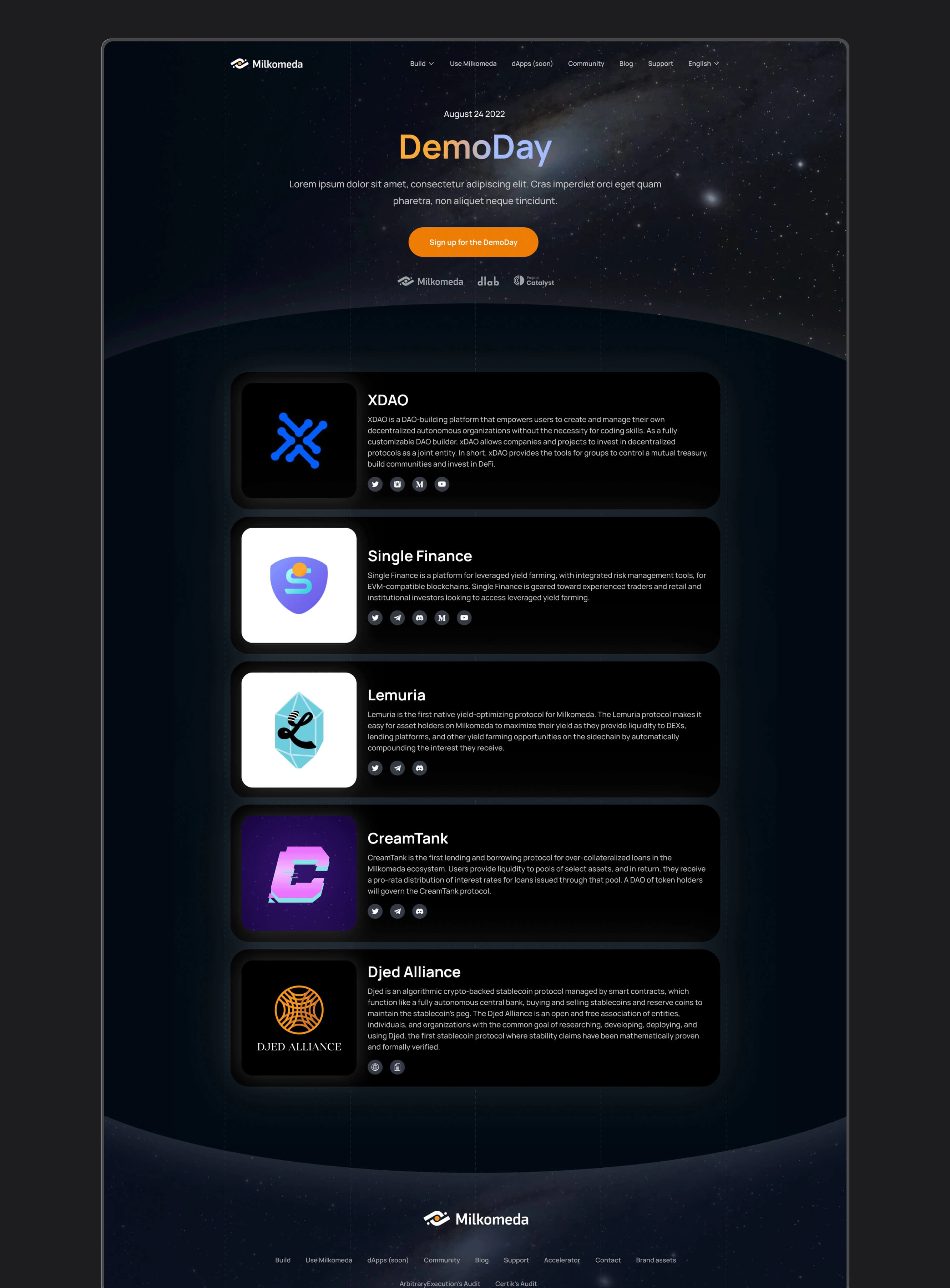
C. Website and marketing
The marketing website and materials supporting hackathons, accelerator programs, and incubator activities, extending the same identity across the platform’s public presence.
06 - Outcomes
The design work established a shared visual and interaction language across six tools, alongside a coordinated brand identity, website, and marketing materials.
The suite addressed distinct tasks through interfaces appropriate to each one, from discovering applications to reviewing transactions and managing operational information.
What I delivered:
Interface designs for Bridge and Bridge Explorer
A DApp discovery experience
Liquid Staking and Token Merger interfaces
Validators Coordination tools
Shared navigation, controls, and visual patterns
Brand identity and visual storytelling
Marketing website design
Materials supporting events and ecosystem programs
Platform context
Milkomeda reached a peak total value locked of $97.6M. This describes the value of assets held within the ecosystem at that point and provides context for the platform’s scale.
Rob is a highly gifted designer whose work has significantly elevated our company's online presence. His creativity in developing engaging, impactful designs never ceased to amaze us, consistently adding the 'wow' effect that set our websites and branding apart. Though his contributions will be greatly missed, his talent is undeniable, and I have no doubt that he will continue to create remarkable digital experiences in his future endeavors.
Nicolás Arqueros
CEO at dcspark
07 - Reflection
Milkomeda required working across a connected set of products, each with different users, tasks, and levels of technical detail. Consistency depended on identifying which patterns could be shared and where an interface needed to be specific.
The financial workflows placed particular emphasis on clear information. Helping users understand an action involved its prerequisites, costs, confirmation, and status, as well as the controls used to perform it.
The project strengthened my approach to complex product suites: build a coherent foundation, adapt it to the task, and keep the information users need close to the decisions they make.
Like this project
Posted Oct 9, 2026
Designed 6 cross-chain financial tools for Milkomeda, alongside its brand identity and marketing website, creating a consistent product experience.
Likes
1
Views
0
Timeline
Jan 1, 2021 - Ongoing
Clients
dcSpark