Prekindle: SaaS Marketing Hub UX/UI Redesign

Robert Licau

Prekindle
Redesigning a SaaS marketing hub to make its tools easier to understand, access, and activate.
Role
Product Designer, Prekindle, 2026
Scope
Marketing dashboard, Responsive design, Visual direction
Where
$150M+
Tickets sold on the platform
5 breakpoints
Layouts from desktop to mobile
3 weeks
From brief to design handoff
01 - Brief
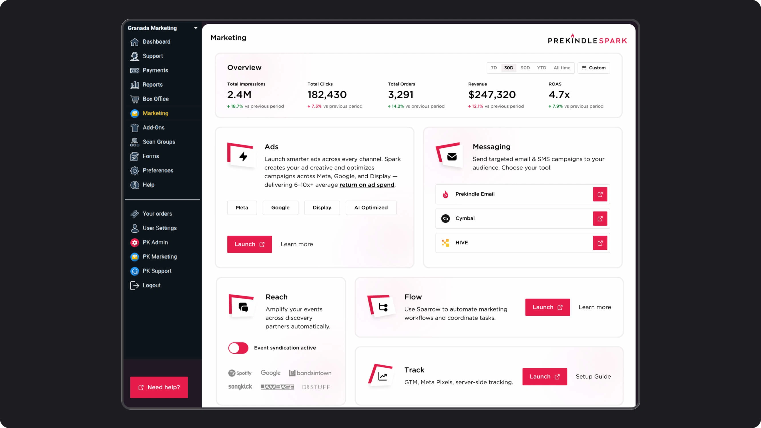
Prekindle is a US event ticketing and marketing platform. Its public website presented a strong, contemporary brand, while the dashboard used by event creators needed a clearer structure and updated visual direction.
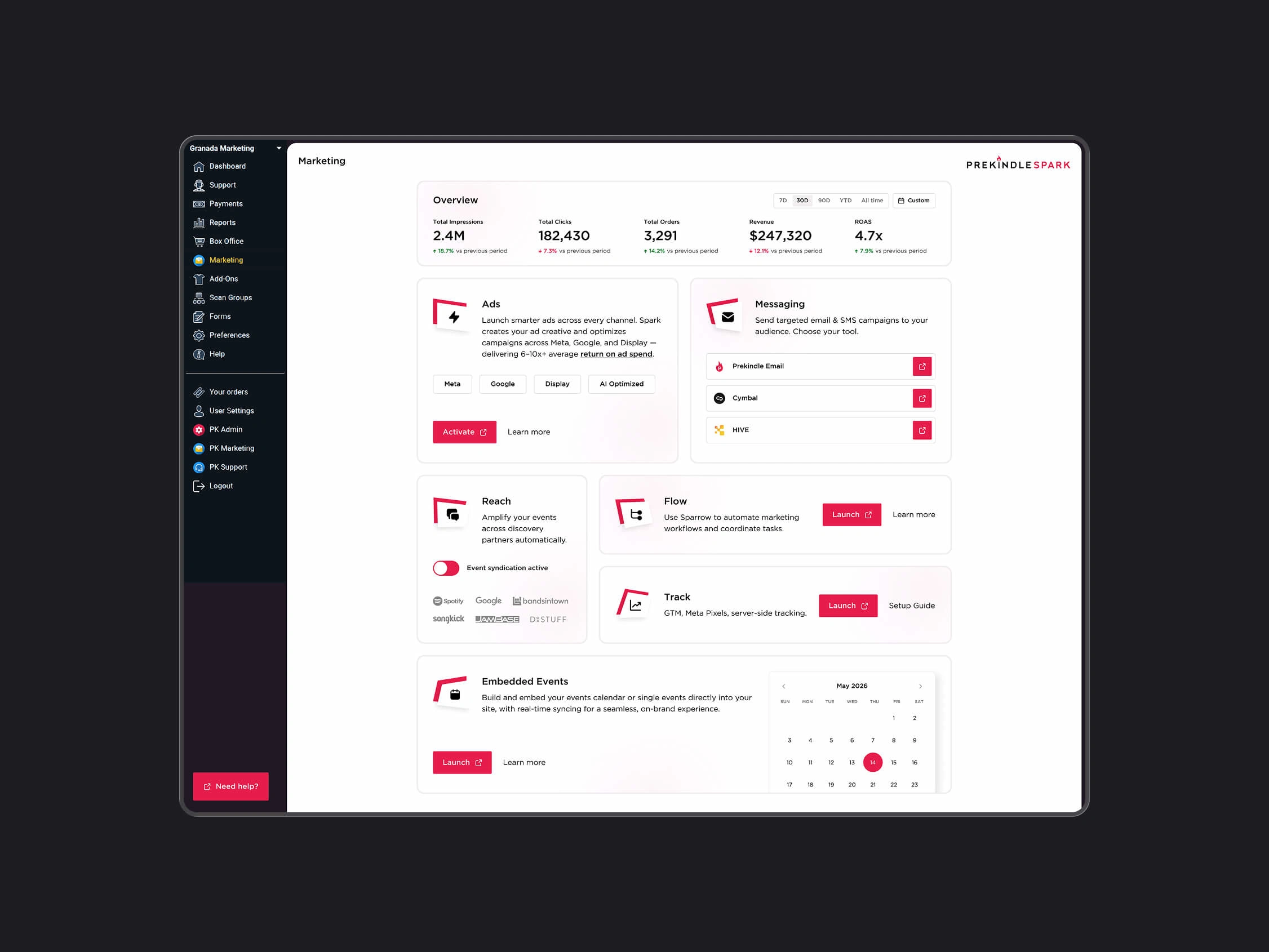
I was brought in to redesign the marketing section: the hub where creators discover and access tools for advertising, messaging, event distribution, automation, and tracking.
The brief also included proposing visual and navigation patterns that could inform future updates elsewhere in the dashboard. The marketing hub became a practical starting point for bringing the product closer to the brand customers already knew.
02 - Challenge
Connecting the product with the existing brand.
The dashboard needed to feel consistent with Prekindle’s public presence. This required translating the brand into everyday interface elements, including navigation, cards, buttons, and information hierarchy.
Making a varied toolset understandable.
The marketing hub brought several capabilities together on one page. Users needed to understand what each tool did, how to access it, and whether setup was required.
Supporting different activation requirements.
Tools had their own conditions for getting started, including consent, email input, and account approval. The interface needed to explain these requirements and distinguish an available action from a pending state.
Working within an existing product.
The redesign needed layouts across five breakpoints while preserving the mobile navigation pattern the team wanted to retain.
03 - Approach
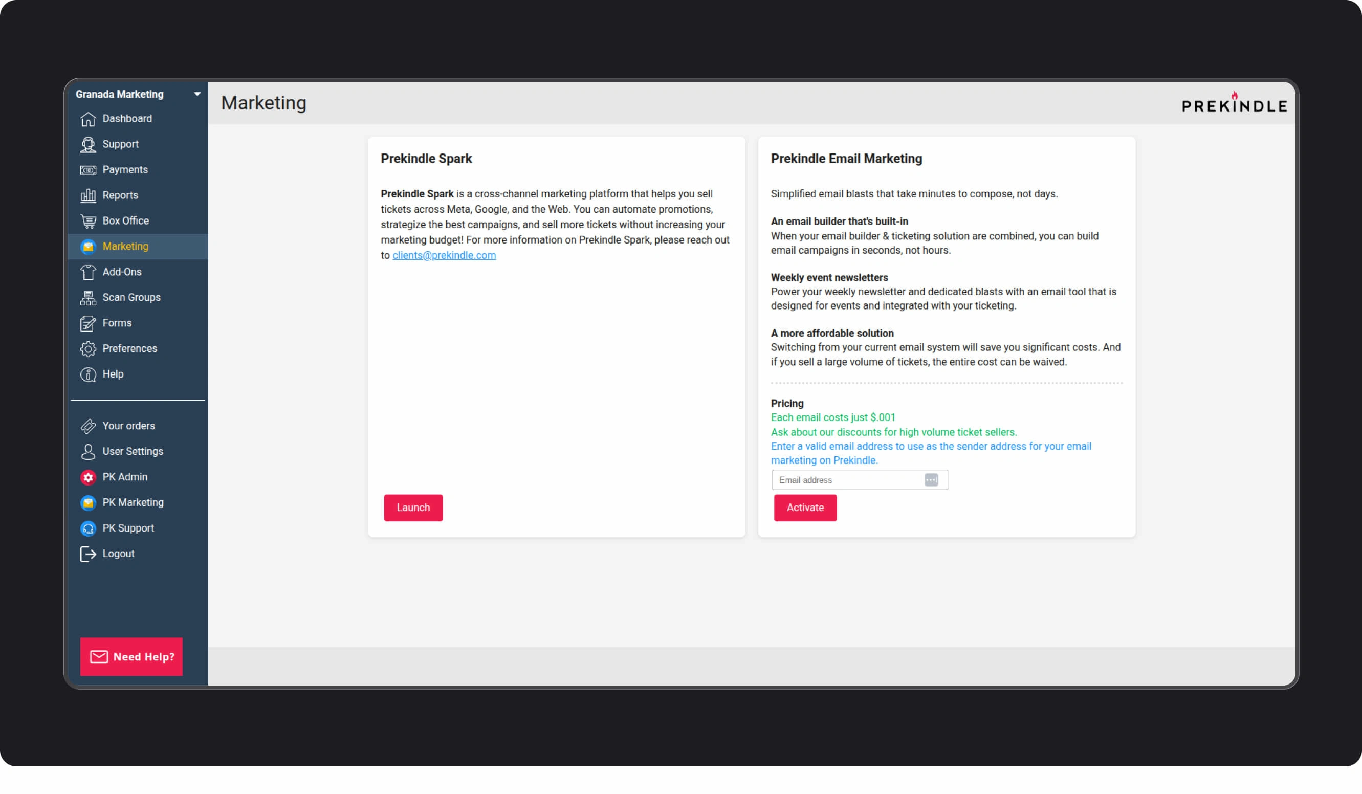
I used Prekindle’s existing brand as the starting point for color, typography, and interface styling. The aim was to carry that identity into a working dashboard with clear hierarchy and consistent controls.
I organized the marketing tools into modules, each combining a recognizable label, a short explanation, and relevant actions. This gave the hub a repeatable structure while allowing different tools to present different information.
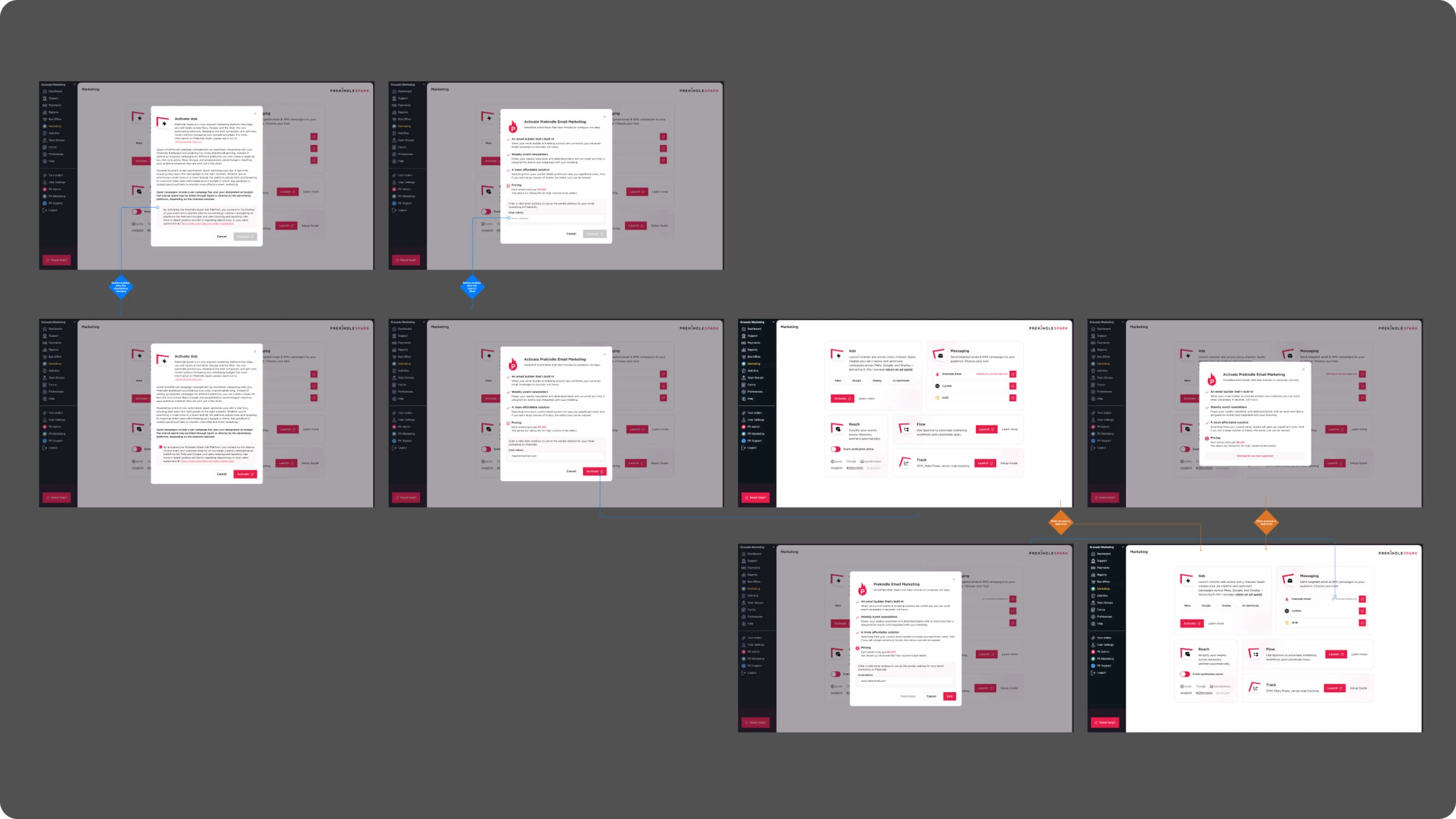
I designed the activation flows alongside the hub, covering the steps between discovering a tool and being ready to use it. These included explanatory dialogs, required inputs, consent, and approval states.
The work developed in two phases. The first established the hub and its module patterns; the second added the performance overview and embedded-events module. Across both phases, I adapted the layouts for five breakpoints while retaining the existing mobile navigation.
04 - Decisions
DECISION 1: Establish patterns the wider dashboard could reuse
I used the marketing section to define a proposed direction for recurring elements: navigation styling, typography, color, cards, and actions.
This kept the work grounded in a specific deliverable while giving the team a reference for future updates. The scope remained the marketing hub, with patterns designed to extend beyond it.
DECISION 2: Give each tool enough context to explain its purpose
I organized the tools into modules with short descriptions and clear entry points. Each module could accommodate the details relevant to that capability, such as supported channels, available providers, or setup guidance.
The layout used more vertical space than a compact list. That space allowed users to review a tool’s purpose alongside the action needed to access it.
DECISION 3: Preserve the existing mobile navigation
The team wanted to retain its mobile navigation pattern. I designed the updated content and responsive layouts around that requirement.
This maintained continuity with the existing product and kept the redesign focused on the marketing experience. The new visual treatment could be introduced within the navigation structure already in place.
DECISION 4: Adapt the content hierarchy across five breakpoints
I designed how the overview, tool modules, and actions would rearrange as the available width changed.
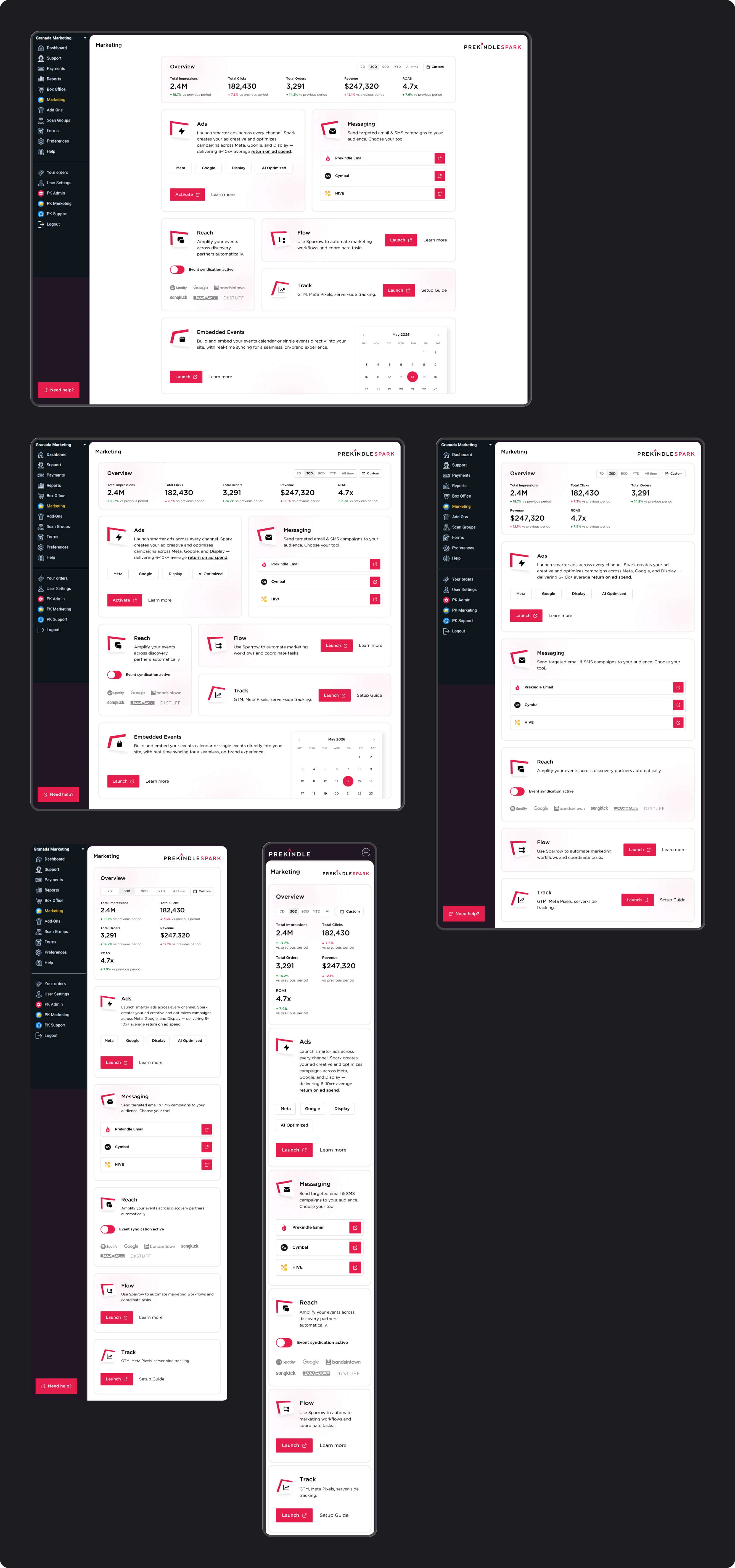
Wider layouts placed related modules side by side. Narrower layouts stacked them into a single reading order, with adjustments to metric grouping, text wrapping, and controls. This defined the responsive behavior beyond a desktop and mobile endpoint.
DECISION 5: Make activation requirements and status explicit
I gave each activation flow space to explain the tool and present the information required to proceed.
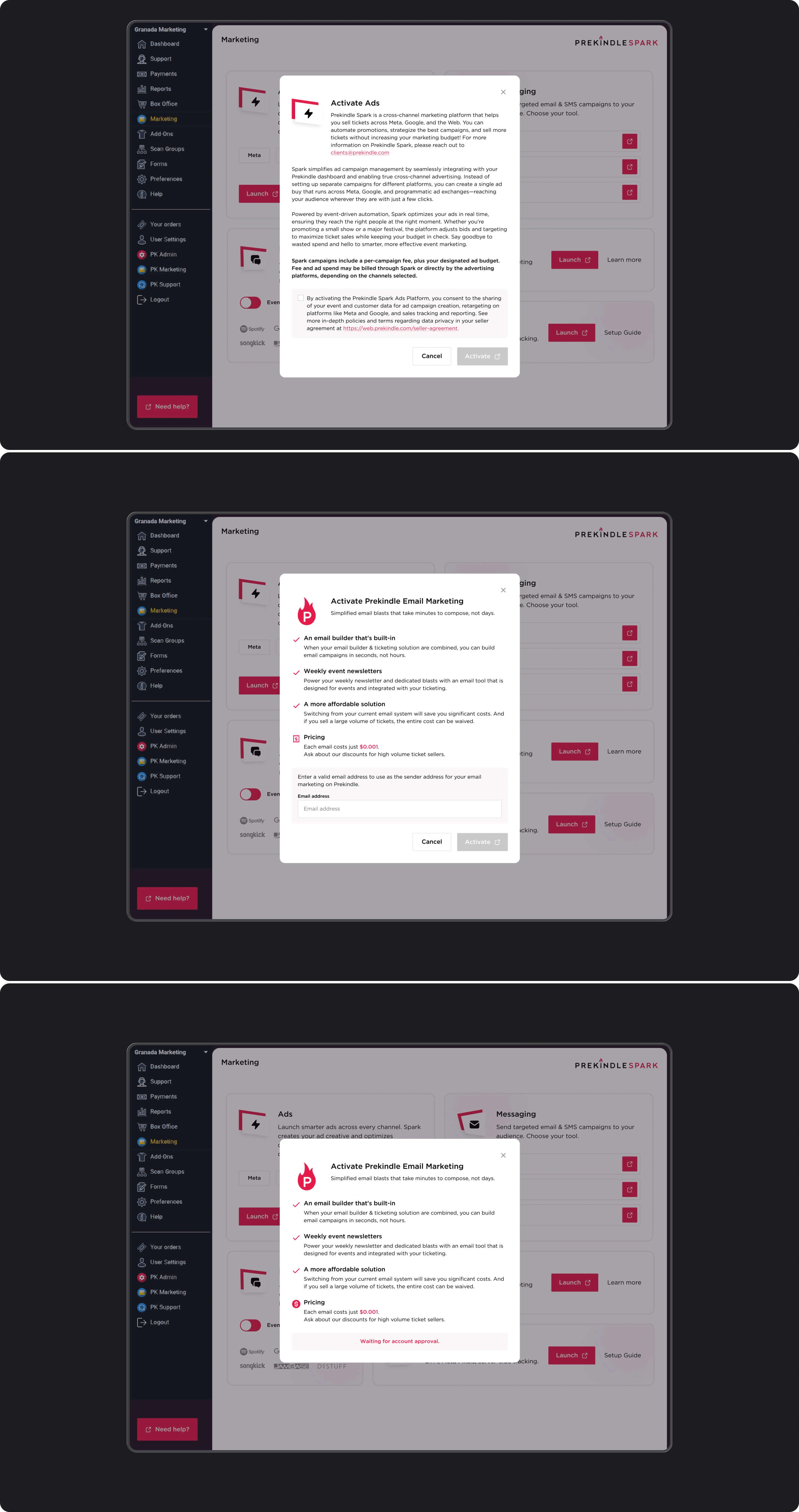
For advertising, the design included consent before activation. For email marketing, it included sender-email input and an account-approval state. These distinctions made the next step visible and explained when users needed to wait rather than take another action.
05 - The work
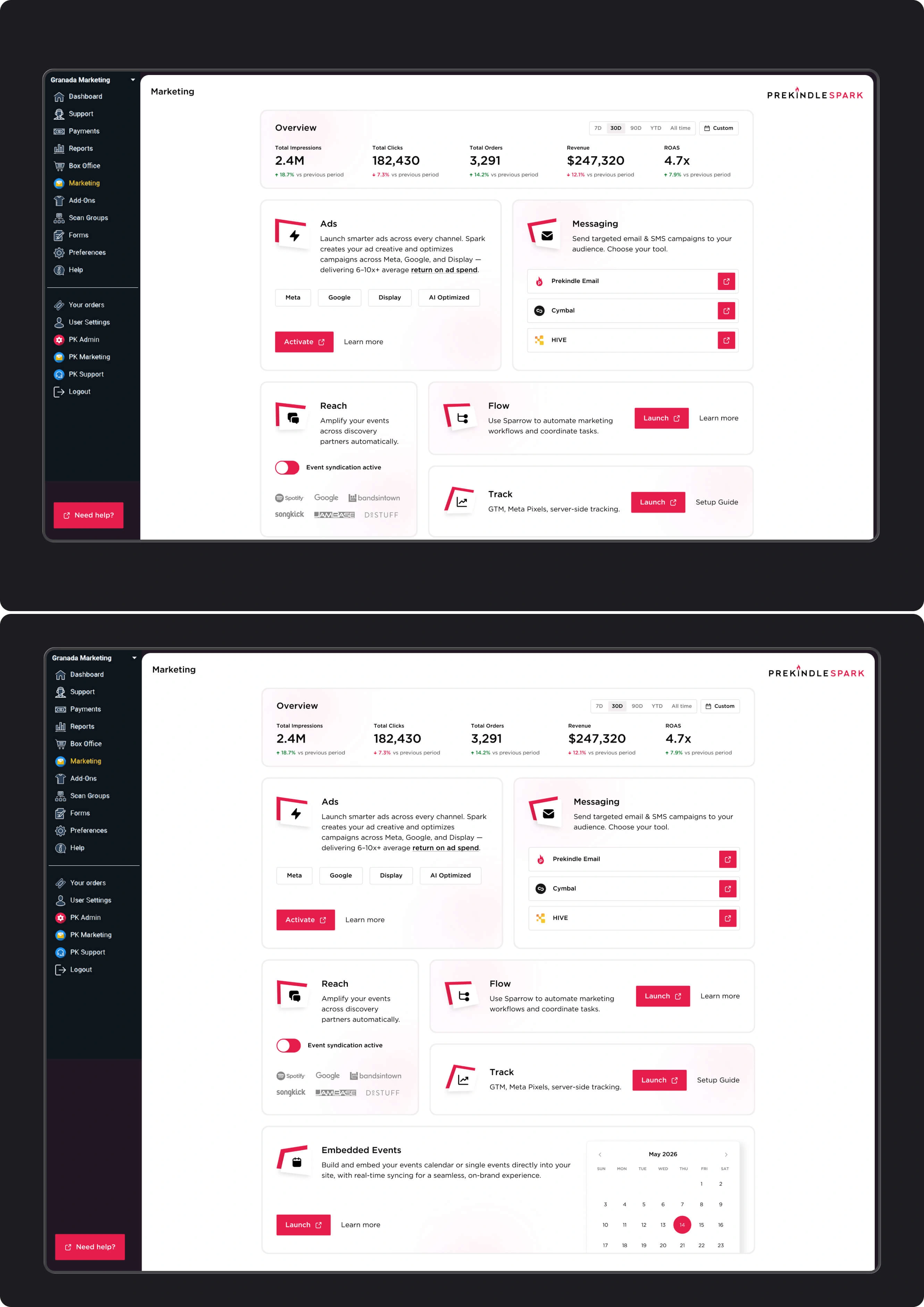
A. Two phases of scope
The first phase established the marketing hub and its module structure. The second added a performance overview and an embedded-events module, extending the same visual patterns.
B. Activation flows
Tool-specific dialogs covering product information, consent, required input, and approval status. The designs distinguish between starting activation, completing prerequisites, and waiting for an account to be approved.
C. Responsive system
Layouts across five breakpoints, adapting the performance overview, tool modules, and actions from desktop to mobile while preserving the existing mobile navigation.
06 - Outcomes
Over three weeks, I delivered a redesigned marketing hub, its supporting activation flows, and responsive layouts across five breakpoints.
The design brought the section closer to Prekindle’s established brand and gave the team a concrete visual and navigation reference for future dashboard updates.
What I delivered:
A modular marketing hub covering the platform’s tool suite
A performance overview and embedded-events module
Activation dialogs with consent, input, and approval states
Responsive layouts across five breakpoints
A proposed visual and navigation direction for the wider dashboard
Designs prepared for handoff to the development team
Our public brand was strong, but the product behind the login had fallen behind it. Robert redesigned our marketing dashboard and gave us a clear visual and navigation direction to bring the rest of the product up to that same standard. He understood the problem immediately, worked fast, and delivered a modern, fully responsive design that finally made the product feel like the company our customers already know. A pleasure to work with.
J.R. Denson
CEO at Prekindle.com
07 - Reflection
Prekindle required improving a defined part of an established product while accounting for the patterns already in use. The existing brand provided a clear visual starting point, and the mobile navigation set a practical boundary for the redesign.
The project also showed how much of a tool’s experience happens before it opens. Descriptions, activation requirements, and approval states all help users understand what is available and how to get started.
Designing those details alongside the main dashboard made the work more complete. The result was a focused update with patterns the team could carry into subsequent product improvements.
Like this project
Posted Oct 8, 2026
Redesigned a SaaS marketing hub and tool activation flows across 5 breakpoints, delivering developer-ready designs in 3 weeks.
Likes
1
Views
0
Timeline
Jan 1, 2026 - Ongoing