Van Holten's Website Redesign
Cake | QuiteGuud ◡̈
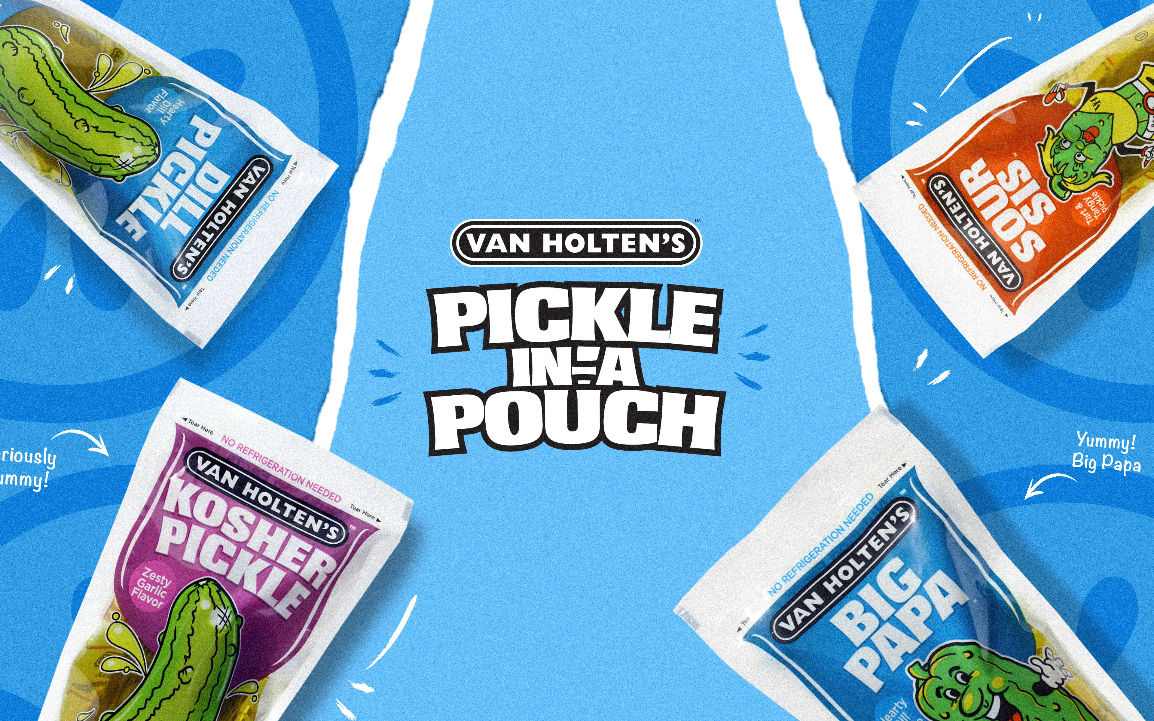
Van Holten's — Iconic American pickle brand since 1939
📍 United States
BACKGROUND
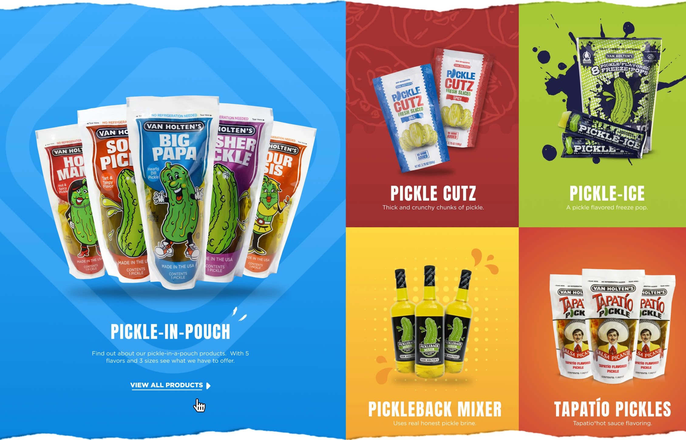
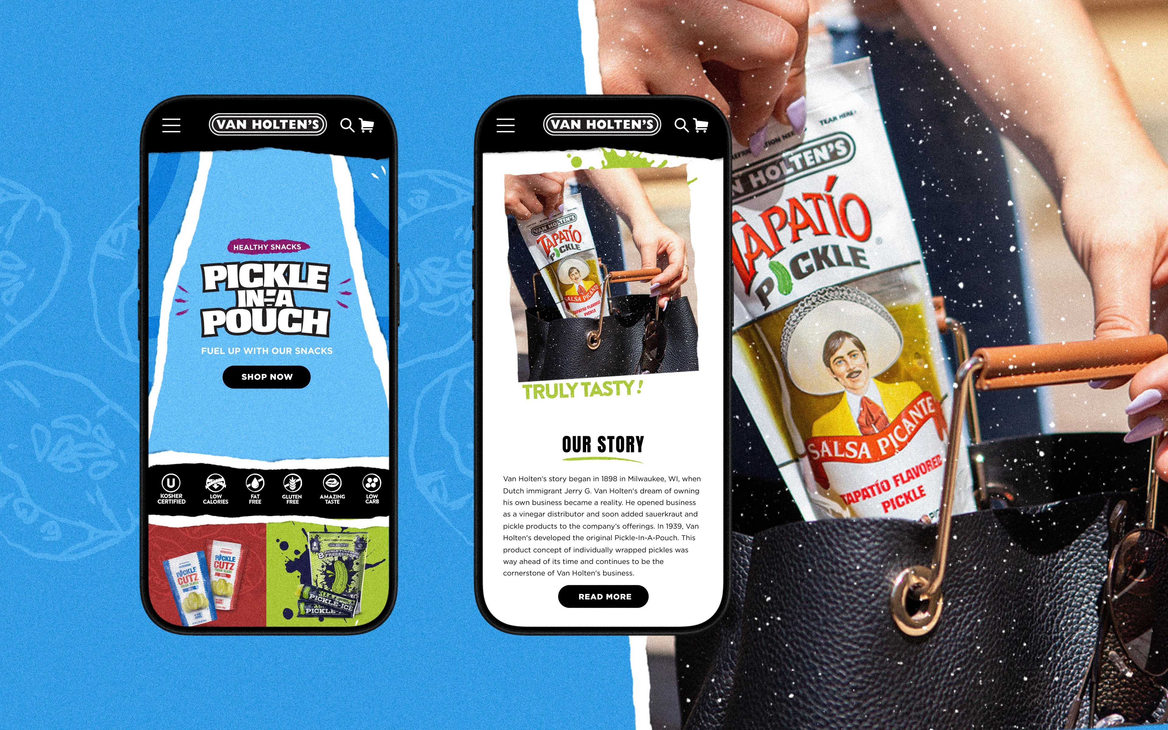
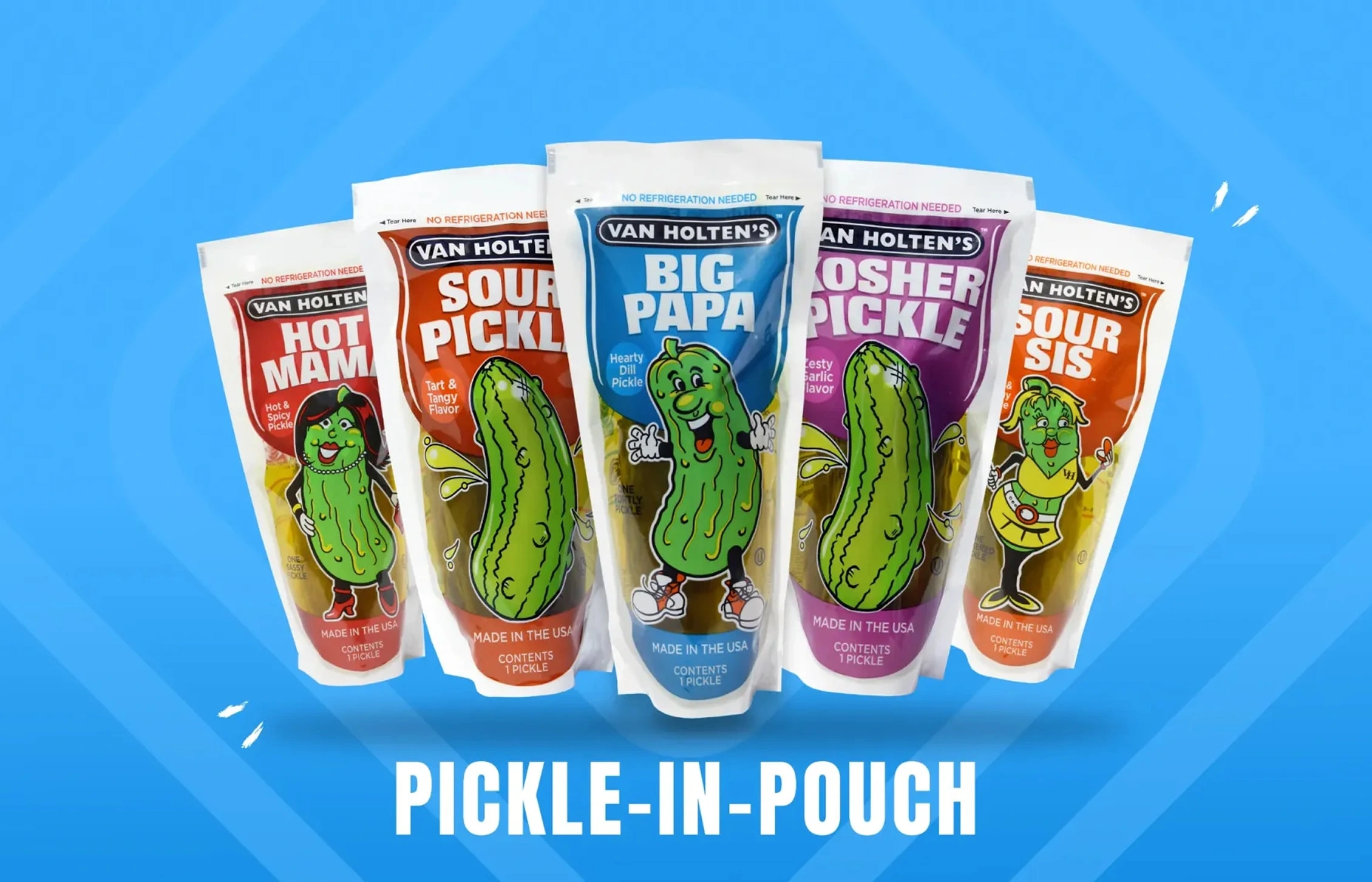
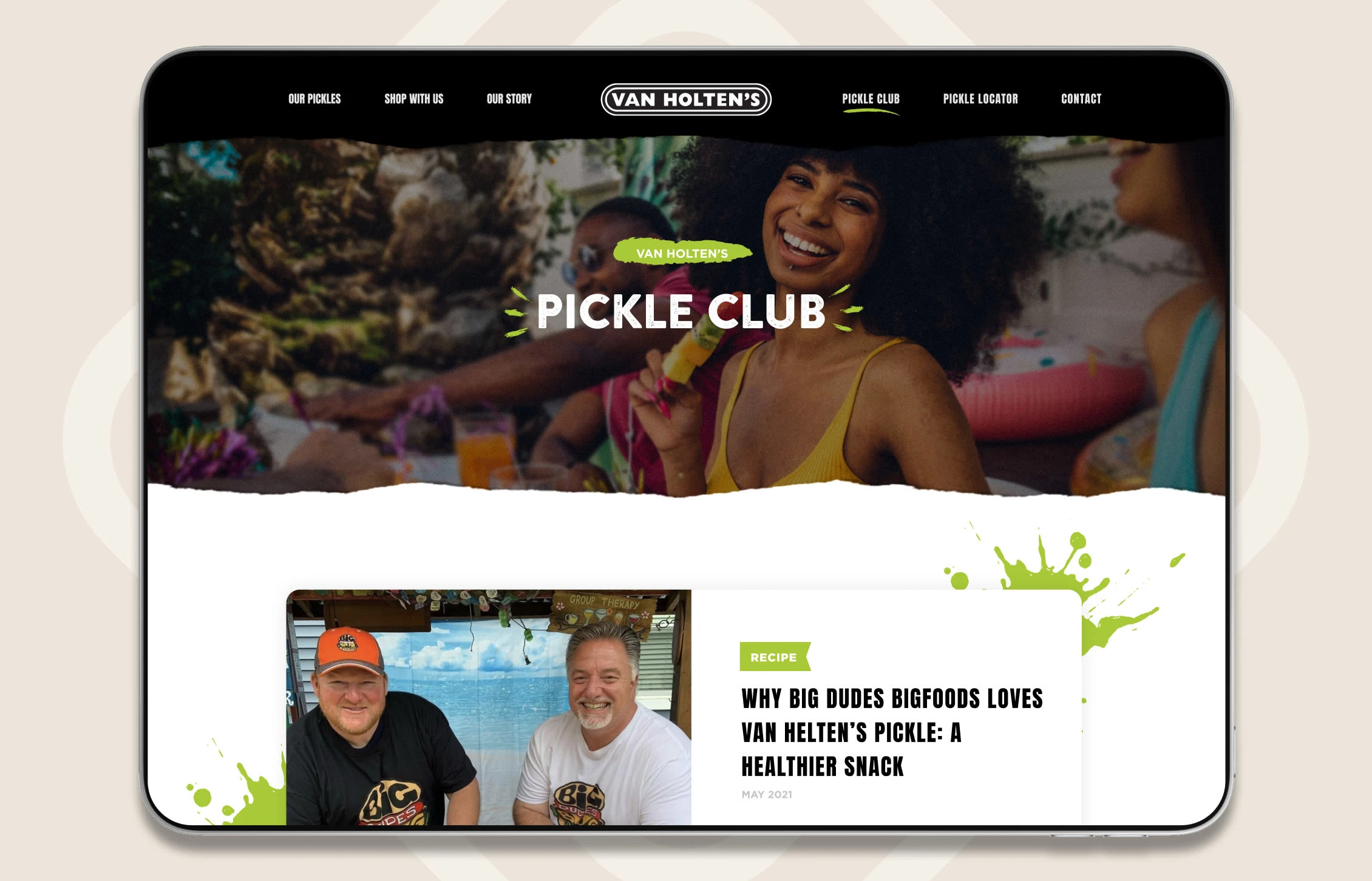
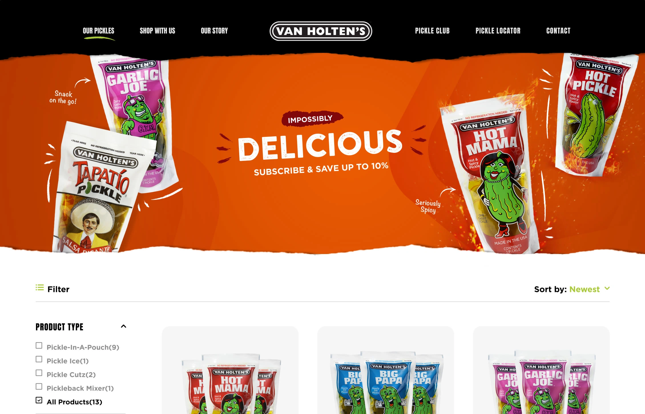
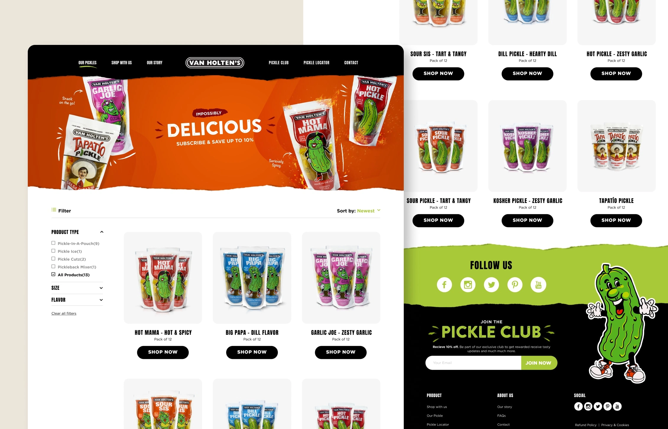
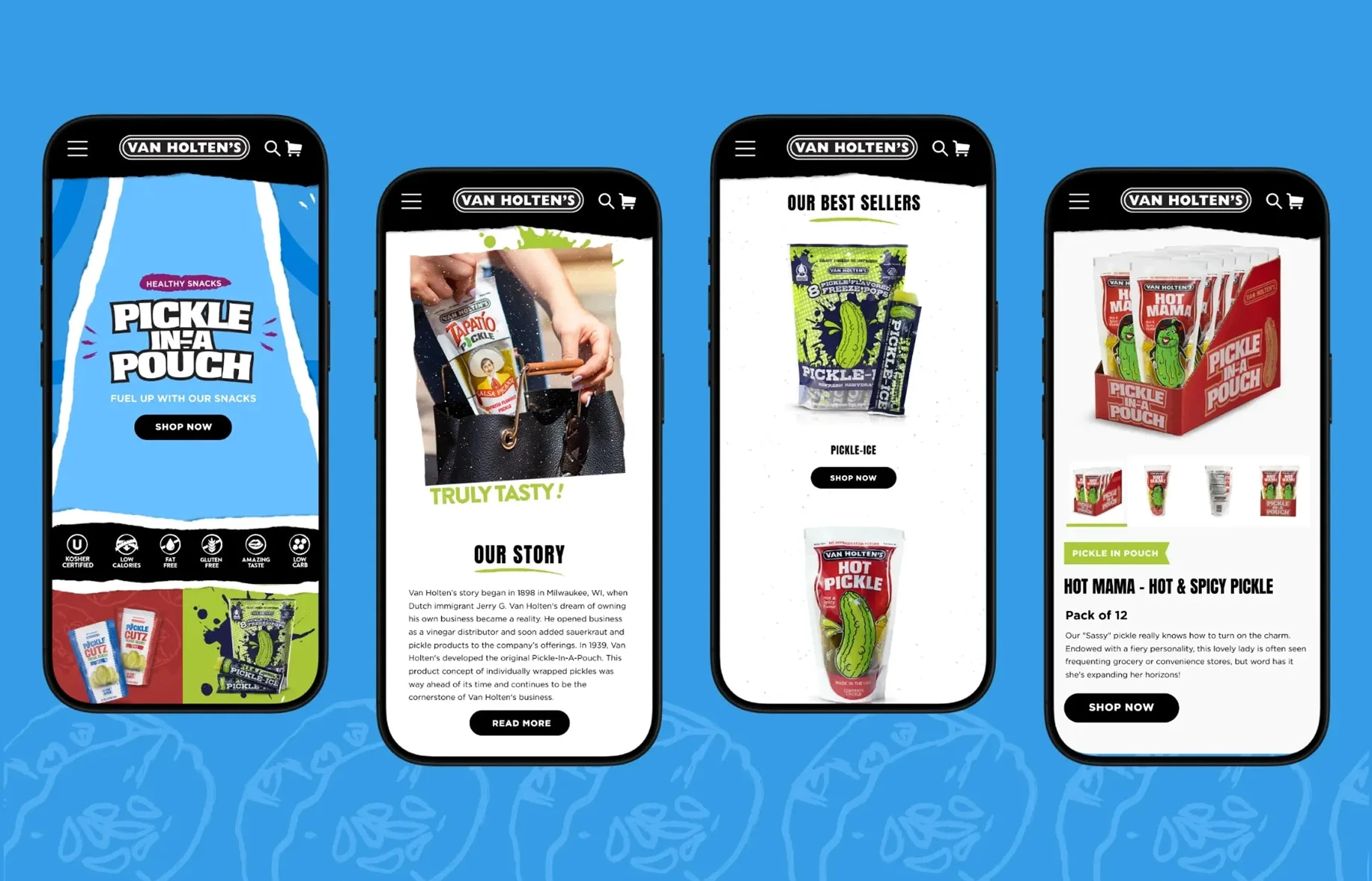
Van Holten's has been around since 1939, and their Pickle-In-A-Pouch is a fan favorite. But the digital side wasn't keeping up with the brand's personality. While I didn't develop the site, I led the art direction and creative vision for the website redesign to bring their bold, fun identity into the digital space.
THE CHALLENGE
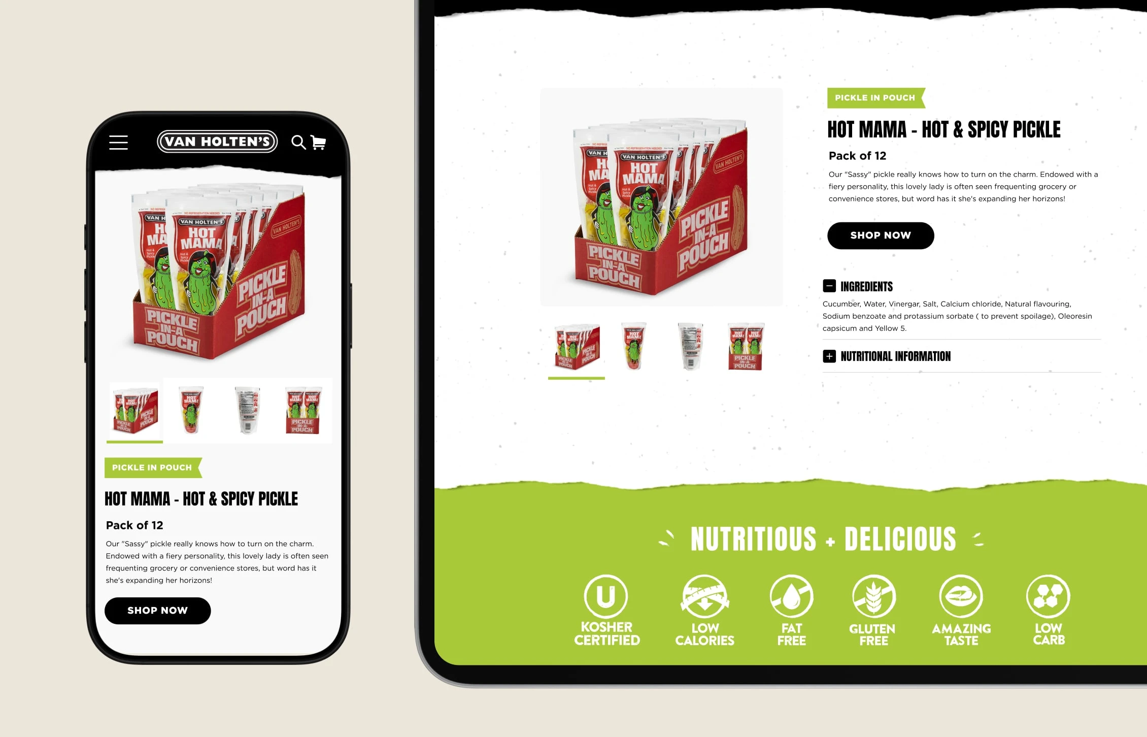
The brand is loud, playful, and has over 80 years of history behind it. The website needed to feel just as energetic as the product without looking chaotic. It also had to balance that fun factor with clear navigation and strong product visibility so people could actually find what they came for.
THE APPROACH
I focused on art direction and visual concepting, setting the creative tone for the redesign. The direction leaned into punchy visuals and bright color to match the brand's personality, while keeping the layout intuitive and the storytelling clear. The goal was a site that feels distinctly Van Holten's — bold and fun, but polished enough to back up a legacy brand.
Note: Work shown as delivered. The live version may have been modified by the client.
Like this project
Posted Nov 28, 2024
We reimagined the digital presence for Van Holten's. The website redesign merges their playful brand personality with modern functionality.
Likes
0
Views
4