Tri-Nuts Packaging Design
About:
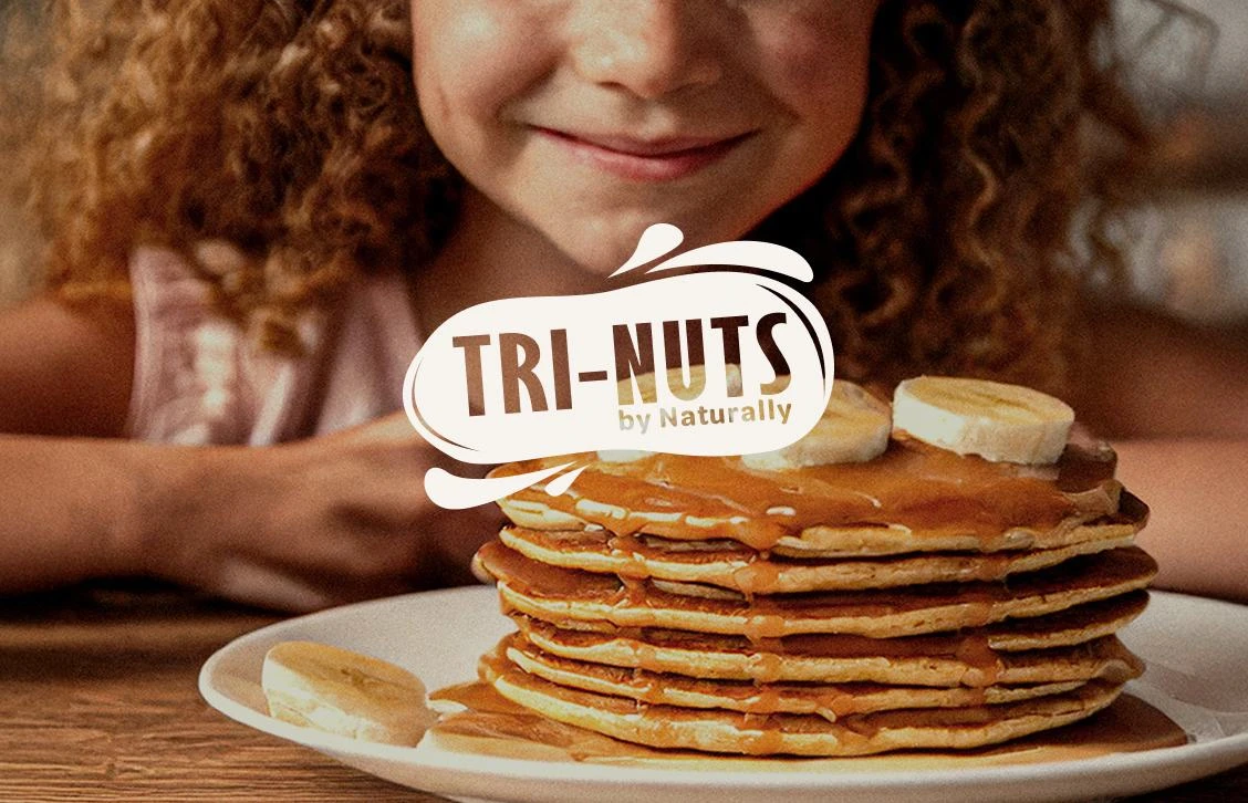
Tri-Nuts Bolivia celebrates the purity of nature, offering premium nuts and dried fruits sourced from Bolivia’s fertile heartlands. The brand stands for health, honesty, and nourishment straight from the source.
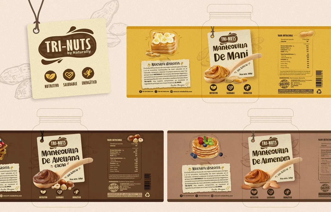
When they first started, they didn’t have any visual identity that could capture that essence. Our gaol was to craft an identity that felt as natural and wholesome as what’s inside every product.
What we did:
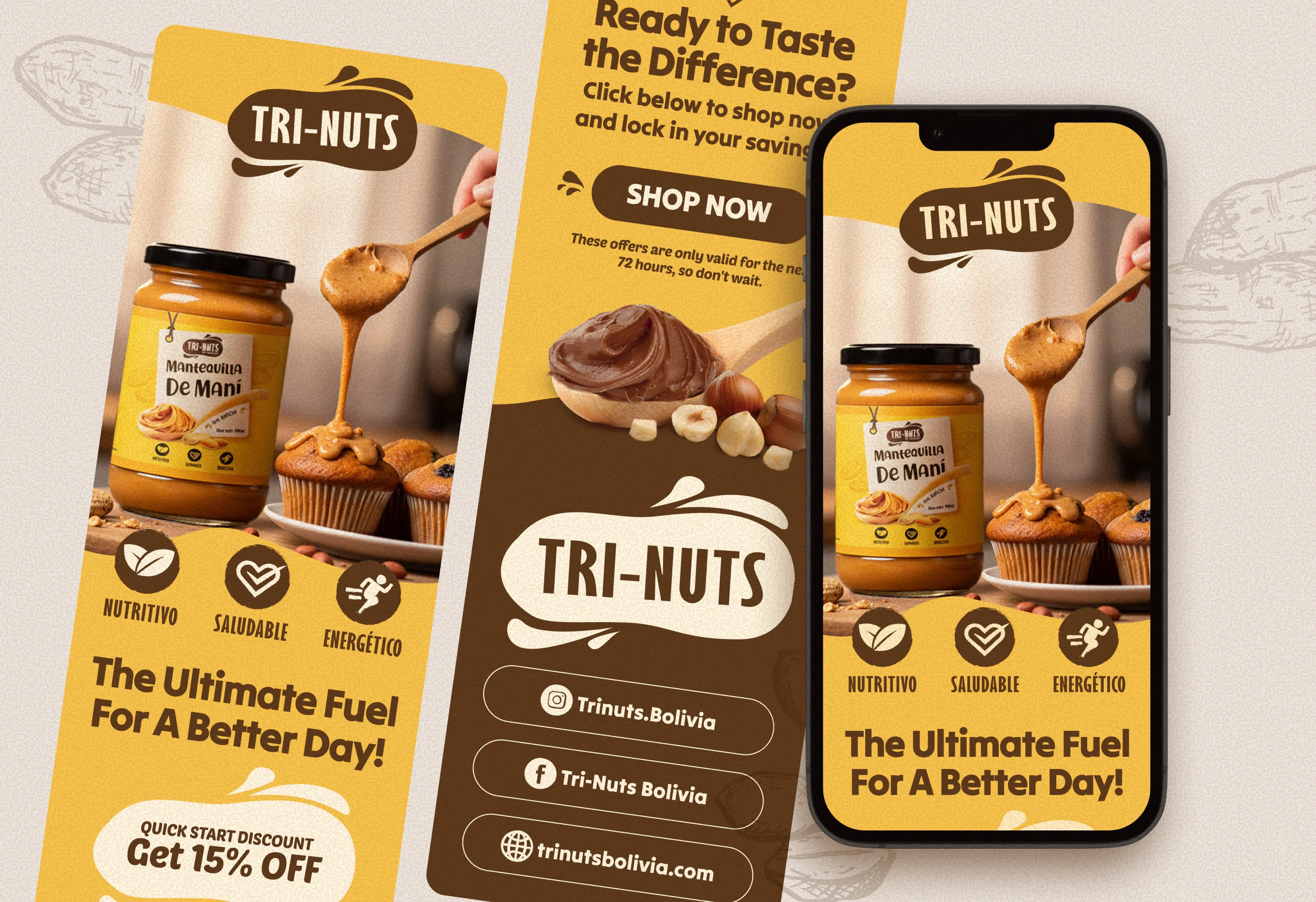
• Brand and creative strategy grounded in authenticity
• Modern logo design inspired by organic forms and earthy simplicity
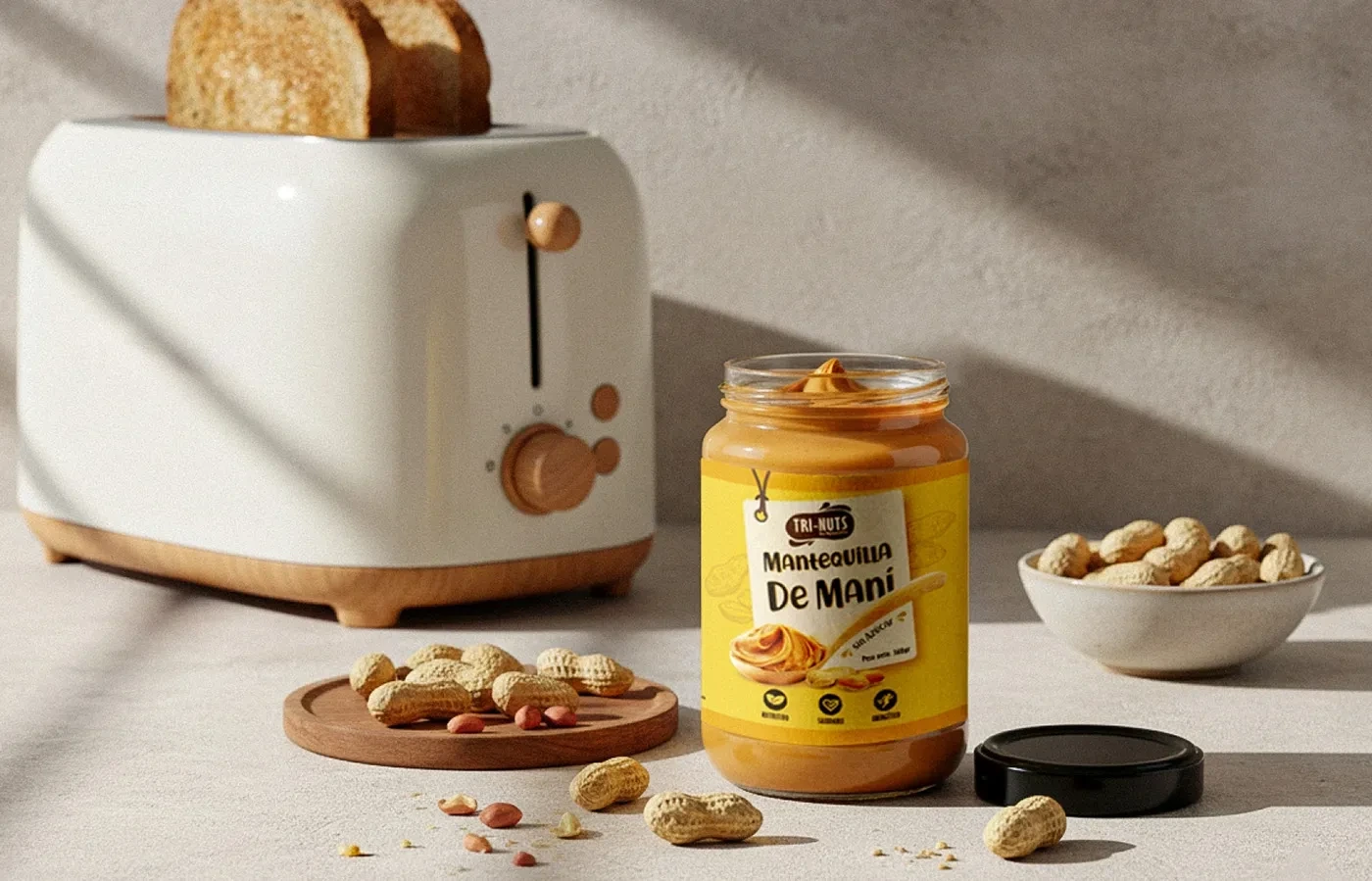
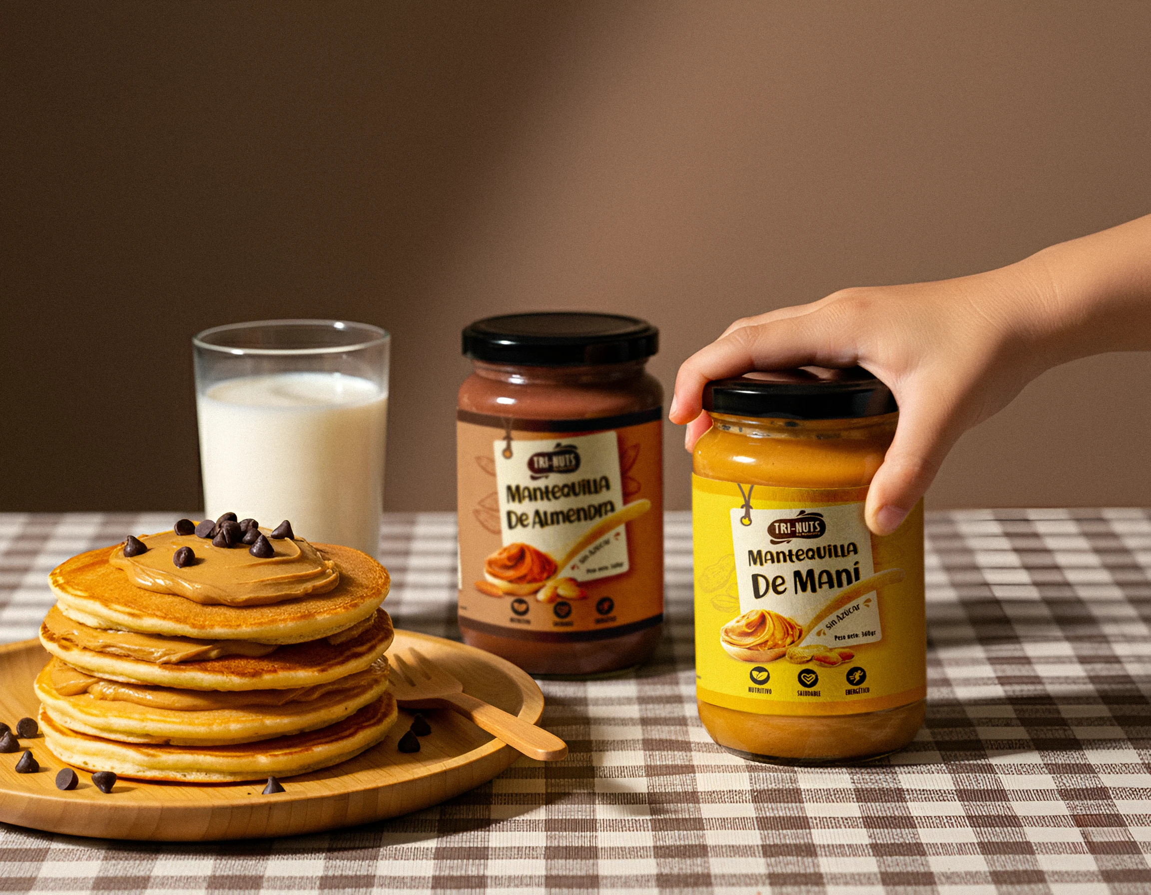
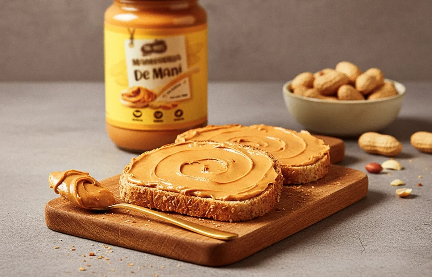
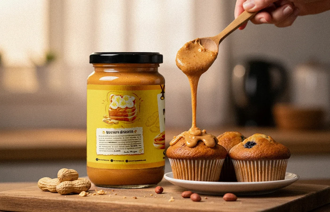
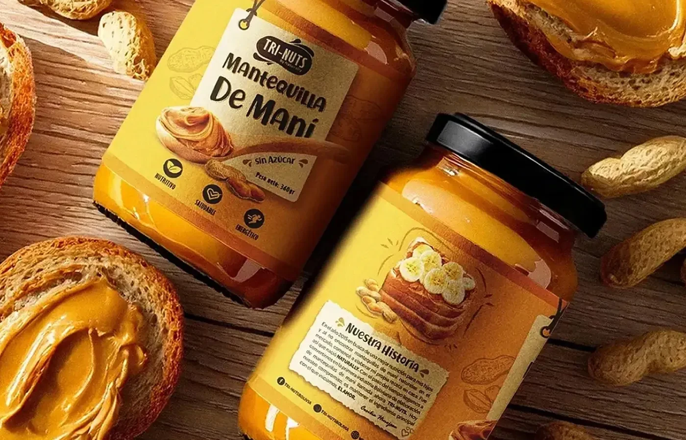
• Packaging system for multiple product lines with clear, honest labeling
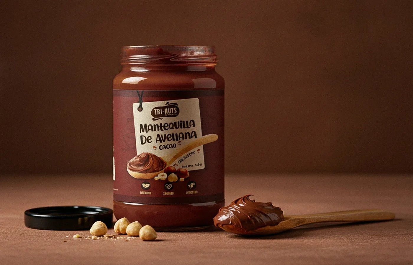
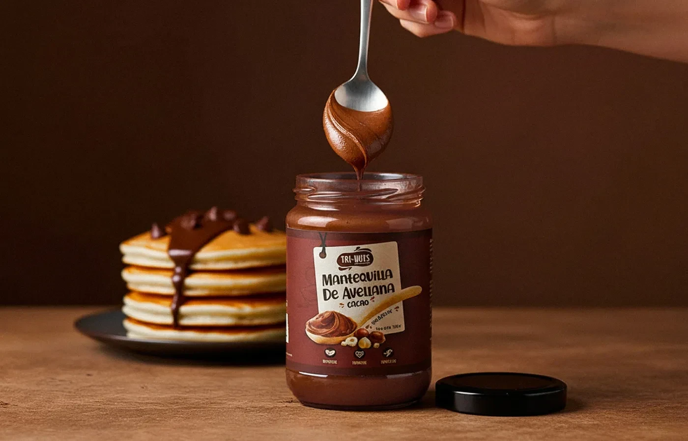
• 3D packaging renders for marketing and retail presentation
The result:
A brand that feels fresh, grounded, and genuinely Bolivian. The new identity blends modern minimalism with natural textures, designed to stand out on shelves while staying true to its roots.
Every detail, from color palette to typography, was built to evoke purity and trust. Tri-Nuts now looks exactly how it feels: clean, honest, and full of life.


Like this project
Posted Nov 29, 2024
Created modern packaging with earthy colors to showcase their premium natural nuts and dried fruits from Bolivia.
Likes
0
Views
4

