Recruitment Agency Brand Identity
Silviu Hogasi
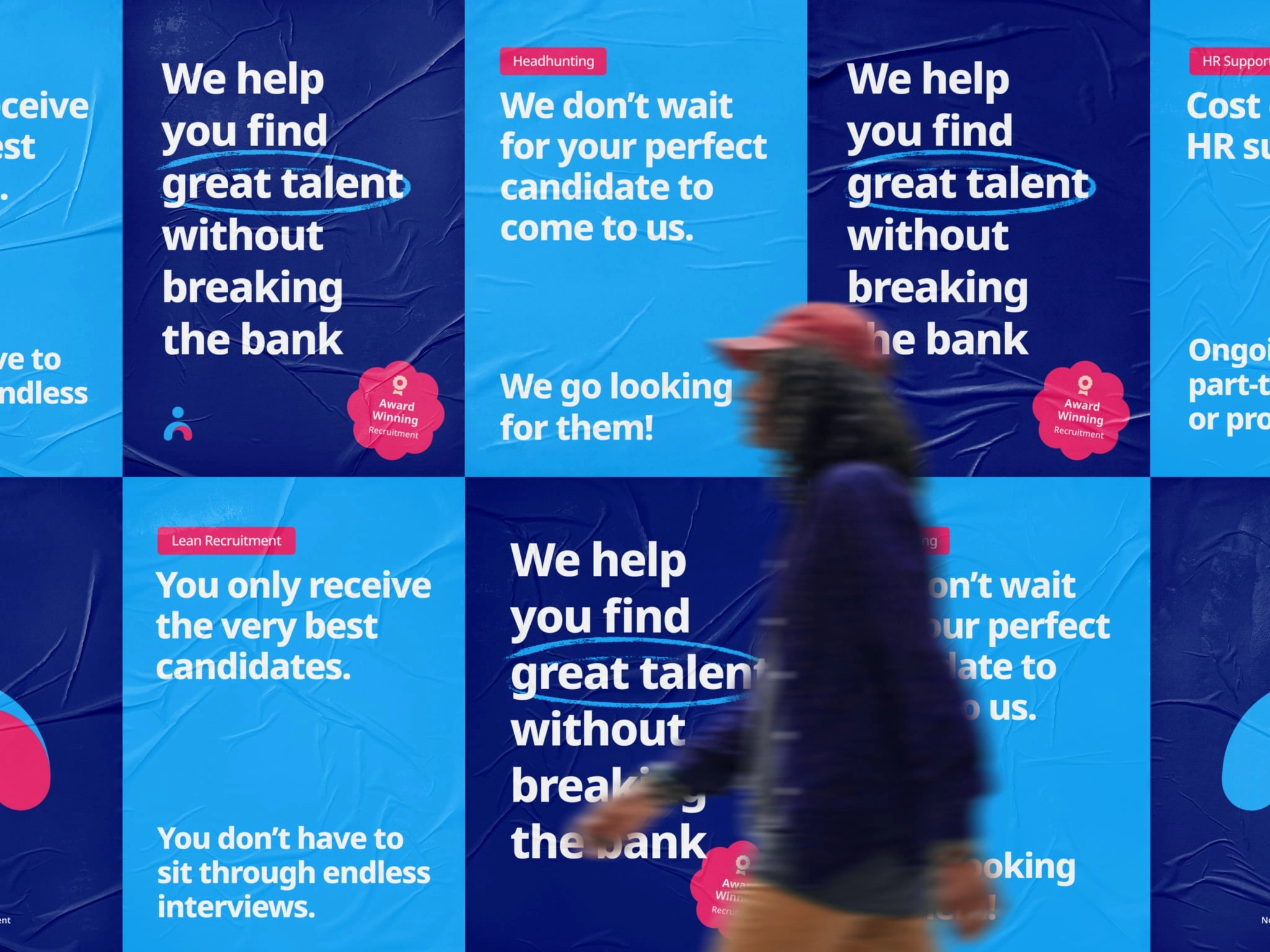
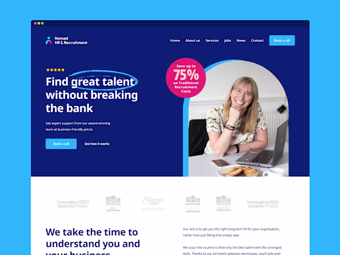
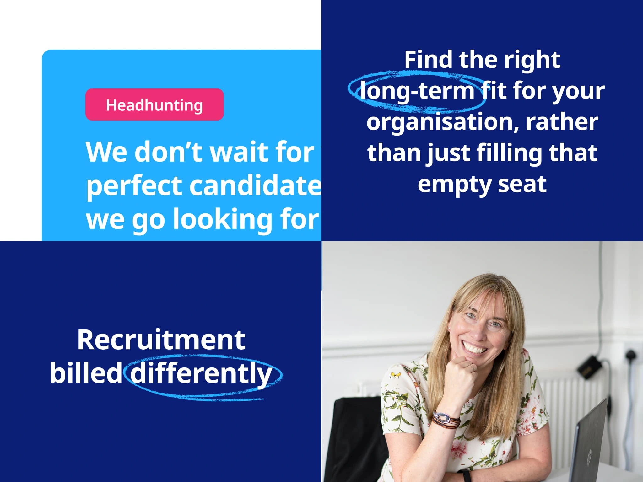
Nomad HR & Recruitment needed a fresh brand identity that would differentiate them in the crowded recruitment market. They wanted to convey their unique approach of proactive talent acquisition and long-term fit matching, rather than simply filling vacant positions.
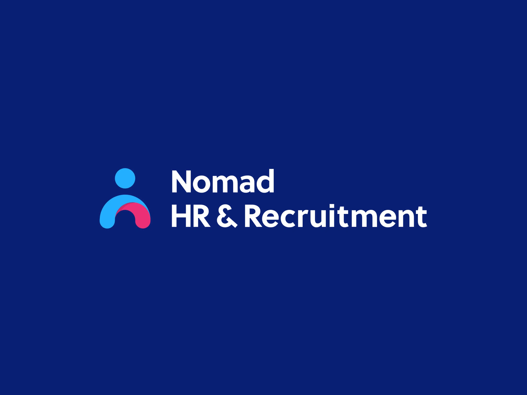
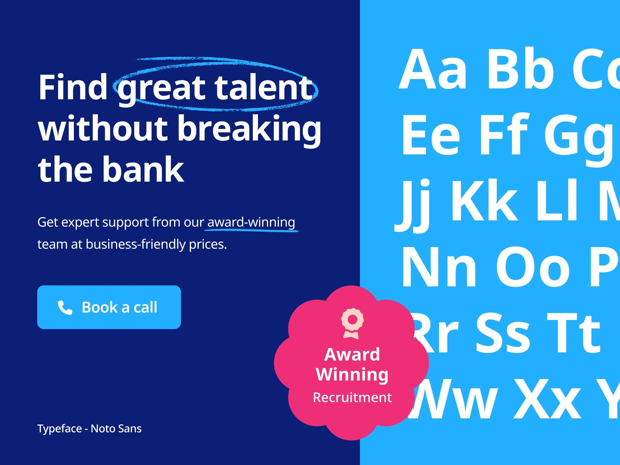
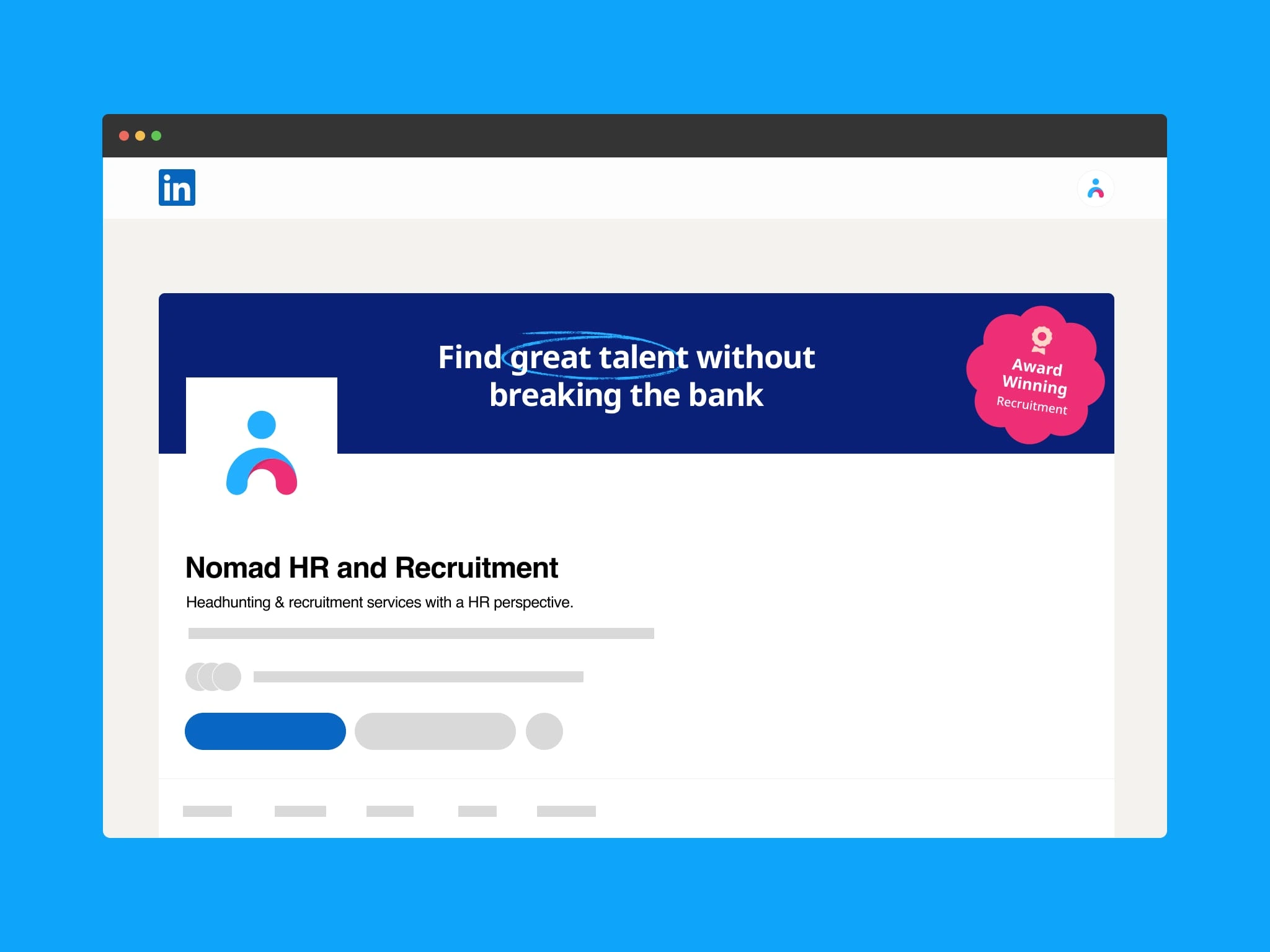
The icon features an abstract human figure created with smooth, flowing lines. The blue elements represent trust and innovation, while the pink arch symbolizes energy and the supportive connection Nomad creates between employers and candidates. The wordmark uses a clean, modern typeface that balances professionalism with accessibility.
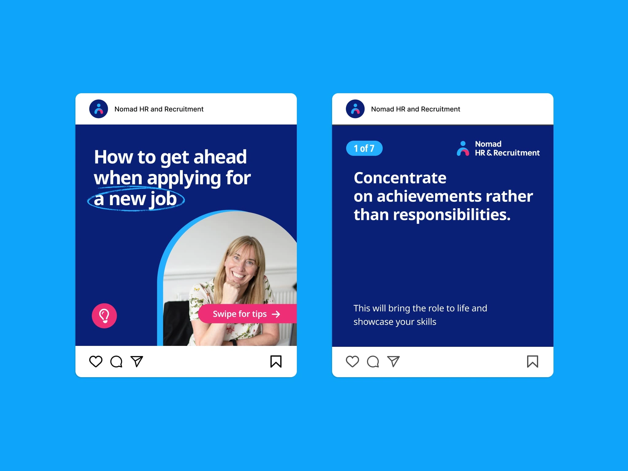
The final brand identity successfully positions Nomad HR & Recruitment as a modern, people-focused agency that delivers exceptional value. The vibrant yet professional design system stands out in the recruitment industry while conveying the approachable expertise that defines the Nomad experience.

Like this project
Posted Mar 20, 2025
A vibrant yet professional design system stands out in the recruitment industry while conveying the approachable expertise that defines the Nomad experience.