mozaika. – Non-Profit Christian Church Branding

Amir Khafizov


Case Study:
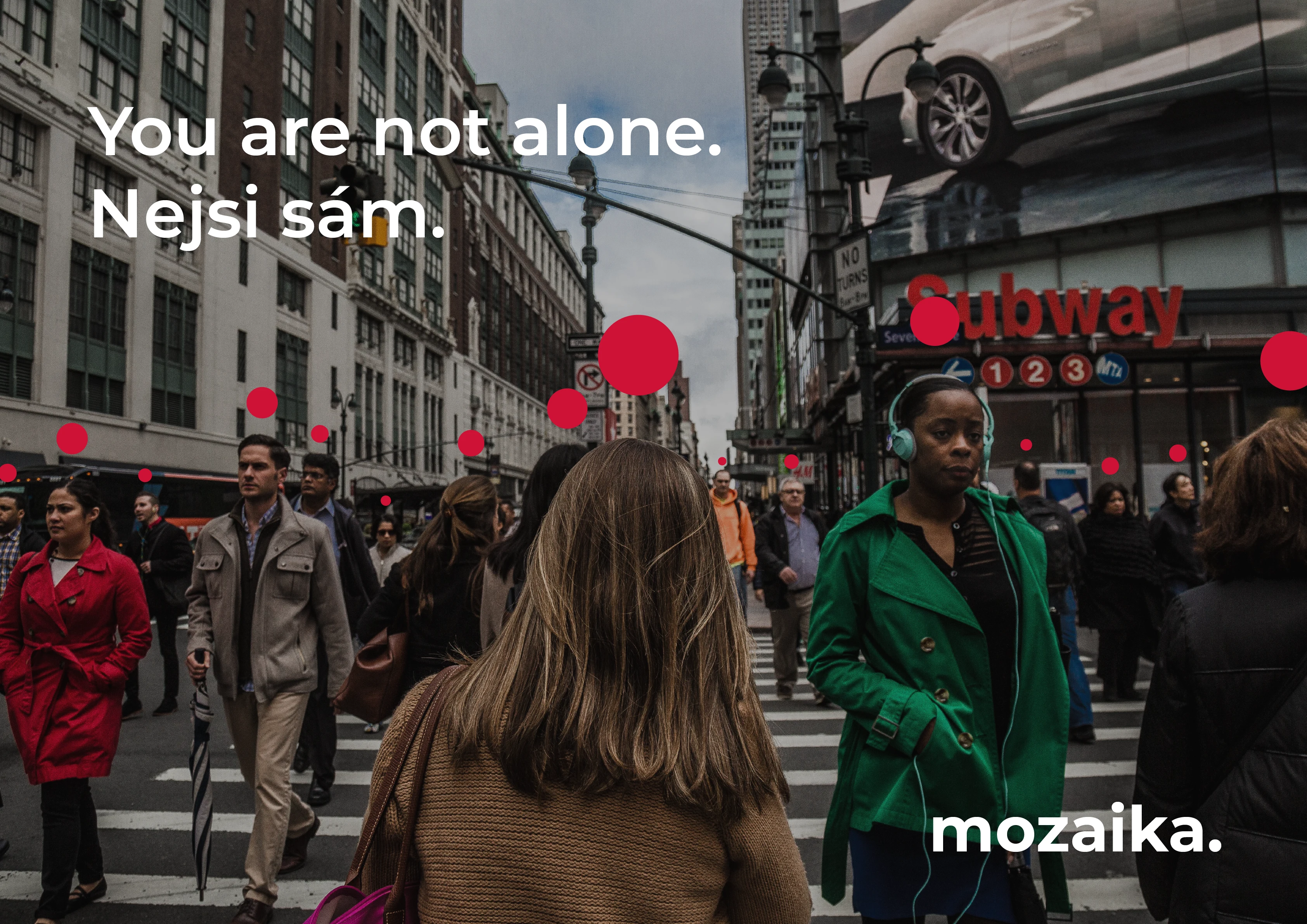
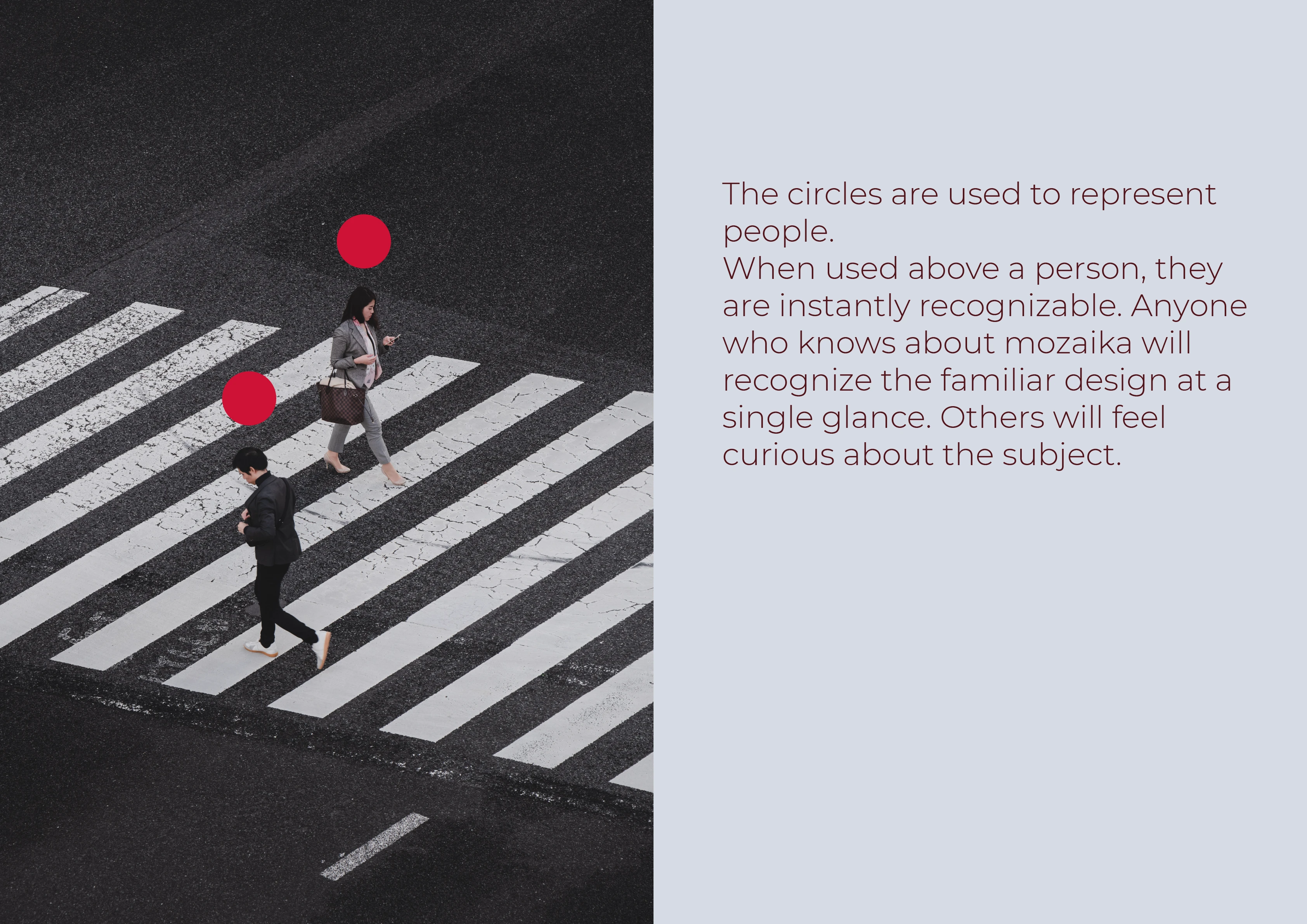
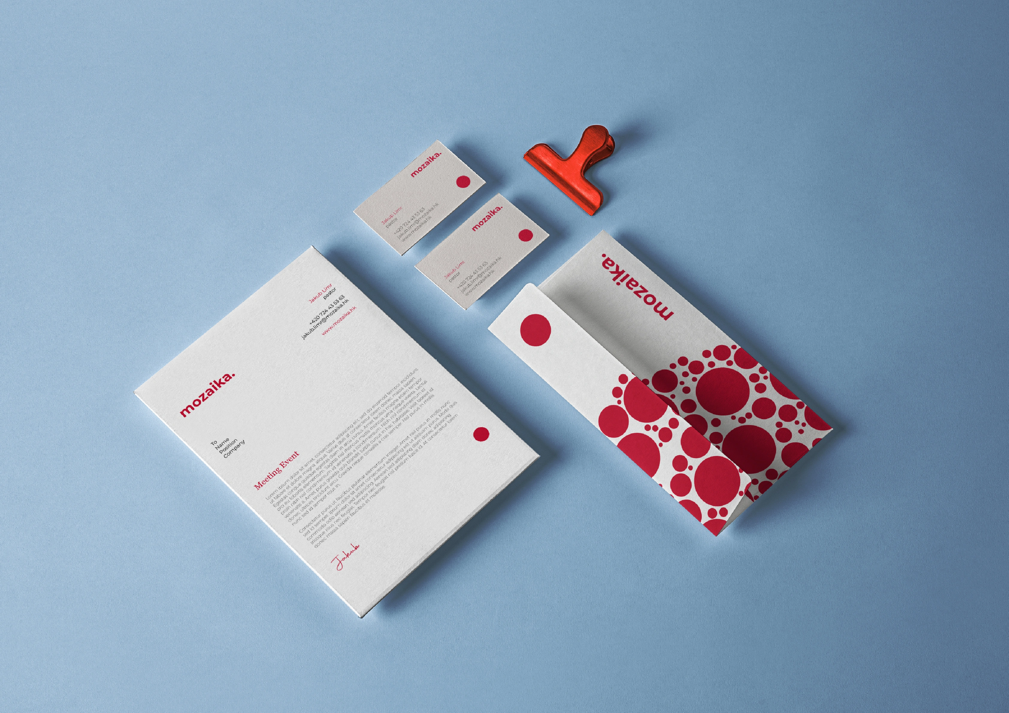
The goal was to create a design so recognizable that it stands out without needing to read the logo. The central idea is about interconnectedness—represented by the red circle above the head, symbolizing unity.
Anyone familiar with Mozaika will instantly recognize the design, while newcomers will be intrigued by its unique concept.
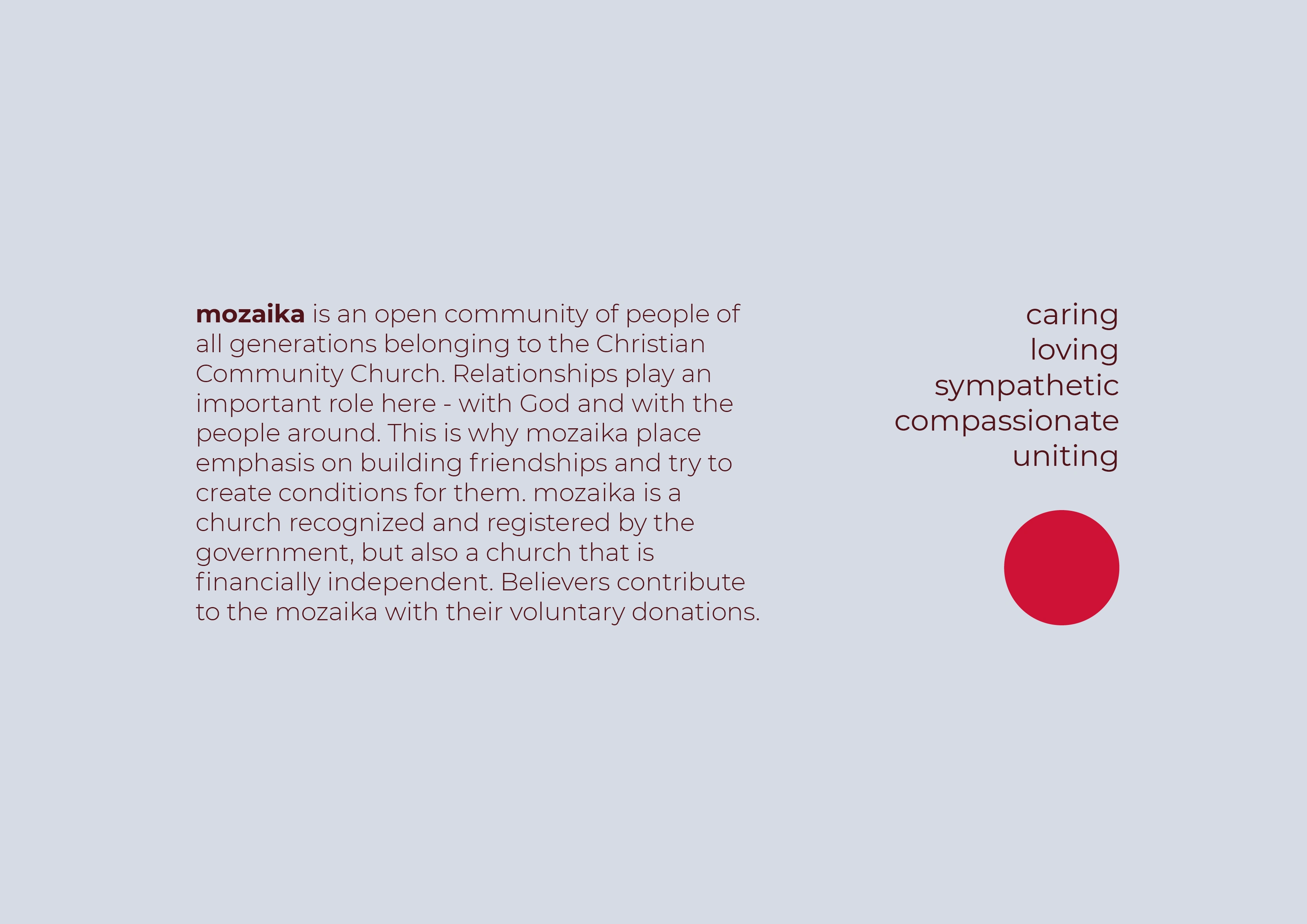
I have deep respect for Mozaika—it's not just a church, but a place of true community, where people support each other, offer a listening ear, and help you find your feet. They operate solely through voluntary donations and are independent of the state.
This project is one of my favorites, as it was my first time working with a pastor and getting to know European churches. I'm excited to see the design on T-shirts and posters around the city!


Like this project
Posted Nov 20, 2024
The identity captures unity of people with a distinct symbol above the head, creating instant recognition for Mozaika, a church driven by community support.