
We created Testkube’s character not only as a mascot but also as a wise automation guru living in a digital zen garden. It was part of the brand story. While others were bombarding users with crazy dashboards and scary alerts, we created an oasis of calm. The message to users was, "Breathe; Testkube will take care of the tests."
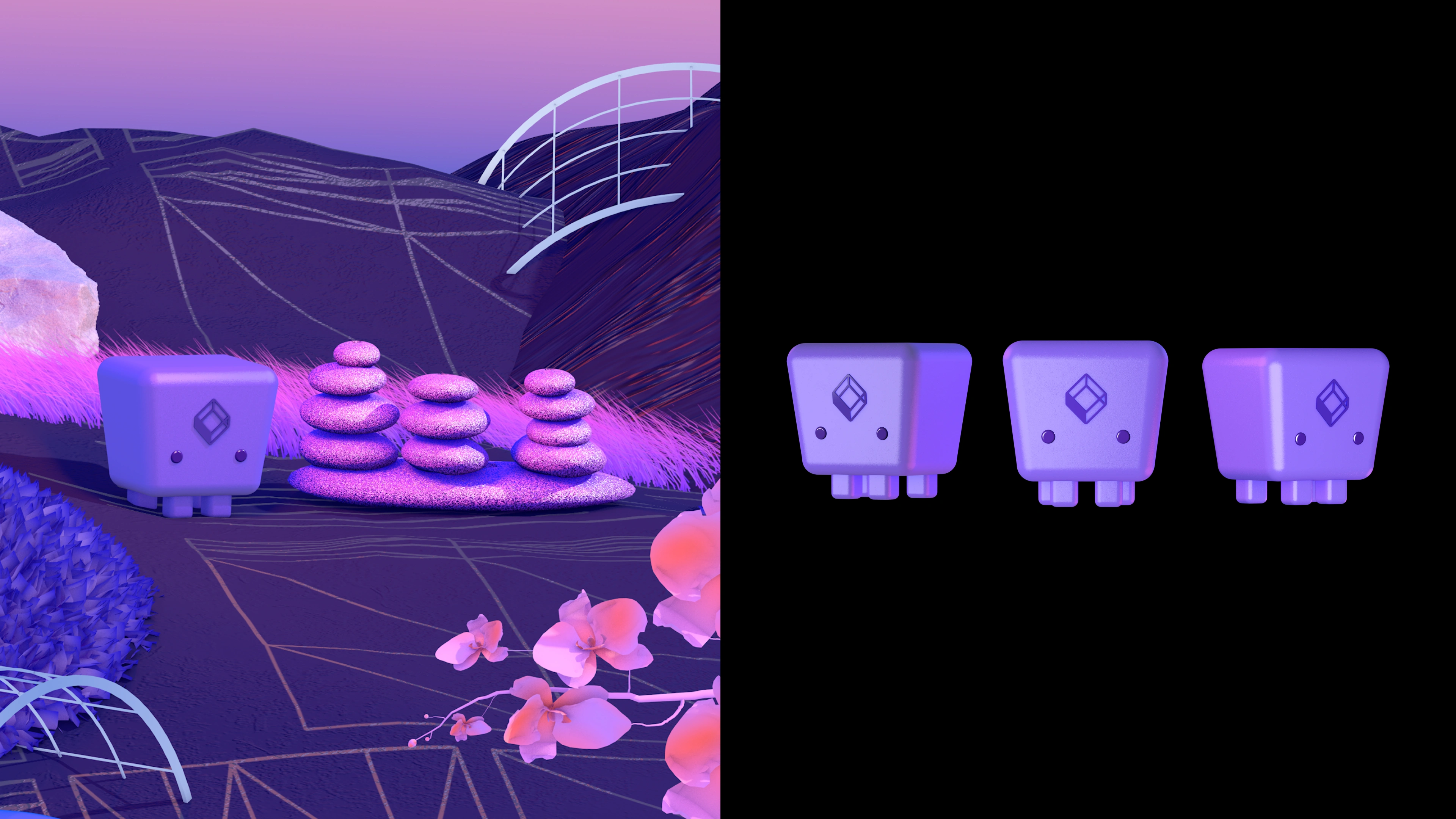
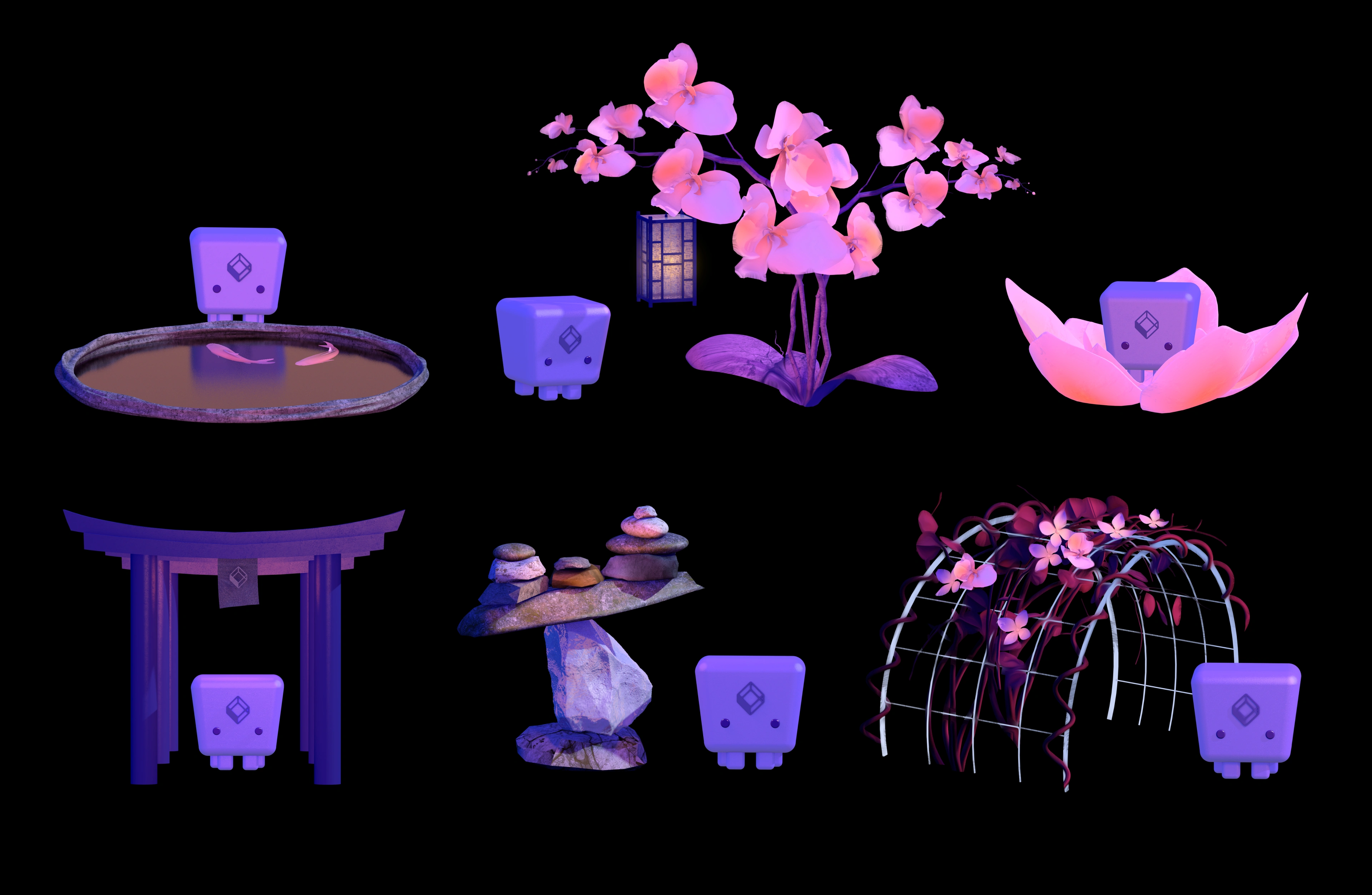
Visually, we avoided rigid geometrical shapes and instead elevated organic look and feel with the shapes giving nod to the nature and growth. Botanical motifs such as orchids and lotuses demonstrated Testkube's flexibility, contrasting with other companies' corporate jungle-like environments.
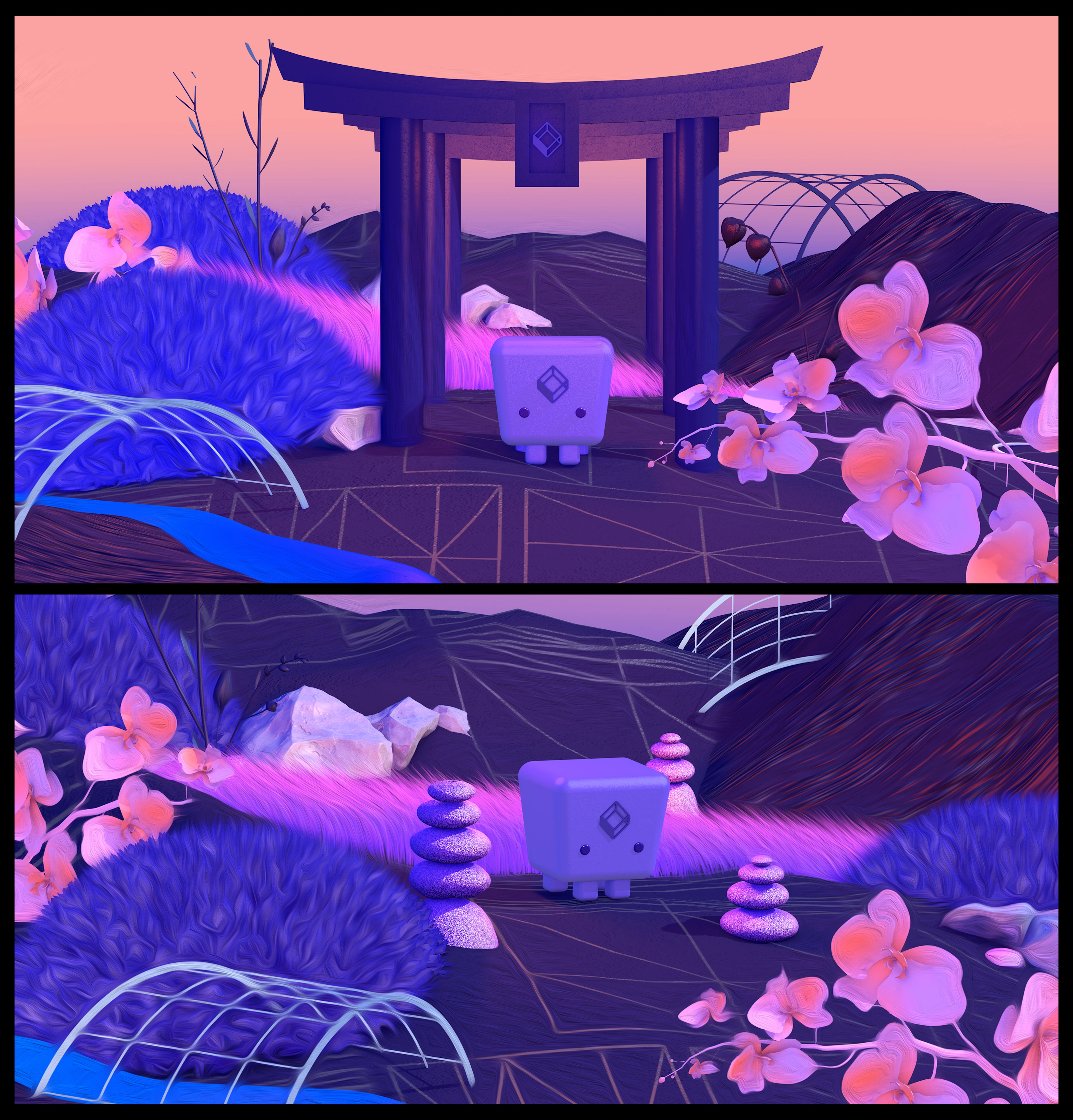
For the color palette, we used calming purples, pinks, and light yellows, a combination that reduces cognitive friction according to neurologists. In contrast to widespread blue and red, this scheme provides reassurance and conveys playful sophistication; each shade carefully selected to transform anxiety into confidence.


0 likes · 0 views · Nov 17, 2026
Full-service SaaS design for a Kubernetes test execution framework