
A VC fund that focuses on investing in high-tech startups in emerging industries.
Challenge
The biggest challenge we faced was creating a brand that reflected the tech-focused nature of a private equity fund. We needed to find the right balance between demonstrating financial strength and showcasing innovative ideas, while maintaining trust and doing so without losing the interest of potential portfolio companies.
Solution
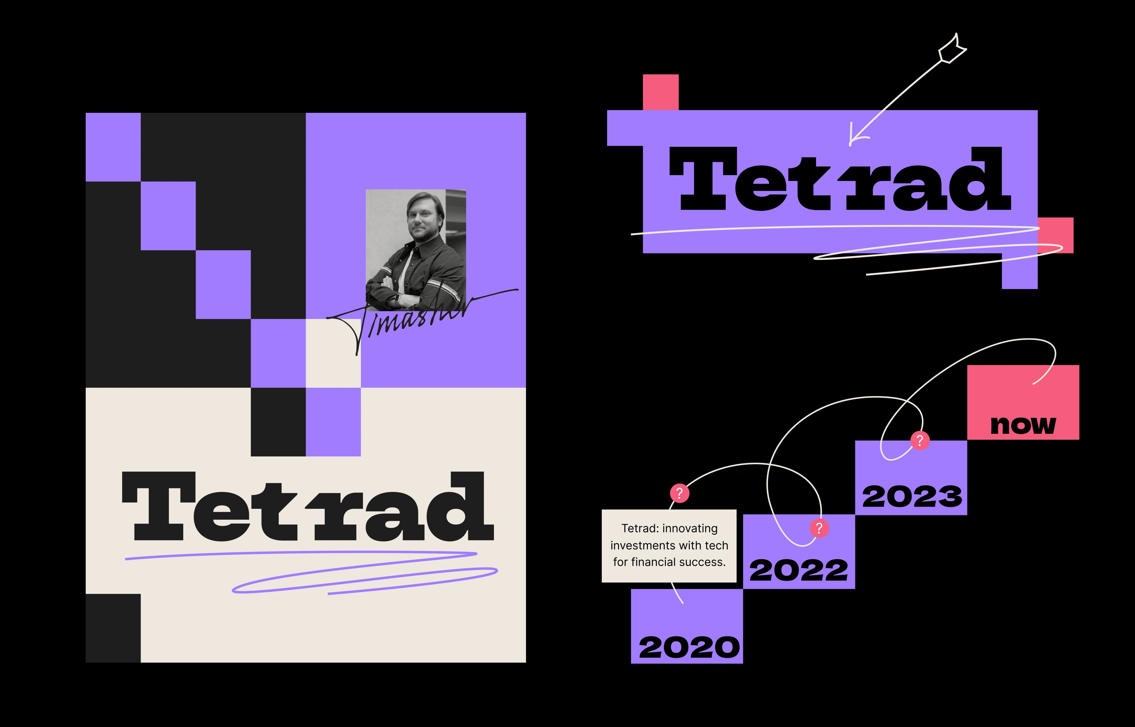
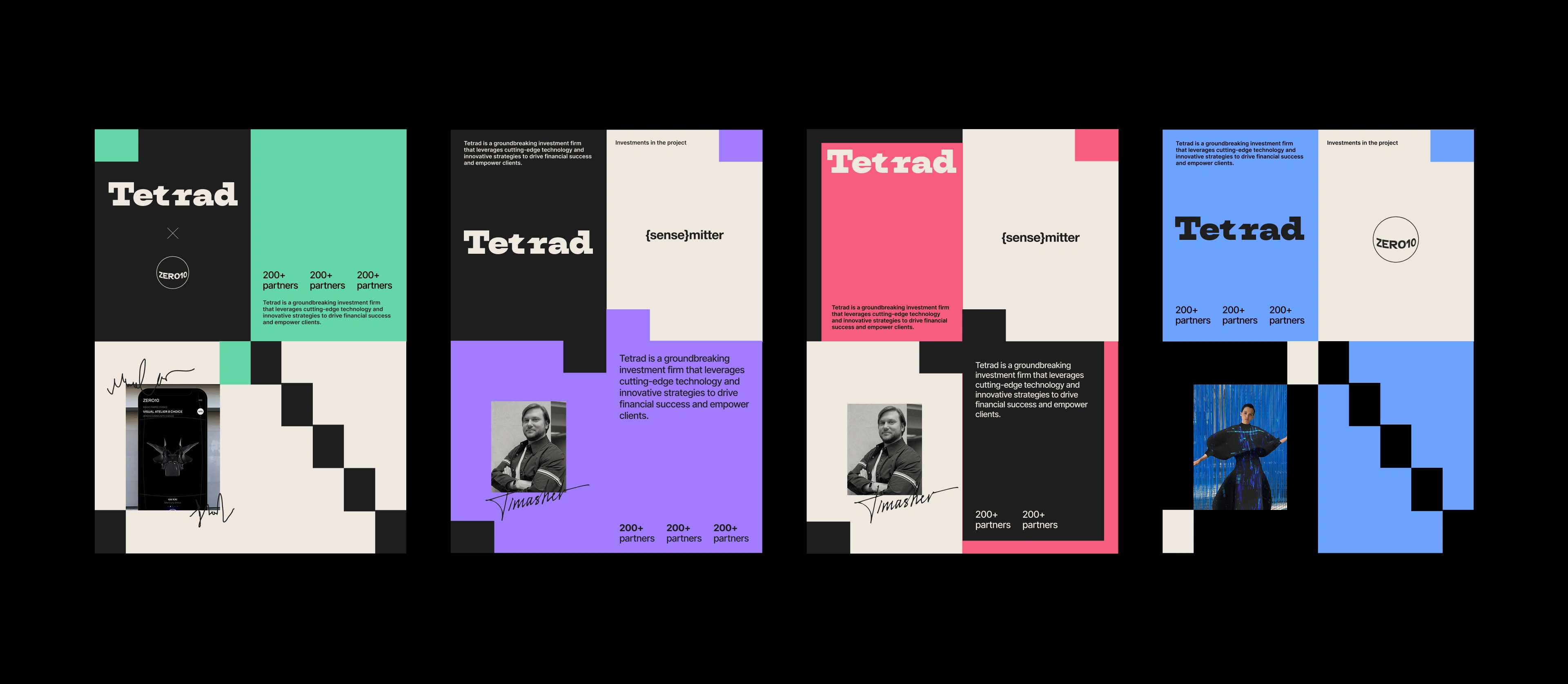
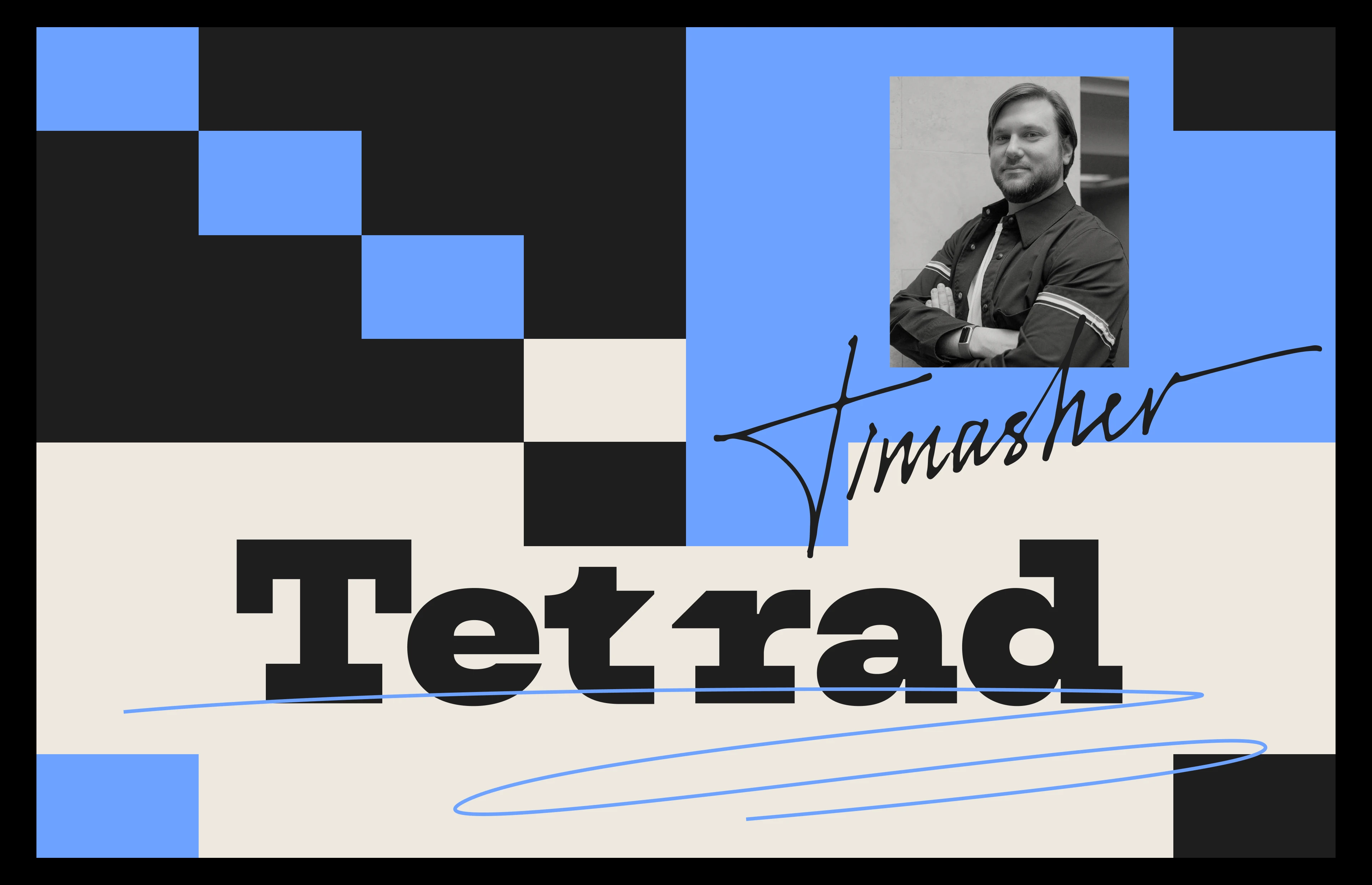
We've created a bold identity design based on geometric shapes and bright colors, using the number 4 ("tetra" in Greek) as a core concept. It's got a strong typography with DeLone Gothic One as the main font, and a flexible grid system. We also added some hand-drawn details to make it more unique. The result is a modern and tech-friendly look that still feels grounded thanks to the use of white spaces and structured layouts.
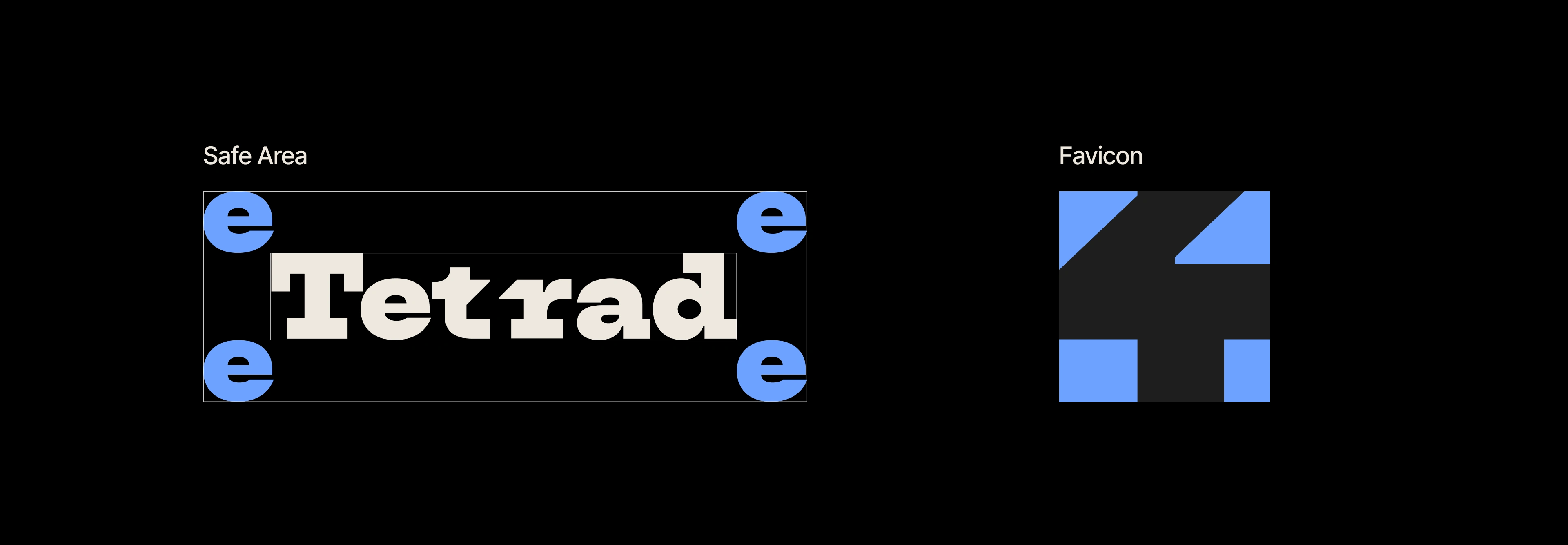
Logo anatomy
The logo is built on a strong slab of Serif typeface, Dela Gothic One. It has subtle customization to include the number "4" to emphasize the meaning of "tetra."

Visual language
The visual identity is based on a modular grid with basic blocks in the main colors of the brand (dark grey and white), and some signature accent colors like blue, purple, pink and green. Dynamic layouts allow diagonal lines, underlined elements and overlapping shapes, which convey both structure and creativity.
Color palette and typography
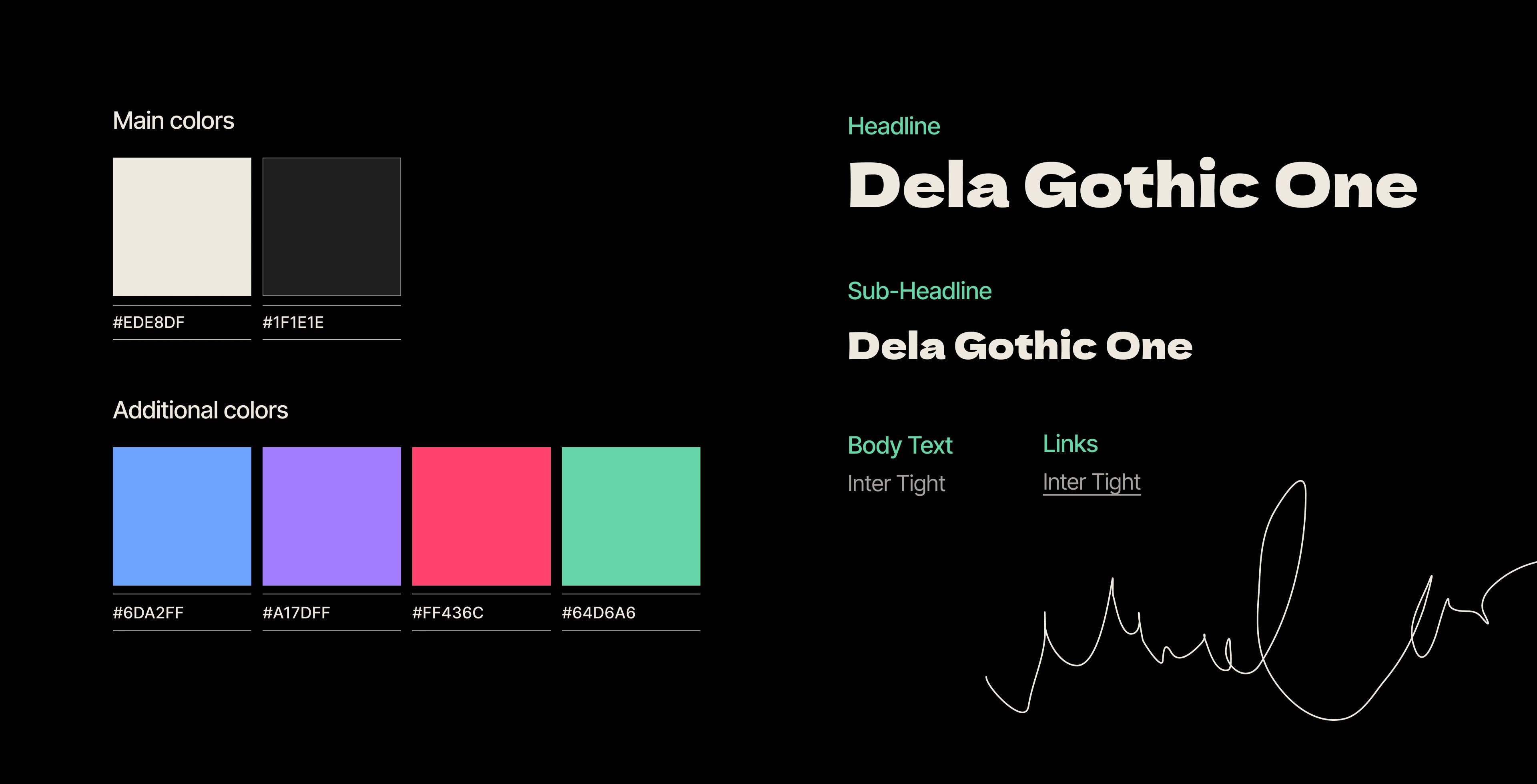
The typography and color scheme combines Dela Gothic One for headings and Inter Tight for body text, backed by a contrasting palette: black and white as the main colors, with blue, purple, pink, and green as bright accents to highlight important content areas.
0 likes · 0 views · Nov 18, 2026
Brand identity and website design for a tech-focused venture capital fund