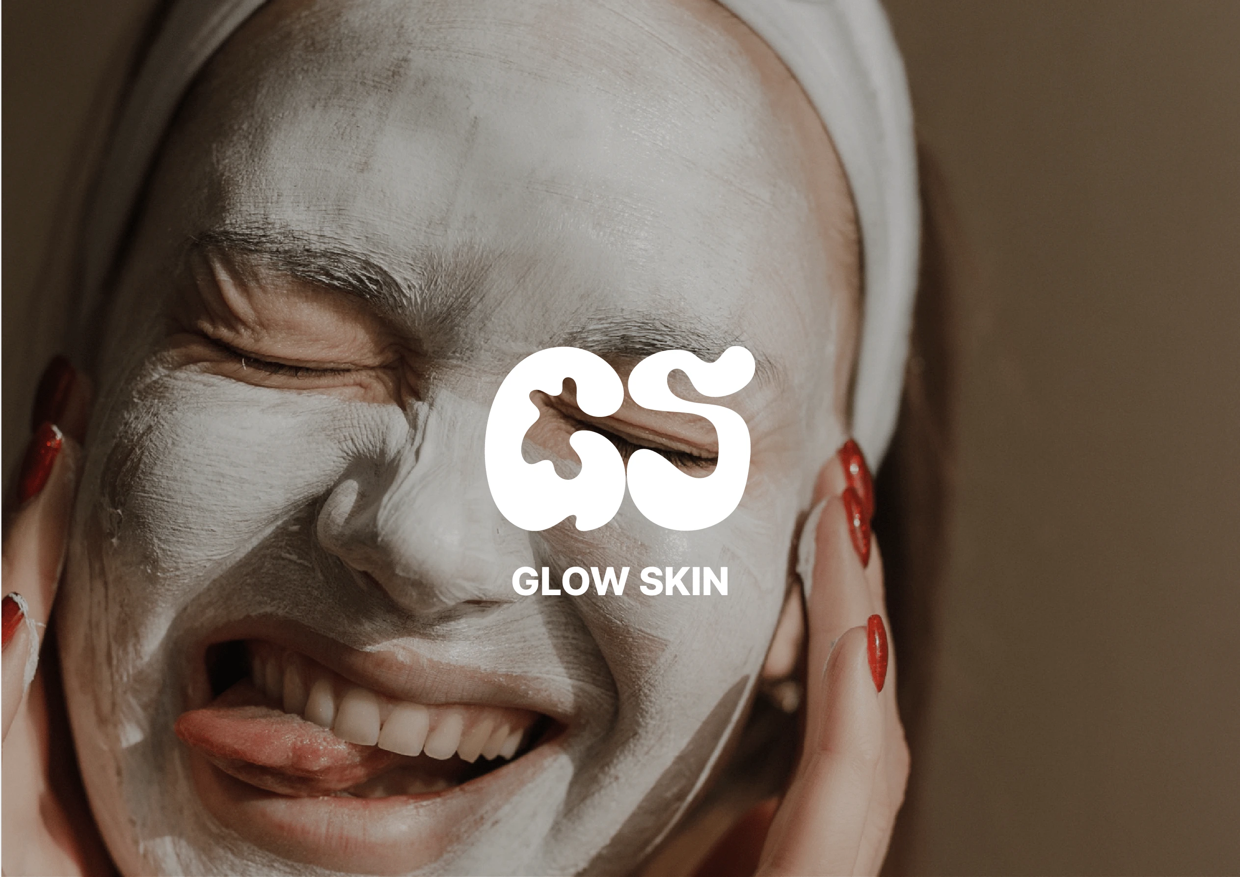
Glow Skin | Branding, Packaging and Social Media
Grace Chen
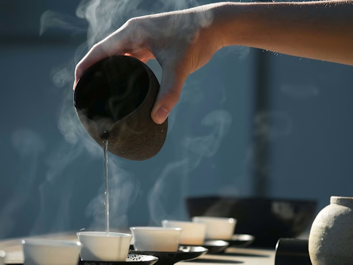
Presentation Cover
Brief
This project is for a skincare brand that specialises in sunscreen for sensitive people called Glow Skin. This project is conceptual project I've chosen to delve into the the skincare and beauty industry.
About Glow Skin
Glow Skin was born from a quest: two friends, each with sensitive skin, struggled to find the perfect sunscreen. Unsatisfied with the available options, they embarked pn a journey to create their own. Embracing the sun while cherishing your skin's natural radiance. Glow on, fearlessly.
Process
Competitors research
Brand Insight research and Moodboard development
Conceptual development
Brand Design Exploration
Packaging Research
Package conceptualisation and exploration
Packaging Testing (Mock-up)
Brand content creation and testing
Competitors Research
In this step, a in-depth research of the sunscreen brand in the area is done to find a common pattern within the market and a gap within the market in terms of design. One thing that was found was that sunscreen is often packaged in bolder more saturated colours, which doesn't suit the target market of this brand with is sunscreen for sensitive skin. When thinking of sensitive skin, a more muted packaging and brand would suit the target market, which is the approach of this brand.
Branding Insight Research and Moodboard Development
The concept needed to be friendly, welcoming and down-to-earth to connect the brand with the customer niche (people with sensitive skin that need a gentle sunscreen). The brand is based on the community of adults that are concerned with their skin's health, wanting something that is natural and allows their skin to embrace the sun without concern, while providing a gentle protection for their skin.
Conceptual Development (Logo)
The concept for the logo was to capture the idea of sunscreen. The logo took on a more form based rather then lettering approach like traditional logos. The form was based off the image and motion of applying sunscreen. With the varied stroke width and flow of the strokes to show the sunscreen once it's applied onto the skin. The logo first started using the initials of the brand, G and S, the centre of the logo uses negative space to form a silhouette of a tube of sunscreen squirting out sunscreen cream.
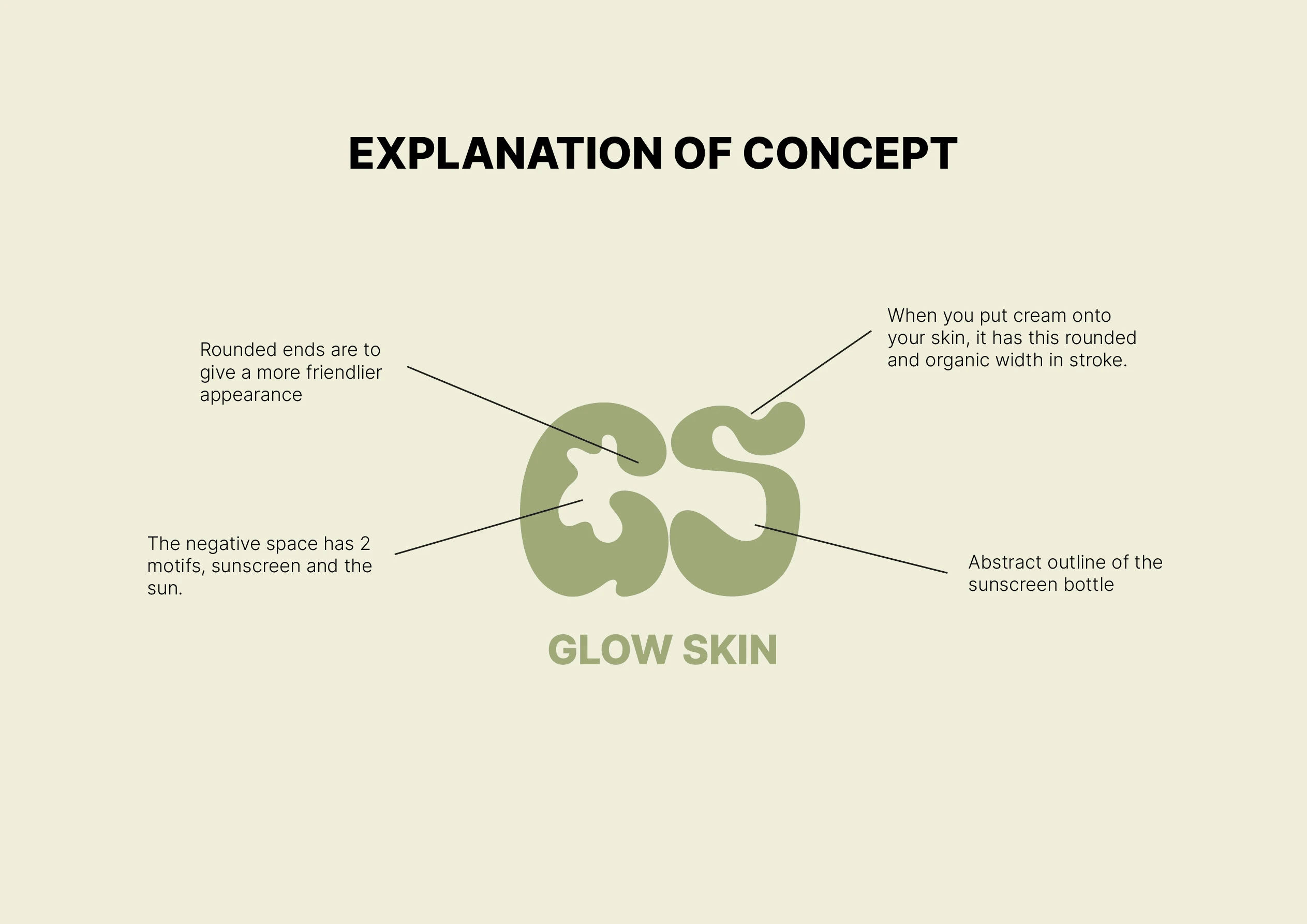
Diagram of Logo Design Choices
Brand Design Exploration
Colour Palette Development
The colour palette has been carefully chosen to create a refined yet simple brand identity. The colours are subtly saturated, evoking a sense of gentleness and care in the consumer’s skin. This choice reflects the brand's commitment to quality and attention to detail, while still maintaining a connection to the natural world.
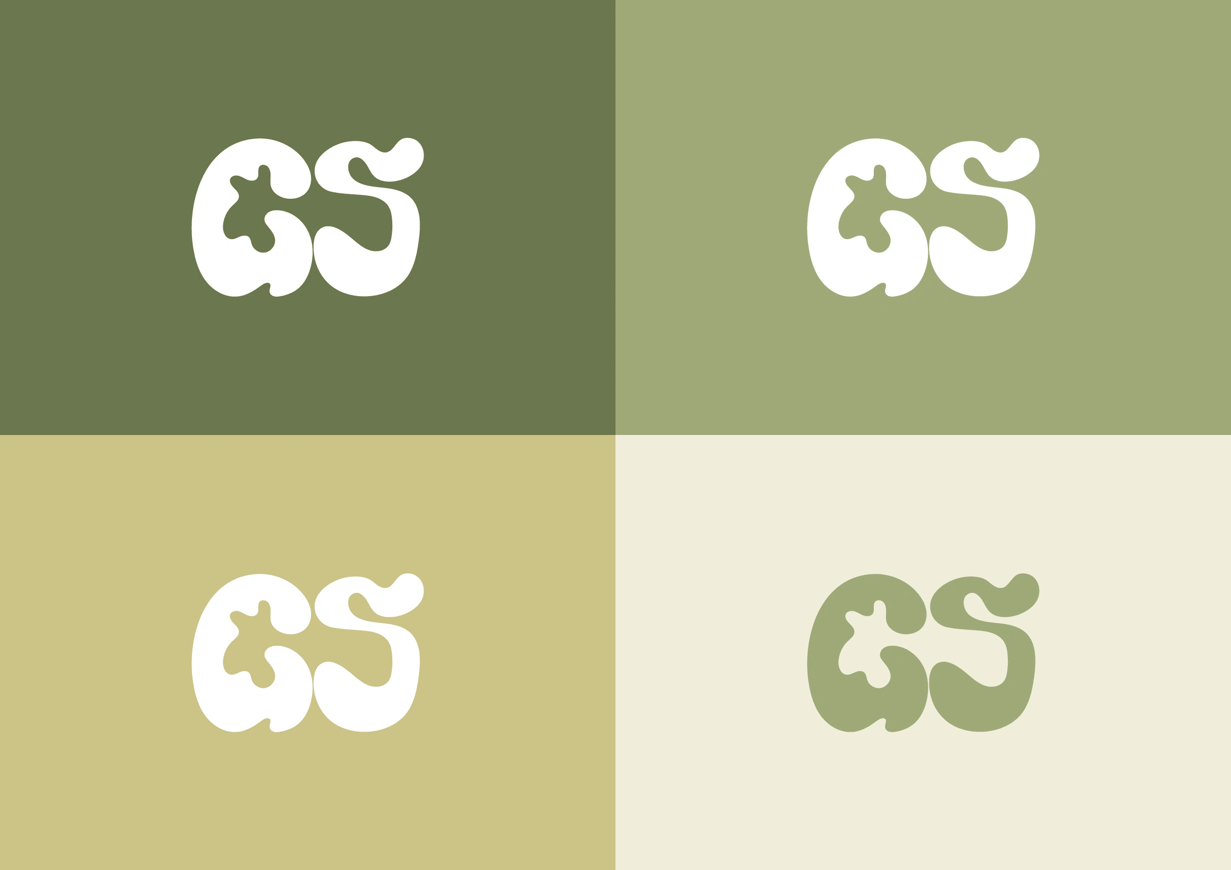
Colour palette with the logo
Packaging Research
Understanding the general market in the sunscreen packaging allows us to find gaps in the market and find where we can stand out. In competitor's research, we found a common pattern in branding where the colours of the sunscreen packaging is too bold and saturate which doesn't reflect Glow Skin brand's target market.
Package Conceptualisation and Exploration
A more simple packaging was chosen to give a gentle brand identity to the market, showing that this product is gentle on your skin and won't cause irritation. An illustration of the side of the box is a illustrative aspect of the packaging to give it a bit of a flair in the design. With a simpler, the customer doesn't get overwhelmed in the packaging and understands that this is gentle product.
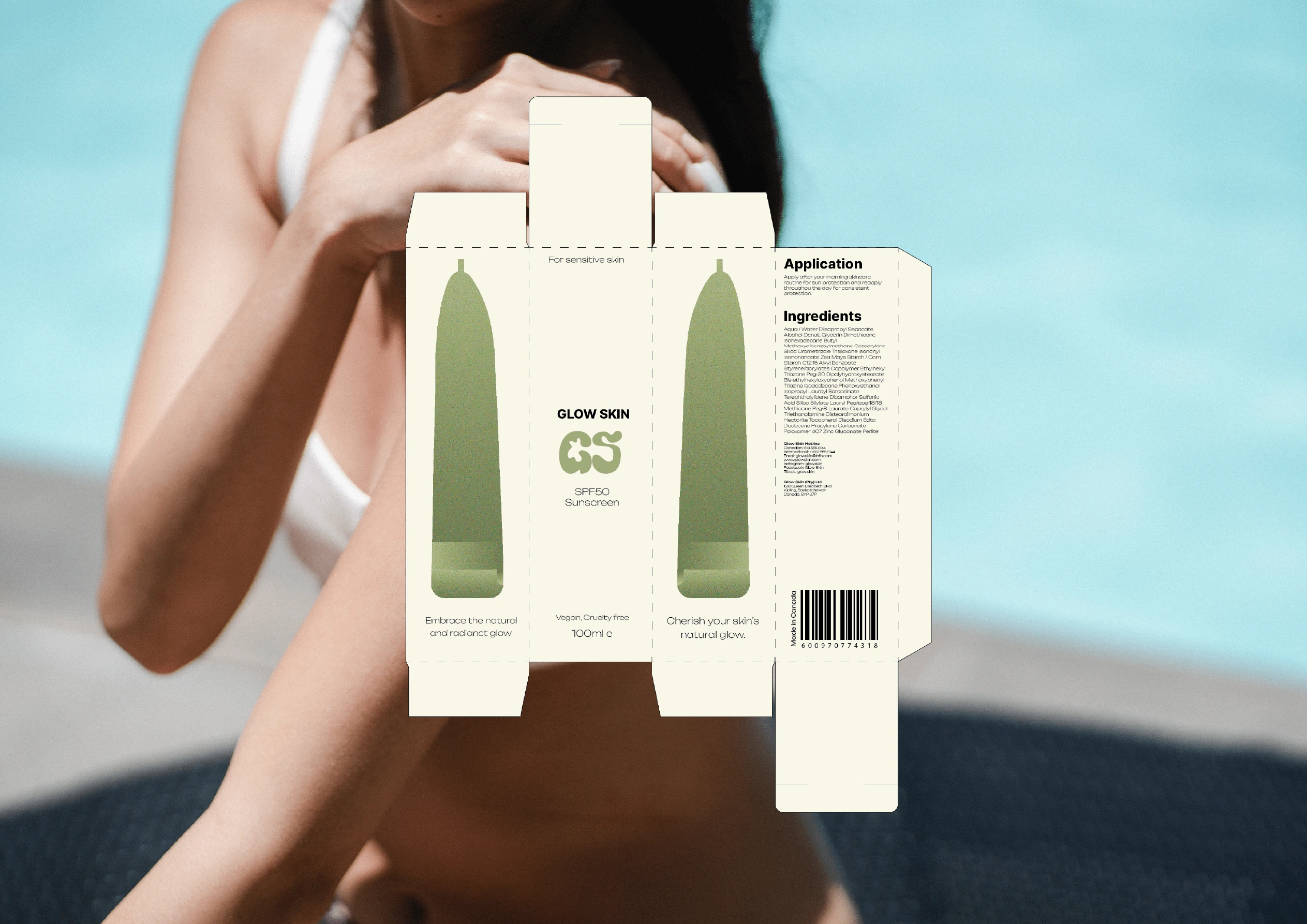
Box Packaging for sunscreen, laid flat
Packaging Testing (Mock-up)
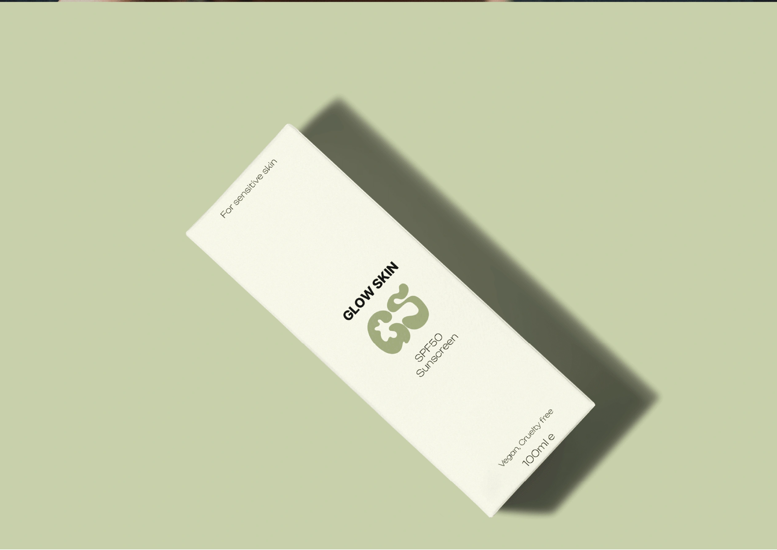
Mock-up of Glow Skin's packaging
Brand Content Creation and Testing
Social media is a crucial aspect of every brand as it is how we reach our target market and let people know of a brand. Glow Skin's brand identity is a gentle, simple and down-to-earth, which is the approach for their social media content. Their social media content takes on the approach of educating their audience in their sensitive skin and the importance of sunscreen to your skin.
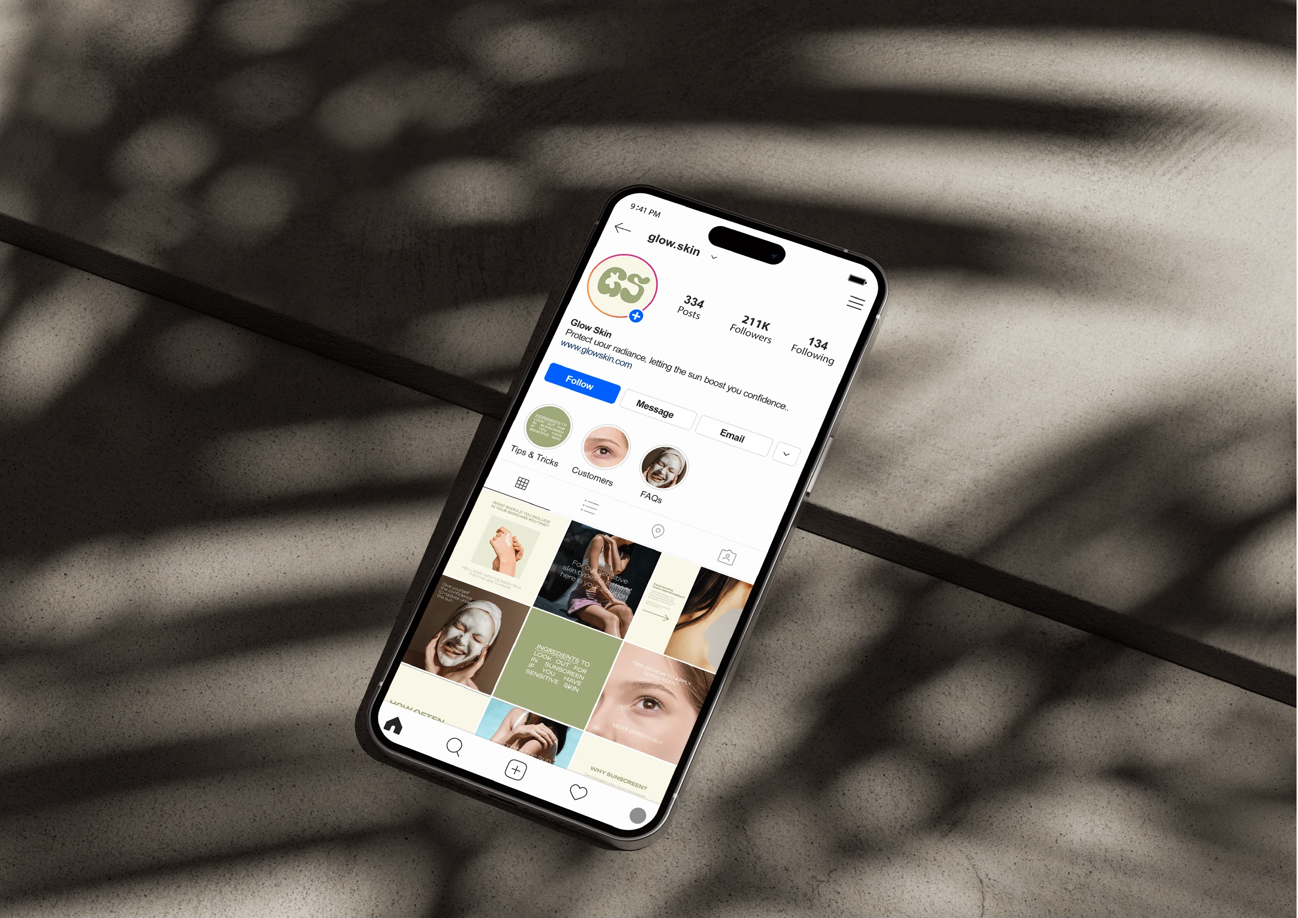
Mock-up of content created for Glow Skin, re-enforcing their brand identity
Conclusion
The Glow Skin brand and packaging project was a comprehensive and meticulous endeavor that encompassed extensive visual research, creative exploration, and rigorous testing. Every step of the process was approached with great care and attention to detail, ensuring that the final design truly embodies the company's core values.
Throughout the project, the team focused on creating a brand identity that exudes friendliness, warmth, and approachability. By infusing these qualities into the design, Glow Skin aims to establish a strong connection with its target audience in the skincare market.
The final design is not only visually appealing, but also highly versatile. It has been carefully crafted to adapt to different platforms and mediums while maintaining its cohesive and friendly aesthetic. This flexibility allows Glow Skin to effectively communicate its brand message across various touchpoints, enhancing brand recognition and customer engagement.
In conclusion, the Glow Skin brand and packaging project is a testament to the company's commitment to creating a memorable and inviting brand experience. By prioritizing friendliness, welcoming vibes, and a down-to-earth approach, Glow Skin aims to establish itself as a trusted and relatable presence in the skincare industry.
If you liked the project, feel free to reach out to me. I'd love to work together.
Like this project
Posted Sep 25, 2023
The Glow Skin brand and packaging project for Glow Skin. A brand that is determined to help people with sensitive skin with the perfect sunscreen.