Kuidaore | Restaurant Brand Identity
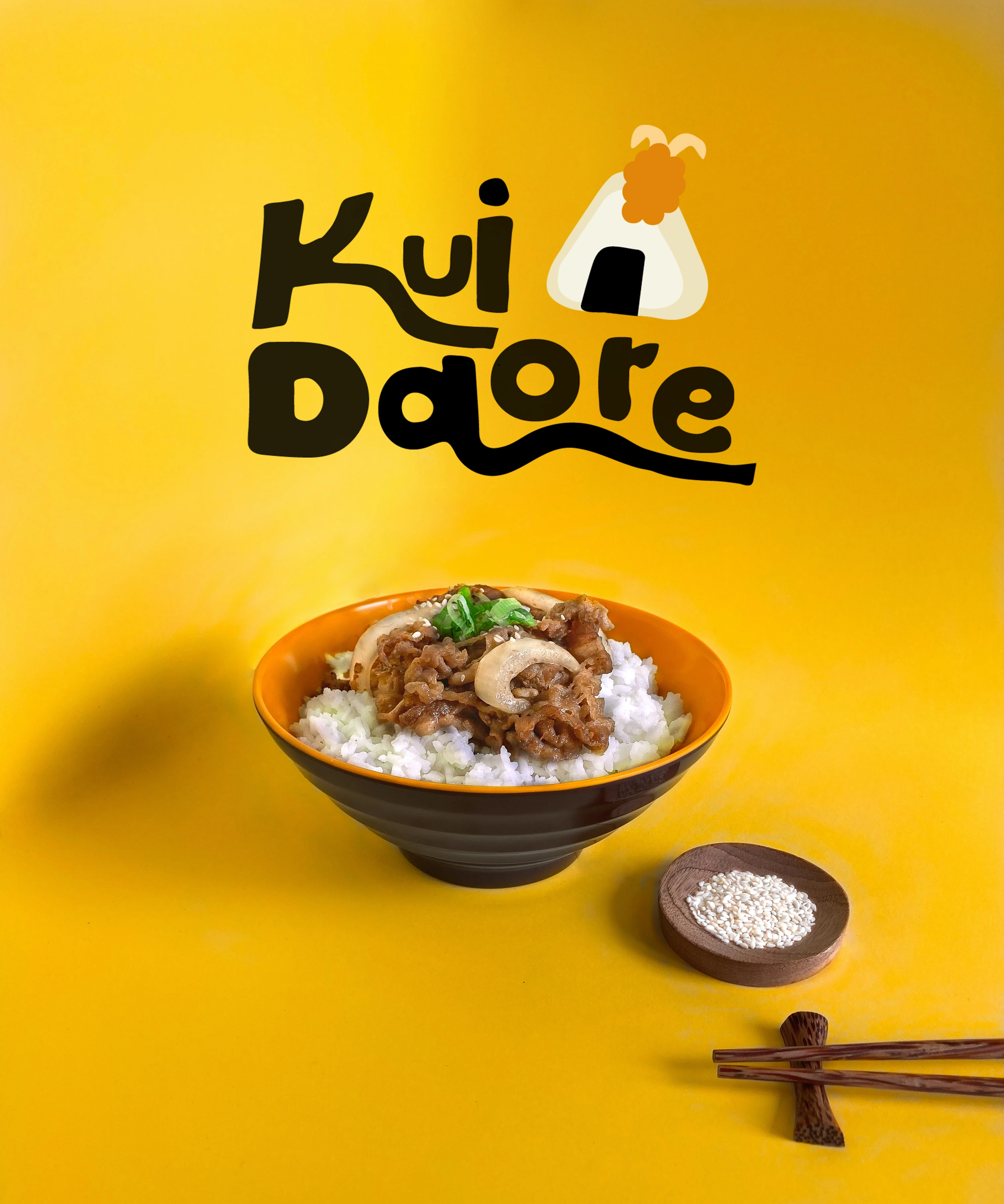
Eat yourself to Ruin
Kuidaore means to eat yourself to ruin, taken out the proverb "Dress into ruin in Kyoto, Eata into ruin in Osaka". Kuidaore is a local Japanese restaurant that provides affordable and nutritious lunches for takeaway and sit-in meal. Helping the working force stay in top health, taking the burden of health while in the busy environment (which is the workplace). Bringing different and nostalgic flavours to the local community, like a vacation at grandma's house.
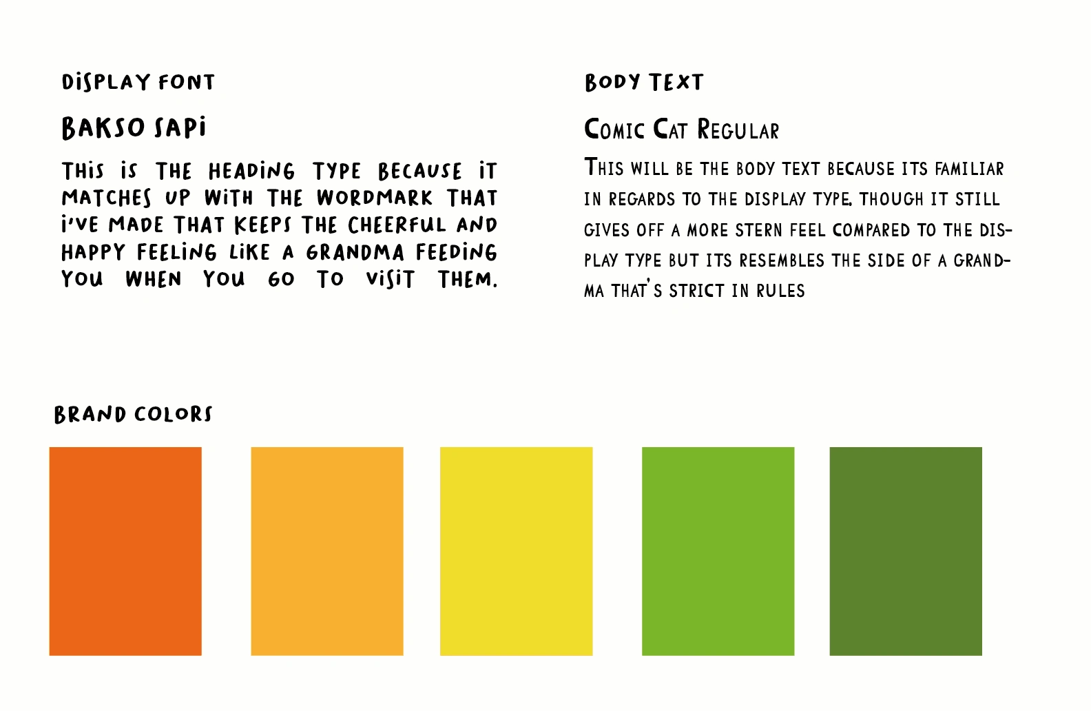
The brand needed was a fun and colorful brand. The colors inspiration was picked from the colors found in a bento, a Japanese lunchbox meal. The color palette uses saturated color give off a less expensive feel to indicate to customers that this restaurant isn't high-end.
Ideas that guided the design:
Chiseled strokes are used to resemble seaweed that can be commonly found in many Japanese dishes.
Cute and fun illustration to give a welcoming brand.
Japanese lunch related - bento
bright primary/secondary colors colors - like what you see in Bentos.
Logo

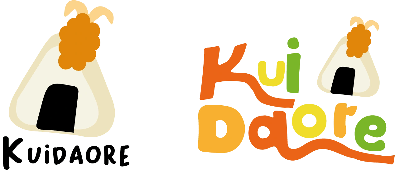
The final logo
This logo is the final choice, keeping it simple and allowing the Onigiri illustration to be the first point of focus in the logo.
Alternate Logos
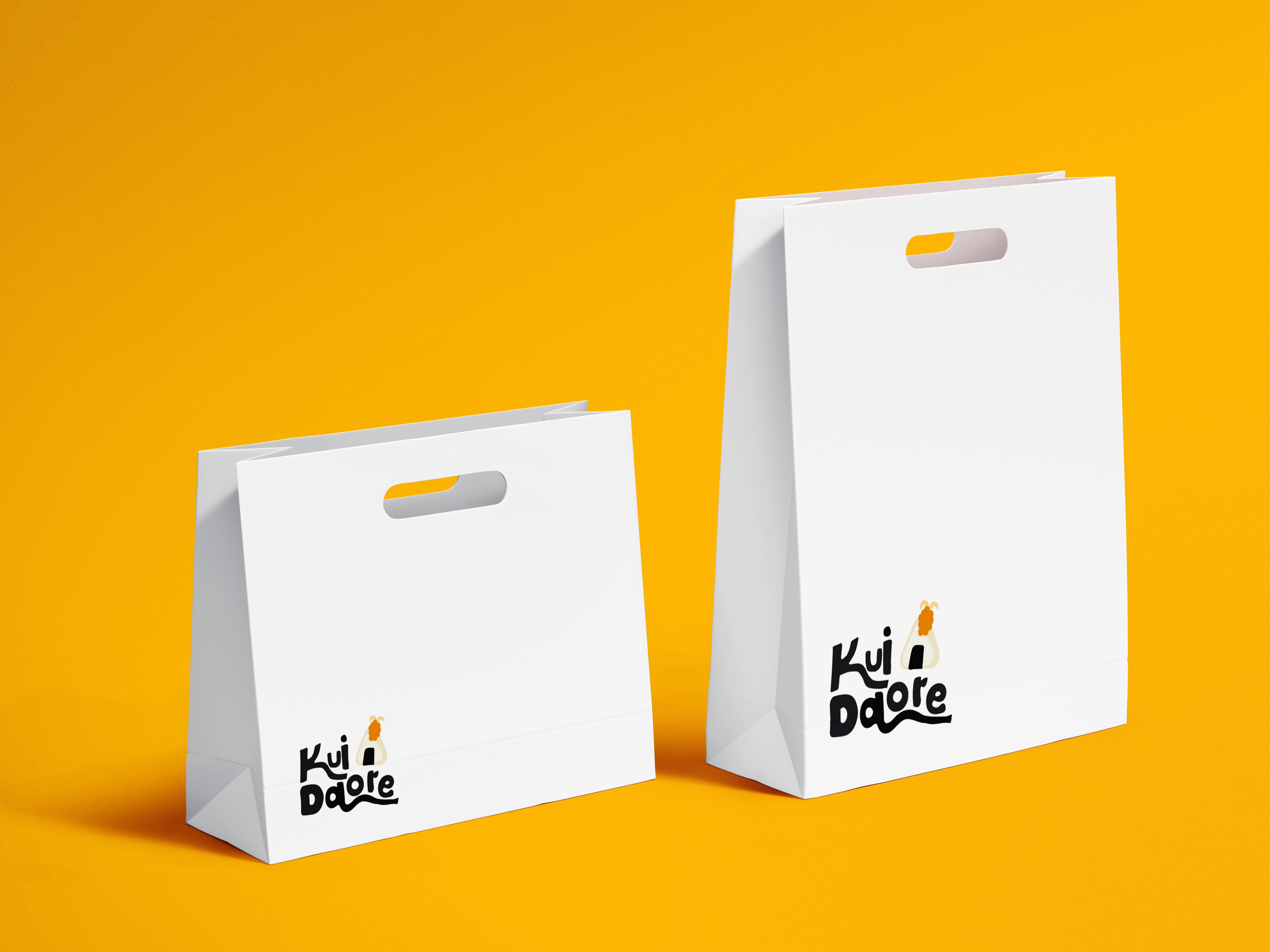
Mockups
The paper bag is stamped in the corner because that is often where the person will look.
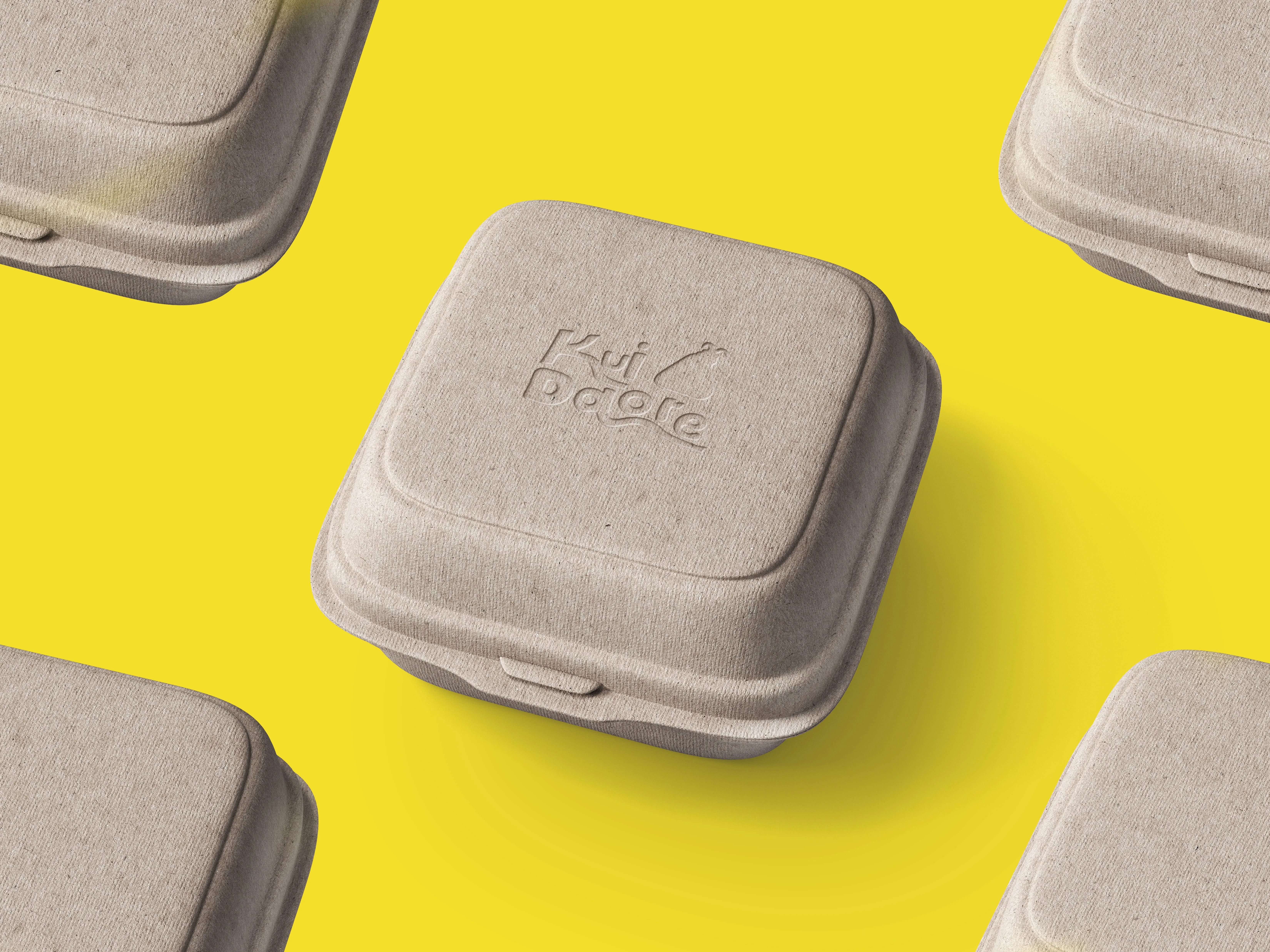
The takeaway boxes are engraved rather than stamped to give it a subtle branding that doesn't takeaway from the eating experience.
Like this project
Posted Aug 31, 2022
Kuidaore is a brand identity design for a local Japanese restaurant that focuses on giving the community great and healthy food.
Likes
0
Views
14

