Ahold Delhaize USA
Holistic web, mobile, in-person experiences to enrich eCommerce
Responsibility
As a Product Experience Designer, I was responsible for researching, designing, prototyping, testing, and introducing innovative digital experiences for digitally engaged shoppers. My significant contribution was materializing:
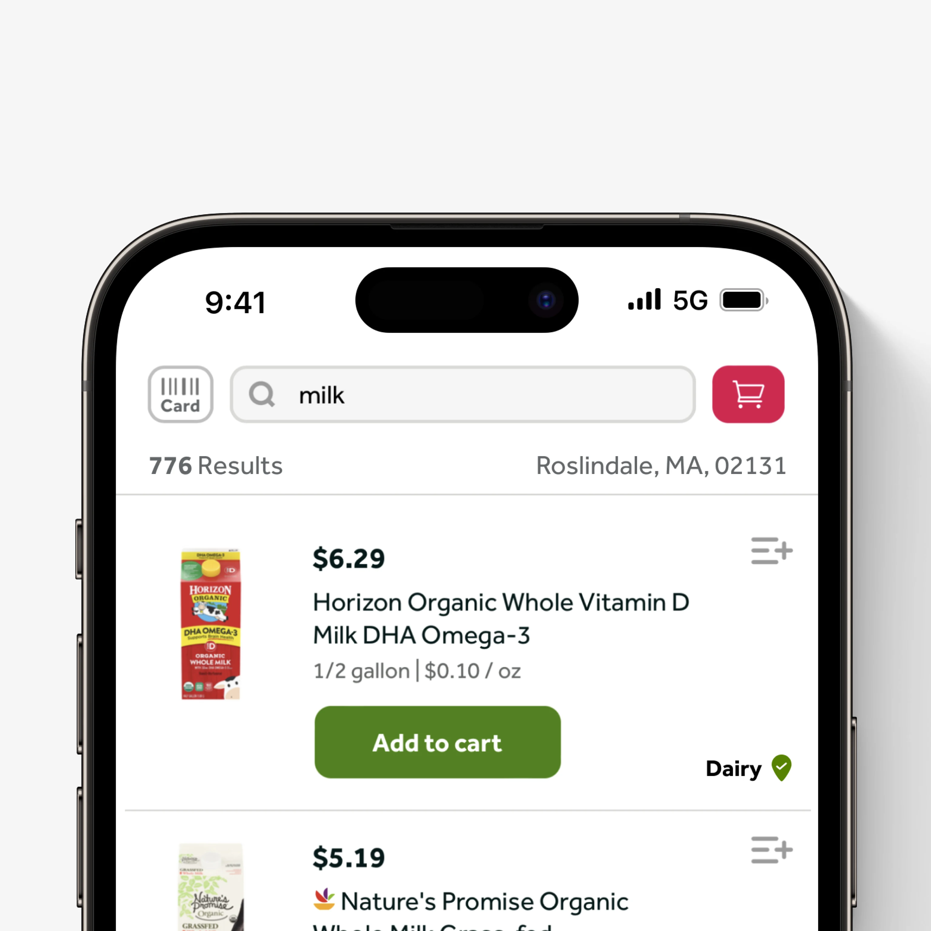
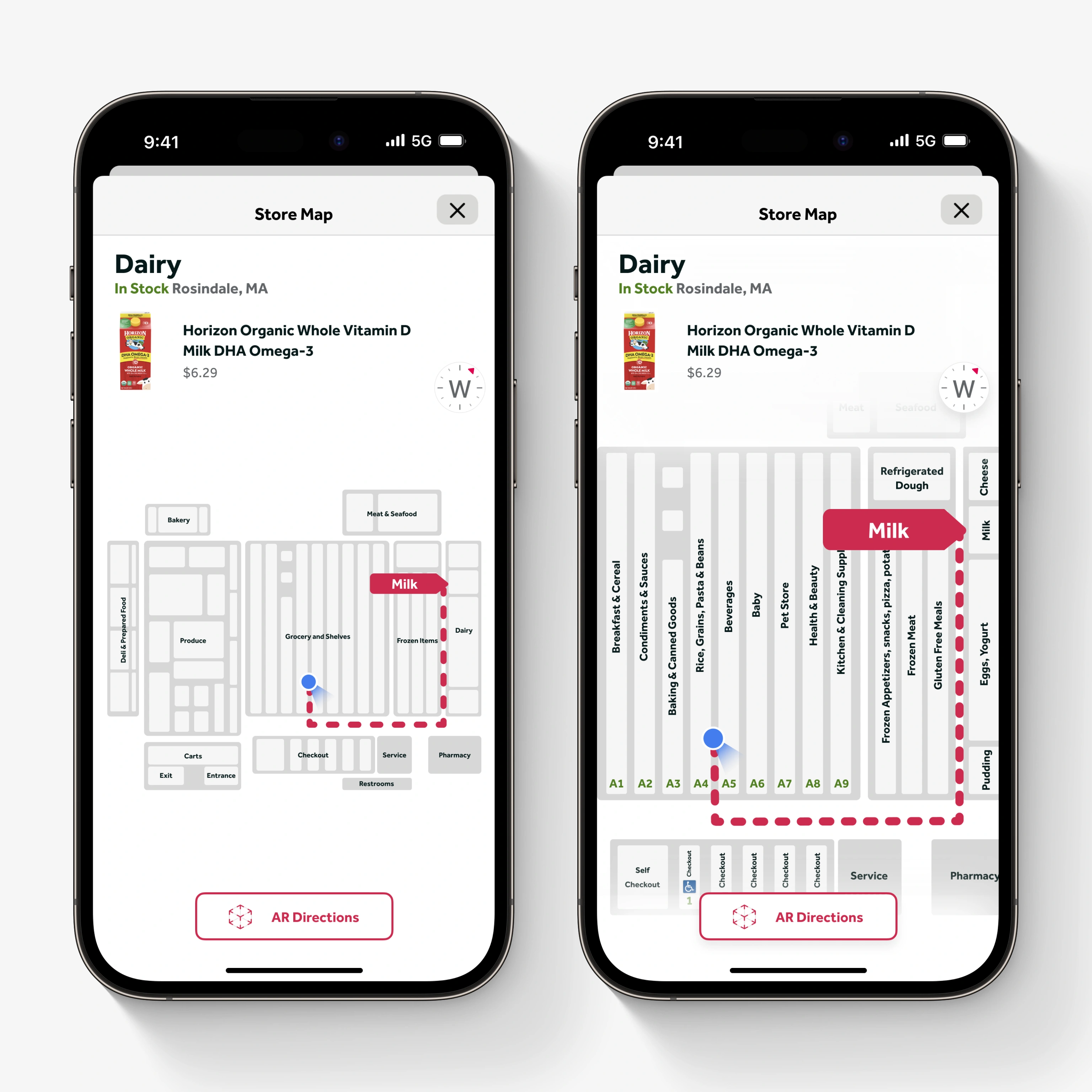
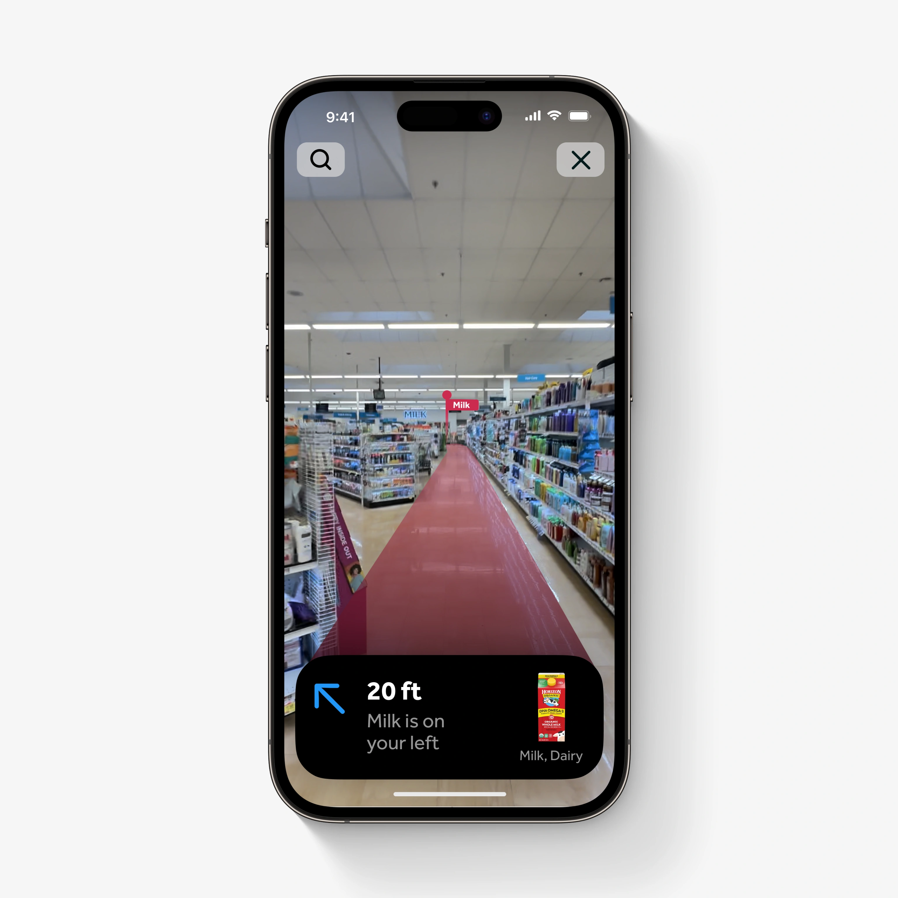
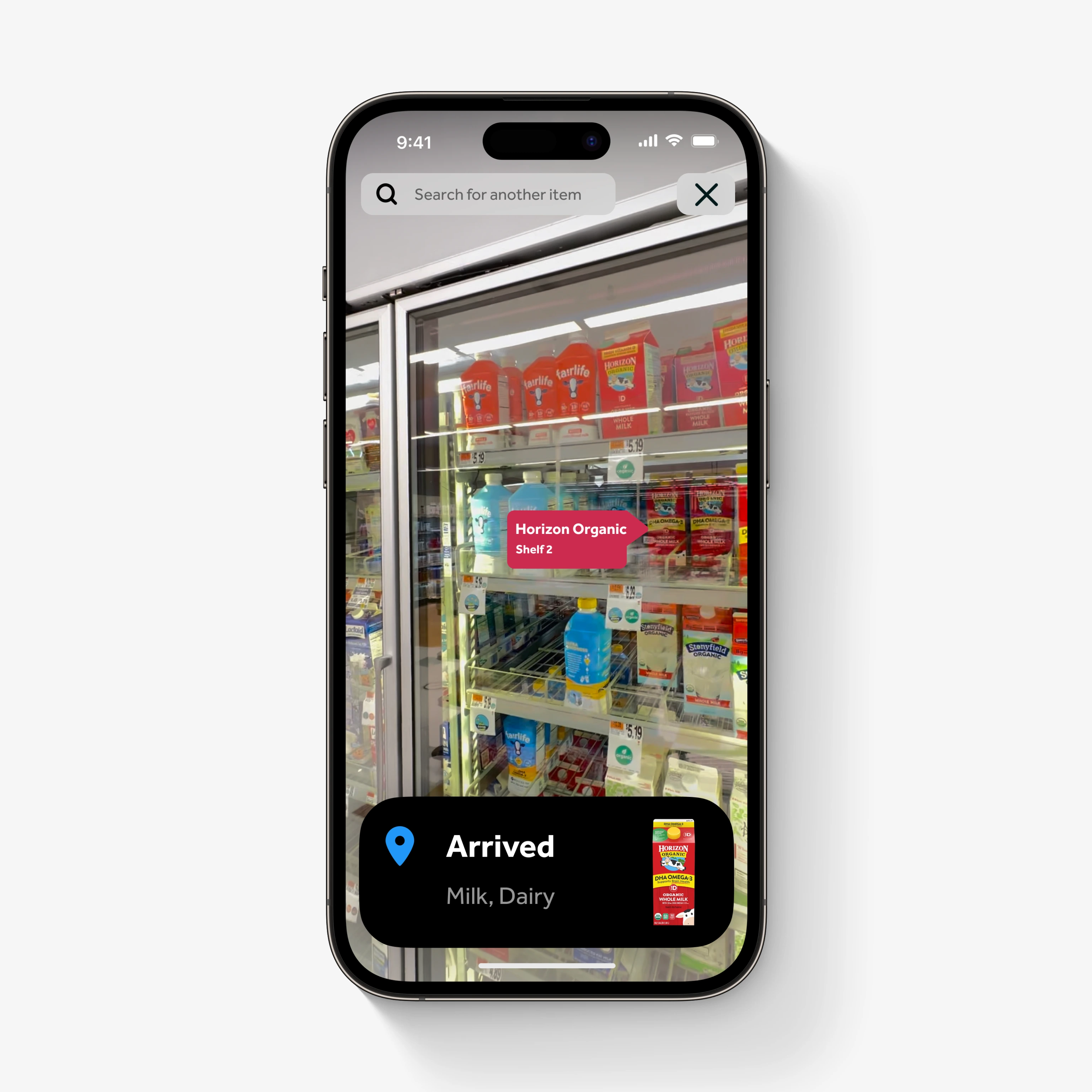
1. Wayfinding: Grocery wayfinding feature for shoppers to help find items in-store using labels, 2D Map and Augmented Reality (AR).
2. Home Screen Widgets: Allowing shoppers to access frequent shortcuts and features directly from their iOS home screen.
3. Live Activities: iOS 16 Live Activities helping users stay informed about order delivery and pick-up status.
Wayfinding
Goal
Make it easy for customers to quickly locate items, enhance in-store shopping efficiency; ultimately, increase customer satisfaction through an improved wayfinding experience that saves time.
Ideation
At the start of the project, I initiated an analysis phase in which I collaborated with stakeholders to identify wayfinding pain points, conduct competitive analysis, and brainstorm potential solutions for the app. UX Research, customer journey mapping revealed that finding specific items in-store was tedious, frustrating, and inefficient. We determined that guided wayfinding in the app would help shoppers navigate more easily, provide a clearer path through aisle locations; ultimately making grocery shopping quicker, easier, and more efficient.
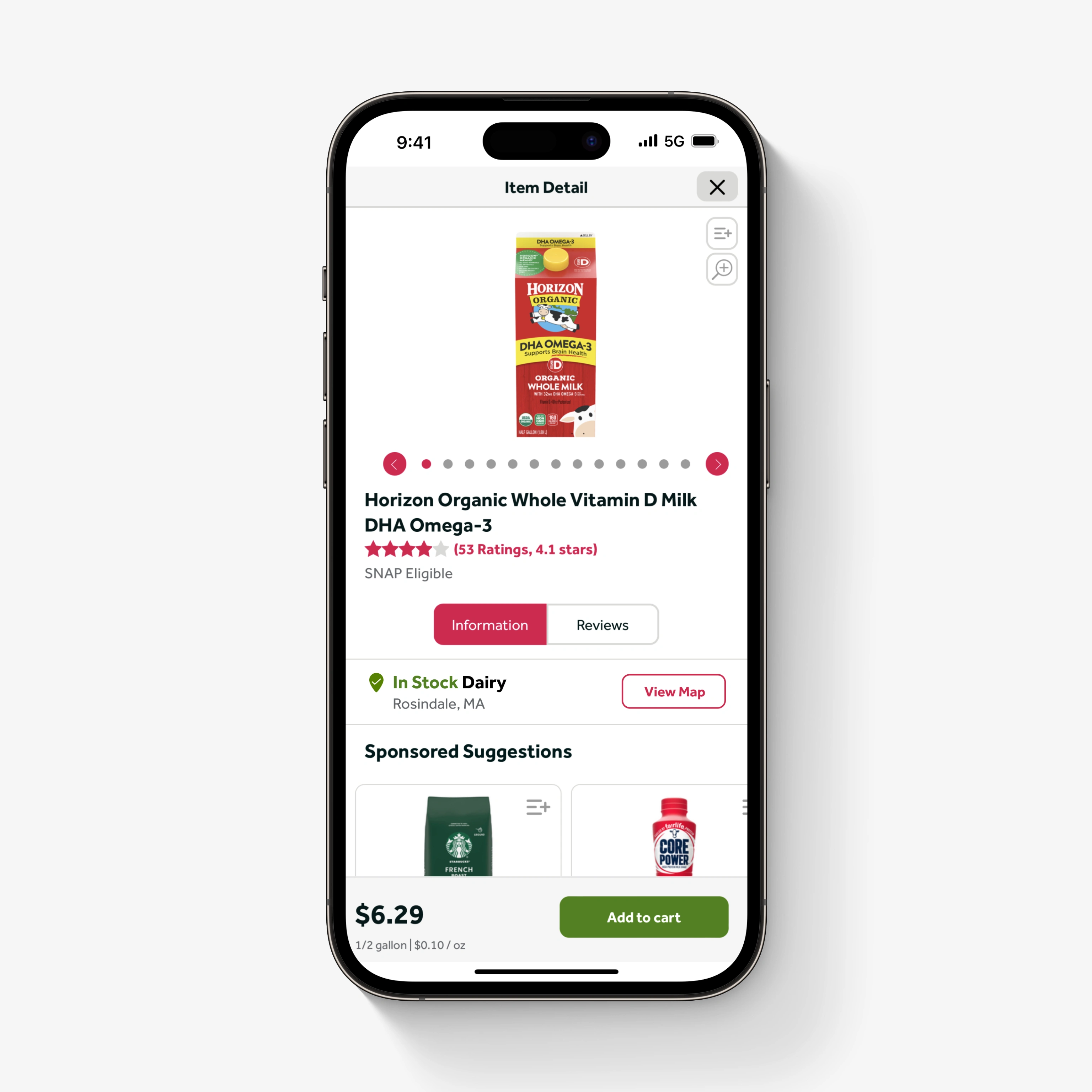
In-app Labels, 2D Map & AR Directions
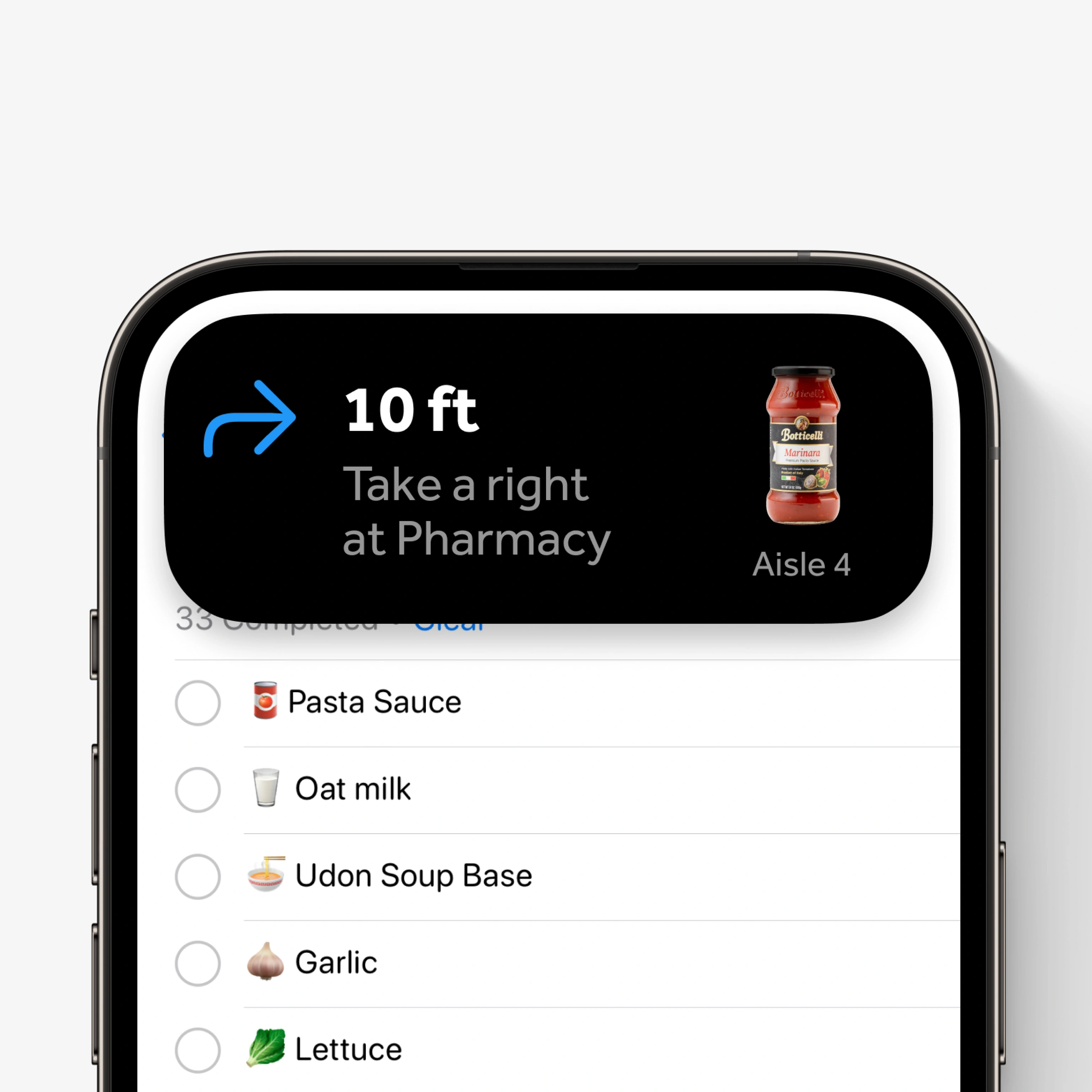
To improve accessibility, I designed stock information labels within the app, 2D indoor maps, and AR Directions to guide shoppers directly to items. Dynamic Island on iOS 16 would allow shoppers to keep track of directions while switching between apps, such as Reminders for their grocery lists.
Company’s initiative
This project was crucial for the company. UX research showed that although 32% of in-store shoppers were digitally engaged, they contributed an average of $1.8 billion brand revenue per quarter. Digitally engaged shoppers spent 2x as much as non-engaged shoppers. We hypothesized that enhancing digital features would improve the shopping experience, boost loyalty, increase revenue, and drive the company’s overall growth and success.
Making people’s lives easier
Before this project, customers at Ahold Delhaize USA grocery stores had to rely on aisle headers, printed lists, or store representatives to find items, a process that was inefficient and challenging, especially for people with disabilities. By addressing these pain points, we aimed to create a more holistic, continuous, accessible, inclusive, independent, seamless, and efficient shopping experience for customers both online or in-person.
My personal motivation
Personally, I was particularly motivated to work on this project because I have experienced the same wayfinding struggles as many shoppers in-store. Like many, I often found myself wandering up and down aisles in search of specific items, frustrated by the inefficiency and time-wasting that often accompanies in-store shopping. I am proud to have contributed to a project that has the potential to make a real difference in the lives of shoppers, including myself.
User Tests
To assess the effectiveness of mobile wayfinding solutions, the UX Researcher and I conducted 45-minute moderated feedback interview sessions with 4 regular users of the Stop & Shop, Giant Foods, Food Lion apps. We evaluated different approaches, including in-app labels, 2D maps and AR, using interactive prototypes. This feedback informed design iteration decisions, ensuring we met the needs of our users.
Impact
3 out of 4 participants responded positively, stating that guided wayfinding helped them “find things quicker, make life easier, and shopping more convenient.” With a satisfaction rate of 75%, this feedback validated the importance of integrating guided wayfinding into our solution, significantly improving the shopping experience.
Home Screen Widgets
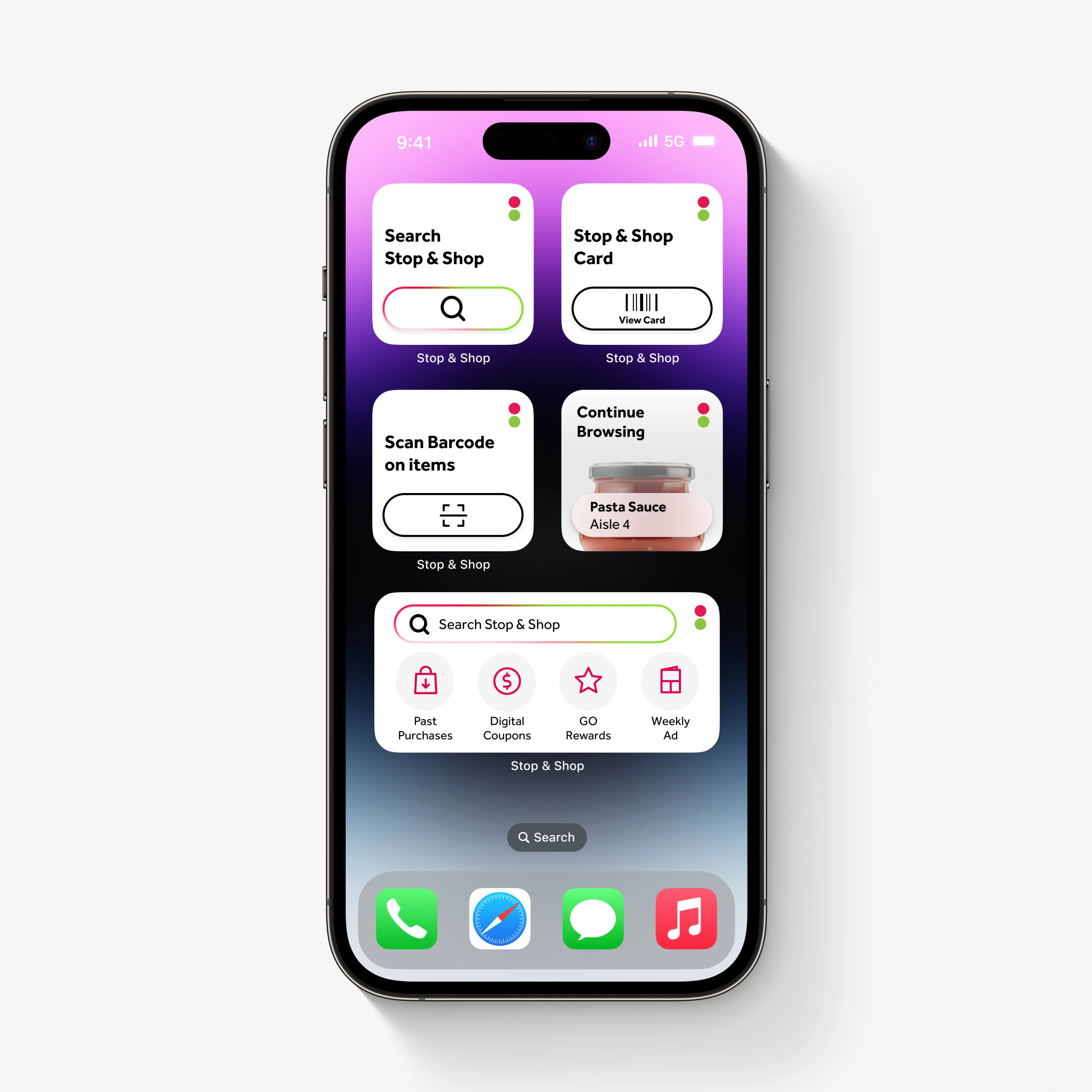
Glanceable
In addition to designing wayfinding features, I also played a key role in developing iOS Home Screen widgets that would enable shoppers to engage more effectively with quick and easy access to a range of information for efficient browsing and shopping.
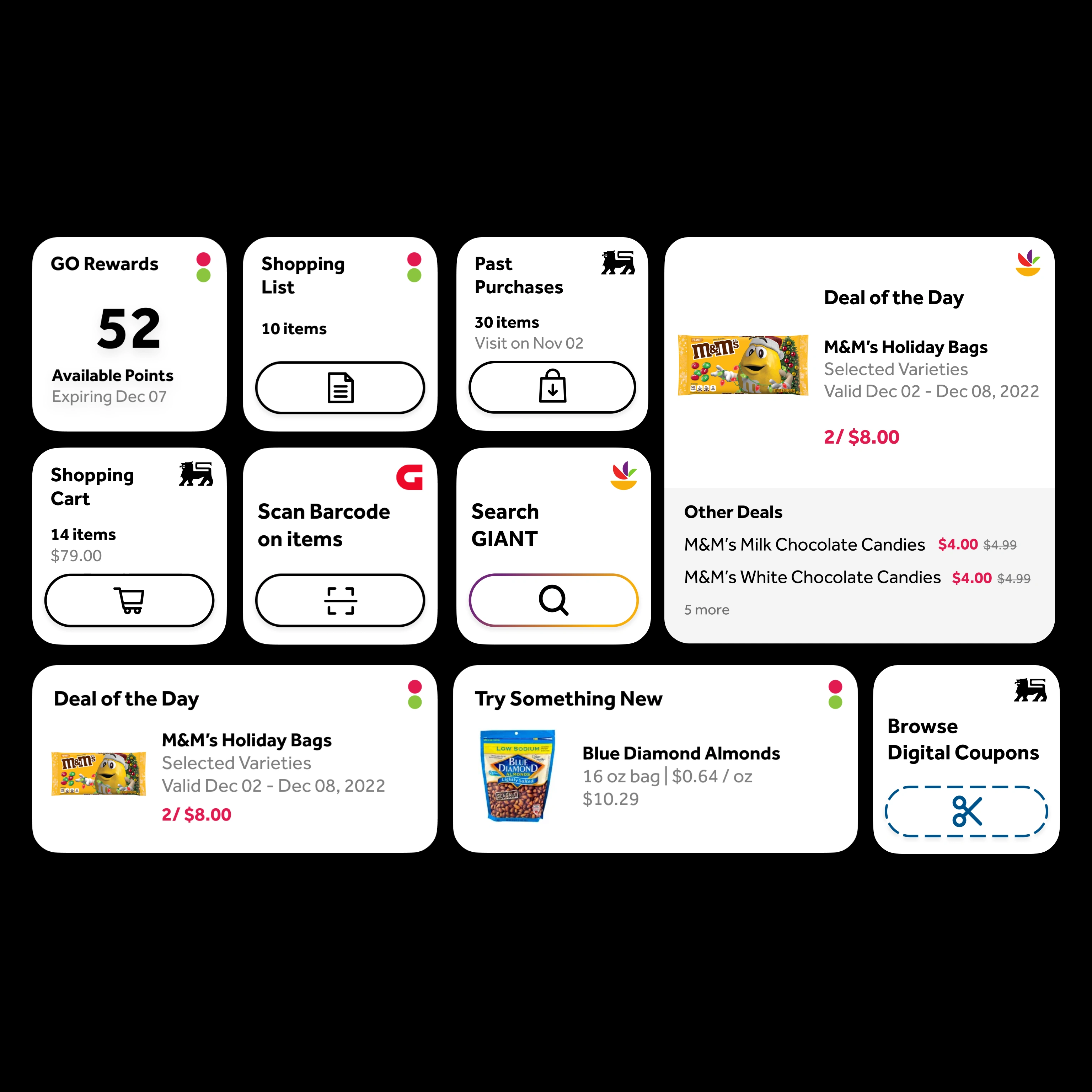
Small, Medium, Large
The widgets were designed in small, medium, and large sizes, focused on providing access to key features such as past purchases, shopping lists, the cart, rewards, savings, and digital coupons. Small widgets offered quick shortcuts to the shopper card, barcode scanning, and browsing. Medium widgets displayed deals of the day and product recommendations. Large widgets provided detailed views of deals, shopping lists, and more.
Live Activities
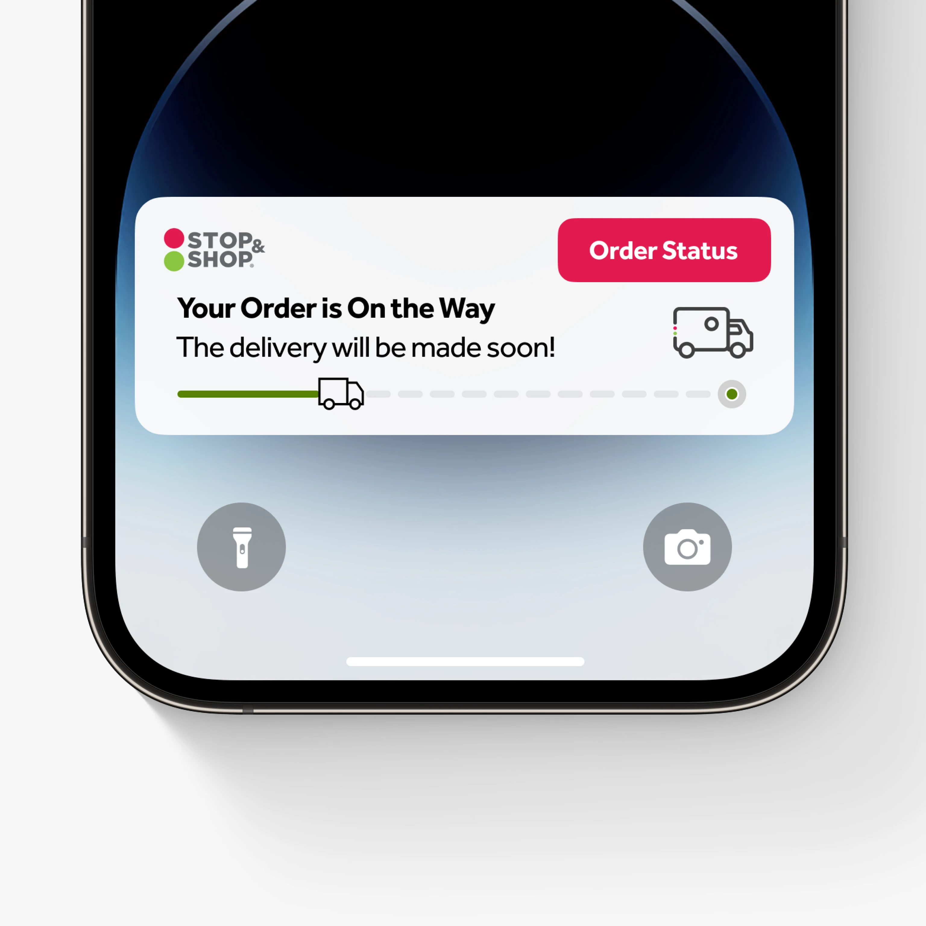
Real-Time
To further enhance the digital engagement and satisfaction of shoppers, I implemented the Live Activities API on iOS to provide real-time notifications for pickup and delivery orders, offering updates on order status and time sensitive notifications when the pickup or delivery window was about to begin.
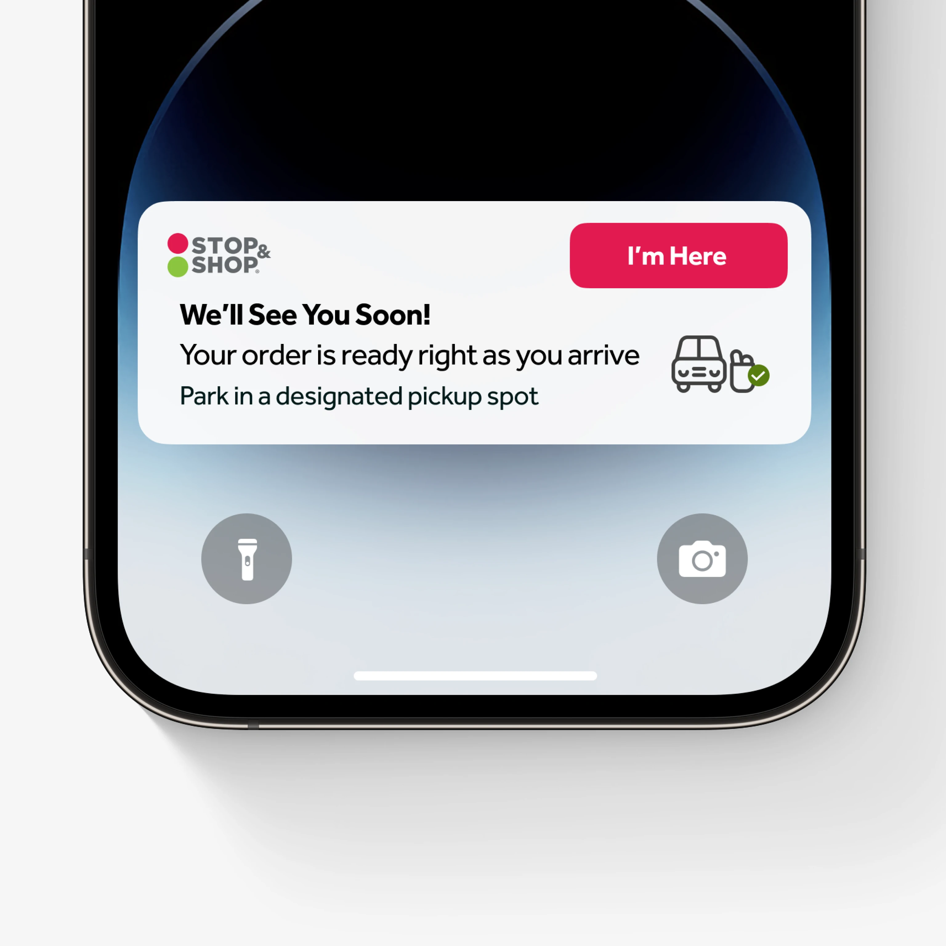
Pickup and delivery orders
Live Activity Notifications are designed to trigger automatically 30 minutes before the pickup window, providing updated status on the lock screen.
I led design and prototyping of this system for both pickup and delivery orders, leveraging the Live Activities API to create a responsive and streamlined experience to keep shoppers informed and engaged throughout the shopping process.
Like this project
Posted Aug 2, 2024
As a Product Experience Designer, I was responsible for researching, designing, prototyping, testing, and introducing innovative web, mobile experiences.
Likes
0
Views
10

