Rethinking the T-Mobile App
Rohan Tandon
Rethinking the T-Mobile App
Reimagining T-Mobile’s iOS application
Project Overview
A redesign concept of T-Mobile’s iOS app provides user data at a glance, without making it difficult to understand and present in the least cluttered way.
Problem
As an everyday user of T-Mobile’s iOS application, I challenged myself to push myself creatively as a designer and redesign the app from the ground up. My goal was to solve user-experience issues that I was facing.
Solution: A Redesign
To take full advantage of T-Mobile’s services, core design elements of the application had to be reimagined and streamlined.
Project Goals
1. Unobtrusive and Deferent
Facilitate an engaging experience when it comes to presenting information about user’s cellular information
2. Human-Centric
Open space that reflects emotion and empathy through design
3. Support & Self-Help
Access to support with personalized access to solutions — all in one place
4. Monitoring Account
Help users understand account changes, the latest offers, and much more
“Design is not just what it looks like and feels like. Design is how it works.”- Steve Jobs
My Attempt
My Redesign of the T-Mobile App
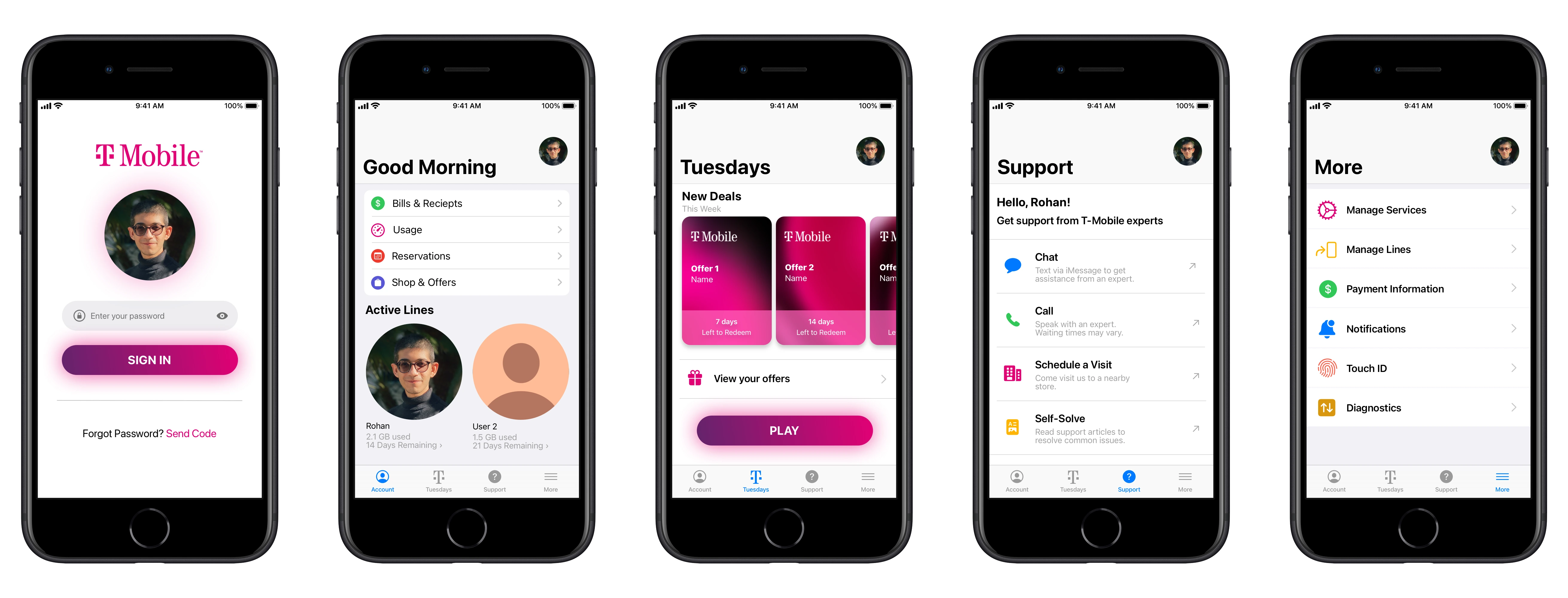
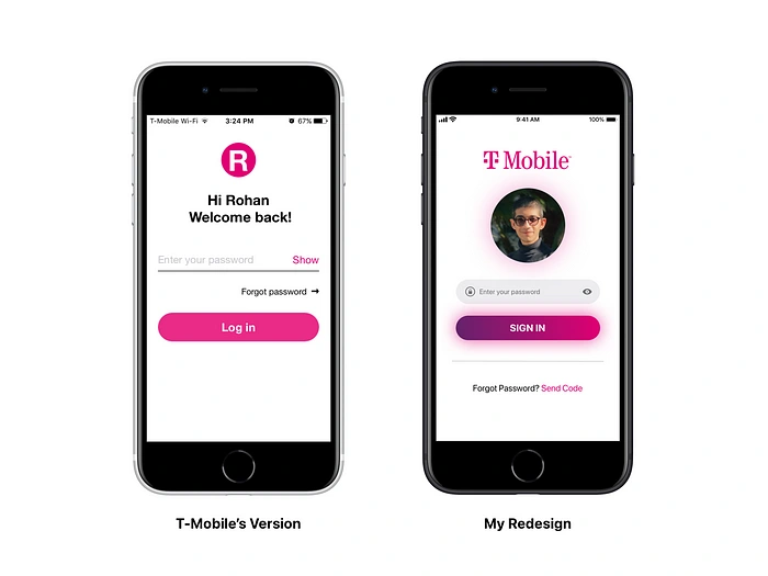
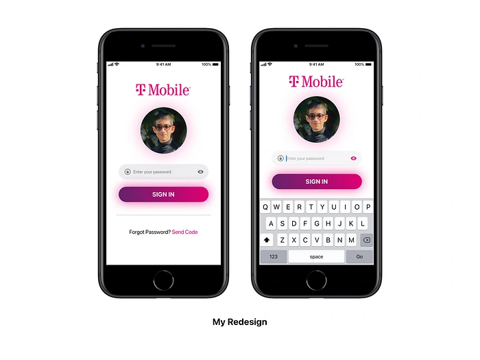
Log-In Screen
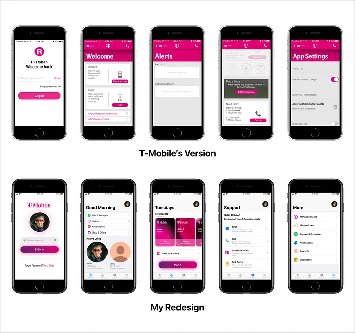
Welcome Screen
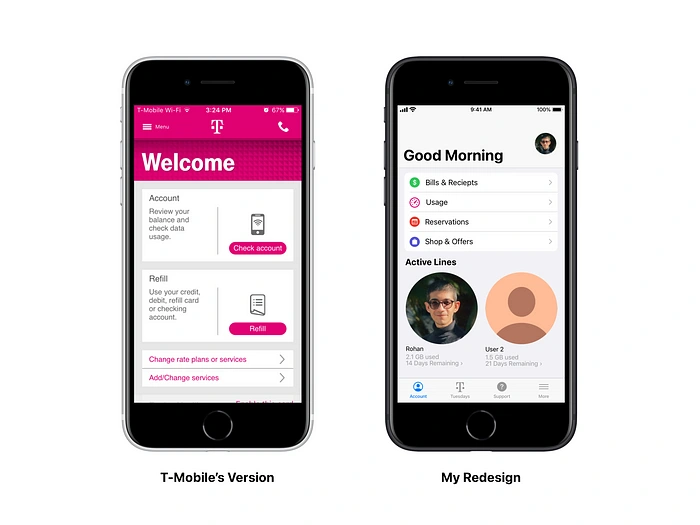
Quick and easy access to important app functions on the welcome screen, without needing to switching pages. Bold typography provides a clear sense of context. Crucial account information is available at a glance — active lines, data usage, number of days until the data reset.
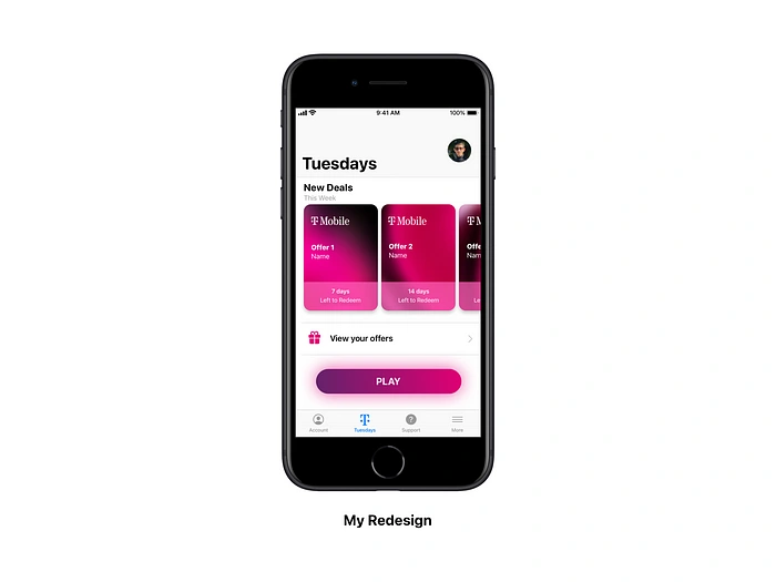
T-Mobile requires its users to download a separate app for ‘T-Mobile Tuesdays’ promotions. In my redesign, I integrated the service within the main app to increase the user base of the promotion service. Users can view available deals and claimed offers within the main app.
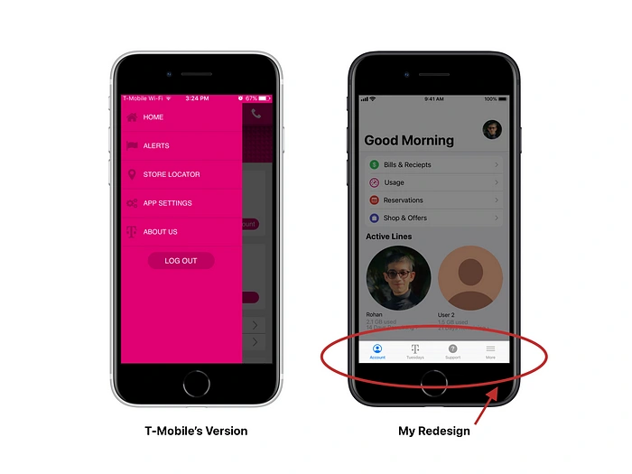
I also ditched the side navigation menu in favor of a relatively convenient toolbar at the bottom. A compact toolbar at the bottom lets the user stay focused on the main task and easily switch pages with just a tap. By following Apple’s Human Interface guidelines, I gave an overall look fresh and engaging feel.
Unobtrusive and Deferent
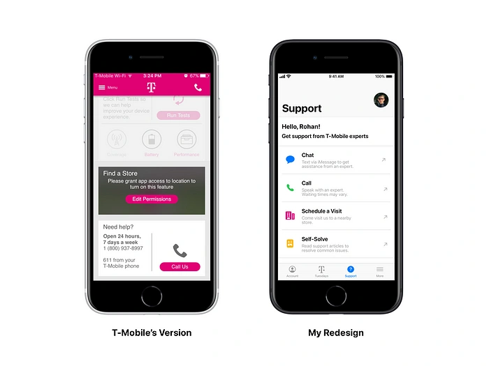
A stand-alone support page to help troubleshoot an issue, get guided, or self resolve using step-by-step solutions
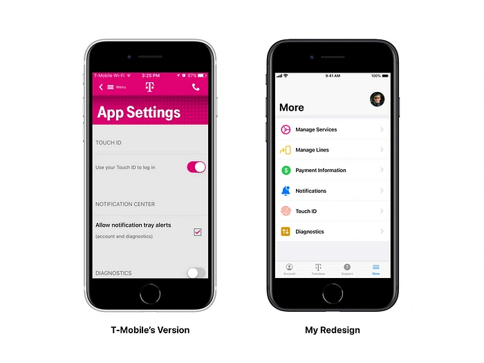
Manage Account — Options to manage services, phone lines, and payment information.
Ultimately, a straightforward design provides clarity. Mobile interfaces can achieve simplicity only if ornamentation is avoided. When I sat down to work on a redesign concept for the T-Mobile app, my focus was to simplify the UI and pave the way for a better user experience. I hope my work represents these goals.
Thank you for reading! Let me know if you have any thoughts on this.
Like this project
Posted Oct 5, 2024
A redesign concept of T-Mobile’s iOS app
Likes
0
Views
13