Moonwort: Evening Tea Brand Identity and Packaging System

Supreme Dream


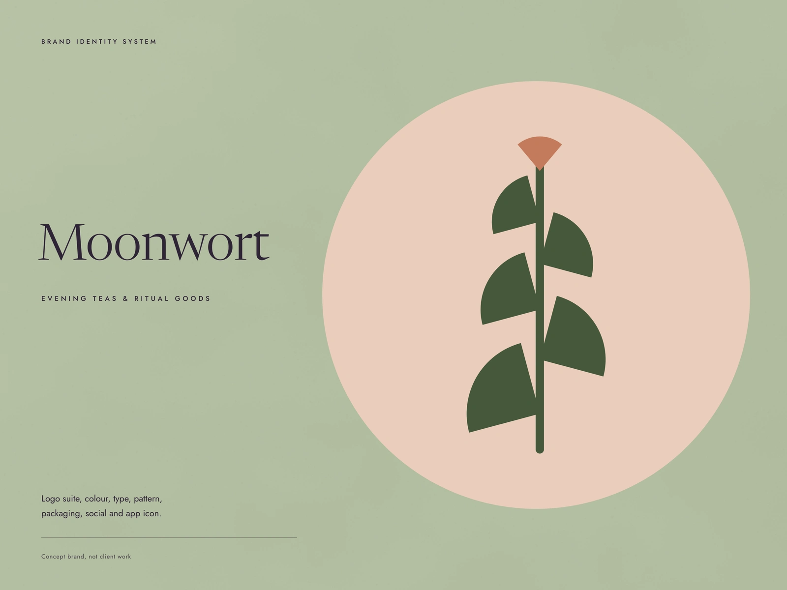
Wellness packaging tends to blur into one shelf of soft beige. Moonwort had to feel quiet without disappearing: a brand for the hour after dinner that you could still pick out from across a room.
Moonwort is a concept brand, not client work. The names and products on the boards are placeholders.
The brief
Evening teas and ritual goods. The identity needed a mark that works as a foil stamp on a tin lid and as a 16 px app icon, a palette that says "slow down" while still passing contrast, and a packaging line that looks like a family on the shelf.
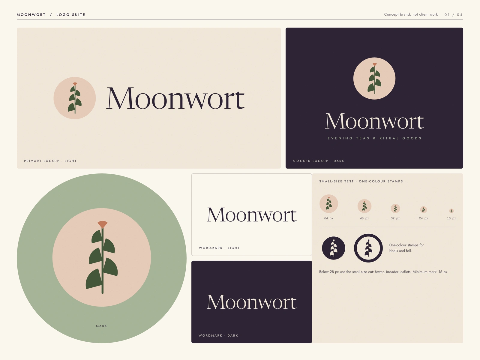
Moonwort logo suite: horizontal and stacked lockups, the mark on sage, light and dark wordmarks, one-colour stamps and the small-size test
The idea
The mark is a moonwort frond, five pairs of fan-shaped leaflets on a single stem, standing in a blush moon disc. It is built only from sectors, a disc and a straight stem, so it stays clean at any size. Below 28 px a small-size cut takes over with fewer, broader leaflets.
The palette is named for the evening: Dusk, Moss, Clay, Blush, Oat and Sage. Every pairing on the guide carries its measured contrast ratio, so the soft look never costs legibility. Dusk on Oat reads at 12.2 to 1.
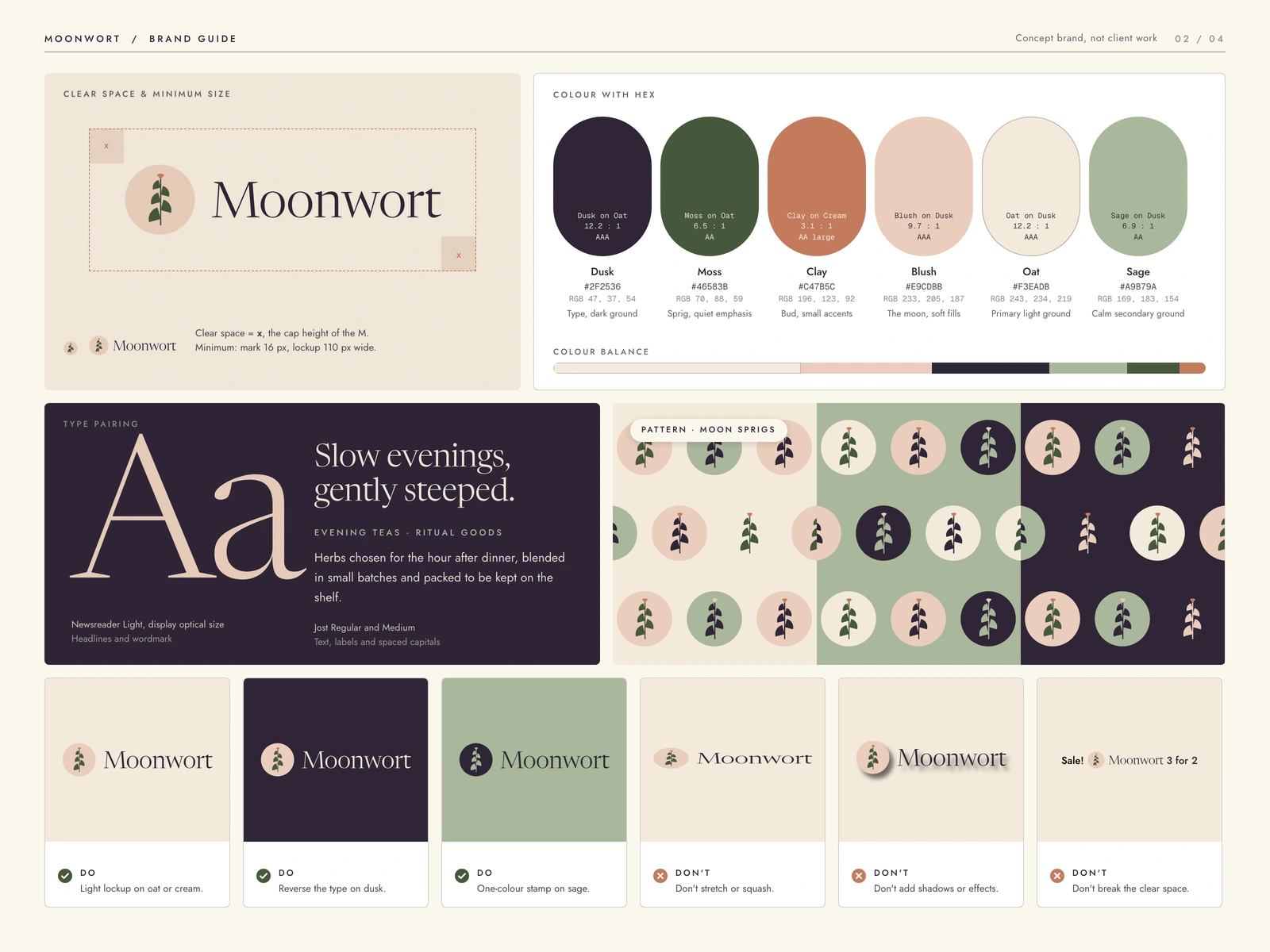
Brand guide: clear space and minimum size, colour with hex and contrast, Newsreader and Jost pairing, the moon-sprig pattern and do and don't rules
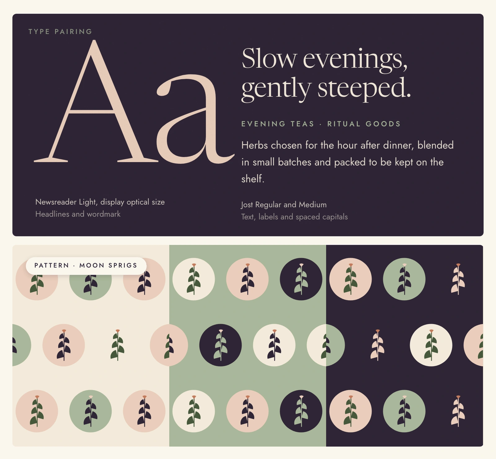
Type and pattern: "Slow evenings, gently steeped." set in Newsreader Light, beside the moon-sprig pattern in three colourways
How it is built
Every mark is generated from geometry in Python and written out as SVG: 23 logo files in SVG plus 23 in PNG, covering lockups, wordmarks, marks, small-size cuts and three app icon colourways. The boards are laid out by hand in HTML and CSS and rendered in a headless browser. Grain and paper textures are generated in code. No stock imagery, no photography.
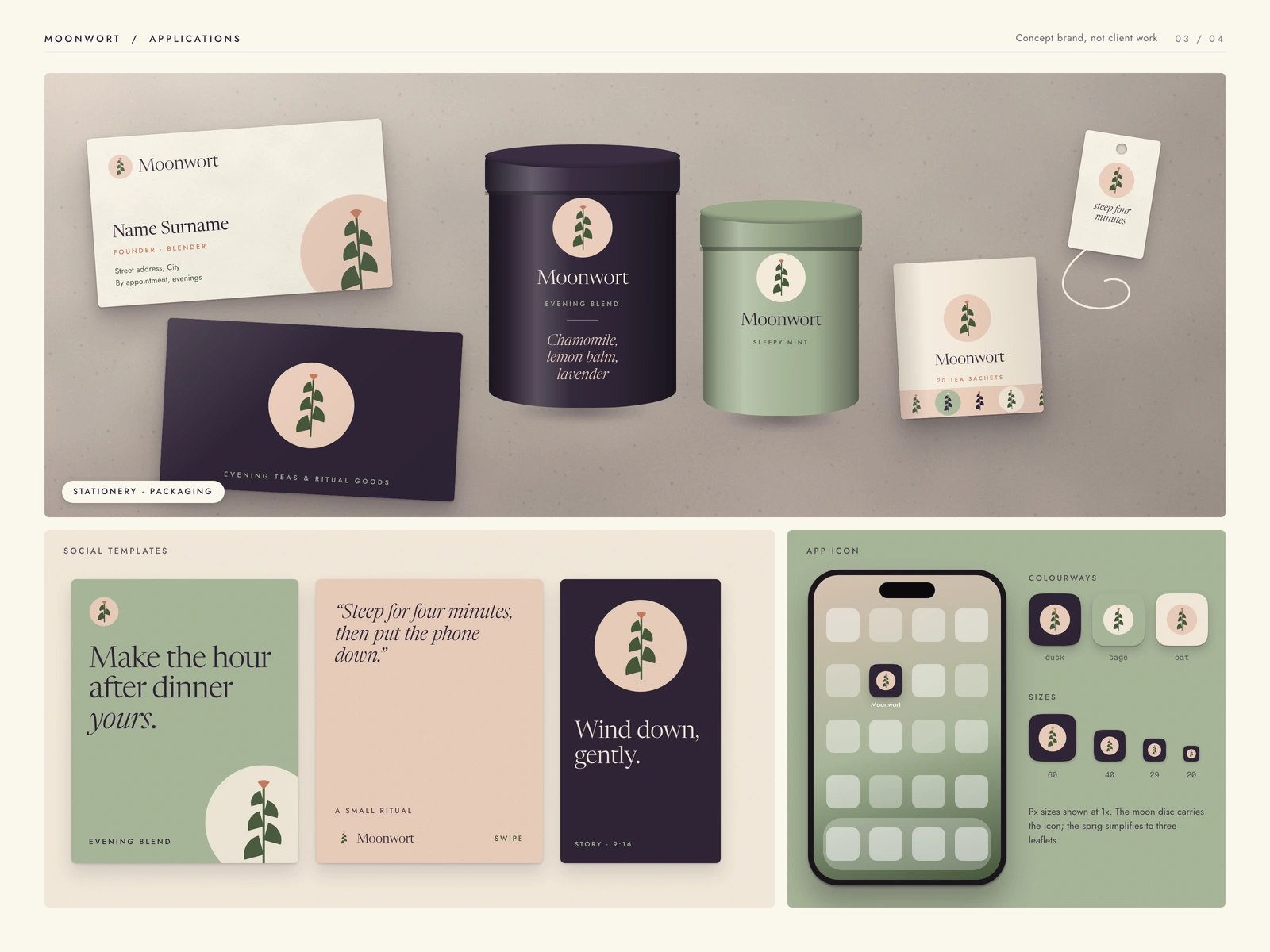
Applications: business cards, two tea tins, a sachet box and a tea tag, three social templates and the app icon
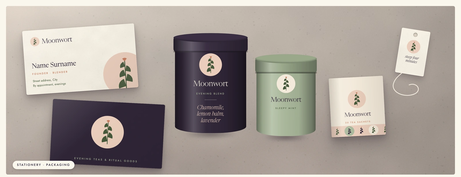
Packaging detail: the evening blend tin in Dusk, the sleepy mint tin in Sage, sachets and the hang tag
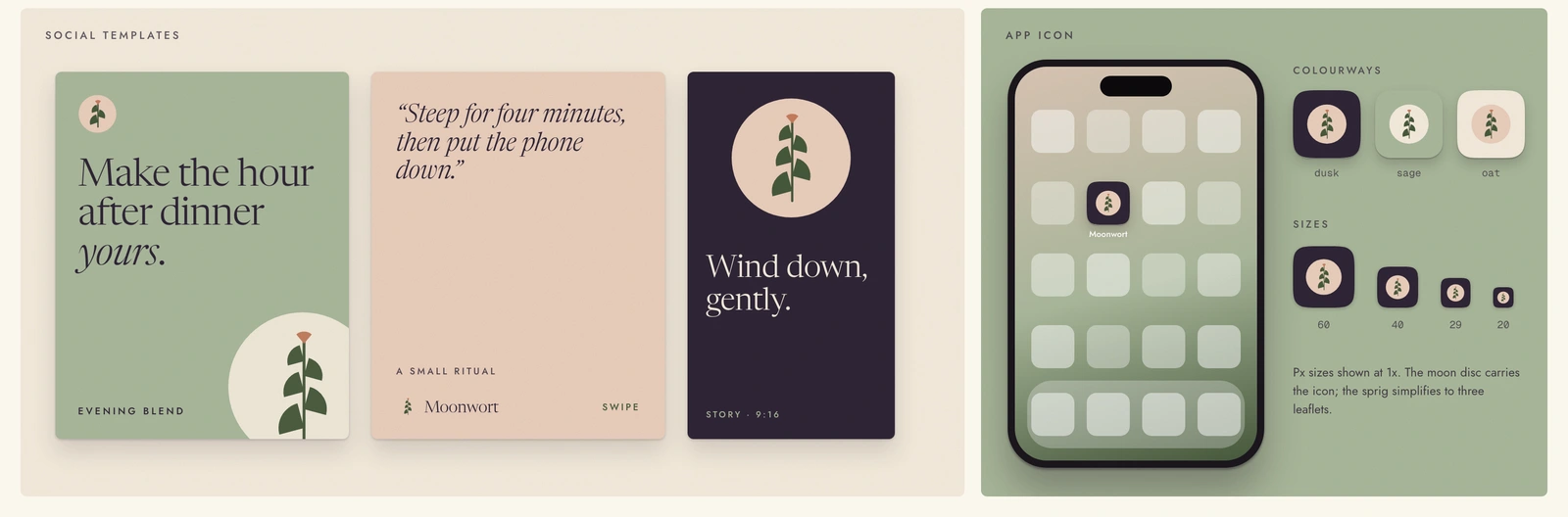
Social templates and app icon: three story formats plus icon colourways at 60, 40, 29 and 20 px
What a client gets
A complete identity you can hand to a printer and a developer on the same day: master logo files in every colourway, a guide where the contrast is already checked. Then the applications: tins, stationery, story templates for launch week, and an app icon set.
Work with us
This is a concept brand made to show the system. If you are launching a product that needs to feel calm and premium on a crowded shelf, tell us what it is and when it ships.
More work: givemeprompts.com/work
Like this project
Posted Oct 3, 2026
A concept identity for an evening tea brand: a moon-and-frond mark, a calm palette with checked contrast, tea tins, social templates and an app icon.
Likes
0
Views
1