MUS - Packaging System Concept

Supreme Dream


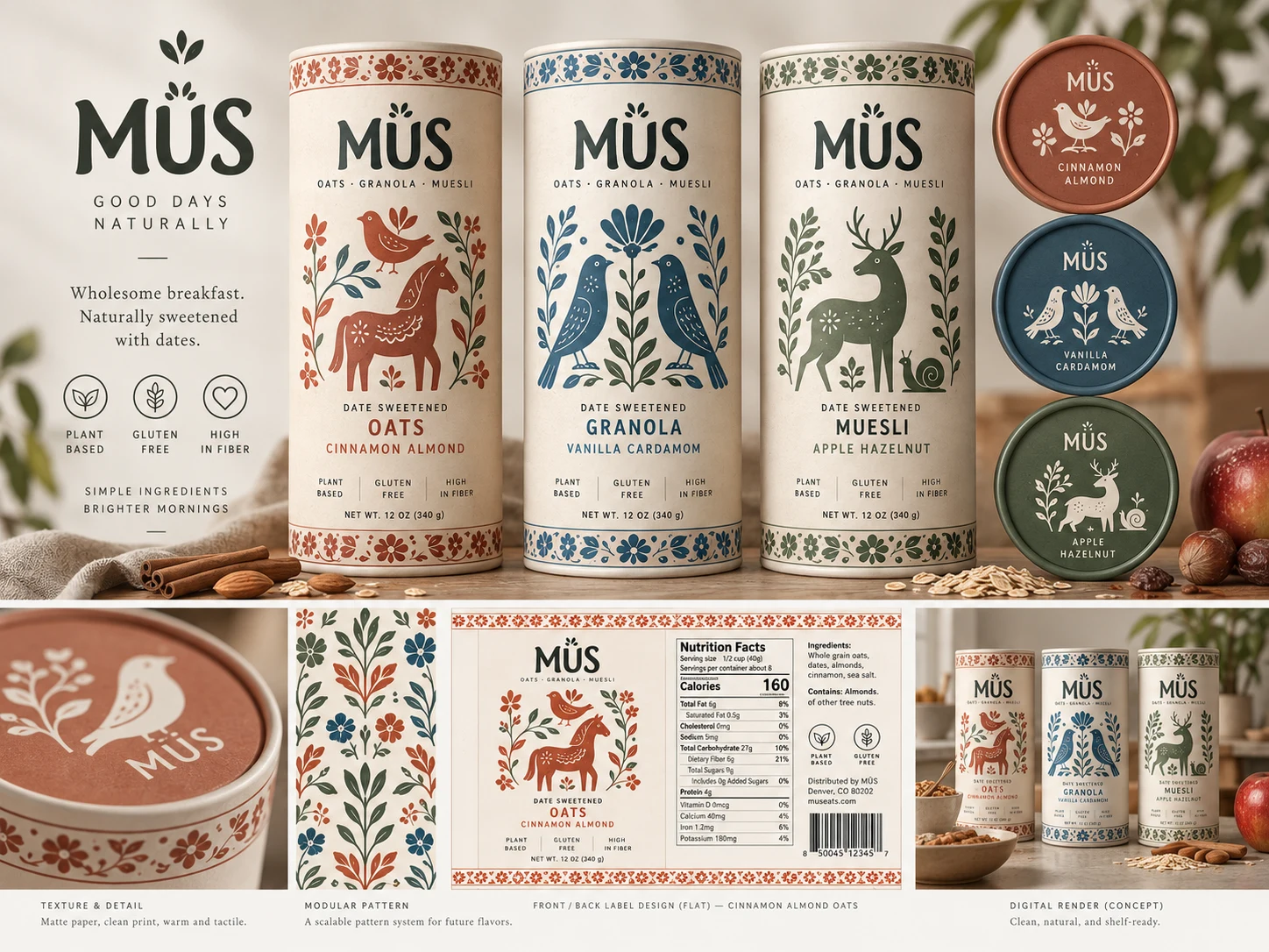
MÜS is an oat, granola, and muesli line built as an owned concept brand. The brief I set myself: a breakfast shelf that looks like it came from a farm shop rather than a template, and a system a printer could actually run.
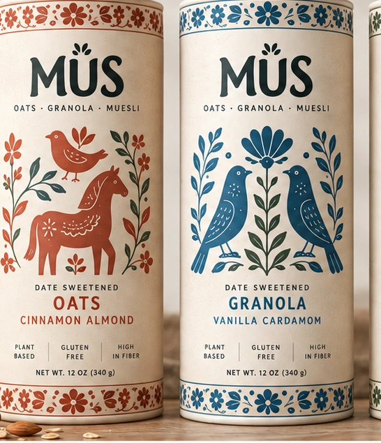
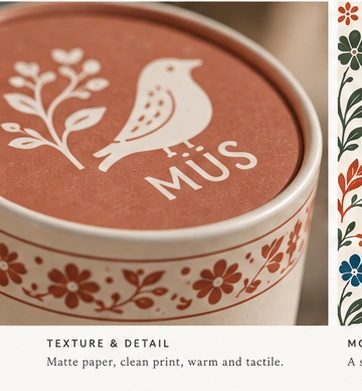
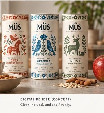
The wordmark carries a leaf in place of the umlaut. The tagline is GOOD DAYS NATURALLY. The palette is cream with three accent colours doing the sorting work: terracotta for Cinnamon Almond Oats, denim for Vanilla Cardamom Granola, sage for Apple Hazelnut Muesli.
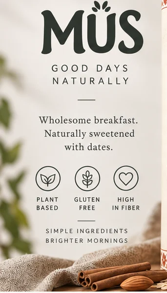
Illustration is folk-art: symmetrical floral borders, a horse, paired birds, a deer and a snail. Flat shapes with a screen-printed feel, drawn to read at shelf distance and to tile cleanly as a pattern.
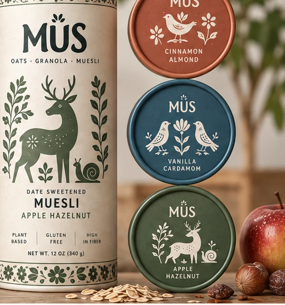
The pattern is the part that turns three packages into a brand. The border motif repeats at any aspect ratio, so it wraps a lid, a band, a shelf strip, or a page without redrawing anything.
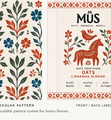
Each label is built flat first. Front with the illustration and the three dietary marks, back with the nutrition panel, ingredient list, distributor block and barcode. Then applied. Nothing was faked at render time that would not survive a real print setup.
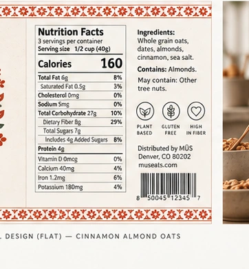
Presented the way it would be handed over: identity block, SKU line-up, lid system, flat labels, texture detail, modular pattern, and a shelf render.
Owned concept work by Supreme at GiveMePrompts. No client, no commission, no invented metrics.
Like this project
Posted Sep 17, 2026
Owned-brand packaging system concept for MUS: brand block, three canister designs, modular folk-art pattern, front and back label design. Built to scale.
Likes
1
Views
4


