Tofan Arkitektur Logo Refresh
Radu Gabriel
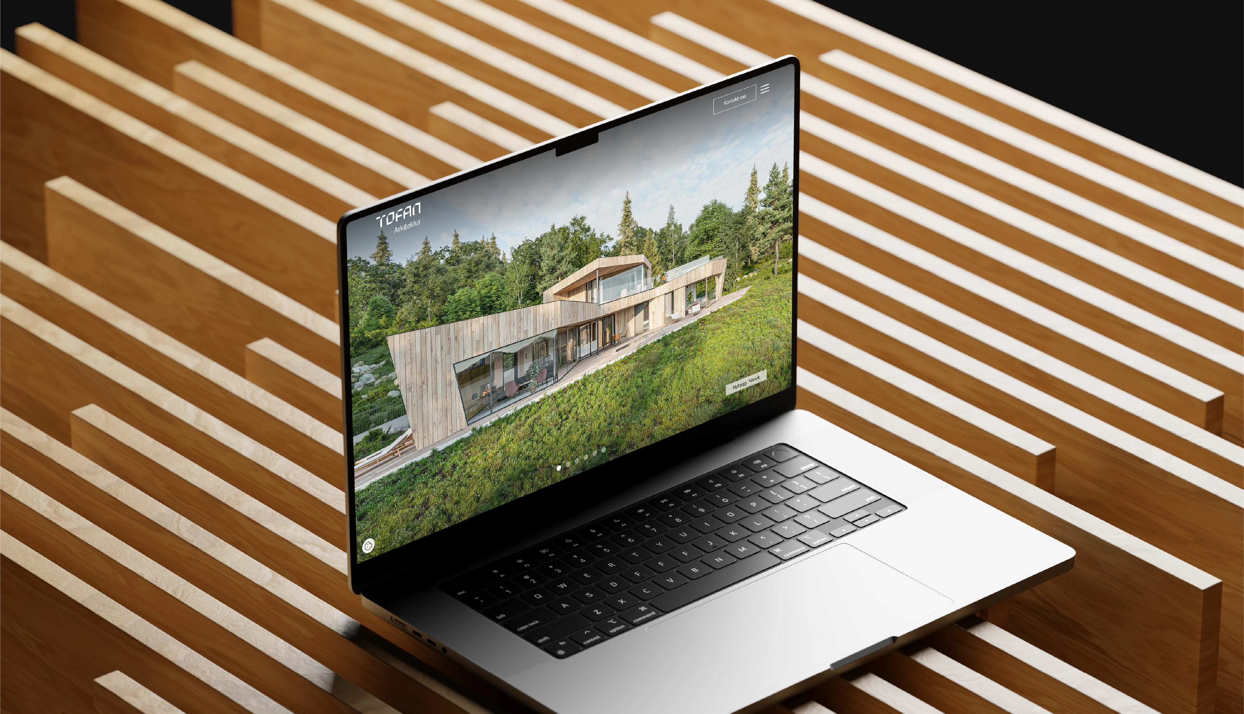
Tofan Arkitektur
Tofan Arkitektur is a Norwegian architecture studio with a clear point of view, grounded, precise, and built with care. Their work ranges from private residences to larger projects, always with the same attention to detail and place. The brief was a logo refresh, not a reinvention.
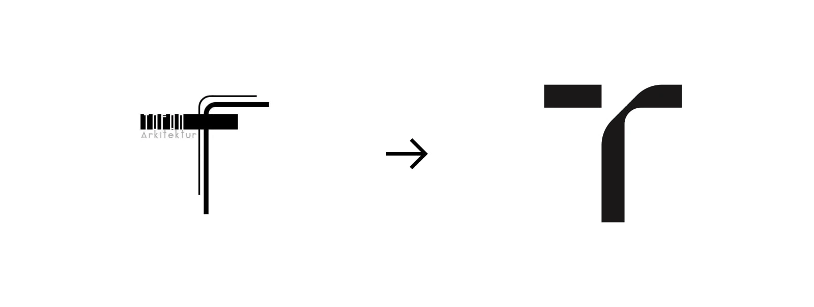
The process started with the original T, treating it as a foundation rather than something to replace. Working on a square grid, different forms were tested until one held the same character as the old mark but felt more confident. The rest of the wordmark followed, each letterform considered, the whole thing precise without being cold.
Credit
Web development:
Horn Media
Photography:
Diana Tofan
Renders:
Diana Tofan
Like this project
Posted Apr 17, 2026
An architectural practice in Norway