Wilsgård Rebranding
Radu Gabriel

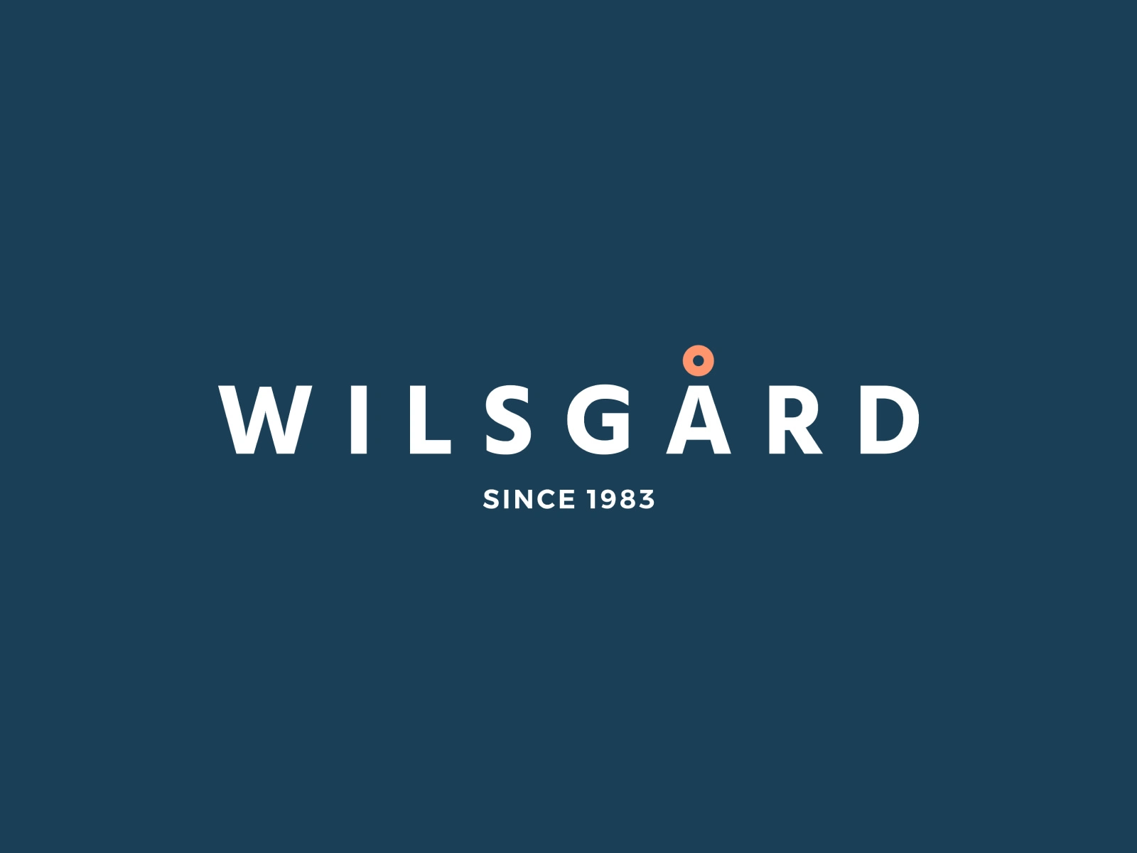
Wilsgård
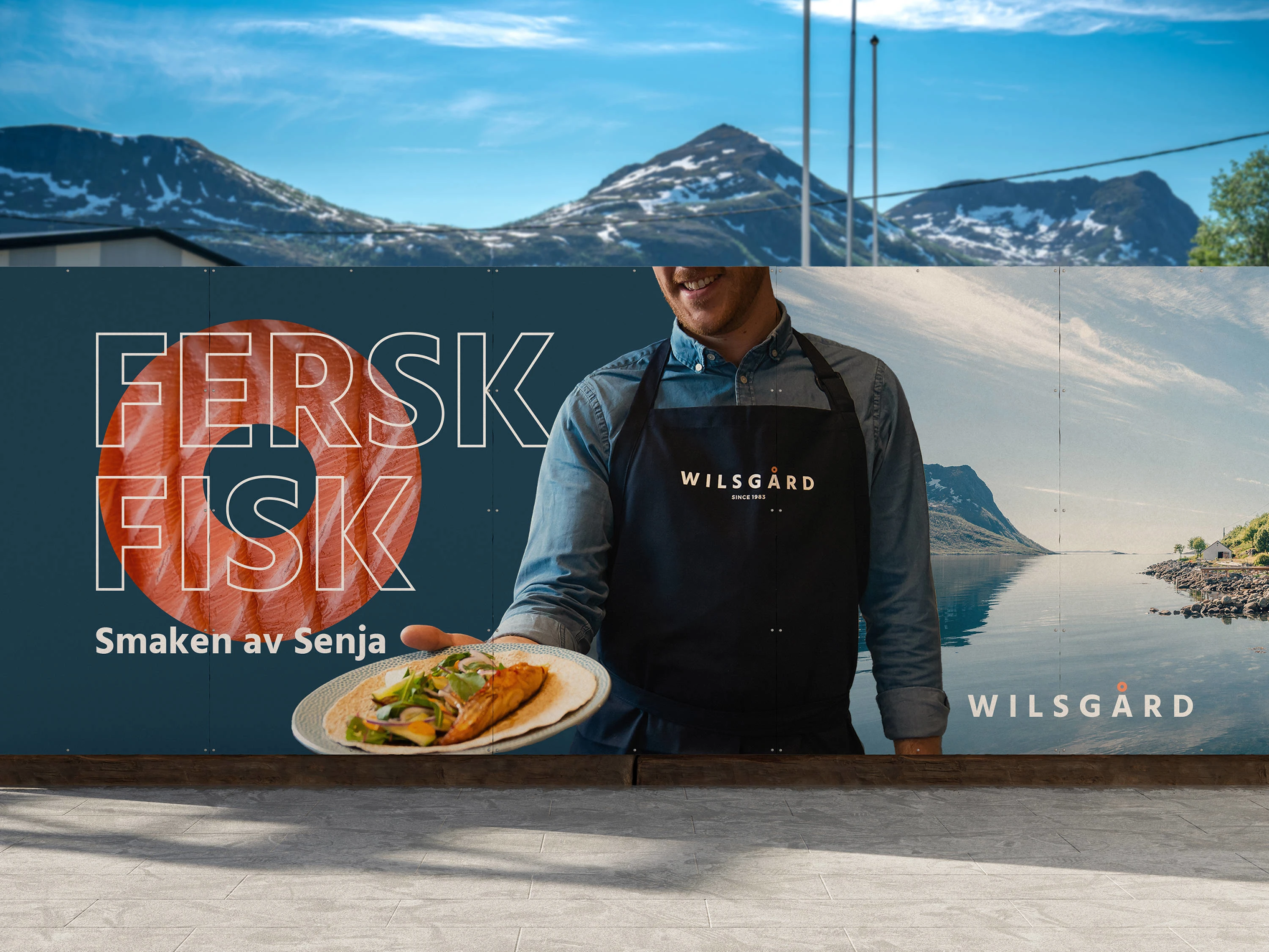
Wilsgård has been part of Norway's seafood industry since 1983. Based on the island of Senja, they are a well-known name in the market, one that carries both heritage and the expectations that come with it.
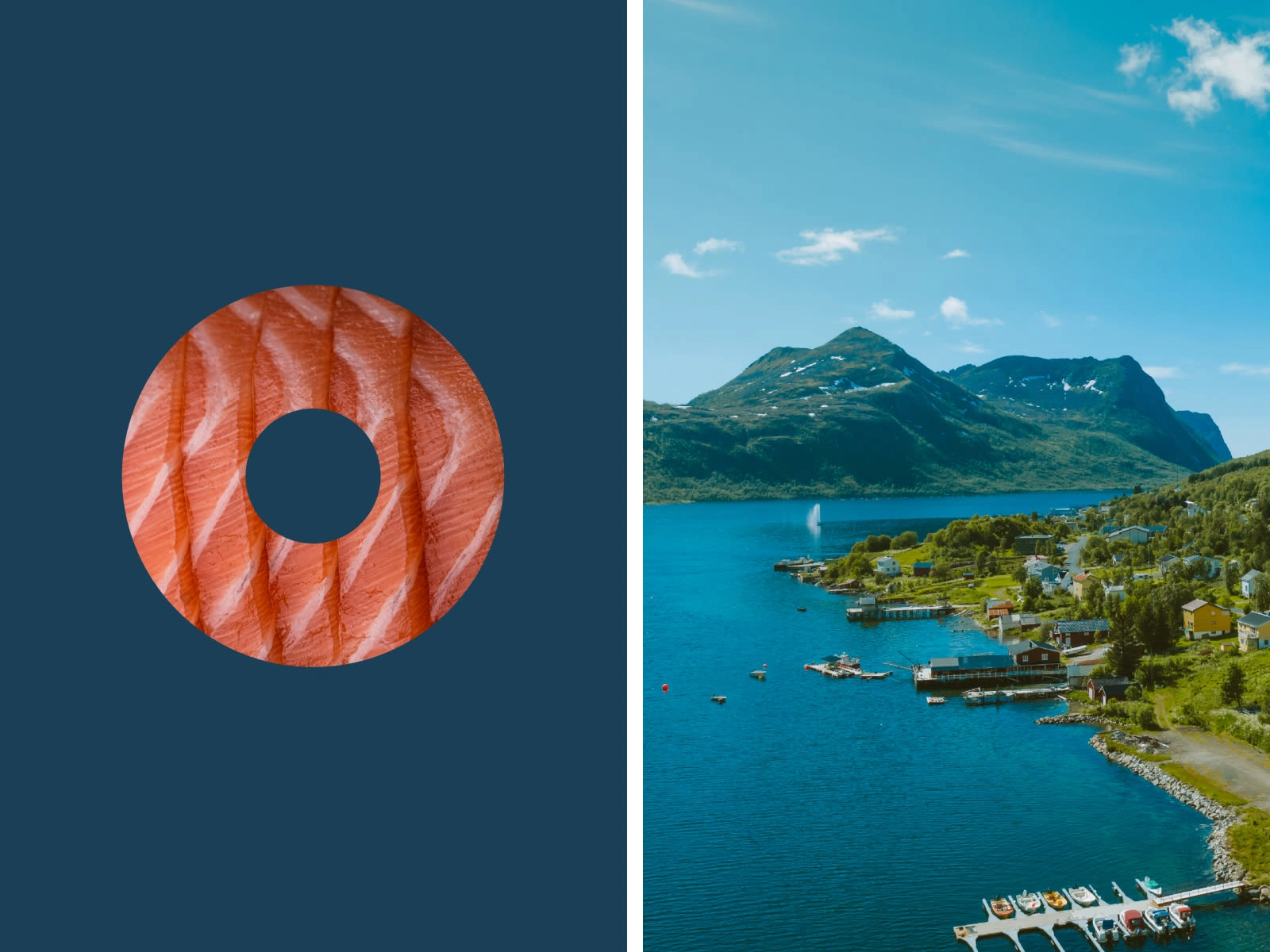
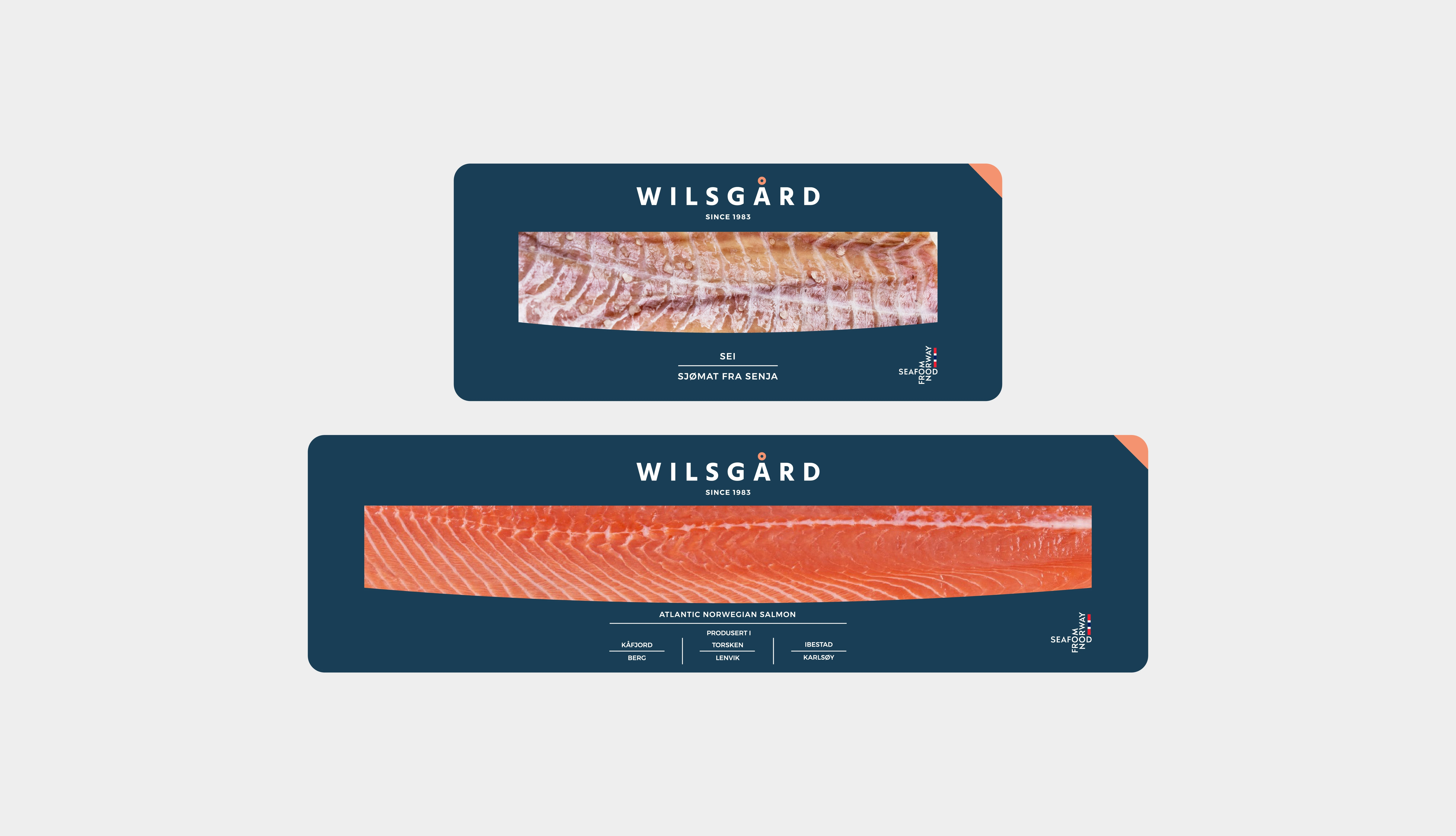
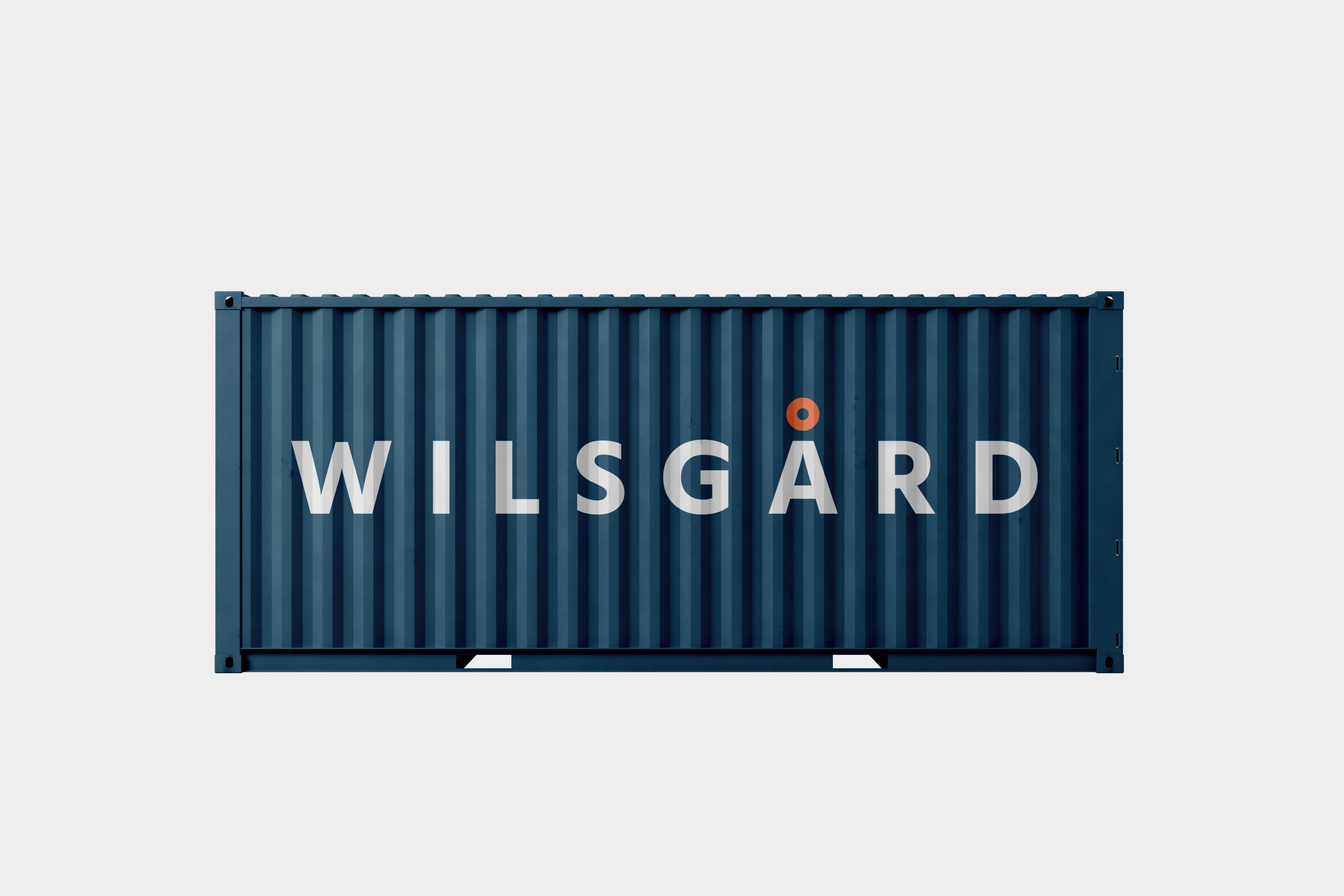
The rebrand needed to honor that history while giving the company a sharper, more confident presence. The Å became the anchor of the identity, its circle replaced with a cross-section of salmon, connecting the letter directly to the product. A small change with a clear meaning, carried across packaging, logistics, and everything in between.


Credit
Development:
Magy Media
Photography:
Kjell-Petter Hetland
Like this project
Posted Apr 15, 2026
A Norwegian seafood company from the island of Senja, known for fresh fish since 1983