Brand and Platform Development for Taste Tromsø
Radu Gabriel
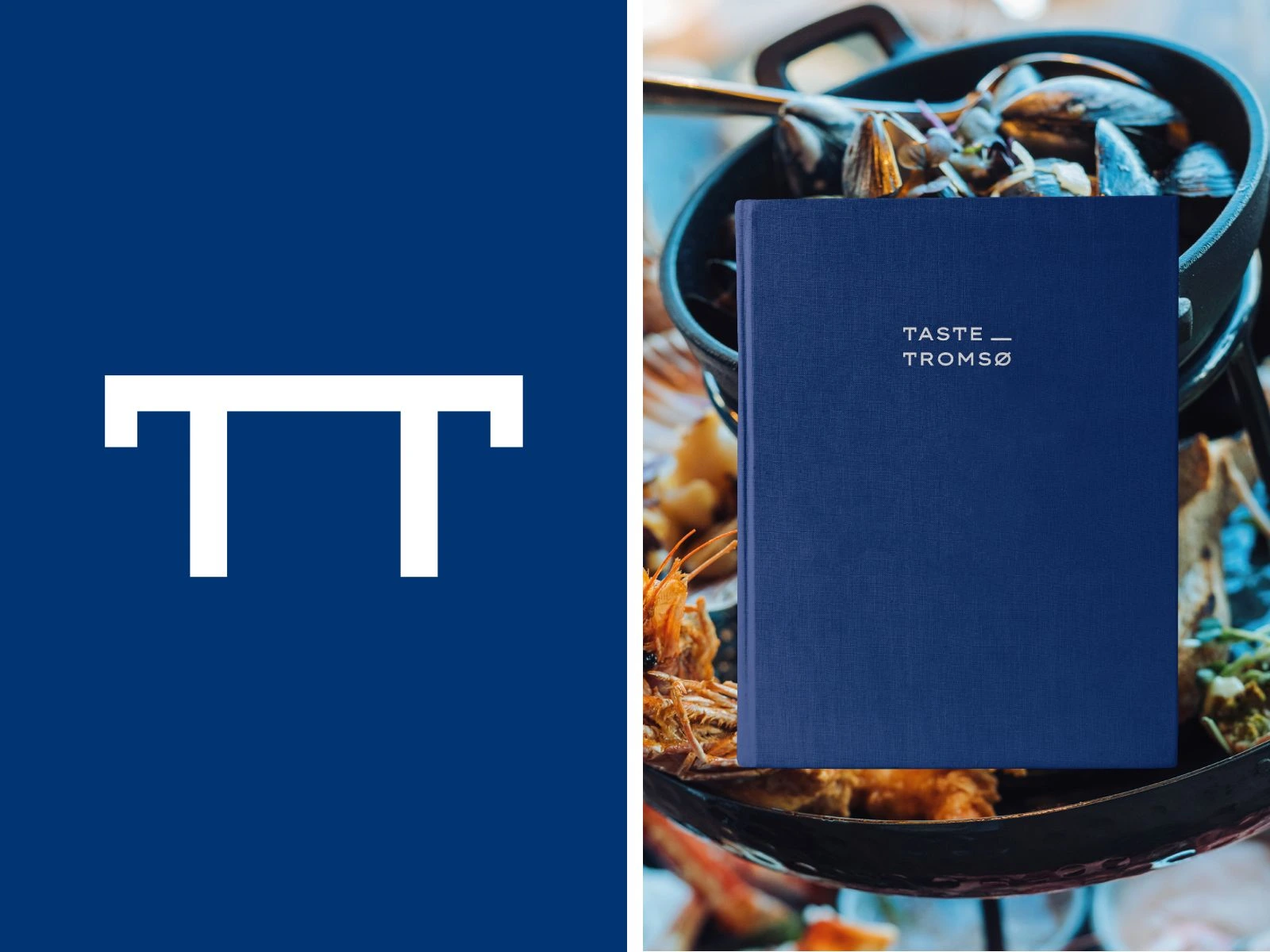
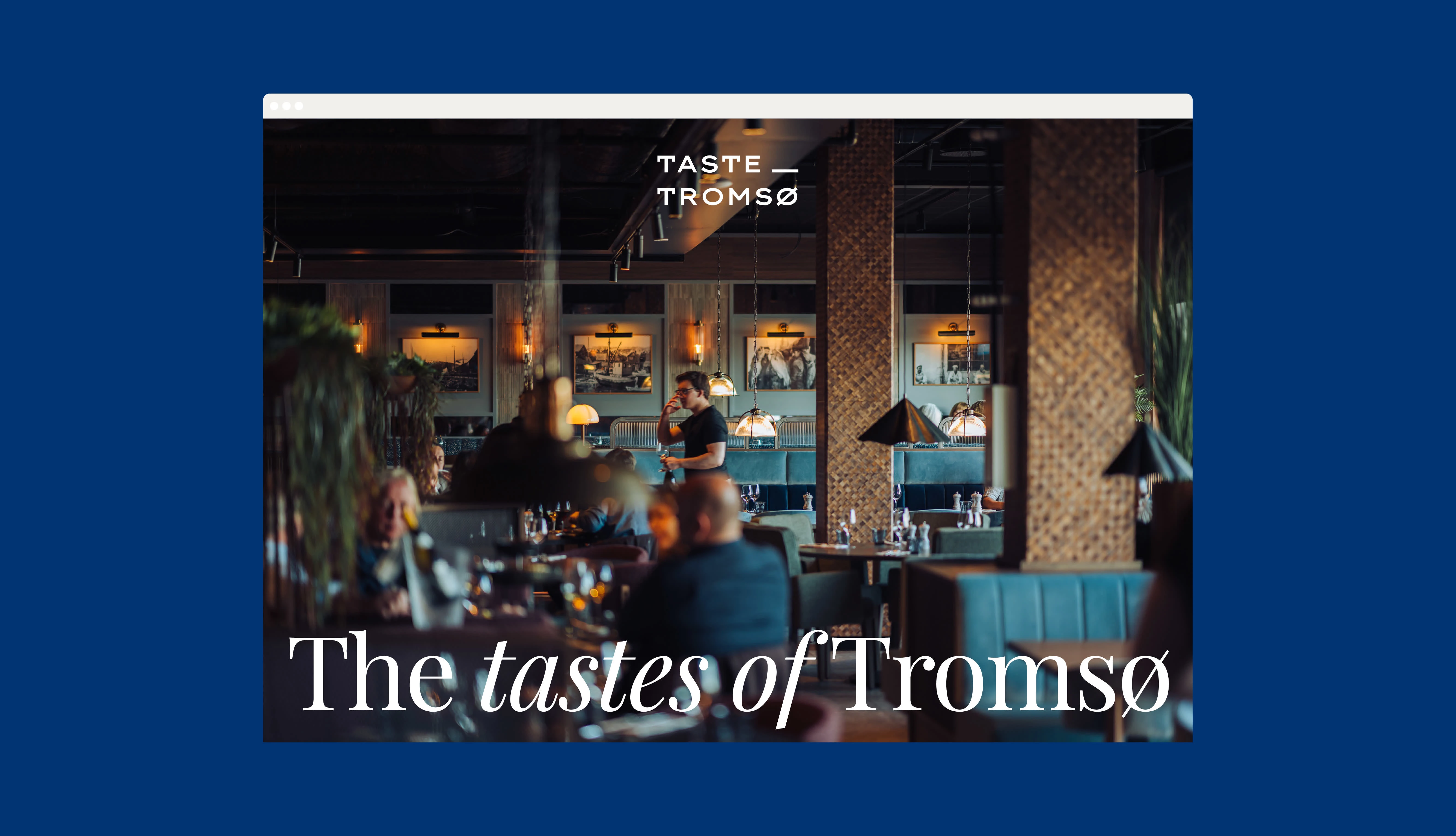
Taste Tromsø
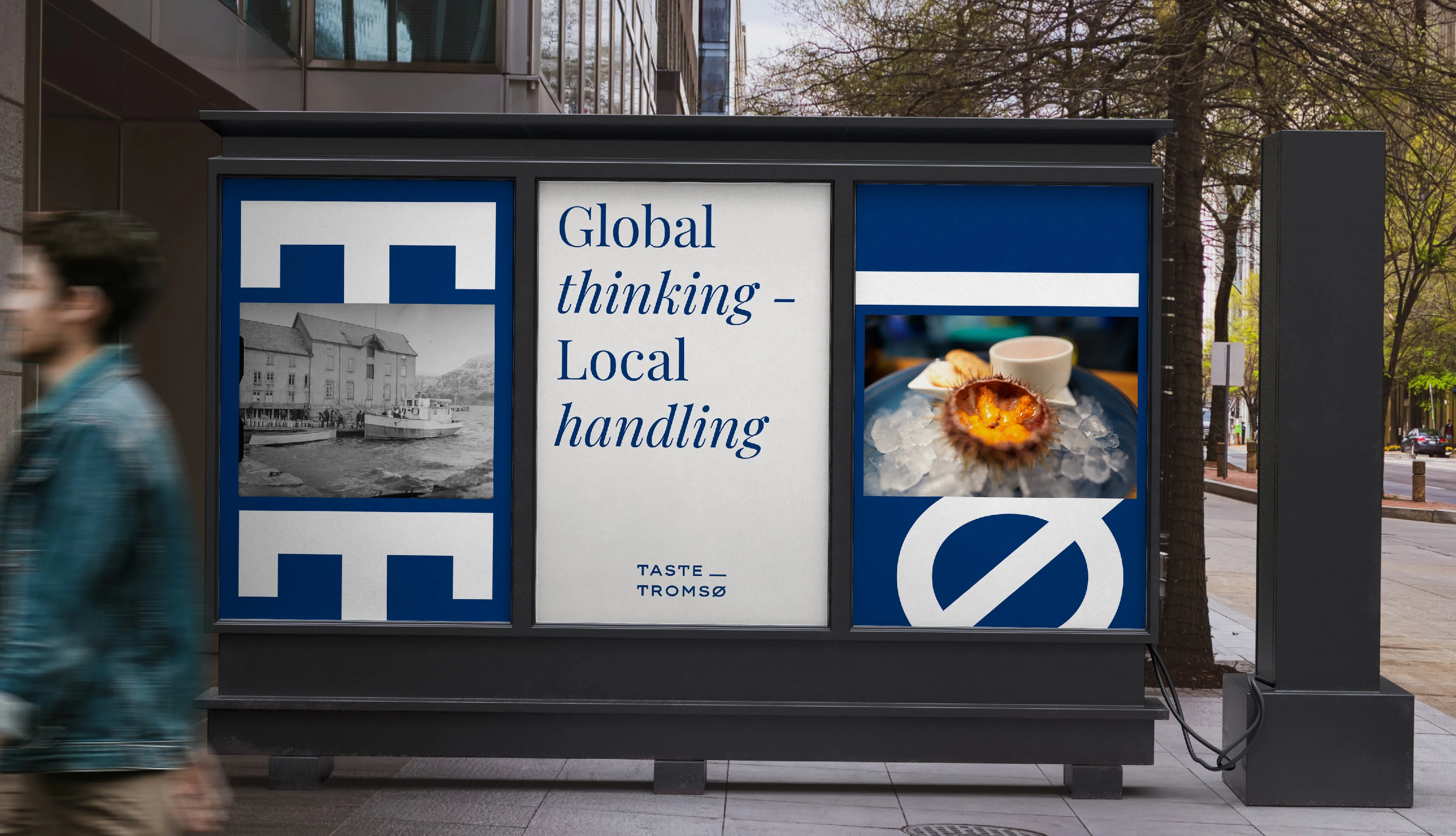
Taste Tromsø is a curated platform bringing together some of the best restaurants and bars in Tromsø. More than a guide, it's a gathering, a shared identity for places that care about the city and the people in it.
They needed a brand with local character that could hold its own beyond the region. The T was drawn from old Tromsø newspaper typography, its crossbar reimagined as a plate. Together, the TT monogram reads as a table, a symbol that is specific to the city, but immediately understood by anyone

Credit
Web development:
Ankra
Photography:
Vegard Stien
Like this project
Posted Apr 15, 2026
A group of local restaurants and bars with a warm heart for our city and its people