up.NEXT mobile app
A mobile app to organize watchlists across multiple tv media subscriptions.

OVERVIEW
There seems to be never ending bids for our attention. In the TV and movie space, we have endless options for streaming subscriptions and the next “must watch” thing. I wanted to create a way to organize those watch lists within the subscriptions quickly and easily, all within one app.
I’ll walk you through defining the problem, early research to see if it was even worth building, discovering how I might solve this problem, designing and testing my solution!
PROBLEM
How might we easily show people what they are subscribed to, what they were just watching last night and have their custom watchlist at a glance too.
MVP
To create a mobile app that gives users the ability to login to all of their subscriptions, make custom watchlists and find what to watch for the night quickly.
KEY REQUIREMENTS
Ensure user is able to create account and connect all streaming services to the app.
User can create “lists” and search across streaming services to add it to the list.
User can click on media and it will open in the corresponding streaming services app.
EARLY SOLUTION DISCOVERY
DECISION FATIGUE
I had been sitting on the couch with my husband one weekend afternoon, and we couldn’t decide what to watch together. It had to be kid friendly, because our seven year old was playing with his new construction trucks on the floor. It had to be something we BOTH wanted to watch. By the time we finally decided it had been at least ten minutes of scrolling and disagreeing.. Which i’m not sure about you, but it makes it difficult to fully relax after that!!
SURVEY
So first i started with a few questions.. I needed to see if people might be interested in this app at all. I wanted to know..
How many hours of tv do people watch in a day?
How many subscription viewing services do they have? (paid for themselves or others)
Do the have a "watch next list"?
I made a survey in google forms asking just that, and a few more which you can see here.
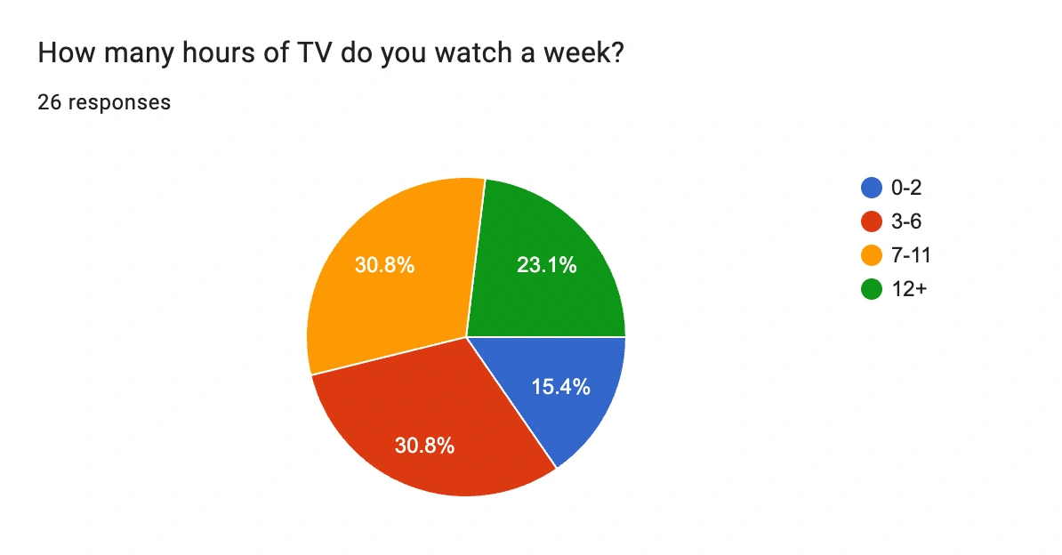
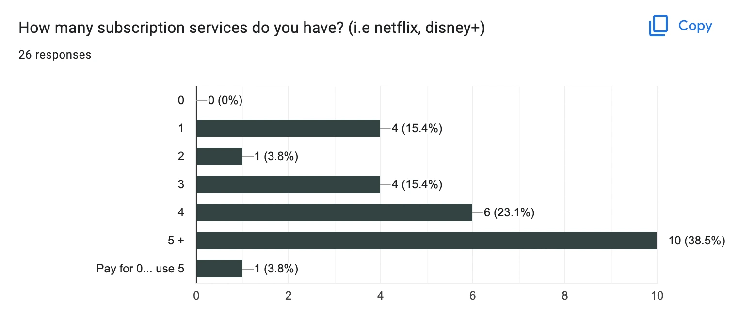
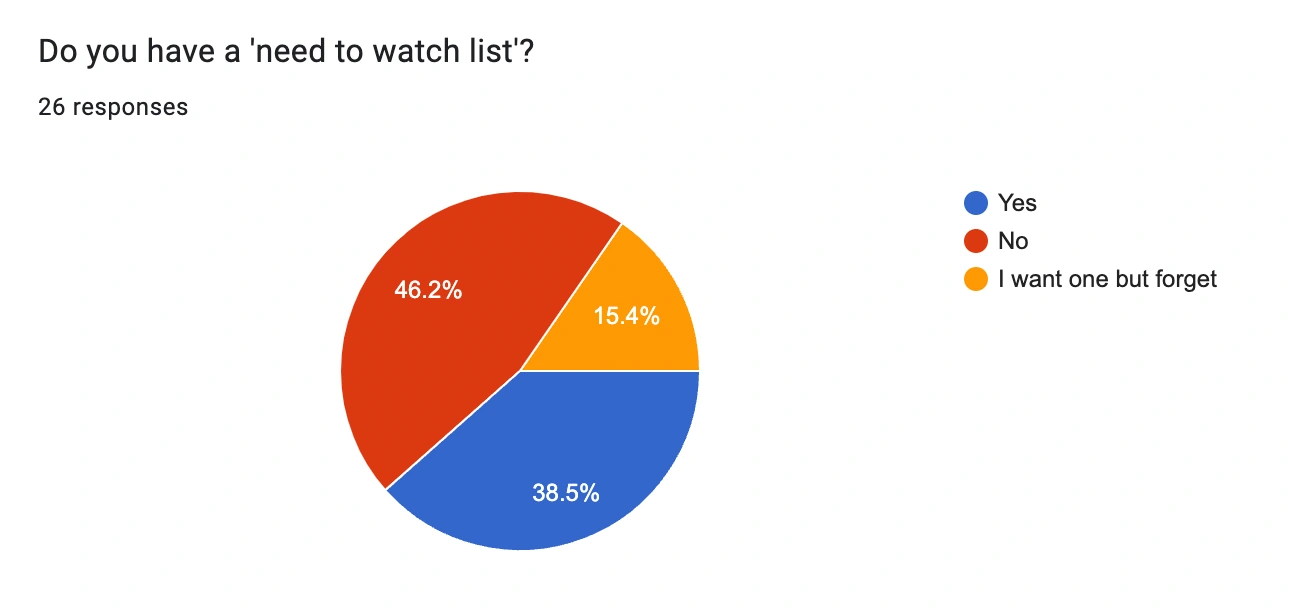
KEY TAKEAWAYS FROM SURVEY RESULTS
The answers to “How many hours of TV do you watch a week?” were a little surprising to me.
In my psychology studies I learned that particularly when asked to self-report, people tend to UNDERESTIMATE.
So I think I would feel comfortable in saying, while looking at those results that people watch at least 7 hours of tv a week, so 1 hour a night.
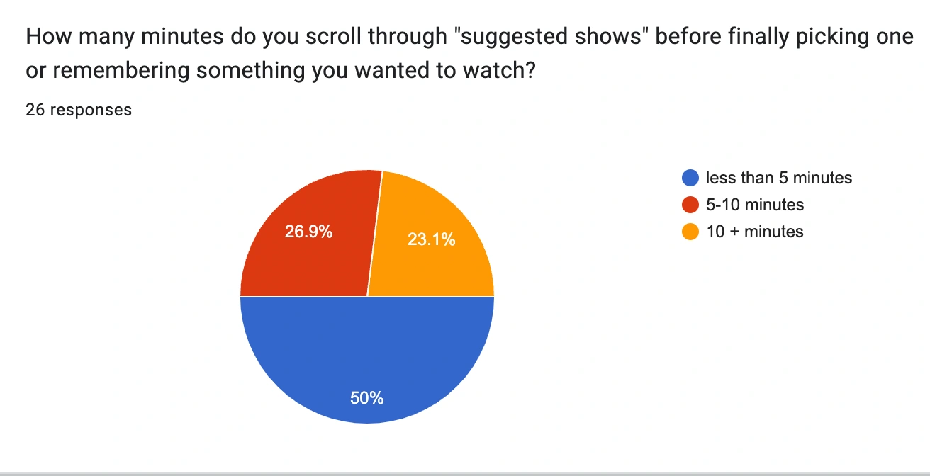
50% of people said they scroll through shows for less than 5 minutes, 27% said 5-10 and 23% said 10+ minutes.
I’d say that having almost a quarter of people surveyed taking 10+ minutes is a big deal and there is a gap that needs to be addressed in the way users can interact with their subscriptions and all of their shows.
COMPETITIVE ANALYSIS
I did a quick google search to see what might already be in the market and chose three different apps to look at! In my analysis I noticed a couple of things, they were very “info heavy” and most of them were more like social sharing apps. Which could be a fun direction to go in the future. I did love that one of them already did what I was hoping and that was when you click on a show it takes you to the corresponding app. Eliminating user steps early on just makes their lives so much easier. All in all, there isn’t an app quite like what I am wanting just yet! So, good news for me… I can help solve this problem! I used a new software for this comparison and I'm not sure if I love it yet.
I NEED MORE!
Feeling like my project was already off to a promising start, I needed to get more information from my potential users. I reached out to a total of four people from my initial survey. I was able to gather a few key takeaways and notice an overall pattern in the users pain points.
TIME
The most valuable thing to all of my interviewees. If they were able to save just five minutes a day, they felt that time would compound and could spend it doing more meaningful things like being present with family and friends, playing with their kids or enjoying a hobby. I always love the in depth surveys because I can get a real feel for the users problems and what matters most to them. I brainstormed some questions and then created an interview guide.
DECISION MAKING
They also struggle with how many decisions that they need to make a day. The list is a mile long, so having their relaxing activity on somewhat of an autopilot would free at least some brain space!
MORE DISCOVERY..
PERSONAS
MEET TYLER, MEGAN AND ANDREW
From the research so far I was able to make three different personas organizing patterns and goals and grouping the users together.
I came up with Tyler, Megan and Andrew. All wanting to achieve slightly different things with their TV watching experience.
Now it was time for me to step out of this being MY project.. And move into who the users might be and what THEY want.
TYLER
Busy, working parent of 3 young kids
Trying to balance all of things in life. Wife, kids, his own hobbies, work, relaxing, worrying about the future…
Needs list out of his head to make more room for other thoughts.
MEGAN
Mom of 2 young boys, works very part time in a record store (for the discount)
Doesn’t get a lot of alone time, so she definitely doesn’t want to spend it scrolling for something to watch.
Already feels like she makes a million decisions a day… one less would sure feel nice.
ANDREW
Works with high school aged kids during the week and is the favorite grandpa on the weekend.
He’s an “empty nester” so it’s given him the opportunity to foster his friendships and they enjoy watching the newest movies in his basement theater.
Wants to find more time in his days to call his kids, go to grandkids sports and probably garden more!
SO, WHY ARE THEY IMPORTANT?
They allow us to see what people value and create something meaningful for them.
Here are the user stories I made for them.
As a working parent, I want to find a show to watch quickly so that I can unwind at the end of my stressful days.
As an empty nester, I want to see all of my subscriptions and their shows so that I can enjoy my basement theater to the fullest.
As an empty nester, I want categories for my lists so that I have something I know everyone will enjoy. (this one could easily apply to all of them as well!)
As a busy mom, I want to have a list of shows that my husband and I can watch so I can make one less decision throughout the day.
I originally had 6, and needed to save 2 for the sake of time and they felt like something that would be better addressed in the next version of iterations.
AND NOW... DEFINE!
USER FLOWS
So taking those user stories, and personas I sketched out some basic user flows. I also took into account what typical onboarding processes look like in other apps. So here i did a good amount of browsing and finding inspiration to make sure my mind was on the right track.
Turning those sketches into digital user flows took longer than I anticipated! I was quickly learning that this has the potential to become a robust app, and while I will develop and iterate in the future i needed to make this version pretty minimal in order to get wireframes, mockups and prototyping done. I do love this step though because it allows me to see really how many screens I may need and if I can cut any out, or if i’m missing something altogether.
WIREFRAMING
I'll share my early sketches below, I wanted to include the text in my wireframes so I knew exactly where everything was going.
SKETCHES
DIGITAL WIREFRAMES
After doing the sketches and compiling what I had discovered so far, it was time to put it all into action. Creating in Figma is one of my favorite things because I love seeing it go from just an abstract idea in my head to an actual, viable product. These wireframes were a bit more in depth than I was used to making because I wanted to easier convey what I was thinking on each screen. I didn’t have any placeholder text, so that made it even easier to test the flow of things.
INFORMAL TEST OF WIREFRAMES
I conducted a quick internal test to see if my wireframes even made sense before I moved to my mockups.
Some great feedback was received! The biggest one being, the onboarding process felt long.
I implemented that by having the option to skip some steps, so I could move to mockups + prototyping, and we will see how it does in usability tests!
BRAND IDENTITY
Before jumping into my mockups, I took some time to create a little bit of brand identity. This part usually works its way into my thoughts early on so i already had an idea of a color palette and patterns i wanted to use.
I didn’t want it to be too overwhelming and also wanted to stand out in the usual shades of red and black that the industry is usually associated with. I love that shades of green trigger feelings of recharging and relaxing, which, looking back at the data is why most of the people surveyed watch tv in the first place. Below is my moodboard for the project.
MOCKUPS + PROTOTYPE
THE PROTOTYPE!
Screenreader support is currently disabled. To enable it, use the Accessibility settings from the Options menu.
up.NEXT prototype.Edited 1 year ago
ALMOST DONE! FOR NOW...
USABILITY TESTING!
Looking again to the user stories, I was able to identify a few tasks and simply see if they could be completed and what that looked like for them. I wanted to know more about how the user felt while they went through the app and if they could achieve what they wanted to i.e finding shows easily and if they could see themselves using it long term.
PATTERNS AND PROBLEMS IDENTIFIED
Overall, they LOVED the feel of the app. It reminded them a bit of simpler times of things like the TV guide. Below is a list of the problems that were identified.
When integrating the accounts, the “double wide squares” felt like they were higher priority over the others because they were bigger. - which later in the test they also said the different sizes of the movie posters was a little confusing as well.
They also felt as though the all caps choice felt too harsh and took away from the bubbliness of the overall branding.
Some of the colors and text blended too much with the background
FURTHER ACTIONS AND ITERATIONS
Redo the layout of the connect screen to better convey hierarchy.
Look at typeface that seems harsh, change it to lowercase and test again.
I'll also check the contrast for accessibility to make sure they are easier to read.
FINAL THOUGHTS...
I learned a lot from this project! I think I created the start of a solution to a problem that people can easily relate to. If I were to do something differently it would be creating a master project list! When I was making my user flow I realized I forgot to sketch it out first. I also would have tested more and earlier if I had a little more time! I’m excited to continue this project and take what I’ve learned and keep moving forward, testing and iterating.
THANK YOU FOR YOUR ATTENTION!
If you have any questions or feedback, don't hesitate to contact me HERE.
Other projects:
Like this project
Posted Sep 19, 2023
Created a mobile app to organize watchlists across multiple tv media subscriptions
Likes
0
Views
17
